
Designers rarely pull a full brand palette out of thin air. Most color systems start with one strong brand color, then build supporting colors around it. From there, the work becomes more systematic: lighter tints for backgrounds, darker shades for text and hover states, muted tones for UI elements, transparent colors for overlays, and a secondary color that works with the original.
Standalone color generators can help with the math, but they often stop at a list of hex values. You still have to move those colors into your actual website, whether that means pasting values into a stylesheet, creating CSS variables by hand, or entering each one into your builder.
Divi 5’s Color Palette Generator turns that process into a built-in workflow. You provide one primary color, choose how the rest of the palette should relate to it, and Divi creates a connected color system using relative colors. The generated palette is saved directly to the Variable Manager as color variables.
That means your palette is not just a group of static swatches. It becomes part of your Divi 5 design system. You can use the colors across modules, presets, and Theme Builder templates, then update the system from one central place when the brand color changes.
This tutorial walks through the single-brand-color workflow in Divi 5. We will focus on turning one primary color into a usable palette, then applying and reusing that palette across other Divi 5 projects.
- 1 When To Generate A Color Palette From One Brand Color
- 2 Open The Color Palette Generator
- 3 Choose The Right Generator Type
- 4 Set The Primary Color
- 5 Choose A Palette Type
- 6 Fine-Tune The Secondary Color
- 7 Set Shade, Tint, And Tone Counts
- 8 Adjust The Color Intensity
- 9 Customize Variable Names
- 10 Review The Color Preview
- 11 View The Generated CSS
- 12 Add The Palette To Your Site
- 13 Use The Palette With Presets
- 14 Reuse Your Color System On Other Sites
- 15 When You Need To Input Colors Individually
- 16 Turn One Brand Color Into A Working Design System
When To Generate A Color Palette From One Brand Color
The Color Palette Generator is best when you have one primary brand color and need a complete supporting palette around it. It is also useful when you are starting a new site, building a design system, or creating a reusable layout pack that needs to adapt to different brands later.
Use this workflow when:
- You have one main brand color and need supporting colors around it.
- You want tints, shades, tones, and transparent variants without building them manually.
- You want colors saved as reusable variables in Divi’s Variable Manager.
- You plan to use those variables inside Divi 5 Presets.
- You want the same design structure to work across multiple sites with different brand colors.
If you already have several locked brand colors from a client style guide, the one-color palette workflow may not be the best starting point. In that case, Color Scale or Color Harmony generation can be a better fit if those options are available in your Divi build. This post stays focused on the one-color-to-full-palette workflow.
Open The Color Palette Generator
The generator lives inside the Variable Manager. Here’s how to navigate to it:
- Open any page in the Visual Builder.
- Click the Variable Manager icon in the left sidebar.
- Hover over the Colors group.
- Click Generate Color Palette Variables.
The generator opens as a full-screen modal with settings on the left and a live preview on the right. If the regular page or element settings panel is still open, close it so the generator has more room.
Choose The Right Generator Type
For this tutorial, keep the generator set to Color Palette. This is the option designed to start with one primary color and generate a full supporting palette from it.
If your build includes Color Scales and Color Harmony, those are useful for different workflows. Color Scales are better when you already have individual colors and want tint, shade, and tone scales for each one. Color Harmony is better when you want to generate multiple related colors from a harmony model.
Use Color Palette when the starting point is one brand color and the rest of the system should be derived from it.
Set The Primary Color
The primary color is the seed for the entire palette. Divi uses this value as the foundation for the secondary color, tints, shades, tones, and transparent variants.
Enter your hex value in the Primary Color field. The preview panel updates immediately, so you can see how the generated palette changes around that new color.
Choose the color that best represents the brand. This should usually be the color you would use for key buttons, active states, brand accents, or the strongest identity moments on the site.
A very pale or very dark color can limit the usefulness of the generated steps. If your primary color sits close to white or black, test the preview carefully before saving the palette.
Choose A Palette Type
The Palette Type setting controls how the secondary color relates to the primary color. This is one of the fastest ways to change the overall feel of the palette.
Divi includes several color harmony options:
- Analogous: Uses a nearby hue on the color wheel for a calm, closely related palette.
- Complementary: Uses a hue opposite the primary color for stronger contrast.
- Split Complementary: Uses a hue near the complement for contrast that feels less direct.
- Triadic: Uses a three-point color relationship for a more energetic palette.
- Tetradic: Uses a four-point color relationship for a broader, more complex palette.
For most brand websites, Complementary or Analogous is a practical starting point. Complementary palettes give you a clear accent color. Analogous palettes tend to feel softer and more unified.
Triadic and tetradic palettes can work well for expressive brands, event sites, creative portfolios, or bold campaign pages. They usually need more restraint because they introduce more competing color energy.
Fine-Tune The Secondary Color
The palette type gives you the starting relationship. The secondary color controls let you adjust that relationship without abandoning it completely.
Use these settings when the generated secondary color is close, but not quite right:
- Secondary Color Hue Offset: Rotates the secondary color around the color wheel.
- Secondary Saturation Offset: Increases or decreases the secondary color’s intensity.
Small changes often work best. A few degrees of hue offset can make the secondary color feel more polished while keeping the same general harmony. Saturation adjustments are useful when the secondary color feels too loud or too dull for the brand.
Depending on the palette type, your build may also show controls for additional generated colors, such as tertiary or quaternary values. Use the same logic there: adjust only as much as the brand needs.
Set Shade, Tint, And Tone Counts
The next group of settings controls how many variations Divi generates for each base color. This is where one brand color starts becoming a full color system.
- Number Of Shades: Darker versions of the base color.
- Number Of Tints: Lighter versions of the base color.
- Number Of Tones: More muted versions of the base color.
A smaller palette is often easier to use. Start with two to four of each variation type, then add more only if the design needs them. Too many variables can make decisions harder later, especially for teams or client-managed sites.
Tints are useful for backgrounds, cards, and soft section treatments. Shades are useful for text, borders, buttons, and hover states. Tones help when a pure tint or shade feels too saturated for interface elements.
Adjust The Color Intensity
The intensity sliders control how far the generated colors move from the base color. They affect the strength of each step, not the number of steps.
The generator includes these controls:
- Shade Intensity: Controls how dark the shade steps become.
- Tint Intensity: Controls how light the tint steps become.
- Tone Intensity: Controls how muted or neutral the tone steps become.
- Alpha Intensity: Controls the opacity range of transparent variants.
Lower intensity creates subtler changes between colors. That works well for backgrounds, dividers, borders, and quiet UI details. Higher intensity creates more separation, which can help with hover states, active states, overlays, and high-contrast design moments.
Avoid pushing every intensity slider high by default. A useful design system needs a few strong colors, but it also needs quiet colors that can be used repeatedly without overwhelming the layout.
Customize Variable Names
The naming section controls how the generated variables are labeled. Clear names matter because these variables will appear throughout the builder when you apply colors to modules and presets.
The default naming is straightforward:
- Shades Prefix: shade-
- Tints Prefix: tint-
- Tones Prefix: tone-
- Alpha Suffix: alpha-
Most users should keep the defaults. They are easy to understand and match common design-system language.
Change the prefixes only when you already have a naming convention you want to preserve. For example, your team might use light-, dark-, muted-, or overlay- in an existing design system. Matching that language can make the generated variables easier to scan later.
Review The Color Preview
The right side of the modal shows the palette before you save it. Use this preview to check whether the generated colors are useful in real design situations, not just attractive as swatches.
Depending on your settings, you will see groups such as:
- Primary and secondary colors.
- Primary and secondary tints.
- Primary and secondary shades.
- Primary and secondary tones.
- Transparent alpha variants.
The Color Style Guide Preview shows sample text and background combinations. This is helpful for spotting combinations that feel too low-contrast, too saturated, or too heavy before you apply them across a page.
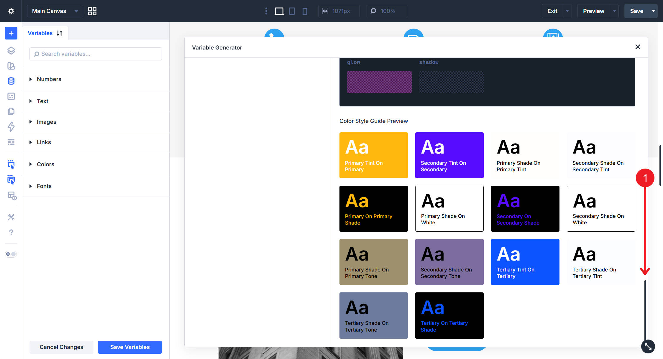
The preview is a good first pass, but it is not a replacement for accessibility testing. Before publishing, test key text and background combinations with a contrast checker, especially for body text, buttons, navigation, forms, and calls to action.
View The Generated CSS
To see how Divi defines each variable, click Show CSS at the top of the preview. The generated values show how the palette is built with HSL-based relationships.
You do not need to write or edit this CSS manually. The point is to understand what Divi is doing behind the scenes. The variables are built as related values, so the palette can stay consistent when the primary color changes.
This is the difference between a static list of hex codes and a color system. A static palette gives you individual values. A relative color system keeps those values connected.
Add The Palette To Your Site
When the preview looks right, click Add Variables To My Site in the top right of the preview panel.
Divi closes the modal and adds the generated colors to the Variable Manager. The generator updates the base color slots, including Primary, Secondary, Heading Text, Body Text, and Link. It also creates the additional tint, shade, tone, and transparent variables based on your settings.
After that, the colors are ready to use anywhere Divi supports color variables. You can apply them to backgrounds, text, borders, buttons, gradients, overlays, forms, and other module settings.
If the generator created more variables than you need, reduce the tint, shade, or tone counts and run the generator again. Matching variable names can update existing generated variables. Extra variables from an earlier, larger palette may need to be removed manually in the Variable Manager.
Use The Palette With Presets
The palette becomes more useful when you combine it with Divi 5 Presets. Variables store the color values. Presets decide where those colors are used.
For example, you might create:
- A Button Preset that uses the primary color for the background and a tint for the text.
- A Card Preset that uses a soft tint as the background and a shade for the border.
- A Heading Preset that uses the heading text variable.
- A Form Preset that uses tones for fields and a primary shade for focus states.
This keeps your design decisions reusable. Instead of applying the same color variables module by module, you apply presets that already reference the right variables.
If you want to build this into a broader system, pair the color palette with Divi 5’s Sizing System. Color variables handle the visual identity, while sizing variables handle spacing, type scale, gaps, widths, border widths, and radius values.
Reuse Your Color System On Other Sites
From here, modules, presets, and Theme Builder templates can all pull from the generated variables. The real payoff appears when you reuse the same design structure on another project.
Export your Design Variables and Presets together using Divi’s portability tools. The exported JSON file can carry the variable names, preset structure, and design relationships into another Divi 5 site.
On the receiving site, the layout and preset architecture stay intact. The brand colors can change.
Open the Variable Manager on the new site, hover over the Colors group, and click Generate Color Palette Variables again. Enter the new primary color, adjust the palette relationship, and click Add Variables To My Site.
For the cleanest result, use the same palette type and the same tint, shade, and tone counts as the original system. That helps Divi update matching variable names instead of leaving unused extras behind.
Every module or preset that references those variables can now reflect the new brand. The structure stays the same, while the color values change.
When You Need To Input Colors Individually
The Color Palette Generator solves the one-color-to-many problem. It is not always the right tool when a brand already has several locked colors.
If your brand guidelines already define a primary, secondary, accent, and neutral color, use a workflow that respects those fixed values. Depending on your Divi version, the Variable Generator may include additional color options such as Color Scales and Color Harmony.
- Color Scales: Use this when you already have individual colors and need tint, shade, or tone variations for each one.
- Color Harmony: Use this when you want to generate related colors from a broader harmony model.
The single-color Color Palette workflow is the right choice when one primary brand color should drive the rest of the system.
Turn One Brand Color Into A Working Design System
What used to be several separate jobs now happens inside one Divi 5 workflow. You choose a primary color, Divi generates a connected palette, and the result lands in the Variable Manager as reusable color variables.
The real value is not just speed. It is consistency. Your colors can live in one system, feed into presets, travel across layouts, and adapt to new brand colors without rebuilding every module from scratch.
Start with one color. Generate the palette. Save the variables. Then use those colors inside presets so the whole site follows the same design logic.


Leave A Reply