

The Divi 5 Visual Builder is highly customizable. Panels can be opened, closed, docked, floated, resized, and combined into tabs. You can also choose which top bar icons appear, change the interface mode and color scheme, set a default view, and control other builder preferences. That flexibility becomes even more useful with Workspaces.
A workspace saves a particular Visual Builder setup so you can return to it later. Instead of using the same interface for every stage of a project, you can create one setup for working on your design system, another for assembling pages, and a cleaner one for editing content.
In this post, we’ll first walk through the interface options that Workspaces can save. Then we’ll use them to create three practical workspaces for different stages of a Divi 5 project.
What A Workspace Controls
A workspace is a saved configuration of the Divi 5 Visual Builder. You arrange the interface the way you want, save that setup under a name, and switch back to it whenever that working environment makes sense. Importantly, a workspace changes the builder around the page, not the page itself. Your sections, rows, modules, content, Design Variables, and Presets stay exactly where they are when you switch workspaces. A workspace primarily remembers two types of information.
The first is the builder layout. That includes which panels are open, where they are positioned, whether they are docked or floating, their size, tabbed panel groups, sidebar dimensions, and the current builder view and breakpoint. The second is your builder preferences. These include settings such as Interface Mode, Color Scheme, Builder Default View Mode, Settings Modal Default Position, Page Bar Icons, and other options that affect how the Visual Builder behaves.
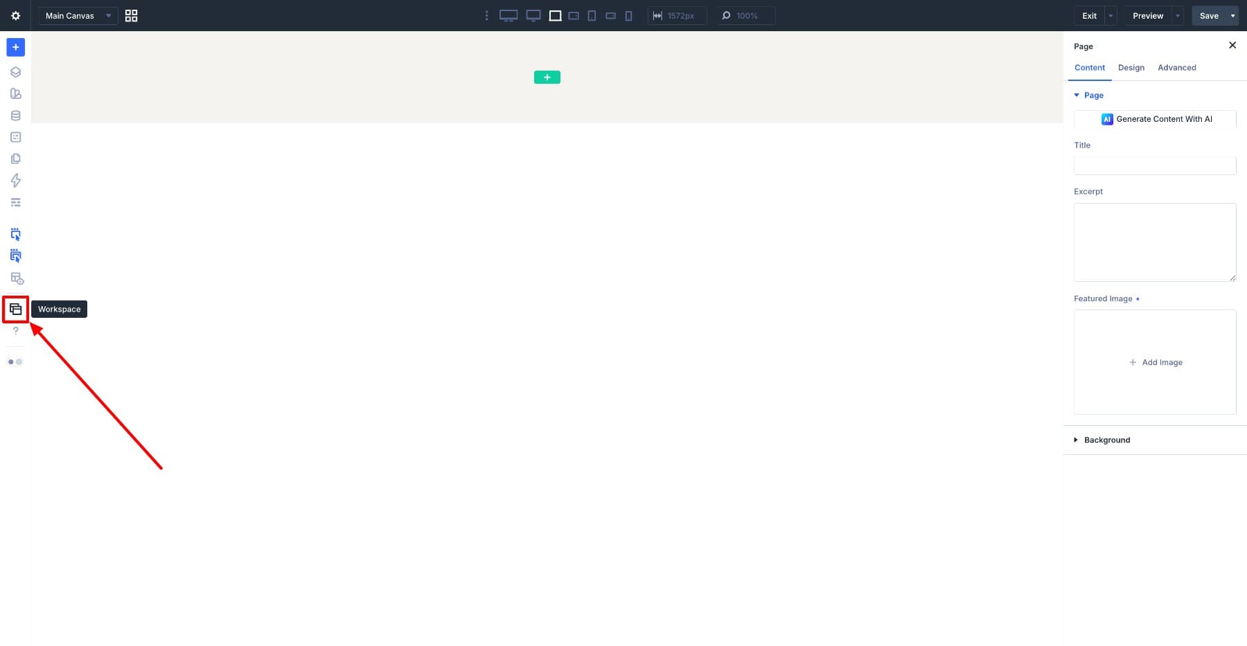
Switch workspaces, and Divi restores that saved environment together. You’ll find the Workspaces icon in the left sidebar.
Global, Personal, And Premade Workspaces
There is one useful distinction to understand before creating your own. Divi organizes workspaces into three groups:
- Website Workspaces: This includes the Global workspace. Global is stored site-wide and is available to users editing the website.
- Your Workspaces: These are the custom workspaces saved to your WordPress user account. Your personal setups do not rearrange the builder for another editor.
- Premade Workspaces: Divi includes Builder and Minimal as built-in starting points. These are read-only, but you can activate one, customize the interface, and save the result as a new workspace.
Out of the box, Global is the default workspace. You can set another workspace as your default later.
Learn Everything About Divi 5 Workspaces
Customizing The Builder Interface
Before creating task-specific workspaces, it helps to understand the interface adjustments that can become part of them. Open any page in the Visual Builder and try the options below.
Open, Close, And Dock Panels
Start with the panels. Open Layers and the Inspector from the left sidebar. These are useful examples because they make it easy to see how a workspace can rearrange larger interface tools.
Panels can be docked to either side of the builder. Drag a panel by its header, move it toward the left or right edge of the screen, and drop it into the sidebar. You can also stack multiple panels in the same sidebar.
Resize a docked panel by dragging the divider between it and another panel. You can also change the overall sidebar width by dragging its inner edge. A wider Layers panel can make deeply nested page structures easier to read, while a narrower sidebar leaves more room for the canvas.
Float Panels Over The Canvas
A panel does not have to remain docked. Drag it away from a sidebar and release it over the canvas to turn it into a floating panel. You can then resize and reposition it wherever it fits your workflow.
Floating works particularly well for panels you want available without permanently taking width away from the page preview. For example, you might keep Layers docked during a complex build but float the Inspector closer to the area you are currently reviewing.
Floating panels can also be useful on smaller screens. A docked sidebar reduces the width available to the canvas, while a floating panel can sit temporarily over the layout and be moved away when you need to see the full design.
Because Workspaces remember panel layout, you can create a setup specifically for that screen size rather than rearranging everything each time.
Combine Panels Into Tabbed Groups
If you want several tools available without giving each one its own section of the sidebar, combine them into a tabbed group. Drag one panel onto the header of another and release it. Both panels will share the same space, and you can switch between them using tabs.
You can add additional panels to the same group in the same way.
Tabbed groups are particularly useful on laptops or anywhere canvas width matters. Layers, the Inspector, and another frequently used panel can share one sidebar rather than competing for separate space.
Choose Your Page Bar Icons
The Page Bar at the top of the Visual Builder provides quick access to common builder actions. Open Workspace Settings from the Workspaces area and find the Page Bar Icons controls. From here, you can decide which actions remain visible in the bar.
There is no need to show every available icon in every workspace. A workspace intended for focused content editing might use a minimal Page Bar. A workspace for heavy page building can keep more actions visible.
The point is not simply to remove controls. It is to keep the ones that support the task you are doing.
Customize Workspace Settings
Workspace Settings also stores preferences that change how the Visual Builder behaves.
The available options include:
- Builder Default View Mode: Choose whether the workspace opens in Desktop, Tablet, Phone, or Wireframe View.
- History State Interval: Control how frequently Divi records actions in the History panel.
- Settings Modal Default Position: Choose where element settings appear by default, such as a fixed sidebar or floating position.
- Page Creation Flow: Choose what happens when you start working with a new page, including building from scratch, opening the premade layout library, or building with Divi AI.
- Page Bar Icons: Choose which controls stay visible in the top bar.
- Show Disabled Modules At 50% Opacity: Decide whether modules hidden through Visibility settings remain partially visible while editing.
- Group Settings Into Closed Toggles: Start option groups collapsed instead of displaying every group open at once.
- Add Placeholder Content To New Modules: Decide whether newly added modules start with sample content.
- Speed Up The Builder With Prerendering: Enable or disable Divi 5’s speculative prerendering behavior.
- Interface Mode: Switch between Light and Dark mode.
- Color Scheme: Change the accent color used throughout the builder interface.
- Show Theme Builder Layouts: Choose whether assigned Theme Builder areas are visible and editable while working on the page.
- Enable Admin Bar: Show or hide the WordPress admin bar while the Visual Builder is active.
A workspace can combine these preferences with its panel arrangement. That is what makes Workspaces more useful than simply rearranging the builder once.
Saving Your Setup As A Workspace
Once the builder looks and behaves the way you want, save the setup before changing anything else. Open the Workspaces panel and click Save as New Workspace.
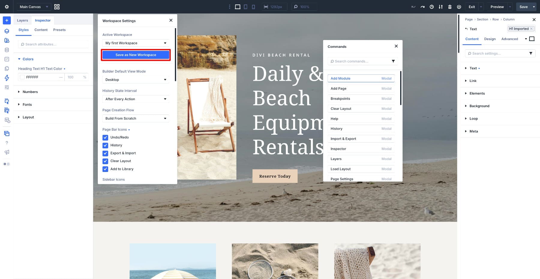
Enter Design Optimized in the Workspace Name field. Enable Set As Default if you want this configuration to load automatically when you enter the Visual Builder, then click Save.
The workspace now appears under Your Workspaces. Switch to another workspace and return to Design Optimized. Divi restores the saved interface configuration, including its relevant layout and preferences. Two additional actions are useful as your setup evolves.
Update Active Workspace saves the builder’s current configuration into the active workspace. Reset Active Workspace returns the workspace to its stored baseline configuration when you want to discard interface changes.
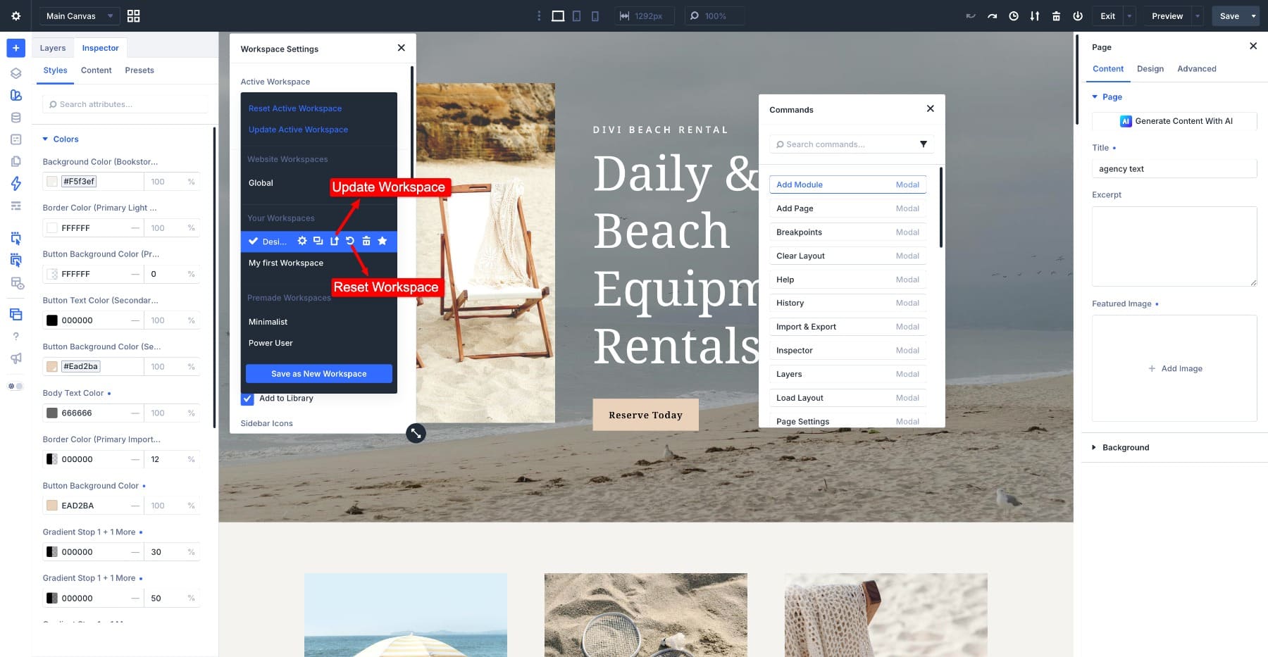
You can also rename, duplicate, delete, and set eligible workspaces as the default from the same area. Now that the save-and-switch workflow is clear, we can build workspaces around actual tasks.
Let The Interface Follow The Workflow
There is no single workspace configuration that is best for every stage of a website project.
A system-focused session may revolve around the Variable Manager and Preset Manager. Page assembly relies more heavily on Layers and the Inspector. Content editing can benefit from a cleaner canvas with fewer interface elements competing for attention.
For this tutorial, we’ll create three practical examples:
- Design System: For Design Variables and Presets.
- Page Build: For structure, layout, and assembling pages.
- Content Editing: For writing, images, and ongoing content updates.
These are starting points rather than rigid rules. The value of Workspaces is that you can adapt each setup to the way you actually build.
Workspace 1: Design System
The first workspace is built around design system work. This is where you might create or refine color, typography, and sizing variables, then connect those values to Option Group Presets and Element Presets. Two of the most useful tools for that workflow are the Variable Manager and Preset Manager.
You do not necessarily need Layers or the Inspector taking up permanent sidebar space while focusing on sitewide design decisions, so close them for now. Open the Variable Manager and give it enough width to make variable names and values easy to scan. Open the Preset Manager as well. You can dock the two separately or combine them into a tabbed group if you want both tools to share one sidebar.
Because these are sitewide systems, this workspace can be useful whenever you need to step away from an individual layout and adjust the underlying design language. Next, open Workspace Settings. Set Builder Default View Mode to Wireframe View if you prefer a more structural canvas while working on the design system. If seeing the finished page while adjusting variables is useful to you, Desktop View is equally valid.
For this example, we’ll use Wireframe View to reduce visual distractions. Turn on Group Settings Into Closed Toggles as well. When you are moving through several settings groups while creating or refining presets, collapsed groups make longer settings panels easier to scan.
Once the setup feels comfortable, save it as Design System.
You can return to this workspace whenever a project needs a new variable, a preset adjustment, or a broader design system change.
Workspace 2: Page Build
The second workspace focuses on assembling layouts. At this stage, Design Variables and Presets can already do much of the styling work, so the interface can prioritize page structure and style inspection. Open Layers and dock it in the sidebar. Layers gives you a structured map of the page and becomes especially useful once Sections, Rows, Columns, Groups, and nested modules start adding depth to the layout.
Then open the Inspector. The Inspector helps you trace the styles affecting an element, including values coming from Presets and Design Variables. That makes it useful when checking whether an element is following the design system or has accumulated individual styling.
If Layers and Inspector consume too much horizontal space, combine them into a tabbed group.
The Command Center is also particularly useful during page building. Press Cmd+K on Mac or Ctrl+K on Windows to open it. From there, you can add elements, open builder tools, jump to settings, switch views, navigate pages, apply Presets, and run other commands without searching through the interface.
Unlike Layers and Inspector, the Command Center does not need a permanent place in the workspace. Open it when needed and close it when the command is complete. In Workspace Settings, set Builder Default View Mode to Desktop if you prefer designing visually from the start. You can also use Wireframe View if your normal workflow begins with structure before moving into the styled page.
For this example, we’ll use Desktop. Turn on Add Placeholder Content To New Modules as well. When real copy has not arrived yet, placeholder content makes the shape and hierarchy of newly added modules visible immediately.
If you work on a smaller screen, try floating Layers instead of docking it. That leaves the canvas at a wider working size while keeping the page structure close at hand. Save the completed setup as Page Build.
One useful habit pairs naturally with this workspace: when an element needs styling, check whether an existing Preset or Design Variable already handles it before adding a new individual value. That keeps page assembly connected to the design system you created earlier.
Workspace 3: Content Editing
The third workspace strips the interface back for writing, replacing images, reviewing content, and making routine page updates. Start by closing panels that are not necessary for those tasks. Layers and Inspector are still available whenever you need them, but they do not have to occupy permanent screen space while someone is moving through the page and editing content directly on the canvas.
With the sidebars clear, more of the page itself remains visible. Next, adjust a few preferences in Workspace Settings. For this example, switch Interface Mode to Dark. The darker builder chrome gives the workspace a noticeably different visual context from the Design System and Page Build setups while keeping the page itself prominent.
Interface Mode is personal preference, so Light mode works just as well if that is more comfortable for your environment. Turn off Show Theme Builder Layouts if the person using this workspace only needs to edit the current page. Divi 5 can display and edit assigned Theme Builder areas such as headers and footers directly alongside the page. Hiding them here simply keeps global template areas out of view when the task is limited to page content.
That can be particularly useful for writers, editors, or clients who do not need to interact with those global areas during routine updates. Turn off Add Placeholder Content To New Modules as well. Placeholder content is helpful while planning structure, but during a content pass it can create unnecessary sample copy that later needs to be replaced. Starting with an empty module makes it clearer that real content still needs to be added.
Save the setup as Content Editing.
If a client will use a setup like this, remember that a workspace controls the interface, not permissions. Closing a panel or hiding Theme Builder layouts can simplify what is visible, but it does not remove a user’s underlying capabilities. Use Divi’s role management controls when you need to restrict which features or areas a particular user can access.
These three examples cover several common stages of a Divi workflow, but they do not have to be your entire workspace collection. You might also create a workspace for responsive review, for example. Set its default view to the breakpoint you inspect most often and arrange the builder around testing rather than construction. There is usually no need for a separate workspace for every breakpoint. Workspaces are most useful when each one represents a meaningfully different way of working.
Switching Workspaces As You Work
Once several workspaces are saved, switching between them is where the feature starts to become part of the workflow. First, choose a useful default. Out of the box, Divi uses the Global workspace as the default. You can set one of your custom workspaces as the default instead if there is a configuration you want the builder to open with most often.
For a design-system-heavy project, that might be Design System. During active page production, Page Build may make more sense. For a site that mostly receives copy and image updates, Content Editing may be the setup you want to see first. Open the Workspaces panel, select the workspace, and use Set as Default Workspace.
For faster switching during an active session, use the Command Center. Press Cmd+K on Mac or Ctrl+K on Windows and start typing the name of the workspace you want. Choose it from the results, and Divi switches the Visual Builder to that saved configuration.
The Command Center also includes workspace commands for updating and resetting the active workspace. That makes it possible to move between working environments without navigating back through the Workspace Settings panel every time.
A Practical Workspace Switch
Here’s what that can look like during a real build. Imagine you are assembling a page in the Page Build workspace and realize that a CTA needs a background color that does not exist in your current palette. You could add a one-off color directly to the Section, but if that color belongs to the site’s broader design language, adding it as a Design Variable keeps the system more reusable.
Open the Command Center and switch to Design System. Your saved Variable Manager and Preset Manager setup appears. Add the new color to your Design Variables, then switch back to Page Build and apply the variable to the CTA. The important part is not the number of clicks saved. It is that each workspace puts the tools for that type of decision back in front of you. The interface starts reinforcing the workflow instead of staying identical regardless of what you are doing.
Tips For Keeping Workspaces Useful
A few habits can keep a workspace collection useful instead of letting it turn into another thing to organize.
- Name Workspaces By Purpose: Names such as Design System, Page Build, and Content Editing immediately explain when a workspace is useful.
- Update Intentional Changes: If you rearrange a workspace and decide the new setup is better, use Update Active Workspace so the new configuration becomes part of it.
- Use Reset When An Experiment Does Not Work: If you move panels around and want to return to the workspace’s stored configuration, use Reset Active Workspace rather than manually rebuilding the layout.
- Check Workspace Settings When An Icon Disappears: Page Bar Icons are saved with the workspace, so a missing top bar control may simply be disabled in the active setup.
- Duplicate Before Making A Major Variation: Divi lets you duplicate a workspace, which is useful when two workflows share most of the same interface but need a few different panels or preferences.
- Keep The Collection Intentional: Divi lets you create multiple workspaces, but each one should represent a genuinely different workflow, screen setup, or use case.
Divi’s current Workspace management controls cover actions such as editing, duplicating, updating, resetting, deleting, and setting a workspace as the default. If you use Workspaces across several sites, keep the setups straightforward enough that they are easy to recreate where needed.
Let The Divi 5 Builder Match Your Workflow
Workspaces turn Divi 5‘s customizable interface into something you can reuse. Instead of choosing one builder arrangement and forcing it to fit every task, you can save different environments for different parts of your workflow. Keep the Variable Manager and Preset Manager close when working on your design system. Bring Layers and the Inspector forward when assembling pages. Strip unnecessary panels away when the job is primarily content.
Then switch between those setups as the work changes. The examples in this tutorial are only a starting point. As you use them, you may find that Layers belongs on the other side of your screen, that the Inspector works better as a floating panel, or that one Page Bar icon matters more than you expected.
When a change consistently improves the workflow, use Update Active Workspace and make it part of the setup. Over time, each workspace becomes less about customizing the interface and more about opening Divi 5 with the right tools already waiting for the job. If you are building a system-first workflow, start with Design Variables, then shape your workspaces around the way you use that system.










Leave A Reply