

Contact forms, videos, and product details can be useful without needing a permanent place on the page. A pop-up lets visitors open that content when they need it while keeping the main layout focused.
Divi Overlays by Divi Life gives that content a second layer. It is a pop-up, modal, and full-screen overlay builder that uses the Visual Builder, so you can design the overlay with the same modules, layouts, and design settings you already use. Click a button, image, text link, or menu item to open it, or trigger it automatically with a timed delay, scroll percentage, or exit intent.
The plugin supports both Divi 4 and Divi 5. We’ll use Divi 5 for the walkthrough below.
In this post, we’ll look at what Divi Overlays includes, how its triggers and animations work, and how to build a pop-up inside the Visual Builder.
Why Popups Are Still Effective
A Divi page can only hold so much before it starts to feel crowded. Contact forms, email opt-ins, pricing details, videos, and product showcases all compete for the same space. Putting that content on a separate page solves the clutter problem, but it also sends visitors away at the moment they decide to act.
A well-placed pop-up lets a visitor request a quote, watch a video, or compare plans without navigating to another page. Its usefulness depends on the content and timing: a requested team bio serves a different purpose from an automatically triggered promotion.
The design matters too. Each overlay is a Divi layout, so its typography, colors, and spacing can follow the rest of the site. You build the content with familiar modules rather than styling it in a separate editor.
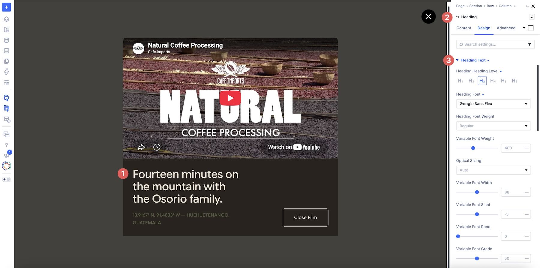
In practice, that adds another layer to the website. The page stays focused, the overlay carries the extra content, and both share the same Visual Builder you’re accustomed to.
Overview Of Divi Overlays
Divi Overlays treats each pop-up as its own Divi layout. The plugin adds a custom post type for Overlays, then lets you design them with the Visual Builder. You can create as many as you need, reuse them across the site, and edit one overlay without rebuilding every page that triggers it.
Once an overlay exists, you attach it to the site through a trigger. That trigger can be almost anything on the page, including a text link, button, module, Row, Section, or navigation menu item. Automatic triggers include timed delay, scroll percentage, and exit intent. A URL trigger also lets you link directly to an overlay.
The workflow has three parts: build the overlay, configure its appearance and display locations, and connect a trigger.
Key Features
The main features cover the overlay’s content, when it opens, where it appears, and how visitors close it.
Design Overlays With The Divi Builder
Divi Overlays gives you the Visual Builder’s layout and module controls inside each overlay.
That makes the plugin useful for both simple and complex layouts. A contact form overlay might only need a heading and a form module. A promotional overlay might include a pricing table, an image gallery, a slider, or a video. More specialized content, such as a multi-step form or shopping cart, depends on the form or e-commerce tools installed on the site.
Because the overlay is designed as a page, it can follow the site’s typography, colors, spacing, and module styling, rather than looking like a third-party widget dropped on top of Divi.
Click Triggers And Automatic Triggers
Overlays can open on click or when triggered by a rule you set in the overlay editor.
Manual / Click
Click triggers are the most straightforward way to reveal extra content without leaving the page. Text links, images, buttons, menu items, and even entire modules can open an overlay.
In Divi 5, copy the overlay’s CSS Class from its settings, then add it as a class attribute under the trigger element’s Advanced > Attributes option group. The team bio walkthrough below shows each step.
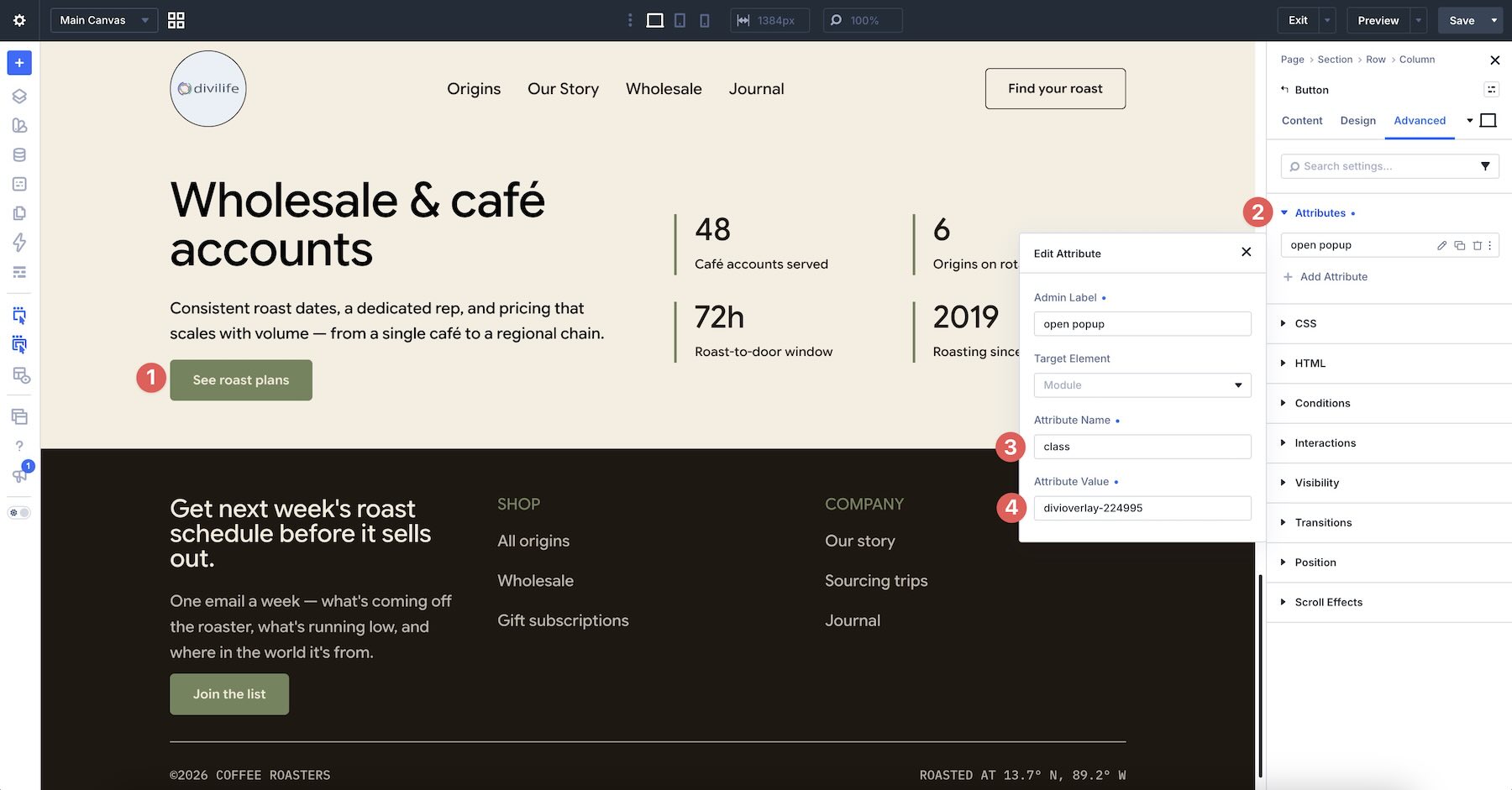
After that, the existing page element becomes the open action. This works well for contact forms, bios, product details, and other content that should appear only when someone asks for it.
Automatic
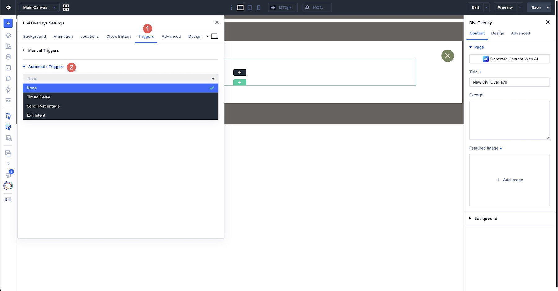
Automatic triggers are set on the overlay itself. Simply open the Divi Overlay settings, go to the Triggers tab, and use the Automatic Trigger dropdown.
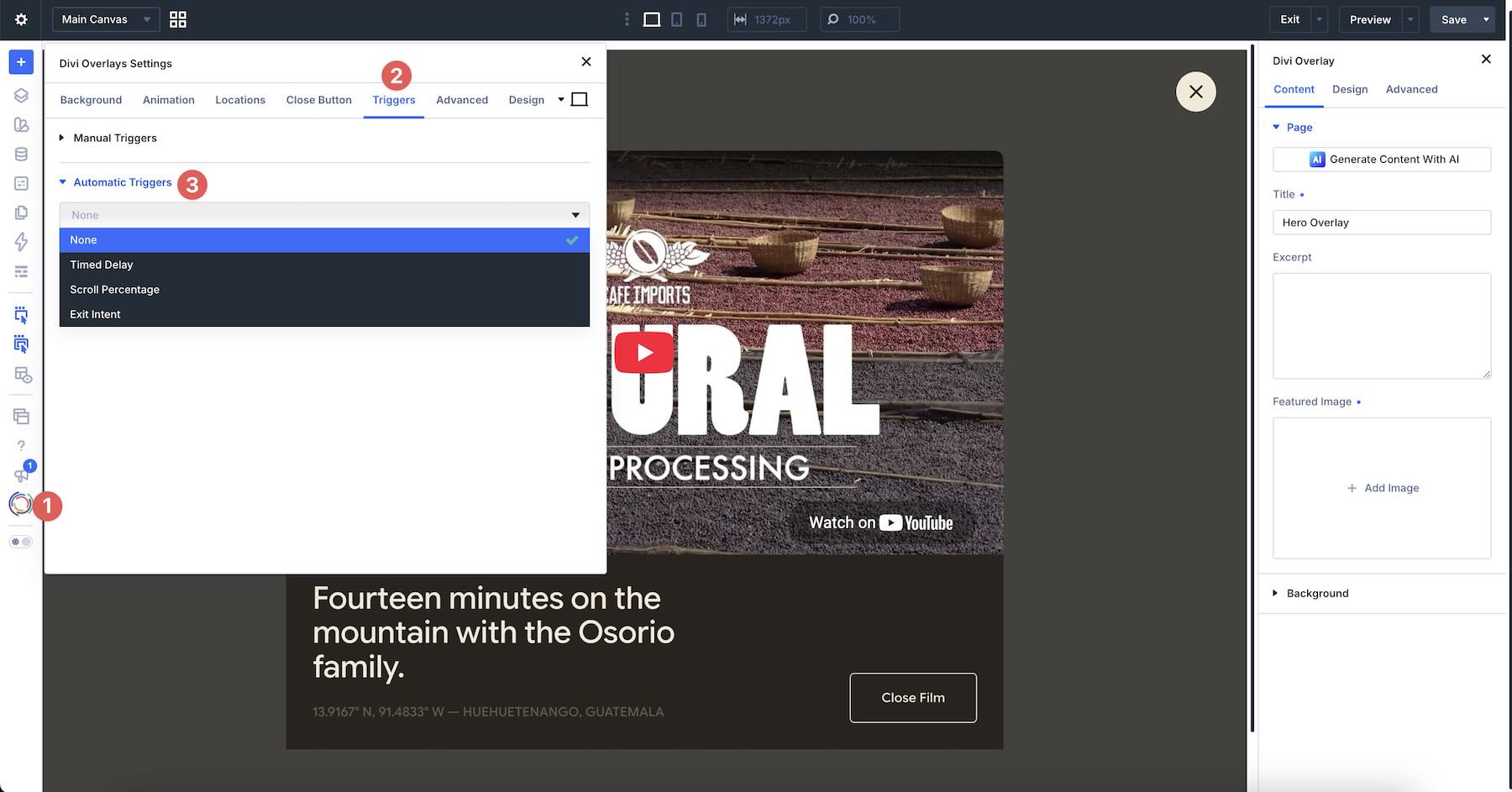
Use None when the overlay should open only from a click.
Timed Delay
When Timed Delay is selected, the overlay waits a set number of seconds before opening. Use Specify timed delay (in seconds) to choose that interval. A value of 0 opens the overlay as soon as the page loads, while a higher value gives visitors time to see the page first.
The same panel also controls where and how often that delay runs. Disable On can turn the automatic trigger off for Phone, Tablet, or Desktop if the overlay should not appear on a specific device. Display Once Per Page Load limits the trigger to one appearance per page load.
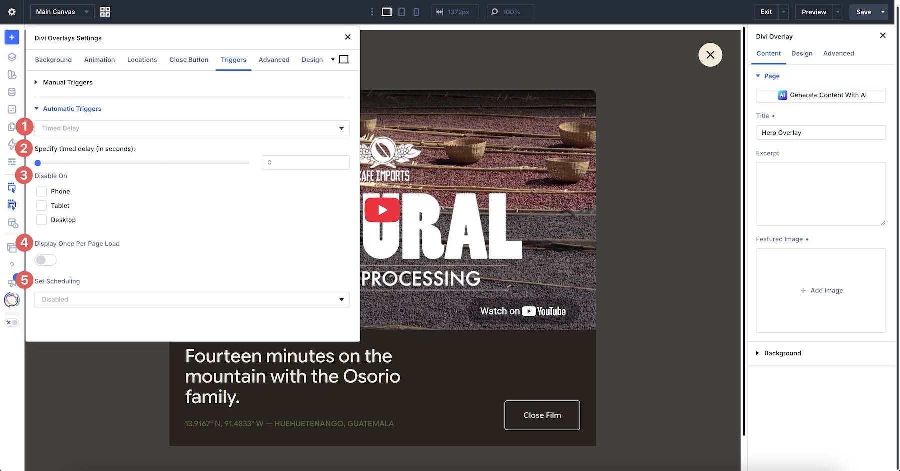
Set Scheduling can limit the trigger to a Start & End Time (date) or a Recurring Schedule with the option to disable it on any day of the week. You can also specify a start and end time for the days you choose.
Scroll Percentage
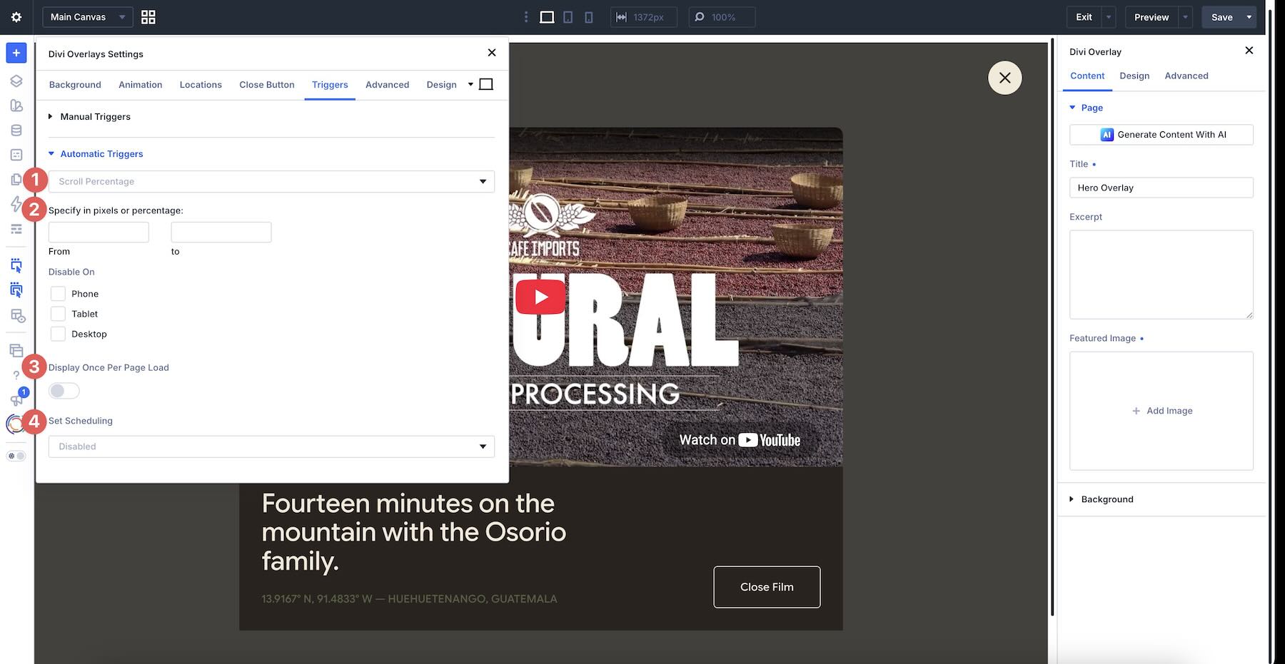
Scroll Percentage waits until the visitor has moved down the page before the overlay opens. Under Specify in pixels or percentage, you can set a From and To range so the trigger can fire at a specific scroll point or inside a window of the page. Use a percentage when the overlay should appear relative to the page’s length, or pixels when you want it tied to a more precise distance.
Disable On can exclude a specific device if the scroll-based overlay should only run on certain devices. Display Once Per Page Load limits the trigger to one appearance per page load.
Exit Intent
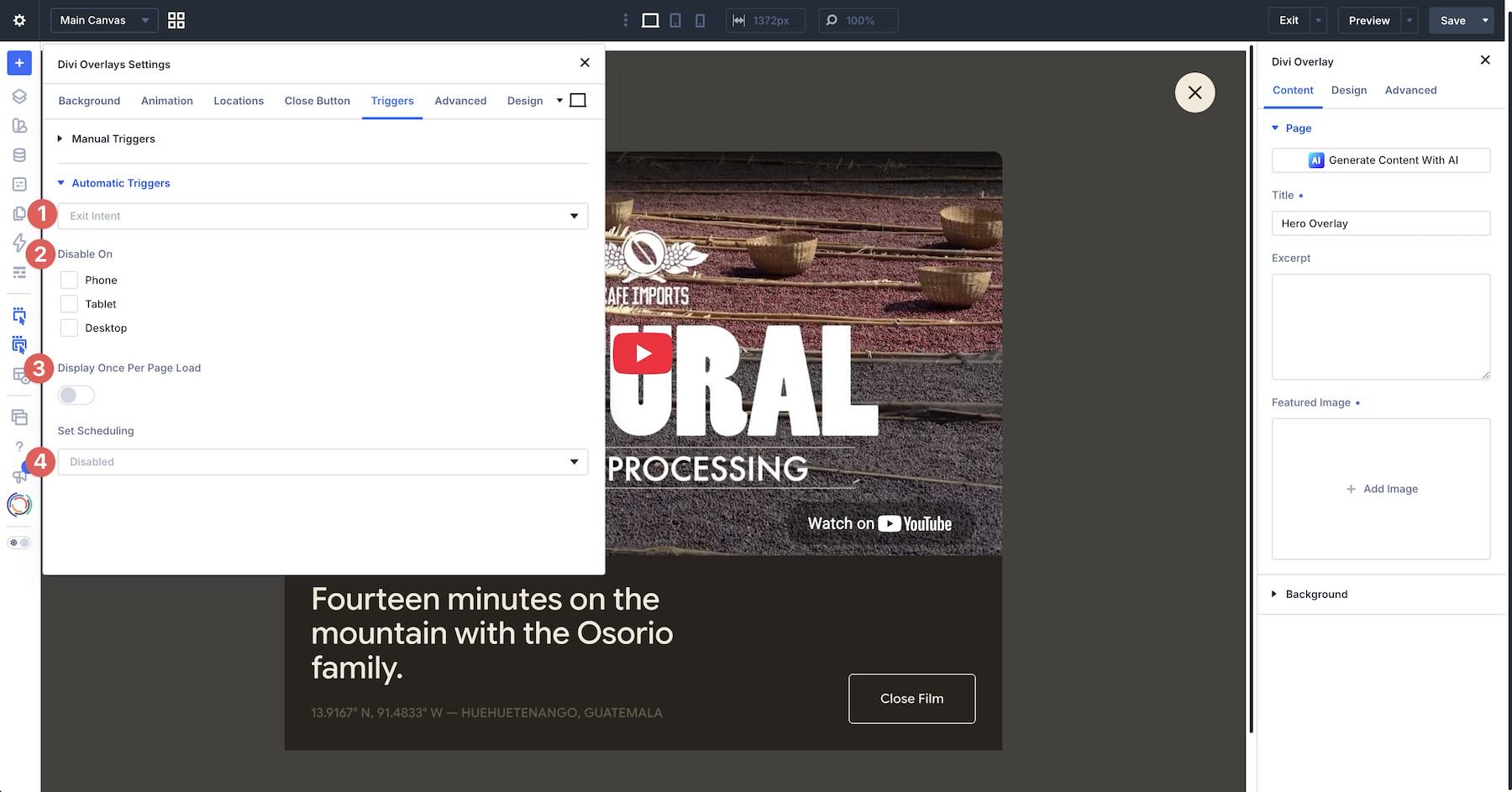
Finally, Exit Intent opens the overlay when the visitor appears about to leave the page. There is no delay or scroll range to configure here. The trigger is the exit behavior itself, which makes it a natural fit for last-chance offers, opt-ins, or a reminder before someone navigates away.
Use Disable On to keep the overlay from running on a specific screen size when the behavior would feel intrusive. Like the other automatic triggers, Display Once Per Page Load limits it to one appearance per page load, rather than once across an entire browsing session.
Popup Templates
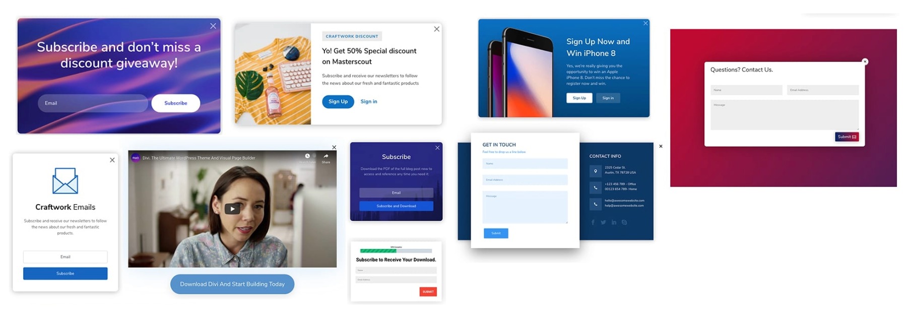
Designing from scratch isn’t the only option with Divi Overlays. The plugin includes premade pop-up layouts for common uses, such as signup, contact forms, videos, splash screens, and welcome mats.
Preview examples on the live demo, download the included templates through your purchase resources, and import a layout into the overlay editor. After import, swap the copy, modules, and styling to match the site.
Display Types And Use Cases
The same overlay workflow can support several types of content. Choose the layout and trigger to suit what the visitor needs to do.
Video Popup
A video pop-up keeps the page uncluttered until someone chooses to watch. The overlay can hold a YouTube, Vimeo, or self-hosted video, plus a short caption or close action. A click on an image, play button, or text link is usually the cleanest trigger, because the visitor has already asked for the video.
Full-Screen Overlay
A full-screen overlay is useful when the message should take over the page for a moment: a welcome mat, a featured announcement, or a first-visit promotion. Because the overlay is still a Divi layout, the takeover can include a heading, supporting copy, a form, or a button instead of a single generic message.
Product Showcase
Use an overlay when you want to show a product, offer, or featured item without immediately sending the visitor to another template. This works for a sale promotion, a featured product card, or extra product detail that would crowd the original page. A click trigger keeps the showcase optional. Exit intent can also work when the goal is to recover attention before the visitor leaves.
Email Opt-In Form
An opt-in overlay is one of the most common uses. The layout can be a simple signup modal or a more detailed lead-generation form. Timed delay and scroll percentage are useful when you want the form to appear after the visitor has seen some of the page. Exit intent is a better fit when the goal is to catch people before they leave.
Contact Forms
A contact overlay lets visitors reach you without opening a separate contact page. Trigger it from a button, text link, or menu item so the form appears in context. This is especially useful on one-page sites, service pages, and headers where a full contact section would take too much room.
Animation, Close Controls, And Display Rules
After the content and trigger are set, the remaining settings control how the overlay appears and how visitors dismiss it.
Divi Overlays includes entrance and exit animations, as well as speed controls. Those settings help the pop-up fade, scale, or slide in a way that fits the page rather than snapping onto it.
The built-in close button can be customized or hidden if the default icon does not fit the design. In that case, a button or other module inside the overlay can serve as the close action. That is useful for video overlays and any layout where the dismiss control should match the rest of the design.
Each overlay is also a reusable Divi post. You design it once, trigger it from multiple pages, and keep later edits in one place. Change the layout, animation, or close behavior on the overlay itself, and every page using that overlay picks up the update.
How To Create A Popup With Divi Overlays
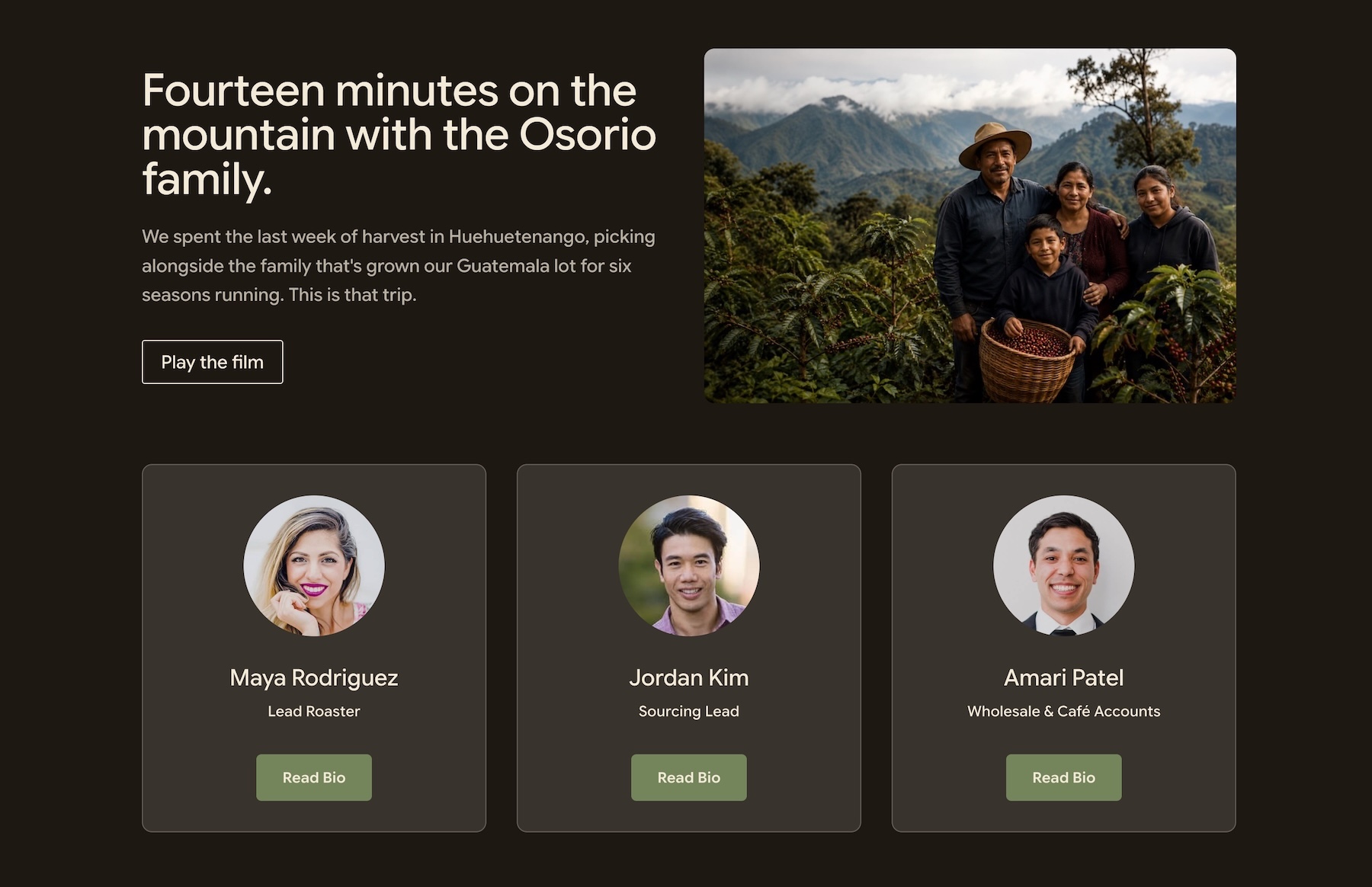
The easiest way to see the workflow is to build a pop-up. We’ll create a click-triggered team bio overlay. The page keeps a compact team grid, while a Read Bio button opens that person’s photo, role, biography, and social links. Repeat the process for other team members.
Before you start, install and activate Divi Overlays. Then open the page that contains your team section, or build that section first.
Add A New Overlay
In the WordPress dashboard, go to Divi Overlays > Add New Divi Overlay.
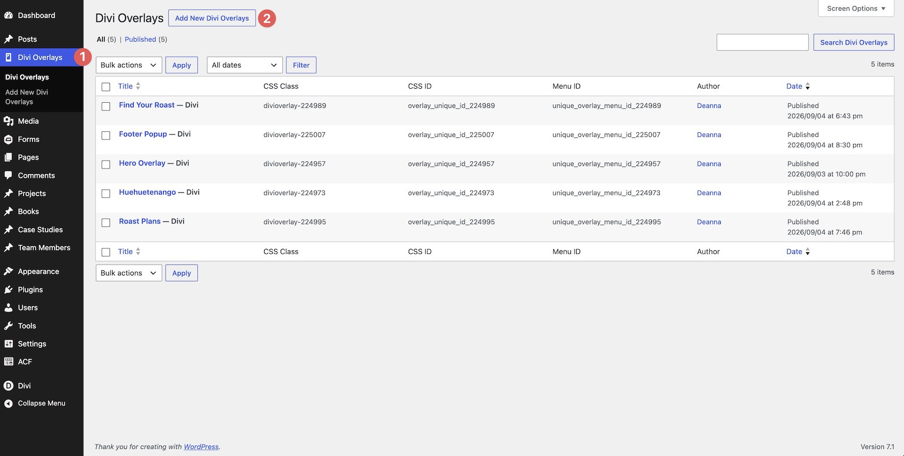
This will open the Visual Builder where you’ll build your layout. Like any other Divi layout, you’ll start with a blank canvas and have access to all of Divi’s modules and design settings.
Configure The Overlay Settings
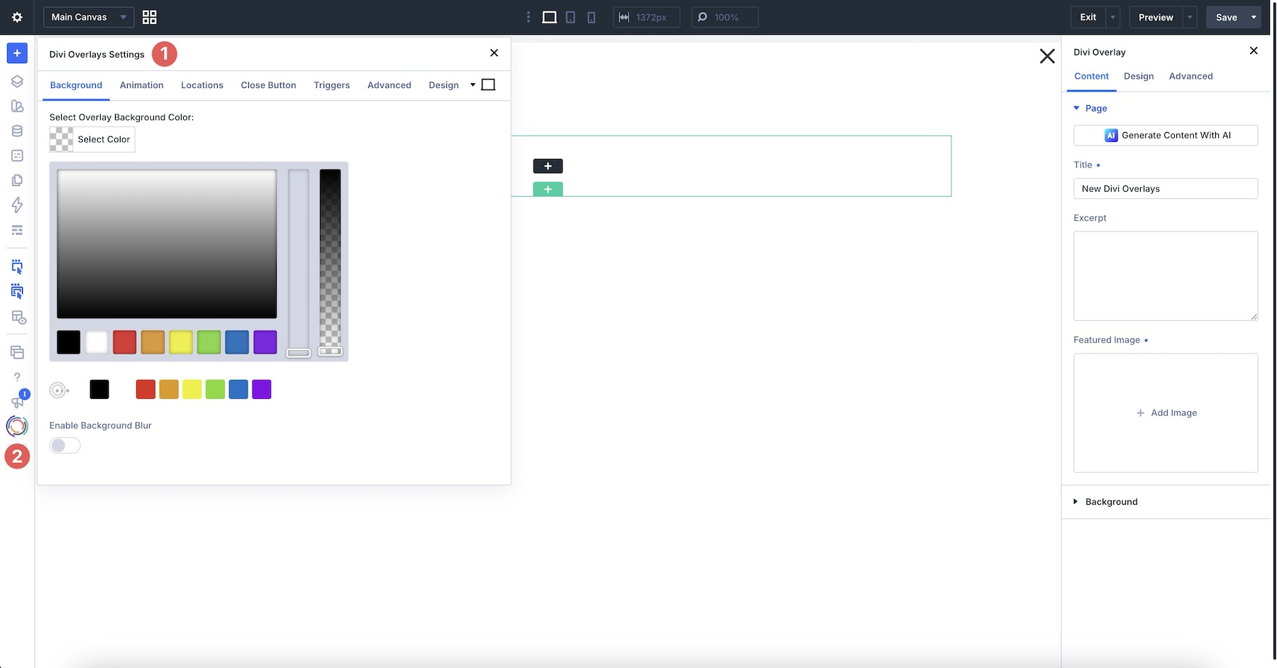
When the Builder launches, the Divi Overlay settings are active by default. There are seven tabs: Background, Animation, Locations, Close Button, Triggers, Advanced, and Design. Should you need to access this panel later, you can find it near the bottom of the Builder Bar, identified by the Divi Overlays logo.
Background Tab
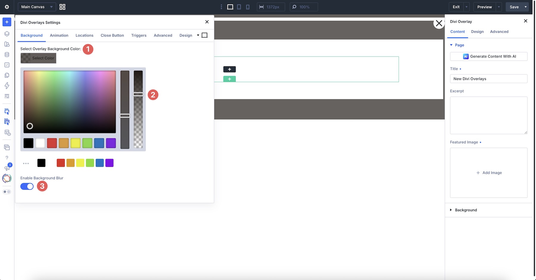
In the Background tab, select an Overlay Background Color, adjust the opacity, and choose whether to Enable Background Blur. Background blur softens the page behind the overlay to help separate it from the pop-up content.
Animation Tab
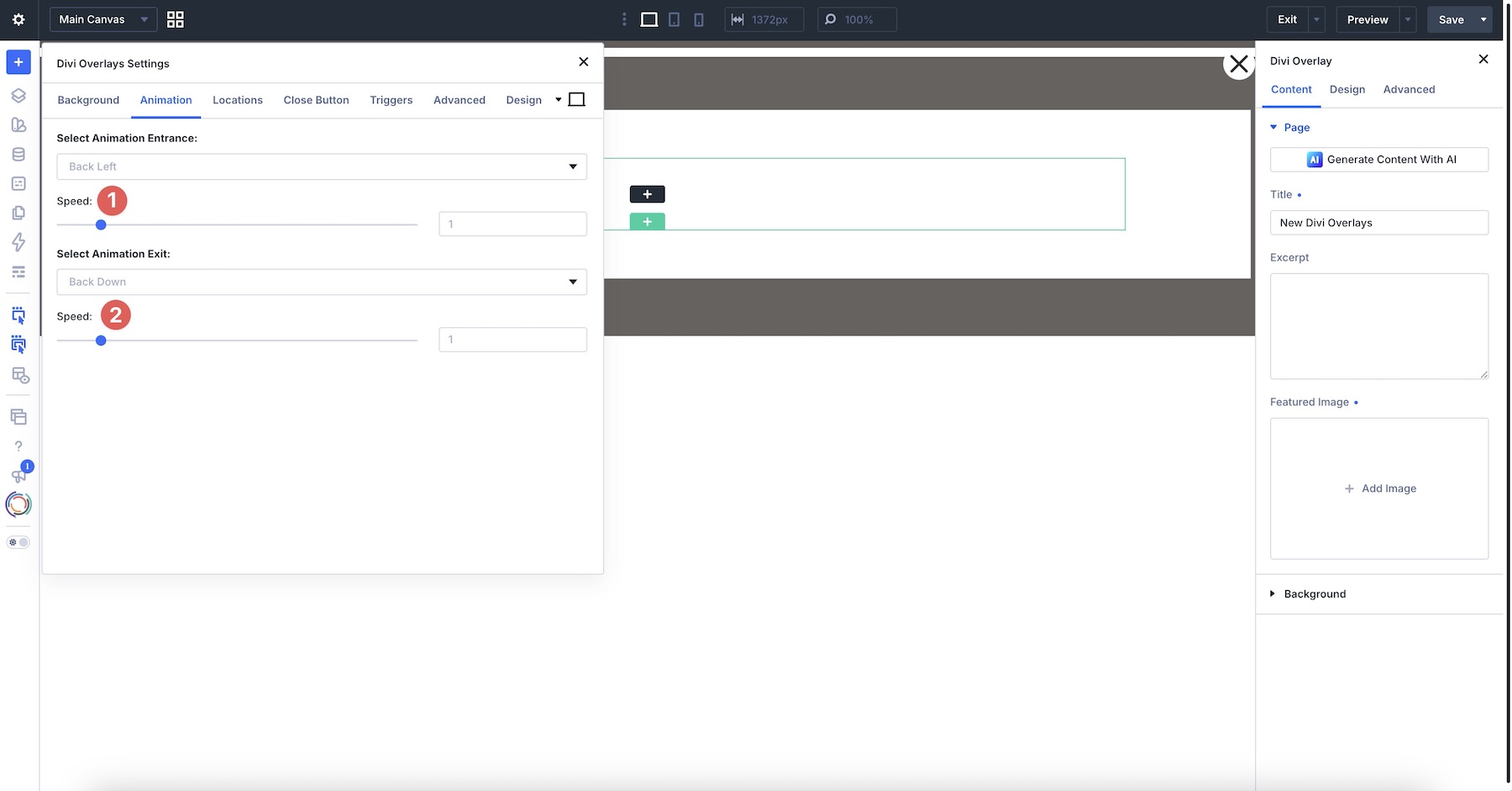
In the Animation tab, you’ll choose the Animation Entrance and Exit settings. Options include Back Down, Bouncing, Fading, Flippers, Lightspeed, Rotating, Specials, Zooming, and Sliding animations. Use the Select Animation Entrance dropdown menu to choose how you want your pop-up to appear when the trigger is clicked. As you select an option, you’ll find various animation styles to choose from. As you click through them, Divi Overlays gives you a preview of the animation.
Use the Speed sliders to control how fast the pop-up enters and exits.
Locations Tab
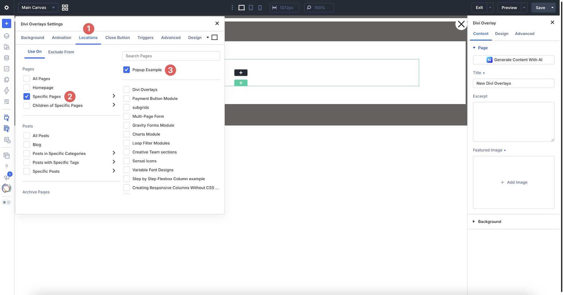
The Locations tab controls where on your site the overlay is available. For this example, include the page containing your team section. You can choose from all pages, the home page, specific pages, or their children. Additional options include displaying on Posts, Archive pages, and custom post types.
Close Button Tab
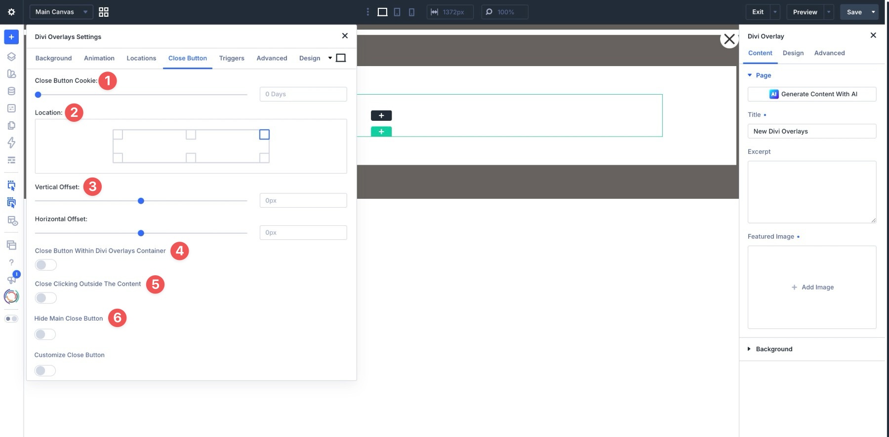
The Close Button settings control how visitors dismiss the overlay. You can set a Close Button Cookie so the overlay does not keep returning after someone closes it, then choose the button’s Location. Vertical Offset and Horizontal Offset fine-tune its placement, and additional toggles give you more control over where it sits.
Enable Close Button Within Divi Overlays Container to keep the button inside the overlay itself. Turn on Close Clicking Outside The Content if clicking the dimmed area around the overlay should also close it. If you would rather use a Divi module as the close action, enable Hide Main Close Button and add your own Button or other trigger inside the layout.
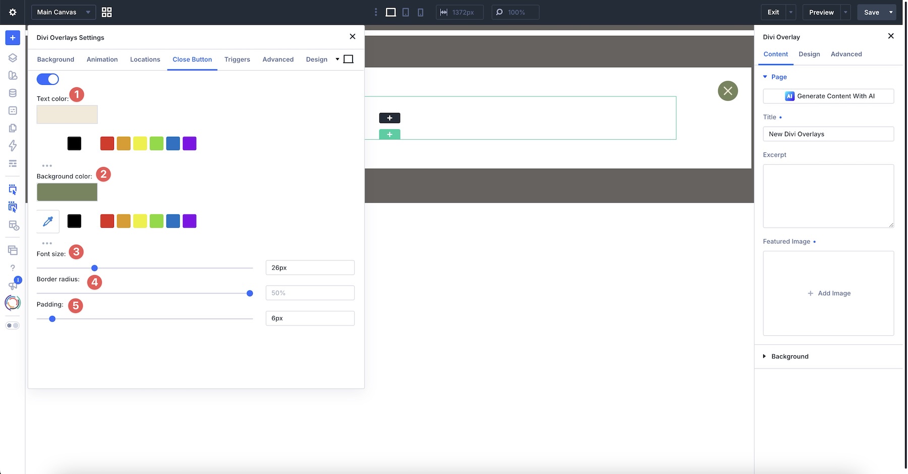
The Customize Close Button toggle lets you choose Text and Background Colors, Font Size, Border Radius, and Padding to ensure the Close Button matches the style of the pop-up’s content.
Triggers Tab
The Triggers tab provides the identifiers used for manual triggers, including a CSS Class, CSS ID, and Menu ID. We’ll use the CSS Class to connect the team member’s Button Module to this overlay.
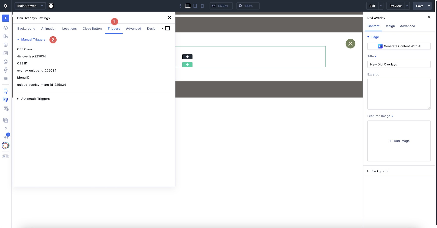
If you prefer to use an Automatic Trigger, you have several options to choose from, including None, Timed Delay, Scroll Percentage, and Exit Intent. For this click-triggered bio, set Automatic Trigger to None.
Advanced Tab
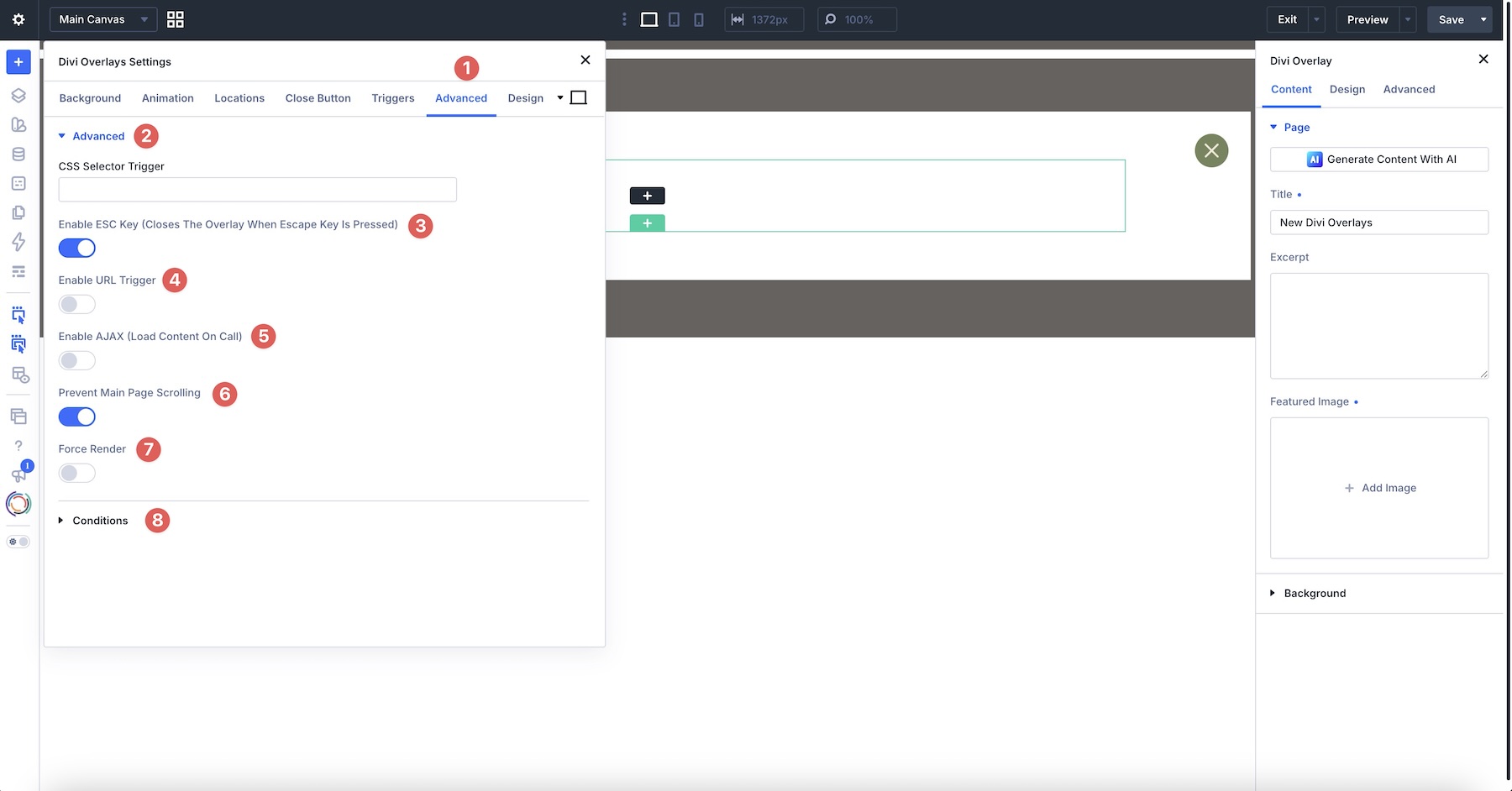
The Advanced tab includes additional trigger and display controls. Enable ESC Key lets visitors close the overlay with Escape, while Prevent Main Page Scrolling keeps the underlying page from scrolling. Keep both enabled for this bio overlay, as shown below.
The panel also includes CSS Selector Trigger, Enable URL Trigger, Enable AJAX (Load Content On Call), Force Render, and a Conditions group. You do not need to change these for this example.
Design Tab
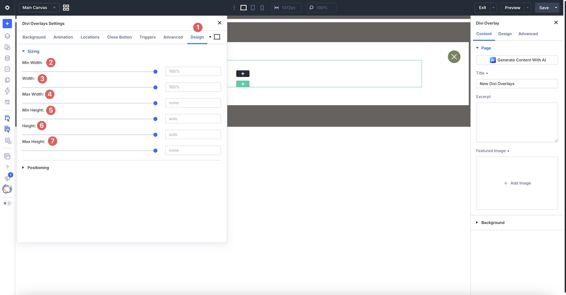
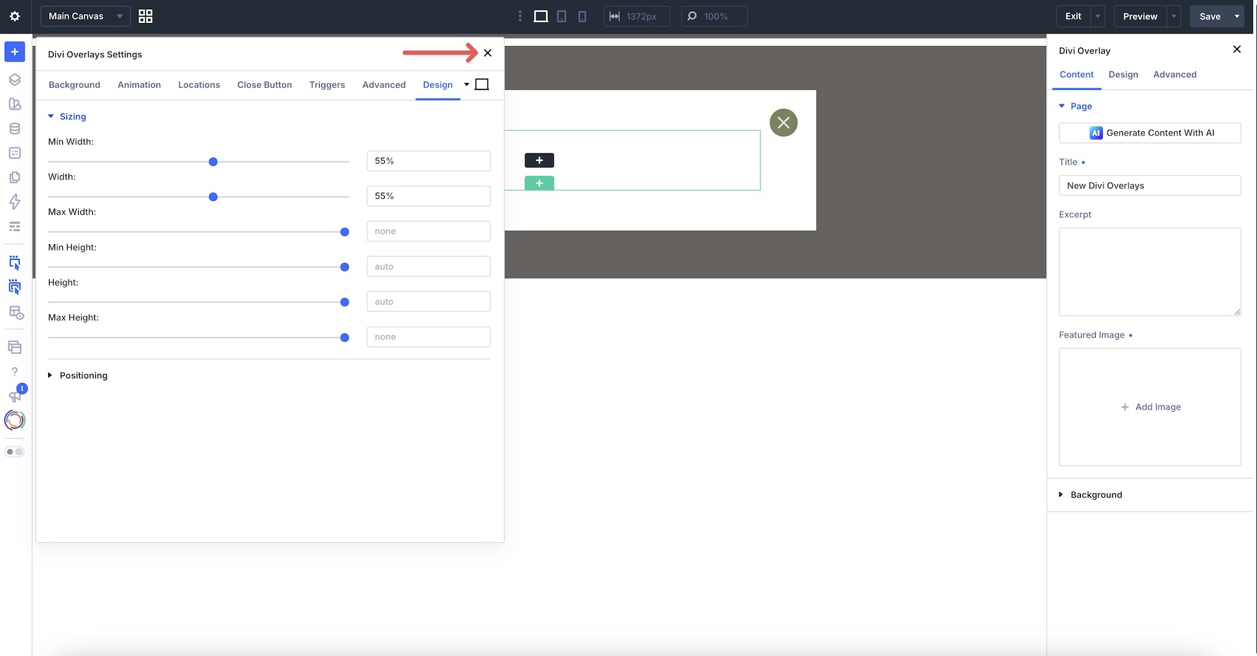
The Design settings handle the Sizing and Positioning settings for your pop-up. Use the sliders to adjust Width and Height, or leave them at their defaults for a full-screen pop-up.
Note: You can also adjust the sizing of the Row once you start building your pop-up.
The Positioning controls determine where on the screen the pop-up should appear. Adjust the Location by clicking on a square, then adjust the Vertical Offset and Horizontal Offset if desired.
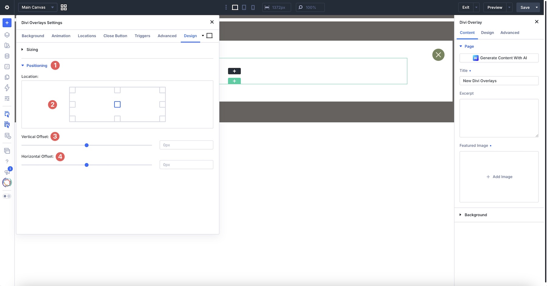
Once your settings are confirmed, click the close icon at the top right of the modal to begin building your pop-up.
Build The Bio Layout
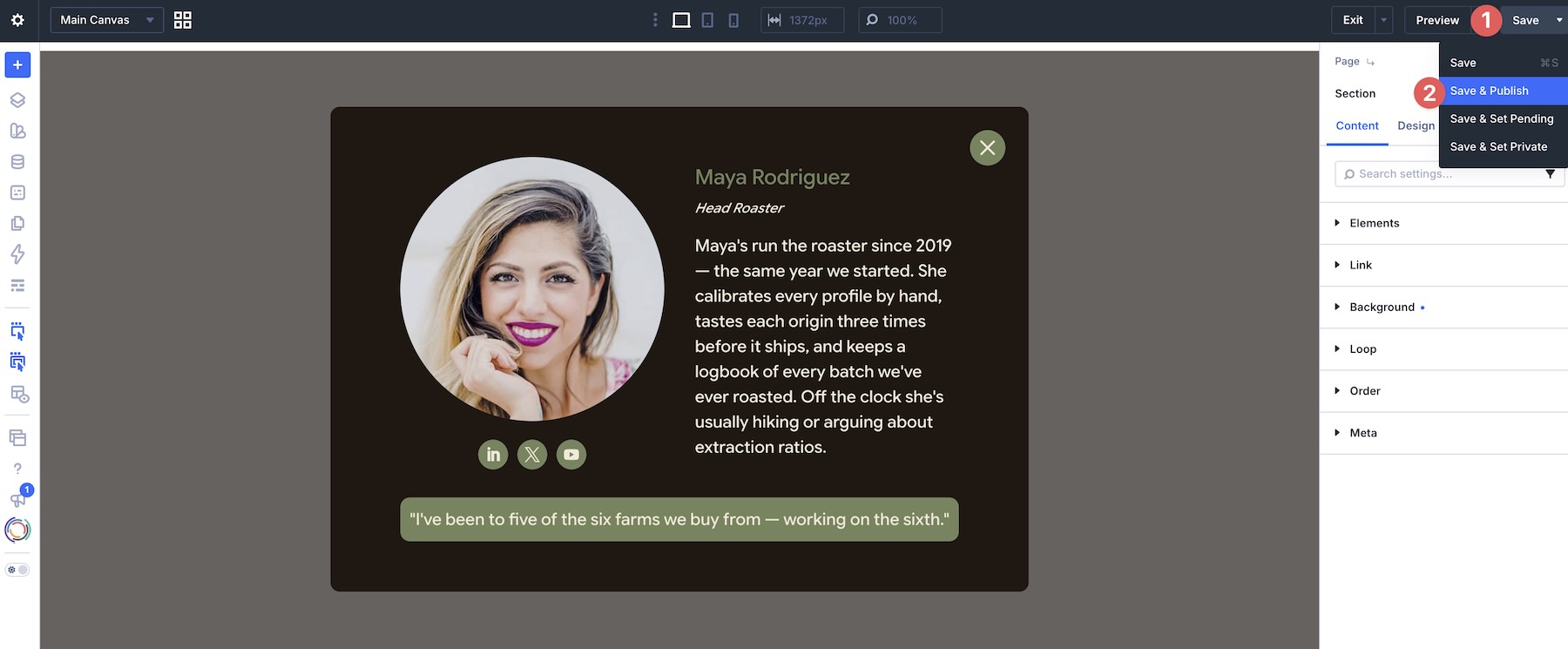
Use the Visual Builder to design the overlay content. A simple team bio layout can include a circular or cropped portrait, the person’s name and role, a short biography, and social media links or icons. The most important thing is to keep the layout focused. The overlay only needs the details that would crowd the team cards on the page. Save or Publish the overlay when the content is in place.
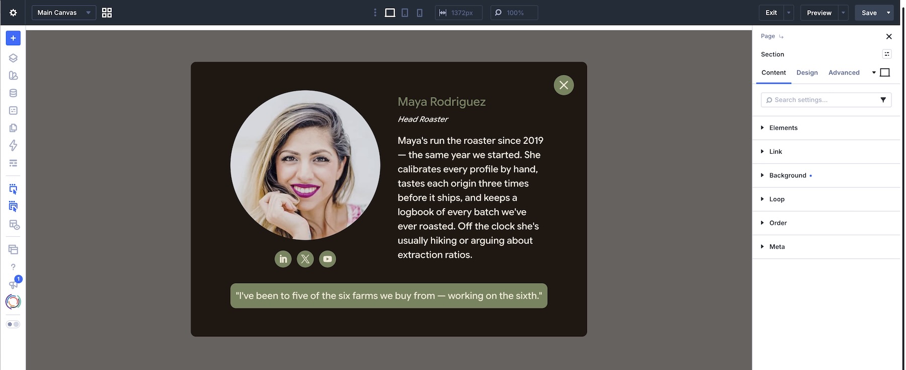
Use Divi’s responsive previews to check the layout at smaller breakpoints. Adjust spacing, text sizes, and content width as needed, and make sure the close control remains reachable.
Save and Publish your layout before moving on to the next step. The overlay needs to be published before visitors can open it.
Copy The Overlay’s Unique Class
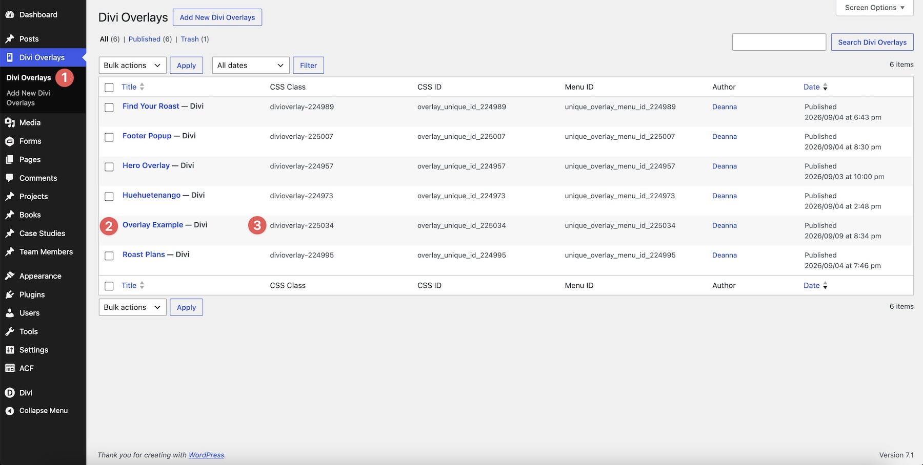
After saving your overlay, head back to the main Divi Overlays screen and copy the unique CSS Class we’ll use to trigger our new pop-up.
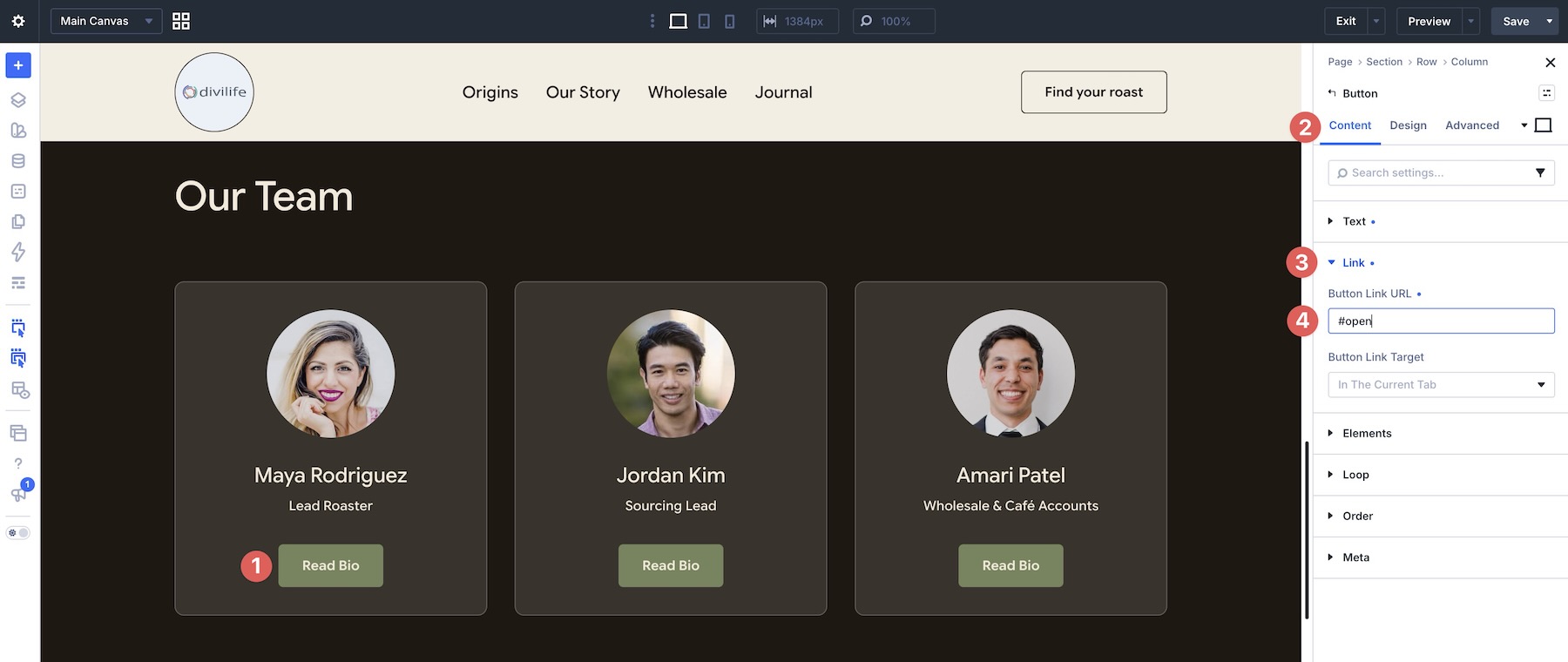
Return to the team section on the page and open the Read Bio button module for that person. Expand the Link option group in the Button’s Content tab, and enter #open in the Button Link URL field.
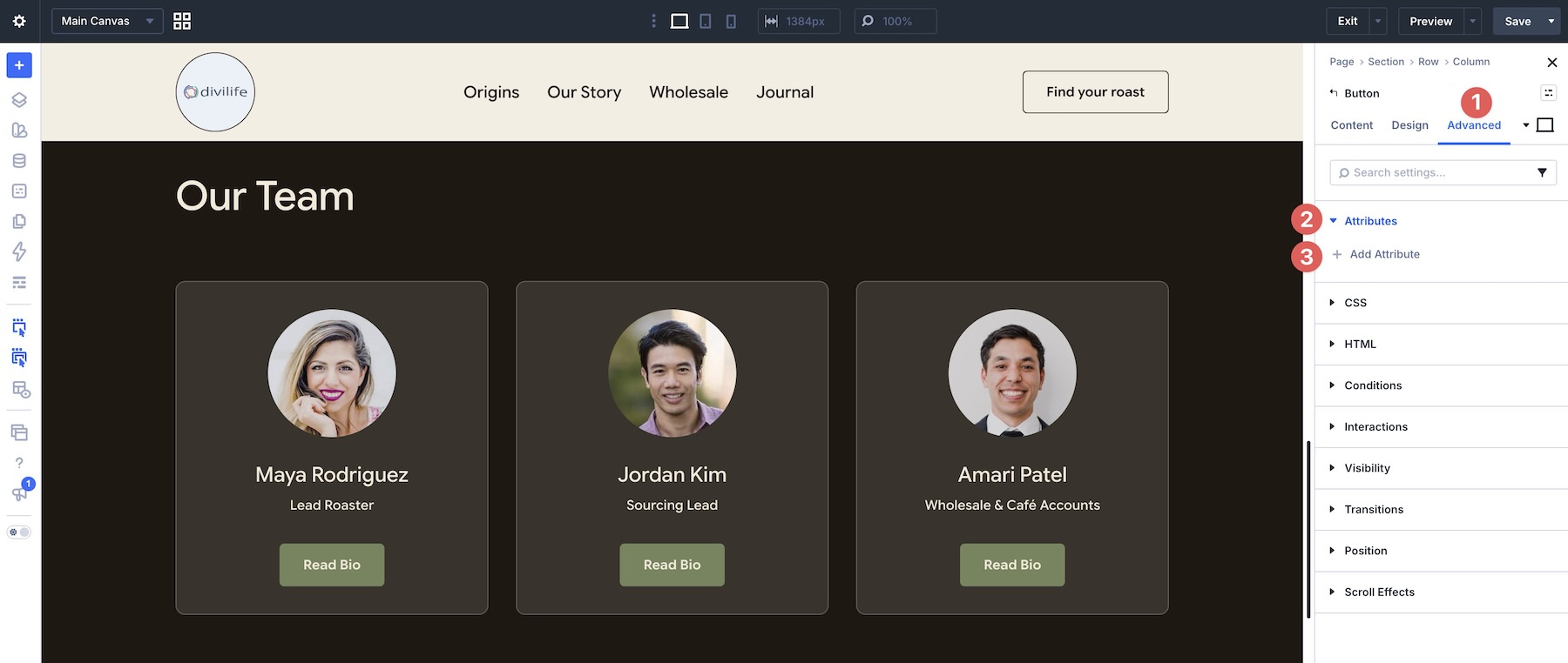
Next, go to the Advanced Tab and expand the Attributes option group. Click + Add Attribute to add the CSS Class that will launch the pop-up.
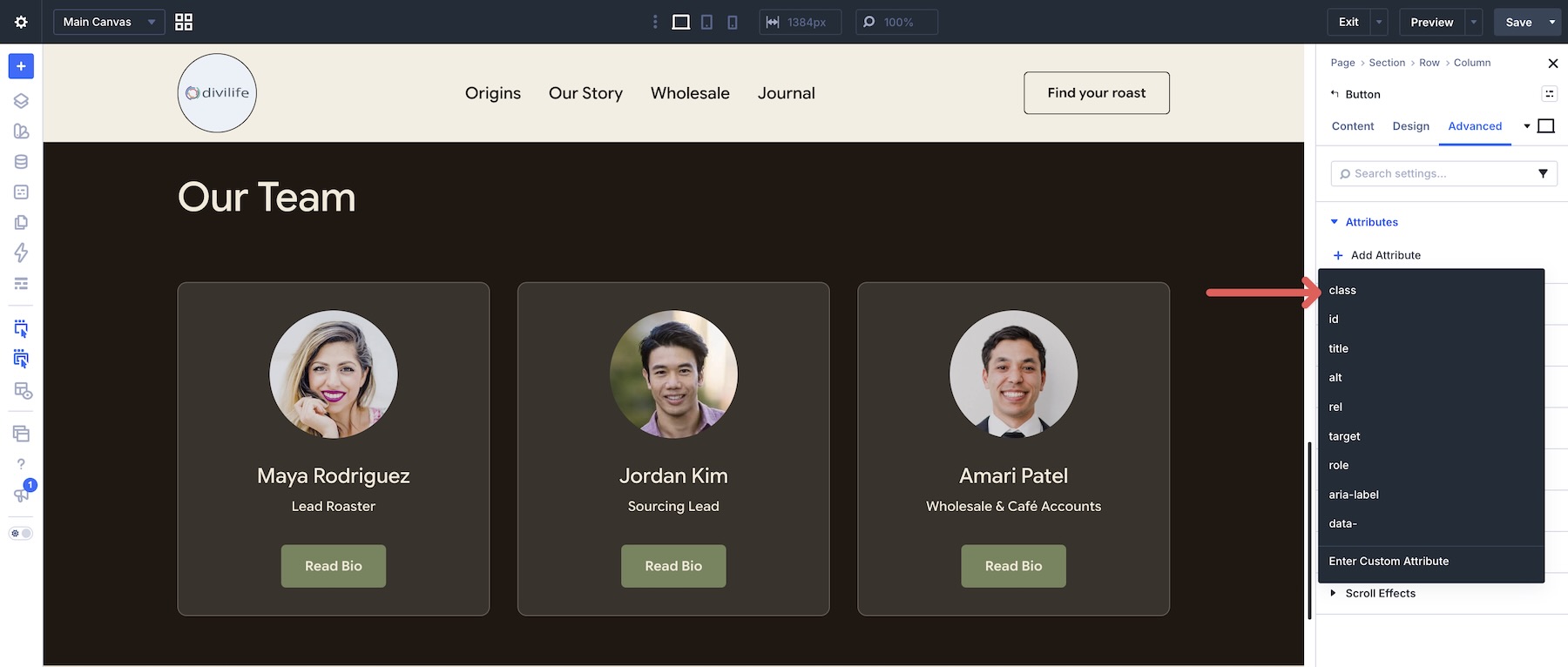
When the options appear, choose class from the available options.
Give the new attribute an Admin Label like Launch Popup, and add the CSS Class you copied from Divi Overlays to the Attribute Value field. Paste the class name without a leading period.
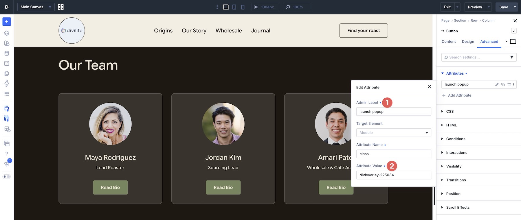
Save the page and preview the overlay in another tab. Ensure that the click trigger is working correctly and that you can close the pop-up with the close button.
Who Is Divi Overlays For?
Divi Overlays makes the most sense when you want pop-ups that look like the rest of your site and want to stay within the Divi workflow. Agencies and freelancers can design branded overlays with the same modules and styling they already use on client pages. That avoids the need to maintain a separate pop-up tool with its own layouts, typography, and color system.
One-page and marketing sites benefit when extra content would otherwise force another page or crowd the current one. Team bios, service details, videos, and contact forms can live in overlays and open only when someone asks for them.
E-commerce and lead-generation sites can use the automatic triggers for timed opt-ins, scroll-based offers, exit-intent reminders, and cart-related messages. The overlay can hold a subscribe form, a promotion, or product details without taking the visitor off the page.
It is also a practical fit for Divi 5 users who already use Overlays on Divi 4 sites and need the same workflow to keep working. The plugin is compatible with Divi 4 and Divi 5. Divi Life provides support for this third-party plugin. Marketplace purchases include one year of support and updates, which is useful when you need help with an overlay’s setup or behavior.
Build Advanced Popups With Divi Overlays
Divi Overlays keeps extra content off the page until it is needed. Each overlay is a Divi layout, so forms, videos, product details, and full-screen messages can use the same builder and styling as the rest of the site. Click triggers and automatic rules decide when that layout appears, and the overlay stays reusable across the site. The plugin works with Divi 4 and Divi 5, so the same workflow applies to existing sites and newer Divi 5 builds.
If you want a faster start, preview the layouts on the live demo, import a premade pop-up template, then follow the steps above to set the trigger, animation, and close behavior.
Divi Overlays is available in the Divi Marketplace at a regular price of $79, with any current discounts shown on the product listing. It includes unlimited website usage, one year of support and updates, and a 30-day money-back guarantee.










Leave A Reply