
Drop shadows are a fabulous way to bring your website images to life because it adds a deep shadow below the image to give it a really cool three-dimensional effect. And by changing the size and vertical distance of the shadow, you can make your images appear elevated or stationary.
In this tutorial I’m going to show you how to add a multi-layered drop shadow for your images right from the Divi Builder without any external custom CSS or photo editing software. When it comes to drop shadows, the more layers you have the more realistic the shadow looks because it will be better blended together. That is why I’m going to show you how to layer 5 text modules, each with a custom box shadow, to serve as a great drop shadow for images and videos for your website. Plus, you can even add an animation to create an elevation effect for your header images.
So if you aren’t familiar with photoshop or are looking for a Divi-friendly method for adding drop shadows to any element on your website, you have come to the right place.
The results may just surprise you.
Let’s get started.
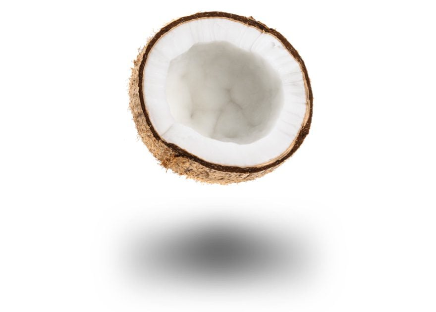
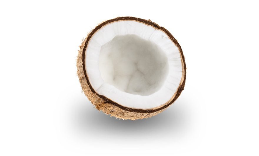
- 1 Here are a Few Examples of What You will Be able to Create in this Tutorial
- 2 Where to Use These Drop Shadows
- 3 How to Create “Floating” Objects in Divi Using Dropshadow
- 4 Creating a Multi-Layered Drop Shadow for Photos, Videos and Devices
- 5 Save it to Your Library And Place it Anywhere
- 6 How to adjust your shadow for greater surface area and rounded corners
- 7 Adding Animation to your Image and Drop Shadow to Create Elevation
- 8 Responsive and Browser Compatible
- 9 Final Thoughts
Here are a Few Examples of What You will Be able to Create in this Tutorial


Where to Use These Drop Shadows
To state the obvious, a drop shadow should reflect the shape of the shadow’s object. Rectangular images should have rectangular shadows, circles should have circular shadows, and so on. And since there are an infinite amount of objects to account for, creating a perfect drop shadow for each is a little outside the scope of this article. Instead, I’m going to limit this post to drop shadows for basic rectangular and circular objects which will work for a number items.
How to Create “Floating” Objects in Divi Using Dropshadow
Subscribe To Our Youtube Channel
Creating a Multi-Layered Drop Shadow for Photos, Videos and Devices
The first drop shadow we are going to create is good for showcasing rectangular items like promo videos, featured images, mobile devices, and sliders. This drop shadow will be thinner to accommodate for the lack of depth of these items. To create the shadow, we will be using 5 text modules with box shadows. Then using custom margins and sizing, we will layer the shadows to blend together nicely.
Create a One-column Row and Add an Image
Create a new page and add a regular section with a one-column row. Then add an image to your row (at least 800px wide). Make sure you set the alignment of the image to center within the design tab of the image module settings.
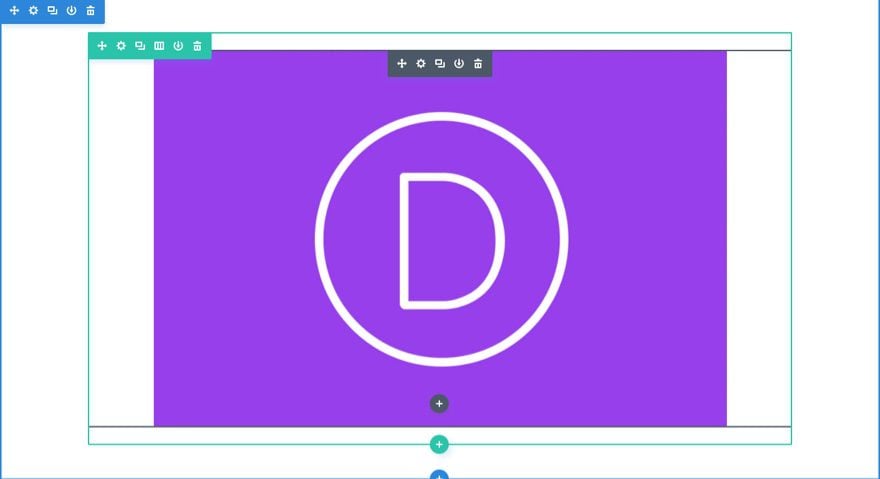
Creating the First Shadow Layer
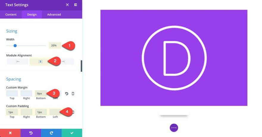
To create our first shadow, add a text module under the image. We will eventually be using the box shadow for this text module and we want each shadow to increase in width with each text module we use. So for this first text module, we are going to set the width to 20% (the shortest of the 5 layers). Update the text module settings as follows:
Width: 20%
Module Alignment: Center
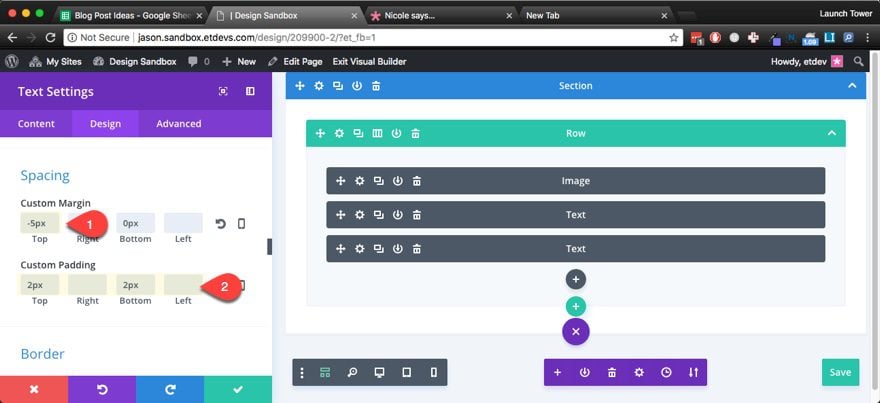
Since we aren’t going to be putting any content in this text module, we need to establish the size of the text module (and its eventual corresponding box shadow) by giving it a top and bottom padding. The padding values will increase with each new text module to create the expanding effect for the drop shadow. This first one will have the smallest padding.
Custom Margin: 0px
Custom Padding: 1px Top, 1px Bottom
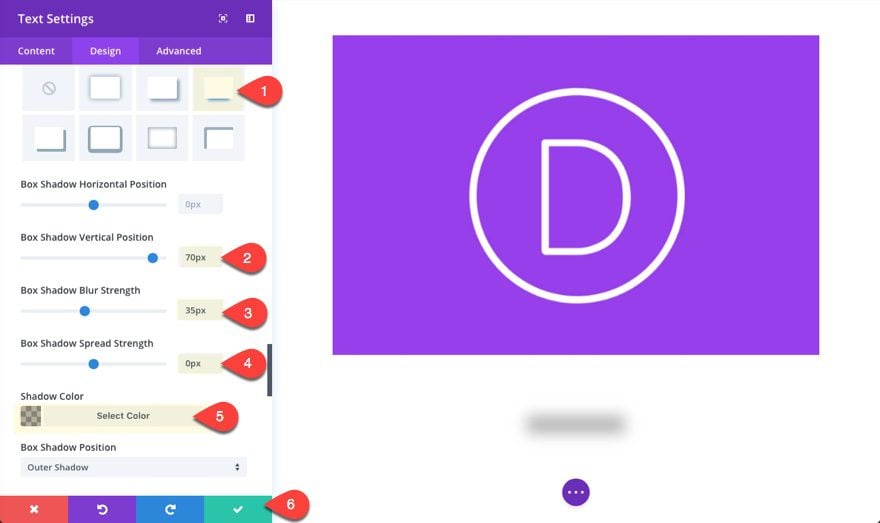
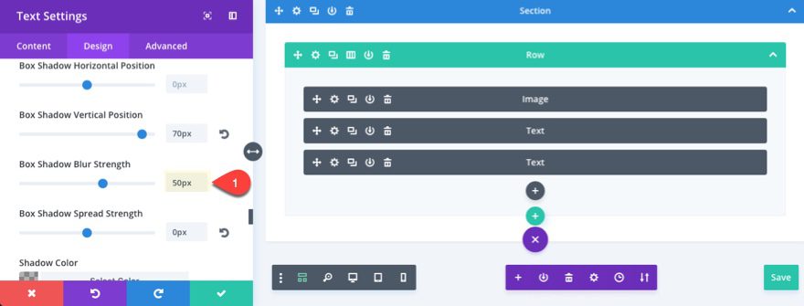
Now we are ready to add the box shadow for our text module. This trick here is to separate the box shadow from the text module using the vertical position value to create enough space so that the shadow doesn’t overlap the module above. Then we can adjust the blur, spread, and color of our shadow.
Select the third box shadow option and update the following:
Box Shadow Vertical Position: 70px
Box Shadow Blur Strength: 35px
Box Shadow Spread Strength: 0px
Shadow Color: rgba(0,0,0,0.25)
Although the other box shadow options will change with each layer, the shadow color will stay the same since each color will be layered on top of each other to create different shades. The shadow color is also important for controlling the overall darkness of the shadow. So, if you want a lighter shadow, you may choose to go with a shadow color of rgba(0,0,0,0.2) and for a darker shadow you may go for rgba(0,0,0,0.3).
You could actually use this simple one-layout drop shadow as it is right now and play with the width and box shadow settings to fit your needs, but if you want a more realistic shadow, you will need more layers.
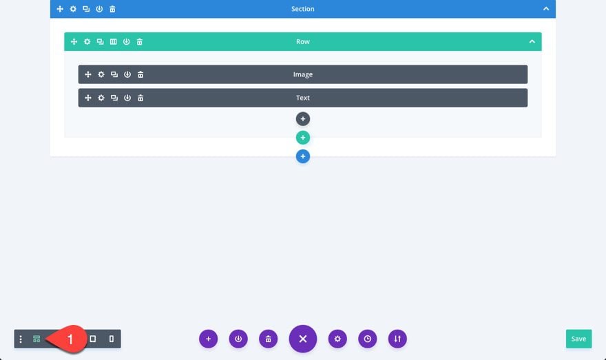
Since we will need to overlap these modules, the default visual builder view may make editing the text modules a bit of a challenge (although using the grid mode would work). But since the box shadows will not render exactly how they would on the live site, let’s create the rest of the text module layers from the wireframe view.
Create the Second Drop Shadow Layer
To create the second drop shadow layer, duplicate your first text module and update the settings as follows:
Width: 40%
Because we have 5 layers, we want to increase the size by 20% with each new layer so each layer will expand evenly (20%, 40%, 60%, 80%, 100%).
Custom Margin: -5px Top
The negative top margin value is used to overlap this layer with the layer above and will change with each layer depending on the size of the module.
Custom Padding: 2px Top, 2px Bottom
We will continue to double the size of the layer’s height by doubling the padding value of the previous layer.
Box Shadow Blur Strength: 50px
The blur strength will also increase with each layer.
Creating the Third Drop Shadow Layer
To create the third drop shadow layer, we will continue by duplicating the text module and updating the settings. Duplicate the text module you just finished editing and update the following:
Width: 60%
Custom Margin: -15px Top
Custom Padding: 3px Top, 3px Bottom
Box Shadow Blur Strength: 70px
Save Settings
Creating the Fourth Drop Shadow Layer
To create the fourth drop shadow layer, duplicate the text module you just finished editing and update the following:
Width: 80%
Custom Margin: -10px Top
Custom Padding: 4px Top, 4px Bottom
Box Shadow Vertical Position: 100px
Box Shadow Blur Strength: 90px
Here the vertical position increased to 100px to accommodate for the greater blur strength and also for positioning the shadow.
Creating the Fifth Drop Shadow Layer
To create the fifth drop shadow layer, duplicate the text module you just finished editing and update the following:
Width: 100%
Custom Margin: -5px Top, 200px Bottom
Custom Padding: 5px Top, 5px Bottom
Box Shadow Vertical Position: 100px
Box Shadow Blur Strength: 110px
I added a 200px bottom margin to accommodate for the negative top margin we added throughout the layers.
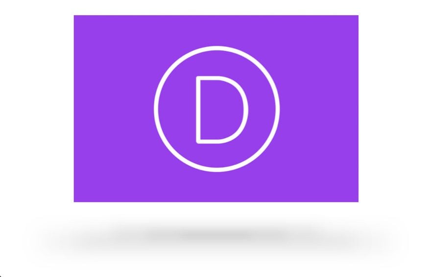
And that will do it. Now you have a beautiful drop shadow for your image.
Save it to Your Library And Place it Anywhere
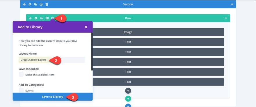
Because this drop shadow will work with many different items you may want to display, you can save the row that contains the 5 modules to your library. Then whenever you need a drop shadow you can add the row to your page and place the modules wherever you need them.
Here is what it looks like if you simply add the very same 5 layers of text modules under the mobile device image on the Web Agency Landing Page Layout. As you can see it looks even better on smaller column widths.

How to adjust your shadow for greater surface area and rounded corners
Using the same setup as we did for the first drop shadow, you can create some amazing drop shadows to use for displaying items on your page.
For example, you can use the settings below to create a four layered drop shadow that has a greater surface area and rounded corners.
The main difference will be the increased padding for each of the text modules to create more surface area for the shadow, and by adding a 50% border radius to all corners to create the circular shape.
Here are the settings you need to create the four text modules for your drop shadow. Feel free to duplicate the first text module to speed up the creation of the other three.
First Layer Text Module Settings
Width: 25%
Alignment: Center
Custom Margin: 0px Bottom
Custom Padding: 50px Top, 50px Bottom
Rounded Corners: 50%
Box Shadow Vertical Position: 250px
Box Shadow Blur Strength: 100px
Box Shadow Spread Strength: 0px
Box Shadow Color: rgba(0,0,0,0.2)
Second Layer Text Module Settings
Width: 50%
Alignment: Center
Custom Margin: -100px Top, 0px Bottom
Custom Padding: 60px Top, 60px Bottom
Rounded Corners: 50%
Box Shadow Vertical Position: 250px
Box Shadow Blur Strength: 110px
Box Shadow Spread Strength: 0px
Box Shadow Color: rgba(0,0,0,0.2)
Third Layer Text Module Settings
Width: 75%
Alignment: Center
Custom Margin: -120px Top, 0px Bottom
Custom Padding: 70px Top, 70px Bottom
Rounded Corners: 50%
Box Shadow Vertical Position: 250px
Box Shadow Blur Strength: 120px
Box Shadow Spread Strength: 0px
Box Shadow Color: rgba(0,0,0,0.2)
Fourth Layer Text Module Settings
Width: 100%
Alignment: Center
Custom Margin: -130px Top, 0px Bottom
Custom Padding: 70px Top, 70px Bottom
Rounded Corners: 50%
Box Shadow Vertical Position: 250px
Box Shadow Blur Strength: 130px
Box Shadow Spread Strength: 0px
Box Shadow Color: rgba(0,0,0,0.2)
Notice That the width increases by 25% with each layer (25%, 50%, 75%, 100%). Also the padding and blur strength increased to gradually expand and blur the shadow outward.
Here is the result of what it looks like under a png image of an object.
If you lower the object down by given it a negative margin, you can see the object appear to be sitting on the surface.
Adding Animation to your Image and Drop Shadow to Create Elevation
I’m not going to lie, the animation isn’t going to be 100% percent accurate to the physics of how a shadow appears when an object is lifted from the surface, but the effect is still cool enough for me to share.
Let’s add some animation to our first 5-layer shadow example with the Divi Image. The concept is simple. Set a slide animation in the up direction to the image you want to do the “elevating”. Then add a slide animation in the center direction for each of the shadow elements below the image. That way the image lifts at the same time the shadow expands. In order for this animation to be realistic, you should probably limit this animation to items above the fold so that your animation will happen to both the image and the shadow at the same time when the page loads. If you depend on activating the animation when the user scrolls down the page, you will get a delay between the image elevation and the shadow expansion.
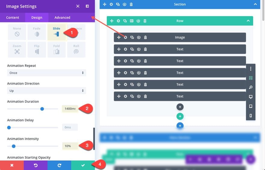
To add the animation, update the image module settings with the following:
Animation Style: Slide
Animation Duration: 1400ms
Animation Intensity: 10%
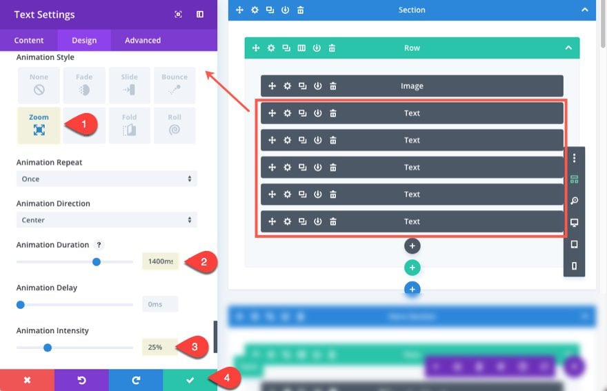
Then for each of the five text modules, update the following:
Animation Style: Zoom
Animation Duration: 1400ms
Animation Intensity: 10%
Here is the resulting animation…

Responsive and Browser Compatible
Because these shadow layers are built using percentage widths, they will conform to the size of the column they are in and look great on any device or browser width. Also, the box-shadow css property used to create these shadows is widely accepted by all major browsers.
Here is a quick view of these shadows on mobile…

If you want to adjust the size of your shadow for mobile, you can always set a specific custom padding for tablet and smartphone for each of the layers when building out your shadow.
Final Thoughts
I originally set out to create these shadows using the blur filter, but
The multi-layered drop shadows explained here are only a fraction of the many combinations of shadow blends, colors and shapes you can make with the Divi builder. Once you understand the technique of layering the box shadows of text modules, you can tweak the drop shadow pretty easily. Plus, you can save these layers to the Divi Library and use them anywhere on your site.
I hope this design technique will inspire you to create some amazing drop shadows in your next project. I mean, I haven’t tried more than five layers…yet.
I look forward to hearing from you in the comments.


it seems like a bit much for just for a shadow – I feel like a well designed shadow PNG would do the same thing
Aaron,
Yes, I admit it is a bit much at first. But since you can save it to the library and customize the shadow design easily on the fly may be helpful for those not comfortable with doing the same thing in photoshop.
Many thanks? I have an immediate use for this and Divi slider?
Yet another excellent tool and technique to add depth of field to my sites. Great work Jason as, when applied appropriately, this will make any webpage POP.
What CSS is used to make the object/image have a hover or floating effect?
Joe,
This is created using the animation options within the module settings.
Super cool! Why not use a Divider Module instead of a Text Module? Are there limitations regarding box shadows with Divider Modules? There’s just a small voice in my head that says, “don’t use a Text Module if there’s no text”.
:))
Nice suggestion! I don’t know why I didn’t think of that. Divider module should work as well.
Thanks.
Love it! Adds more depth with the design! ?
Thanks, Rg. I saw what you did there. haha. Nice one.
https://www.elegantthemes.com/blog/divi-resources/how-to-style-your-divi-blog-page-to-look-like-elegant-themes-new-design
Very good article. How to design a Search Page? look forward to…