
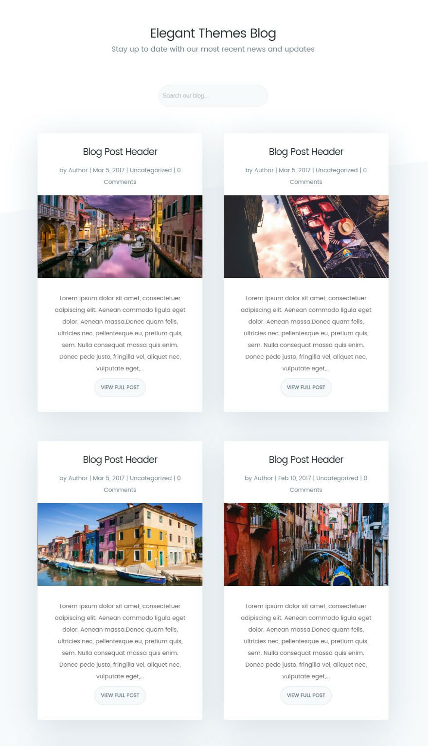
Today I’m going to show you how to design your blog page like the new Elegant Themes blog using Divi’s Blog Module. The three major design modifications include: (1) changing the default three-column blog grid layout to only two columns, (2) placing the featured image below the headline and post meta, and (3) sizing the featured image for the new column width. These are accomplished by adding a few lines of code. Aside from that, the Divi Builder and some custom CSS will take care of the rest.
Let’s get started!
How to Style Your Divi Blog Page to Look Like Elegant Themes’ New Design
Subscribe To Our Youtube Channel
Implementing the New Elegant Themes Blog Design in Divi
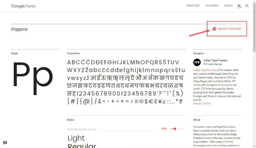
Importing Poppins Font Using Google Fonts
Elegant Themes uses the font Poppins for the headers and body text. Since Divi doesn’t come with that font as an option currently, you can get it from Google Fonts easily for free. If you don’t want to go through the trouble for Poppins, you can use the Montserrat font that closely resembles Poppins and is built in to Divi. But for those who love the Poppins font like I do, it is worth the extra step.
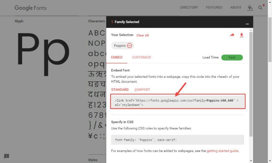
First go a find the Poppins font in Google Fonts. Once you find it, click the button that reads “Select This Font”.
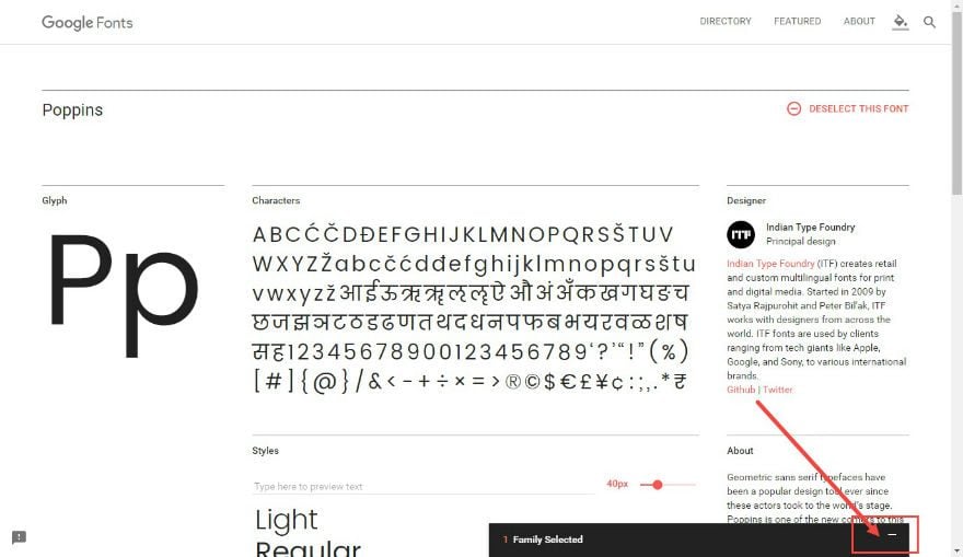
Once selected, click to toggle open the Font Family settings box that shows up at the bottom of the screen.
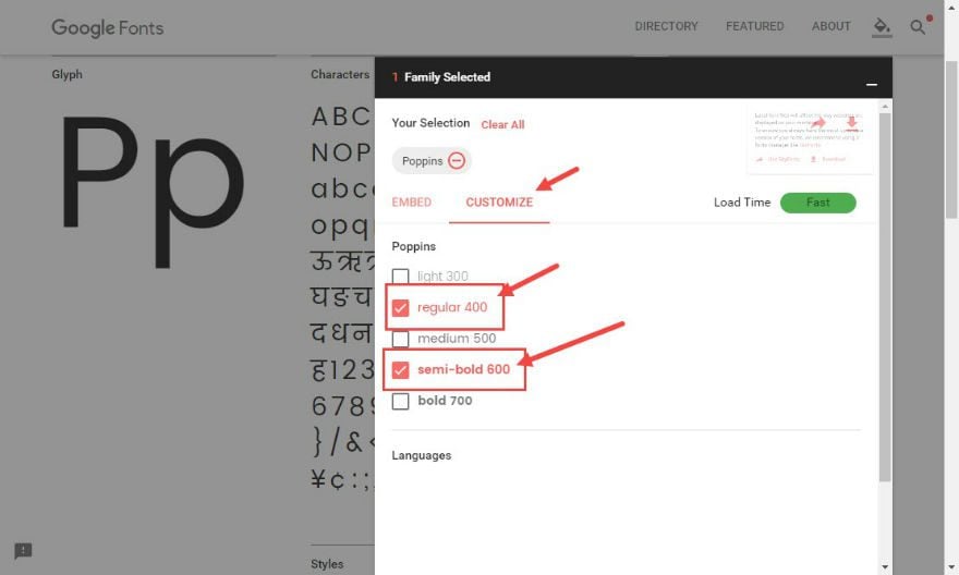
Once open, click the “customize” tab and make sure you select both “regular 400” and “semi-bold 600”.
Click back to the “Embed” section and copy the embed code that was generated.
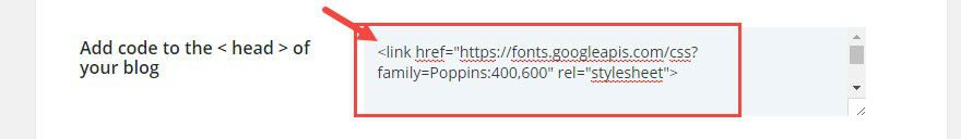
Go to Divi → Theme Options. Under Integration, Add the following code in the text box labeled “Add code to the head of your blog”:
<link href="https://fonts.googleapis.com/css?family=Poppins:400,600" rel="stylesheet">
While still in Theme Options, go to the General section and enter the following CSS in the Custom CSS box:
body {
font-family: “Poppins”, sans-serif;
}
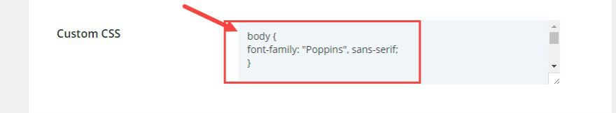
Now Poppins should be set as your default font.
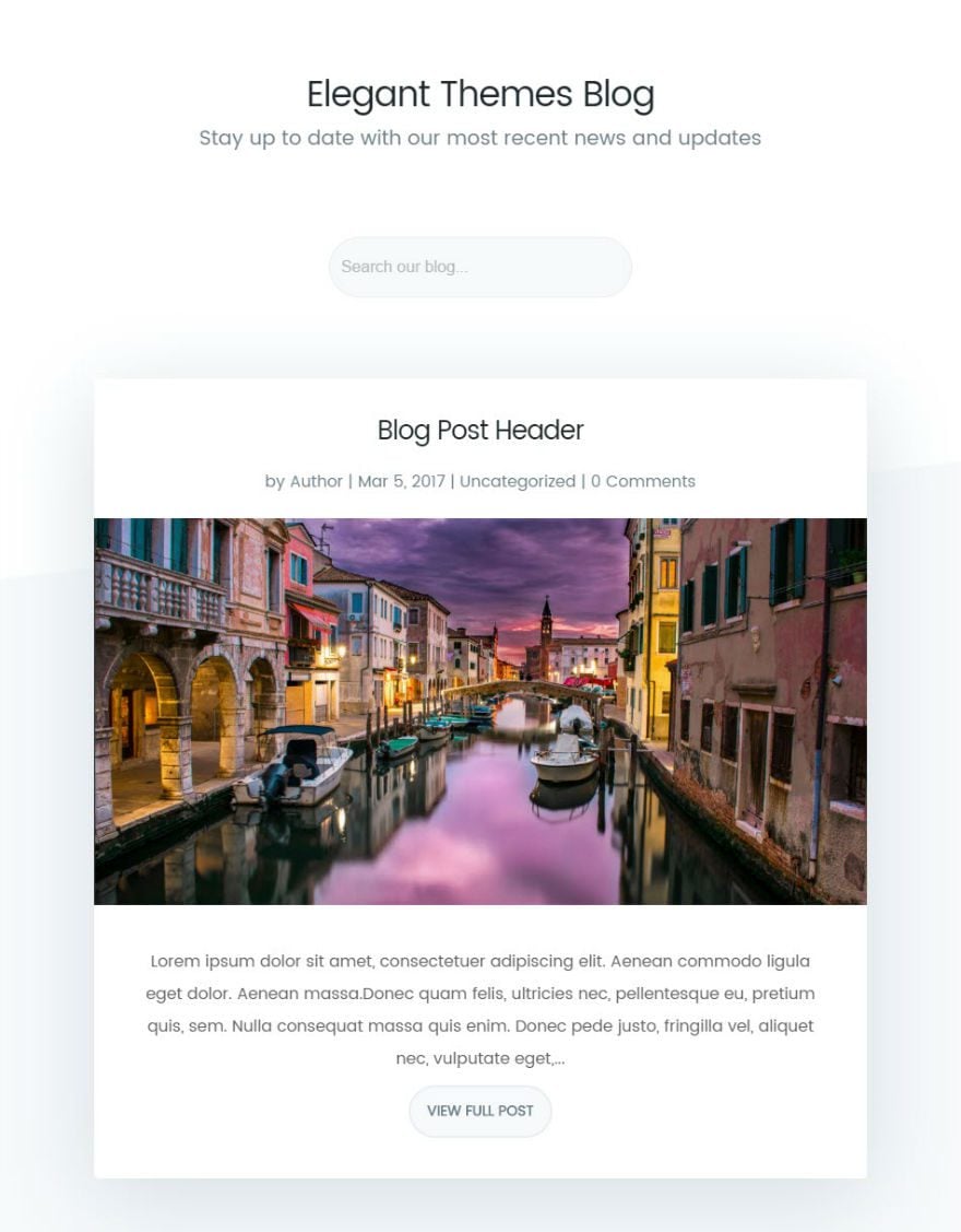
Designing the Page Header
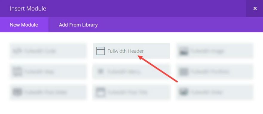
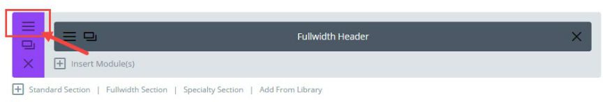
First add a Fullwidth Section with a Fullwidth Header Module to your layout.
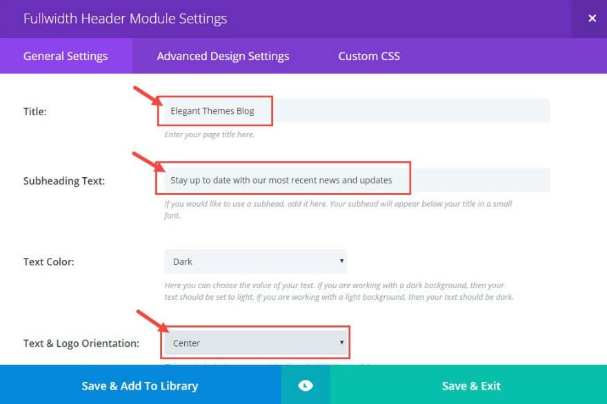
Edit the Fullwidth Header Module Settings as follows:
Under General Settings:
Title: [add title]
Subheading Text: [add subheading text]
Text & Logo Orientation: Center
Under Advanced Settings:
Title Font Color: #20292f
Title Font Size: 35px
Subhead Font Color: #71818c
Subhead Font Size: 20px
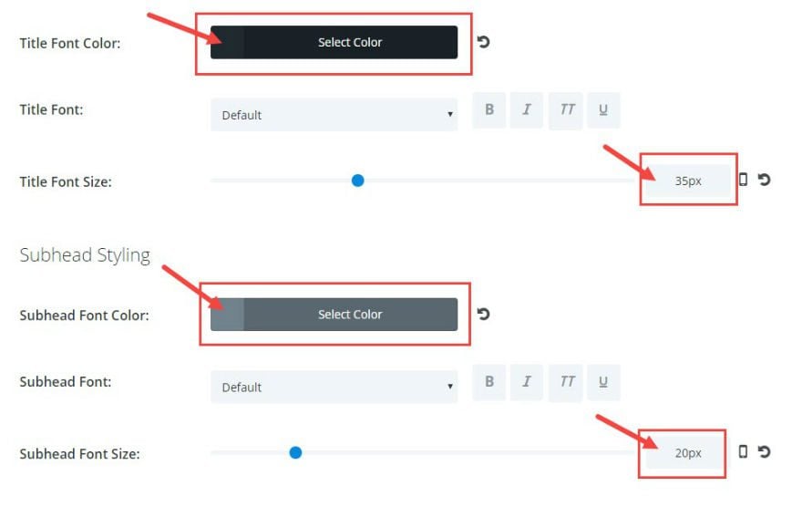
Save & Exit
Click to edit the Fullwidth Section Module Settings.
Make sure the background color is set to the color white (#ffffff).
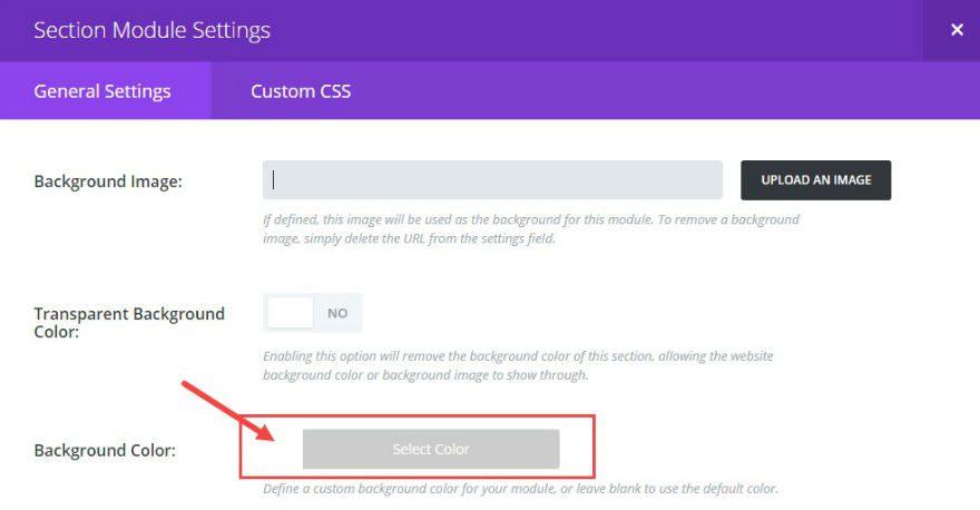
Save & Exit
Now your heading is in place.

Adding the Search Bar
To add the search bar, insert a standard section with a fullwidth column and edit the Section Module Settings. Under General Settings, change the following:
Custom Padding: Top 0px and Bottom 0px
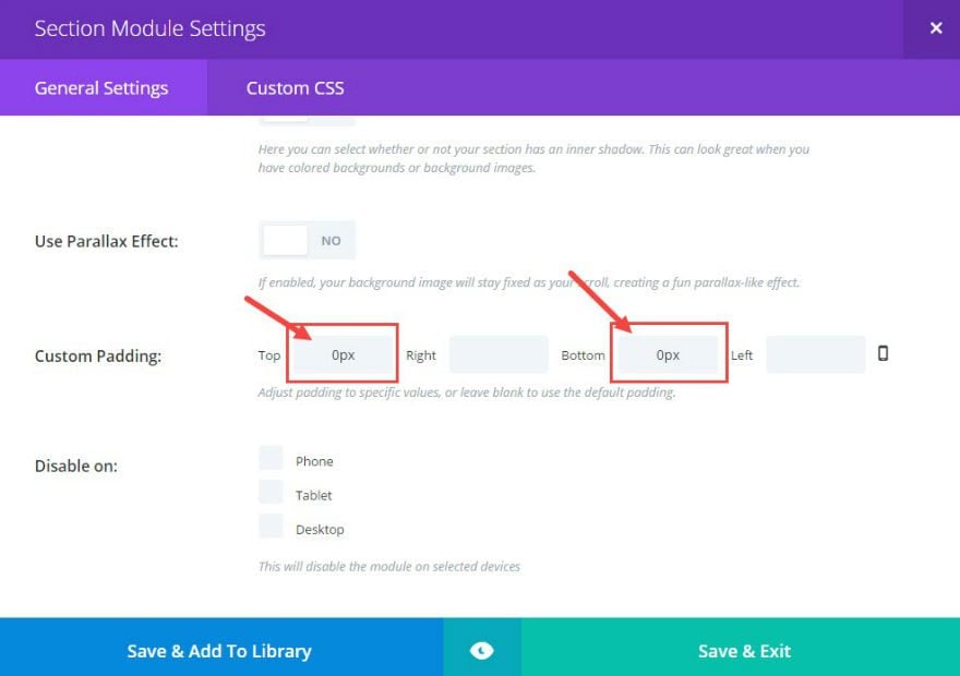
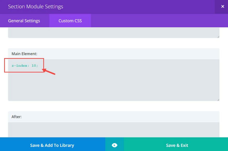
Under Custom CSS, add the following CSS in the Main Element text box :
z-index: 10;
Save & Exit
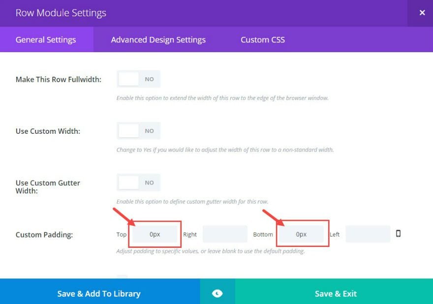
Now click on the Row Module Settings. Under General Settings, change the following:
Custom Padding: Top 0px and Bottom 0px
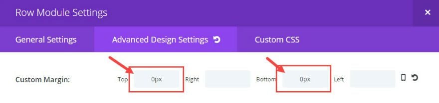
Under Advanced Design Settings, change the following:
Custom Margin: Top 0px and Bottom 0px
Save & Exit
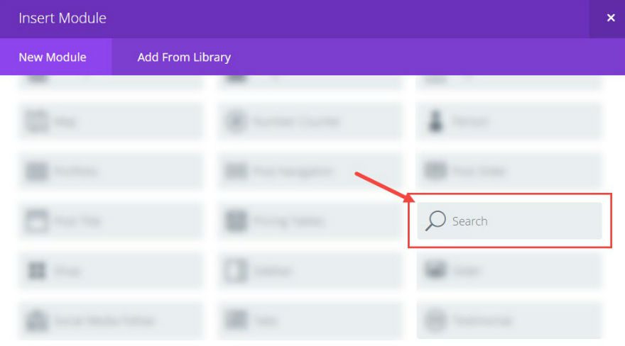
Insert a Search Module in your column.
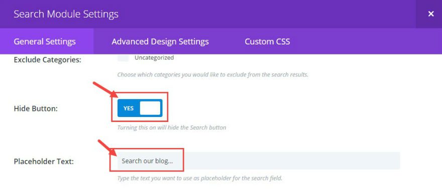
Now edit the Search Module Settings. Under General Settings, change the following:
Hide Button: YES
Placeholder Text: “Search our blog…”
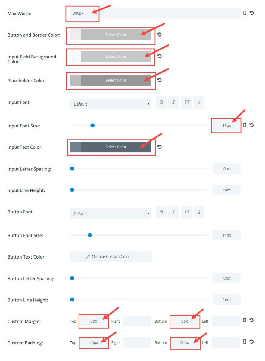
Under the Advanced Module Settings, change the following:
Max-Width: 300px
Button And Border Color: #eeeeee
Input Field Background Color: #f7f9fb
Placeholder Color: #bbbbbb
Input Font Size: 16px
Input Text Color: #71818c
Custom Margin: Top 0px, Bottom 0px
Custom Padding: Top 20px, Bottom 20px
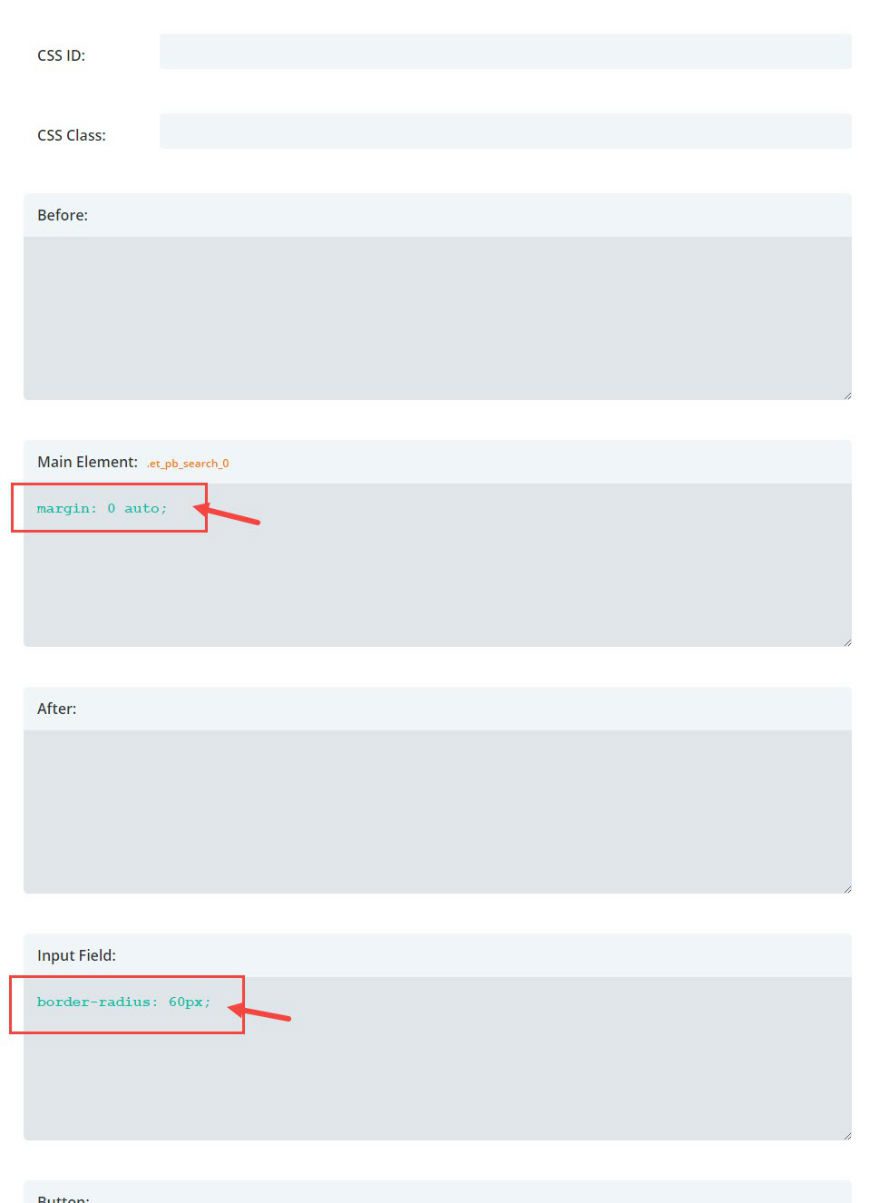
Under Custom CSS, add the following CSS inside the Main Element text box:
margin: 0 auto;
Inside the Input Field box, add the following CSS:
border-radius: 60px;
Save & Exit
That’s it. Notice the search bar hugs the footer right now. That’s okay.
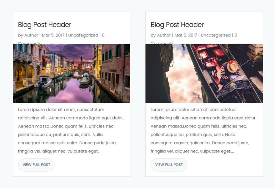
Designing the Blog Grid
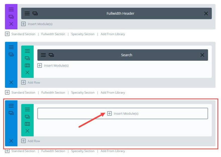
Add another Standard Section and insert a fullwidth column.
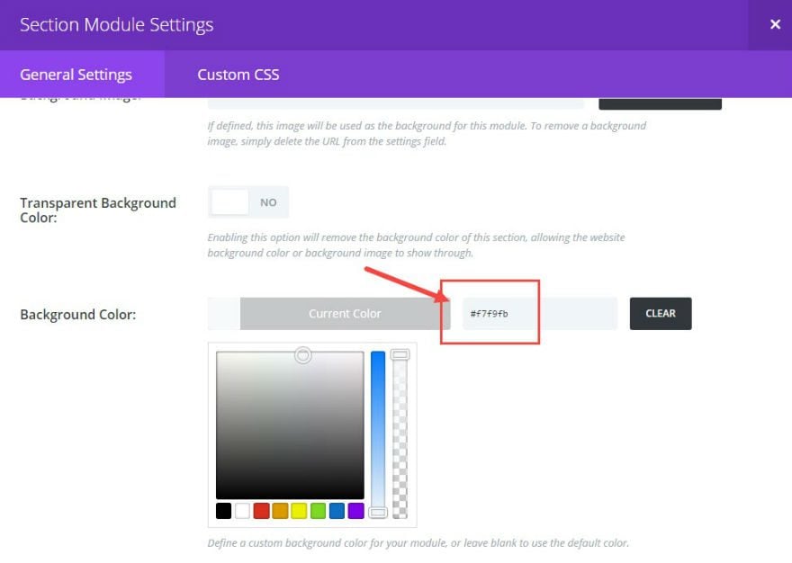
Click to edit the Section Settings and, under General Settings, change the following:
Background Color: #f7f9fb
Under Custom CSS add the following:
CSS ID: skew
CSS Class: elegantdesign
Note: The “skew” ID will be use to create that very subtle diagonal (or skewed) line separating the header white background and the light gray content background. The “elegantdesign” class will be used to target all the custom CSS changes we will be making.
Save & Exit
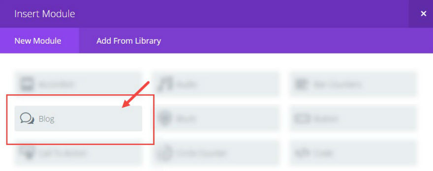
Next insert the Blog Module in your column.
Edit the blog Module Settings. Under the General Settings, change the following:
Layout: Grid
Read More button: ON
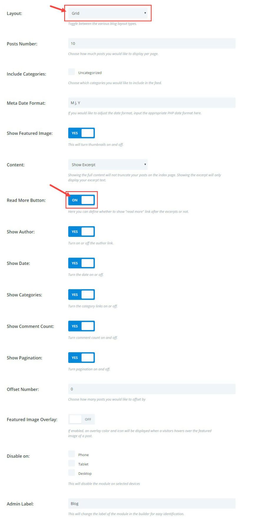
Under Advanced Settings, change the following:
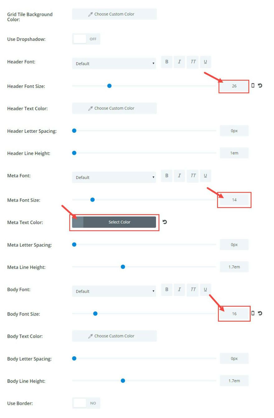
Header Font Size: 26px
Meta Font Size: 14
Meta Text Color: #71818c
Body Font Size: 16px
Save & Exit
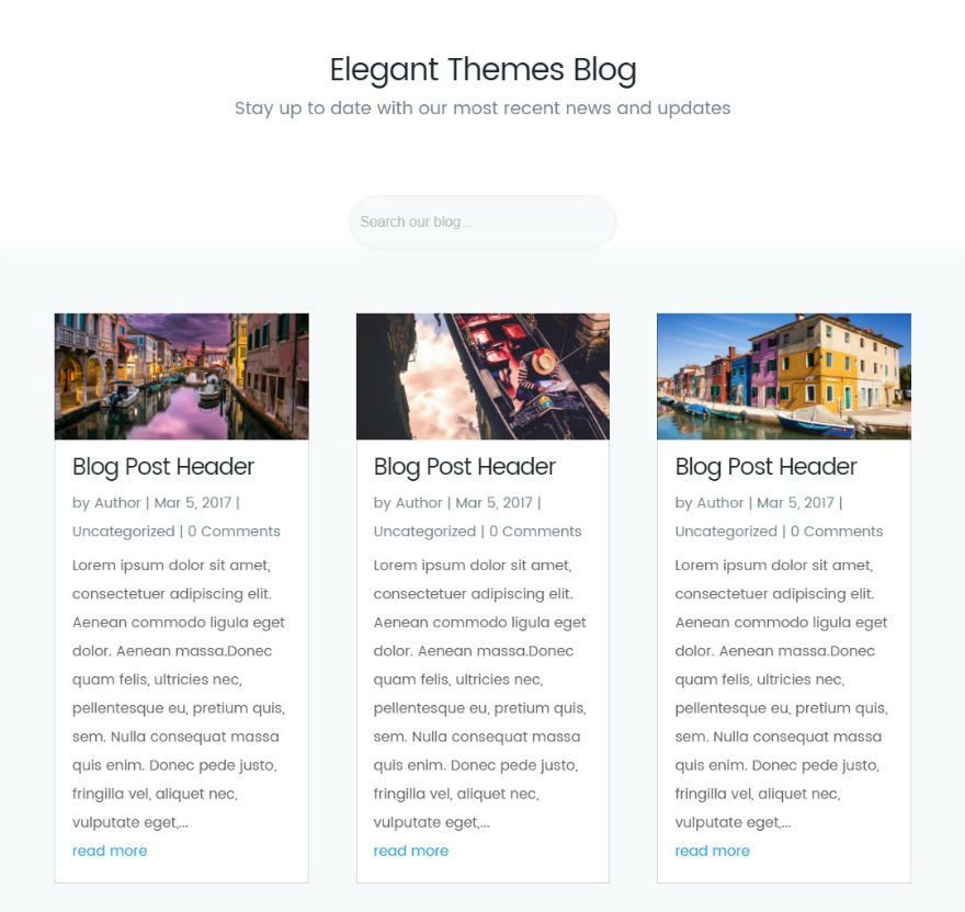
Here is what you blog page should look like now:
We still have some big changes to make but so far so good.
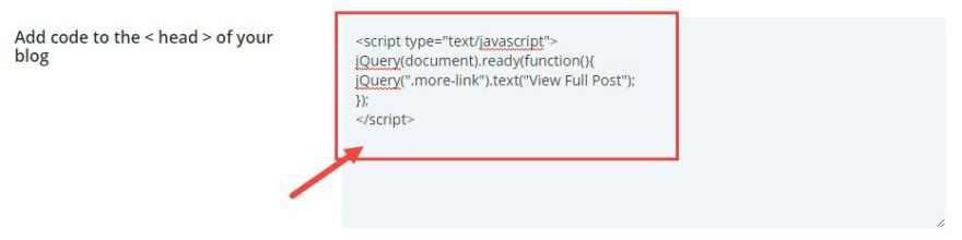
To change the Read More text to read “View Full Post”, go to Divi → Theme Options. Under the Integration tab, enter the following script inside the “Add code to the head of your blog” text box:
<script type="text/javascript">
jQuery(document).ready(function(){
jQuery(".more-link").text("View Full Post");
});
</script>
While you are in the Theme Options, go to the General tab and enter the following CSS in the Custom CSS text box:
.elegantdesign a.more-link {
    font-size: 14px;
    color: #71818c !important;
    font-weight: 600;
    text-transform: uppercase;
    margin-top: 10px;
    float: none;
    display: inline-block;
    padding: 8px 16px;
    border-radius: 60px;
    background-color: #f7f9fb;
    border: 2px solid #e9eff5;
}

.elegantdesign a.more-link:hover {
color: #20292f;
}
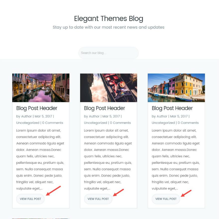
Now your blog grid should have the new buttons.
Implementing the Two-Column Grid Layout
By default, the blog grid has a three-columnn grid layout. To change this to a two-column layout, go to Divi → Theme Options and add the following CSS in the Custom CSS box:
@media only screen and ( min-width: 980px ) {
.elegantdesign .et_pb_column .et_pb_blog_grid[data-columns]::before { content: '2 .column.size-1of2' !important;
}
.elegantdesign .et_pb_column .column.size-1of2 {
width:47% !important;
margin-right:6%;
}}
@media only screen and ( max-width: 980px ) {
.elegantdesign .et_pb_column .et_pb_blog_grid[data-columns]::before { content: '2 .column.size-1of2' !important;
}
.elegantdesign .et_pb_column .column.size-1of2 {
width:100% !important;
margin-right:0%;
}
}
Now your grid should be two columns for any screen size bigger than 980px. For screens less than 980px the grid will change to a single column.
Changing the Position and Size of the Featured Image
Now that you have changed the columns from a three-column layout to a two-column layout using CSS, you may have noticed the quality of your featured images have suffered. This is because when you save a featured image, Divi saves a version of that featured image at a size specific to a three-column layout (400 x 250). But now that you have a wider column, the featured image is being stretched beyond its size and distorting the quality of the image. Therefore you need to change the size dimensions of the featured image from 400 x 250 to 600 x 300.
To do this you need to add a new function to your functions.php file in your theme files. Of course it is always best practice to create a child theme first. Once your child theme is created and activated on your website, access your site files via FTP using a software like Filezilla. Go to your child theme folder and create a new functions.php file. Make sure the file is named exactly “functions.php”.
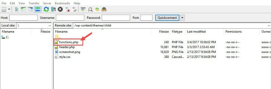
There is no need to copy over your parent theme’s function.php file or code because your new functions.php file will not override the parent theme file. It is simply a way to add more functionality to your existing theme.
Once you have created a new functions.php file in your child theme folder, add the following at the very top of the file:
function gallery_size_h($height) {
return '600';
}
add_filter( 'et_pb_blog_image_height', 'gallery_size_h' );
function gallery_size_w($width) {
return '300';
}
add_filter( 'et_pb_blog_image_width', 'gallery_size_w' );
Important: Make sure you add the opening tag php tag at the very top of the functions.php file before the code.
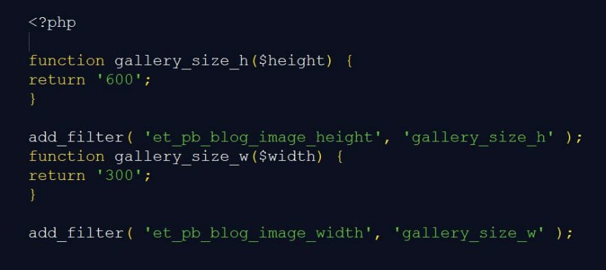
That’s it. Now your featured images should be clear and not stretched or distorted when displayed on the two-column grid layout.
The ideal size of your featured images (when uploading them to your site) should be around 1200 x 600.
By default, your featured image displays above the blog title and post meta. To display the featured image below the blog title and post meta, go to Divi → Theme Options and add another script of code. Under Integration, add the following code in the text box labeled “Add code to the head of your blog”:
<script type="text/javascript">
jQuery(document).ready(function(){
jQuery("article.et_pb_post").each(function(){
jQuery(">a:first-child, .et_pb_image_container", this).insertAfter(jQuery(".post-meta", this));
});
});
</script>
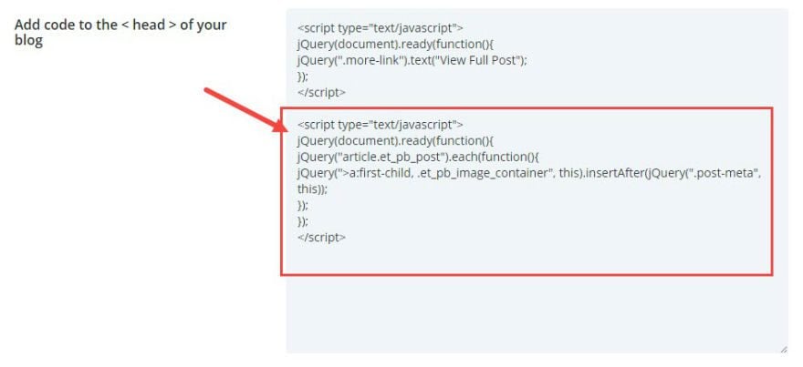
Now check out your blog page. The featured image is now displayed under the post title and meta.
There is a little overlapping of the image and the header but that will be fixed with some CSS adjustments.
Now we are ready for the final touches of CSS to make it all come together. Once again, go to Divi → Theme Options and enter the following CSS in the Custom CSS box:
#skew:before {
    content: '';
    -webkit-transform: skew(0, -7deg);
    transform: skew(0, -7deg);
    position: absolute;
    left: 0;
    right: 0;
    top: -120px;
    height: 340px;
    background: #ffffff;
}

.elegantdesign .entry-title {
margin-top: 0px;
padding-bottom: 20px;
}

.elegantdesign .et_pb_image_container {
margin: -20px -40px  40px;
}


.elegantdesign .et_pb_blog_grid .et_pb_post {
    margin-bottom: 80px;
    width: 100%;
padding: 40px;
    background-color: #fff;
    border-radius: 4px;
    box-sizing: border-box;
    -webkit-box-sizing: border-box;
    -moz-box-sizing: border-box;
    box-shadow: 0px 20px 150px #d6dee4;
border: none;
text-align:center;
}

.elegantdesign .et_pb_post .post-meta {
margin-bottom: 40px;
}
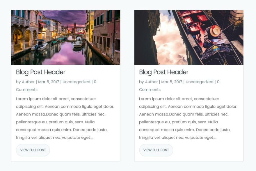
That’s all. You are finished! You should now have a blog page that looks like the Elegant Themes Blog – a well designed page with a centered header and search bar above a two-column grid layout with featured images below the title and post meta.
Is It Responsive?
Yes. The layout is responsive and will alternate between a one-column layout for mobile and a two-column layout for desktop. Here is a screenshot of the mobile layout:
Wrapping Up
There are a few elements missing from this design that are on the Elegant Themes Blog page. I didn’t cover the design of the navigation bar and the footer. I left out the custom search button icon on the search bar. And, I kept the default pagination. If you want the same pagination that Elegant Themes uses, you need to install a plugin like WP-PageNavi and customize the settings to fit the design. Here is a great article to get you started. As far as that cool animated CTA at the bottom of the Elegant Themes Blog page, I may tackle that in a future post.
In the meantime, I hope you take advantage of this tutorial and implement this new design on your next project.
I look forward to hearing from you in the comments.
Enjoy!
Tomorrow: How to Style Divi’s Single Post to Match the New Elegant Themes Post Design
In my next article, I’m excited to show you how to style your single post page after the new Elegant Themes blog post design. See you then!
In the meantime, if you have any questions about today’s tutorial, please feel free to leave them in the comments below.


Thank you for this article (and the other)! I always find exactly what I was searching using Divi Blog, your work and Divi are amazing!
Blog Module Pagination
Had an issue with pagination in the blog module and others may have the same problem. Page 2 was reverting to the main blog page i.e. http://www.site.co.uk/blog/ instead of http://www.site.co.uk/blog/page/2/ although pages 3 and 4 worked fine.
I discovered that by removing the trailing slash in the URL, page 2 worked i.e.
http://www.site.co.uk/blog/page/2 So, by changing the permalink to custom structure and /%postname% (without the trailing slash), all seems to work.
I can´t get to work. There is still a little overlapping of the image and the header
Great post!
Please consider going over the divi footer current layout: that would be awesome!
Hey! Great tutorial, but I do seem to have an issue, I’m running my site in boxed with a custom width of 1100px. When I do all of this it works great but! The white that is transformed in the background behind the blog posts are not going full width from left to right? Any idea?
https://gyazo.com/82de7d0acb50550c80526848ddee4011
This is the page link – http://knoxvegasairsoft.com/kva-intel/
Fantastic article!
One question: is there any way to make the search bar displays the search results in a grid mode exactly as it works on your blog?
Thanks!
Howdy, Jason Champagne March, Thanks for The Tutorials, Let me know CSS, In the Mobile, How to Increase the Grid Blog Width Thanks
Great article!
I was wondering how to add search button icon on the search bar?
Please let us know how. 😉
I tried this and it mostly worked except the resizing of the images so they aren’t stretched.
Any ideas on how to fix this?
Thank you very much for sharing this, it offers a real clean blog.
It would be really cool to have a template one could load and would bring all this to life through Divi.
There is a lot of CSS injection and manipulation that can be not so simple to manage for non technical users or if one wants to replicate this across multiple blogs.
Thanks for your consideration!
I’ve been using Poppins in my divi custom fonts for a while, so I was happy to see a relative post. I do have one question
For the custom css font styling, why did you wrap the font in “” (double quotes) vs” (single quotes)? Is there a difference?
I’ve been using:
body {
font-family: ‘Poppins’, sans-serif;
}
vs
body {
font-family: “Poppins”, sans-serif;
}
Amazing article and thank you Jason!!
Anyone know how to insert custom search button icon on search bar? Can anyone help. Thank you in advanced.
I applied some of the tutorial, it’s great.
However, I failed placing the Featured Image below the Headline without enabling Post Meta, Author, Categories and Comments Count. Any help?
Great stuff! One question: How do I get my video live thumbnails (clickable and watchable in the blog page) to act like the rest of the thumbnails and have the title, etc., up above? They revert to having copy below. Thanks!
Great article. Thank you very much!
Being the perfectionist I am: Do you have any hint to get me started to get custom search button icon on the search bar?
The search bar just makes more sense with the icon.
I have everything working except for the skew… Just looks faded at each of the left and right edges.
I had a look at your site, looks like you reverted back to the standard grid post layout?
Great post.
Yet not working correctly. Can you help me (us) solve it?
On desktop view the blog are sorted correctly, as follows:
Row 1: Post 1 + 2
Row 2: Post 3 + 4
Row 3: Post 5 + 6
On responsive tablet and phone view, the posts are sorted incorrectly, as follows:
Post 1
Post 3
Post 5
Post 2
Post 4
Post 6
How to solve that?
Thanks !
For everybody who didn’t yet noticed they had a problem with the sorting of blog posts on media screens with a max-width of 980px.
Change the corresponding CSS as follows and you’ve solved the sorting error.
@media only screen and ( max-width: 980px ) {
.elegantdesign .et_pb_column .et_pb_blog_grid[data-columns]::before { content: ‘1 .column.size-1of1’ !important;
}
I’m sorry, I just don’t like the new ET blog design layout. Why is every site changing the layout of blog posts into grid tiles? I would be cool to see a “switch back to the old version” option. UX team please keep in mind that your designs are for the users – so don’t change stuff just because it will look cool.
For a better loading time why you don’t use thumbnail instead of resizing the featured image?
Hi
Any chance you also will write an article on how to style the pagination in the buttom ?
I applied this tutorial to one of my websites.
I’m having issues with the quality of the featured image. It’s really “pixelated”!
I’ve tested the 1200×600 dimension as suggested and it’s still blurry looking at it from the blog page. I look at ET’s blog page and the featured image looks fairly good. The dimension you guys have is 960×440. I’ve also tried that and still the same result.
Any suggestions?
Make sure that you include the following code in your functions.php file:
<?php

function gallery_size_h($height) {
return '600';
}
add_filter( 'et_pb_blog_image_height', 'gallery_size_h' );
function gallery_size_w($width) {
return '300';
}
add_filter( 'et_pb_blog_image_width', 'gallery_size_w' );
?>
That should take care of the image blurriness on the blog page. Are you referring to the sing post featured image?
I’m having trouble having my title of the post displaying on the top and my featured image in the middle.
Also, the “view full post” code did not work.
I followed everything laid out above and have achieved the overall look of the design, but these two things are not updating correctly. I have copied the correct CSS, named the correct classes, id’s etc etc…
Since these two features are both scripts in the head of your blog, I would double check to make sure you aren’t missing a small piece of code or a closing bracket or something first. Then I would maybe try disabling some plugins. Are you using an updated version of the Divi Theme?
So I tried this tutorial and my blog post and page is using Sans Serif instead of the Poppins font.
Did the columns revert to 3 for anyone else after updating to the latest version of Divi?
Yes! Same here
Is there a way to get the date to be featured above the title instead of below it?
Do you want just the date or all of the meta content?
Hi, first of all, thanks for this great guide, but I have a problem that I can not solve.
By clicking on the meta-description categories of any post, it takes me to the static pages that have the same name.
It does not lead to the categories created in the blog.
If you can help me?
Thank you!
Great Post!!!
I change my blog page without any problems at all. Thanks
I’ve tried to implement the two column part of this but it really hasn’t worked for me ???
any suggestions why? I’ve copied the code exactly and I’ve placed in the correct place but nothing has changed.
PS; this is the code i’m using
@media only screen and ( min-width: 980px ) {
.elegantdesign .et_pb_column .et_pb_blog_grid[data-columns]::before { content: ‘2 .column.size-1of2’ !important;
}
.elegantdesign .et_pb_column .column.size-1of2 {
width:47% !important;
margin-right:6%;
}}
@media only screen and ( max-width: 980px ) {
.elegantdesign .et_pb_column .et_pb_blog_grid[data-columns]::before { content: ‘2 .column.size-1of2’ !important;
}
.elegantdesign .et_pb_column .column.size-1of2 {
width:100% !important;
margin-right:0%;
}
}
I’m not sure. Are you using an updated version of Divi?
This happened to me. It was working fine, but after I updated Divi it reverted to 3 columns. (my other column customizations on portfolio page and archive page reverted as well).
Nevermind. I was missing a } …duh…
Need some help – same problem I’ve had in the past which is that I have no idea where to go to edit the header and footer. Your text says “First add a Fullwidth Section with a Fullwidth Header Module to your layout” but I have no idea where the layout is – or do we go to Library, select “Add New”, then select a template type of “Layout” and then check the Global box?
The layout refers to what you build using the Divi builder. Using the builder to add rows and columns and modules you are creating a new layout for your page.
Does that help?
Hi Jason,
Excellent article adn a bunch of fun to walk through the steps but somewhere along the way I have stuffed something up and the header is not right… I’m not sure how to explain what ‘isn’t right’, nor do I know where I’ve gone wrong as I’ve gone back through a handful of times to see where I messed up but I can’t for the life of me figure it out.
Please help 🙂
Hi,
at first many, many thanks. I have tryed yet by myself and it works so far. For me I only not use the part from 3 rows to 2 rows (child theme, functions.php) and now the part of Heading, Picture, Text not working. I see first the picture, than the heading and then the excerpt. Why? Have You any idea?
How can I reduce the space over and under the search field?
Kind Regards Frank Weber (from Germany, sorry for the english)
I’m not sure, Frank. Did you apply the CSS for the 2 column structure? Also, to reduce the space of the search field, I would adjust the padding for the search module.
Thanks.
I enjoyed this post and would love more blog page design options.
I love the blog layout, but instead of having two posts I’d like to have one post that is more prominent. Anyone know how to do that?
Thanks,
Brandon
Do you mean that you want one column instead of a 2 columns layout?
Hi Jason,
Yes. I would love to have the blog post preview more prominently featured where everything is the same as your example, except larger and a single column.
Any way you could tell me how to do that?
Thanks,
Brandon
Thank you for sharing…
Just a question,
Can you explain how to style “Blog-Page” when a user search a category or a tag?
Thank you.
Thanks for the suggestion. I will consider this for a future blog post. Thanks, Dany.
I am a beginner with CSS but managed to follow the instructions and it looks great on desktop and tablet. Unfortunately on mobile the blog grid is still 2 columns directly side by side. Do you know how to make it change to 1 column for mobile only?
I’m not sure why this is happening since the CSS for 2 columns only applies to a width of 980px and above. Maybe check to make sure your CSS is correct.
This is so sweet! I’ve wanted to add buttons to my blog posts for quite some time, and they came out beautifully. Thanks so much for this tutorial.
And I have one question. I have one post on my blog page that’s in the full width. I’m happy that the “Continue Reading” text updated, but is there a way for me to add the button to my first post without messing up the grid layout?
Thanks again!
I’m not sure. How did you set up the full width blog post?
When use css code example for 2 collumns as described – it doesn’t work.
Can you post the CSS you are using? Thanks.
I also notice that if I set the blog module not to display the date, which often I do not want on certain categories, it destroys the layout in that it then puts the featured image on top of the block…is there a way to keep the title at the top without showing the date?
I’m not sure yet, but thanks for the feedback, Trisha. I’ll look into it.
A few hurdles to run through but eventually it all worked well and looks fab!
Did end up with uneven column heights which is down to the fact that my featured images are not all the same size…this is often a problem with the photos that are supplied for the blog. Is there a way to force all columns to have the same height, though it may distort some of the feature pix.
But great tutorial, thank you so much!
Thank you!
Can the same styling easily be applied to the archive pages as well?
Good idea. I’ll keep this in mind for a future post.
The button change for the read more is not working for me. The CSS is doing nothing, still just text. any ideas/help?
What is the css you are using to style your button?
The button change for the read more is not working for me. The CSS is doing nothing, still just text. any ideas/help?
Nice CSS here. However, it doesn’t apply to the archives page (center h1, etc.) when applies. Please advise. Thank you.
I will consider adding styling to the archive pages as a future post. Thanks.
Great, I really need to know how to do this. Looking forward to it!
Hi
Thankyou very much for the great post and tutorial.
Everything went fine with me, except pagination.
I tried with link you provided, followed still pagination is not visible in my “2nd post”. ( I have only 3 dummy post ).
Will figure out.
Thanks anyways, looking forward to learn more.
So far so good until my theme options in Divi opens to a blank page. Tried it on google chrome and safari and it’s blank on both 🙁
I have the same problem!
Great post. I’m stuck with the search box at the bottom. How do I raise the box up?
Thank you.
I would try adding top padding to the module.
Something’s gotta be missing in this functions code because I keep getting an error whenever I add it; using a child theme + there’s already stuff in there.
<?php
function gallery_size_h($height) {
return '600';
}
add_filter( 'et_pb_blog_image_height', 'gallery_size_h' );
function gallery_size_w($width) {
return '300';
}
add_filter( 'et_pb_blog_image_width', 'gallery_size_w' );
Sorry Rik. Not sure about that. Maybe if you already have the php opening tag on your document from previous code then you may not need to include it with this snippet.
Stripe Plugin allows to accepting payments from your WordPress site via Stripe payment this post is very quite helpful for me and thanks for the info.
Genera/custom CSS
It would be great if you implemented a feature where you can build your post layout for the post grid using a builder like visual composer blog manager does. I am not a fan of visual composer page builder ( I like Divi better for sake of ease of use ) but the VC features are great. You can position where you want the title, image, excerpt, read more whatever you want and you can save many layouts and choose which one you want for your needs.
Secondly, I think the same for single post layouts is a must because even though it is great to be able to use page builder to create an awesome layout, if the client wants to change this layout for all the posts, how do you change all the past posts without going in and spending hours and hours changing each one? there needs to be a global layout otherwise I will never use the page builder for posts. I know I can make a custom single post page in my child theme, but its not as awesome as using the page builder and all its features.
Fantastic post!
I have implemented it on my website and it looks perfect.
And I would like to ask if it is possible to implement this look also on the categories page. In the page in which the posts related to a certain category appear.
Thank you!
Jason,
This tutorial is very detailed, and extremely helpful. Thanks for taking the time to write it up for us!
Brilliant post and really clear instructions. Thankyou so much. However, my search box is still a little too low down. How do I move it up a few pixels?
Sorry – done it by increasing the margin on the search module.
I guess I’m odd-man-out but I do NOT like the new blog design. (Your explanation was very detailed,so thanks for that).
What I do not like is this:
1. I think Poppins is too difficult to read. Characters are too square.
2. Line length is too long. By the time I get to the end, I don’t easily find the start of the new line. If find myself moving my entire head to read, not just my eyes. That prevents any type of speed reading, or at least hinders it.
3. There is no dominant visual in this design. Every thing has near-equal value and weight.
But that’s me. I am not into the latest design styles unless they improve my experience. To me, this does not.
But thanks for the great detail and explanation.
Thanks for the feedback Randy.
Probably stupid question – how to truncate blog excerpt to make all blog post boxes equal in height?
Great tutorial! I’m very happy with this layout on my page, but I can’t figure out why my grid boxes are all uneven heights, not perfectly lined up like the demo ones. ARGH! 🙂
I was going nuts with one site till I realised some headlines went over two lines. That drops those boxes down the page and creates the uneven look
That is true, but if you have a look at the Eleganttheme blog, you will see that while different headlines may create shorter or longer boxes, the following boxes still start on an even line.
Not sure. Maybe try making your featured images the same size?
I´m having the same issue here.
Did everything except change the php file for the image resize. The only problem I’m facing is that the blog post titles are not going to the top. They’re all the way at the bottom still under the read more button. Would love to have them at the top. Any suggestions?
Where do I go to my theme files? cpanel?
How do i create a child theme? What if I dont have a child theme then how should i proceed?
Lau,
I would suggest using FileZilla. If not, you would have to edit Divi’s Theme files and all of your changes would be lost once you updated the theme. Check out this post to get started on a child theme… https://www.elegantthemes.com/blog/resources/wordpress-child-theme-tutorial
Thank you Very much, Jason I am waiting for a long time I am glad of Elegant theme
You’re welcome. Glad you like it.
Why not update Divi instead or give us the ability to create custom modules?
Hi Dan, we’re actually working on that as part of our Developer Update. You can in fact create custom modules now but we’ll be publishing developer docs with our next major update to show you how.
Just one question: how can I make the posts appear in random mode? I don’t want them to be shown according to the date they were published, but in random order every time the page is loaded.
I’d really REALLY appreciate your help on this… thanks!
Thanks for a great article. I’m a paint by numbers sort of guy and so followed your article all the way through leading to exactly what I had hoped for, very impressed.
Cheers Rob
Great job on your blog!
Can we please have a tutorial on how you created the “Join to Download” button in top navigation? I found an older EL blog post about something similar but it seems out of date.
Love the bright colored button…please hook us up with the deets!
I’ll take a look at our old post. We might updated it with a new example. The process will be pretty much the same.
Loved this tutorial! I applied to one of my client’s sites and it looks great!
The only problem I have is that the button hover CSS isn’t applying:
.elegantdesign a.more-link:hover {
color: #20292f;
}
For some reason the color of the Read More button doesn’t change when I hover. The other CSS worked fine. Is there any reason why this wouldn’t?
In .elegantdesign a.more-link, I removed the !important in ‘color: #71818c !important;’ and left it as ‘color: #71818c;’. That seem to work, so far…
Thanks! This worked!
That worked for me too. Thanks! I am also having trouble changing the ‘read more’ to ‘View full post’ (I’ve copied and pasted a couple of times – did you have any problems with this?)
Thanks for this! Will you include how to make the signup row you have in the Divi blog (ex: https://www.elegantthemes.com/gallery/divi/documentation/cta/)?
I love how it transforms when you scroll over it and would love to implement something similar on my own site.
Thanks,
Alex
I would love to see a tutorial on this as well. I think it is THE BOMB!
Good idea. I will consider this for sure.
I like the look of this but really wouldn’t want to go through all of this – it’s not for a novice. It would be great if more of this functionality was built into the blog module. For example, I’d love the following:
1. the ability to change the size or aspect of the image (i.e. landscape, portrait,square or round)
2. Position of the image, above the title, below the title.
3. Look & content of the “Read more” link – whether a button, etc.
Thanks for the feedback Philippa! You’re right that this is not a beginner tutorial. We try to mix it up between tutorials that anyone can do and more complex stuff like this post. We tend to do a lot more beginner level posts than not.
Just noticed that when I read this post in Safari on my iPhone, zooming in to look at you screenshot examples in more detail was not useful because your header enlarged as well. So your Elegant Themes logo quickly filled to screen, given it is set to stick to top of screen.
This seems very unfriendly to mobile. Shouldn’t your layout be set to not have the header stick to solve this or are there other solutions in Divi for this?
I love the Divi Tutorials like this!! Let’s see more for some of the other Elegant Themes! 🙂
We’re focused pretty exclusively on Divi and Extra. That said, we are due some more Extra tutorials and I’ll do my best to get them out in the near future.
Great tutorial. Thanks.
Question: On the example above, regardless of post length, each pair align together at the top. I’m missing this step.
Thx,
I’m having the same issue. I’d like the pairs of posts to align, regardless of the size of the heading, image, or excerpt text. I’ve tried adding min-height to .et_pb_blog_grid .et_pb_post in the custom CSS area, but it doesn’t seem to be recognizing it.
I’m not sure what you are asking. Can you clarify please. Thanks
I see that on the Elegantthemes blog every pair of posts are lined up at the top. However, following your instructions, each post is separated from the top post by a fixed distance. And, therefore, the posts are not aligned on top in pairs. Do you know how you can get this alignment in pairs? Thank you
i certainly missed something, the switch to two collumns and the read more button is not working. ;).
Is there a way to put the post meta above the title instead of below it? I’m trying to edit the jquery but I’m not sure what exactly it should be changed to.
Make sure that you don’t skip the step about adding the CSS Class: elegantdesign under Custom CSS for the blog module
Great Post!
Is it possible to change blog’s layout from function.php without using jQuery?
Maybe something like displaying a custom field rather than replace the excerpt.
Thanks
Thanks a lot for this guide
I appreciate your tutorials. Playing with Divi is fun, but a lot of options, so this not only helps in what you’re showing, but in modifications for our own needs
Finally you’ve redesigned your own website! 🙂
Have many thanks. I will try it in the next weeks when I switch my blog to Divi.
Kind regards Frank
This was awesome, thanks! How did you get your archive pages to have the same look?
Me too!
+1
I’d like to know this aswell!
I already have code in my functions.php Divi Child Theme…I am not sure what the first function does, but it appears the second is the success message for Contact Form.
Question: Where should I place the functions snippet for Featured Image from tutorial?
Thanks (not wanting to play trial and error with functions file :D).
Code That Already Exists:
<?php
// Exit if accessed directly
if ( !defined( 'ABSPATH' ) ) exit;
// BEGIN ENQUEUE PARENT ACTION
// AUTO GENERATED – Do not modify or remove comment markers above or below:
if ( !function_exists( 'chld_thm_cfg_parent_css' ) ):
function chld_thm_cfg_parent_css() {
wp_enqueue_style( 'chld_thm_cfg_parent', trailingslashit( get_template_directory_uri() ) . 'style.css' );
}
endif;
add_action( 'wp_enqueue_scripts', 'chld_thm_cfg_parent_css' );
// END ENQUEUE PARENT ACTION
add_filter('gettext', 'replace_contact_message', 10);
function replace_contact_message($translated) {
$new = 'Success! I thank you, Mike';
// replace the above sentence within the single quotes with yours. Make sure the syntax is maintained.
$translated = str_ireplace('Thanks for contacting us', $new, $translated);
return $translated;
}
Mike,
Go ahead and put it under the current code you have. That should work fine.
Let me know how it goes.
Jason
Thank you.
I’m starting with DIVI and this tutorial seems great. Thank you very much!
Awesome Enrique! You are welcome.
It’s great, thank You very, very much:)
You’re welcome!
Great tutorial, thanks. What I cannot figure out is if I have created a header and footer for my site using Divi and these are standard library elements I can reuse. I can build my site and use many of the other features in the main content area. All of that works great. Even on the blog page. However once you click on an element in the blog page and it expands, I don’t have my footer and header there any more. I am sure it is written down somewhere, but it is not obvious how to do it and remain consistent on all of the content.
Too complicated for the average user. Can you add some predefined layouts blog posts?
We have been asking for this for longer than you can imagine, but they refuse to do it. Their reasoning is, Divi was not primarily designed for blogging, yet they put out tutorials like this which say otherwise. Much of what this tutorial does in terms of style is offered in the Extra theme.
Loving this!! I would like to see how the mobile menu is done *hint*hint* 🙂 Thank you
The new Elegant Themes mobile menu is already very similar to how Divi automatically handles the mobile menu. What specifically would you like us to show you how to do?
The change in the hamburger menu on open state and the animation when it deploys?
Yes! Thank you very much. I have been asking for this.
I know this is done via the Divi builder. Do you also plan on releasing this and the single page as a page template?
Will there be more Google Fonts additions to Divi? I have a few suggestions:
Cormorant
Libre Franklin
Nunito Sans
Poppins
Slabo 27px
Thanks for the suggestions!
Great post!
Awesome post! Great to see you guys listened to all the comments asking for this!
Can’t wait for tomorrow’s article on the single post!
This is really great and in-depth. I’d love to see more tutorials like this, and I’m hoping that with the Divi Developer release we will. Also, I love your company name Launch Tower!