
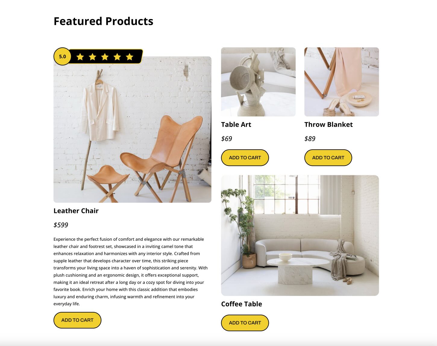
Star ratings are one of the quickest ways to communicate trust and perceived quality on a website. Whether you are highlighting product reviews, service testimonials, or customer feedback, a well-designed star rating adds instant visual context. The challenge is making it look polished, reusable, and responsive without overcomplicating the build. In Divi 5, that process is much easier.
One of the most useful tools for this kind of custom component is Module Groups. Groups let you bundle multiple modules into one manageable unit, which makes it easier to build repeatable UI elements such as badges, review summaries, pricing callouts, and custom star ratings.
In this post, we’ll walk through how to create a custom star rating module in Divi 5 using Groups and Flexbox. By the end, you’ll have responsive, reusable star rating designs that you can save and use throughout your site.
Let’s get started.
What Are Module Groups?
Groups are one of the most useful structural additions in Divi 5. A Group is a container element that lets you bundle multiple modules into a single, cohesive unit inside a column. Once modules are placed inside a Group, you can move, duplicate, style, and manage them together far more efficiently.
That makes Groups especially useful for building custom, repeatable components without needing extra Nested Rows.
Here are a few of the most useful things Groups bring to this workflow:
- Built-in Flexbox controls: Groups work especially well with Divi 5’s Flexbox-based layout system, giving you visual control over direction, alignment, justification, wrapping, and gap spacing across breakpoints.
- Nesting support: You can place Groups inside other Groups to build more advanced structures while keeping the layout organized.
- Group-level styling: Apply backgrounds, borders, shadows, spacing, sizing, transforms, and other design settings at the container level.
- Reusable design patterns: Once a Group-based component looks the way you want, you can save and reuse it across your site.
In short, Groups make it much easier to build polished, reusable components like star ratings while keeping your page structure lean and manageable.
Step-By-Step Guide For Creating A Star Rating Module
In this section, we’ll build two custom star rating designs using Groups and Divi 5’s native Flexbox controls. The first example is more decorative and layered. The second is much simpler and works well for compact rating displays.
While Nested Rows could also be used for certain custom layouts, they are unnecessary here. Groups and Flexbox provide enough control to handle spacing, alignment, and responsiveness with fewer layers and less overhead.
Star Rating Module Example 1 (Layered Design)
Set Up The Group Structure
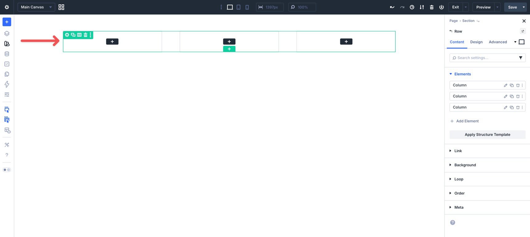
Start by creating a new page or opening an existing one in the Visual Builder. Add a new three-column row to the page.
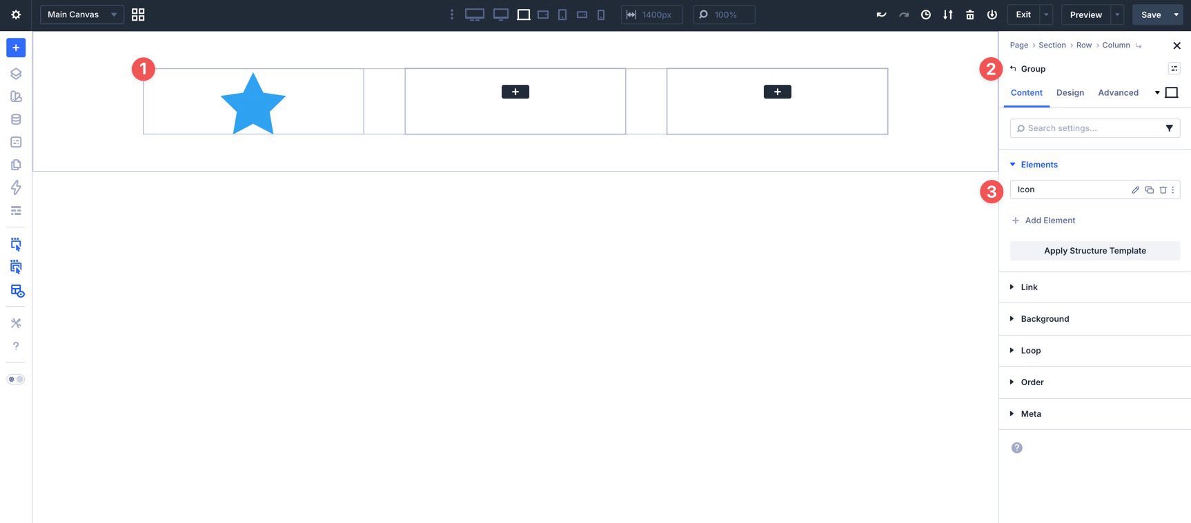
In the first column, add a Group. This will be the Main Group.
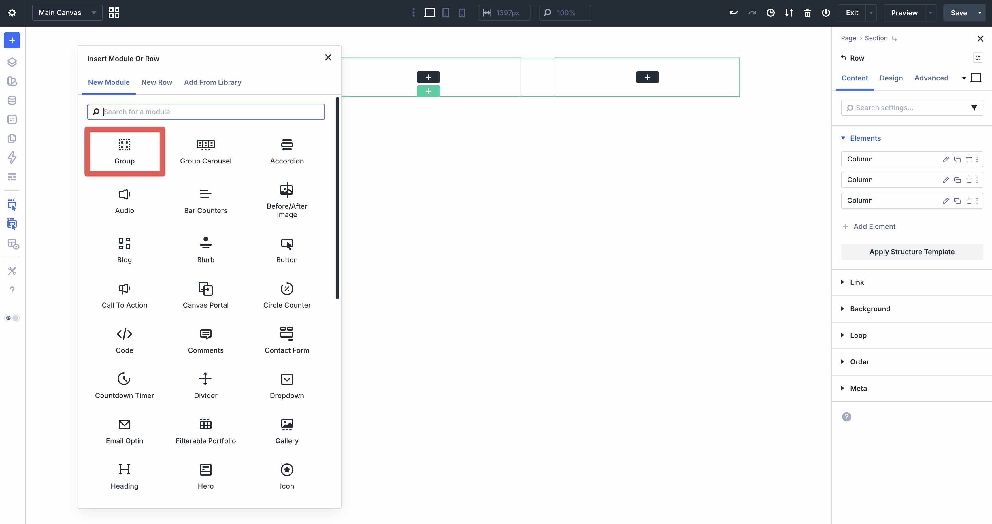
Inside that Group, add another Group. This will be the Circle Group.
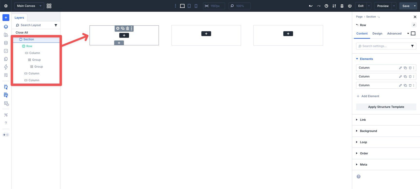
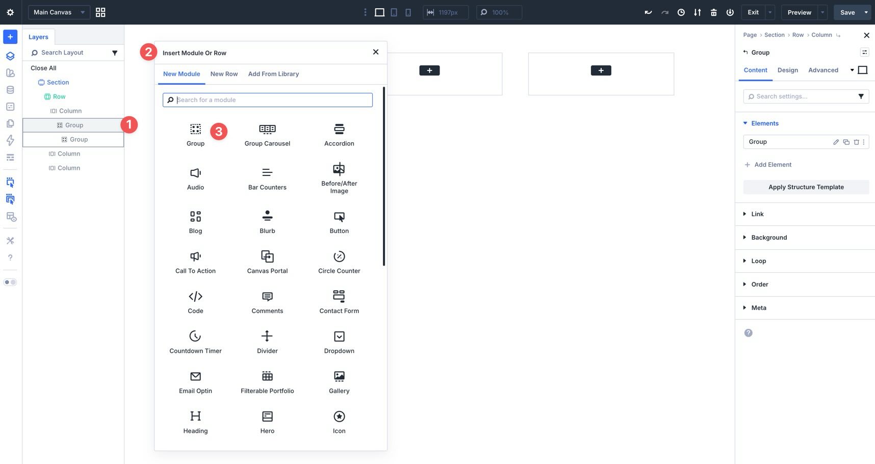
Next, use Layer View to add another Group inside the Main Group.
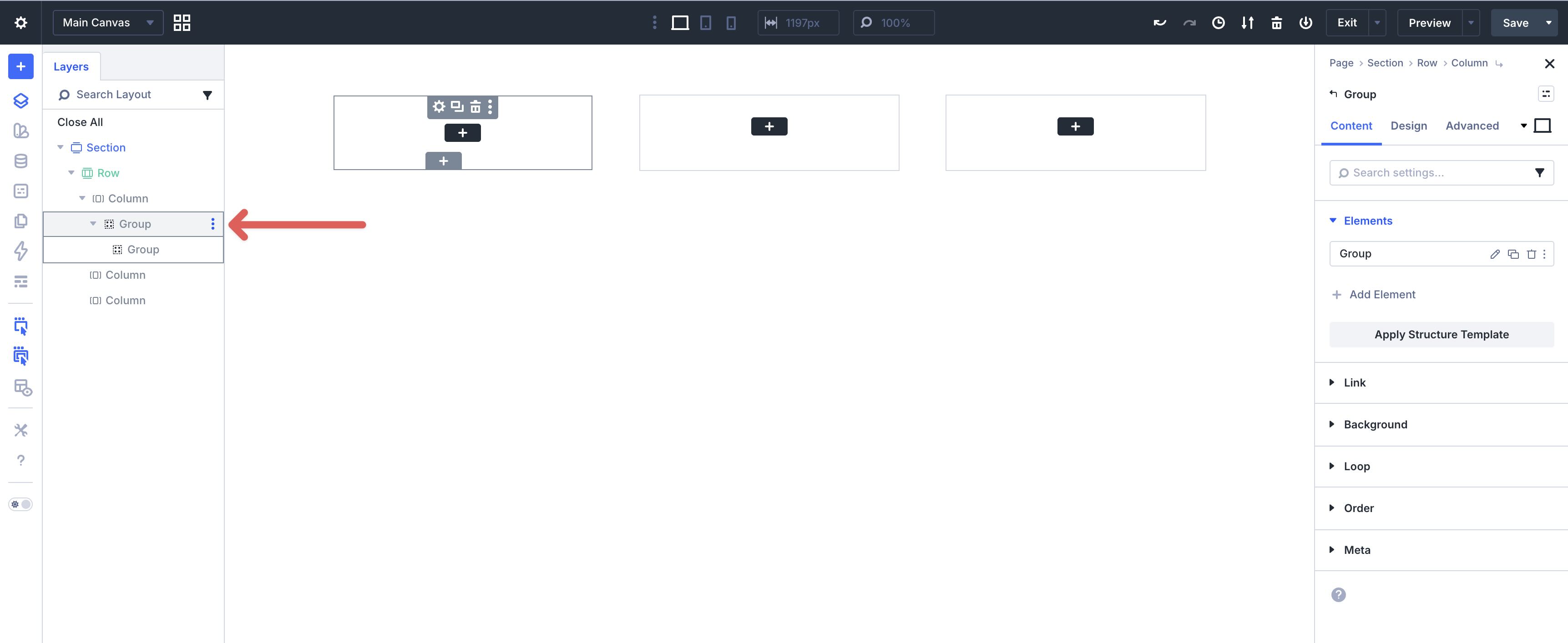
Hover over the Main Group in Layer View, open the menu, choose Add Element, and place another Group inside it. This will be the Star Group.
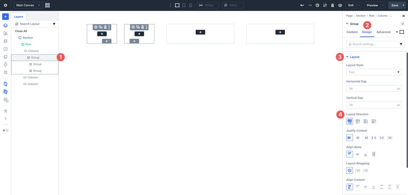
Now select the Main Group, go to Design > Layout, and set Layout Direction to Row. This places the Circle Group and the Star Group next to each other.
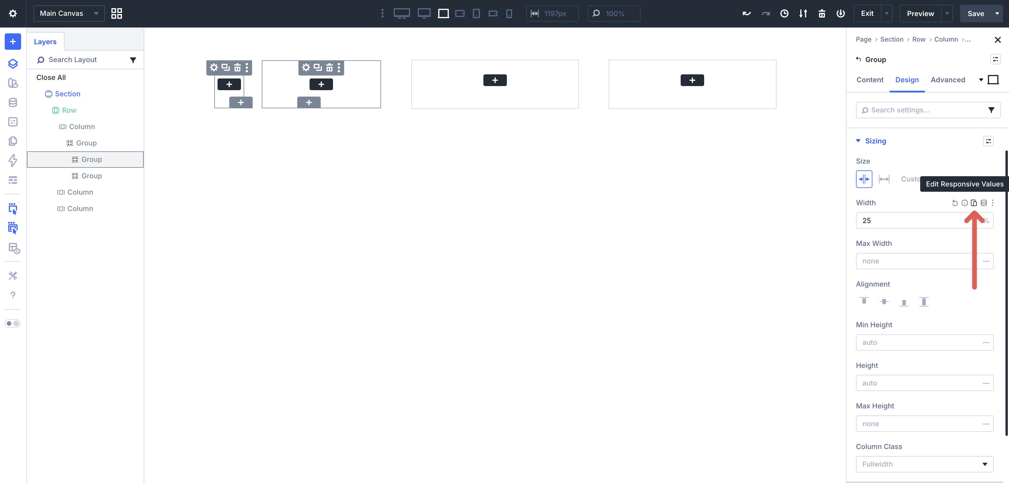
Size The Groups
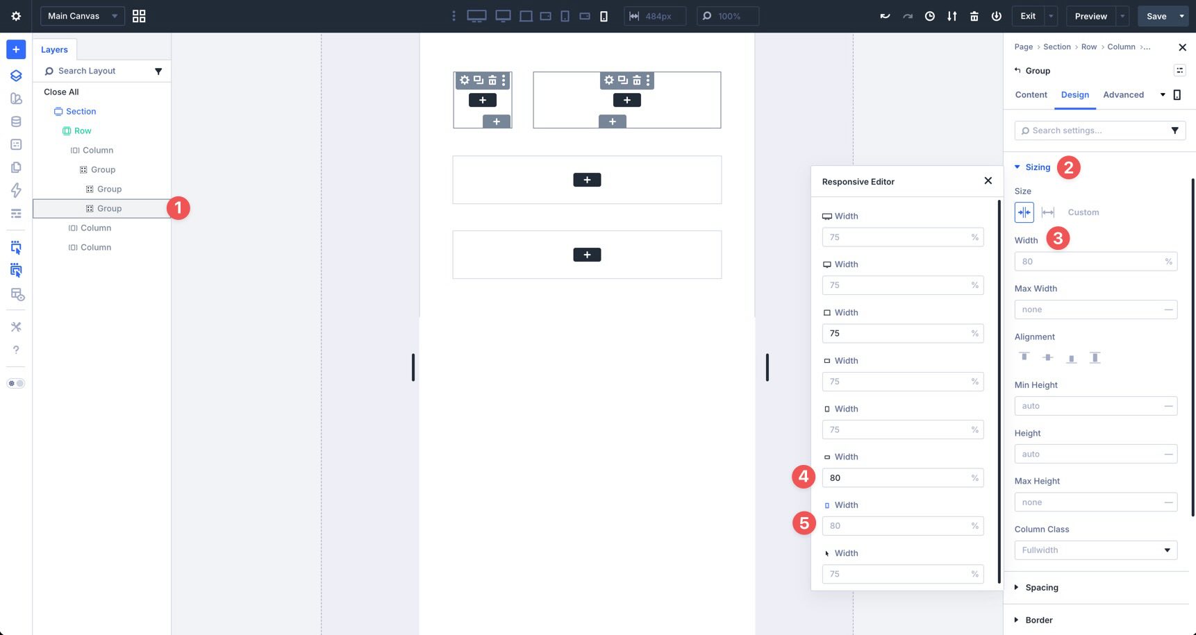
Now set the sizing for each nested Group. Select the Circle Group, go to the Design tab, and open Sizing. Set the Width to 25%.
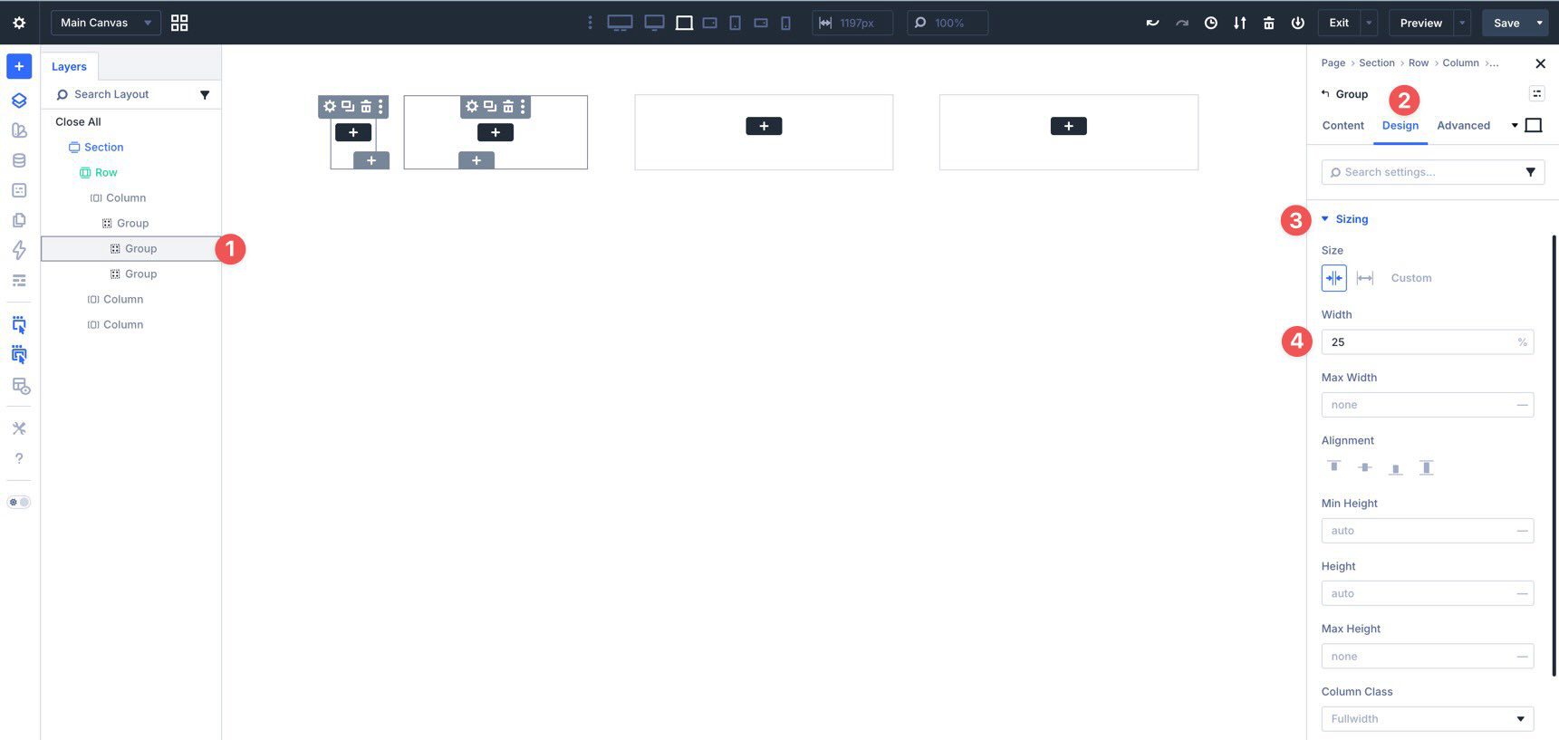
Use the Responsive Editor to adjust the width at smaller breakpoints. Keep it at 25% for larger screens, then set Phone Wide and Phone to 20%.
Repeat the process for the Star Group, setting the Width to 75% on larger breakpoints and 80% on Phone Wide and Phone.
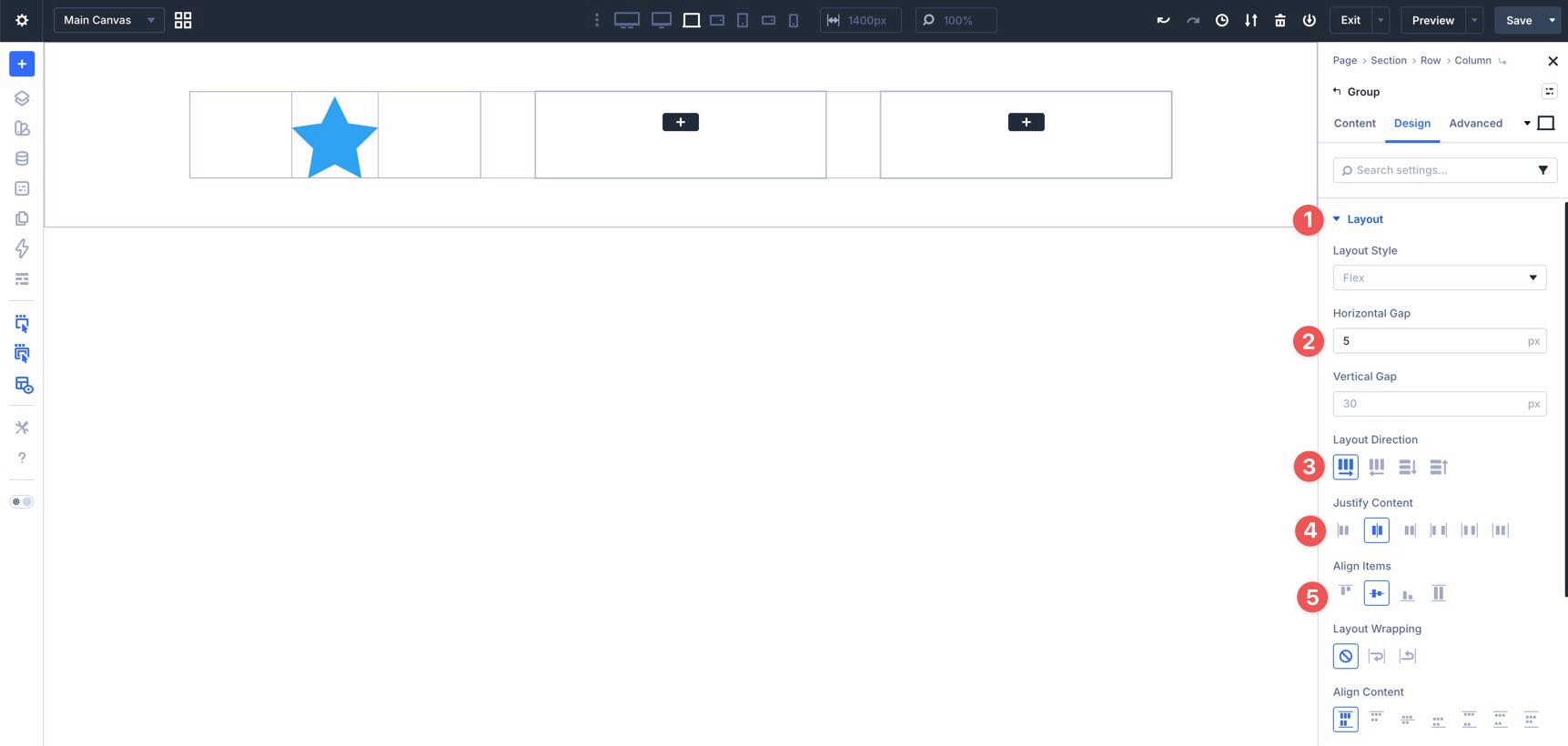
Next, select the Main Group, go to Design > Layout, and set the Horizontal Gap to 0px.
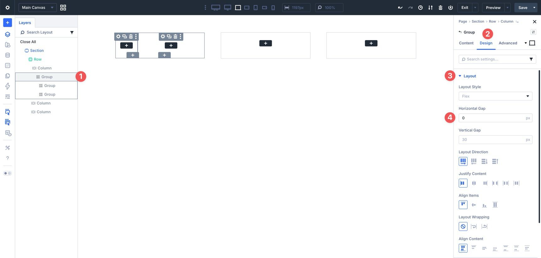
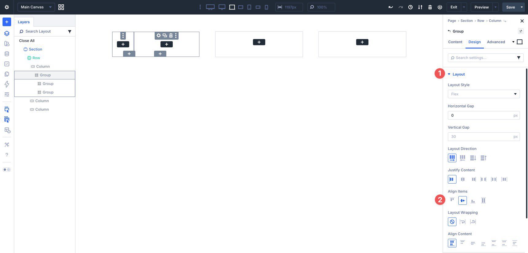
Then set Align Items to Center.
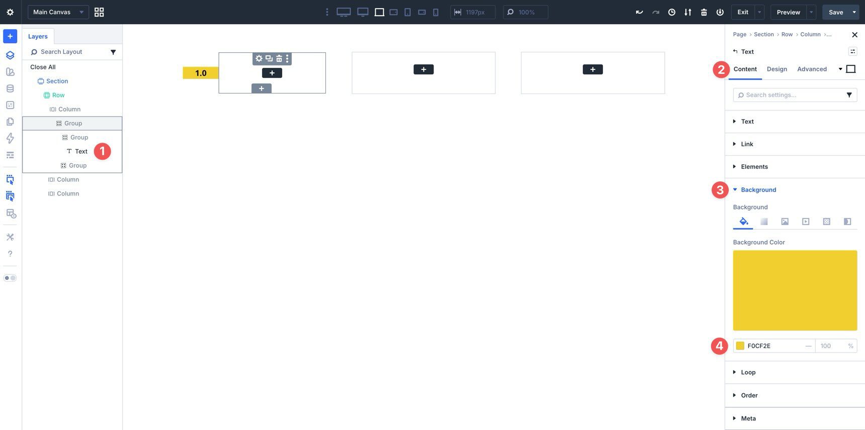
Add Design Elements To The Circle Group
With the structure in place, click into the Circle Group and add a Text module. Set a Background Color in the module settings.
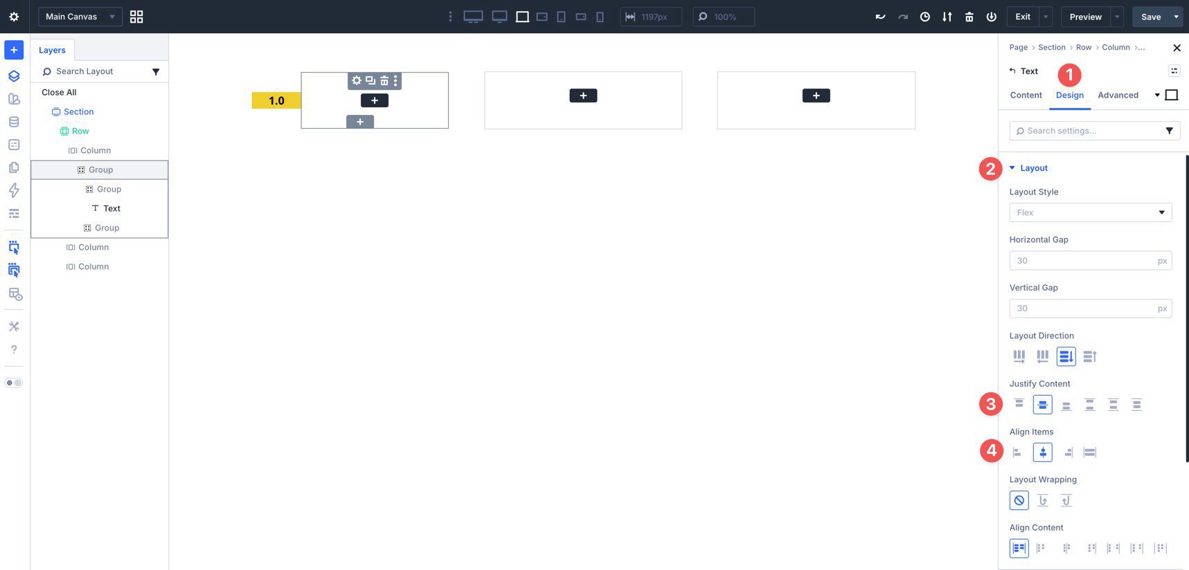
Go to the Design tab and open Layout. Set both Justify Content and Align Items to Center so the rating number stays centered inside the circle.
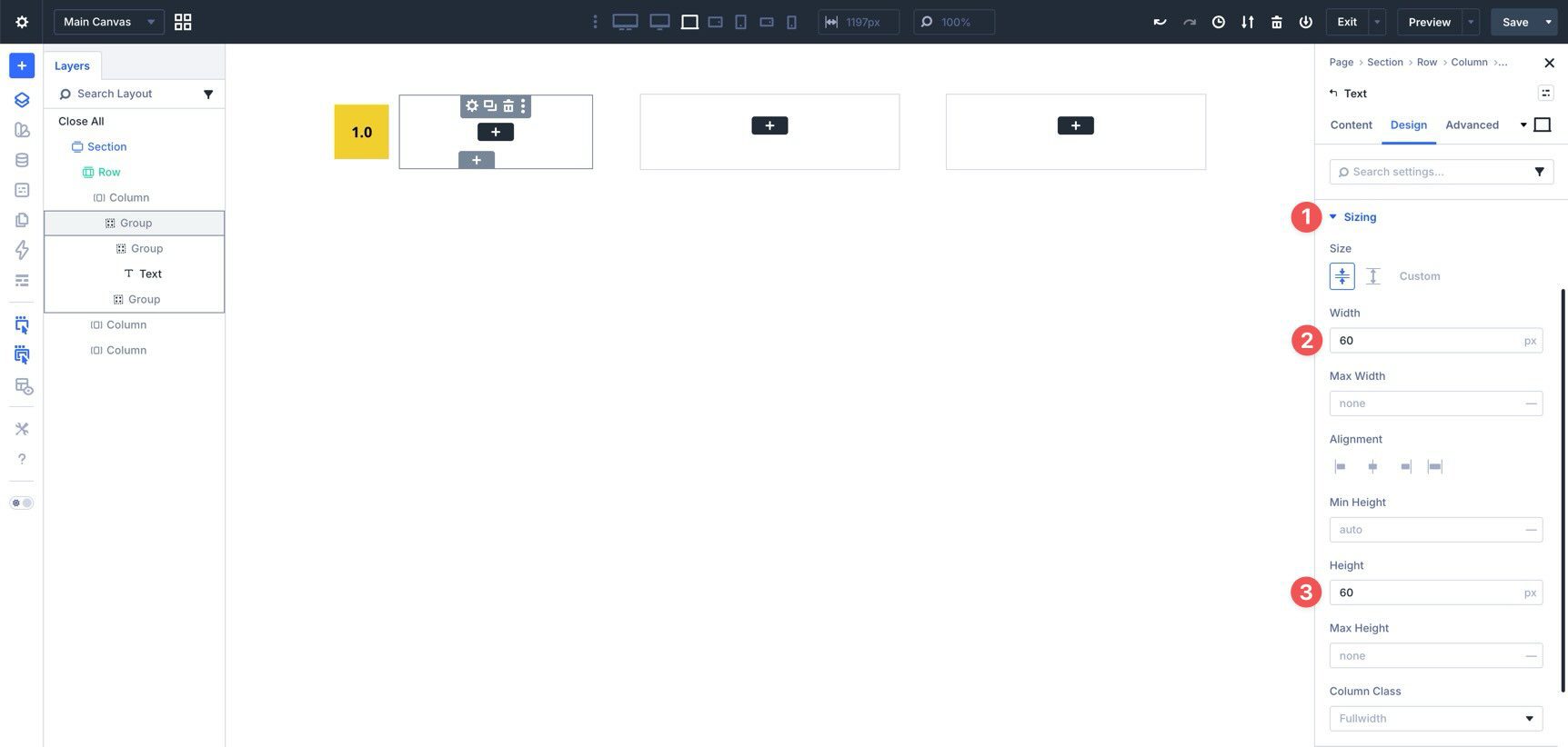
In Sizing, set both Width and Height to 60px.
Use the Responsive Editor to reduce those values at smaller breakpoints if needed.
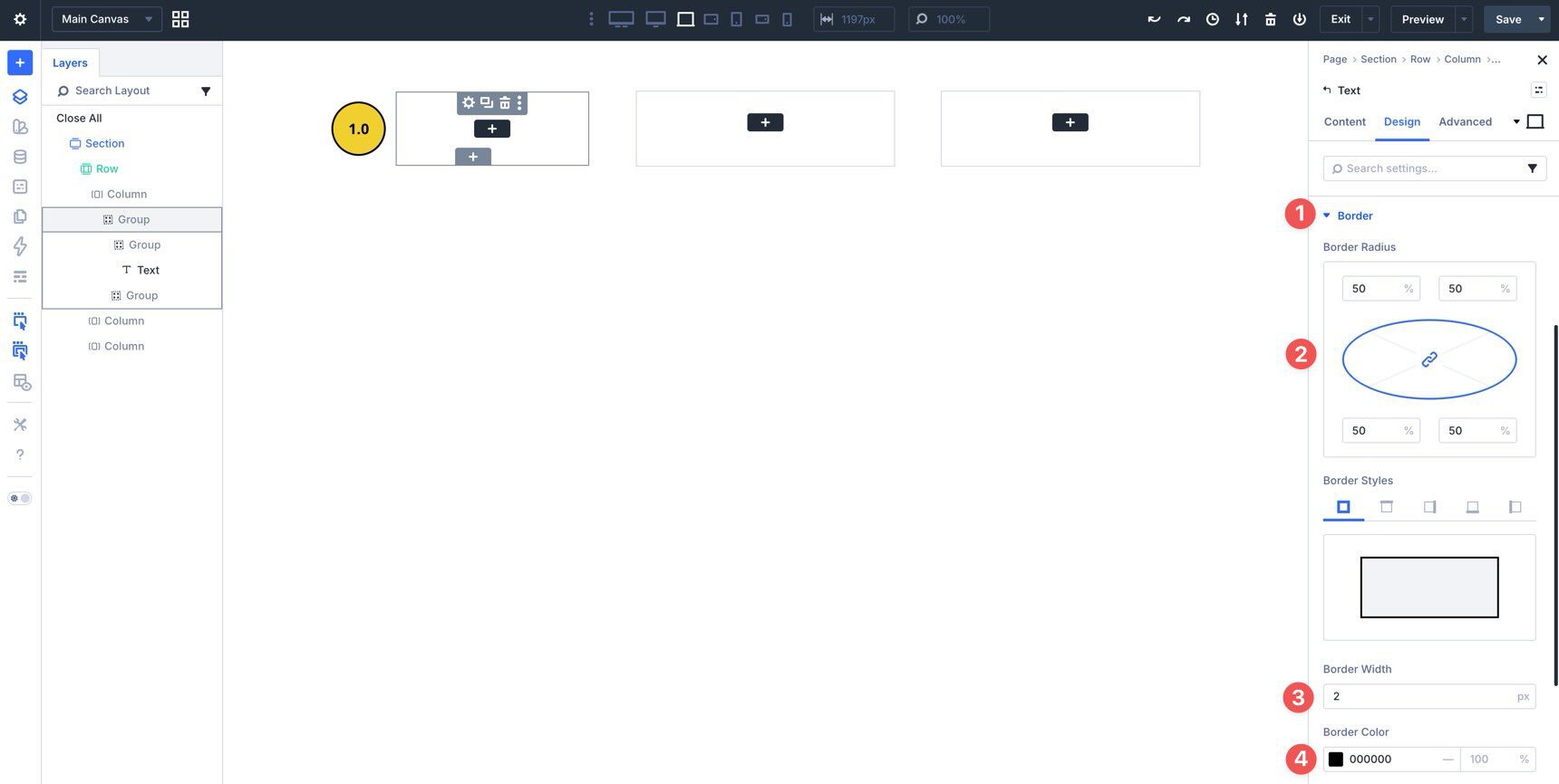
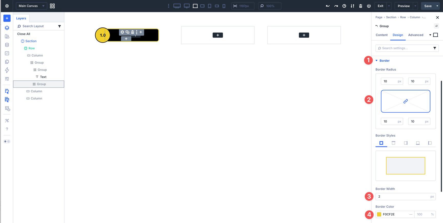
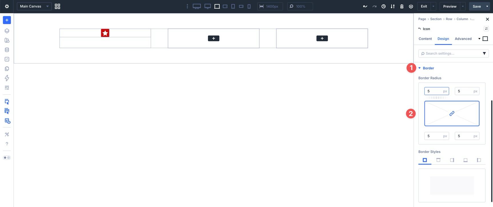
Next, open Border and set the Border Radius to 50%. Add a 2px border and choose a border color.
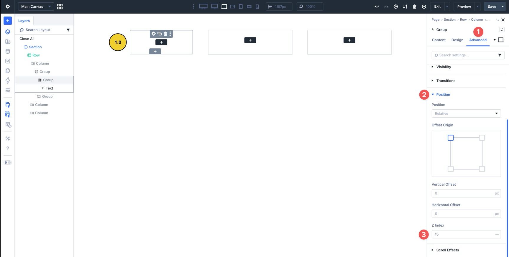
Finally, go to Advanced > Position and set the Z Index to 15. This allows the circle to overlap the Star Group cleanly.
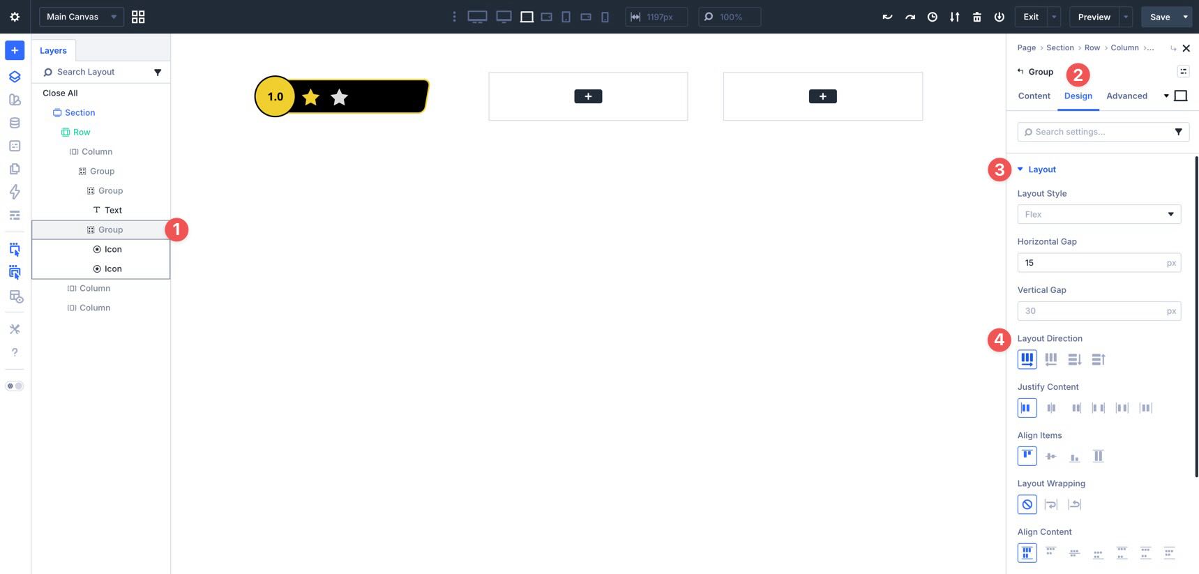
Style The Star Group
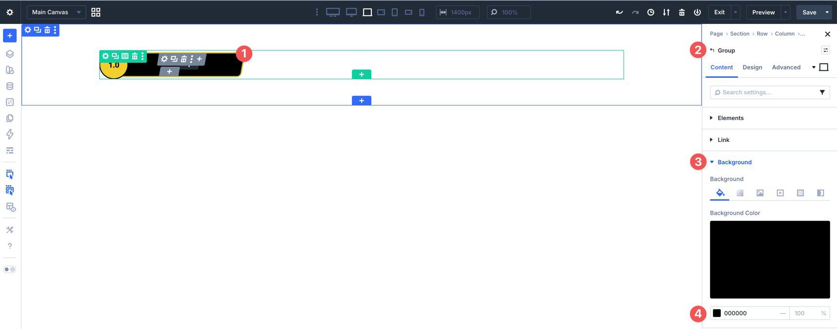
Select the Star Group and assign a background color in the Content tab.
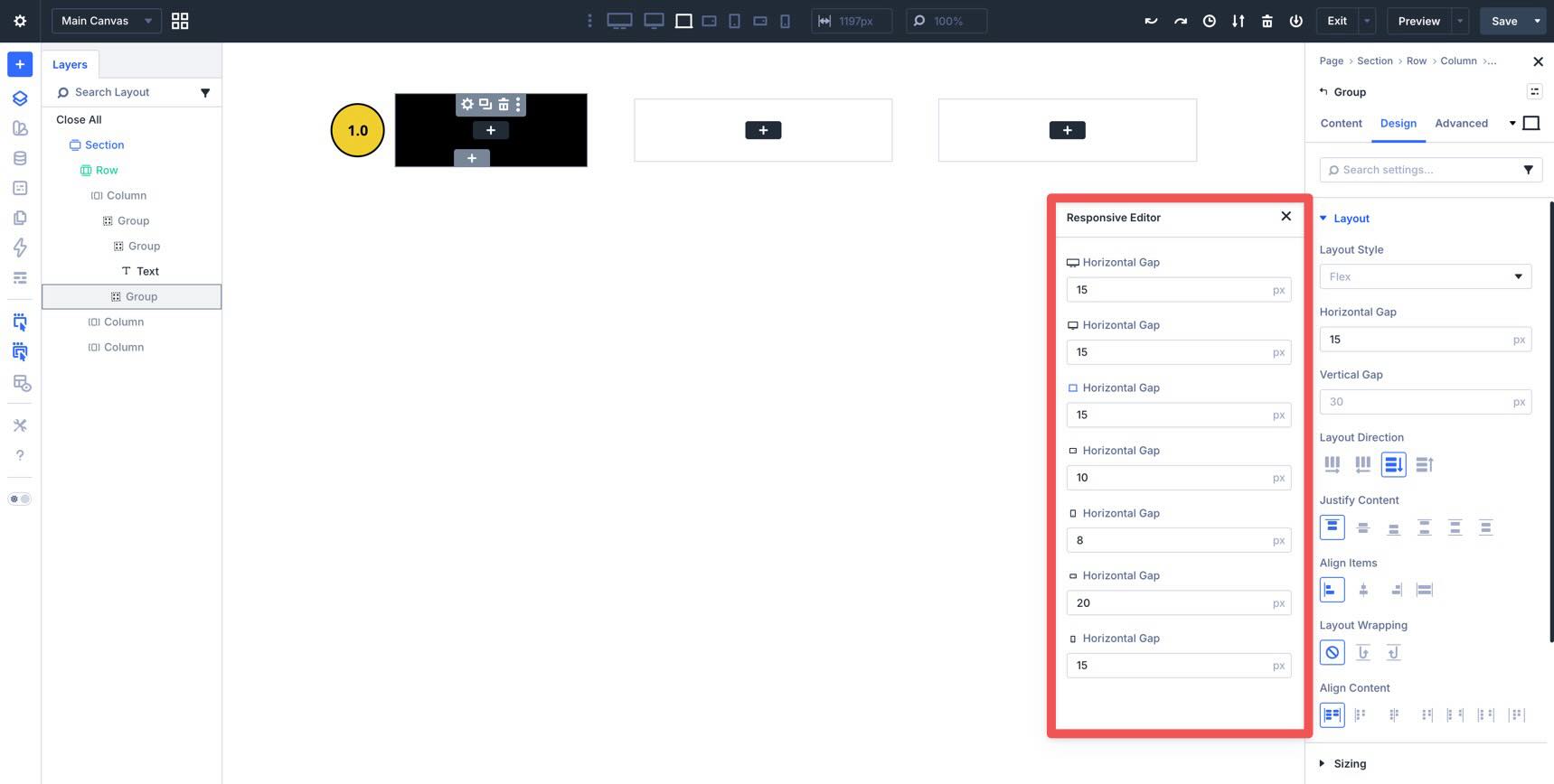
In Design > Layout, set the Horizontal Gap to 15px. Then use the Responsive Editor to adjust it for smaller devices as needed.
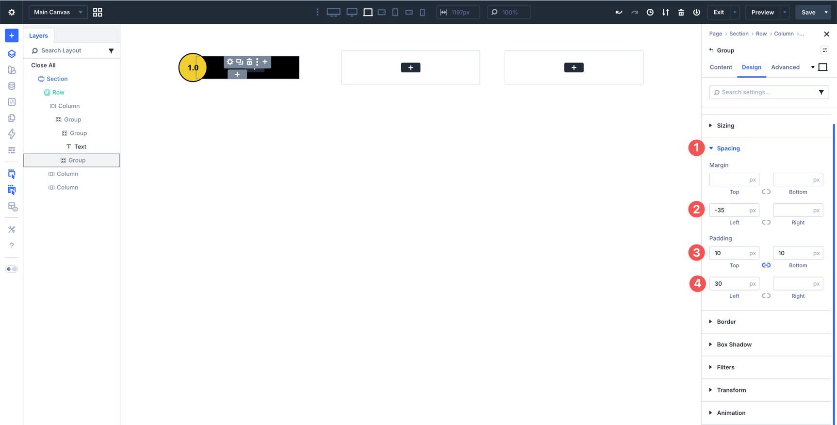
Open Spacing and add a -35px left margin, 10px top and bottom padding, and 30px left padding. Tweak those values by breakpoint if your design needs more room on smaller screens.
Next, open Border, set the Border Radius to 10px, add a 2px border, and choose a border color.
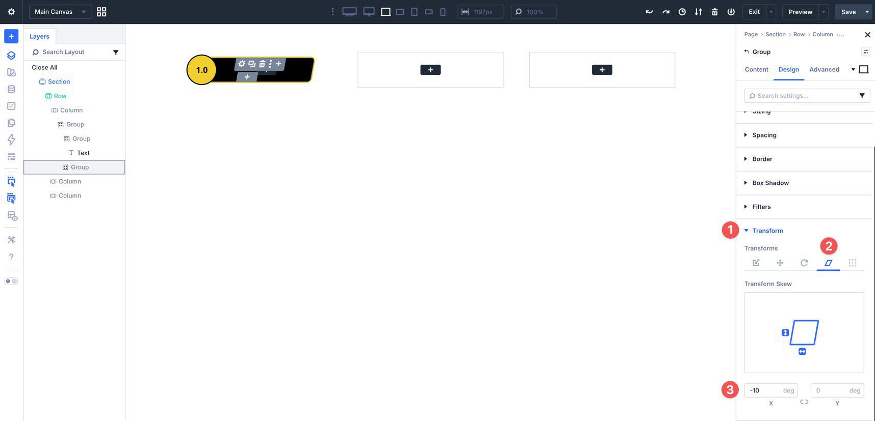
Finally, in Transform > Transform Skew, set the X-axis skew to -10deg.
Add The Star Icons
Now click inside the Star Group and add an Icon module.
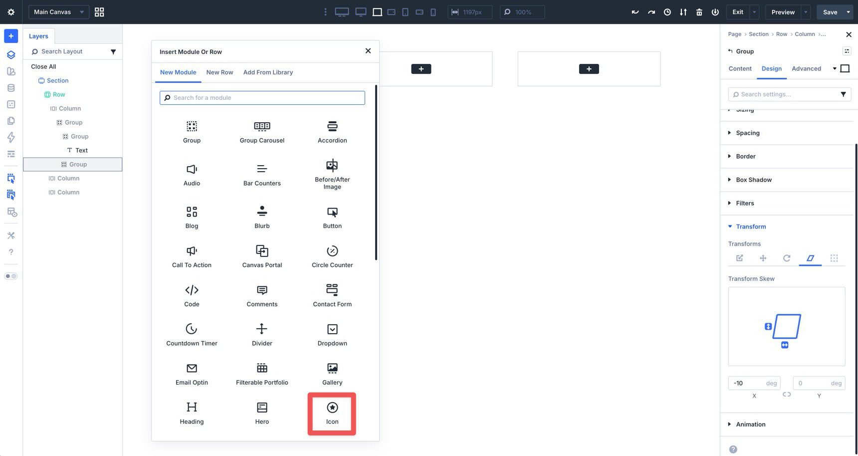
Choose a Star icon in the Content tab.
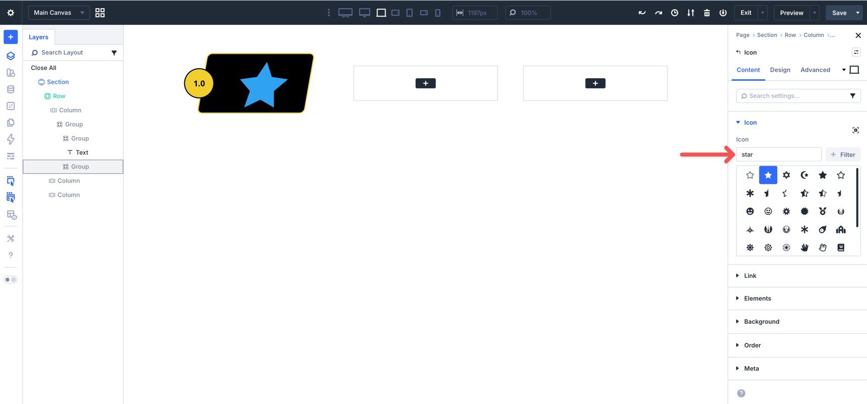
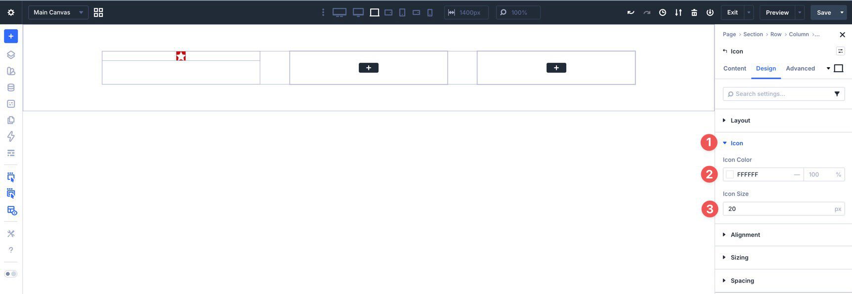
Then go to Design > Icon and set the Icon Color and Icon Size. Use the Responsive Editor to fine-tune the size at different breakpoints.
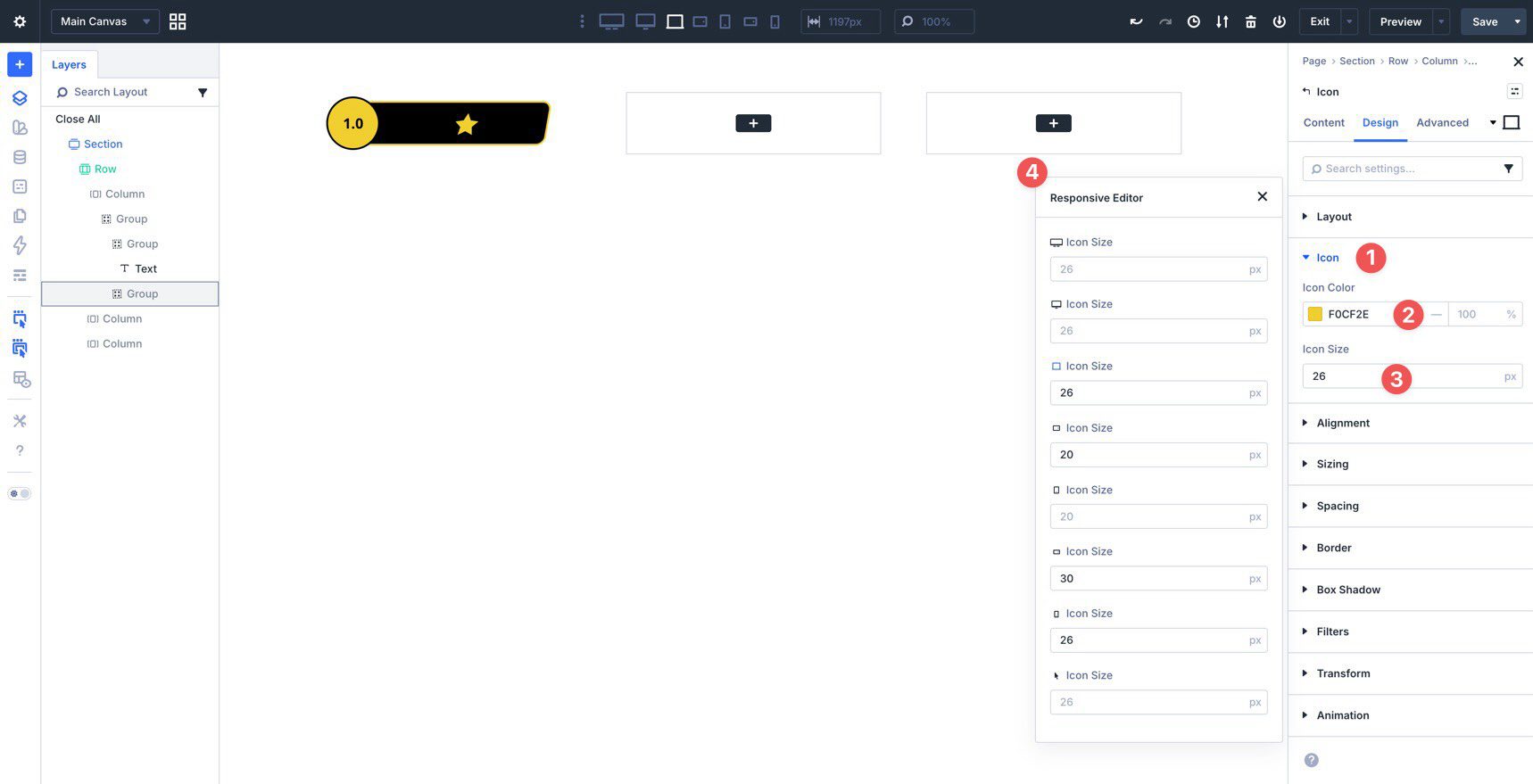
Because the parent Group is skewed, the icon will also inherit that visual distortion. To counter it, open the Icon module’s Transform settings and apply a 10deg skew on the X-axis. This counter-transform keeps the star visually straight while preserving the skewed container shape.
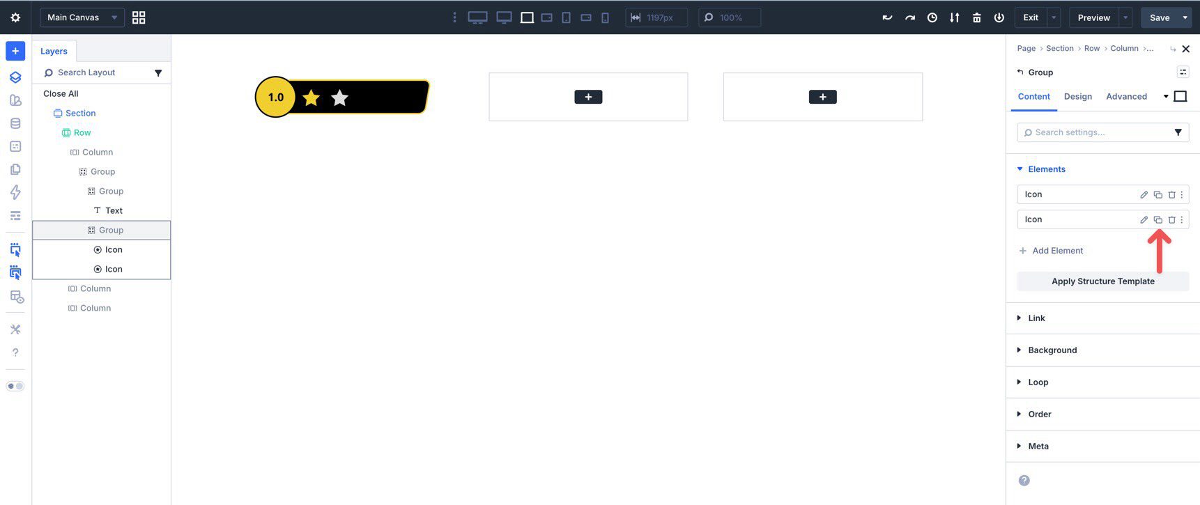
Using Layer View, duplicate the Icon once.
Change the color on the second icon to create contrast.
If the icons stack vertically, select the Star Group, go to Design > Layout, and set Layout Direction to Row.
Then duplicate the second Icon three more times until you have a five-star row.
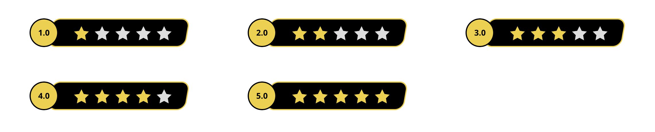
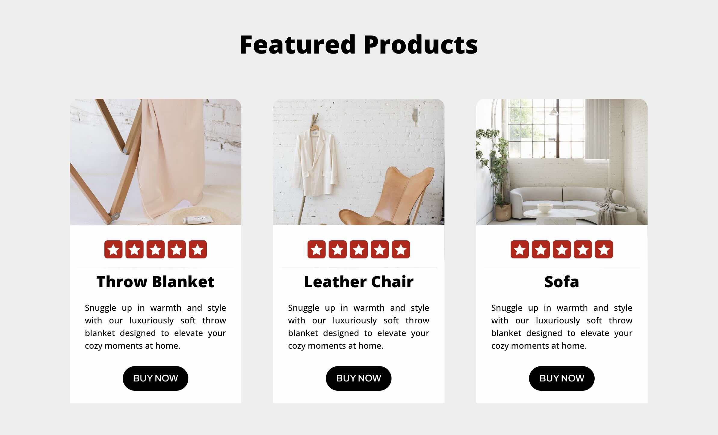
At this point, your star rating module should look like this:
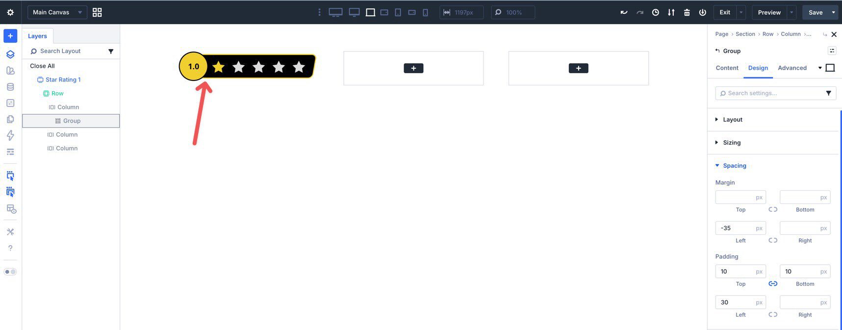
Once the module is complete, give the Group a clear Admin Label such as 1-Star Rating, then save it for reuse in your library.
To create variations, duplicate the saved version, adjust the rating number, swap colors, rename it, and save each version as its own reusable item.
A practical best practice here is to decide early whether you want the component to show only full-star values or support partial ratings visually. If you need half-star or decimal-style ratings, build that variation intentionally from the start so your saved versions stay consistent.
Apply The Module To An Existing Layout
Once saved, you can add the star rating module anywhere on your site by loading it from your saved items when inserting an element.
For example, you can place it in a product section, adjust the width as needed, and use z-index settings to create a layered composition.
Star Rating Module Example 2 (Basic Design)

Using a simpler version of the same approach, you can also create a minimal star rating with a single Group. This style works well for product cards, short reviews, and compact content areas.
Add a new three-column row, place a Group in the first column, and add one star Icon module inside it.
In the Group’s Layout settings, set the Horizontal Gap to 5px, Layout Direction to Row, and both Justify Content and Align Items to Center.
Set a background color on the Icon module, then choose a white icon color and an Icon Size of 20px.
In Spacing, apply 5px padding on all sides.
Then add a 5px border radius to the Icon.
Finally, duplicate the icon until you have a five-star row.
From there, save it for reuse and insert it into other layouts as needed.
A small but helpful improvement for this simpler version is to save multiple color variants up front, such as gold, dark, muted, and brand-colored versions. That gives you more flexibility when dropping the module into different design contexts later.
Download The Files
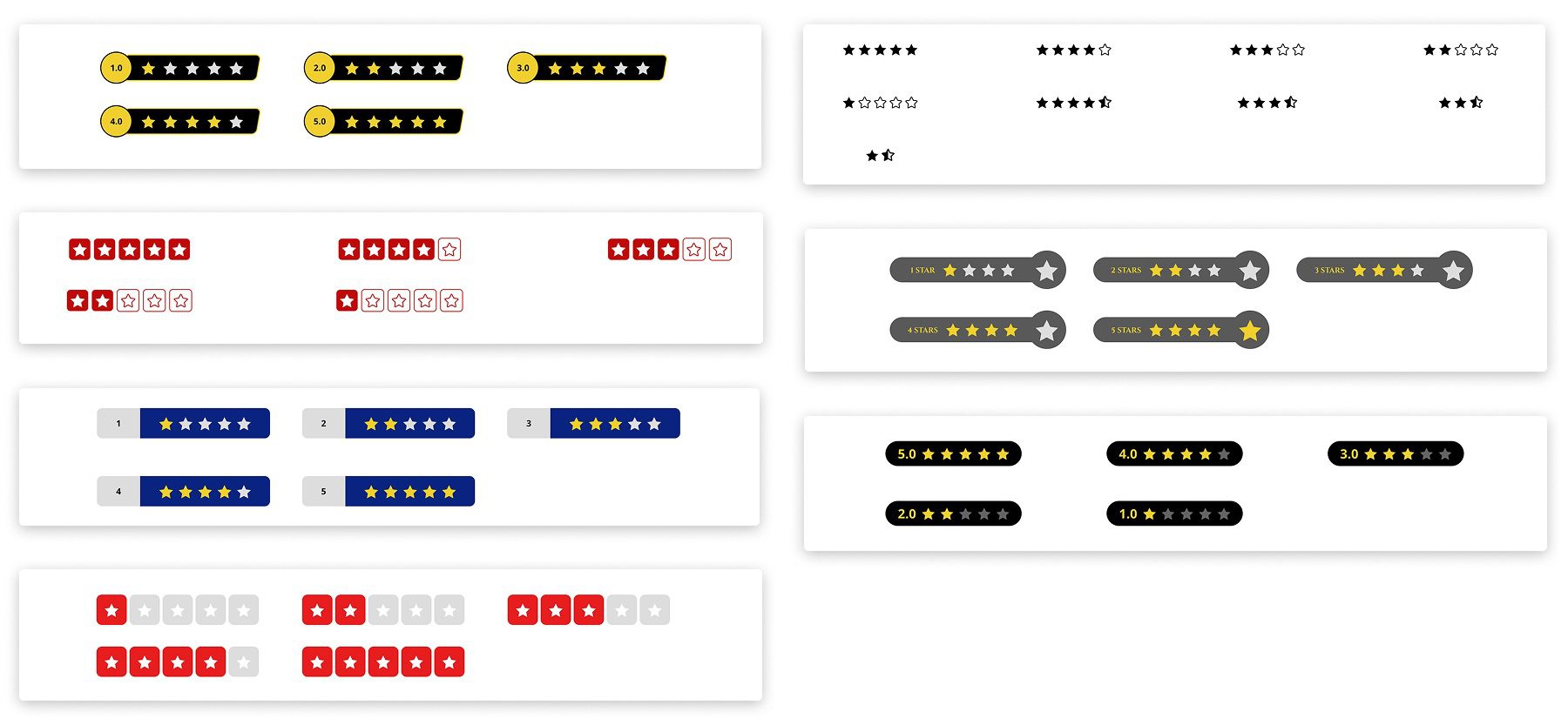
In addition to the two examples above, there are five more variations you can use in your own projects. Download them below, import the JSON files into your library, save them as individual reusable items if needed, and place them throughout your site.

Start Building In Divi 5 Today!
Creating custom star rating modules in Divi 5 is straightforward once you use Groups and Flexbox together. They give you enough structural control to build reusable, responsive components without needing custom CSS, extra plugins, or unnecessary layout layers. From a layered badge-style design to a simple five-star strip, the same workflow scales well across different use cases.
The biggest advantage is reusability. Once you build one version cleanly, you can save it, duplicate it, create variations, and use it anywhere you need rating visuals across your site. That makes star ratings faster to maintain and much easier to keep consistent.


This is a great tutorial on creating the design for a rating layout design.
Now we just need Divi dynamic data to have advanced functionality to implement designs like this as dynamic data that can automatically show the quantity of stars/items based on a dynamic data point.
Great work
Agreed. This ought to be made more dynamic.
When developing tutorials in the future, instead of using terms like “Next, use Layer View to add another Group inside the Main Group.”, maybe use conventional naming of the Layers to minimize confusion.