
You have an awesome podcast. But your website may need some work. It does its job, but it doesn’t stand out. Never fear, podcaster! I’ve got you covered.
I’m going teach you a simple way to use Divi to create not only an easily updated homepage for your podcast, but also a stylish archive page and a template for individual episodes.
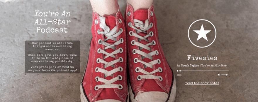
Today’s Final Product: Three-Section Podcast Homepage
I wanted to keep the design simple and as minimal as possible, without losing the personality that a good podcast has to maintain. This design is for a fictional indie podcast called You’re An All-Star, whose focus is shoes and being happy. I wanted the design to reflect that theme.
The first section uses a bright color to draw the user’s attention, provides a quick blurb about what the podcast is about on the left, and uses the Divi Audio Module to present a podcast episode for immediate listening.
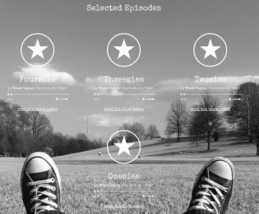
As the user scrolls down, the aesthetic shifts slightly into the Selected Episodes section, which again uses the Divi audio module to present easily accessible content, as well as an option to visit the show’s archives. The background is parallax to draw attention to the episodes themselves.
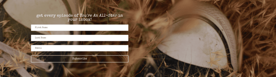
The final section is simply an email opt-in. Every brand, podcast, blog, and company needs one, and in order to make it stand out, I switched this section back to a color background and made it small enough that the parallax from the second section would help call additional attention to it.
Below, I’ll give you a step-by-step tutorial on how I styled and created each module, section, and page of the site.
Assets You’ll Need
The great thing about this design is that it doesn’t take a lot of resources outside of Divi itself. All you’ll need are 5 high-res images to use for backgrounds and whatever podcast art and thumbnails you use for your episodes.
All of my images came from Unsplash (all of the images for this site can be found in this collection). I used Preview to convert some of them to black-and-white, but you can use whatever image editing software you want. Pretty much all of them let you either select a grayscale/black-and-white option or lower saturation to zero.
Other than that, all the resources you’ll need are right inside of Divi. Let’s get to it, then!
Podcast Website Homepage: First Section
Start out by creating a new page in your WordPress dashboard and setting it as your site’s front page. (I conveniently named mine “Home.)
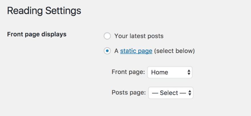
Now go back to edit your new page. Inside the Page Attributes box on the right sidebar, change the default template to the blank page template.
![]()
First thing, we create a three-column row.
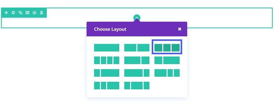
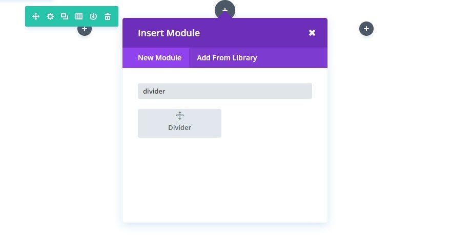
Inside the middle column, we want to insert a Divi divider module.
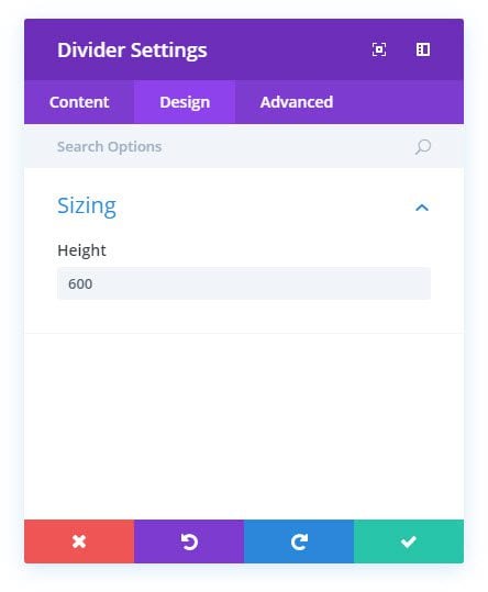
Inside the divider settings, under the Design tab, set the height to 600. This will not only keep the two outer columns (the section’s main content) separated, but will also keep the section tall enough to allow adequate white space on a number of viewport resolutions. (While remaining hidden on mobile by default.)
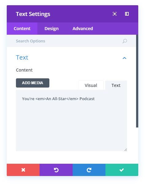
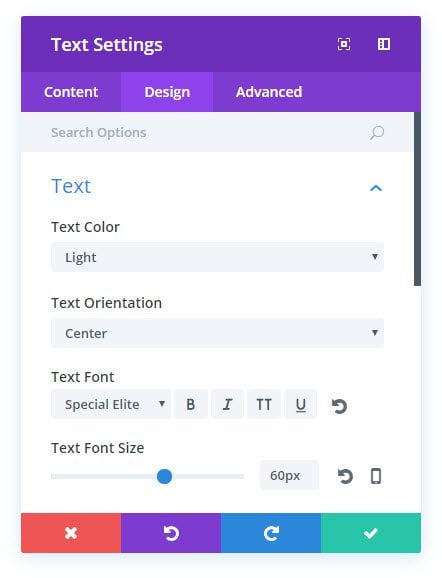
Now, in the left column, we are going to add two text modules. I decided that for this project, a horizontal header would have looked out of place, so the first text module will simply be a title.
Under the content tab of the Text Settings, add the title to the content box.
In the Design tab, update the Text Color to “Light” and change the Text Orientation to “Center”. Then adjust the text font and size. I chose the font “Special Elite” because of its distressed look and then set its size to 60. Also set the Text Line Height to 1em.
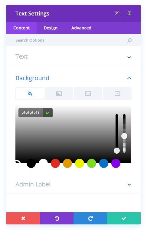
Once that’s taken care of, it’s time to move to the second text box. We’re using this one as a quick blurb for the podcast.
In the Content tab, Update the following options:
Content: enter your text for the description (I’d suggest a truncated version of the description you use on iTunes and other services)
Background Color: rgba(0,0,0,0.4)
In the Design tab, select “Light” for the text color and select “Center” for text orientation like you did in the previous box. Also set the text font to “Special Elite” at 20px size.
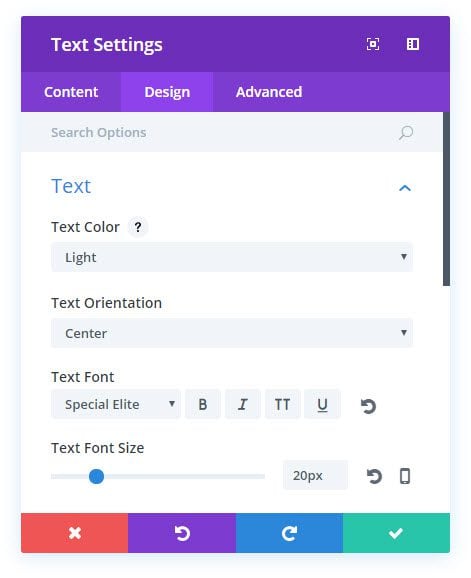
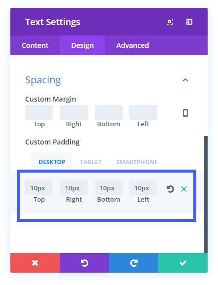
Finally, add 10px of padding around the entire box of text.
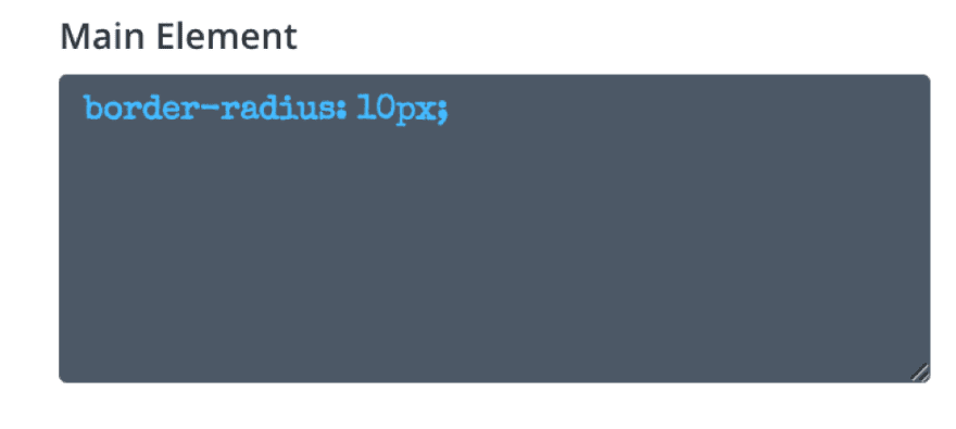
After that, head to the Advanced tab and, under Custom CSS, enter this into the Main Element field to round the corners of the text box:
border-radius: 10px;
Once you’ve done that, you’re done with the first two columns of your new site! Hooray! Save your work by clicking the purple circle at the bottom of the page and hitting the green save button.

Excellent work!
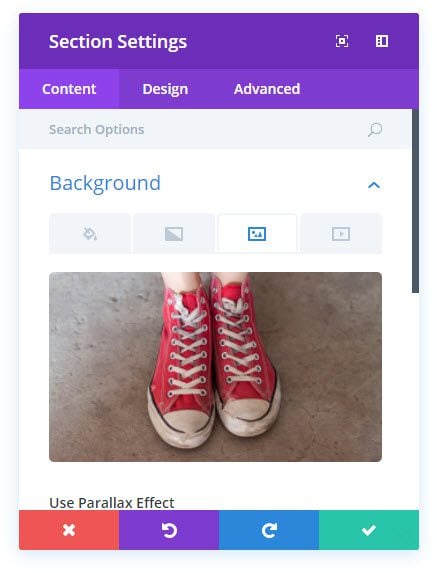
To make it a little more visually appealing, though, we need to set the section’s background, so go into settings of the blue (section) box and upload a background image. I tend to keep mine around 1920×1280 resolution.
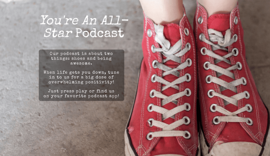
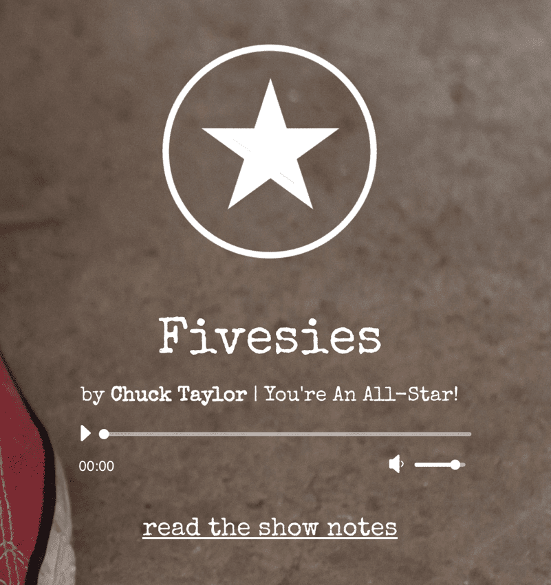
You should see something that looks like this by now:
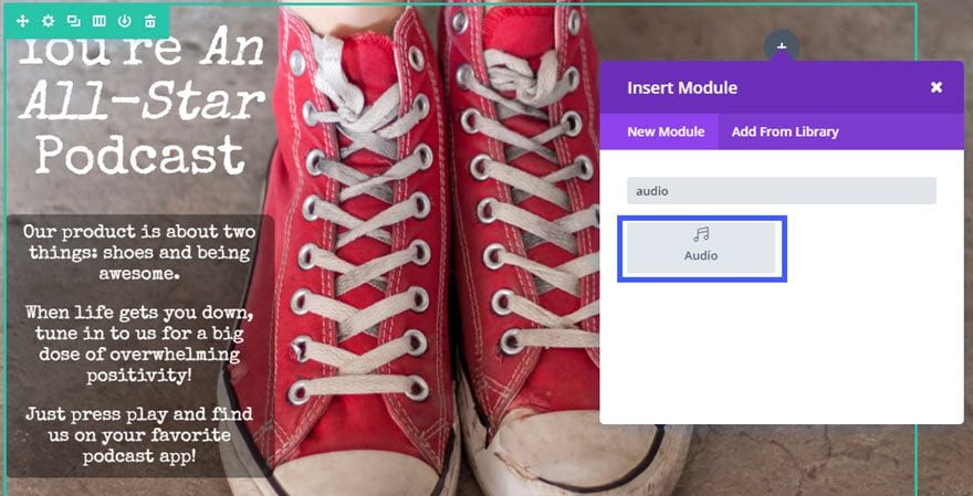
By now, you may be asking yourself: “What about the podcasts? It’s a podcast site, and we haven’t done anything with a podcast yet!” You are totally right. So let’s get some audio going by selecting the (you guessed it) audio module in the third column of our row.
The default audio module doesn’t exactly fit the theme we’re going with for this site, so let’s take it from this: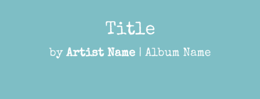
To this: 
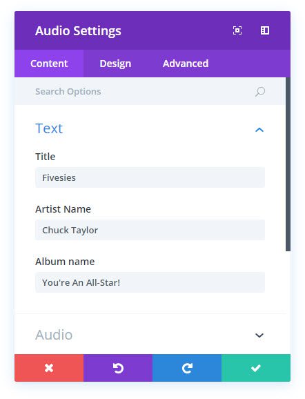
Open up the audio module’s settings. The Audio field is where you can either upload your own file to whatever host you use, or you can directly link to the media file of whatever podcasting service you use. I use Libsyn for mine, so I just grabbed the media URL and pasted it in.
(Fun fact: anyone who clicks play on your site through this module also gets counted as a download in your Libsyn dashboard. Score!)
Then you’ll want to put the title of the episode you linked to under Title and your name under Artist Name (or whatever you go by on your show. For our fictional podcast about shoes, how could I choose anything other than Chuck Taylor?). The Album Title will be your podcast’s name.
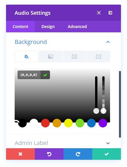
Next let’s change that greenish-teal color to a totally transparent background. The color doesn’t matter. Just slide the transparency bar all the way to the bottom, or until the last digit of the RGBA is 0.
For the cover art image, it’s best to use either this particular episode’s thumbnail or the podcast art you use on iTunes and elsewhere.
Once the podcast details are sorted, head into the Design tab so you can really make this player yours.
Select “Light” for the Text Color option. Set the fonts to “Special Elite,” the title size to 50px, and the caption size to 20px.
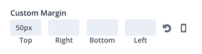
I also set the top margin on this particular player to 50px because this margin keeps the player centered horizontally in the section, and when you swap to mobile, it allows for good spacing between elements. (The setting applies to all viewport sizes, as long as you don’t click the smartphone icon.)
Because the background is transparent, there’s no need to round the corners to match the text box in the first column, so hit save.
Because this podcast player is the star of the show, we don’t want to have to recreate it each time, so we’re going to save this module to the Divi library, which will allow us to easily duplicate it around the site and edit as we need to.
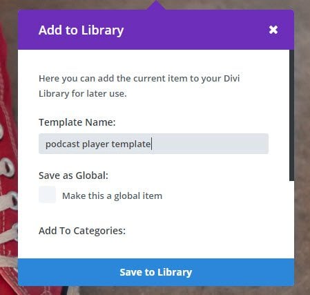
Enter whatever template name you want and DO NOT check “Make this a global item.” We’ll be using that option in Part 2 of this series, but not right now.

All right! Just one more element and the first section is complete. (Don’t worry, though. It’s the most involved of them all.)
Most podcasts keep a blog or show notes for listeners to go back to and revisit what was discussed in the episode. Your podcast is no different, I’m sure. Adding a link to your podcast’s shownotes is totally painless.
Create a new text block in the third column, open up the settings, and type whatever link text you want. For this example, it’s the self-explanatory “read the show notes.”
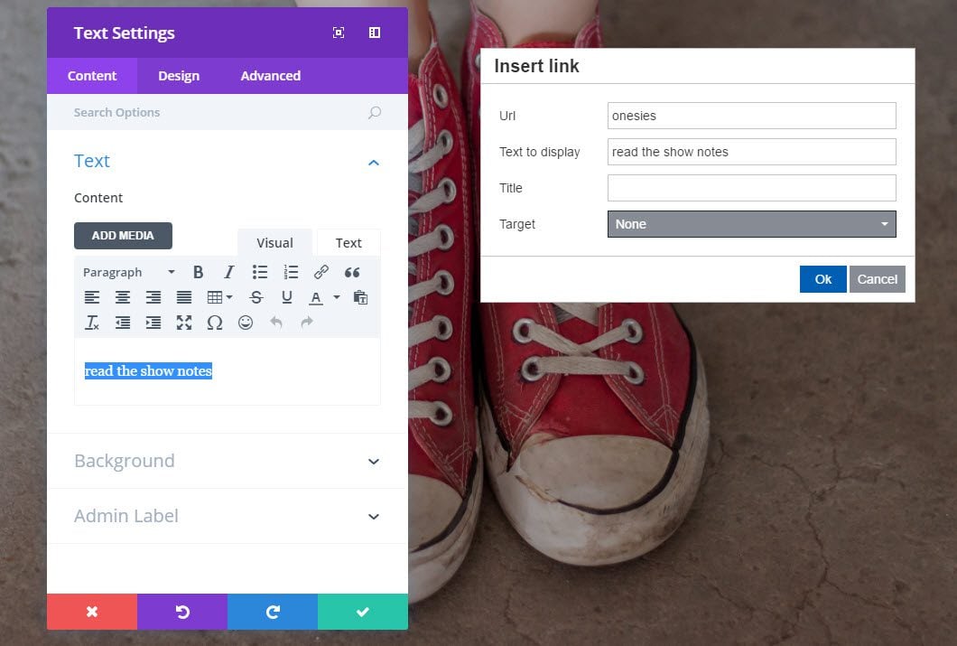
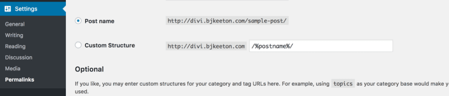
Click the icon in the toolbar to add a link, and type/paste in the URL for your show notes. (Again, in Part 2, I’ll show you how to create and style blog posts for show notes.) Because I have the WordPress permalink structure set to “Post Name,” all I have to do is type in the slug of the post I wrote for this episode.
(Side note: By not entering the domain information and only the slug, you are telling WordPress to direct users to that page, regardless of domain information. This is really useful in case you ever change domains, and it helps prevent broken links!)
Just save that link, and you’re ready to go!
You should also save this module to your library in the same way you did your podcast player.
Voila! Your very own…wait. Uh oh. Your show notes link is…is…ugly!
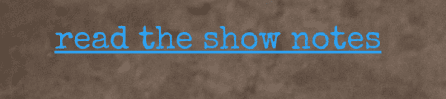
No worries, though. Ugly links are an easy fix! Even if you use the settings in the text module to change the text color, it won’t affect these words because they’re a link.
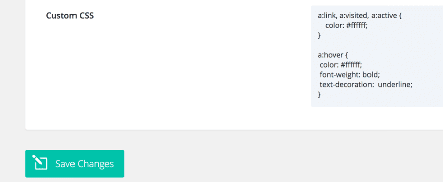
Head to the Custom CSS field in your Divi –> Theme Options and enter this at the bottom.
a:link, a:visited, a:active {
    color: #ffffff;
}

a:hover {
 color: #ffffff;
 font-weight: bold;
 text-decoration: underline;
}
What this will do is keep the text white (in line with the rest of the site’s text, make sure it’s underlined like most other links, and turn it bold when you hover over it with a mouse.)
Make sure you save it, and now your podcast player is complete!
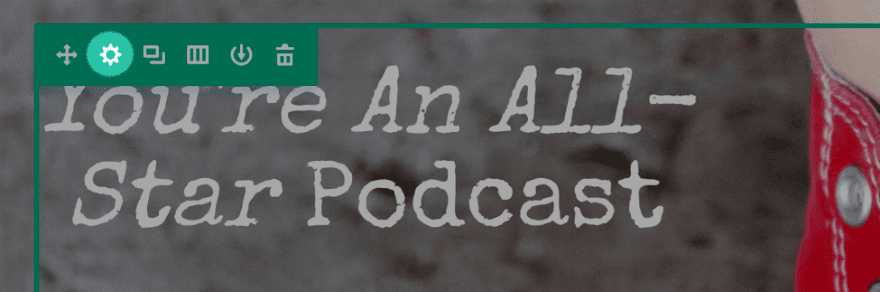
And for the last bit of tweaking in this first section, click into the Row settings (green box).
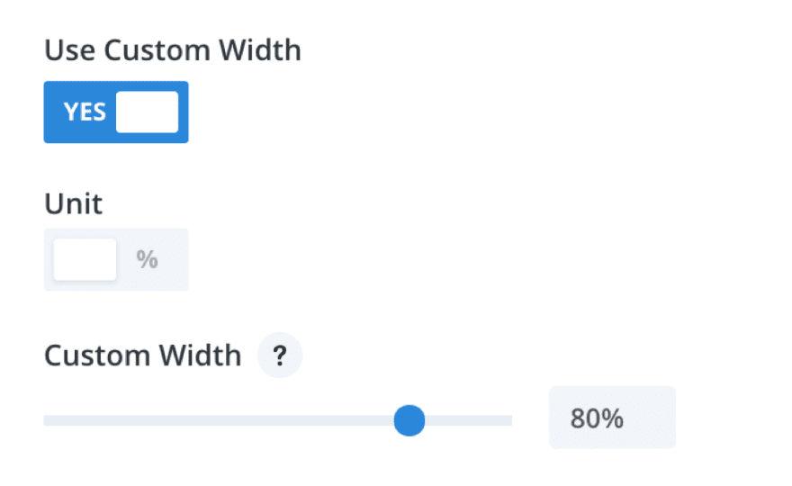
Select “Use Custom Width.” Make sure the units are set to percentages and move the slider over to 80. Doing this will make that row take up 80% of whatever size viewport the user has, which keeps everything from bunching up.
And so is the top section of your podcast’s new website! It should look something like this by now.

Save it, and just like that, most of the work is done! And thanks to Divi’s library feature, the next couple of sections are gonna fly by! Just watch.
Podcast Website Homepage: Second Section
This section is going to showcase selected episodes of our podcast and allow users to visit the archives (which are, like the show notes pages, coming in Part 2).
The first thing we’re going to do is actually create a new section by clicking on the blue + at the bottom of the section and adding a regular section. Doing so will create another blue box in the visual builder. Add in a single-column row.
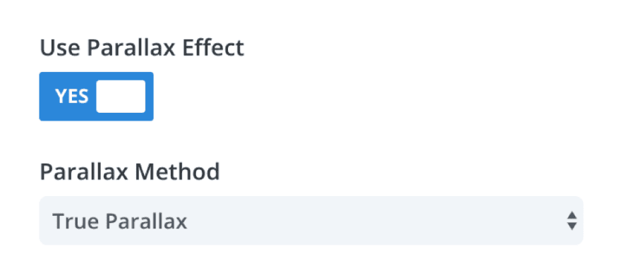
When we have that in place, let’s add a background the same way we did above, only this time, we want to select the “Use Parallax Option” in the section settings. Keep the dropdown on “True Parallax” instead of “CSS.”
This is the only section we’ll use with parallax on the homepage. I think that using the effect sparingly calls more attention to the content you want to highlight.
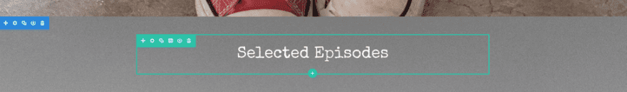
Save and then insert a new text box into the row. Type in “Selected Episodes,” center it in the WYSIWYG editor, and head to the settings to make the text font to “Special Elite” and the text size 50px. You should see something like this now:
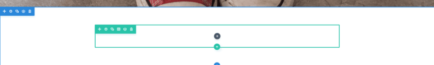
Below that, make a new three-column row by clicking the green +, and in the first column, enter the “Add From Library Tab.” (You won’t have all these library options right now, but you will later!)
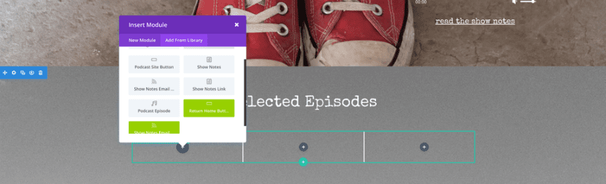
Select the “Podcast Episode” or whatever you named your player above. Then add another module under it, navigate to the library again, and add your saved “Show Notes Link” module. Do this for all three columns, until you see this:
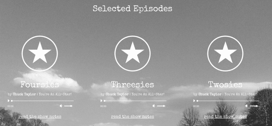
Continue doing this until you’ve added all the episodes you want. Edit the title, album art, and show notes links for each episode. I just added a second row and only filled in the second column to make the design fit with my chosen background.

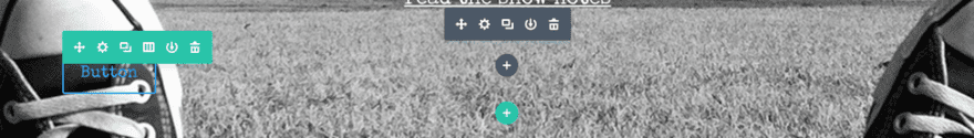
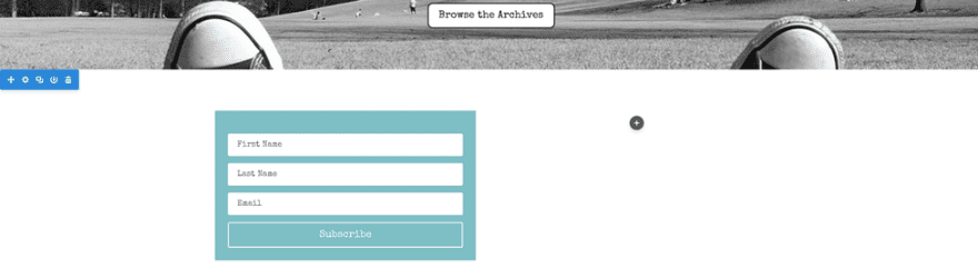
The only thing left for this section is adding a “Browse the Archives” button. Create a new row at the very bottom by clicking the green + and use a single column layout. Insert a “Button” module. This will create a very hard-to-read button (depending on your background, of course), which will need some simple styling.
Open the Button module’s settings and enter the URL slug for the page that will be your archives. I went with the obvious “/archives,” used the text “Browse the Archives,” and then centered the button itself.
In the settings tab, we click the “Use Custom Styles for Button,” and will set the background color to “#ffffff” and the text color to “#000000” (that’s white and black, respectively.)
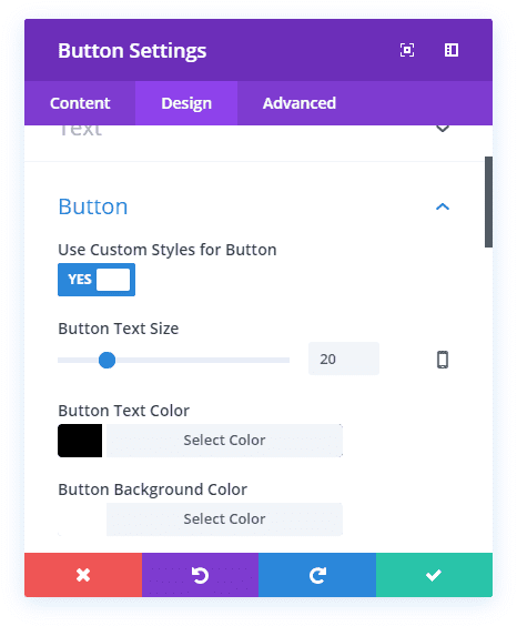
Then we’ll want to round the corners of the button by setting the Border Radius to 10px, set the font to “Special Elite,” and change the Add Button Icon from “Default” to “No.”
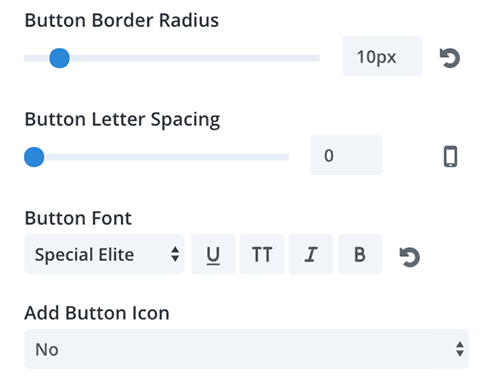
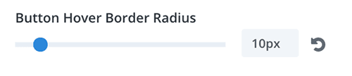
FInally, change the Button Hover Border Radius to 10px so it’s rounded when the button has a mouse over it.
I saved this to my library so that I could use the styling in other buttons as I go along.
And with that, your second section is done. You’re almost done, podcaster! You’re rounding third–literally!
Podcast Website Homepage: Third Section
This is just going to be a single module over a static background.
First, create a new blue box with a double-width column like we did for section two and select the “Email Optin” module from the menu.
You’ll see this lit, which does not fit our design at all. It’s a super easy fix, though.
Navigate into the module’s settings and update the following options:
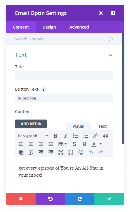
Title: I left the title intentionally blank
Content: add your Call to Action blurb and center it.
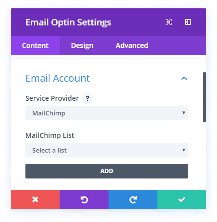
Service Provider: I use Mailchimp, so that’s what I went with here.
Background Color: transparent; this also makes the button itself transparent.
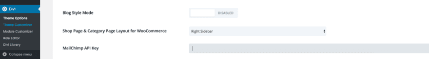
The only thing you have left to do is make sure your email service is provided, or the form won’t show up after you save and exit the builder. If you use Mailchimp, there’s great documentation on finding your API key in their support documentation.
Once you have your key, go to your WordPress dashboard, head over to Divi –> Theme Options once again, and enter your Mailchimp API key in the aptly named “Mailchimp API key” field.
After that is saved, the only step you have left before you have a beautiful, finished page is to set a background for the third section. The final product should look something like this:

You did it! Hooray! You now have a fully functional homepage for your podcast. Time to hit record and tell the world about it, right?
Tomorrow: Creating Beautiful Archives and Show Notes Pages for your Podcast
Since you have a great home page now, you can showcase the most awesome content you’ve got. But if your fans become true fanatics, they’re going to want to dive deep into your show.
Tomorrow I’ll show you how to put together some simple-yet-beautiful pages for your entire archive of podcast episodes, as well as individual pages for each episode that tell readers what you discuss in each episode and give them a chance to sign up for your super-amazing email list.
See you tomorrow!
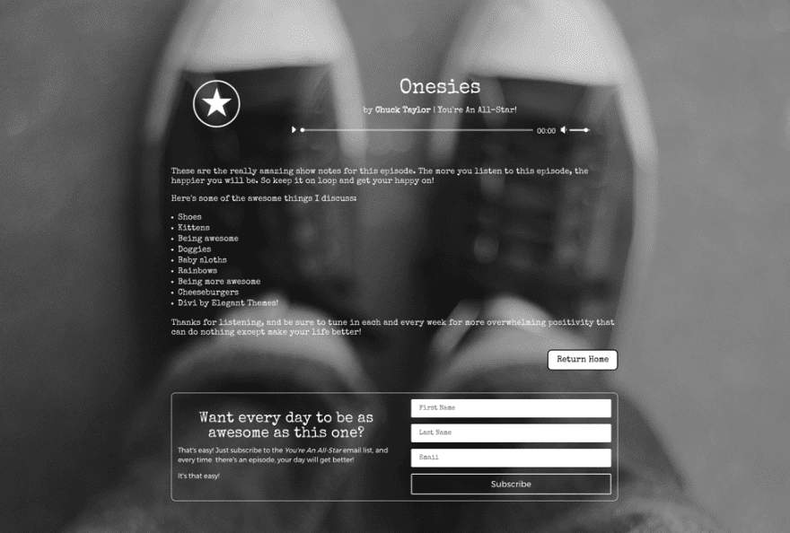
Show note page:
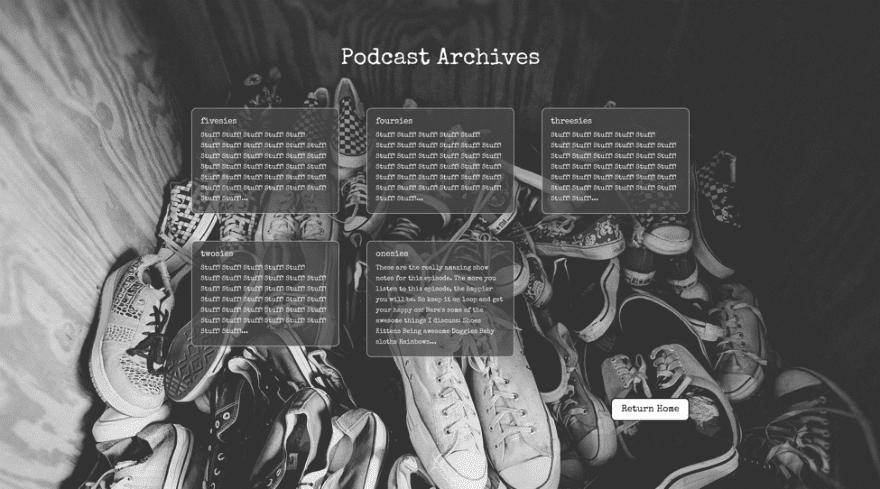
Archives page:


Knocked this out during my lunch break today. Your instructions were very easy to follow. Thanks!
Very cool, thanks for the article!
Did my first podcast website using Divi for a client and we’re happy with the results.
Might consider using a CPT in the future, but curious what plugins podcast creators are using to maximize their user experience and get the most conversions (subscribers, downloads, follows, likes, etc).
That’s a really good point about the CPT. With a single-purpose site, I haven’t used one for it, but it would be incredibly useful–especially if it’s coming through something like BlueBrry’s Powerpress. Combined with Apple’s recent WWDC announcement regarding podcast analytics, there is a lot of room for growth in that limited field because the options available are kind of stinky.
I’d love to see the podcast site you set up, too!
Sorry to be a dufus but, whats CPT?
It’s a Custom Post Type. 🙂
Please please please add playback speed control option to your audio module. That’s super great for podcasts… In the mean time are there any plugins out there that do this. I know Pat Flynn has one but I think it’s a monthly subscription.
Hi,
ok thats a fine looking Audiopage. But no Podcast Page.
Where can i download the Episodes?
What happens, if a new Episodes goes online?
What did you think about creating an How to for an real Podcast page? Something using Podlove? Or an external Podcast Service?
The Pages are build with Extra or Divi 😉
Tomorrow’s article has the individual episode pages and archives. ?
And right now, the episode up top has to manually be added to the home page, but you can have a new episode launch automatically with something like Libsyn’s OnPublush and then go in to add the styling as needed to tweak on the ep pages.
Thank you Nathan. So appreciate all you do to support the Divi community.
Ironic given you still haven’t fixed your iTunes Divi Nation problem…
My podcast page is part of my website but love this look, and can’t wait what for tomorrow’s lesson.
I am, too! I really like the Archives and Show Notes pages. They’re simple but stylish, if I do say so myself. ?
thank you 🙂 it would be great if you could share the template for those who are not webdesigners like me 😉