Building a hero section is an excellent way to call attention to important content on your page. It’s a super-sized piece of content that you can use to tell your story, share information about your work, or highlight a product or service. With Divi’s Fullwidth Header module, you can add a title, a subtitle, two buttons, body text, a logo image and a header image. Of course, you can also utilize the background options to add and combine images, gradients, colors, patterns, and masks. You can edit all of these settings within the one fullwidth header module’s settings instead of having to toggle between multiple image, text, and button modules.
In this tutorial, we will show you how to build an engaging and eye-catching hero section using Divi’s fullwidth header module.
Let’s get started!
Sneak Peek
Here is a preview of what we will design.
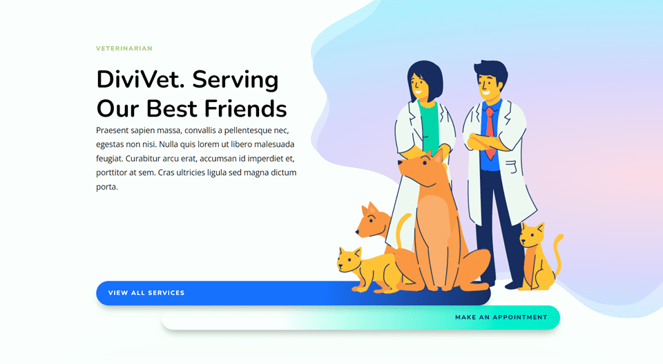
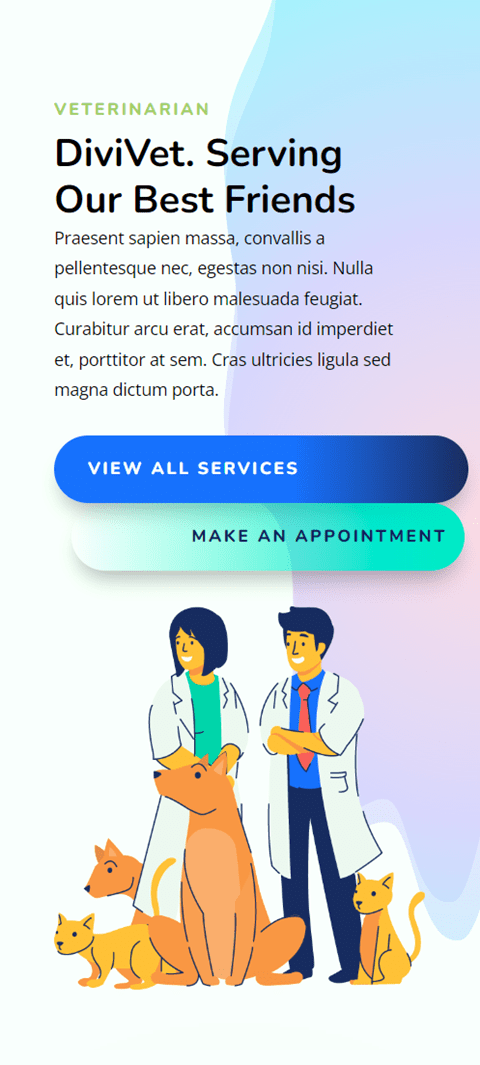
What You Need to Get Started
Before we begin, and make sure you have the latest version of Divi on your website.
Now, you are ready to start!
How to Build a Hero Section with Divi’s Fullwidth Header Module
Create a New Page with a Premade Layout
Let’s start by using a premade layout from the Divi library. For this design, we will use the Veterinarian Landing Page from the Veterinarian Layout Pack.
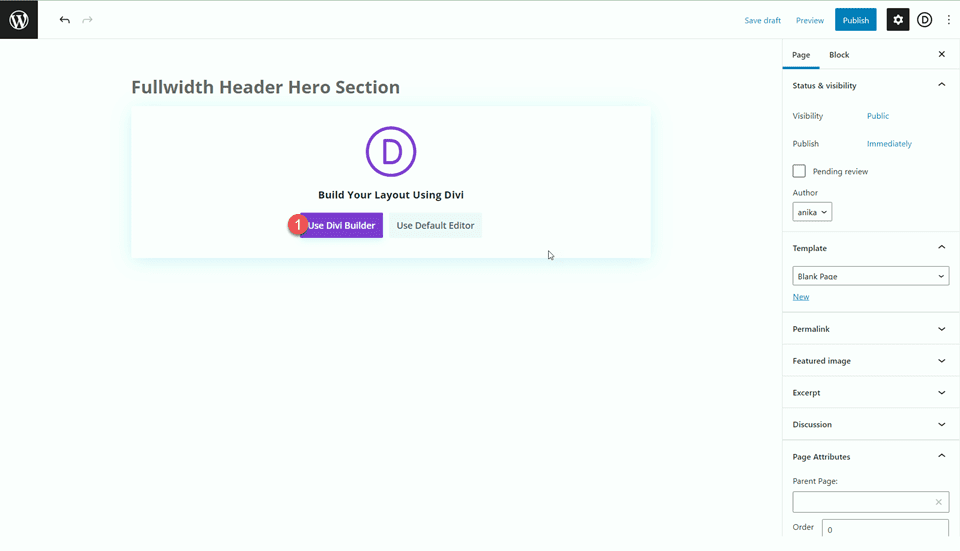
Add a new page to your website and give it a title, then select the option to Use Divi Builder.
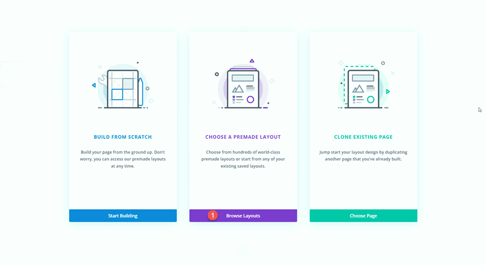
We will use a premade layout from the Divi library for this example, so select Browse Layouts.
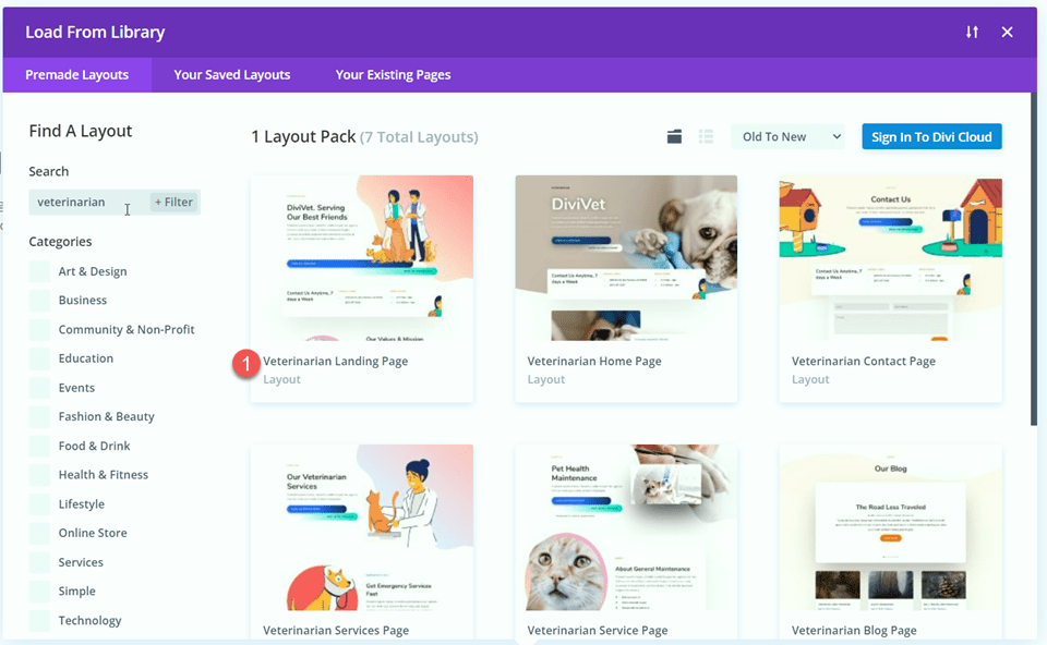
Search for and select the Veterinarian Landing Page layout.
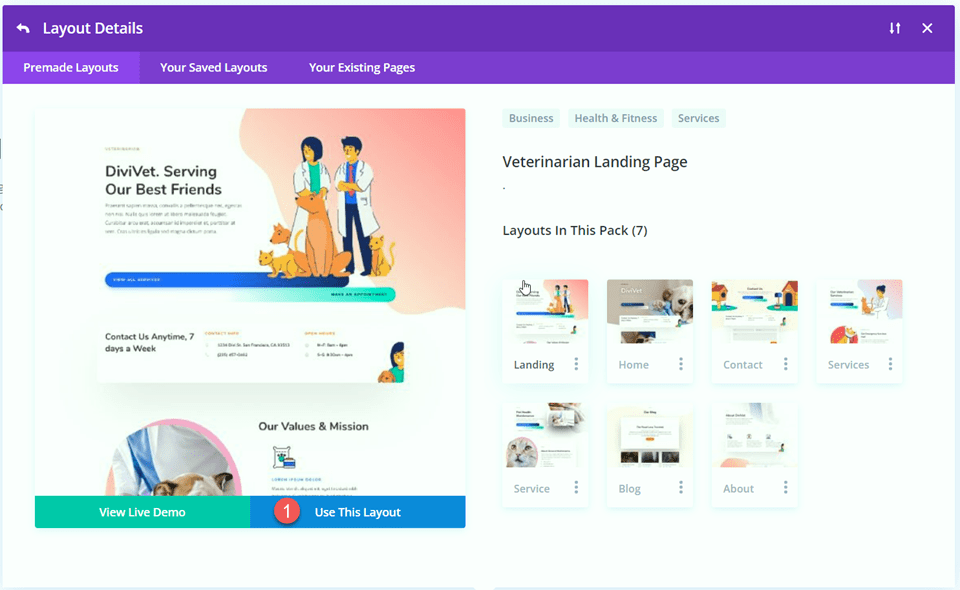
Select Use This Layout to add the layout to your page.
Now we are ready to build our design.
Add the Fullwidth Header Module
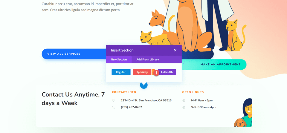
We are going to be recreating the hero section using the fullwidth header module. Add a new fullwidth section to the page, below the existing header.
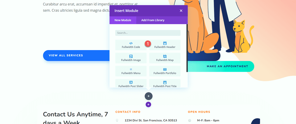
Add a fullwidth header module to the section.
Then, delete the original header section.

Customize the Fullwidth Header Module
Add Content
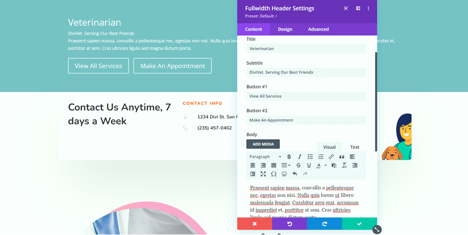
Open the fullwidth header module settings and add the following content to the module:
- Title: Veterinarian
- Subtitle: DiviVet. Serving Our Best Friends
- Button #1: View All Services
- Button #2: Make An Appointment
- Body: Praesent sapien massa, convallis a pellentesque nec, egestas non nisi. Nulla quis lorem ut libero malesuada feugiat. Curabitur arcu erat, accumsan id imperdiet et, porttitor at sem. Cras ultricies ligula sed magna dictum porta.
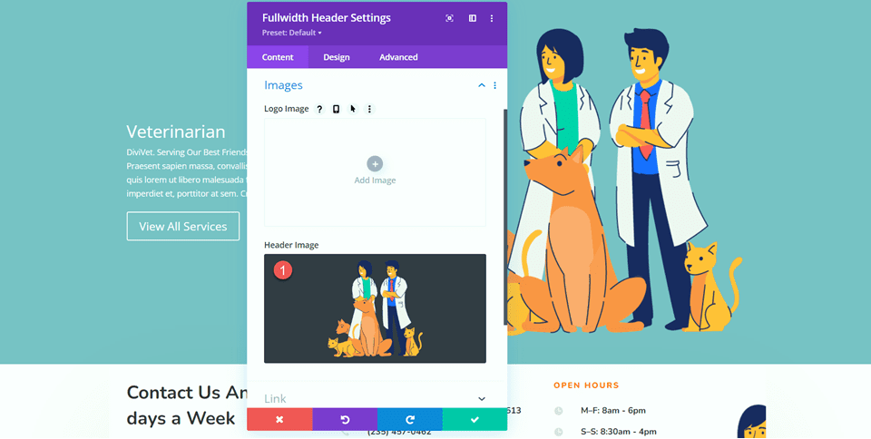
Next, add the Header Image of the veterinarians with the animals.
Gradient Background Settings
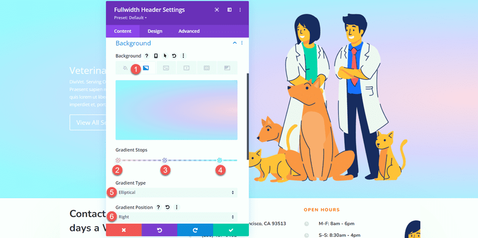
Move to the background settings. Delete the original background color, then add a background gradient.
- 0%: rgba(255,170,205,0.48)
- 40%: rgba(110,66,255,0.24)
- 87%: rgba(124,239,255,0.71)
- Gradient Type: Elliptical
- Gradient Position: Right
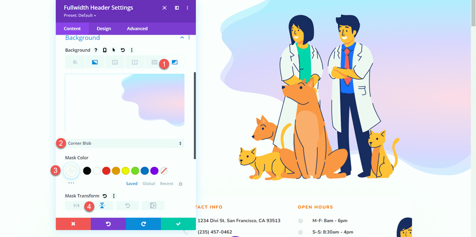
Next, select the Background Mask tab and add a background mask to the background.
- Background Mask: Corner Blob
- Mask Color: #FFFFFF
- Mask Transform: Vertical
Customize Text Styles
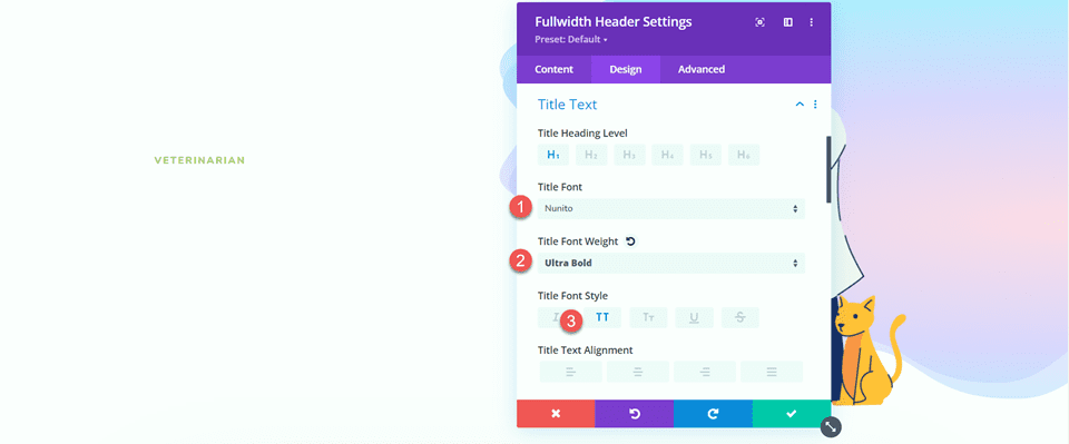
With our header content and background in place, let’s move over to the design tab to customize the text styles. First, open the title settings and customize the text as follows:
- Title Font: Nunito
- Title Font Weight: Ultra Bold
- Title Font Style: TT (Capitalized)
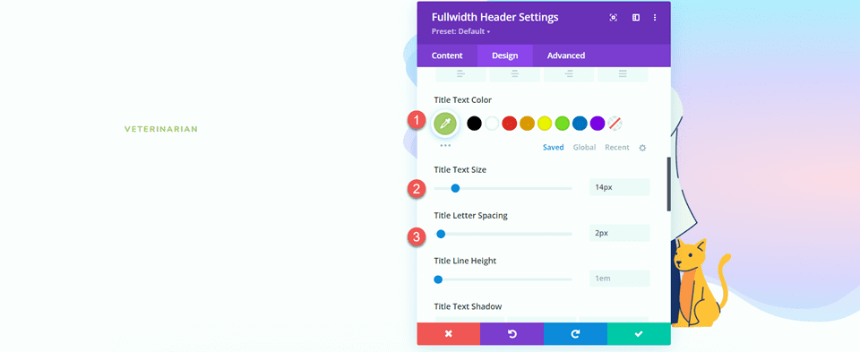
Modify the title text color, size, and spacing.
- Title Text Color: #a9cb6b
- Title Text Size: 14px
- Title Letter Spacing: 2px
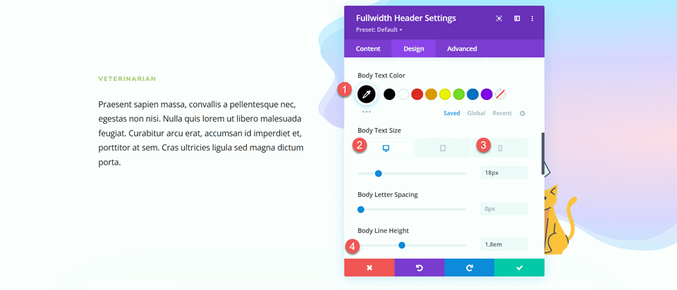
Move to the body text section and customize the font. Use Divi’s responsive settings to add a smaller text size for mobile devices.
- Body Text Color: #000000
- Body Text Size-Desktop: 18px
- Body Text Size: Mobile: 14px
- Body Line Height: 1.8em
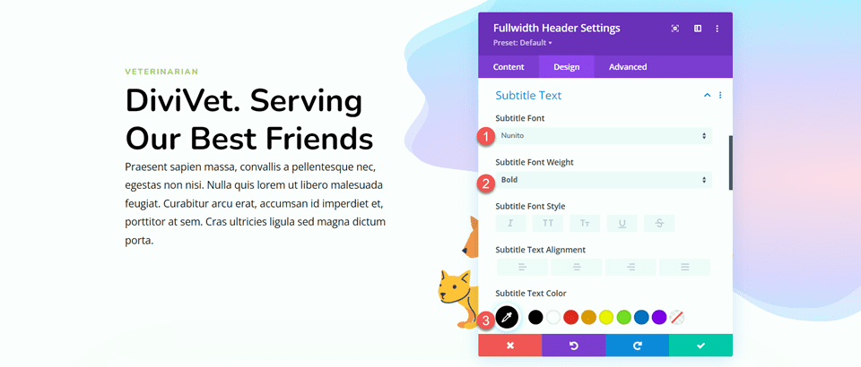
Next, open the subtitle settings and customize the font.
- Subtitle Font: Nunito
- Subtitle Font Weight: Bold
- Subtitle Text Color: #000000
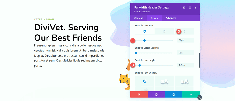
Finally, change the text size for desktop and mobile (once again, use the responsive settings to add a smaller text size on mobile) and adjust the line height.
- Subtitle Text Size–Desktop: 56px
- Subtitle Text Size-Mobile: 32px
- Subtitle Line Height: 1.2em
Customize Button One Styles
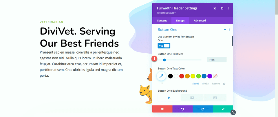
Next, we will customize the button styles. Start by enabling custom styles for Button One, then adjust the text size.
- Use Custom Styles for Button One: Yes
- Button One Text Size: 14px
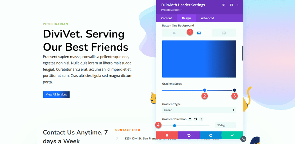
Add a background gradient to the button. Gradient values are as follows:
- 58%: #316EFF
- 100%: #1D2B60
- Gradient Direction: 90deg
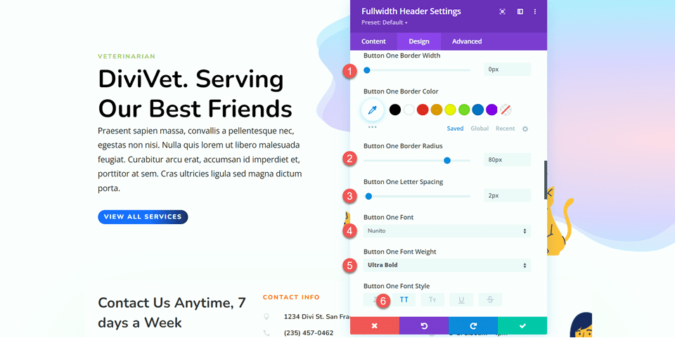
Next, customize the border settings and font settings.
- Button One Border Width: 0px
- Button One Border Radius: 80px
- Button One Letter Spacing: 2px
- Button One Font: Nunito
- Button One Font Weight: Ultra Bold
- Button One Font Style: TT (Capitalized)
Disable the Button One Icon.
- Show Button One Icon: No
Next, customize the margin and padding settings for the desktop design and add a box shadow.
- Button One Margin-Top-Desktop: 200px
- Button One Margin-Bottom-Desktop: 0px
- Button One Padding-Top-Desktop: 16px
- Button One Padding-Bottom-Desktop: 16px
- Button One Padding-Left-Desktop: 2em
- Button One Padding-Right-Desktop: 50em
- Button Box Shadow: Bottom
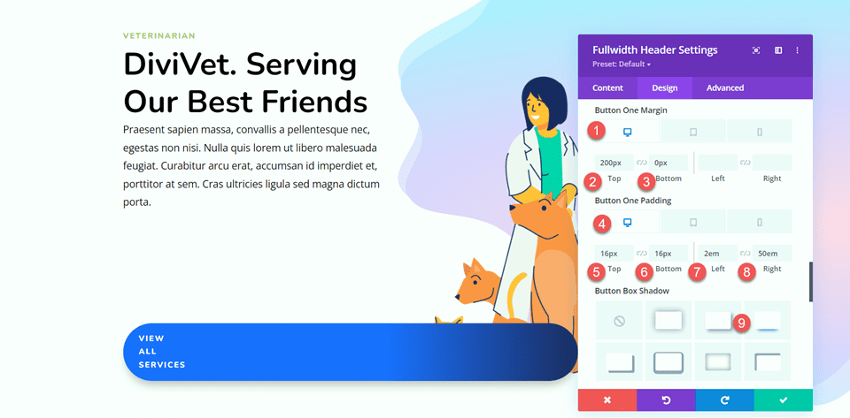
Use the responsive settings to set different margin and padding values on mobile devices.
- Button One Margin-Top-Mobile: 25px
- Button One Padding-Right-Mobile: 10em
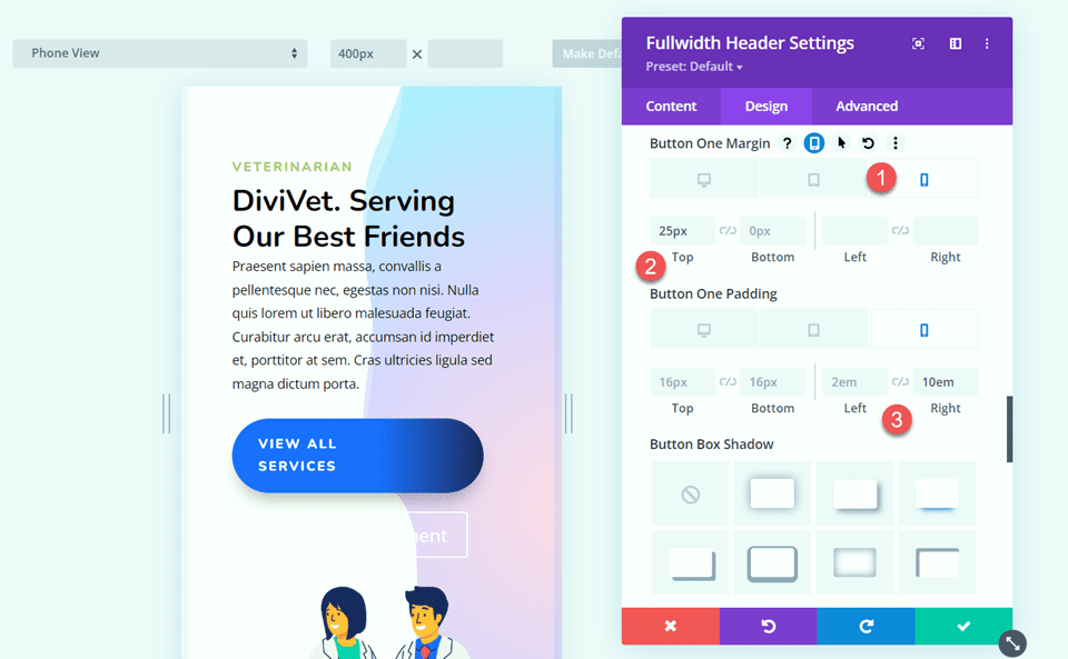
There are some text wrap issues with our button that we will fix with some custom CSS later.
Customize Button Two Styles
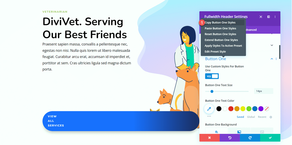
Button two has some different colors and spacing but is pretty similar to button one. To save some repetitive design steps, let’s copy the button one module styles to the button two module, then customize what we need to change.
First, right-click on the button one section and copy the button one styles.
Then right-click on the button two section and paste the button one styles.
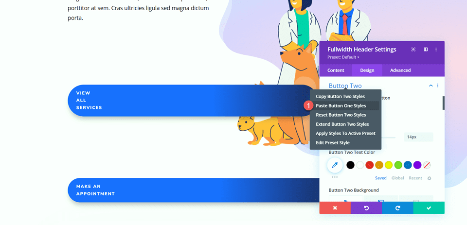
Now we can customize the button two styles. Change the text color.
- Button Two Text Color: #121F60
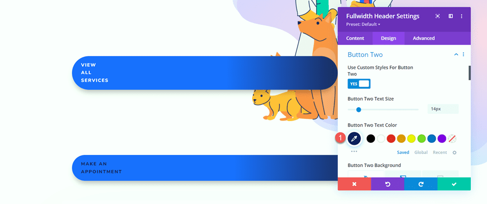
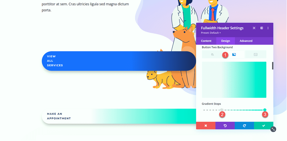
Customize the background gradient for button two.
- 30%: rgba(0,229,198,0)
- 100%: #00e5c6
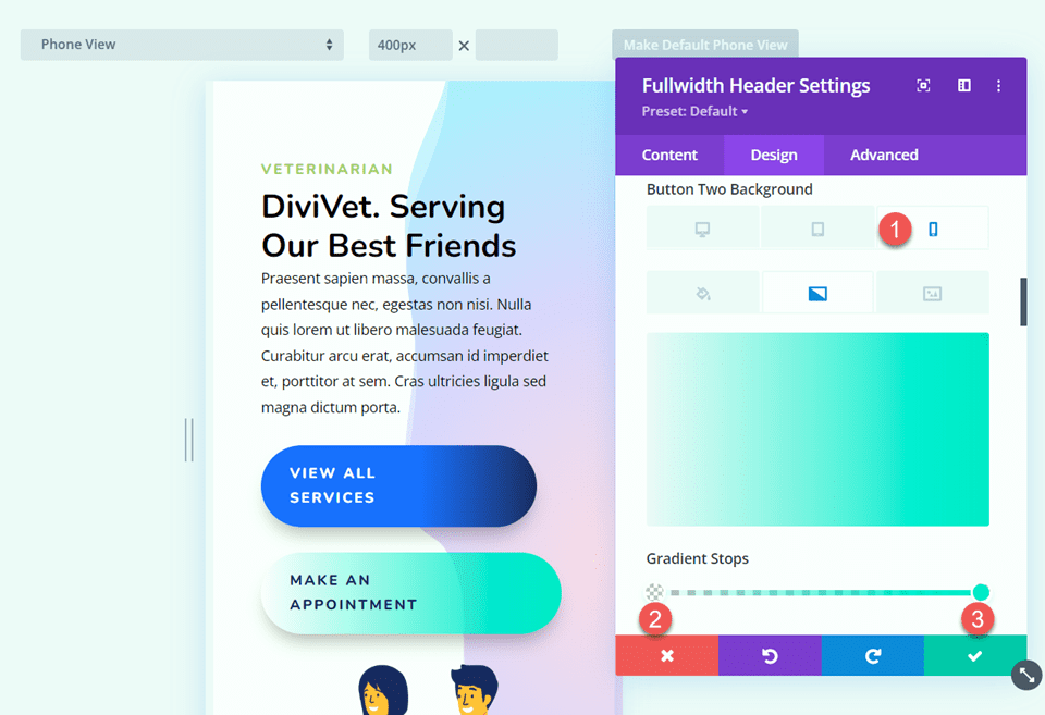
Use the responsive settings to adjust the background gradient for mobile devices.
- 0%: rgba(0,229,198,0)
- 100%: #00e5c6
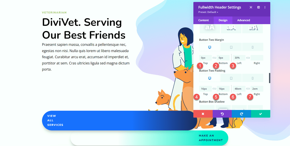
Next, adjust the margin and padding for the desktop design.
- Button Two Margin-Top-Desktop: 0px
- Button Two Margin-Bottom-Desktop: 0px
- Button Two Margin-Left-Desktop: 30%
- Button Two Padding-Top-Desktop: 16px
- Button Two Padding-Bottom-Desktop: 16px
- Button Two Padding-Left-Desktop: 48em
- Button Two Padding-Right-Desktop: 2em
Use the responsive settings to set different margin and padding values for the mobile design.
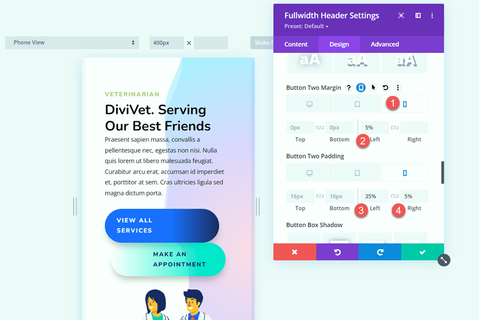
- Button Two Margin-Left-Mobile: 5%
- Button Two Padding-Left-Mobile: 35%
- Button Two Padding-Right-Mobile: 5%
Custom CSS
Finally, the bulk of the design work is done. Now we need to add some custom CSS to complete the design. Move over to the Advanced tab and open the Custom CSS section.
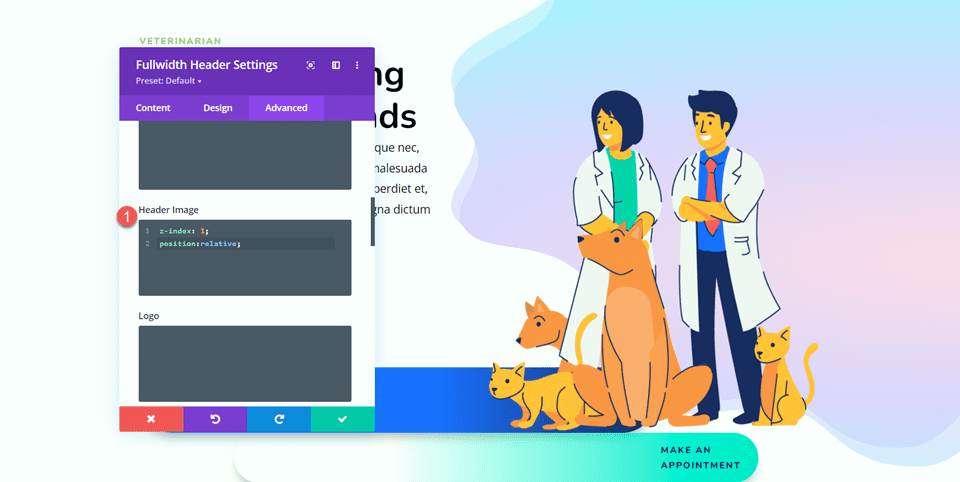
First, let’s start with the Header Image CSS. This CSS allows the header image to display above the button.
z-index: 1;
position:relative;
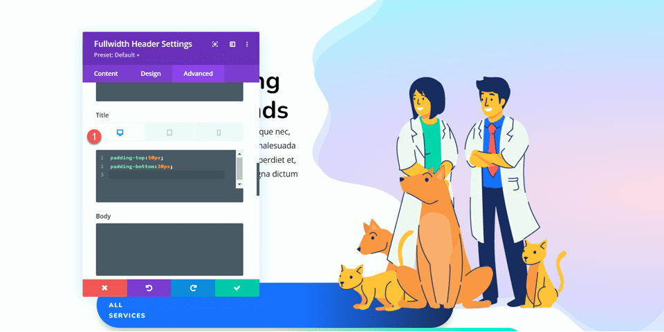
Next, Custom CSS to the Title. We’ll set different values for the desktop and mobile views using the responsive settings.
For desktop:
padding-top:50px;
padding-bottom:30px;
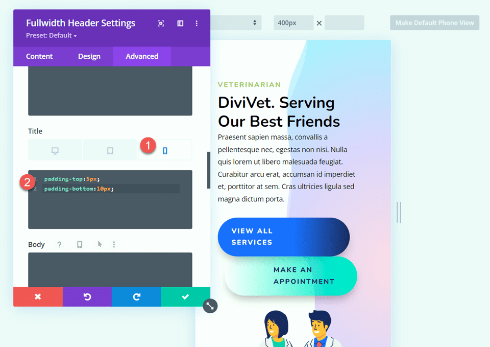
For mobile:
padding-top:5px;
padding-bottom:10px;
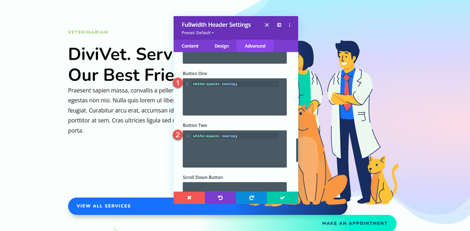
Finally, add the following CSS to Button One and Button Two.
white-space: nowrap;
Final Result
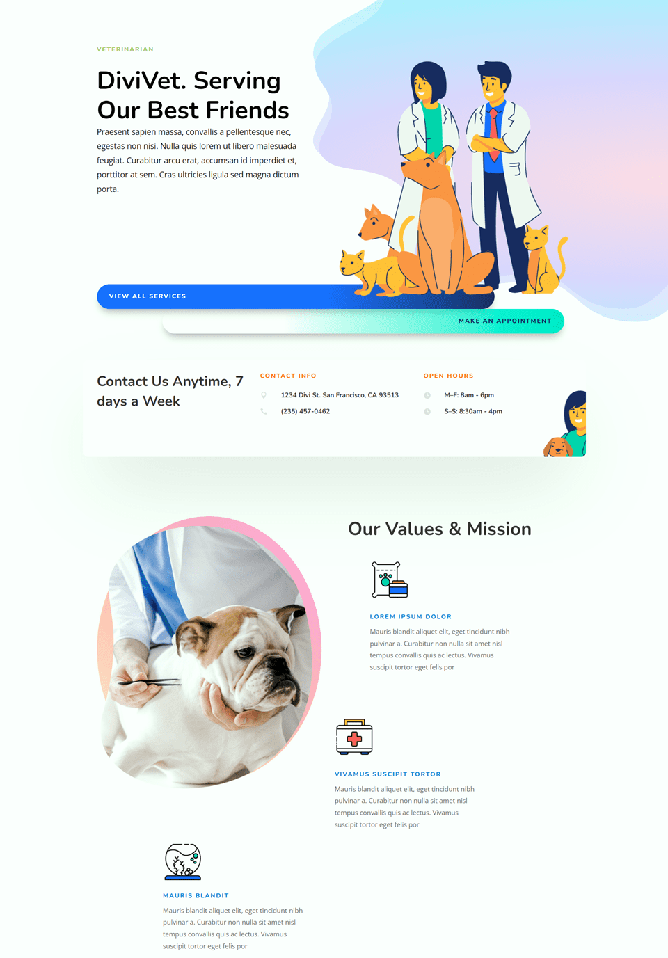
Here is the final design for our fullwidth header hero section.

Final Thoughts
The fullwidth header module allows you to easily create a beautiful hero section to advertise your services and tell your visitors what your website is about. The built-in settings make it easy to customize the design of every aspect of the header, and everything is in one place, so no need to toggle between multiple modules to build your hero section. For more unique hero section designs, check out this tutorial: How to Use Divi’s Background Masks and Patterns for a Hero Section. Do you use the fullwidth header module to build your hero sections? We would love to hear from you in the comments!



i wonder how responsive this is, and i do not mean in desktop and mobile only
That was my first thought : how responsive this is? And is it compatible with all mobile devices? Btw – I liked the builder very much:)
This is a very insightful and useful article. We shall share it amongst our team. Thank you for expressing your views on this.
Divi is an amazing WordPress website builder. I started out using a different builder and then switched to Divi because it’s so much more customizable. We use it for most of our WordPress website design projects. Thanks for the great tutorial – I’d be lying if I said I didn’t know it but still thanks a lot for sharing step by step instructions. This will be really helpful for people starting out.
I was very much confused about how to build a hero section. Thanks for this tutorial. No I am able to create full-width header.
its very been new and header value of module your blog is very truthful for new stuff to understand actually i have have that much experience with divis
this is more onformativies