Divi’s new background masks and patterns is one of our most exciting new design features yet. Each of the masks and patterns can be combined with other background elements (like colors, images, and gradients) for countless unique combinations in a few clicks.
Today we are going to show you how to use Divi and its new background masks and patterns to design a hero section. In this tutorial, we’ll cover the important steps needed to create background masks and patterns. We’ll even show how to position background images to fit a mask design. This should help give you the tools you need to create the perfect hero section for your site in minutes.
Let’s have some fun!
Subscribe To Our Youtube Channel
- 1 Sneak Peek
- 2 Download the Layout for FREE
- 3 Download For Free
- 4 What You Need to Get Started
-
5
How to Use Divi’s Background Masks and Patterns on Your Hero Section
- 5.1 1. Create the Layout Structure
- 5.2 2. Add the Headline and Call to Action
- 5.3 3. Add Vertical Spacing to the Section
- 5.4 4. Add a Background Image and Gradient
- 5.5 5. Create a Background Pattern for the Section
- 5.6 6. Create a Background Mask for the Section
- 5.7 7. Adjust Background Image Position
- 5.8 8. Use a Blend Mode
- 5.9 9. Adjust the background mask for mobile
- 5.10 10. Create a Dark Version
- 6 Final Results
- 7 Try Different Masks and Transform Options
- 8 Get More Background Mask and Pattern Designs!
- 9 Final Thoughts
Sneak Peek
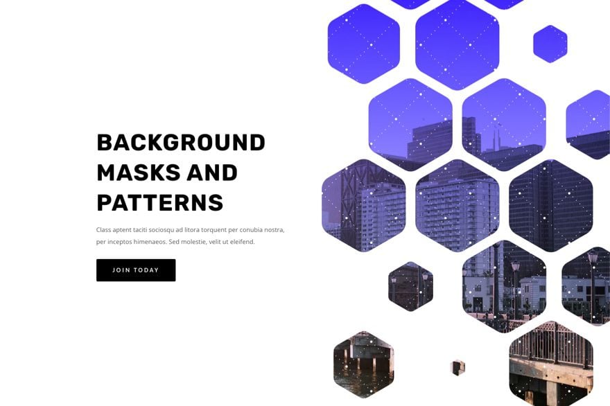
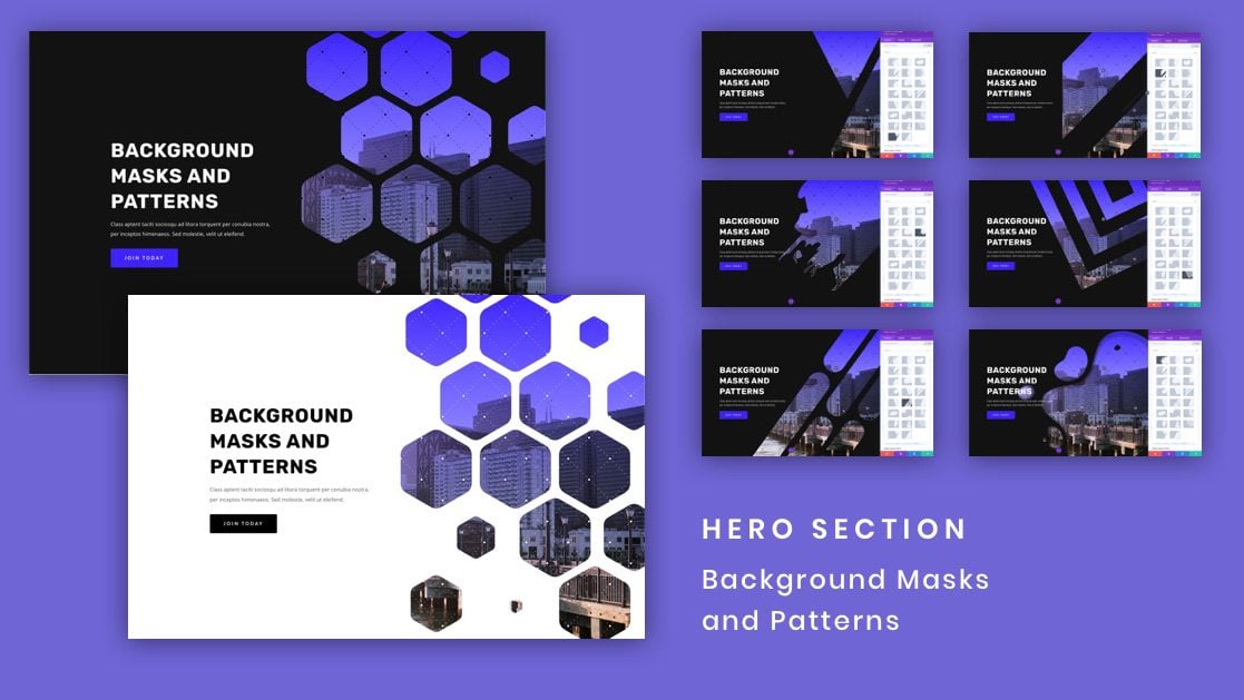
Here is a quick look at the design we’ll build in this tutorial.
Here is an example hero section with a white mask and pattern.
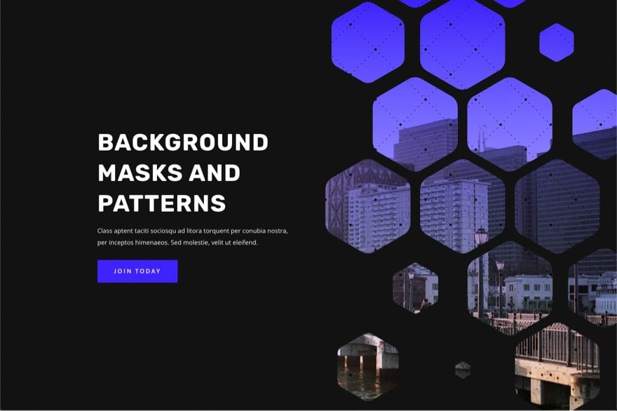
Here is a dark version of the same hero section with a black mask and pattern.
With this design in place, you can easily change masks and mask positions with a few clicks!
Download the Layout for FREE
To lay your hands on the layout design from this tutorial, you will first need to download it using the button below. To gain access to the download you will need to subscribe to our newsletter by using the form below. As a new subscriber, you will receive even more Divi goodness and a free Divi Layout pack every Monday! If you’re already on the list, simply enter your email address below and click download. You will not be “resubscribed” or receive extra emails.
To import the section layout to your Divi Library, do the following:
- Navigate to the Divi Library.
- Click the Import button at the top of the page.
- In the portability popup, select the import tab
- Choose the download file from your computer (make sure to unzip the file first and use the JSON file).
- Then click the import button.
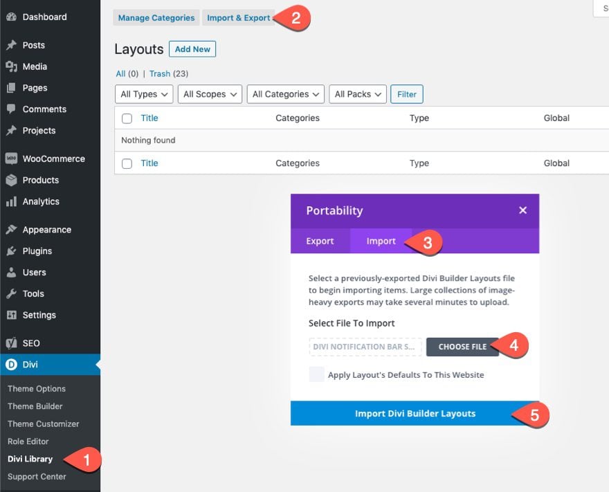
Once done, the section layout will be available in the Divi Builder.
Let’s get to the tutorial, shall we?
What You Need to Get Started
To get started, you will need to do the following:
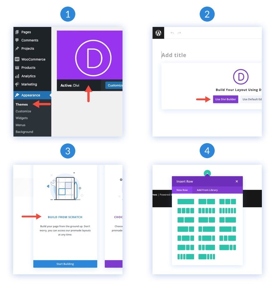
- If you haven’t yet, install and activate the Divi Theme.
- Create a new page in WordPress and use the Divi Builder to edit the page on the front end (visual builder).
- Choose the option “Build From Scratch”.
- Now have a blank canvas to start designing in Divi!
How to Use Divi’s Background Masks and Patterns on Your Hero Section
1. Create the Layout Structure
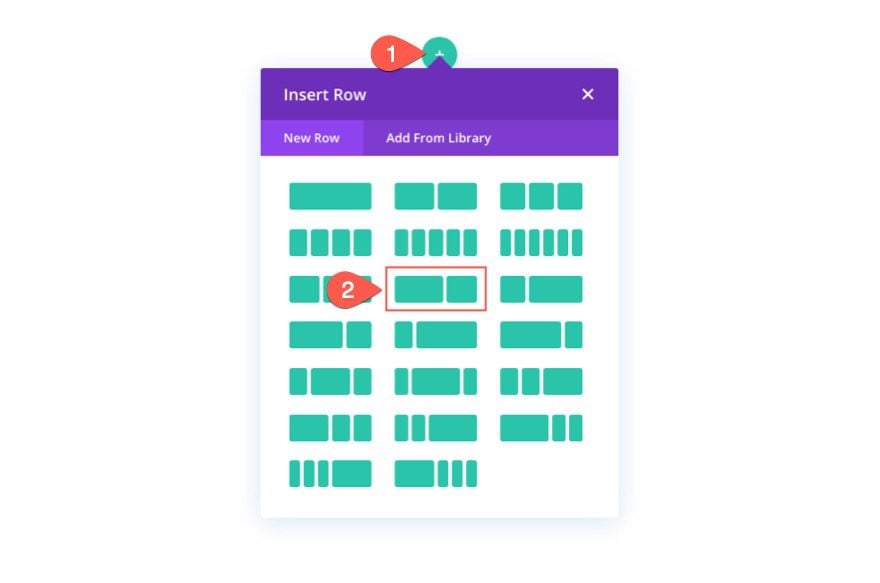
For this hero section, we are going with a classic layout structure with the headline and call to action on the left and an image (or visual design) on the right. For this design, our visual design will be created using Divi’s background options. But before we get into that, we need to create a two-column row so that we can save room on the right side of the page for showcasing our section background masks and patterns design.
2. Add the Headline and Call to Action
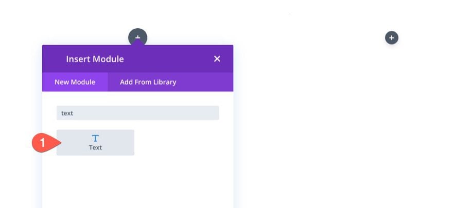
In the left column (column 1), add a text module for your main heading, a text module for your subheading text, and a button module for your button.
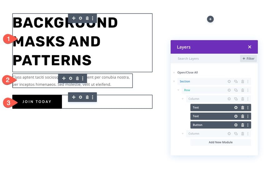
If you want to know the specific design settings for these, feel free to download the layout and check it out for yourself at another time. For today, we are going to concentrate on the background design.
3. Add Vertical Spacing to the Section
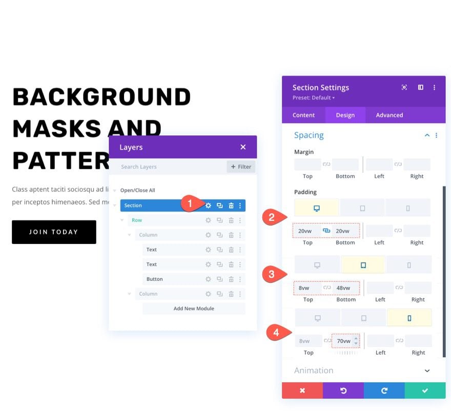
In order for our background design to be big and beautiful, we need to add some vertical height to the section. An easy way to do that is to add padding to the top and bottom of the section. Keep in mind that we need to adjust the padding on tablet and phone display to make room for our background design once the columns stack vertically.
Open the settings for the section. Under the design tab, update the padding as follows:
- Padding: 20vw top, 20vw bottom
- Padding (tablet): 8vw top, 48vw bottom
- Padding (phone): 8vw top, 70vw bottom
4. Add a Background Image and Gradient
Next, we can add a background image and gradient to the section. Keep in mind that the main focal point of the background image will be revealed on the right side of the section, so use an image that has what you want to see on the right side. For this example, we are using an image with a city skyline. The right side of the image has buildings that are closer and more aesthetically pleasing so it works great.
Under the image tab, upload the image to the section background.
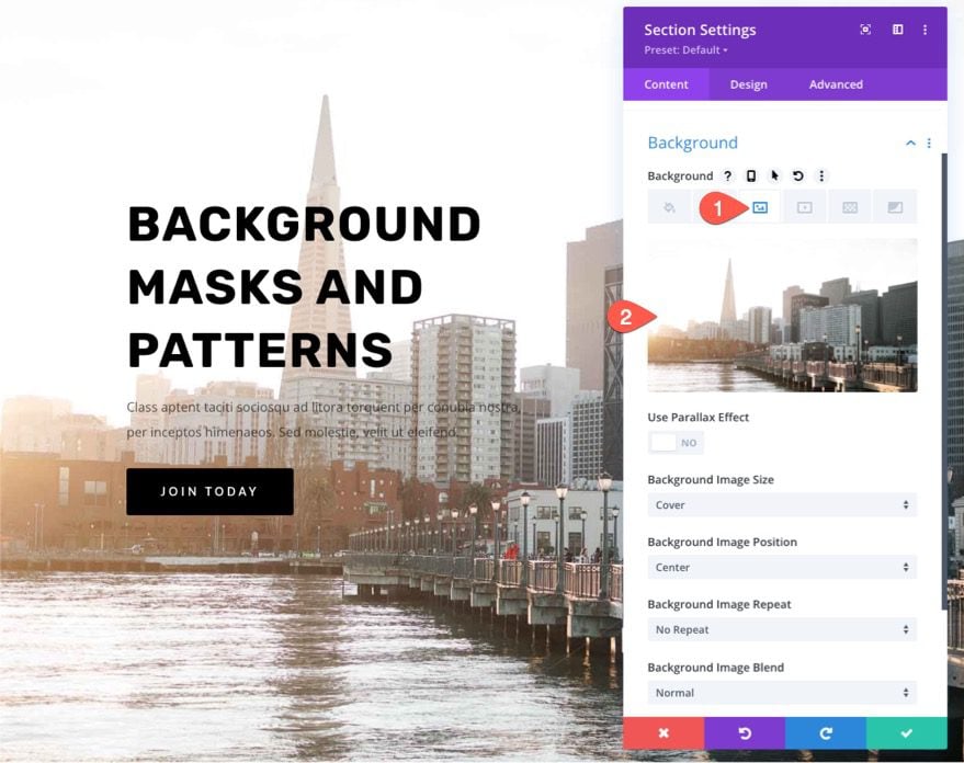
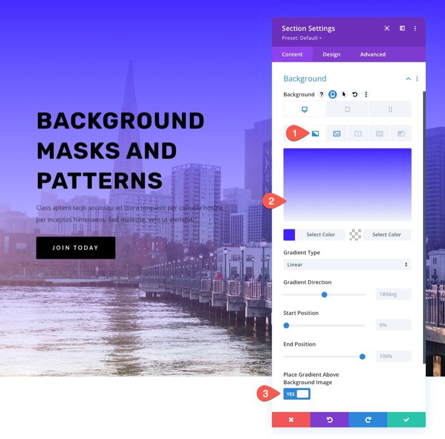
In Divi, you can easily add a color gradient over the background image. Under the gradient tab, add the following gradient to the section background:
- Left Gradient Color: #3e22ff
- Right Gradient Color: transparent
- Place Gradient Above Background Image: YES
5. Create a Background Pattern for the Section
Now that our background image and gradient are ready, we can add a background pattern to compliment the design. In this example, we are going to use a subtle pattern that just adds a little texture to give it a more unique look.
Under the patterns tab, update the following:
- Background Pattern: Tufted
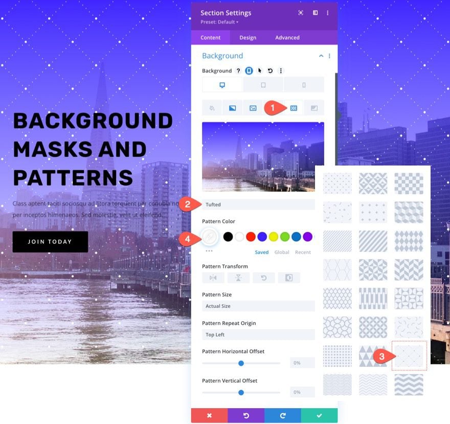
TIP: With background patterns, it is generally better to keep it subtle. Try using custom sizes for patterns that are smaller and then drop the opacity of the color.
6. Create a Background Mask for the Section
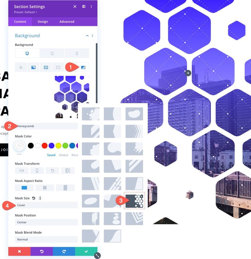
With our background pattern in place, we are finally ready to test out a brand new background mask for our design. There are a bunch of options and variations to choose from. For this example, we are going to use the honeycomb mask.
Under the masks tab, update the following:
- Mask: Honeycomb
- Mask Color: #ffffff
- Mask Size: Cover
7. Adjust Background Image Position
Since we are using a background mask, a portion of our background image is being hidden (or “masked”). So, you may need to adjust the position of the background image to a spot where a particular portion of the image is visible through the mask. To do this, you can use the background image position and offset options to nudge the background image in the right spot.
In this example, we are going to make sure the bottom right of the image is most visible and we’ll move it over to the right a bit to show more of the buildings.
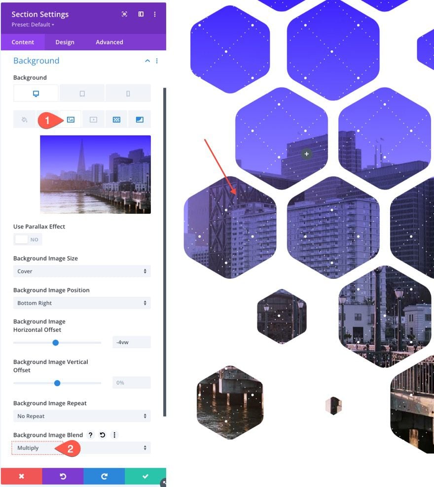
Under the image tab, update the following:
- Background Image Position: Bottom Right
- Background Image Horizontal Offset: -4vw
Notice how the background image can be moved to the right.
8. Use a Blend Mode
One way we can get creative with all of these background elements is to add a blend mode. Blend modes can be added to any of the background options and they can be used to blend multiple background layers (image, gradient, mask, etc.) together in creative ways.
For this example, we are going to blend the background image with the gradient color. To do this, click the background image tab and add a blend mode to blend the gradient color with the background image as follows:
- Blend Mode: Multiply
NOTE: The multiply blend mode basically multiplies the current layer (in this case the background image) with the background gradient. An easy way to think about the effect is to imagine two slides in a slide projector stacked one behind the other. If you project the two images on a screen, you would get a blend of the two that is slightly darker.
For more on blend modes, check out this
9. Adjust the background mask for mobile
It is important to make sure the background mask design looks great on mobile devices as well. Thankfully, the built-in options make this process easy. Remember, we already added the extra padding on tablet and phone to make room for our background design. Now, all we need to do is use the background transform and aspect ratio options to adjust the mask for mobile.
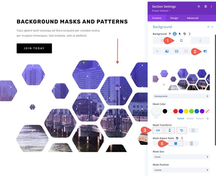
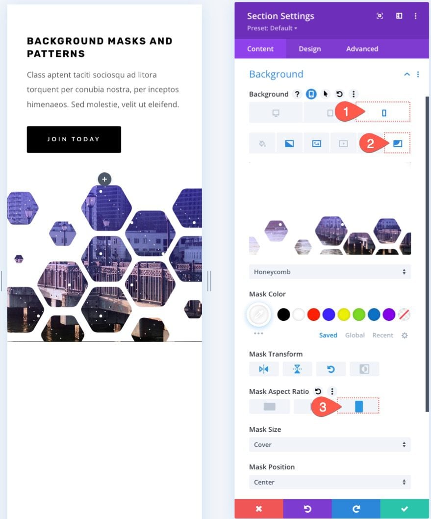
Under the mask tab, activate the responsive options and update the following:
On tablet…
- Mask Transform: Flip Vertical, Flip Horizontal, Rotate
- Mask Aspect Ratio: Square
On Phone…
- Mask Transform: Flip Vertical, Flip Horizontal, Rotate
- Mask Aspect Ratio: Portrait
The Result
Check out the design we created so far.
One desktop…

One tablet…
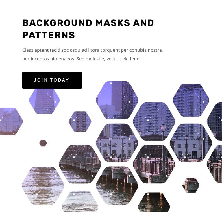
One phone…
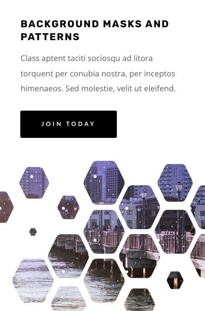
10. Create a Dark Version
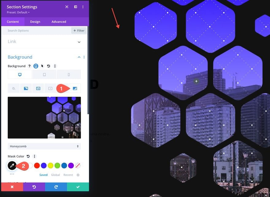
If you want a dark version of this design, simply change the background mask color to a dark color (like black).
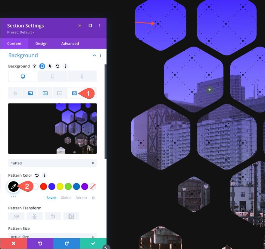
Then change the pattern color to black.
Then change the headline and subheader text to white. And you may want to update the button color as well.
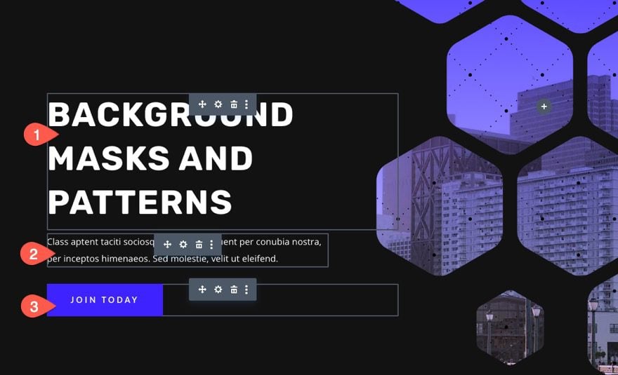
Here is what the dark version looks like.

Final Results
Here is another look at our final results.


Try Different Masks and Transform Options
With this hero section background design in place, we can experiment with other background masks (and patterns) by selecting different masks from the list. Then you can use
Get More Background Mask and Pattern Designs!

If you want more designs like this one, check out these 12 background mask and pattern designs free for download.
Final Thoughts
Designing a hero section for your website is a lot of fun with Divi’s background masks and patterns. The background options are easy to tweak to get the design just right. And there are so many other options you can use (like blend modes) to create even more unique background designs. Plus, you can add masks and patterns to any Divi element, not just sections. So have fun experimenting!
I look forward to hearing from you in the comments.
Cheers!




This is great. Can I make my own masks to use for this feature? And how would I go about doing that?
Unfortunately, there is no option by default to upload custom mask and patterns in Divi at the moment, but I found this article that might help you using Custom CSS codes:
https://www.peeayecreative.com/how-to-upload-your-own-custom-divi-background-patterns-and-masks/
I have uploaded the JSON file but Im not seeing the layers or the patterns features when inside the builder?
Suzanna,
Sorry to hear that. Make sure you have the latest updated version of the Divi theme. Other than that, I’m not sure what could be the issue. Please reach out to our support team so they can help.
Thank you, you are doing a great job.
I would love this if it was also to use icons and fonts as a mask 🙂
Theresa,
Actually, you can do that. Just not with the background options. You can give a text module, or icon module, an absolute position. Then increase the size (probably with vw length units) and position the element over the background wherever you want it. You could probably do the scaling and positioning using the transform options. After that, you would need to set overflow to hidden on the parent container so that the large icon or text doesn’t extend beyond the container. Hope that helps.
This post could be helpful…
https://www.elegantthemes.com/blog/divi-resources/turning-oversized-characters-into-background-masks-with-divi-free-download
Hey I have downloaded the file, imported it but i am not getting the options for background patterns at all, it’s still the standard ones? I have deleted the file and reuploaded it but nothing. Any tips on why it’s not working?
Jason, thanks for ‘splaining this. My OCD kicked in and I have to ask your opinion on this question: When using the viewport type of measurements (vw for width and vh for height), why are you using “vw” for a vertical (height) parameter (padding top/bottom)? Is it because vw and vh are “close enough” to where you can get away with this, or is there something I am missing? I love these units, and I use them a lot on big-space items, and I always use vh for left/right and vw for top/bottom. OCD.
Hi Randy! Good question. Using the vw for top and bottom padding keeps the design more consistent when adjusting browser widths. So for a hero section, when you shrink the width of the browser, the background design scales with the browser width. Hope that makes sense.
Love this new update but I wish that you could place a mask over videos as well. Also would be nice to be able to add background images to the masked area and for the pattern to adjust to the gradient opacity, so if you have a gradient that fades to transparent for the pattern to go transparent as well if you choose to. I have also always wanted more control over the layering. At the moment only the gradient can be moved to be over or under the background image
Lenta,
Thanks for the feedback. The masks should work with background videos. Are you referring to embedded videos like in a video module? Having more control over the layering is a good idea. What you described about the pattern fading away with the gradient might be possible with a blend mode. Plus, you can always add another background layer to your background section with a row. Here’s how…
– Take out section padding
– Add new row; give it an absolute position, height: 100%, width: 100%, max-width: 100%.
– Add additional background options in the row settings.
This would double the background options so you can do all kinds of cool stuff. We’ll be doing some tutorials like this in the near future. Stay tuned.
Thanks will try this but would be really nice if there was a button similar to the gradient one to move above or below for all the other ones and also to have gradient, pattern and image options within the masked area 🙂
“This file should not be imported in this context.”
So frustrating. Followed the instructions to the letter.
Sorry about that, Tim. The instructions weren’t that clear. Make sure you unzip the file and import the JSON file to the Divi library. I just tested it and it worked for me.
Divi is just too great. I have never regretted buying it.
Thank you divi theme
These are great! Is it possible to put patterns on top of the mask itself, or only on the image below the mask? I like how you can change the mask color, but it would be cool to be able to put lines on it as well.
ajh,
Thanks. I don’t think this is possible to add patterns over the masks with the background options of a single Divi element, unless you use a semi-transparent color for the mask to expose the pattern below or get creative with blend modes. But I don’t think that is what you are looking for. Good question though. I’ll think about that one.