
Category menus are a delightful addition to any blog. They give bloggers an opportunity to showcase the different kind of topics available so readers can get to the stuff they care about quickly and easily. So, it’s important that you have a well-designed category menu on all the blog related templates in your website.
In this tutorial, we are going to show you how to add a sticky category menu to your blog with Divi’s Theme Builder. We’ll cover how to create the sticky category menu using the Divi Builder and also how to add the category menus to different templates on your site that make up your blog.
Let’s get started.
Sneak Peek
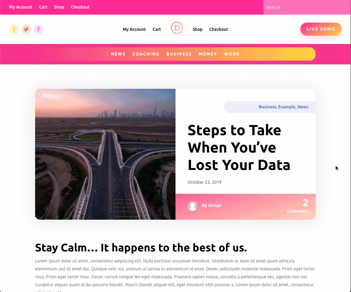
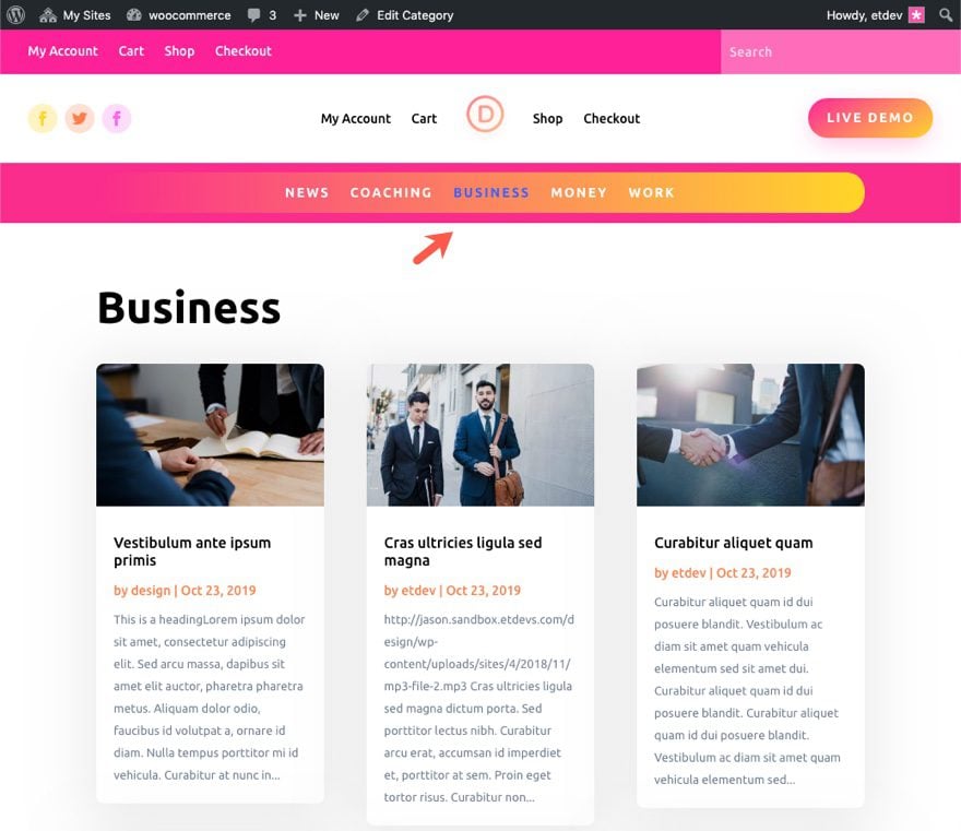
Here is the Sticky Category Menu added to the Post Template
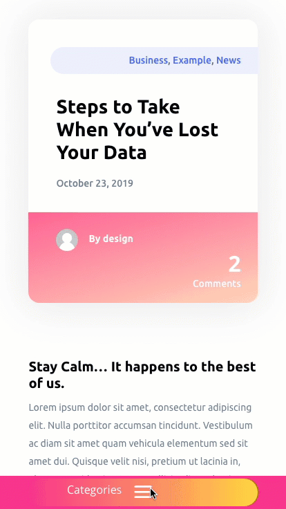
Here is the bottom sticky category menu on mobile.
Here is the Category Menu on the Category Page Template.

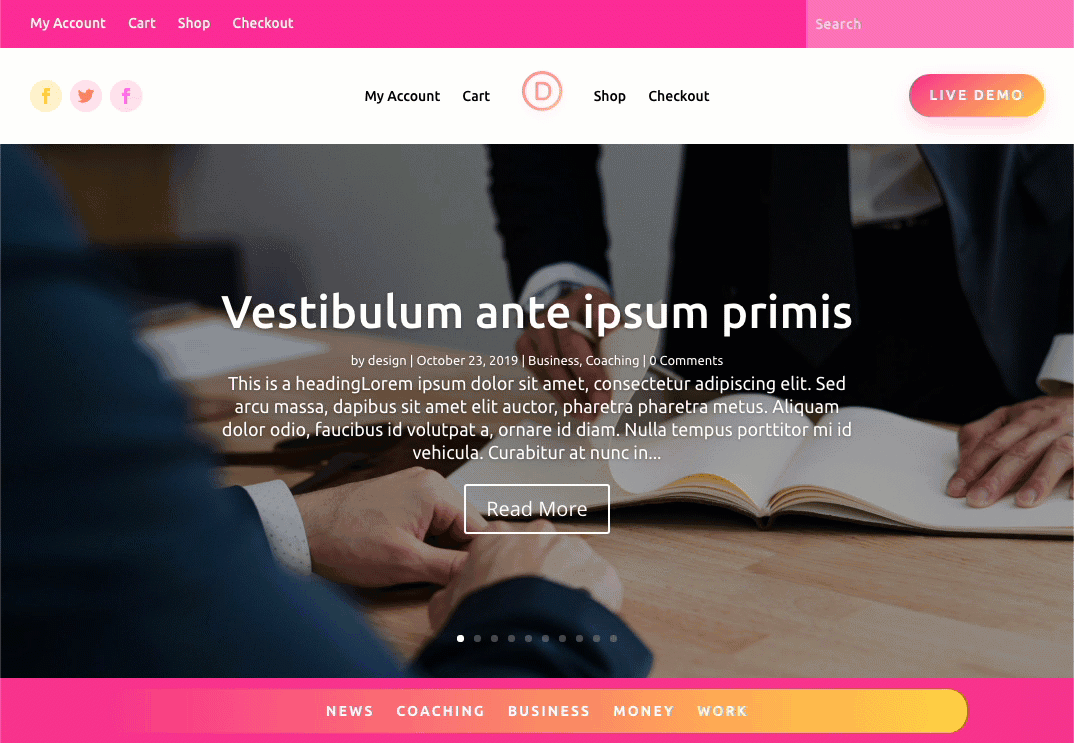
And here is a quick and easy Blog Template we’ll create with the Sticky Category Menu starting below the post slider and sticking to the top of the page on scroll.
Download the Template(s) for FREE
To lay your hands on the templates with the sticky category menu from this tutorial, you will first need to download it using the button below. To gain access to the download you will need to subscribe to our newsletter by using the form below. As a new subscriber, you will receive even more Divi goodness and a free Divi Layout pack every Monday! If youíre already on the list, simply enter your email address below and click download. You will not be ìresubscribedî or receive extra emails.

To import the layout to your page, simply extract the zip file and add one of the json files into the Divi Theme Builder using the Theme Builder Portability option.
Let’s get to the tutorial shall we?
What You Need to Get Started
To get started, you will need to do the following:
- If you haven’t yet, install and activate the Divi Theme.
- Download Theme Builder Pack #6 to get started on the new design.
After that, you are ready to go.
Subscribe To Our Youtube Channel
Uploading the Theme Builder Pack #6
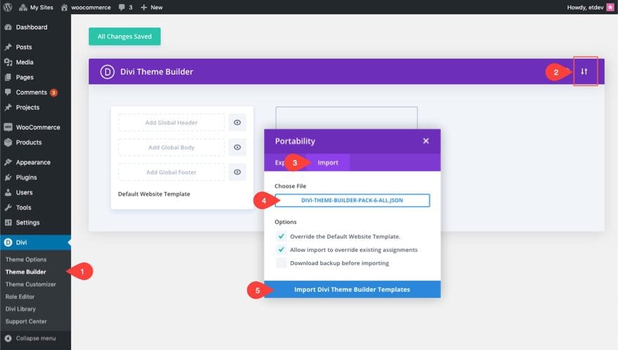
For this tutorial, we are going to use the Theme Builder Pack #6. Once you download the pack from the blog post, go to the WordPress dashboard and navigate to Divi > Theme Builder.
Then click the portability icon at the top right. In the portability popup, select the import tab and choose the Divi-Theme-Builder-Pack-6-All.json file. Then click the “Import Divi Theme Builder Templates” button.
This will import all of the templates to the Theme Builder.
Now we are ready to start creating our Category Menu.
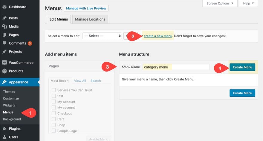
A category menu can be created just like a normal menu in WordPress. From the WordPress Dashboard, navigate to Appearance > Menus. Click the create a new menu link, give the menu a name, and click the “Create Menu” button.
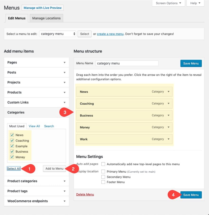
Under the menu items, open the Categories toggle and select all the categories/pages you want to add to the menu. Make sure to have categories already created for category items to appear in the categories toggle. Category menu items will redirect to the category page for a specific post category.
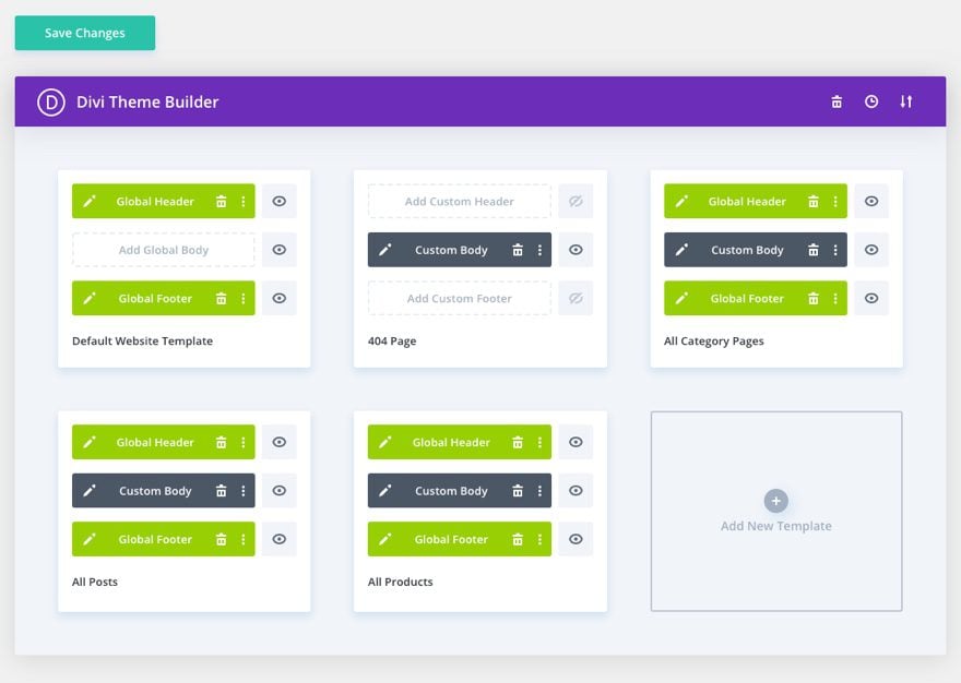
After the category menu is created, it’s time to design our category menu. To do this, we will need to add it to a body area of one of the templates. We will eventually add the category menu to other templates related to the Blog, but for now, let’s add it to the template for all posts (or post template).
Open Body Area Template Layout Editor
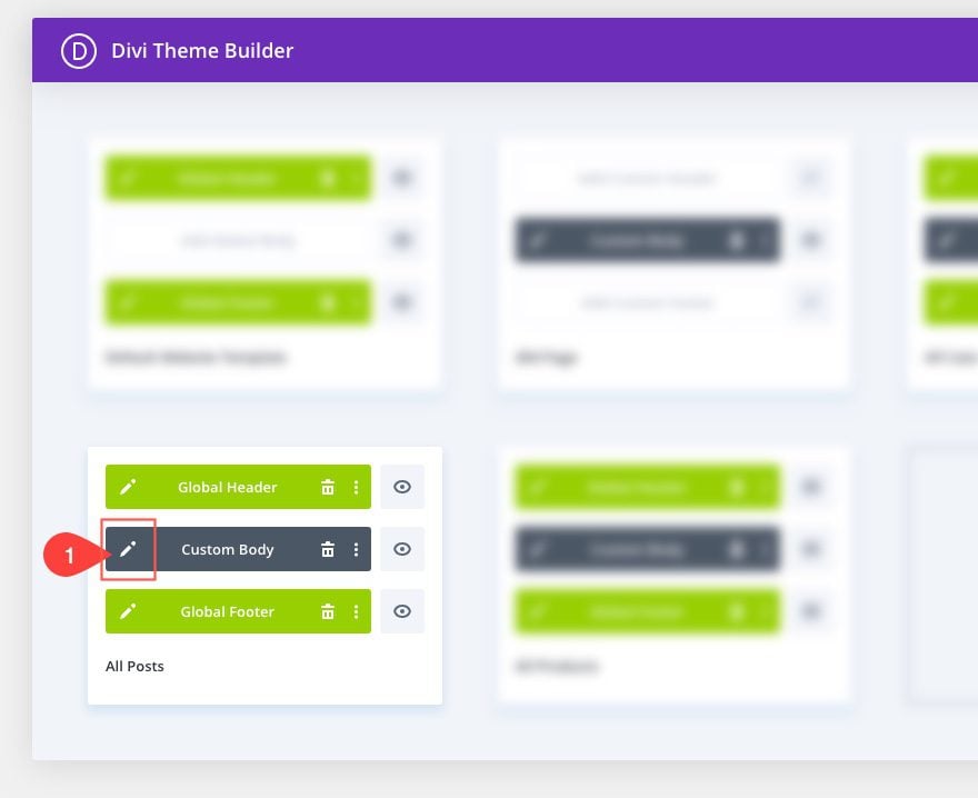
In the Theme Builder interface, find the template already assigned to “All Posts”, and click the edit icon on the Custom Body Area.
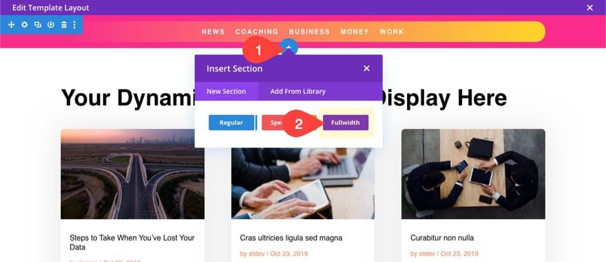
Add New Section and Row to the top of the template
In the template layout editor, create a new section with a one-column row and drag it to the very top of the layout.
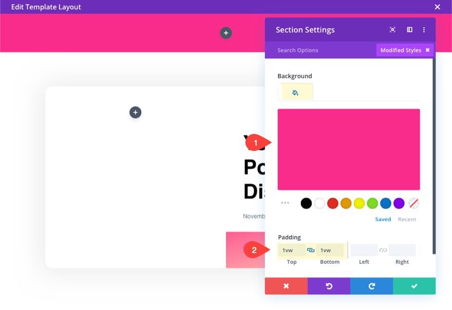
Customize Section
Before adding a module, open the section settings and give it a background and some padding as follows:
- Background Color: #f92c8b
- Padding: 1vw top, 1vw bottom
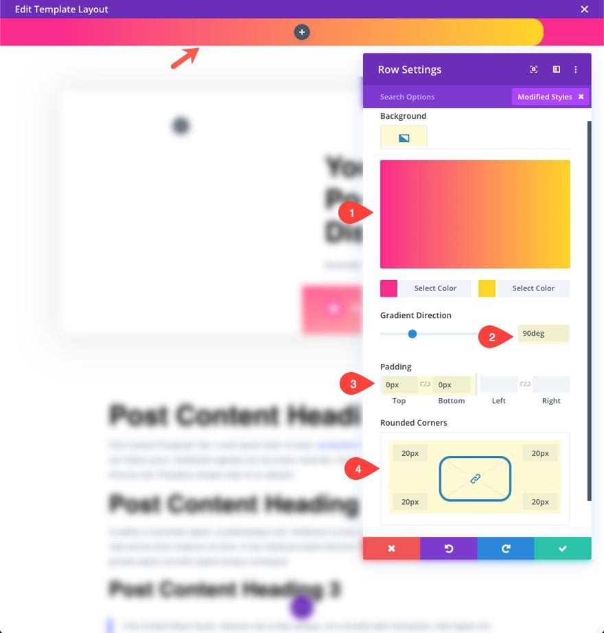
Customize Row
Next, update the row settings as follows:
- Background Gradient Left Color: #f92c8b
- Background Gradient Right Color: #ffd625
- Gradient Direction: 90deg
- Padding: 0px top, 0px bottom
- Rounded Corners: 20px
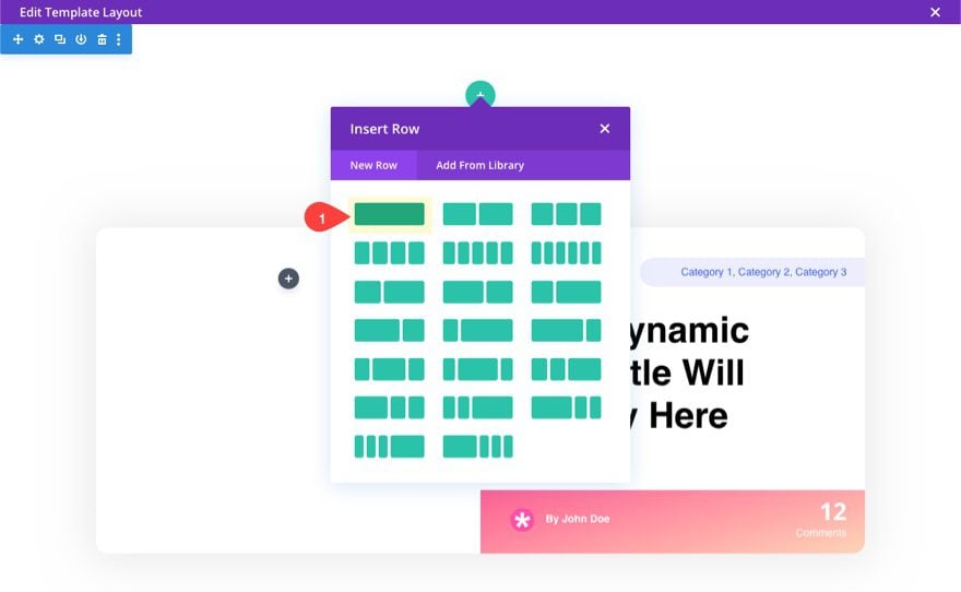
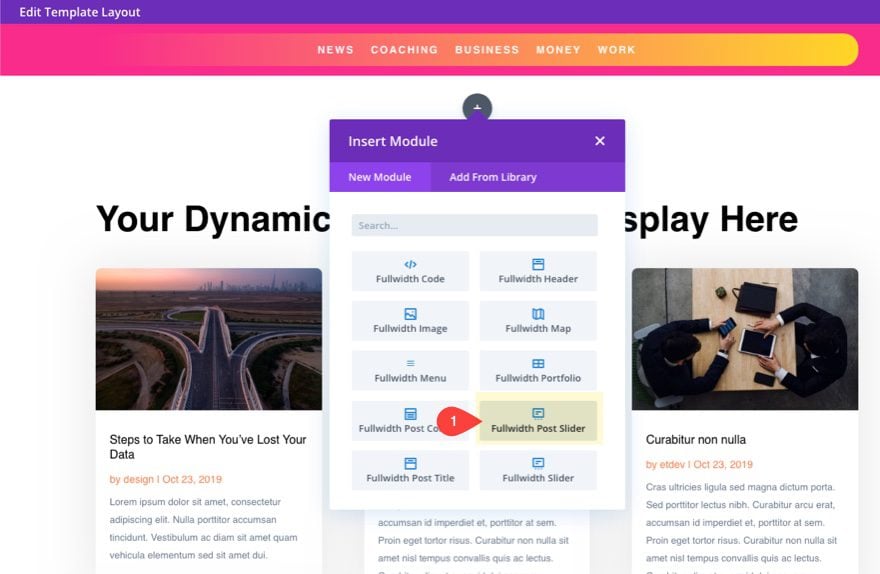
Add Menu Module
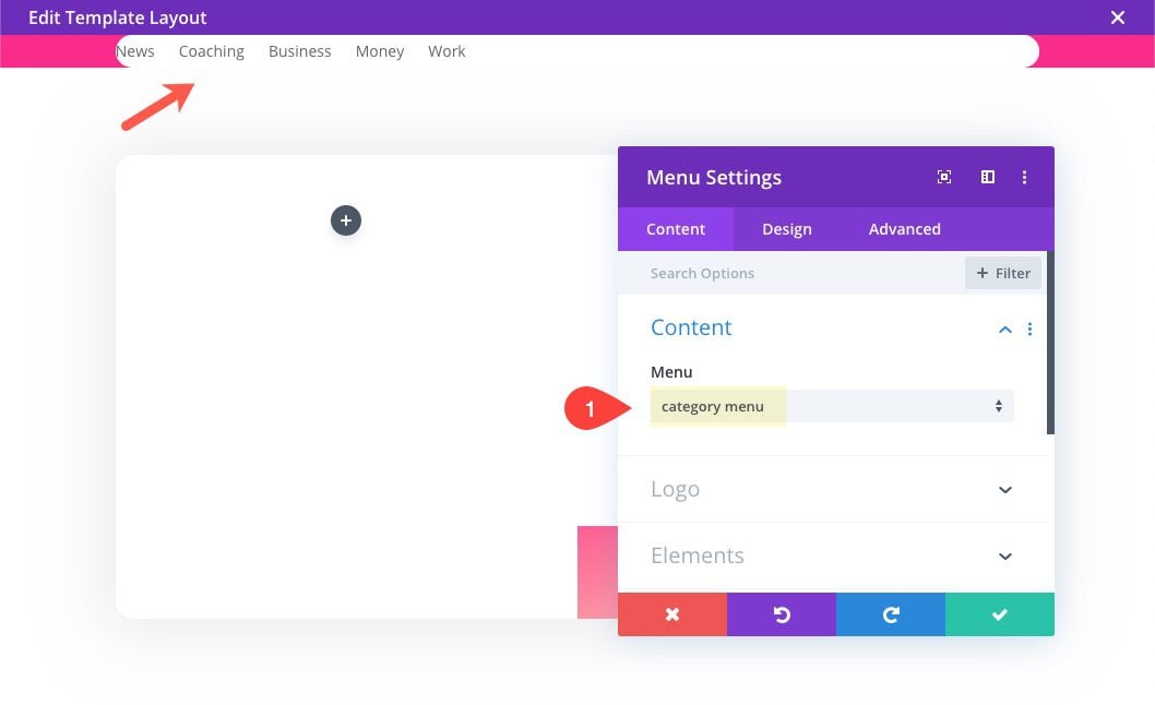
Inside the one-column row, add a new menu module.
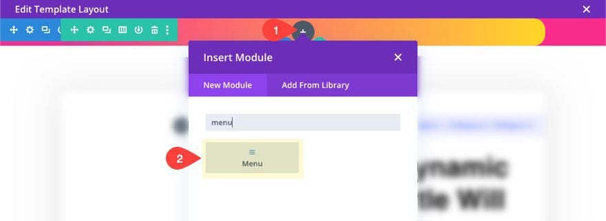
Then, select the category menu you created earlier from the dropdown menu. Once selected, you menu items will appear in the menu.
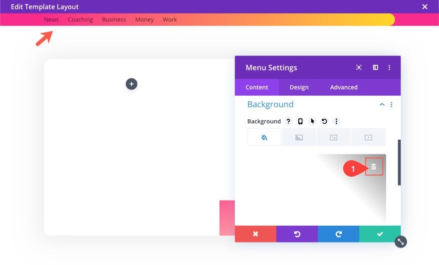
Design Menu Module to match Template
Delete the default background color so that the row background color shows.
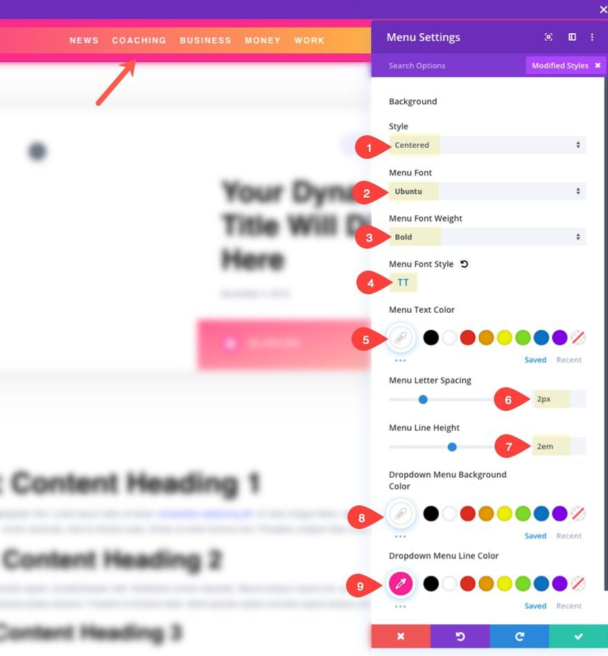
The update the following design settings:
- Style: centered
- Menu Font: Ubuntu
- Menu Font Weight: Bold
- Menu Font Style: TT (capitalize)
- Menu Text Color: #ffffff
- Menu Letter Spacing: 2px
- Menu Line Height: 2em
- Dropdown Menu Background Color: #ffffff
- Dropdown Menu Line Color: #f92c8b
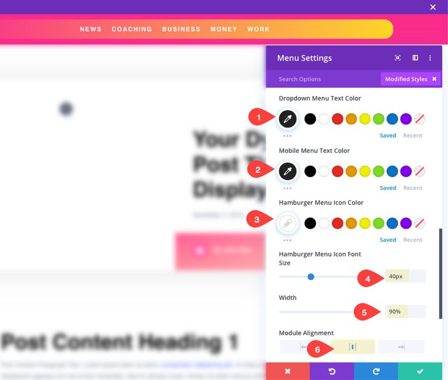
- Dropdown Menu Text Color: #222222
- Mobile Menu Text Color: #222222
- Hamburger Menu Icon Color: #ffffff
- Hamburger Menu Icon Font: 40px
- Width: 90%
- Module Alignment: Center
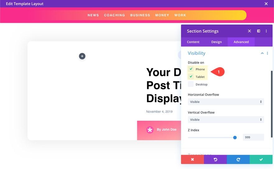
Section and Row Visibility
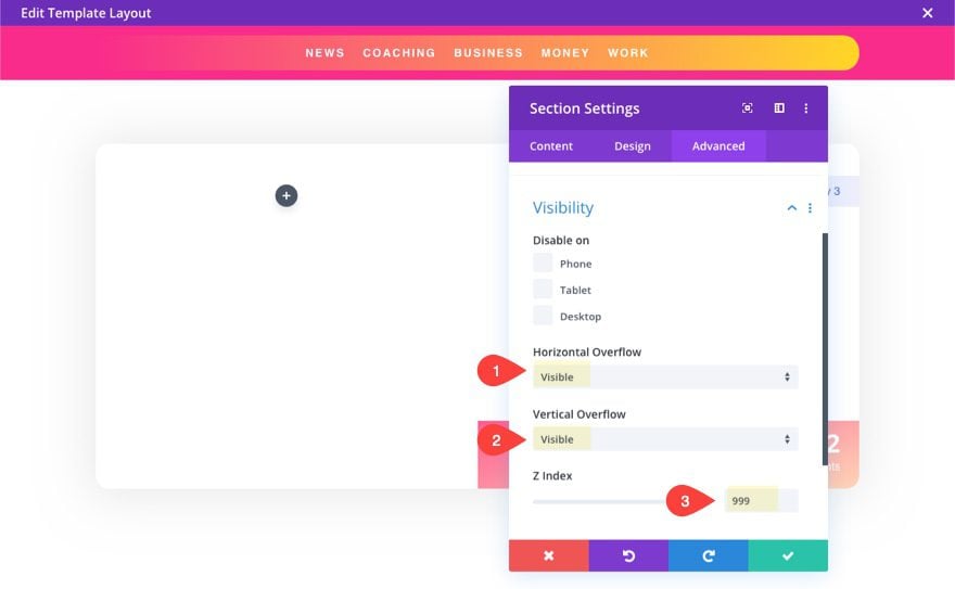
In order to keep any menu dropdowns from being hidden, we need to make sure and set the visibility of our section and row to visible. Plus, we will also need to give the z index a high number to keep the entire menu order above all other content on the page. This will be needed to maximize visibility for the dropdown menu on mobile and also for the sticky menu.
Open the section settings and update the following:
- Horizontal Overflow: Visible
- Vertical Overflow: Visible
- Z-Index: 999
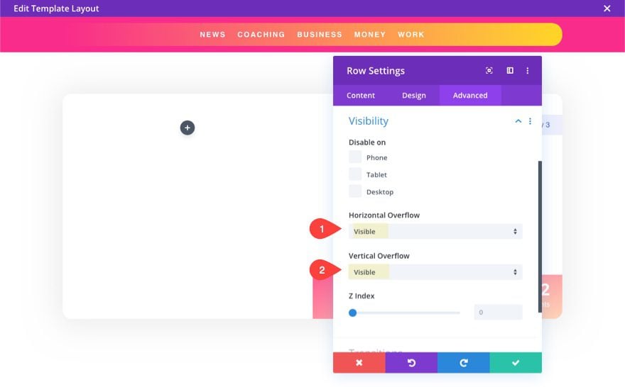
Open the row settings and update the following:
- Horizontal Overflow: Visible
- Vertical Overflow: Visible
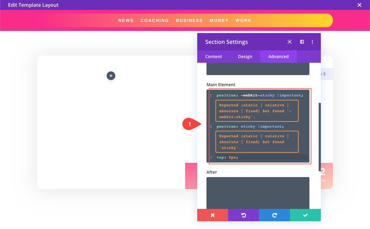
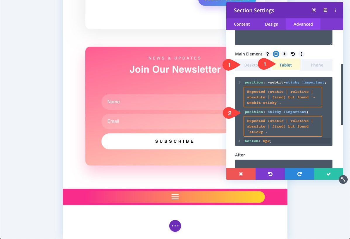
Making the Section (Containing the Menu) Sticky
This is optional of course, but to create a sticky category menu, open the section settings and add the following custom CSS to the Main Element:
position: -webkit-sticky !important;
position: sticky !important;
top: 0px;
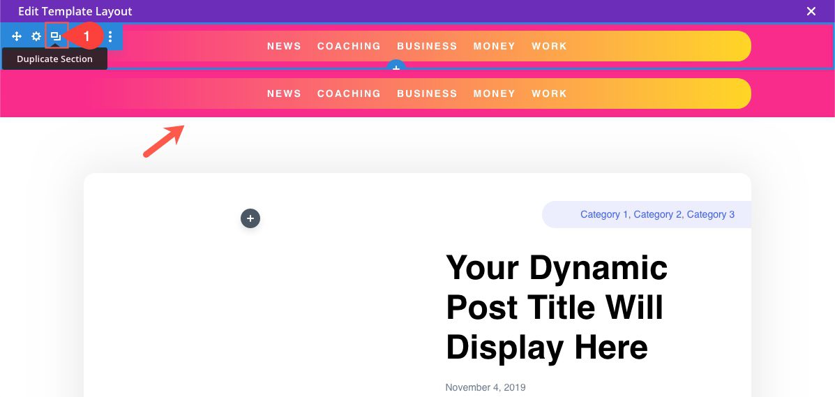
Duplicate Section to Create Bottom Category Menu
For a better user experience on mobile, we can create another category menu that will stick at the bottom of the page. To create the menu, simply duplicate the section containing the menu just created.
Optimize Bottom Sticky Menu for Mobile
Update Sticky CSS with bottom positioning.
Since we will only need this menu to “stick” on mobile, open the section settings and delete the Custom CSS for Desktop. Then add the following custom CSS under the tablet tab.
position: -webkit-sticky !important;
position: sticky !important;
bottom: 0px;
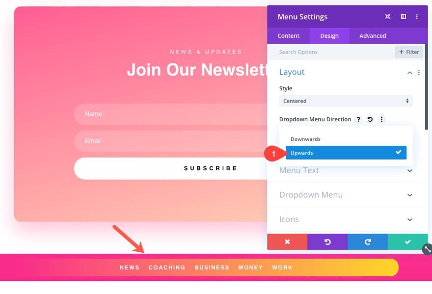
Change Dropdown Menu Direction for Bottom Category Menu
Because the menu will sit at the bottom of the screen on mobile, change the direction of the dropdown menu:
- Dropdown Menu Direction: Upwards
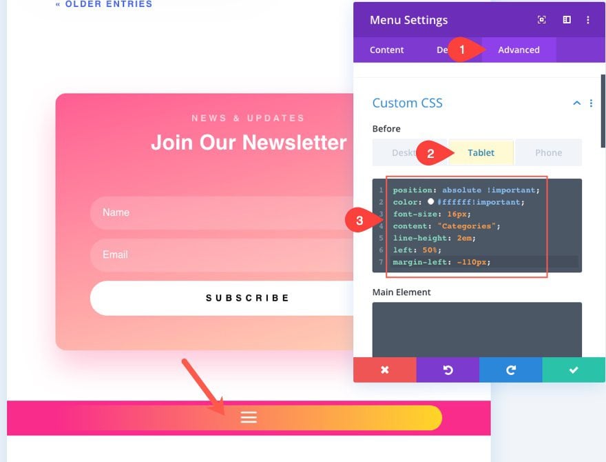
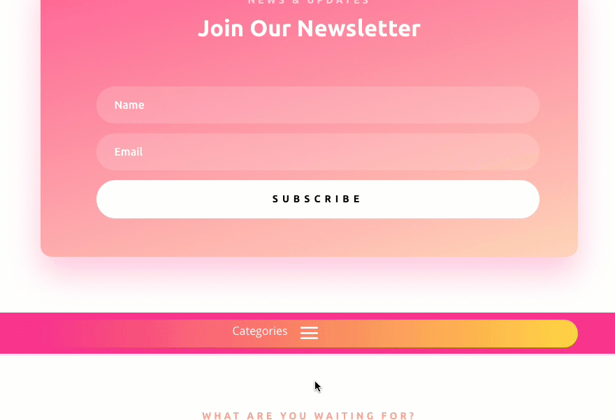
Add “Categories” Menu Label
To add a label next to the mobile menu icon, under the advanced tab of the Menu Settings, add the following custom CSS to the Before Element:
position: absolute !important;
color: #ffffff!important;
font-size: 16px;
content: "Categories";
line-height: 2em;
left: 50%;
margin-left: -110px;
Here is what the menu looks like so far on mobile.
Hide Top Menu on mobile
To keep from overcrowding the header on mobile, disable the top menu on phone and tablet. This will only show the top sticky menu on desktop.
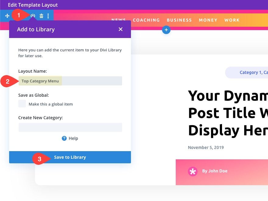
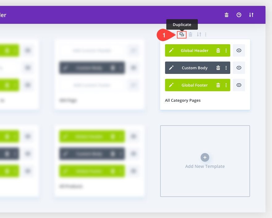
Save Both Menus/Rows to the Divi Library.
We are finished creating the two category menus for the layout. To make it easy to add them to other templates, we can save them to our Divi library. To save the top menu, select the “Add to Library” icon from the Section Menu. Then give the Layout a name and click the “Save to Library” button.
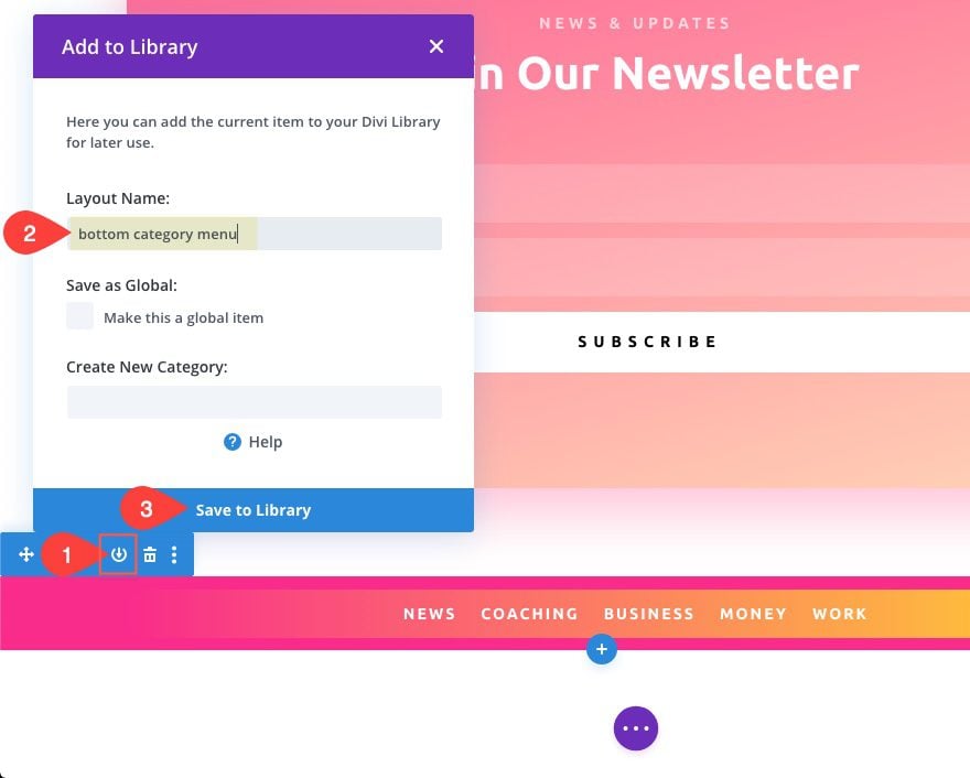
Repeat the same process to save the bottom menu to the library as well. Just make sure and give it a name that you will remember.
Final Result of Blog Post Template
Let’s check out what a live post looks like with our new sticky category menu in place.
Desktop View (Top Menu)
Mobile View (Bottom Menu)
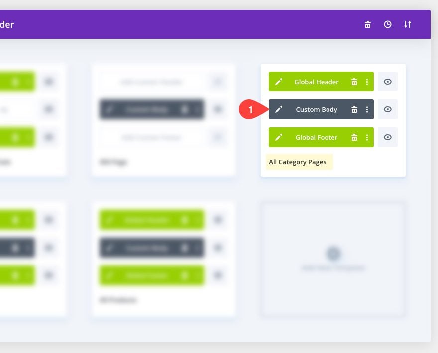
Since we have our menu sections added to the Divi Library, we can add them to any template layout. The next template we are going to add the category menus to is the Category Page template.
Edit the Body Area of the Category Page Template
Find the Template assigned to “All Category Pages” and click the edit icon on the Custom Body Area.
Add top Category Menu from library
From within the template layout editor, click the blue plus icon to add a new section. Then choose the Add from Library tab and select the top category menu from the list.
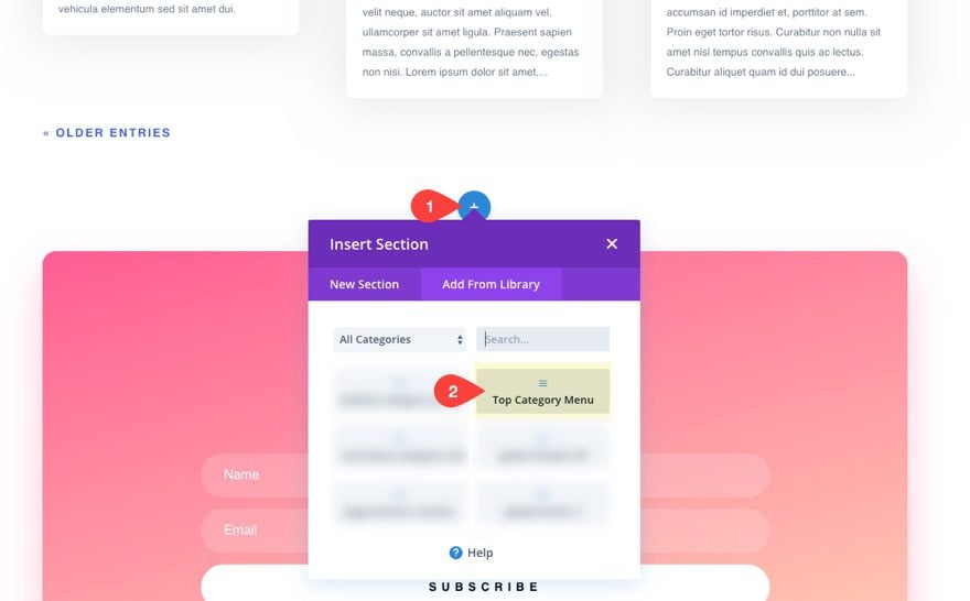
Then move the section to the top of the template layout.
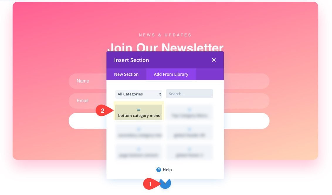
Add bottom Category menu from library
Next, click to add a new section to the very bottom of the layout. Then add the bottom category menu from the library.
Update Active Link Color for Menu
For this template, it is a good idea to update the active link color since the menu items will hold links to category pages using this template. Open the top menu settings and update the following:
- Active Link Color: #4160fd
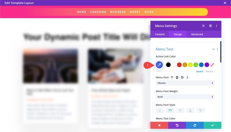
Now when you visit a category page, the active link will show blue.
Final Result of Category Page Template
We can also add our sticky category menu to the blog page of our website. A blog page is basically the home page of your blog and usually shows a feed of all your blog posts. With the Divi Theme Builder, we can create a template for the blog page and add the category menu easily.
Creating the Blog Template
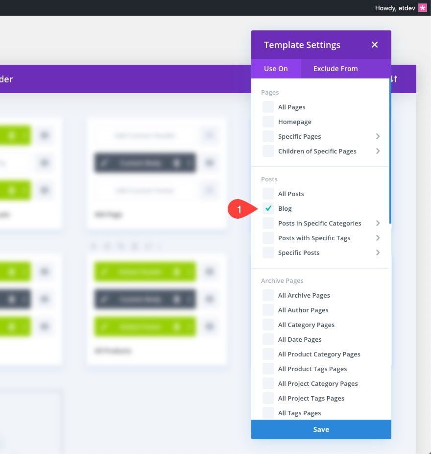
First, duplicate the Category Page template.
Then assign the duplicate template to the Blog.
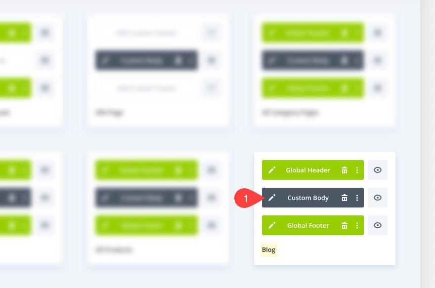
Edit the custom body of the Blog Template.
Customize the Blog Template Layout
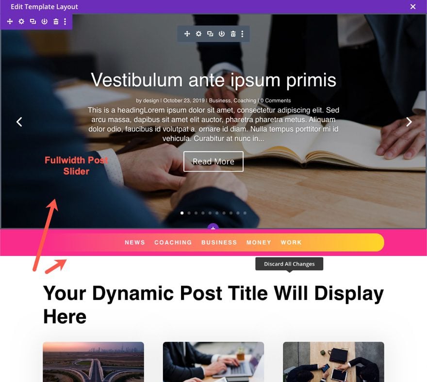
Use the Template layout editor to design the blog template. For now, let’s just give it a nice fullwidth post slider at the top of the page. To do this, create a new fullwidth section.
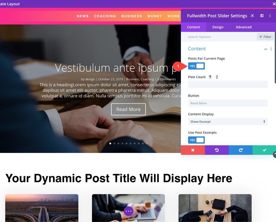
Add Fullwidth Post Slider
Then add a fullwidth Post Slider module to the section.
Set the Content to pull the “Posts for Current Page.” Then will make sure it is pulling the right dynamic content for the blog page.
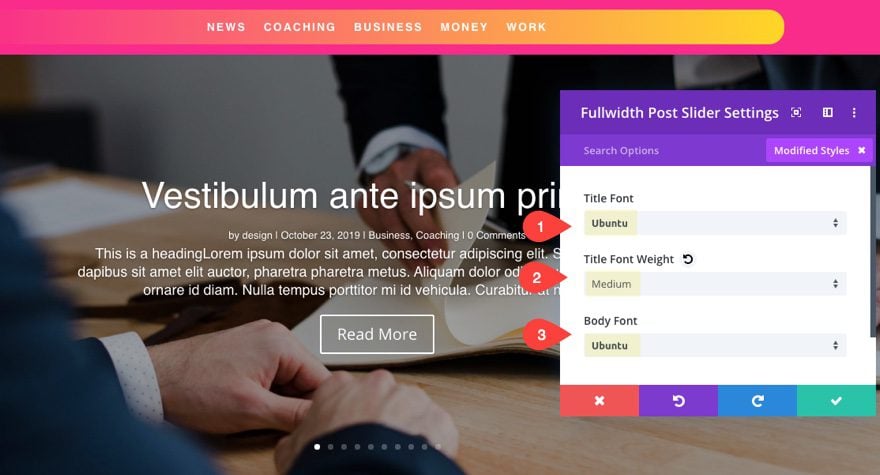
Update the fullwidth post slider settings as follows:
- Title Font: Ubuntu
- Title Font Weight: Medium
- Body Font: Ubuntu
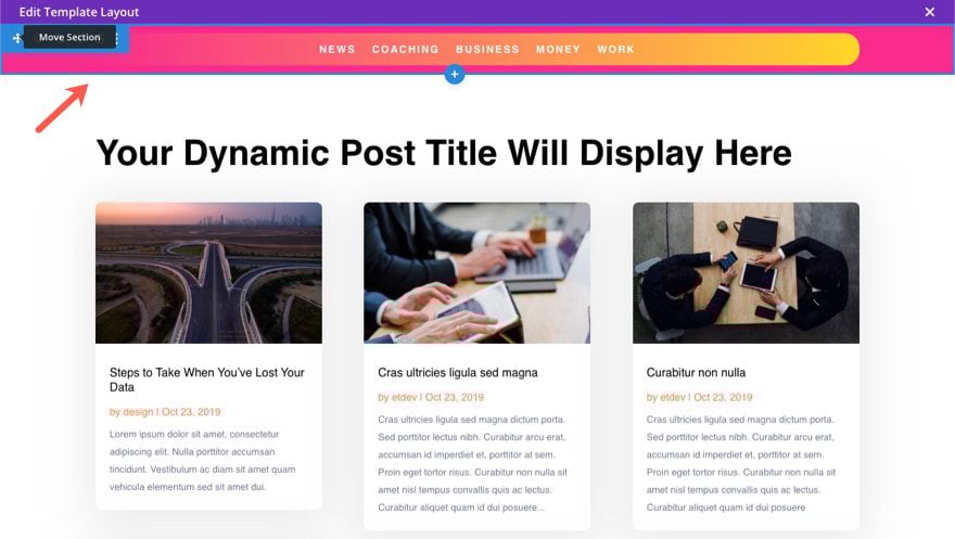
Move Menu Under Post Slider
For this layout, let’s drag the post slider to the top of the page so that the top sticky category menu will be located under the slider.
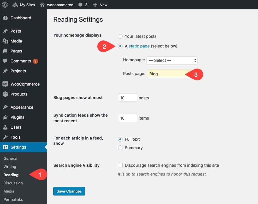
Create and Assign the Posts (or Blog) Page
Make sure you have a blog page designated in WordPress. To do this, go to Settings > Reading. Then for homepage displays, select a static page. Then select the page you want to use for the Posts page.
Final Result of Blog Page Template
Notice how the category menu becomes sticky when it reaches the top of the page.
Final Thoughts
A sticky category menu can really take your blog to the next level. Building one is really simply using the Divi Builder. And the Theme Builder makes it easy to add the menu anywhere you want on your site. Plus, you can even make a separate sticky menu for mobile to give your users the best experience. Hopefully this will come in handy on your own blog or next project.
I look forward to hearing from you in the comments.
Cheers!


Elegant is always my wp teacher. I am searching it and it’s show and teach me easily. Now am very happy.. thanks for share.
That’s awesome to hear! Thank you for the comment, Chef Cart.
I have tried on my website and the Sticky menu does not work. I have downloaded the template to try again and the menu is not blocked at the top. Any solution?
I use extra theme and would like to see some templates added:-
1. For existing Header and Post content template, Footer area built by theme builder. Extra Theme has trending bar in Header which is not includded in theme builder. so for most most of sites which are already news Trending section in Extra theme will not go for Header built by theme builder.
2. Extra theme existing content area is very customised and has fields for rating, sharing, reviews which is not yet incuded in theme builder. so please release extra theme specific header and footer templates built with theme builder.
Rajeev,
Thanks for these suggestions.
Many of the small features in Extra that Rajeev describes are important. In addition, while the cart is included the number of items count is not when using the theme builder.
I think that it is odd that Extra has features that Divi doesn’t and vice-versa. Would it not make senes to merge the two into one full featured theme? Or just make a new super theme based on the block editor?
Well explained. Hoping for more new articles like this.
Thanks! Glad you liked it.
Let’s see some stuff with sidebars! Not a single Theme Builder pack or tutorial has used a sidebar yet.
Dan,
We are working on getting some sidebar related articles out soon. In the meantime, this theme builder pack has a sidebar on the category page template: https://www.elegantthemes.com/blog/divi-resources/download-the-fifth-free-theme-builder-pack-for-divi
I’m not able to get this to work, unless I have the ‘Sticky Menu (or Anything!) on Scroll’ plugin installed. Also, I am not able to get the menu to stick to the bottom at all.
Dan,
Sorry for the late reply. I think I realize the issue. The tutorial was based on using a custom global header, not Divi’s default “fixed” header. The top sticky menu should work if you disable the fixed nav on Divi’s default menu. But the bottom stick menu should work on mobile, even with the default fixed menu in place. Not sure why that isn’t working for you. I apologize. I should have tested the functionality more extensively. I’ll see if I can provide a better solution.
In the meantime, if you want to have the category menu “stick” under the default fixed Divi Menu, you can replace the “Position:sticky; top:0;” CSS added to the section containing the header with…
Position: fixed;
Width: 100%;
CSS “position:sticky” might not work because it is not fully supported (by all browsers):
https://caniuse.com/#search=position%3Asticky
Same here, menu does not stick to the bottom despite the CSS
The same happens. It doesn’t work for me
A very valuable article, but please slow down the GIFs or suggest that readers take ginger chews or seasickness pills before viewing… ?.
BJ,
Sorry about that! haha Trying to keep those GIFs small. I’ll slow them down in the future. Thanks.
Very well explained, thank you !
Awesome!
Information is pretty good and impressed me a lot
Great! Thanks for the comment, Muhammad.