
Typically, adding a sticky (or fixed) header to your website is a safe play for larger screens (desktops) because there is more room. Adding a sticky header on mobile devices with smaller viewports (especially phones) requires a little more finesse. You don’t want that sticky header taking up too much of the viewport. I mean, there’s no point in boosting the navigation experience with a sticky header if you can’t see the pages you visit. For this reason, sometimes it is easier to add a sticky header specifically designed for mobile.
In this tutorial, we are going to show you how to add a custom sticky header for mobile using Divi. Using Divi’s built-in options (including the sticky position options), we’ll show you how to display a completely custom sticky header that includes those crucial elements (like a logo, a button, and a menu icon) without taking up too much space.
Let’s get started!
Sneak Peek
Here is a quick look at the sticky header for mobile we’ll build in this tutorial.
Sticky Header on Desktop
Sticky Header on Tablet
Sticky Header on Phone
Download the Sticky Header for Mobile Template for FREE
To lay your hands on the designs from this tutorial, you will first need to download it using the button below. To gain access to the download you will need to subscribe to our newsletter by using the form below. As a new subscriber, you will receive even more Divi goodness and a free Divi Layout pack every Monday! If you’re already on the list, simply enter your email address below and click download. You will not be “resubscribed” or receive extra emails.

Subscribe To Our Youtube Channel
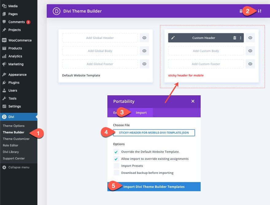
Import the Template to the Divi Theme Builder
To import the header template, you will need to navigate to Divi > Theme Builder.
Then use the portability icon at the top right of the page to import the JSON file.
Let’s get to the tutorial, shall we?
Adding a Custom Sticky Header for Mobile Using Divi
Part 1: Adding a Premade Header Template in the Divi Theme Builder
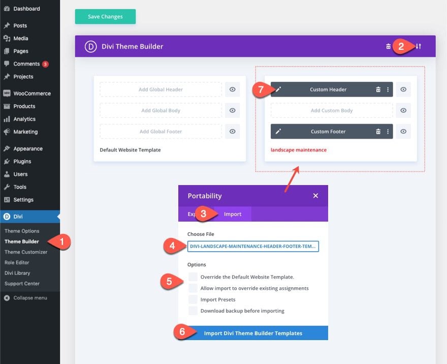
For this tutorial, we are going to add a custom sticky header for mobile to one of our free header templates using the Divi Theme Builder. First, download the import file from the blog post featuring the Landscape Maintenance header and footer template.
Once downloaded, follow these steps:
- Navigate to the Divi Theme Builder in the backend of your WordPress website.
- Then, in the top right corner, you’ll see an icon with two arrows. Click on the icon.
- In the portability popup, navigate to the import tab.
- Select the JSON file which you were able to download.
- Uncheck the Options to override existing templates.
- Then click on ‘Import Divi Theme Builder Templates’.
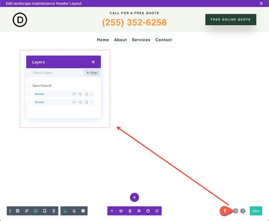
- Once you’ve uploaded the file, you’ll notice a new header and footer template. To modify the header template’s elements, start by opening the template’s custom header.
Inside the Header Layout Builder, open the layers view for easier access to the elements.
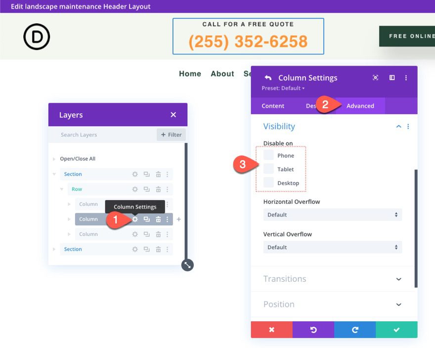
Part 2: Optimizing Top Header Element on Mobile
This particular header layout has two sections. The top section contains a logo, a CTA, and a Button. The bottom section has a sticky position already and contains the menu.
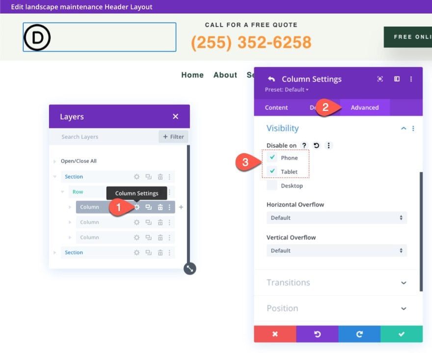
Since we are going to add a logo to a new sticky menu on mobile, we need to hide the logo in the top section on tablet and phone. To do this, open the settings for column 1 in the row of the top section and, under the advanced tab, select disable on Phone and Tablet. This will hide the entire column and the logo it contains on mobile.
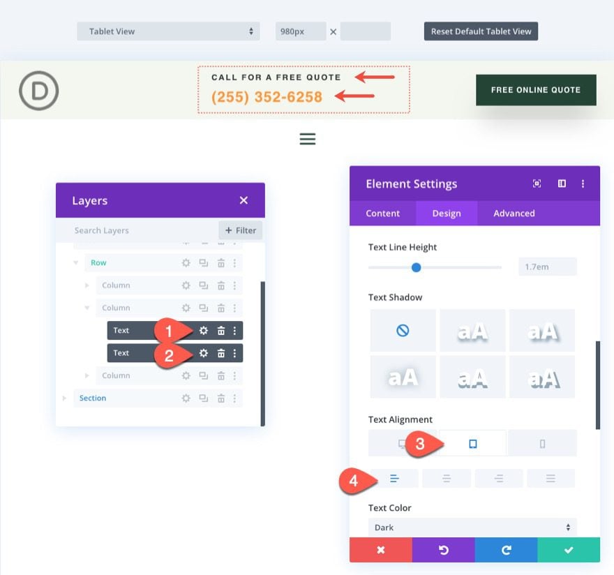
Next, open the settings for column 2 in the same row and make sure no devices are disabled. Since our logo will be disabled on mobile, we have room for this call to action on mobile.
For aesthetic purposes, update the text alignment for the two text modules that make up the call to action in column 2 as follows:
- Text Alignment (tablet and phone): Left
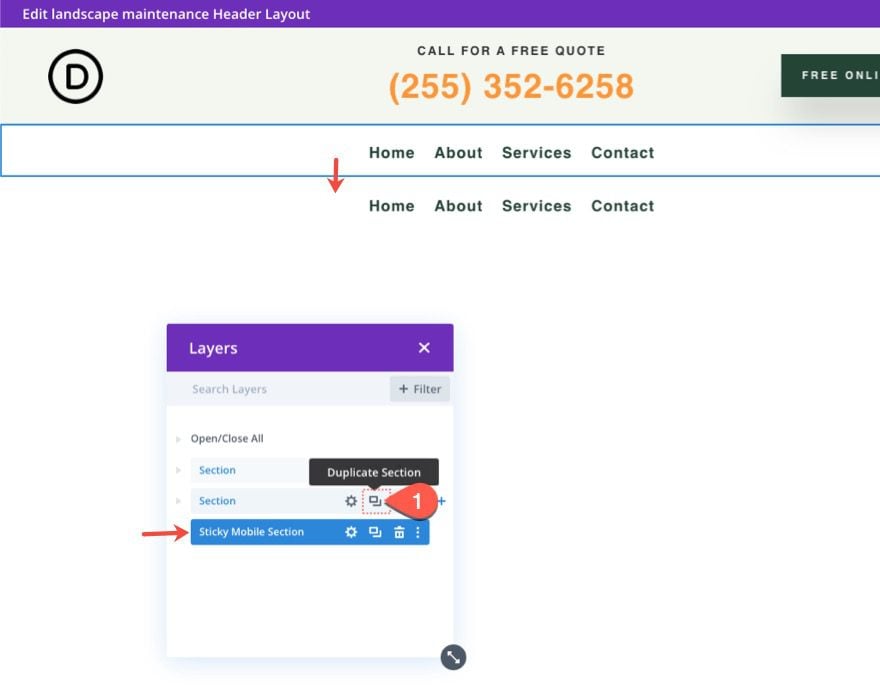
Part 3: Building a New Sticky Header Section for Mobile
For mobile devices, it is important to decrease the height of the sticky header as much as possible so that it doesn’t take up to much of the viewport when scrolling. For this reason, we aren’t going to make the top section of the header sticky. Instead, we are going to create a new sticky section that will only show on mobile. This way we can include elements that are specific to mobile and won’t take up too much vertical space in the sticky state.
To create the new sticky header section, duplicate the existing bottom section that contains the menu. You can also label the new section “Sticky Mobile Section” for reference later.
Hide Existing Sticky Section on Mobile
Since we are going to include a menu in our mobile sticky section, open the settings of the existing sticky section and select Disable on Phone and Tablet.
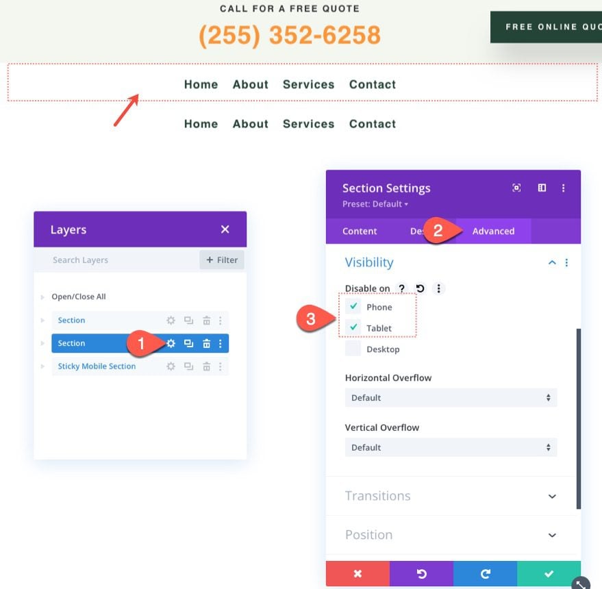
Next, open the settings for the new mobile sticky section and select Disable on Desktop.
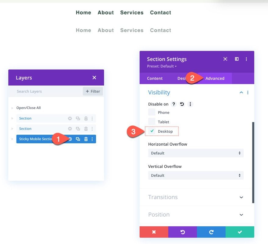
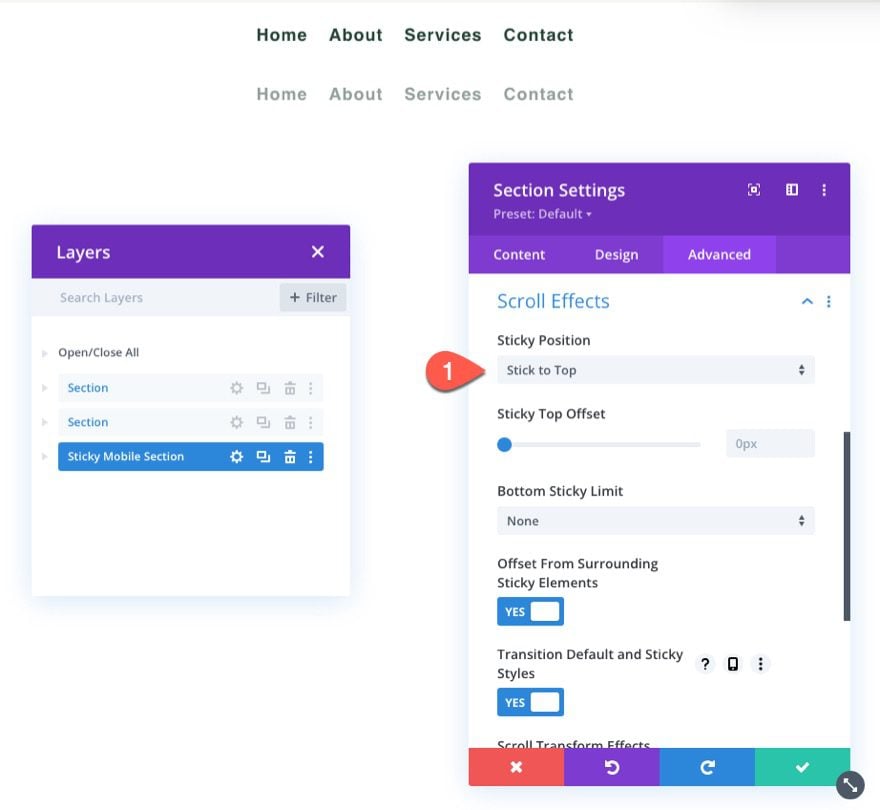
Make sure to give the new mobile sticky section a sticky position as follows:
- Sticky Position: Stick to Top
Update Row Sizing
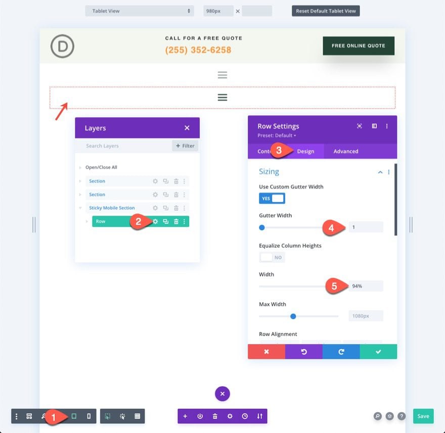
At this point, it is a good idea to start editing in tablet view to get a better sense of what the design will look like on mobile. To do this, click the tablet icon in the setting menu at the bottom of the builder.
Then, open the row settings and update the following sizing options:
- Gutter Width: 1
- Width: 94%
This will give us more room on mobile.
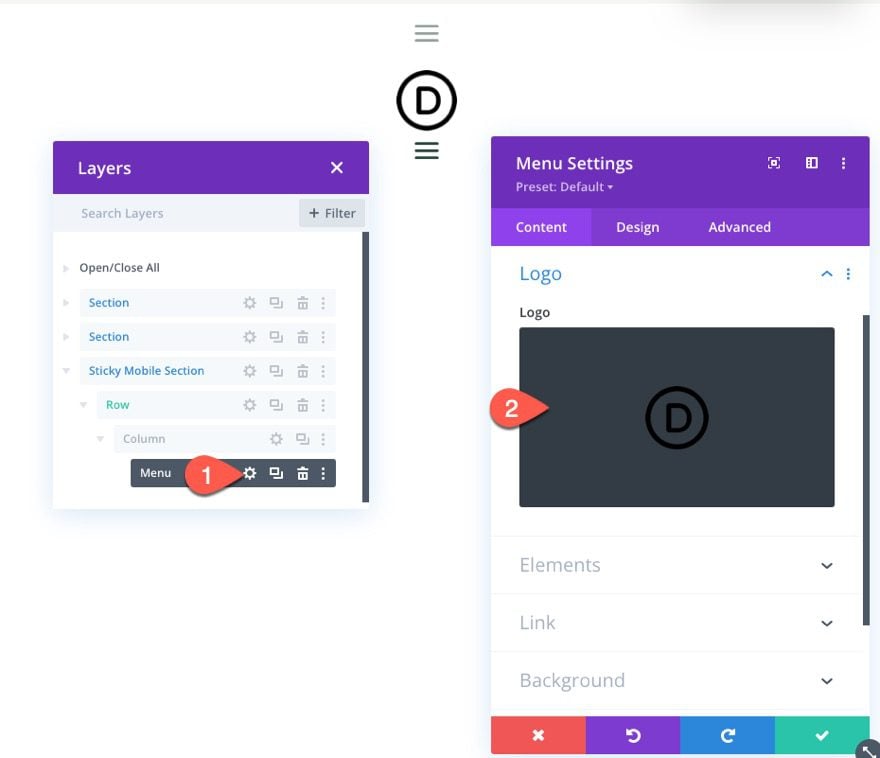
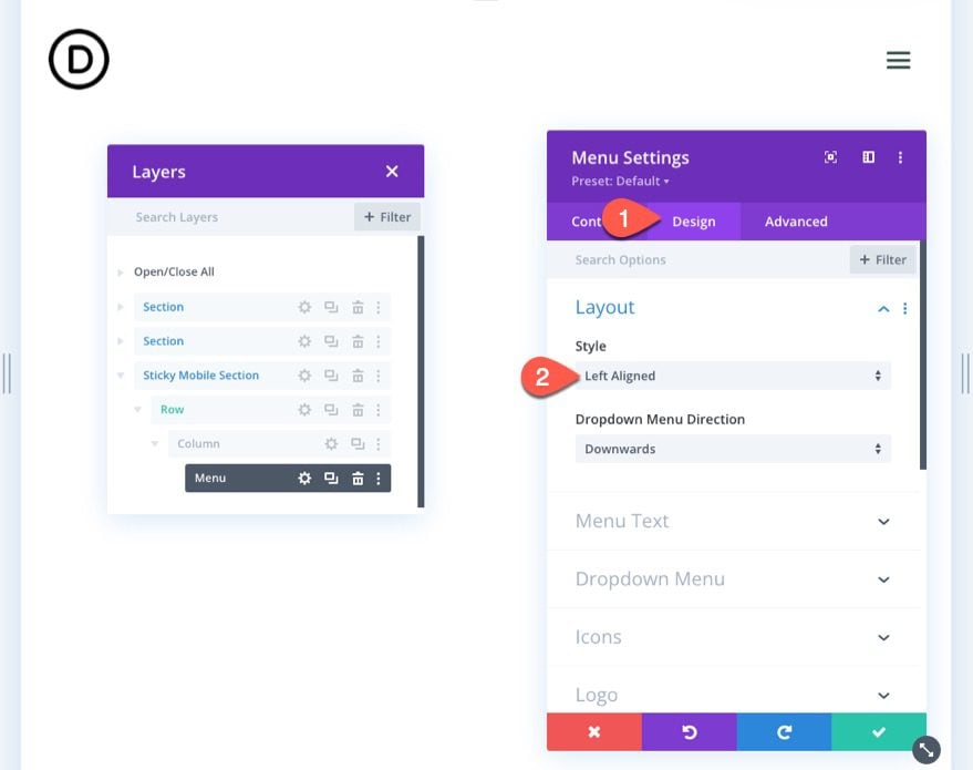
Update Menu Logo and Layout
Next, open the menu settings and add a logo to the menu.
Under the design tab, update the style of the layout:
- Style: Left Aligned
Part 4: Adding Sticky State Styling to Sticky Elements
Now that the elements are in place for the mobile sticky header, we can start optimizing the style of the elements in the sticky state.
Because the section has a sticky position, you will be able to toggle the sticky position options when styling the section or any child elements within the section. You can toggle the sticky position styling by clicking the thumbtack icon when hovering over a style option.
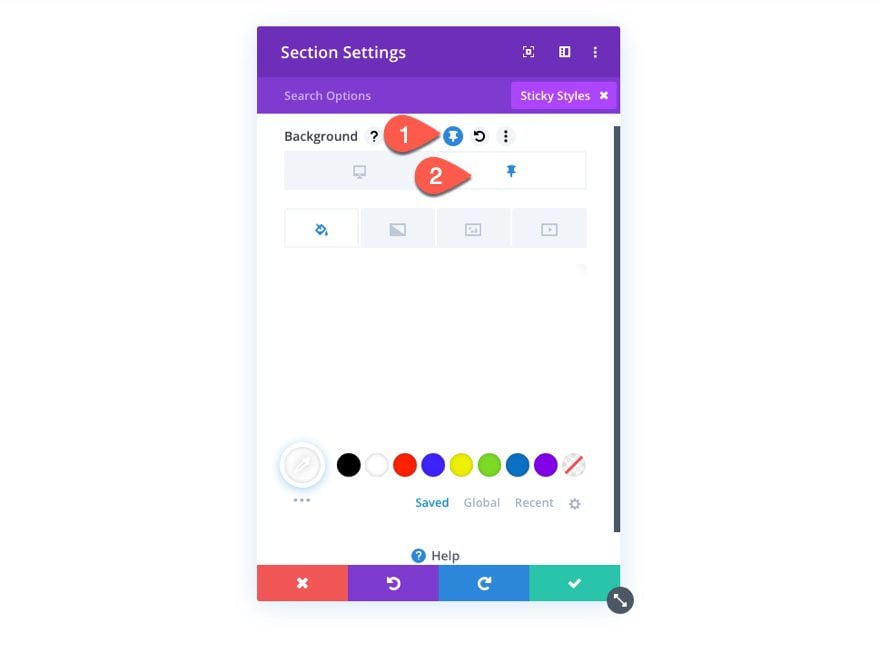
This will allow us to give the sticky header a different design once the user scrolls and activates the sticky state of the section.
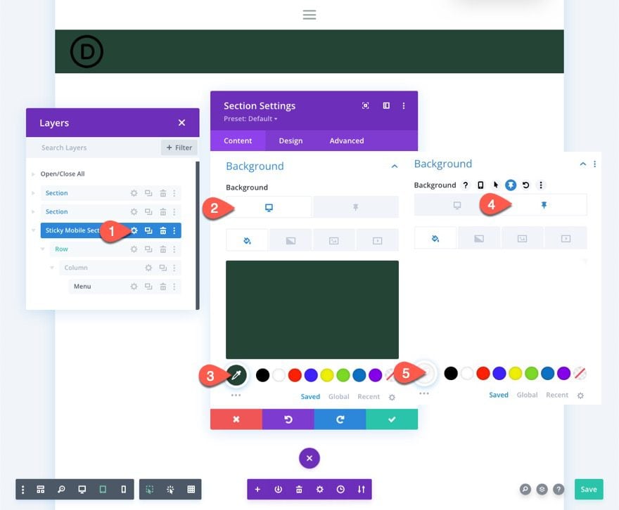
Sticky Section Background Color
To start, let’s update the background color of the mobile sticky section as follows:
- Background Color (desktop): #244435
- Background Color (sticky): #fff
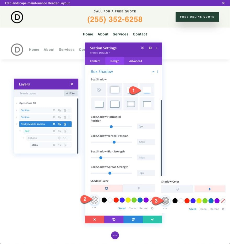
Sticky Section Box Shadow
Under the design tab, give the section a box shadow in the sticky state as follows:
- Box Shadow: see screenshot
- Shadow Color (desktop): transparent
- Shadow Color (sticky): rgba(0,0,0,0.1)
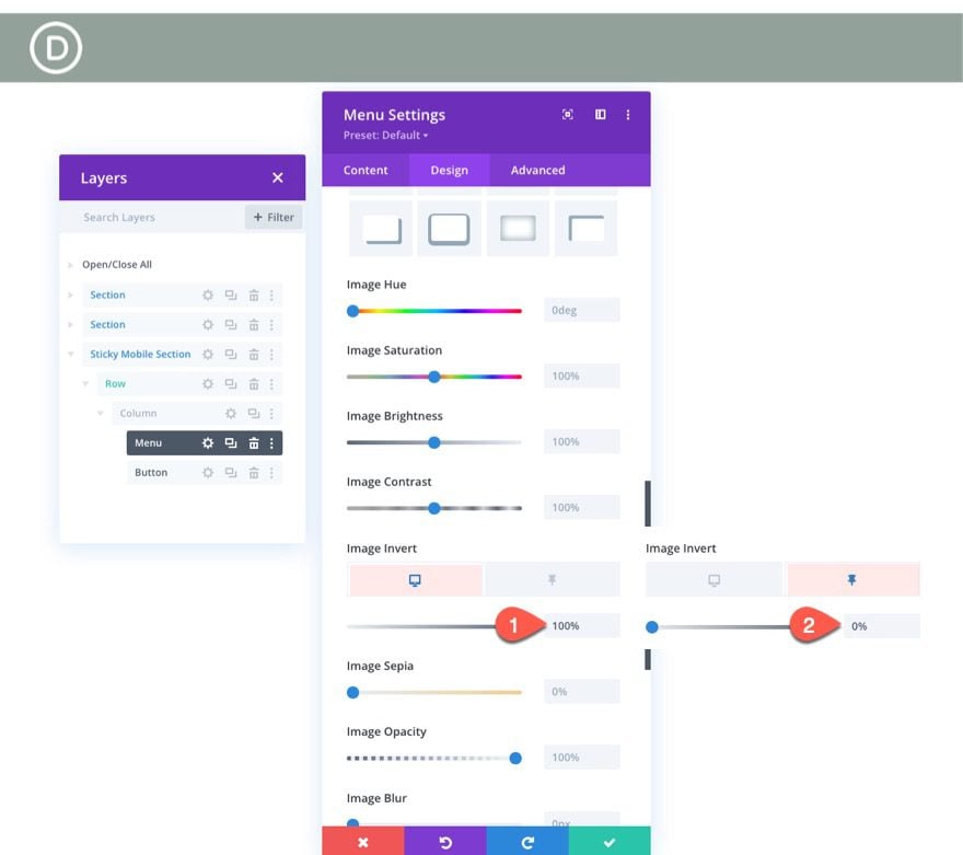
Sticky Menu Logo and Icons
Next, update the logo image with a filter that inverts the dark logo into a light logo image by default and then inverts it back to a dark logo in the sticky state. Under the Logo options, update the following:
- Image Invert (desktop): 0%
- Image Invert (sticky): 100%
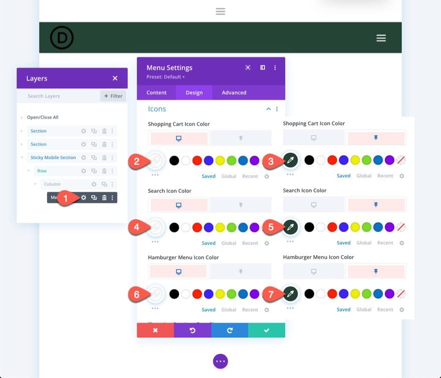
We also need to change the color of the icons as follows:
- Shopping Cart Icon Color(desktop): #fff
- Shopping Cart Icon Color(sticky): #244435
- Search Icon Color(desktop): #fff
- Search Icon Color(sticky): #244435
- Hamburger Menu Icon Color(desktop): #fff
- Hamburger Menu Icon Color(sticky): #244435
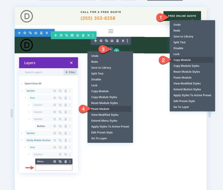
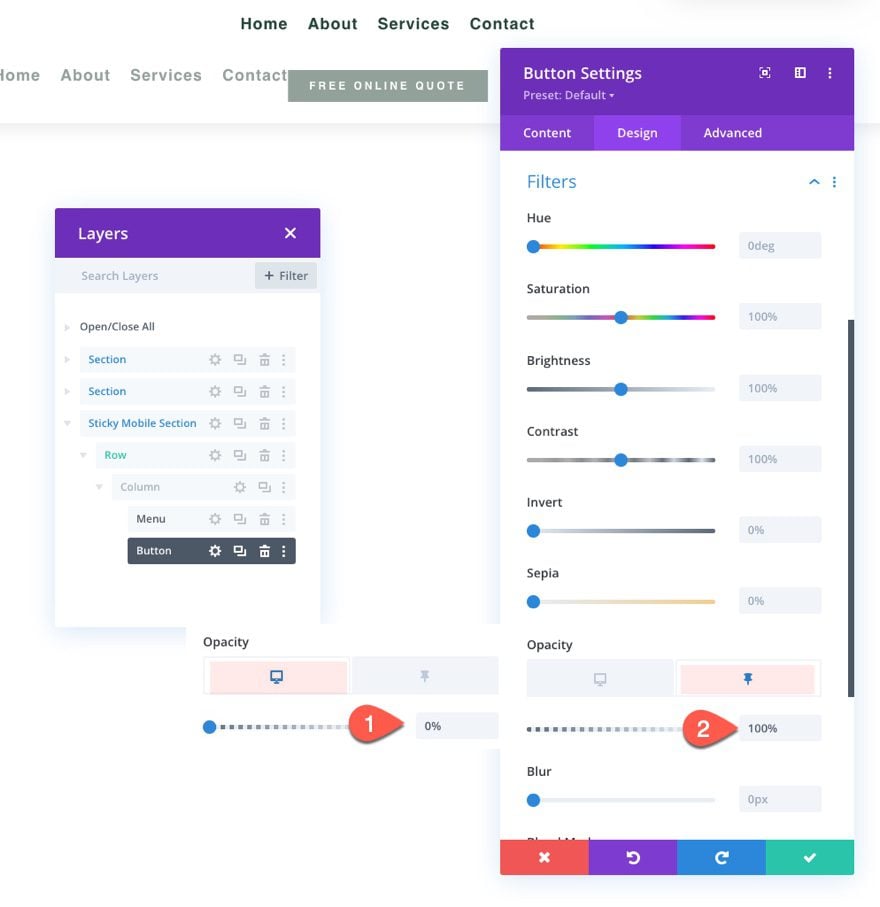
Sticky Header Button
Currently the button in the top section of the header will not show in the sticky header on mobile. We can add the same button to the new mobile sticky section and then make it appear only in the sticky state.
To add the button, copy the existing button in column 3 of the row in the top section. Then paste the button module under the menu in the mobile sticky section.
To make the button sit on top of the menu, open the button settings and, under the Advanced tab, update the position options as follows:
- Position: Absolute
- Location: Center
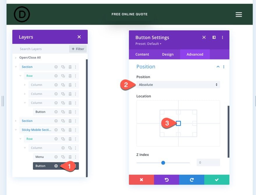
Under the design tab, update the filter option to change the opacity of the button from 0% to 100% in the sticky state.
- Opacity (desktop): 0%
- Opacity (sticky): 100%
This will hide the button from view until the user scrolls down the page.
Final Result
To view the result, save the layout, assign the template to a page on your website, and then save changes in the theme builder. Then open the page that has been assigned the template.
Here is the result.
Sticky Header on Desktop
Sticky Header on Tablet
Sticky Header on Phone
Final Thoughts
With Divi, you have the luxury of thinking mobile-first when it comes to those sticky headers. We just showed you how easy it is to add a sticky header for mobile using Divi’s built-in options. Once you unlock the power of Divi’s sticky options, you can get pretty creative with how you transition the elements of the sticky header. You can invert the logo from light to dark with a filter, make a button appear, or change the entire background color of the header. And that’s just the beginning. Feel free to experiment with more customizations that fit the needs of your next project!
I look forward to hearing from you in the comments.
Cheers!


I followed this tutorial and the dropdown for the hamburger menu is cut off on the left side and I don’t know how to fix it and have looked for tons of tutorials. Please help!
Kelly
Sorry to hear that Kelly. I suggest that you reach out to our Support Team by starting a conversation from our website. They’ll be happy to assist.
Thanks for posting such a detailed step by step guide. My website is currently on Thrive and I’m looking to switch because my website performance is poor according to Google Core Web Vitals. One of the reasons being on mobile, there is a very large shift when header menu is loading, ie, the Hamburger menu loads in an expanded view fully for a microsecond before Thrive Builder compresses and the hamburger icon is loaded. This might be a silly question but if I were to use Divi, will the header menus completely expand and then compress into the hamburger? Please let me know.
Hi Great article very helpful for me ! I know this kind of field is not that easy, but I tried do it better for my online business. Thanks a lot keep posting!
YESSSS!
Just was I was looking for.
I will have to play with this.
Thanks Jason,