
It’s that time again for our monthly Divi Showcase where we take a look at 10 Awesome Divi websites made by our community members. Each month we showcase the best Divi websites that were submitted from our community and today we want to share with you the top ten websites for the month of July. Throughout the post, I’ll point out some of my favorite design features that draw me to each of the websites.
I hope you like them!
Divi Design Showcase: New Submissions from July 2019
1. Enash
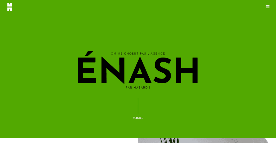
This site was submitted by Nicolas. The site uses lots of extra-large text for the title and for calls to action. The hero section displays a large green background with the title and tagline. A line with text informs the user to scroll. Scrolling reveals a two-column section. The left shows a CTA with large text and an extra-large blocky button. The right shows an image in true parallax. Another large section displays information about their services using large text to introduce the section and blurbs for each service. Another large section shows the names of clients followed by a revealing footer that includes contact information and a menu. I love the design of the Projects page, which uses large colored overlays with high opacity over the images in parallax.
2. Ljuba – Riflessi Digitali
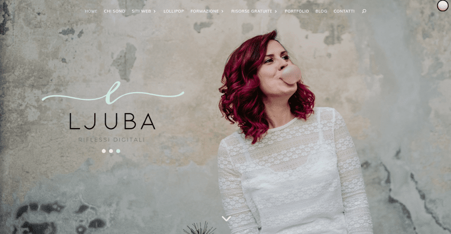
This site was submitted by Ljuba. It displays a full-screen image of the site owner to one side with the title and logo in the other. Under the hero image sits a thin full-width section with a tagline in a scripted font and an email opt-in form. An about section introduces the owner with a CTA followed by several CTA’s with lots of soft colors, scripted fonts, and elegant graphics. The blog section displays posts with a small overlay that includes the blog title. A simple contact form sits over a patterned background. The footer includes an Instagram feed. I like the portfolio page. It displays the examples within computer screens on a desk and includes the title in an overlay at the bottom.
3. Success Mode
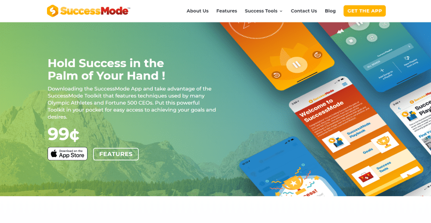
This site was submitted by Aaron Robertson. The site uses lots of bold color throughout, including the backgrounds, graphics, buttons, titles, links, and the CTA in the menu. The hero section displays an overlay over an image in parallax. The overlay provides information and links to the product on one side and stylized images of the product within mobile devices on the other. Features are displayed within blurbs using colorful graphics as icons. A full-width CTA uses large text, a large graphic, and a bold button over a dark background. Another CTA has a similar design as the hero section but uses a single stylized graphic of the app on mobile. Many of the other pages style the Divi modules with similar bold colors. I especially like the audio modules with background images and overlays. This site makes excellent use of color.
4. Eric Hooper
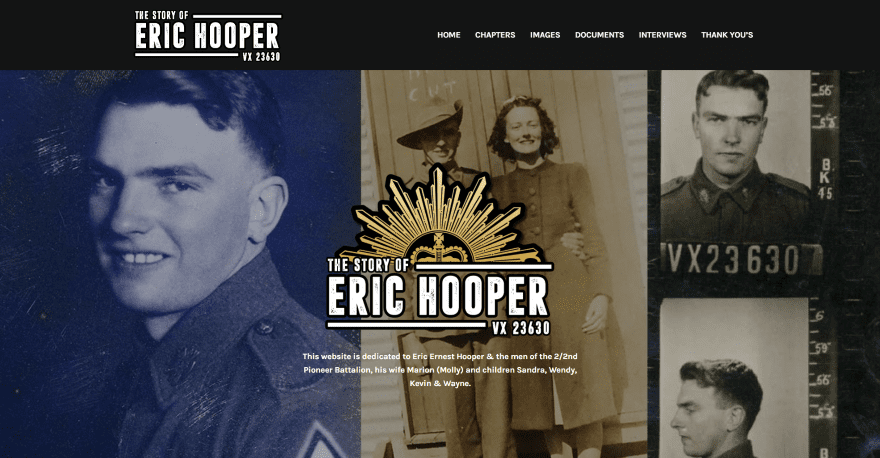
This site was submitted by Ty Hooper. It displays an image montage as the hero section’s background with the logo and tagline in the center in an overlay. A full-width about section follows this, showing an image to one side and information on the other. A section of Chapters displays blog posts in a grid. The chapters themselves display a background image of aged paper with text to one side and an image on the other. The text and images alternate locations throughout the chapter. Blog navigation buttons include the site’s logo. The Images page shows a wall-to-wall gallery, The Documents page is similar but adds titles. The Interviews page includes a combination of embedded video and images of documents in a multi-column layout.
5. Harmona Beach Hotel
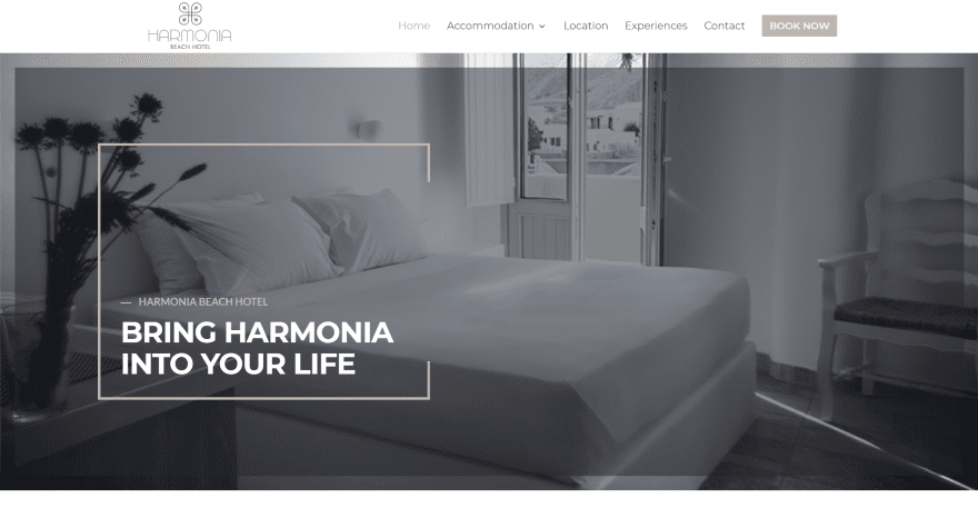
This site was submitted by George Paratsokis. As the site loads, we’re presented with a preloader of the logo (if you want to learn how to add a preloader to your website, swing by this tutorial). After loading, the hero section displays a large background image with an overlay that covers most of the image. Appearing to the left of the image is the title and tagline within an animated box that’s partially open on one side. The box, logo, title text, buttons, social icons, and the CTA in the menu are a nice tan that matches the site’s branding. An about section displays a link with a circle that animates to underline the text on hover. Rooms are shown within cards with the title at the bottom of the image. On hover, an overlay appears over the image, the title moves to the center, and then a Read More link appears. A full-width CTA displays an overlay similar to the hero section and draws the box around the text, overlapping the button.
6. Professional Website Basel
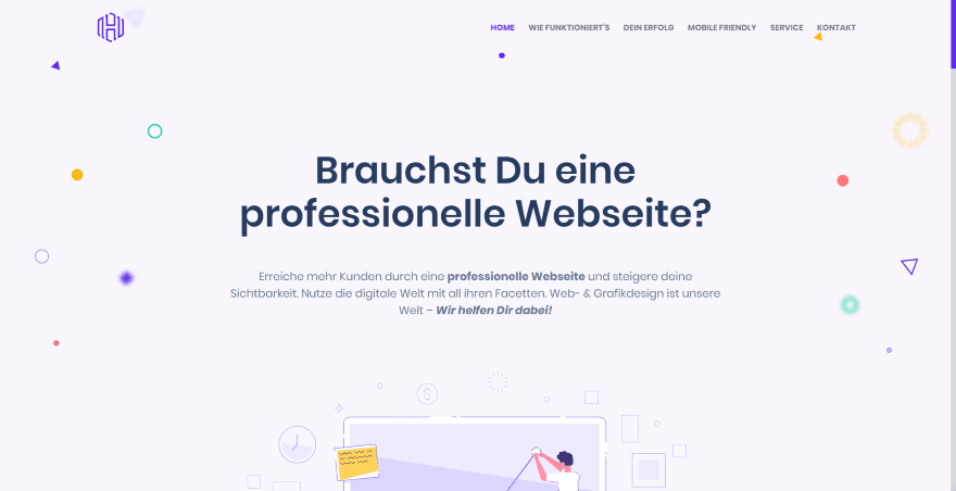
This site was submitted by Benny Hozjan. This is a one-page design with lots of details such as a purple dot that follows the sections and highlights the section in the menu, and a matching styled navigation bar. The hero section shows a patterned background with colored shapes with a tagline in the center followed by a graphic that overlaps the next section. An about section shows how it works using blurbs with animated icons that bounce even if you’re not hovering over them (you can create a similar effect using Lordicon). Several sections display information with text on one side and graphics on the other. Services are shown within blurbs that include hover animation, images, titles, and a styled dot at the bottom. A full-width CTA displays a short line of text in large type with a smaller tagline on one side and an animated button on the other. A section of client logos uses the same background as the hero section but displays it in parallax to create a different look.
7. Just VR
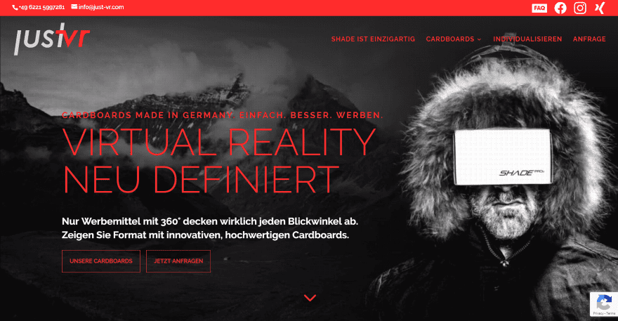
This site was submitted by Reinhard Wedemeyer. The site uses lots of red over both dark and light backgrounds for its branding. The top bar adds an FAQ and several social links. The hero section displays a full-screen background with a Cinemagraph to highlight the product on one side and the title and CTA on the other. The next section shows information within a blurb and images of the products within sliders. Another section of blurbs includes multi-colored icons that match the site’s branding. A full-width CTA displays the text and button on one side over a red background with a graphic of the product on the other. One of my favorite sections shows 8 smaller images of the products with a description in the middle. A detailed contact form is placed over the background image that’s used in the hero section. The individual product pages show the product over a bold red background. A CTA popup in the corner guides you to the FAQ includes an image of the product.
8. Nicolai Soerensen
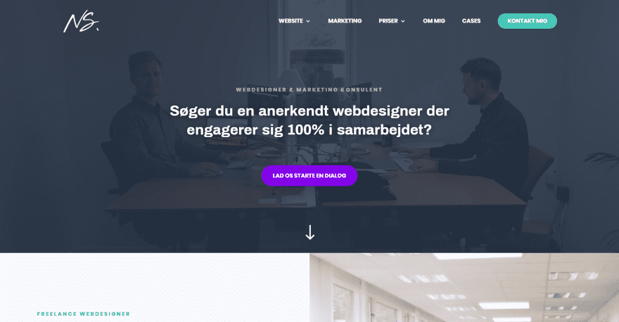
This site was submitted by Nicolai Soerensen. It displays a large background image with an overlay and a CTA in the center. Scrolling reveals a two-column section with a CTA on one side with green buttons that match the CTA in the menu and an image of the office on the other. The page includes several similar CTA’s. An About section shows information on one side with a circled image and award on the other. Several sections of blurbs include green line-drawn images that match the site’s branding. Case studies are shown as large images with a divider, title, and description. A read more button appears on hover. I like the section of gray logos within a lined grid that isn’t closed on the outer edges. It’s a minimal element that makes a big impact. The Marketing page shows client images with detailed statistics.
9. Emerge
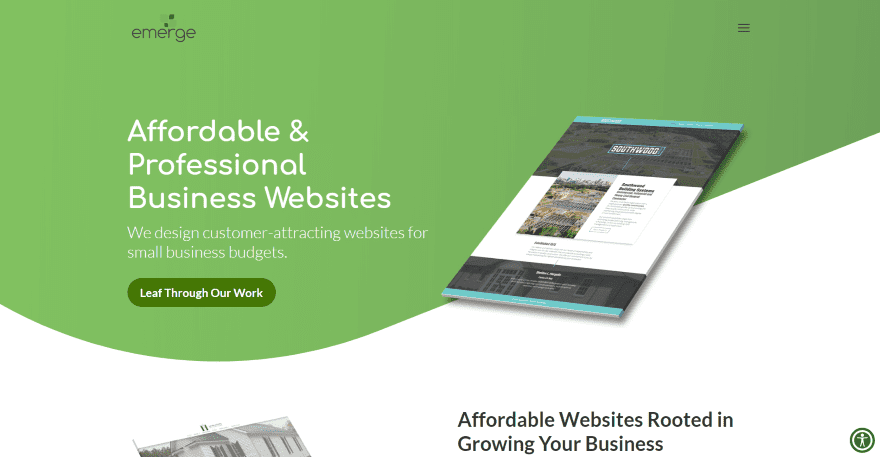
This site was submitted by Christian Schick. It displays a green background with a wavy divider with the CTA on one side and an image on the other that overlaps the next section, which shows an image and detailed information. The images are angled away from each other and diagonals to create an interesting visual effect. The next section shows text on one side and icons on the other. The icons use solid backgrounds with styled shapes to stand out. The shapes match the logo. I like the section of projects. Each project shows an image next to a block of text in a multi-column layout. A text module stands in the center of a section with wavy dividers that overlap the following section that leads into a CTA, and then into the styled footer with a simple email form over a wavy pattern. Each of the pages uses a wavy background with a gradient in the overlay for the title, that also includes icons and a tagline.
10. Mornings People
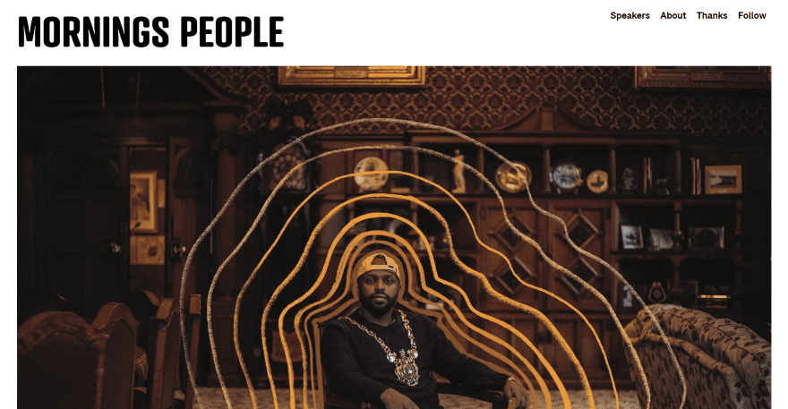
This site was submitted by Lucy. The homepage is a mosaic of images in a multi-column layout. The images are stylized with artistic overlays and other images cropped together. Images of the speakers link to their personal pages. Hovering over them reveals a text box with their name and title and a green border on two sides. Other images of the company are used to fill in space where needed and don’t link to anything. The page of speakers displays large images in a grid with titles under them. The personal pages work like blog posts and display a full-screen image followed by the content. Quotes within the content are in green and match the blog navigation links. The content includes three columns with a logo on the left, the main content in the center, and information in a sidebar on the right.
In Closing
That’s our 10 best community Divi website submissions for the month of July. These sites look amazing and as always we want to thank everyone for your submissions!
If you’d like your own design considered please feel free to email our editor at nathan at elegant themes dot com. Be sure to make the subject of the email “DIVI SITE SUBMISSION”.
We’d also like to hear from you in the comments! Tell us what you like about these websites and if there is anything they’ve done you want us to teach on the blog.
Featured Image via MSSA / shutterstock.com


hello,
thanks for sharing links.
interesting content.
Number 6 is awesome i love clean design.
Lovely designs!
Especially number 10.
Nice looking sites and this is the part where I come across as a hater I guess. But seeing is how these are the “best submitted” and “10 awesome websites created with Divi” I was curious to see if they struggle like myself and others with achieving a decent mobile score with Divi.
Results below from Google Page Speed (Mobile) a little less than inspiring.
Enash – 15%
LJuba – 49%
Success Mode – 62%
Eric Hooper – 59%
Harmona Beach Hotel – 28%
Basel – 69%
Just VR – 23%
Nicolai Soerensen – 37%
Emerge – 44%
Mornings People – 63%
I assume with the amount of time taken to make the sites look attractive they did not overlook mobile and loading times – so where does the issue lie?
I would love to see this addressed as well. Divi is so easy to work with for desktop, but I know I need to design mobile-first nowadays and Divi lacks in that department.
Do you have an article on how to style a CTA button in the menu?
Thank you for featuring Mornings People! I loved working on this project alongside the other creative, inspiring volunteers from the Creative Mornings Sheffield team.
Hi,Randy
I’m so glad to come across such blog post.
Great designer-Aaron..
It looks very interesting and thanks for sharing useful content here with us.
Happy to see SuccessMode here!
Aaron is a great designer, and I loved working with him on this project!
Well the website was definitely a collaborative effort! PKs genius shines through with the development
Mornings People is definitely my favorite out of this batch.
Great job everyone!
Mornings People is quite creative indeed! My fave as well!
Each design looks unique and special. Good show. Soon will list my websites here.
Nice showcase…
Nice list! My favorite is Harmona Beach Hotel! But well done to everyone else as well 🙂