
When you generate font size variables in Divi 5, one of the most important choices is the scale type. Fluid, Fixed Responsive, and Fixed Single can all create a usable typography system, but they behave differently once those variables are applied across your site.
The right choice depends on how you want your typography to respond across screen sizes. Do you want text to scale smoothly between viewport widths? Do you want exact values at each breakpoint? Or do you want one fixed scale that stays the same everywhere?
In this post, we’ll compare the three font scale types in Divi 5’s Variable Generator, explain how each one works, and show when to use each option.
- 1 What Is The Variable Generator In Divi 5?
- 2 Why Font Size Scaling Matters
- 3 Quick Comparison: Fluid, Fixed Responsive, And Fixed Single
- 4 1. Fluid Scale
- 5 2. Fixed Scale Responsive
- 6 3. Fixed Scale Single
- 7 Which Font Scale Type Should You Use?
- 8 Can You Change Scale Types Later?
- 9 How Font Size Variables Fit Into Divi 5’s Design System
- 10 Use The Variable Generator In Divi 5 Today!
What Is The Variable Generator In Divi 5?
The Variable Generator is a tool inside Divi 5’s Variable Manager that helps you create reusable design variables automatically. Instead of building each number variable by hand, you choose a category, configure the scale, preview the output, and add the variables to your site.
For sizing systems, the generator can create number variables for font sizes, spacing, gaps, widths, border radius, border width, and other layout values. Those variables can then be used inside modules, Option Group Presets, Element Presets, and other parts of your Divi 5 design system.
Subscribe To Our YouTube Channel
To open it, launch the Variable Manager in the Visual Builder. Hover over the Numbers group and click Generate Fluid Sizing Variables.
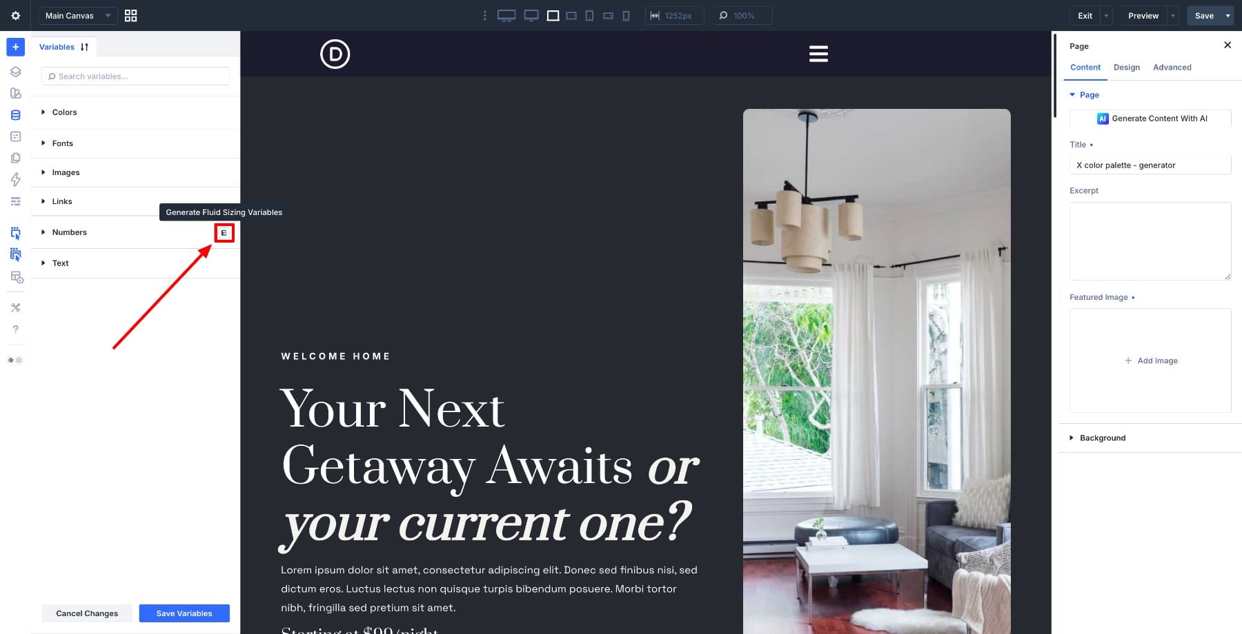
A modal opens with configuration options on the left and a live preview on the right. As you adjust the settings, the preview updates so you can see the scale before saving it.

When the scale looks right, click Add Variables To My Site. Divi saves the generated values as global number variables in your Variable Manager.
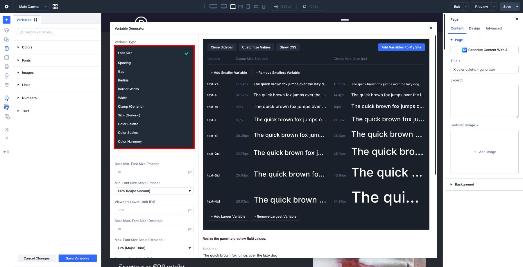
This article focuses on the Font Size Scale and the three scale types available when generating typography variables.
If you want a broader walkthrough of how variables, presets, and site planning fit together, the Divi 5 Mastery Course covers the full design system workflow.
Why Font Size Scaling Matters
Typography has to work across every screen size. A heading that looks balanced on desktop can feel too large on mobile. Body text that reads well on a laptop can feel small on a large display. Manually adjusting font sizes module by module is slow and hard to maintain.
A font size scale solves that by creating a related set of sizes. Instead of choosing random values for body text, labels, headings, captions, and display text, you use a system where each step is connected to the next.
That system becomes more powerful when the sizes are saved as variables. You can reference the same values across modules and presets. If you need to adjust the scale later, you can update the variables instead of chasing individual font size settings across the site.
Learn Everything About Divi 5’s Sizing System
Quick Comparison: Fluid, Fixed Responsive, And Fixed Single
Before looking at each scale type in detail, here is the practical difference.
| Scale Type | How Values Are Set | CSS Output | Best For |
|---|---|---|---|
| Fluid | Minimum and maximum values calculated with clamp() | One fluid value per token that scales smoothly with the viewport | Responsive sites where typography should adapt without breakpoint-by-breakpoint management |
| Fixed Responsive | Separate values set for each enabled breakpoint | Breakpoint-specific values that change at defined screen widths | Precise per-device or per-breakpoint control |
| Fixed Single | One static value set from a single base and ratio | One plain value per token with no responsive behavior | Text tokens that should stay the same across screen sizes |
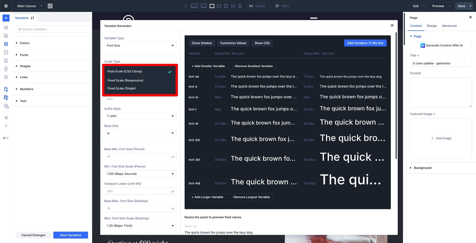
All three options create global number variables that you can use in your design system. The difference is what each variable contains and how it behaves across screen sizes.
- Fluid Scale: Creates variables that scale smoothly between a minimum and maximum value.
- Fixed Responsive: Creates variables with different values at different breakpoints.
- Fixed Single: Creates variables with one value that stays the same on every screen size.
1. Fluid Scale
Fluid Scale is usually the best starting point for modern responsive typography. It creates font size variables that scale smoothly as the viewport changes.
Instead of jumping from one font size to another at a breakpoint, a fluid value gradually increases or decreases between a defined minimum and maximum.
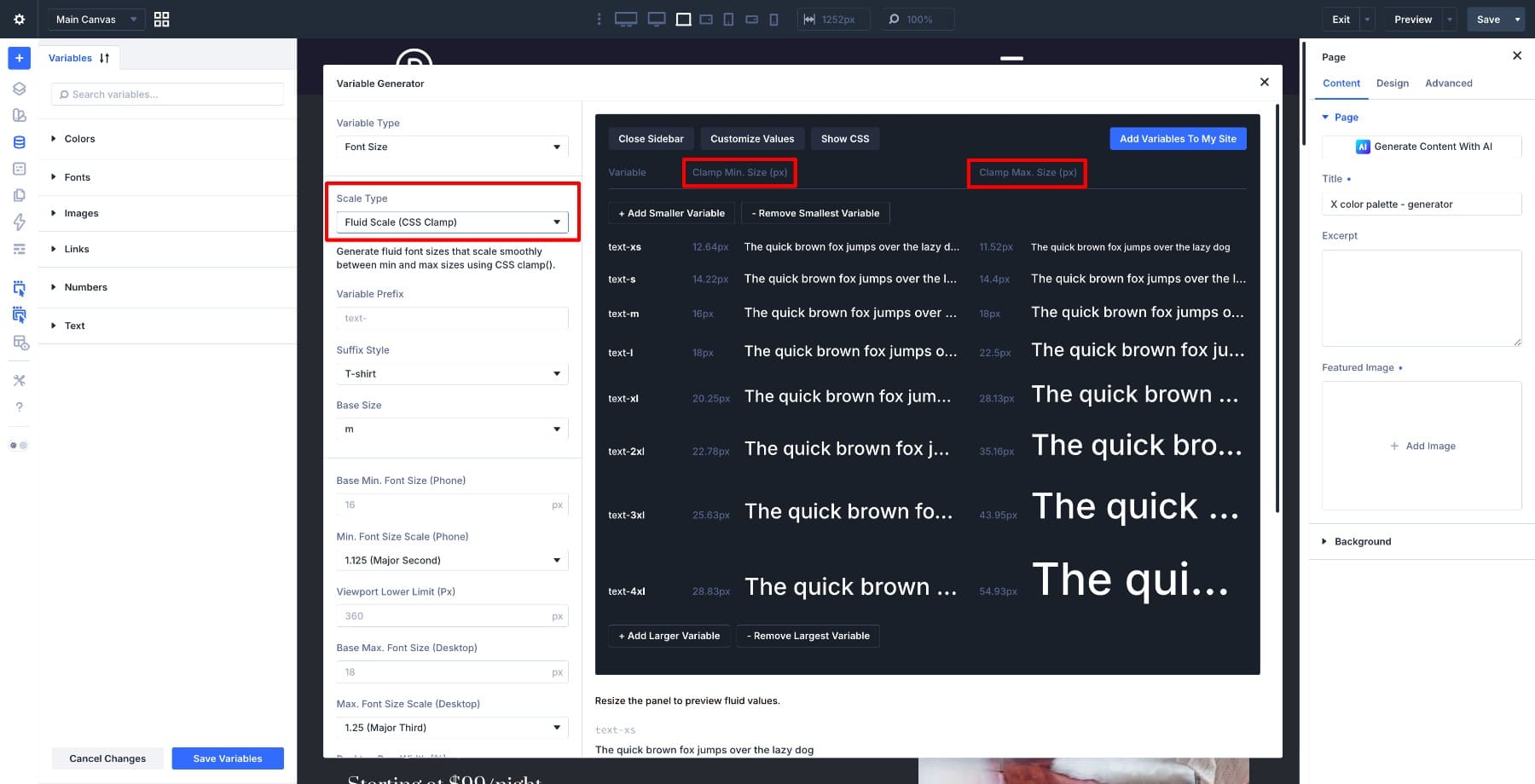
In CSS, this is commonly handled with the clamp() function. A clamp value includes a minimum, a preferred fluid value, and a maximum. Divi’s generator handles the math for you, so you do not need to write the CSS by hand.
What Divi Generates
When you choose Fluid Scale, Divi creates a set of number variables for your font size scale. Each variable represents a step in the scale.
You can add or remove larger and smaller steps before saving the variables.
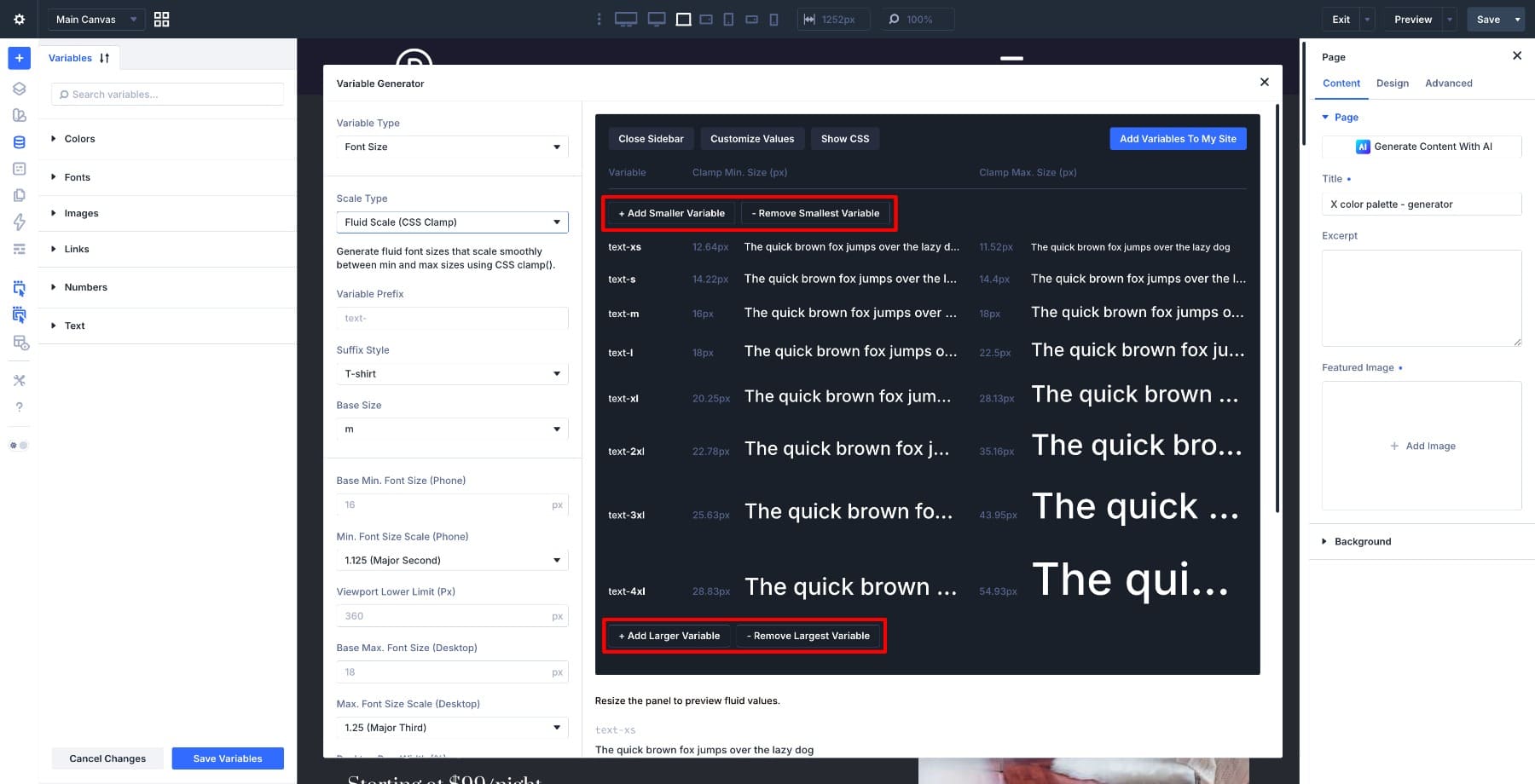
The variables use the prefix and suffix style you choose. For example, a text- prefix with T-shirt sizing can produce names such as:
- –text-xs
- –text-s
- –text-m
- –text-l
- –text-xl
Numeric suffixes can produce names such as –text-1, –text-2, –text-3, and so on.
T-shirt sizing is often easier to read inside presets because it describes relative size. Numeric naming can work well if your design system already uses numbered tokens. The best choice is the one your team will understand later.
How The Scale Is Calculated
Fluid Scale uses modular ratios to build related font sizes. Each step grows or shrinks by a consistent ratio, which keeps the type hierarchy balanced.
The default setup uses a tighter ratio for smaller screens and a larger ratio for desktop. That helps headings stay controlled on mobile while giving larger screens a stronger typographic hierarchy.
You can use the default ratios, choose another preset ratio, or customize the values manually.
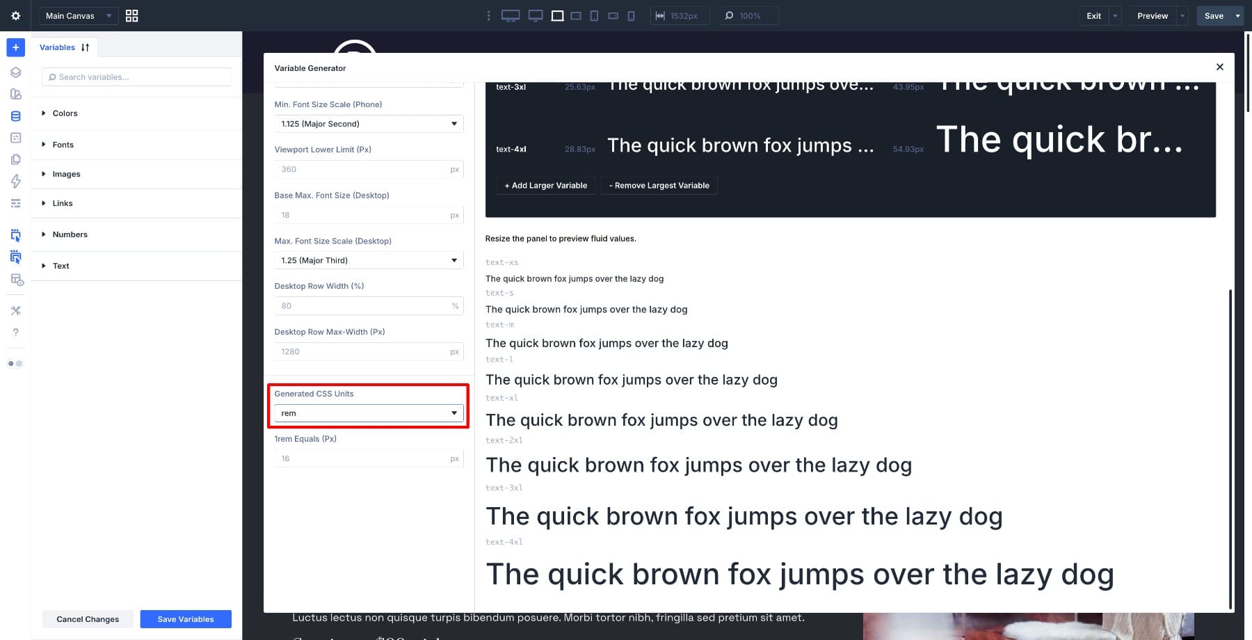
Divi also lets you choose the generated CSS unit. The default is rem, which is usually a good choice for typography because it respects the root font size. The 1rem Equals field tells Divi what pixel value to use for the calculations.
Fluid Scale Settings
The Fluid Scale settings let you control the anchor size, the responsive range, and how the scale relates to your layout.
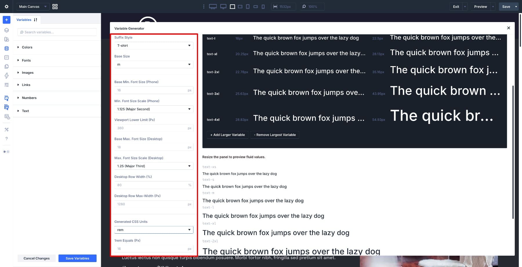
Key settings include:
- Base Size: Sets the anchor step in the scale. This is commonly the body text size.
- Base Min. Font Size: Sets the minimum size for the base step at the smaller end of the viewport range.
- Viewport Lower Limit: Sets where the lower end of the fluid range begins.
- Base Max. Font Size: Sets the maximum size for the base step at the larger end of the viewport range.
- Desktop Row Width: Helps Divi calculate the scale based on your content width rather than only the full browser width.
- Desktop Row Max-Width: Helps define the maximum content area used in the calculation.
These settings are useful because typography usually belongs to the content area, not the full browser window. A site with a narrow max-width should not scale type the same way as a full-width layout.
What The CSS Looks Like
Fluid Scale outputs values using clamp(). The structure looks like this:
clamp(minimum, preferred, maximum)
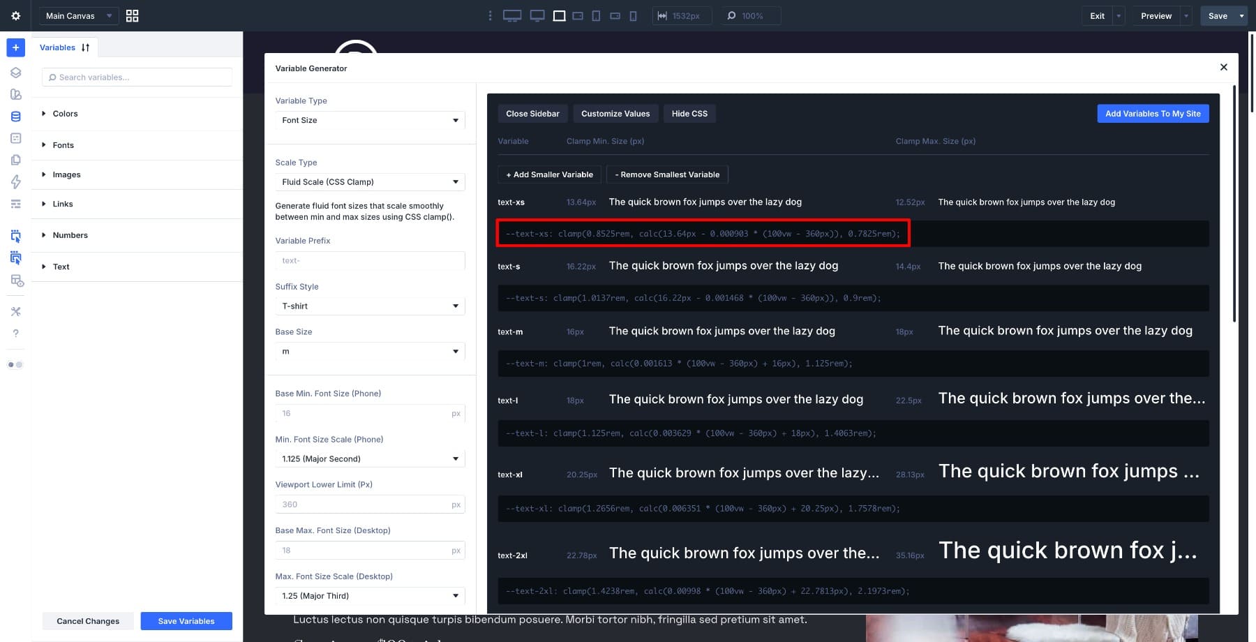
The first value sets the smallest allowed size. The last value sets the largest allowed size. The middle value controls how the size changes between those limits.
You can use the live preview to see how the scale responds before saving it.
When To Use Fluid Scale
Use Fluid Scale when you want typography to respond smoothly across screen sizes. It works especially well for:
- Modern responsive websites
- Fluid layouts
- Editorial pages
- Landing pages
- Sites with flexible containers and spacing
- Design systems where typography should adapt without manual breakpoint edits
For most Divi 5 sites, Fluid Scale is the safest default because it gives you responsive typography with fewer manual decisions after setup.
2. Fixed Scale Responsive
Fixed Scale Responsive uses defined values at specific breakpoints. Instead of scaling continuously, each variable changes when the viewport crosses a breakpoint.
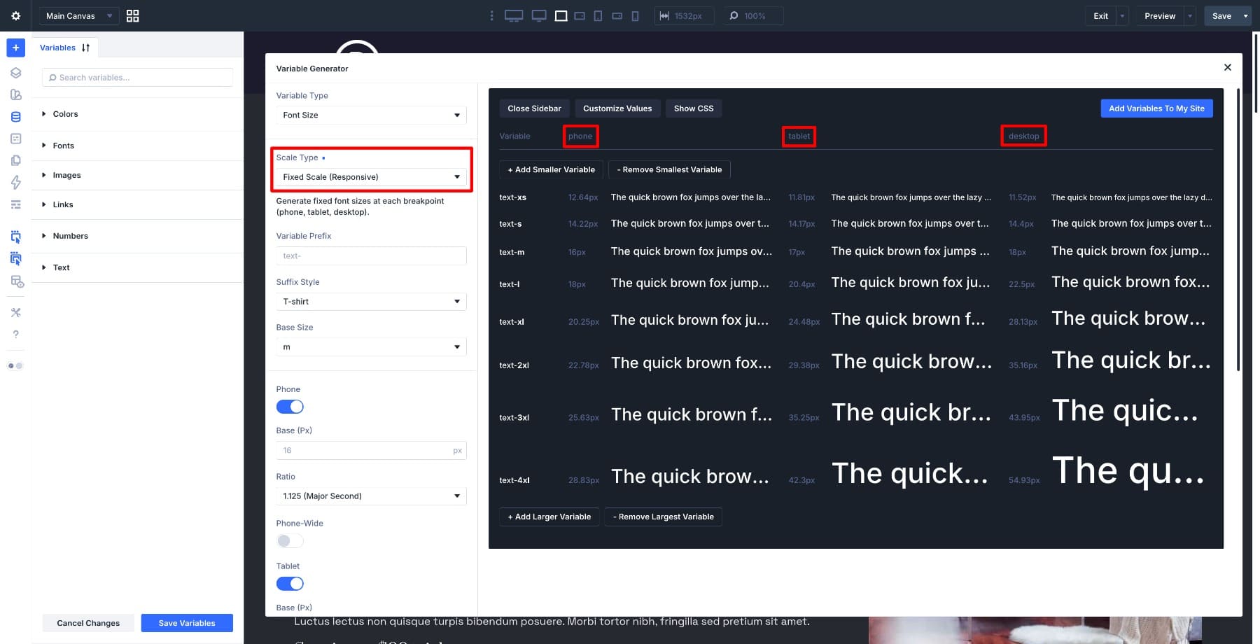
This approach gives you more explicit control. You decide the values for Phone, Tablet, Desktop, and any additional breakpoints you enable. The browser then applies the correct value for the current viewport.
What Divi Generates
Fixed Scale Responsive creates the same kind of named number variables as Fluid Scale, but the values are structured around breakpoints.
A variable might use one size on Phone, another size on Tablet, and another size on Desktop. The value does not slide between them. It changes when the active breakpoint changes.
This is helpful when your design has intentional shifts between device sizes. For example, a desktop layout may use a larger heading hierarchy, while the mobile layout may need a tighter scale.
Divi 5 supports multiple responsive breakpoints, including Phone, Phone Wide, Tablet, Tablet Wide, Desktop, Widescreen, and Ultra Wide. Only the active breakpoints are included in the generated output.
Fixed Responsive Settings
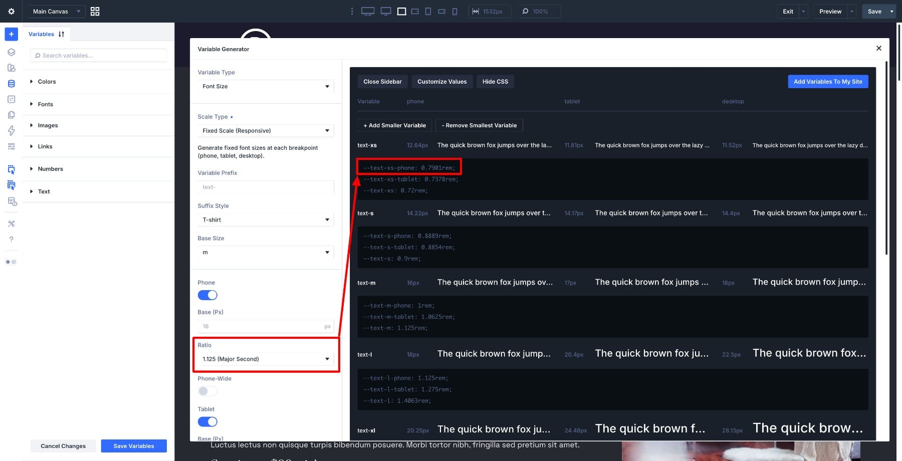
With Fixed Scale Responsive, settings are organized per breakpoint. Each active breakpoint can have its own base size and ratio.
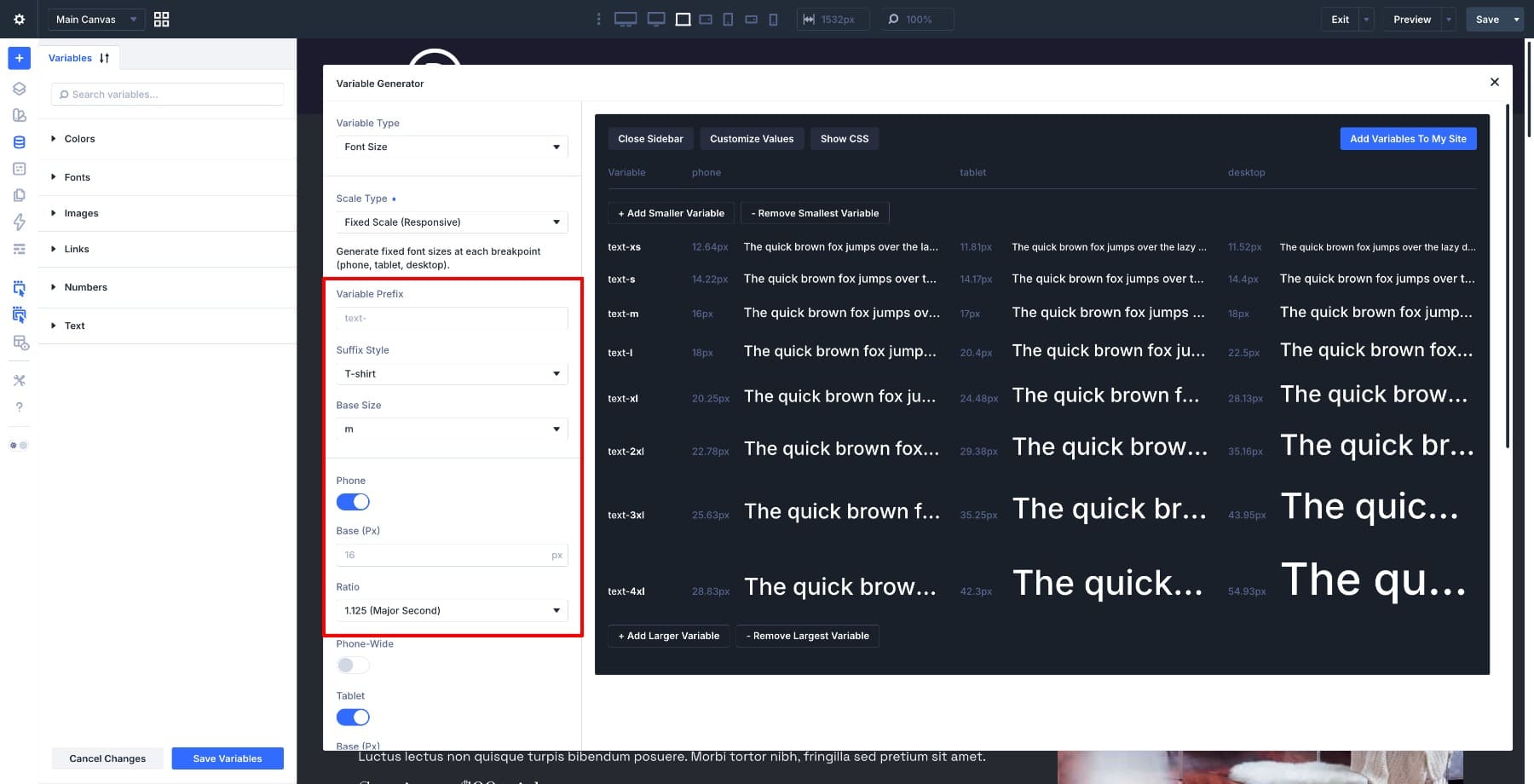
Key settings include:
- Breakpoint Toggles: Include or exclude specific breakpoints from the generated scale.
- Base Size: Sets the anchor font size for each breakpoint.
- Scale Ratio: Sets how strongly each step grows at each breakpoint.
This lets you create a compact scale on phones and a more dramatic scale on desktop, while still keeping each breakpoint controlled.
What The CSS Looks Like
Fixed Scale Responsive outputs plain values that are scoped to breakpoint rules. Each variable gets a value for each enabled breakpoint.
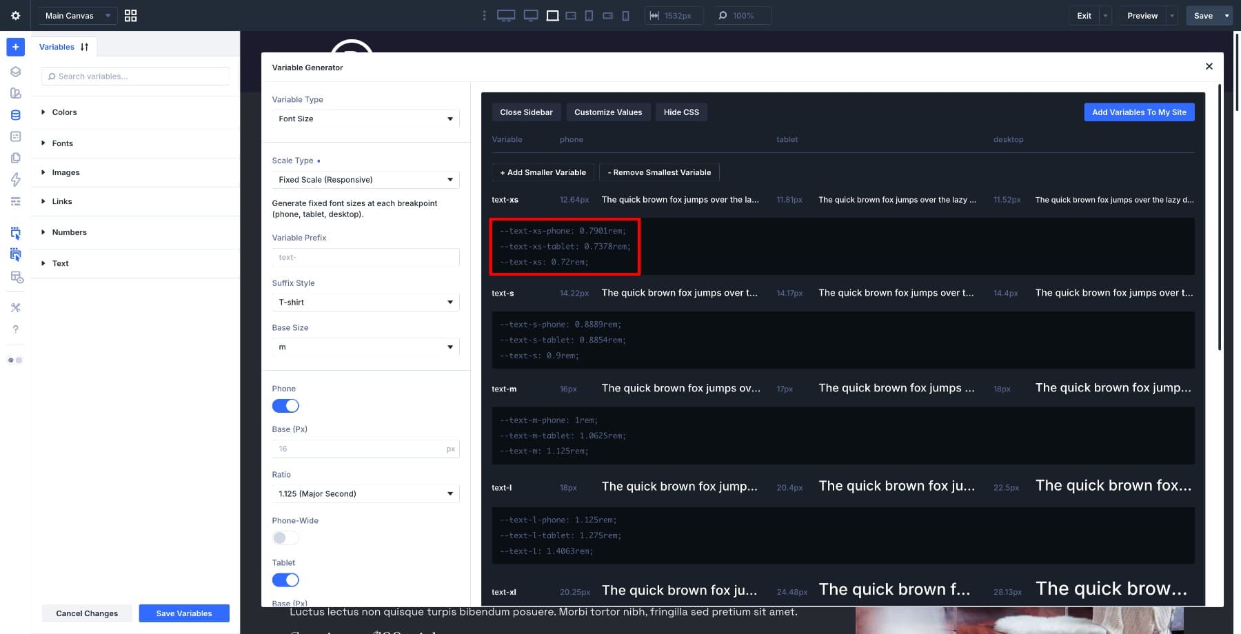
There is no fluid middle range. A size might be one value below a breakpoint and another value above it. That makes the behavior predictable, but less fluid.
When To Use Fixed Scale Responsive
Use Fixed Scale Responsive when you want exact control at each device size. It works well for:
- Client projects with specific font sizes in design files
- Layouts that change structure sharply between breakpoints
- Sites where mobile and desktop should have noticeably different type systems
- Projects where designers want to approve exact values per breakpoint
- Builds that rely on many custom breakpoints
Fixed Scale Responsive gives you more control than Fluid Scale, but it also asks you to make more decisions.
3. Fixed Scale Single
Fixed Scale Single creates one static font scale. Each variable gets one value, and that value stays the same across screen sizes.
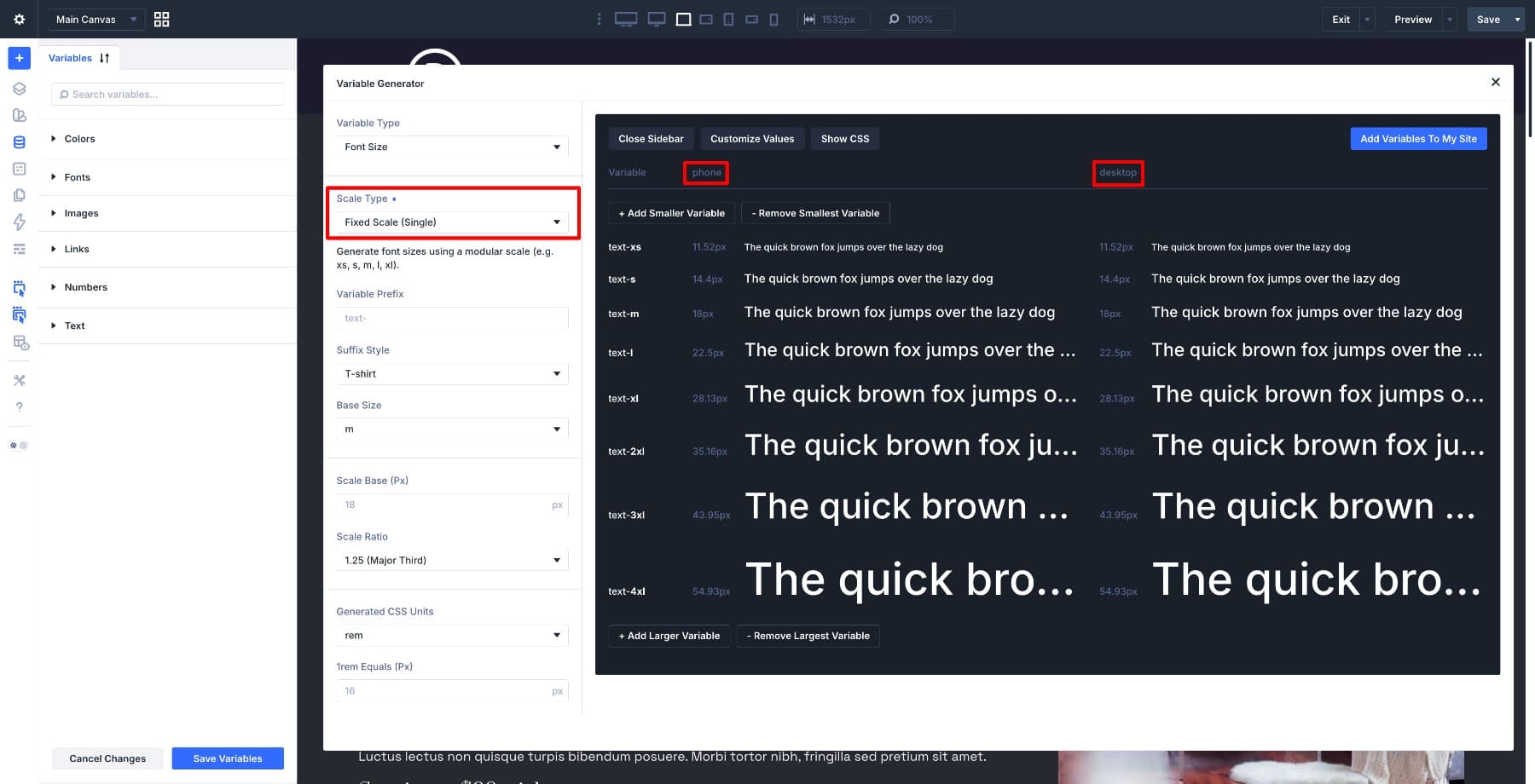
This is the simplest scale type. There is no fluid scaling and no breakpoint-specific output.
What Divi Generates
Fixed Scale Single creates named number variables like the other scale types, but each variable stores one static value.
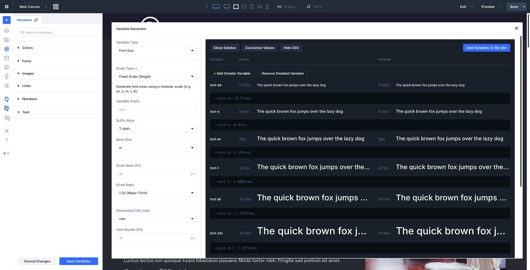
For example, a medium text variable might output one value and use it everywhere.
–text-m: 1.125rem;
There are no clamp functions and no media-query-based value changes. The hierarchy is still modular because the scale uses a base and ratio, but it does not respond to viewport size.
Fixed Single Settings
Fixed Scale Single has the fewest settings.
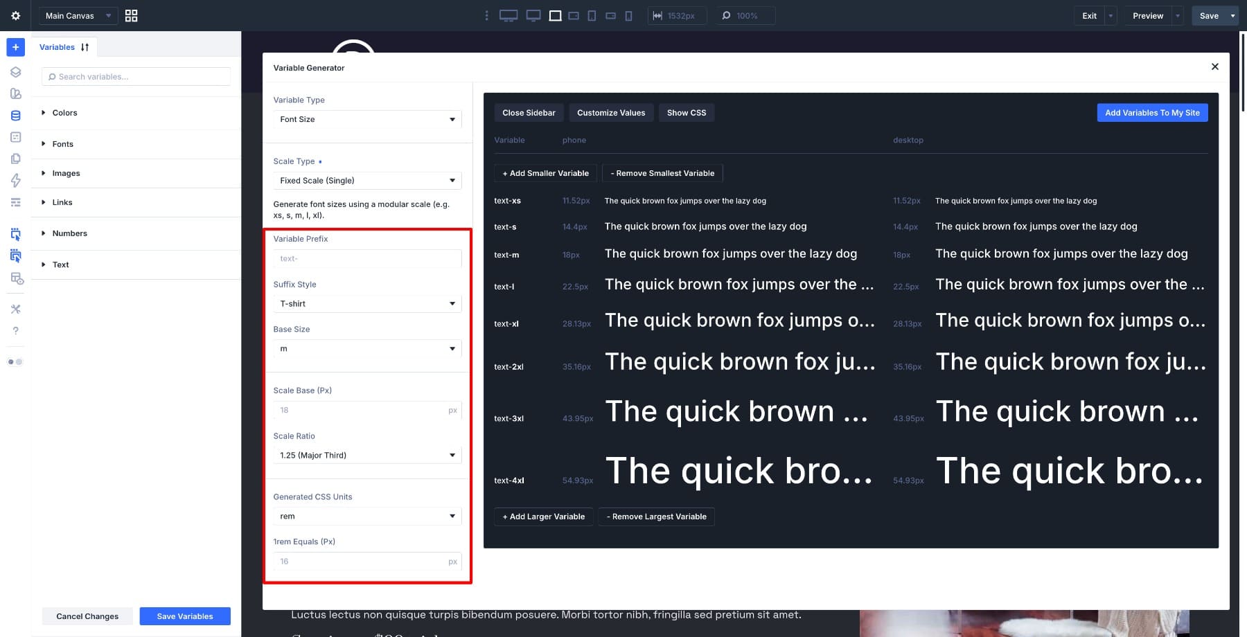
Key settings include:
- Scale Base: Sets the anchor size for the scale.
- Scale Ratio: Sets the multiplier used to generate larger and smaller steps.
Because there is only one base and one ratio, Fixed Single is fast to configure. It is also the least responsive option.
When To Use Fixed Scale Single
Use Fixed Scale Single when the text size should remain stable across screen sizes. It works well for:
- Fixed-width layouts
- Small utility text
- Labels, captions, and metadata
- Legal copy or fine print
- Simple prototypes
- Projects with strict brand rules for exact font sizes
Fixed Single is not the best fit for a full responsive typography system on most modern sites, but it can be useful for specific text roles that should not scale.
Which Font Scale Type Should You Use?
The best scale type depends on how much responsive behavior you want.
Use Fluid Scale For Most Responsive Sites
Choose Fluid Scale when you want typography to adapt smoothly between small and large screens. It works well for most modern Divi 5 builds and pairs naturally with fluid layouts, responsive spacing, and flexible containers.
This is the best default for complete typography systems.
Use Fixed Scale Responsive For Exact Breakpoint Control
Choose Fixed Scale Responsive when you need specific font sizes at specific breakpoints. This is useful when a design file gives exact mobile, tablet, and desktop values, or when a layout changes sharply between devices.
This is the best option when precision matters more than smooth scaling.
Use Fixed Scale Single For Static Text Roles
Choose Fixed Scale Single when a value should stay the same on every screen size. It is useful for small text roles, fixed-width layouts, prototypes, and brand systems that require exact static sizes.
This is the simplest option, but it should be used intentionally.
Can You Change Scale Types Later?
Yes, but treat the scale type as a design-system decision.
Generated variables can be edited in the Variable Manager. You can also run the generator again if you want to create a new scale. If you use the same variable names, be careful because changing the generated values can affect every preset and module that references those variables.
That can be useful when you want to update a site-wide typography system. It can also create unexpected changes if you overwrite variables without reviewing where they are used.
Before replacing an existing scale, check which presets rely on those variables and preview the result across key templates.
How Font Size Variables Fit Into Divi 5’s Design System
The Variable Generator creates the foundation layer. The variables are the reusable values. The next step is to apply those variables through presets. For example, you might use generated font size variables in:
- Heading Text Option Group Presets
- Body Text Option Group Presets
- Button Text Option Group Presets
- Blurb Title Presets
- Card or Loop Layout Presets
- Full Element Presets for modules
That is where the scale starts working across the site. Instead of manually entering font sizes in each module, you reference the variable through a preset. Then the preset carries that decision into every compatible module that uses it.
For a deeper walkthrough of this layer, Part 3 of the Divi 5 design system guide shows how Design Variables and presets work together.
Use The Variable Generator In Divi 5 Today!
Fluid, Fixed Responsive, and Fixed Single all create usable font size variables, but they solve different problems. Fluid Scale gives you smooth responsive typography. Fixed Scale Responsive gives you exact values per breakpoint. Fixed Scale Single gives you one stable scale for every screen size.
Start with the behavior you want, then choose the scale type that supports it. After the variables are generated, connect them to your presets so your typography system can stay consistent across your Divi 5 site.


Leave A Reply