With Divi’s new performance update come a ton of possibilities to increase page speed scores. Today, we’re sharing some practical tips and tricks that you should keep in mind when building a Divi page from scratch. These are recommendations, not rules that are set in stone. It’ll always come down to the main objectives of your page. Sometimes, you’ll find yourself sacrificing some speed for design and vice versa. We believe it’s about finding a healthy balance between both, but using the tips below, you can definitely improve your Divi page speed.
Let’s dive into it!
Subscribe To Our Youtube Channel
1. Optimizing Above the Fold Content
One of the new performance features that have been added to Divi is called Critical CSS. In short, Critical CSS in Divi automatically detects what CSS needs to be loaded right away, referred to as above-the-fold CSS, and delays loading the rest of the page’s CSS. This on its own already helps to improve page speed automatically, without you having to put in the effort. But if you want to go the extra mile, you can decide to optimize the above-the-fold content too.
4-Module Hero Concept
It can be tempting to share as much information as you can with your visitors, at first sight, but that’s exactly what you should avoid in a hero. The more direct your content is, in both styling and visuality, the better. That’s why limiting the number of modules you use above the fold will help you boost your Divi page speed. Preferably, you’d use:
- Title
- Paragraph
- Button
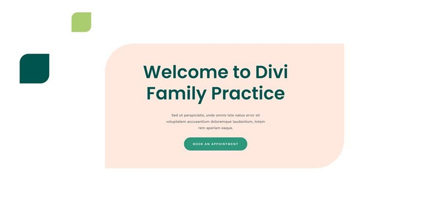
However, in many cases, you’ll want to include an image of some sort too. If you do, try to avoid using the image as a background and use it as a module instead. Using it as a module inside a particular container with a max width will help you use smaller image dimensions, which in turn helps you speed up your site. This brings us to the 4-module hero concept:
- Title
- Paragraph
- Button
- Optimized Image

Use Fullscreen Hero or Split Content into Multiple Sections for Precise Automatic Detection
There is a reason why fullscreen hero designs are popular. Not only do they make your design more breathable, but they also help with critical CSS. If you choose to go for a fullscreen hero, you’re deciding that that’s the only thing that appears above the fold, no matter what screen size you’re using. To create a fullscreen hero in Divi, remember to assign a minimum height of “100vh” inside the section settings. By assigning a min-height; you’re making sure that the section covers the entire height of the browser. You can place anything inside the section to be part of your hero design from that point on. Or, you can also use Divi’s built-in fullscreen header.
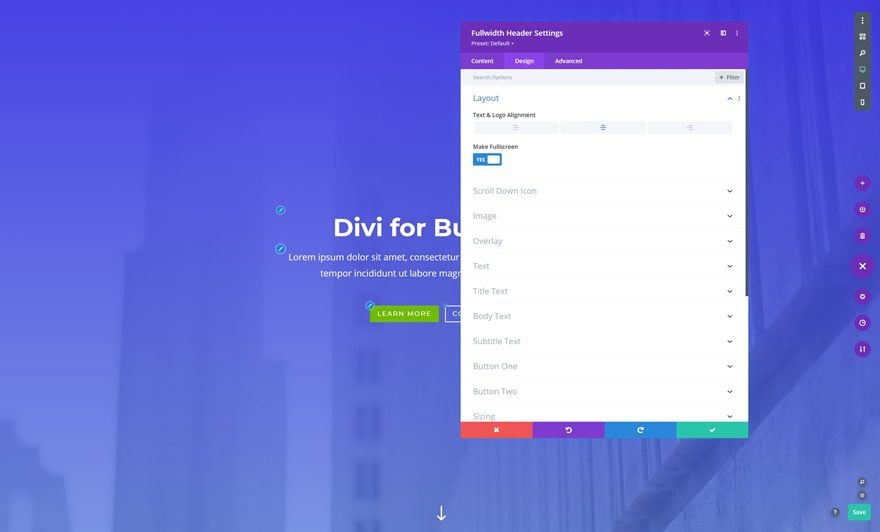
Alternatively, if you don’t want to follow the fullscreen hero route, you can decide to split up what comes above the fold in multiple sections. Divi will automatically detect what appears above the fold on a section level. This means that if you’re building a large section that appears partly above the fold and partly below the fold, the entire section’s CSS, and elements’ CSS in that section, will be loaded. Splitting the sections up into multiple ones will help you avoid having too many elements being treated like they’re above the fold.
Avoid Animations in Hero to Prevent Delay
Anything above the fold that can lead to a delay in loading time is good to avoid. This includes animations. This, however, doesn’t mean you should avoid it altogether. You can easily use animations down the page and/or limit the animations you use inside your hero. Finding a good balance is key.
Modify Above the Fold Content on Tablet & Mobile
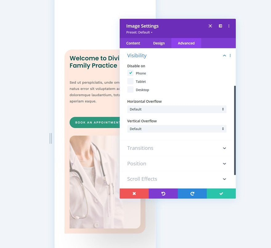
The last thing that’s important to mention regarding Critical CSS is the modification of your design across smaller screen sizes. It’s important to make sure your above-the-fold content is optimized for different screen sizes. It’s a matter of tweaking the design so you can reach a great page speed score on both desktop and mobile. You can, for instance, hide the entire hero image on mobile to boost the speed of your page on smaller screen sizes.
2. Using Smart Styles
How Smart Styles Work
With the new performance update, Divi has been optimized by reducing duplicate styles. To activate smart styles, you’ll need to dive into the world of Divi Presets. Presets basically allow you to share styles with different elements without actually having to assign a unique block of styles to each element that’s styled in the same way.
Using 1 or 2 Presets for Sections & Rows
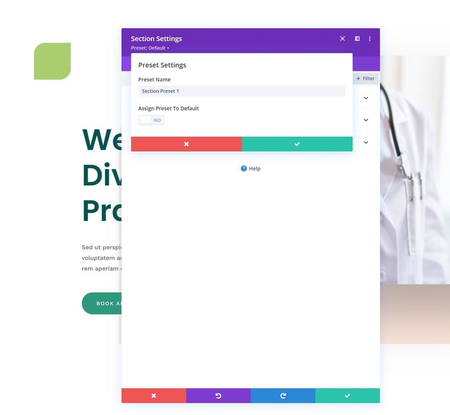
Sections and rows are two element types that often seem to be forgotten when we talk about presets. Just like modules, you can assign presets to sections and rows. Not only will this help you limit the CSS that’s generated, but it will also help you keep design consistency on a page level. Say, for instance, you want to consistently use 100px top and bottom padding for each section, to create vertical rhythm, there’s no reason why you shouldn’t benefit from Divi presets in the process. Create a new preset for a section that uses these padding values and assign it to each new section you add or make it the default section preset.
You can also set up a row preset with a width and max width of your choice and have that be the standard. Play around with these presets and discover how they make not only your design process easier but also help you improve page speed scores.
Use Presets for Modules
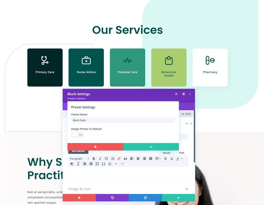
Of course, you’ll want to use smart styles for modules as well. In the example below, you’ll notice that the overall look and feel of each module are similar. Creating a preset for the Blurb Module will help you keep the CSS file of your page small.
Overriding a preset or not?
But you shouldn’t be creating a new preset for every small change. In the example above, for instance, you can notice that the two last Blurb Modules have a different text color. You can create a new preset for this, by duplicating the old one, or you can decide to override the preset. In this case, it makes more sense to just override the text color (which leads to one extra line of CSS code) as opposed to creating a new preset and having multiple lines of CSS code be added.
3. Matching Design Choices with Speed
Limit the Selection of Modules You Want to Use (Dynamic Modules)
When you’re selecting modules you want to use for the page you’re building, it’s a good thing to keep in mind that these will be loaded dynamically. Meaning that if you don’t use a certain module, it won’t have any effect on your page speed. You’ll want to consider each module you add and see if it’s “worth it”. However, in an ideal scenario, you’ll make sure the rest of your Divi content is optimized enough so you don’t have to go sacrificing on modules.
Find the LCP of Your Design & Optimize it
Another thing that can help you improve your page speed is finding your Largest Contentful Paint and optimizing it. In short, your LCP is the largest element on your page that helps determine your page speed score. You can read more on this here. By making sure the LCP of your design is optimized, you can drastically lower the loading time on your page.
Picking an Animation Style (Dynamic Features)
Just like we have dynamic modules, we also have dynamic features. This means that if you don’t use a certain feature, at all, on your page, it won’t be loaded, which leads to a higher page speed. For this particular reason, it’s important to make sure you pick an animation style and stick with it. You can, for instance, choose to go with motion effects and concentrate all animation on your page around that feature. Or you can go for regular animation settings and follow that route. Not only does this allow you to create a lightweight page, but it also empowers predictability, which on a user experience front is usually a good thing.
Font Pairing: Stick to 1 or 2 Font Families
We also recommend you stick to a maximum of 2 font families for the pages you design. By doing so, you’re limiting the number of fonts that need to be loaded before entering the page.
4. Manual Optimization
Responsive Content: Scale down Image Sizes on Mobile
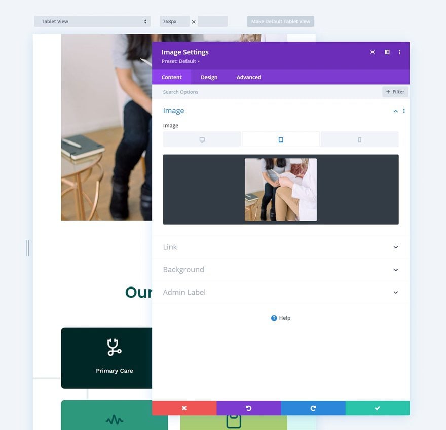
Another thing that will help you boost mobile page speed scores is the usage of responsive content in Divi. This is probably one of the features that can help you best improve your scores on smaller screen sizes. Although this requires a lot more effort, it’s definitely worth it. Scale down the dimensions/size of your image through image editing software and use those smaller images on mobile, as opposed to the ones you show on desktop. This will reduce the size of your image files drastically and lead to higher page speed on mobile.
File Types & Compression
Make sure you stick with JPEG as much as possible too, as these tend to have a lower file size. PNG usually only makes sense if you need transparency in your image for it to elevate the design, but even then, you can try to find an alternative to make the design work. Avoid even heavier file types, such as GIF, too. As for video, that’s usually a no-go, especially if you want it to be played in the background. And of course, make sure you compress the files you use, even before you upload them to your WordPress media library.
Behind the Scenes
All the tips above can help you improve page speed, but it is, however, important to mention that you have to take care of website optimization best practices outside of Divi. An example of this would be with your database. There are some excellent database optimization plugins available that can help you with the performance of your site. You can find more technical insight by going to this ultimate guide.
Building Fast Pages with Divi—Easier than Ever
We can easily come to the conclusion that there’s a big overlap between Divi’s performance features and how you handle building your website. Divi takes care of the partial side, so you can focus on the frontend best practices that are needed to bring it all together into a beautiful and fast website. If there are any best practices that have worked well for you, feel free to share them in the comment section below to keep the conversation going!



> Scale down the dimensions/size of your image through image editing software and use those smaller images on mobile, as opposed to the ones you show on desktop.
How about giving us the option to choose one of the built-in WordPress sizes from a dropdown when we select our image?
Great info, some tips are really useful, showing how exactly Divi now handles stuff!
And that understanding leads to a better design choices and approaches.
Thank you!
Putting together this performance update, and this post on design guidelines, you guys may now compile a great ultimate guide, something like:
“How to design your site strategically for Beauty AND Performance with Divi”
Beauty never was an issue with Divi, but I’ve been spending hours optimizing my Divi sites for performance manually, and with plugins.
And now (after The Update) it is just Plug-and-Play: top speed-stats on Google with no additional efforts!
Amazing job!
Thank you very much again!!
Now more then ever I cannot imagine WP without Divi. You guys make the whole thing complete, beautyfull and No 1.
Thank you for this interesting article which helps us to love Divi even more and to make our sites faster.
A suggestion for the next version:
You could put a speedometer to help when building a page, much like Yoast SEO with their red orange green signage.
Thank you !
Greetings from Switzerland
Thank you Donjete! I’m delighted there is a new focus on speed with DIVI.
This alongside the other blog posts released in the last few days seem be very helpful and sensible and I’ll be working through your tips this week. Thanks again!
Crystal clear! Thanks for these hands-on tips & tricks.
Excited to try all the new speed boost features! Thank you!
Definitely some nice tweaks to optimize your DIVI site even more after the latest performance update from DIVI. Thanks!
Awesome post.. this post can provide lot’s of information about speed up divi page..I am also implement some of on my page .. thanks sharing such detailed suggestion and advice..
Hello,
I’ve just update my websites to new Divi speed update and all looks ok in frontend. Regarding fonts, maybe will be a good idea to have an option to choose what font/s and what font weight to set based on font family options a user need for the website design. Thanks
This post is well done, thanks! Great advice and suggestions that are very practical and realistic.
Thanks Donjete, I picked up some useful suggestions which I will start to apply.
We spent months and a lot of money to try and speed up our Divi builds. Just couldn’t get close to the metrics we were after.
Long story short…moved themes and got there that way.
Divi is AWESOME to build with, but the end result is a nightmare in terms of speed.
Thanks
Um, Chris…I’m curious why/how you commented on this post but didn’t know about the performance update? Try checking the first sentence!
Not anymore Chris 🙂