Adjust Content On Different Devices, Swap Content On Hover And Enjoy Native SRCSET Support
Creating Responsive Websites Has Never Been Easier
Today we are excited to introduce Responsive Content and Hover Content to Divi, including native SRCSET support for responsive images. This update allows you to serve different content to visitors based on which device they are using to browse your website, giving you even more fine tuned control over your responsive designs. Responsive editing is now available for all Divi module content settings. This feature also brings Hover Editing to all Divi content options, allowing you to swap images, videos and text and more on hover. Combined with Hover Editing for design, you can now create even more dynamic and meaningful hover effects.
Responsive Editing For Divi Content
Assign Unique Content Elements To Different Devices
Responsive Editing Now Available For Content
The Responsive Content update brings Responsive Editing to all Divi content options. Responsive Editing for content works just like it does for design, allowing you to assign unique content values to each responsive breakpoint. This allows you to tailor your module’s text, images, and other elements for each device. On smaller screens you might want to use differently sized images, shorter titles, or even hide and display certain module elements to create a design that is better optimized for the current screen width. With responsive editing for content, it’s easy to create perfectly responsive websites.
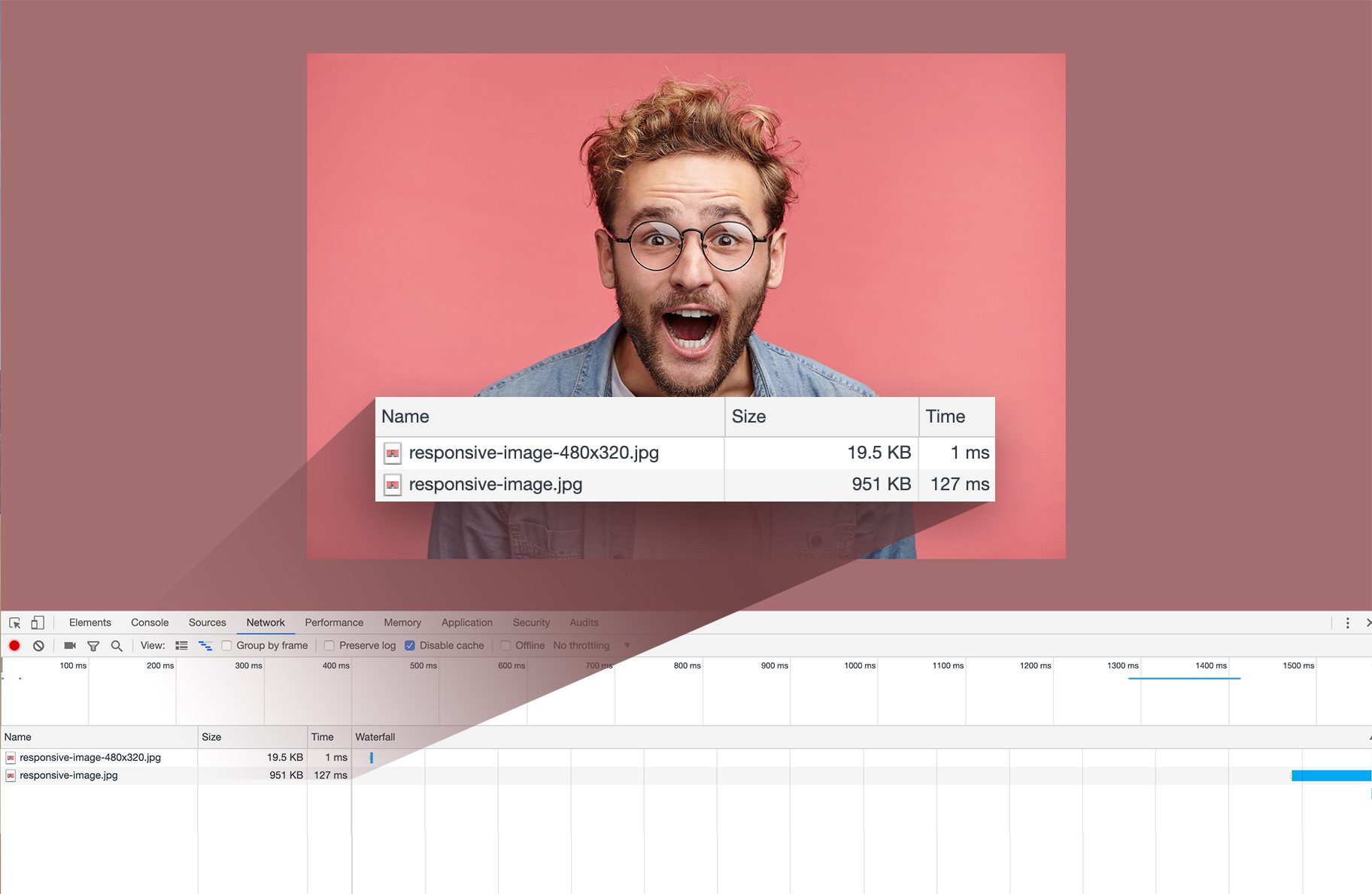
Native Srcset Support For Responsive Images
This update also introduces native SRCSET support for all Divi images, which means Divi will automatically make your images responsive and serve the perfectly sized image to each device. Since smaller images are served to smaller devices, this can greatly improve loading speeds and it doesn’t require any extra work on your part.
Hover Editing For Divi Content
Swap Content On Hover To Create Meaningful Hover Effects
Hover Editing Now Available For Content
In addition to Responsive Editing, this feature also brings Hover Editing to all Divi content options. Using hover editing for content works just like for design. Once hover editing is enabled, you can assign unique content values to the module’s hover state. When you hover over the module, the content is swapped. This works for all content types, such as text, images, videos, icons and more. When combined with hover editing for design, you can create some really impressive hover effects.
Available Today!
Responsive and Hover content is available today, so download Divi and take it for a spin. Let us know what you think in the comments and don’t forget to check back next week for even more great Divi features coming your way.
The Divi Summer Sale Has Arrived!
Today's The Best Day To Get Divi Or Upgrade Your To Lifetime
? Hey There! The Divi Summer Sale has begun. Today we are doubling our discount and offering our best deal of the year so far. If you have been thinking about joining the Divi community, today is the best day to do it. This discount will only be available for a short time, so don’t miss your chance! Once the summer sale is over it won’t be back until next year. Are you already an Elegant Themes customer? Don’t worry, we are offering huge discounts on account upgrades too!
Join Today For 20% OFF!
Renew Your Account Today For 20% OFF!
Upgrade Your Account Today For 20% OFF!

Does the scrset work on images in a WooCommerce gallery?
I am really excited to see how it works on my websites. I use Divi exclusivly as my theme, and so I will post feedback after using it on a few sites. The features are exciting, and I am moving forward on a new site any day now.
After updateing, it gives my already fullwidth images (1920px) max width of 1280px, that is set for layout.
As i have over 400 articles to go through, this is not a good set up.
Now all 400 articles after update have set images 1920px but shows only one that is resized to 1280px.
How to force full size image? Really not expected from elegant themes this kind of problem after update.
Same issue here, my layout is 1920px and all 1920px images are shown as 1080px, somewhere during the last few updates.
It looks like the SRCSET code has no CSS length attribute for 1920w, only (768w, 1024w and 1080w)
Images that are available in 1920x1080px format and should also be displayed in these sizes are trimmed by Divi to a width of 1080px (srcset=”1080×608.jpg 1080w”). However, these images (1080×608) are displayed by Divi at the default 1920px width (srcset=”1080×608.jpg 1080w” sizes=”(max-width: 1920px) 100vw, 1920px”>). This means that an image enlarged from 1080x608px to 1920x1080px cannot be displayed in the best possible quality. Then the view of the image must be blurred.
YES, same problem here have over 400 articles with big size banner on top, fullwidth 1920.
And layout is set to 1280px.
NOW ALL images that go in that banner place are blurred.
This is just wrong update.
First problem in some years with me, and im not satisfied.
Sent the question to support, no answer still.
I need to know how to set image that is wider than layout and still pull image that i want and that is FULL SIZE IMAGE!
I mean its my server let me worry about speed.
Greate DIVI
Excellent update!
Great features! Still waiting for the Theme Builder as well! Thank you for the great work!
Anyone heard anything about a fix for the SRCSET. I am getting blurred images in all image modules. Placed a 1/2 page image and it’s really small and blurry. If I paste that same image in a 1/4 page module it’s fine.
I had already gone ahead and installed in a few sites and now can’t change any or add any images. I tried rolling Divi back to an earlier version but it only rolled me back to 3.27 from 3.27.1. The problem is in 3.27.0
With regards to my earlier issue with 3.27.0. I edited the problem site with 3.27.1 loaded on a different computer with a newer version of Chrome and, to my surprise, didn’t get the blurry images.
Thank you divi developers
Since you did this upgrade I have several issues with my images. I can’t upload any image without problems, they appear blurred, pixelated out of scale, they don’t auto fit and I can see them as little squares in fullwidth rows and sections too, even if I use again the same images I already have in my media library, or any other new image. I checked out all plugins conflicts and my database, just in case I did’nt have more space for my images or contents. In a nut shell I can’t go on with my site because I can’t upload any other images and I don’t really know what I can do with it. It’s not the first time I have serious issues with upgrades. Another time I had to build again some pages, global items were disapperead, animation issues too, no way for some kind of sliders or gallery…
I’m having the same issue. If you get any solution, please share with us!
NICK!!!!! This is one hell of an update
The hover over feature for image and text is awesome and it will make things sooooo much easier as i use to have to code this manually.
The responsive feature is soooo finalllyyyy welcomed you use to have to be out of it to test but now to be able to change the image and content directly in there and see the preview straight away, is not just a big time saver but also it will allow for more testing on the spot for a far better result faster.
You and your team should be proud of this one update particularly. It is really good, i mean it.
Well done!
I can’t believe what’s going on!
This update shoots up every layout. Try it out by opening a section and taking a wide background photo. The picture is blurry afterwards.
BEFORE update:
https://www.gartencenter-willich.de
AFTER UPDATE:
https://www.gartencenter-willich.de/after-divi-update/
I don’t know what happened to my images in full screen. from 1920 I pass them to 1080.
Hi, Had to rollback version, Divi was resizing my images, making them pixelated on a site i am building.. don’t know what the problem is
What a fantastic update!
Really appreciated.
the development of divi during the last months has been phenomenal. i would not have imagined that there could be so many new features and possibilities in such a short time. fantastic job. no longer need to duplicate rows for tablet / mobile, what happiness!
I’m happy for these updates. but I’m losing hope of having a header builder, a footer builder and woocommerce design options. it’s been a long time since they were announced. I would not switch to other software like Brizy.
Hi the images over the videos are blurry when I replace an image over the video in the video module .. how can I fix this .. nothing is working. How can I disable this new feature..Thanks
Divi now respects the thumbnail selected on the media popup. I’m guessing you are selecting the smallest one.
While responsive images, seems to work fine with the Image module, the Blurb module does not seem to feature any SRCSET attribute. I quite often use the blurb module for presenting an image with a corresponding text, and GTmetrix is still complaining.
Are SCRSET attributes limited to the image module? Support in galleries, CTA’s and blurbs would be sweet.
Regarding SRCSET in Blurbs. It seems that replacing the image in the blurb, with a new one, triggers the addition of a SRCSET attribute to the blurb and solves my issue. Regeneration thumbails was not enough. This on 3 year old site, probably built in Divi 2.x, so that may influence.
Good to know that! It will help me. Thanks, Bjarne!
Excellent! Thank you!
I love that update! Using different background images for different devices, is a big plus, and I’m sure the responsive content will come in super handy when aiming for pixel perfect layouts on different devices. And THANK you for the native SRCSET support. It has always been a geeky request, but is another important step in making Divi perform good.
Keep up the good work!
So much love for this update! Thanks a lot!
After the update my header images are too small and therefore blurry. 🙁
How do I disable this SRCSET feature until this is fixed? Or how can I fix it?
After updating Divi from 3.26.7 to the latest version 3.27.1, the images on the home page of our website are displayed blurred by the slider. If I rollback to version 3.26.7 in the WP Dashboard under Divi > Options > Updates, the images will be displayed in normal quality – without being blurred.
Same problem, I can’t upload images anymore, because the result is ugly and my site is image based.
The exact thing has happened to me.
Sorry to hear that Torsten. Have you opened a ticket with your support team yet? This isn’t something we are aware or of something we can replicate in our testing. Best thing to do would be to get in touch with our support team so we can investigate.
Yes, I already opened a ticket and for everyone else, here is the explanation:
The SCRCSET is wrong in my full width header. It is using the content width for the last image and not the full size. This is the markup Divi is producing:
The last srcset image setting is wrong: 1080 Pixel would be correct for the content, which *is* 1080 Pixel, but it is wrong for the full width header! In this case (full width header) the full size of the image should be used.
Hopefully this is fixed soon.
Thanks in advance!
Same problem!!!!!!!!!!!!!!!!!!!!!
Hi, Same problem here, where do i lodge a ticket?
Nice update. But without more options for header and footer (theme builder) it`s really hard to choose divi for future projects.
Agreed! Hopeful for a status update regarding when the header, footer customize can be expected. Key upgrade is needed
DIVI urgently needs the Theme Builder, Woocommerce modules, Popup Builder and full compatibility with the different Toolset modules, otherwise you will lose the battle against other page builders such as Elementor or Brizy. 🙁
I agree, this is another great feature of Divi, but I really need the full Theme Builder and WooCommerce modules. The Popup Builder would be a huge plus as well, rather than relying on a 3rd party.
Yes!!! An other great update.
Thank you guys!
Very happy with this update
Awesome update! The background of the sections can also be changed on adaptive and hover?
Yes, background images, colors, gradients and videos can all have unique values set for hover and each responsive breakpoint.
Hi,
For those who do not use woocommerce, would it be possible to split css and js to have smaller files size ?
Before this update a included a script, which created srcsets AND automatically did the “same” to background images. So the script decided which image size of the background image is the best for the current view port. Clearly I don’t need this anymore for native srcsets but what is with the background image optimization? Can I keep it or is it also now done by divi?
Hi Jan, could you share your script for background images?
As Divi still does not support “automatic” srcsets/image-set to create responsive background images.
Background images do not support srcset, so this update only affects normal image tags.
Why dont u answer to my question above?
Since several month lots of customers wanted to know this!!!!!!
CSS image-set (SRCSET for backgrounds) is rapidly gaining support with Firefox the only outlier at the moment in latest versions. Hopefully Divi can support it soon as well.
There’s also some interesting JS work-arounds that could be implemented.
Hi Michael, you are absolutely right. image-set for Background images ist a MUST have for responsive Websites and Divi should support this.
Pretty cool feature, but how about solving the real problems first?
– Template support
– Developer support
IMO SRCSET was the biggest problem. Super happy to see it implemented.
Very nice !
Only what about the landscape view for tablets? (1024px)
I’ve asked this question here a dozen times and never got an answer. Nobody can tell me that this is not important. The fact is that a lot of layouts in this view simply look shifted.
Hoping to finally get an answer.
One other thing that would be nice to see, has been requested already and prototyped (so it does work), would be for images to pick up the alt text applied to images in the WordPress media library. Text entered in the alt text field in the advanced tab of each individual image module can override this default.
^^^^ this.
Bruh… this is insanew
Hi, nice update btw, just curious when are you guys going to release the basic stuff like adjust column width on different devices? As of now Divi’s mobile version is really poor because there are no options for making it like 2 columns, the only way is to hard code css. I think this is the very basic function? Will be perfect if you guys have it. (I start switching to Elementor because of this reason).
Wow!
Divi is Getting more and more Responsive!
Love it…
You´re simply great!!!
Really awesome update guys thanks! But there two major issues. 1. It’s does work with the Gallery module; there’s not SRCSET code present when I looked. 2. Perhaps not something SRCSET would fix anyways, but there’s no solution for background images. Apparently this can be fixed with CSS code but still as it stands background images remain non-responsive.
Looks like a very useful update. looking forward to seeing what can be achieved using the new features 🙂
A very cool update with so many potential uses. looking forward to seeing what can be achieved with these 🙂
Fantastic!!
Nice! SRCSET support is really nice… but, WHEN Divi will let us create our own headers, footers, single post, archives, popups, and etc like Elementor?
I love Divi, to create, the absence of these very important features makes me use Elementor all the time and use Divi less and less.
To create really good blogs, shops and etc I can’t use Divi anymore.
I really wan’t do go back to Divi again, and I will be so happy if Divi realese an update for it.
The SRCSET addition is awesome! I’ve been wanting this for a while.
Most importantly is DIVI now respects the thumbnail chosen in the Media overlay. Previously it still would only render the original size.
I would love for an inclusion of a lazy load and preload animations.
You are the best!
Fantastic update, I have a few questions;
1. Regarding the SRCSET support, so it uses the thumbnails which WP automatically generates? I.E. I won’t have to manually create multiple sizes from Photoshop.
1b. If it does use the auto WP thumbnails, does WP already size images correctly to match the popular devices? E.G. WP will make 1 size which is good for most desktops (1080p and 720p), 1 for tablets, 1 for modern phones, 1 for older phones etc.
1c. Are there any recommendations regarding which resolution to set for your initial size? I was thinking about making most of my full width images as 4k width then, WP will hopefully generate all the various resolutions below that (2k, 1080p, 720p, tablets, phones) then DIVI SRCSET offers these to the relevant devices. Does that sound like a good plan?
2. Regarding the hover effects, particularly on image hovers, is there a way to set a transition effect? E.G. I’d like the image to fade (or cross fade) from the image to hover image, not just change without any transition.
Thanks again for the fantastic update.
I prefer transition effect on image. Is it possible? 🙂
Great update!
YES!!!!! I’ve been waiting for hover effects for years! awesome work team Divi, you are the best!
This is huge! Every time an update comes out I feel like I need to use a child theme even less. No more hardcoded javascript required! The only thing missing now is native modal boxes and then Divi will be the ultimate swiss army knife.
So, if I understand this right, does this mean that it’s now easier to display a separate image for tablets in landscape mode?
Or will we still have set up breakpoints at 1024px?
Really nice update, well done guys.
That’s an awesome update, thank you!
Can you please consider adding a break point for landscape tablets (@ 1024px for iPads)? At this screen size, Divi still follows the default computer sized break point, but usually the navigation menu in the primary header doesn’t fit in that size. And because there is no break point, there is no way to reduce the font size, letter spacing etc other then with custom css.
As an alternative, being able to set the sizes as %, em, vw in the customizer would also help.
Thanks
JP
i understand your request, but have to say that most of the tablets are now in 1200*800, so 1024px is no longer a priority for me.
That would be greatly appreciated !
I always use my iPad horizontally for surfing the web.
I rarely see anyone using their tablets vertically.
I agree – I also never see anyone using iPads vertically!
I would like a couple more breakpoints. That could be responsive content 2.0 update.
C’est un plaisir d’avoir une équipe qui améliore de plus en plus le constructeur divi j’ai acheter the lifetime access et j’en suis ravis.c’est un super thème ,un super constructeur et un vrai plaisir de voir toutes les nouvelles update .Bravo a l’équipe d’eleganttheme. Surprenez nous encore.
SRCSET support —Yayyyy!
Thank you!
AWESOME!
When is woocommerce feature?
We are still waiting lol
Woocommerce update is going to be next and I hope it can come out at the end of the month.
I’m loving this!!! I was literally working on this for a new project and there you ET . Now All I need is better woocommerce support and I will be good. Maybe also throw in better divi support for search pages. I’m stoked to get this going.!!
Well Garincha the next major theme update is going to be the Woocommerce update and then we get the most important update of the year with the Theme Builder update.
Really cool stuff! Thank you!
Waiting for the theme or header/footer creator!
Oui ça serai super cool.
Bug?
When in the text module the text only shows for the desktop breakpoint. When I click the tablet and phone breakpoints the text does not show in the module text window. It only shows after I make an edit to the text directly on the page while in that specific breakpoint and not before.
Just to add – I updated to the latest Divi version on two other sites and both use “W3 Total Cach” plugin. When the plugin is enabled I could not edit any of the modules in either the “latest divi builder experience” or the visial builder. Clicking on the gear icon to edit the module did nothing. Once I disable the “W3 Total Cach” plugin I am able to edit the modules as usual. Just thought I would share in case anyone is having a similar issue.
I had the same experience with WP Performance Score Booster with the last few versions of Divi. It is specific to one install where Cloudflare CDN is in place.
Thanks for the update. When will the the Theme Builder get released? I need to edit headers and footers in an efficient way. This still prevents me from picking Divi before other themes…
Hey! Looks amazing. Does this mean that we can e. g. left-align text on mobile that is otherwise centered?
Tanya, actually the possibility to have different alignments for text, buttons had already been added on an update some months ago. Now it is even more powerful! You can also change the content for desktop/tablet/mobile without having to duplicate the row and hide it here and there. And if you want, you can change the content on hover as well. That is one of the best updates Elegant Themes has released! Love it!
Even if I haven start using divi for making website I can’t regret my purchase, the DIVI team is working very hard and add new feature regularly. This is very awesome.
Native Srcset Support – YES!!!!! Thank you.
When the woocommerce and theme builder? these updates are …. wow !! Just kidding, this responsive update and srcset is the best! With all my heart, thank you very much for giving us more and more control from the smallest to the greatest details. Better usability + better speed can only bring excellent results. Today I will not ask about woocommerce and theme builder. I will only enjoy this update 🙂 Thanks thanks thanks !!
Yes!! And I mean that in the Meg Ryan “When Harry Met Sally” kind of YES!! Thank you!
The SRCSET sure is a nice addition..
You guys ROCK!!!!!
Great news, we were waiting for SRCSET for long time. Tried couple of times to do myself without luck and I am happy it’s here. Also the extended hover effects are a very welcome addition. Are there available also on CSS advance block for each element?
Yes, I saw it is available on CSS advance block for each element! Amazing update! <3
Tutorial for hover editing?
Thank you much! I noticed you replied to another post that they needed to use a plugin to implement the srcset support for existing images. Is that in all scenarios? Sorry if I misunderstood the nuance.
Ryan, you will only need to use the plugin to regenerate the thumbnails for previous images uploaded before the update. For new images on the “new” Divi, everything will be natively automatically without a plugin. I saw Nick saying that somewhere here on the comments.
As a developer I have never owned a piece of software which I love and would endorse as much as I would Divi. Thank you for all the great work. I can’t say enough. srcset and different content on differences was quite high on my list. Thank you so so much
Nice update! I was hoping it would include the ability to create custom breakpoints. Is that in the works?
Ok this is nice. But what about the header and footer customization? You mentioned that over a year ago. It cannot be that hard to implement. Come on guys..
I’ve gotten tired of bringing this up and always getting the same answer from Nick, “Real soon now”.
15 minutes ago I was complaining that there is no possibility of editing Custom CSS for different devices, and suddenly there is an update with this option, thanks 🙂
Question… With multiple versions of content for each device size and multiple versions of content for different hover states, do we run the risk of ticking off search engines for things like keyword stuffing?
No that shouldn’t be an issue. Hidden content is stored in a data attribute and served via Javascript on the fly. Google knows how to render the page using Javascript to see what content is actually visible. Hidden content is not “stuffed” in the traditional sense.
Bravo
A big update!
Thank you
Amazing.
This is a gamechanger. Well played!
Can’t wait to take it for a spin….
And…you forgot to mention that you can now set the css for desktop, tablet and mobile in Custom CSS on the advanced tab. Much appreciated.
What?!? That’s a big one to leave out!! This will be VERY useful for me=]!! Thank you!!
+1
“you can now set the css for desktop, tablet and mobile in Custom CSS on the advanced tab”
I’ve updated and I am not seeing that under the advanced tab – just the same standard “Before, Main Element and After” css windows.
If you mouse hover over the top side of the code areas the small controls for activating hover and responsive appear.
Thank you for this great information, Stephen! I hadn’t noticed it. This update is so important and will help us so much!
Woah, THAT IS AWESOME!
Oops. Responsive is spelled incorrectly in second graphic down from top of page.
Oops, thanks. Fixed.
Great stuff – how is the text being replaced / changed in the example shown in the video? Is it hidden elements or is this js? Or magic? ?
Oh and another question – if we change an h1 based on breakpoints, how will this new system affect SEO?
Very nice update. I was expecting responsive images, but responsive content and hover content are a nice surprise.
This is awesome! Will the responsive image sizes apply to images already on the site? Or will they only affect images uploaded after the update?
You will need to regenerated WordPress image sizes for images that were uploaded in the past. You can use this plugin.
when using the regenerate image plugin – do we need to install and run it once, then uninstall, or do we need to leave it to keep things running smoothly. thanks for a great update – the hover and swap opens creative doors, and the mobile content shift seems great as well.
Can you please explain the need to regenerate images? Do you mean if we update to this latest version, we will need to update all images throughout the site? That can take several hours for larger sites. I’ve noticed that when some older sites were updated recently, some background images would populate as all image backgrounds on that specific page, and other page backgrounds would populate as backgrounds as all image backgrounds for other pages as well.
The “Regenerate Thumbnails” plugin mentioned actually lets you generate only additional needed files without regenerating sizes that already exist. I’ve not tried it yet, but that could cut down on the time needed substantially.
Never sell your company! you are an artist! in the same category as Matt Mullenweg!
What a neat update! Looking forward to using it. Also looking forward to Divi serving the right size images automatically! 🙂
How well does this play with the initial requests for different users on different devices? Will this call all of the assets and then send the right one, or is it more server side, where the device is recognized and then only the optimized assets for their device are served? Just want to make sure, I was actually looking into doing this today but my questions about implementing this were whether or not users browsers were going to fetch all formats and then serve the screen optimized image for display purposes or if it in fact was going to reduce load times by knowing to only fetch the single asset that is best optimized. Hope I’m explaining this right, and if it does exactly that, then cool beans, just saved me a ton of work.
Srcset sources all image URLs in the image tag and then the browser loads the correct size based on the width of the viewport. Only one image is actually loaded.
Great!
Do we need to do anything to existing sites/designs to get SRCSET added? Or will it “just work” once Divi is updated?
ok, so it reads the link to the images but loads the file only for the optimized image for that screen size. Perfect! Continue to make these updates that benefit SEO and speed, you guys are on the right track!
Was just writing up a little tutorial about the best way ive found to to image changes on hover and then this comes… God Damn It.
Wow, this is amazing! It will definitely change the responsive game.
And at last, the possibility to swap images on hover. I’ve been waiting so long for this feature.
Keep on with this great updates!
SRCSET! Finally! Question: What do we need to do for existing image? Anything? Rebuild thumbnails, or will Divi scan the Library and generate all the images it needs for already placed images?
Need to regen Thumnails 🙂
Quote from FB Group:
Vlad Patrascu The thumbnails generate/regenerate on the fly when a page is created/updated. For existing pages, you can use a regenerate plugin like “Regenerate Thumbnails”. ?
https://wordpress.org/plugins/regenerate-thumbnails/
Good to know!
Well something – I just tried it on Gmetrix and nothing changed after updating Divi
“Valerie-Davide-dog-card-Alfie-768×541.jpg is resized in HTML or CSS from 768×541 to 208×147. Serving a scaled image could save 63.7KiB (92% reduction).
Divi nação: para o alto e além! Sempre notícias boas. Adorei!
Very interesting update from you guys again! This has a lot of creative possibilities. Thanks!!
Another step closer to the Theme Builder for Headers, Footers, etc. 🙂
I really need Theme Builder, more than 5 of my recent projects have required the use of theme builder of sorts & I had to learn elementor in order to complete them. Three more projects next month I will not be using Divi & I have started to miss it, please let us know the timeline for theme builder release.
Great new features!! Love the idea of slimming down titles and content for mobile devices. Thank you!
Great update. Love Divi – when will the header be given more options to customize?
Fuck yeah
Really?
Language please for feck’s sake!
everyday i said that i choosed the great right deal i love your works guys waiting the woocommerce modules and the theme builder .. wonderful team
THIS IS WHY YOU ARE THE BEST! <3
I was waiting for this since I saw responsive content on Flatsome. Obviously I only use Flatsome now and again for e-commerce, no comparison to the mighty Divi!
THANK YOU SO MUCH!!!!!!!
I like it! I like it a lot!
Of course WordPress’ JetPack provided ability to serve different image sizes to different devices, along with serving them form the JetPack Content Delivery Network (CDN). I suppose there’s still a performance gain using their CDN, but how does that work with Divi’s new SRCSET support? Are we better to drop that functionality in JetPack and just rely on Divi SRCSET?
If Jetpack’s CDN improves loading speeds then keep using it. No need to turn that off. Or you can try using a different CDN service like Cloudflare, which is free and doesn’t require any plugins since it works at the DNS level and helps with more than just images.
how well does it play with how ShortPixel serves optimized thumbnails and responsive images? will this replace the need for that functionality? if would help if I can shorten the list of needed plugins. Also, anything in the pipeline to serve webp images on compatible browsers?
Great update. Thanks. 🙂
Nice work ET crew! This will open up some great creative options and help dial-in the mobile design much easier. ? ? ?
YES! Hover Content ? It’s one of those things that I never realized I wanted, but now I’ll be wondering how I lived without it. This is awesome guys. Amazing innovation!!
Another fantastic update!
Nice feature!
The responsive content and SRCSET support is a great update! Thank you!
YES I agree! So so happy that they have released this update. Delivering content different size content images based on device screen size is a game-changer.
YES!!!!! What an update!!
This functionality is dangerous for someone like me!
Really like the hover images effect