
Email marketing is not just about the perfect subject line and personalized emoji. The layout also has a huge impact on conversions inside your email funnels. In this article, we’ll look at 11+ email layout examples to improve your funnel’s performance according to what you want to accomplish.
There are many different types of email layouts that work for different purposes. For example, there’s the all-text layout, the visual design layouts, and the custom HTML layouts. Email providers like Mailchimp, Mailerlite, and ConvertKit offer different types of layouts and a way to add custom HTML. The trick is knowing when you need what type of layout and why.
Let’s dive in.
Subscribe To Our Youtube Channel
- 1 What’s The Difference Between All-text Or Visual Email Layouts
- 2 Pre-Made Email Layouts / Templates Vs. Custom HTML Email Layout Examples
- 3 1. All Text Email Layout Example
- 4 2. All Text With A Pop Of Color
- 5 3. Main Offer At The Top Plus More
- 6 4. One Visual Offer with Minimal Text
- 7 5. Features in Sections
- 8 6. Blog Post List
- 9 7. Minimalistic Humor
- 10 How To Choose The Perfect Email Layout Examples For Your Business
What’s The Difference Between All-text Or Visual Email Layouts
Before we look at email layout examples, let’s talk about the difference between all-text emails and visual design layouts. Each can have a different impact on your readers.
The style of email layout you use greatly depends on your audience. A surefire way to know which works best is to conduct A/B Testing. Unfortunately, many email providers only offer A/B testing features for a minimum number of subscribers. If you have a small list, you can still create test segments and do A/B testing on your own and analyze the results accordingly.
In a general sense, all-text email layouts are for audiences that enjoy reading and don’t much care for fluff. Also, a text-only email will greatly depend on the content inside it. If the subject line convinced the reader to open the email in the first place, the entire message must continue in the same convincing manner. The best all-text emails, like Ann Handley’s newsletter, are usually read all the way to the end.
For all-text emails to be impactful they need to be well formatted using headers, bolded text, interesting sentence placement, among other visual techniques. All-text doesn’t mean plain text. If you use an email provider like Mailchimp or Mailerlite, your all-text email will have the same narrow, vertically centered style as their visual templates. ConvertKit, on the other hand, envisions email marketing differently. They don’t offer visual templates and the emails you send with their service look like regular emails with the left margin all the way to the left.
Visual email layouts are on the other side of the spectrum. There are many types of visual email layouts; one column, two columns, or a combination of the two. Selecting the best one for your email funnel or newsletter greatly depends on what you want to achieve. Some email providers offer pre-made templates and others have a drag and drop approach or a combination of both.
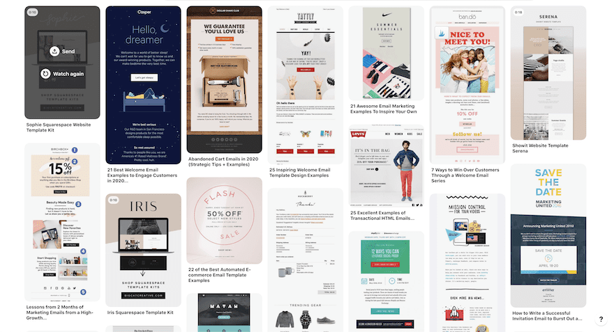
If you’re looking for inspiration to create visual and attractive emails, you can also check some out on Pinterest. Simply input “email layout examples” in the search bar and browse away!
Pre-Made Email Layouts / Templates Vs. Custom HTML Email Layout Examples
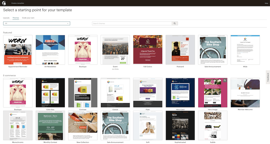
Another difference worth mentioning when it comes to email layouts is the one between premade layouts and custom HTML layouts. The first is most obviously the easiest to use and can get you on the right track quite fast. Creating an email funnel with premade layouts or layout blocks can save lots of time. Premade layouts are available inside most email providers. Sometimes in a minimal style without a theme and in other cases, fully designed with images and fonts.
On the other hand, marketing teams can also create custom HTML emails in any way they want. These are perfect for companies that want to keep all their visual assets fully branded and match the website and landing pages.
In either case, the email layout can be all-text or visual.
1. All Text Email Layout Example
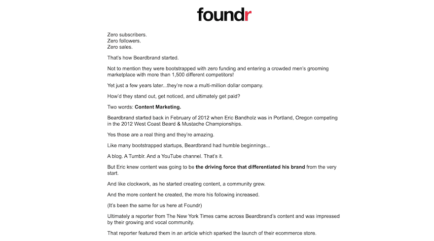
Looking deeper at the all-text email layout, here’s an example from a Foundr Magazine newsletter. The first three lines are short and repeat the word ‘Zero’ for both a visual and meaningful effect. Foundr Magazine is one of the most successful startups of recent years and a lot of that is due to their email marketing. They don’t rely on visual emails to capture their audience. And that’s because their audience responds better to this type of email.
Nevertheless, if the same content was formatted into one big paragraph, it wouldn’t have the same impact.
In an email funnel, all-text emails are great for welcoming new subscribers. After that, emails can get more visual if necessary or not at all!
2. All Text With A Pop Of Color
Another version of the all-text email is the one that uses just a little bit of color and maybe an image. It’s a good halfway point between an all-text email and a visual email. This is a good technique if your readers are the type that prefers to read good content in an email but your company is still quite visual in itself.
This type of email is also good for a welcome email, a monthly newsletter, or a reminder that you have something to offer. Remember that all-text emails rely heavily on storytelling to be successful.
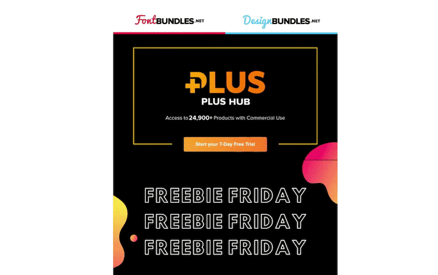
3. Main Offer At The Top Plus More
Moving on to more visual styles of email templates. The first one is the header + two-column layout with one main visual at the top and a list below it. This is an email for the Design Bundles Freebie Friday and has a number of different CTAs. This style of email layout isn’t suited for a funnel whose purpose is to sell one particular offer. A better purpose for this multi CTA layout is to promote brand loyalty.
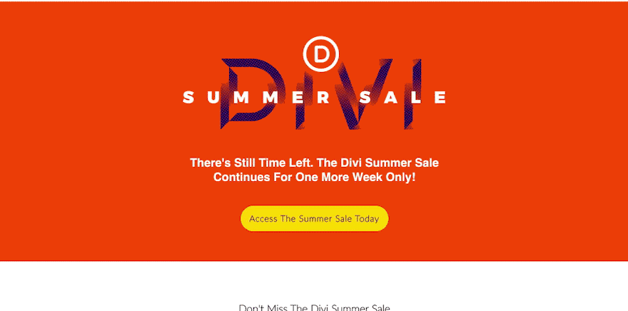
4. One Visual Offer with Minimal Text
Below is another example of a visual email layout. This Divi email has one column, with only one CTA in the entire email. Even though there are a number of buttons with different text, they all take you to the same place, the DIVI Summer sale.
This is the type of email layout you choose when you have something big to announce. Like a big sale. offer or event. The more attention you can get with the layout the best results you’ll get. The trick of using different copy on each button is an added personalization effort that can go a long way in reaching a varied audience.
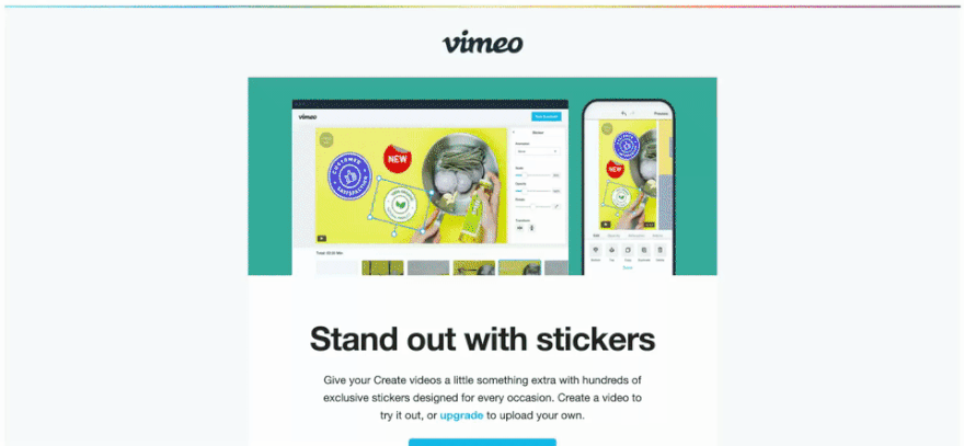
5. Features in Sections
This next email layout example is one of the most common for when the recipient is already a customer. A number of different topics are laid out one after the other. Much like a website layout. These emails aren’t all about the CTA. The first email layout example below is from Vimeo, where they show a number of new features they added to their platform. These emails are meant for current users of Vimeo, so it’s not about grabbing new customers rather keeping the ones they already have.
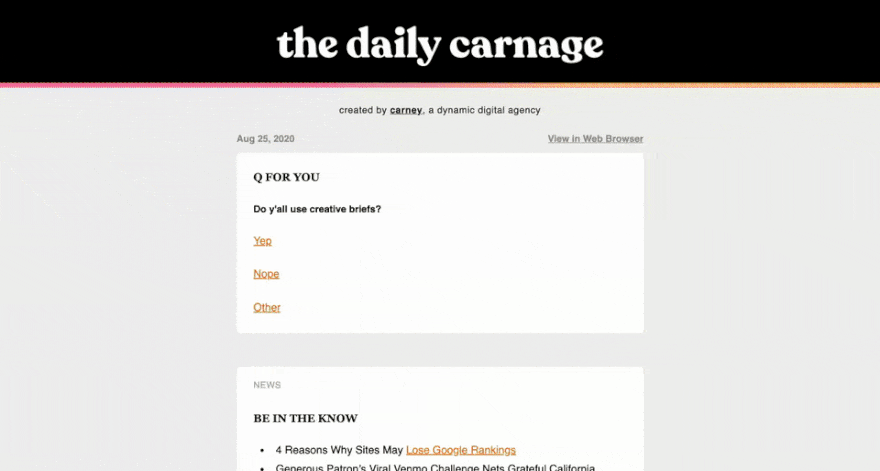
Below is another example of an email layout with sections. This is from The Daily Carnage, a daily creative newsletter full or resources for digital marketers, business owners, and other creative types. The sections include different topics with links and recommendations for things to discover. This is a great layout for a newsletter for a business that wants to garner a loyal following. They don’t sell anything until the end where they promote their affiliate program.
6. Blog Post List
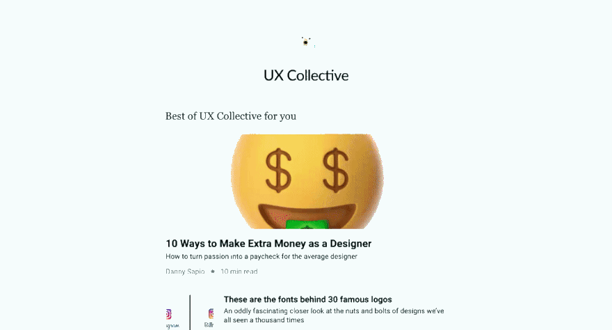
Another email layout example is the blog post or article list. These are very common from online publications. Medium, for example, sends these out for each of their publications as long as you are following them. All the Medium ones look the same except for the logo of the publication at the top. These email layouts are successful because they are simple and to the point. Readers know what to expect from these emails and can rely on them always being just the same and easy to click through.
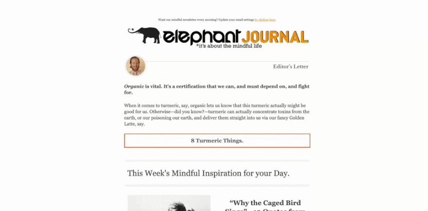
The Elephant Journal also sends out emails with a list of blog posts they have recently published. Their layout is a bit different with buttons that say “read” and some other information to invite the readers to click through. These email updates are perfect for any type of blog or publication. At the bottom of the list, it’s a good idea to include additional CTA’s for different things like joining the writer pool or watch a video.
7. Minimalistic Humor
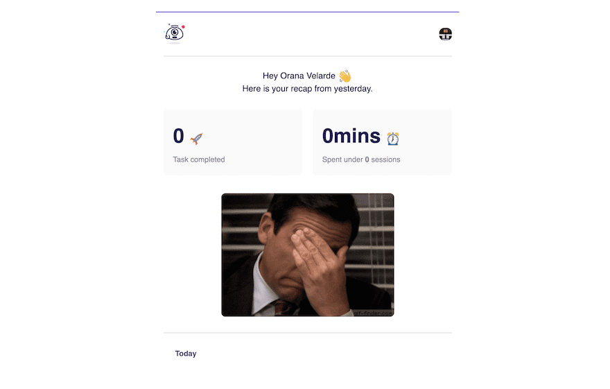
The last example is an onboarding email with a minimal and humorous style. This arrived in my inbox after signing up for a productivity app called KosmoTime. It was a nice surprise to get an email like this and is a great email layout example that truly grabs your attention. If your business can use a humorous streak, considering an email like this is a good idea at any point in the funnel.
How To Choose The Perfect Email Layout Examples For Your Business
Today we looked at some real email layout examples from a number of different businesses to get a feel of how different styles work for different purposes. In the same manner that choosing between an all-text or visual email depends on your audience, the same goes for every type of email layout. Try various things to see how they perform with different topics. Keep records of what emails get the best results and do more of those. Once you land the perfect combination, make a template out of it and try using the same style for a while.
Always remember to stay branded with every email in your funnel, using your logo, brand colors, fonts, and design elements. Start opening all the emails in your inbox and keep screenshots of your favorites. Create your own email layout example folder for inspiration. What email layouts do you prefer to use? Do you create your own or use templates? Which has worked best in your email funnels? Share in the comments below.
Featured Image via Belozerksy / shutterstock.com | Email screenshots from the writer’s inbox


Leave A Reply