
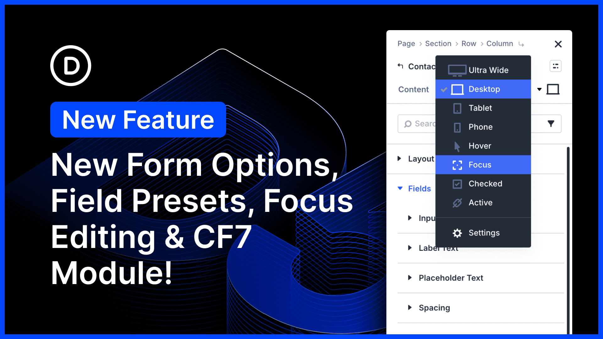
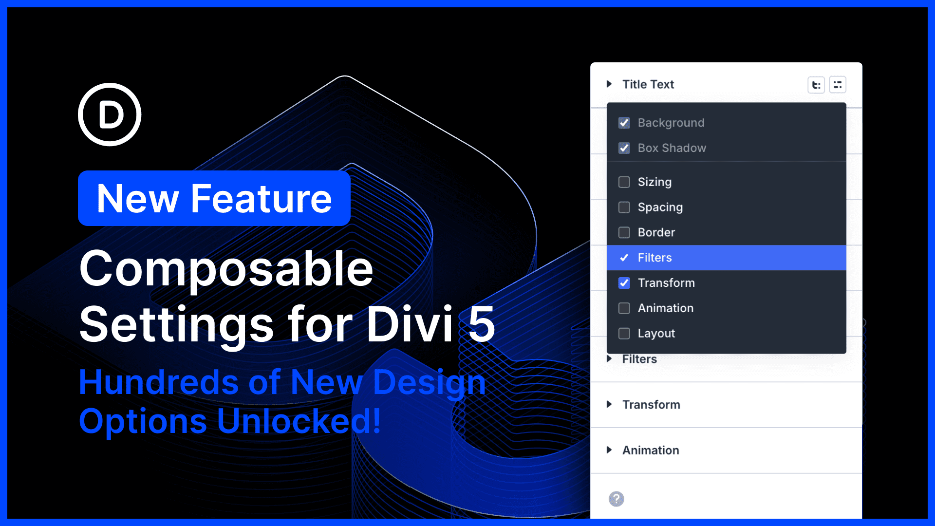
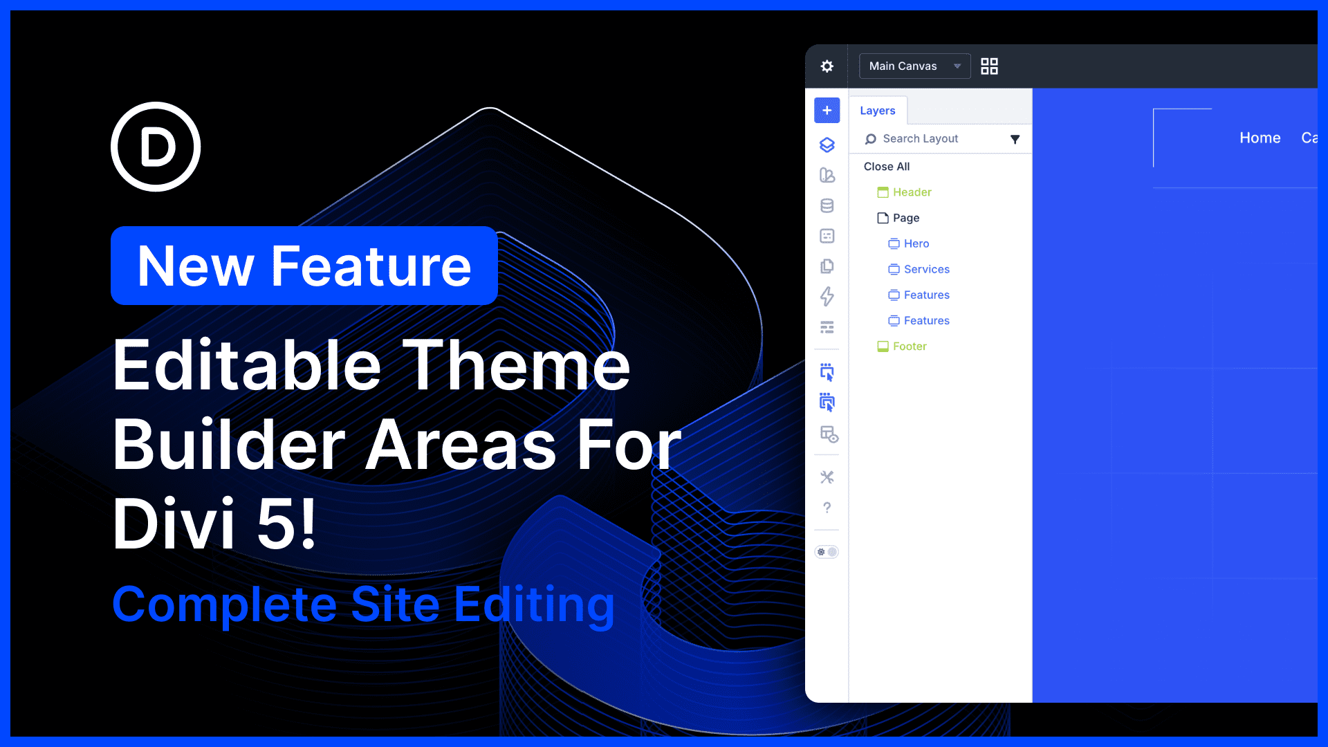
New Gradient Editor, Gradient Variables, Text Effects and More
We just released a bunch of new gradient-related features for Divi 5! Gradient options have been consolidated into a new gradient picker panel, and with the introduction of a new gradient field type, gradients are now easier to manage than ever. You can copy, paste, extend, find, replace, and...
View Full Post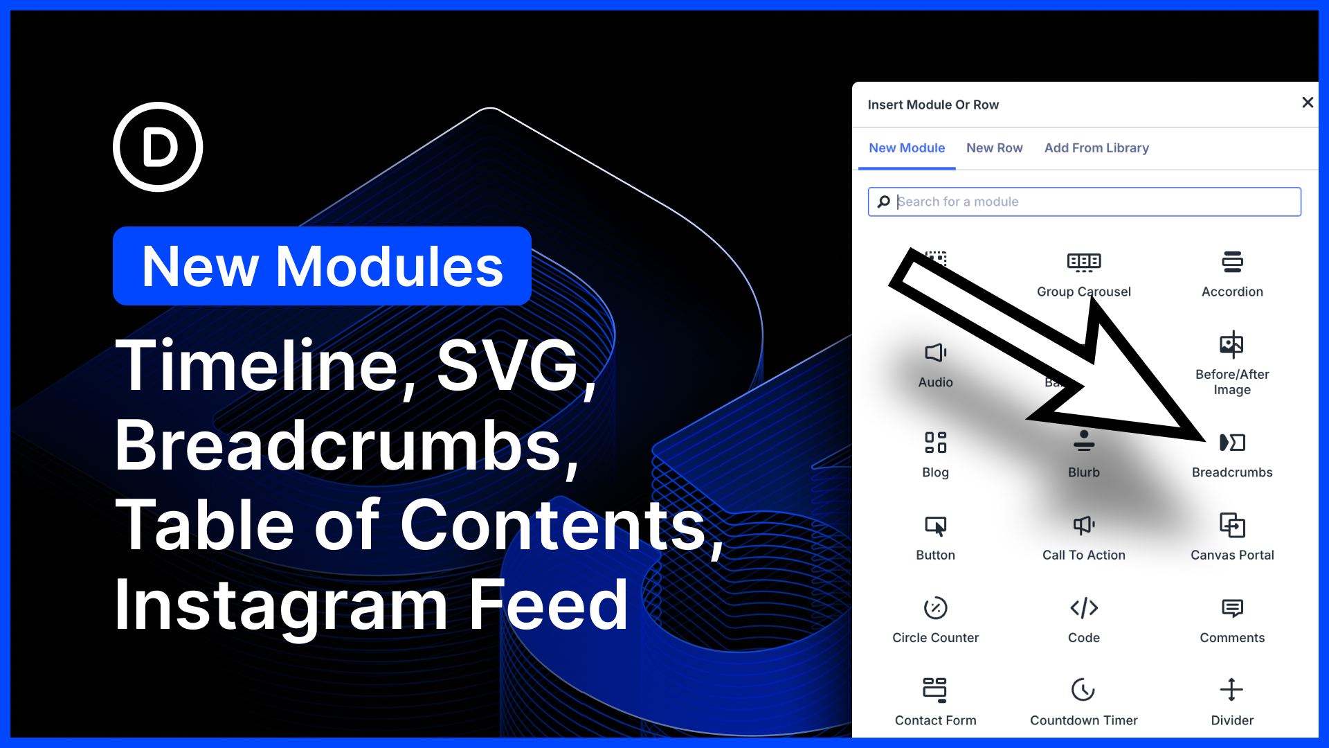

