
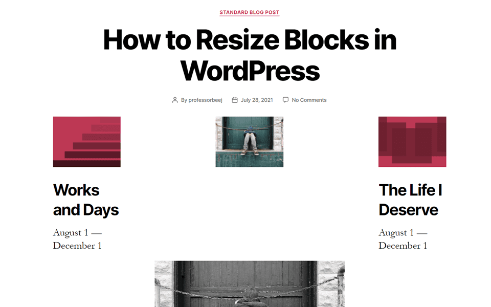
The Gutenberg Block Editor, introduced officially in WordPress 5.0, gives users the opportunity to fully customize their WordPress content and sites. No longer constrained by the need to create in a WYSIWYG tool like the TinyMCE Classic Editor, Gutenberg provides individual blocks for each element of the post’s or page’s content. With control over the settings for each specific block, users can design WordPress content more easily than ever before. And one of the simplest ways to make designs stand out is to take them beyond their default settings. So we’re going to look at how to resize blocks in WordPress so that you can start thinking (and designing) outside of the box.
Most resizing in the block editor is still constrained to the content area of the site due to the blocks’ responsive nature. If you have set your page’s content area to full-width, you will be working within that space. If you have a post content area set to from 580px or 1200px, for example, you will work there. The methods we’re using to teach you how to resize blocks in WordPress are all based on the idea that you will be staying within the borders of any particular block’s container.
How to Resize Blocks in the Editor
Some—but not all—blocks have built-in resizing options. These are the easiest ones to resize for obvious reasons. Depending on the block, however, the resizing options will be in different places.
Example #1: The Image Block
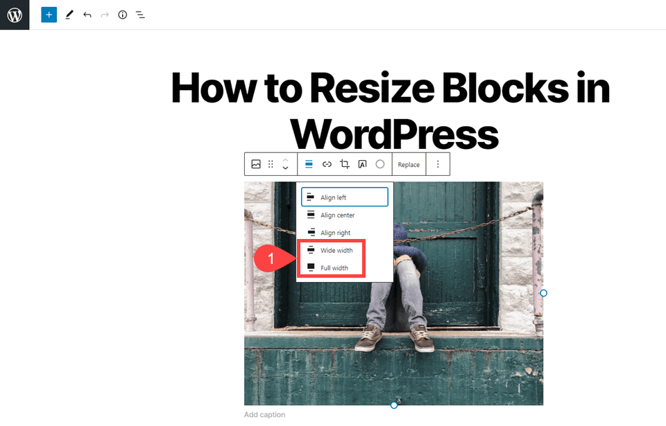
Clicking on the block will bring up the context menu, and the resizing options here are actually spacing options. However, the wide width and full width alignments will change the size of the image block to either the width of the container (wide) or to the width of the whole page (full).
You can also resize the image block using the block settings in the right-hand sidebar. The aptly named Image Size section has a number of choices with which you can resize the block.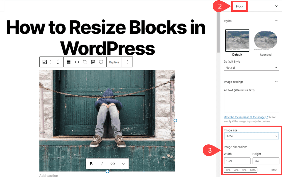
WordPress has a dropdown for quick resizing, and you can choose presets from thumbnail, medium, large, and full size. Selecting full size will vary on your theme whether it actually displays fully or fits to the content area.
You can also specifically adjust the width and height by pixels. Beneath that you can adjust by percentage. The percentage is based on the numerical value in the width and height fields. Not the preset image size that you selected from the drop-down menu.
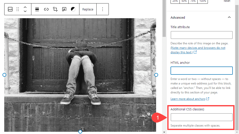
And finally, you can click on the image itself to bring up a blue border with white, circular anchors. You can drag these to resize the block.
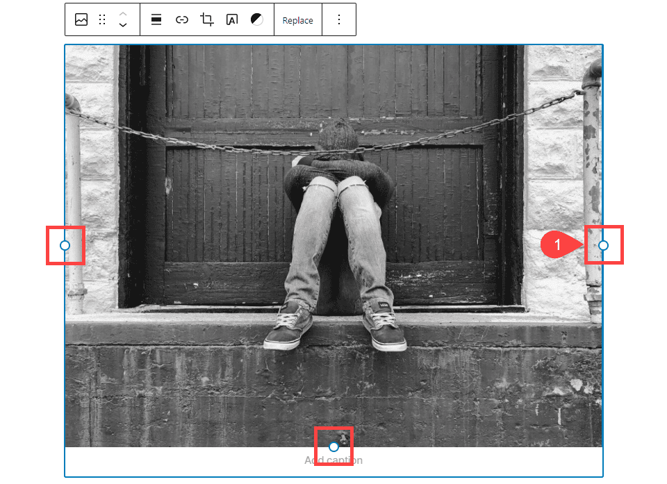
You will simply click and drag on any of the anchors to scale the image. Doing so will adjust the sizing in the height and width fields in the block settings menu.
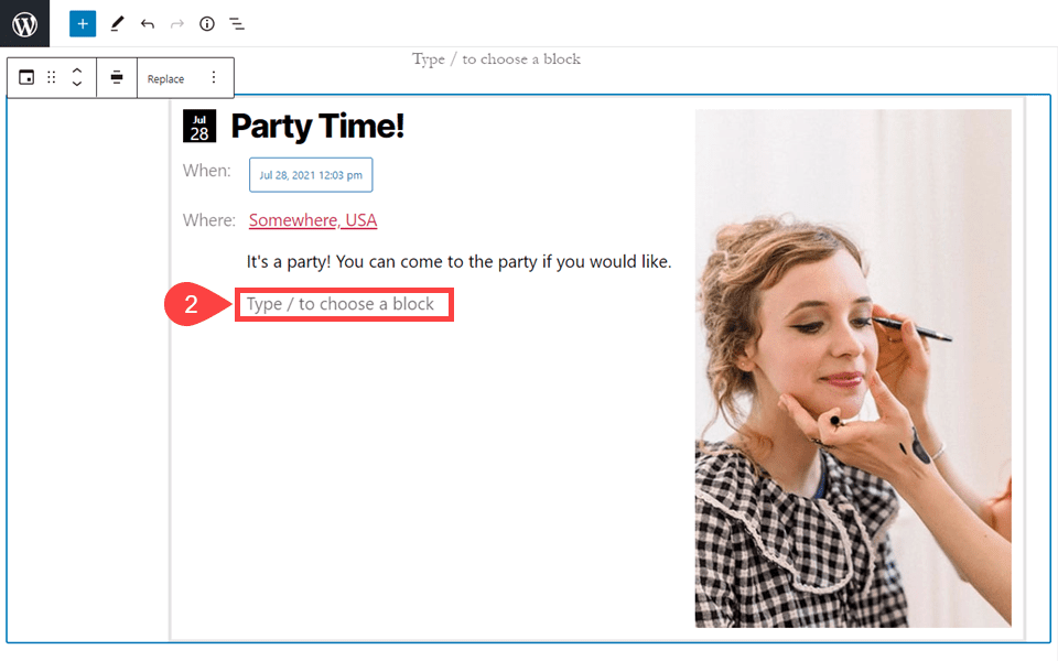
Example #2: The Event Block
For the Event Block, the resizing settings are solely in the context menu in the editor itself. (The Event Block is a separate plugin by Automattic that you will install, and it is not part of Gutenberg core editor.)
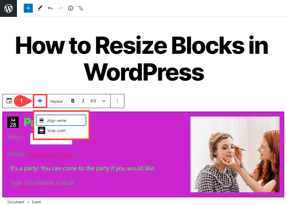
Like some of the image block options, the resizing options here are technically spacing options. But the two options are Align Center and Wide Width. You can choose one to be centered in the container or to be the full width across the screen.
Adjusting the height of the block in the editor itself is kind of hacky, but works. If you simply hit enter/return in the empty-block field, you can expand the height by inserting extra, empty paragraph blocks.
It’s a less-than-ideal solution. But it’s fast and works in a pinch—especially given the absence of a real height-adjustment option for the Event Block.
Example 3#: Using Columns to Resize Blocks in WordPress
If the block you need to resize does not come with resizing options in its settings panel or context menu, using the block editor’s columns is another way you can resize any block. Simply search for the Columns block by pressing any of the + buttons to add a new block.
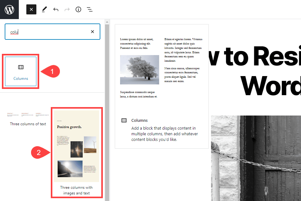
Within the Column block, you can add any other blocks that you want. In the search options, block editor Patterns also appear. These are templates you can insert into your post or page with content already sized and placed, waiting on your content to replace the placeholder.
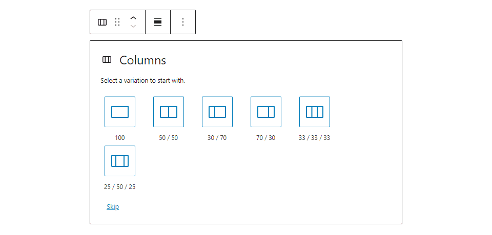
From the outset, the Columns block lets you choose the size of the column itself. It is broken into 6 different orientations, each with a different percentage of the page used for individual columns.
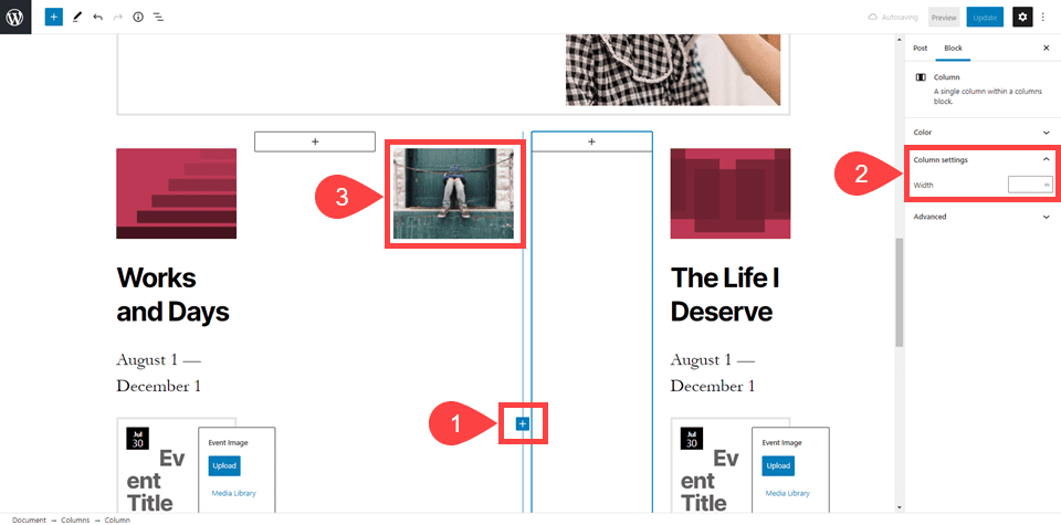
These are not the only configurations you can use. You can use the blue + button inside the block to add a new column at any point. Each individual column has its own settings panel in which you can adjust the width of it alone by percentages.
It may take some experimentation to get the sizing correct for your design. However, when it’s finished, you can have some well-designed and well-spaced content on your front page. Keep in mind that any empty columns that you have in the block editor will also show up as empty on the front end.
By adjusting the width, placement, and number of different columns, your blocks can be resized and placed in almost any way.
Need More Sizing Options? Consider a More Advanced Page Builder
We realize that some of these methods to resize blocks can feel limiting. If you find that they’re too limiting for you, it might be time to look into a more advanced page builder.
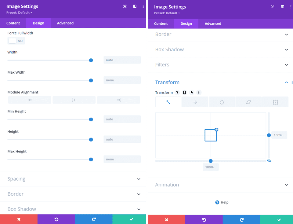
Our own Divi, for example, has Sizing and Transform options for each module (block) that give you much greater control over shape, size, and spacing than is possible in Gutenberg. Most advanced page builders do, too, so if you find that Gutenberg’s options are too limiting, checking out something like Divi may be the best next step.
How to Resize Blocks in WordPress Using CSS
Each block has a CSS section in the settings panel under Advanced Settings. Alongside any other block-specific advanced settings, each one has a field for Additional CSS Class(es). You can assign any selectors you want to this individual block, whether they already exist on your site or if you create it specifically for this block.
Normally, we would suggest using CSS IDs instead of Classes for individual blocks, but that’s not supported by the block editor (by default, at least). So you will want to just use multiple Classes to keep up with individual blocks rather than IDs. Classes are really meant to cover large categories of element types, while IDs are meant for individual elements. In this case, we suggest using a clear naming convention to keep things straight in your code.
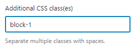
Regardless, you will simply input the class into the text field. Do not include the period/dot in front of the Class name in this field.
Now, you should navigate to Appearance – Customize and find the Additional CSS section at the very bottom. Write or paste the CSS code to resize the block to your liking.
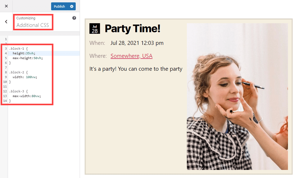
We suggest avoiding using measurements in pixels (px) because they’re absolute. Preferably, you will use either vw (viewport width), vh (viewport height), or % (percentage) to adjust the block. These will each scale in reference to the device and/or other content around it.
.block-1 {
	height:35vh;
	max-height:50vh;
}

.block-2 {
	width: 100vw;
}

.block-3 {
	max-width:80vw;
}
Keep in mind that % and vw/vh are different, too, though they function similarly. They all function on percentages, but those are relative to different anchors.
The percentage measurement is in relation to the container in which the element is held. So if the section or row the element sits in doesn’t go to the edges of the screen, even setting width:100% will not reach the boundaries.
Using vh/vw will, however, as they’re relative to the viewport of the device itself, not the site’s elements. Using height:80vh, you can always make sure that this block takes up 80% of the screen height, regardless of whether it displays on a mobile device, desktop, or tablet.
Conclusion
The block editor in WordPress gives users a huge number of customization options that were previously unavailable (within the editor itself, that is). Knowing how to resize blocks in WordPress is essential to being able to utilize the block editor to its fullest extent. And with full-site editing now in its repertoire, this is one skill that’s only going to be more useful as time goes on.
What are some tips and tricks you can share about resizing blocks in WordPress?
Article featured image by 3rieart / shutterstock.com


Leave A Reply