 Your Website With Accessibility Testing")
A lot of people take being able to navigate the web for granted. Of course, if you don’t suffer from any impairments, navigating modern websites is a simple affair. The problem is, not everyone experiences the web in the same way. More importantly, some disabilities make browsing a site more complicated than you might imagine.
If you want as many people as possible to be able to enjoy your website, accessibility testing is a necessity. In this article, we’re going to talk a bit more about why accessibility testing matters. Then, we’ll teach you how to evaluate your website in four steps. Let’s get to work!
Why Accessibility Testing Matters
The more accessible your website is, the easier it’ll be for all types of users to navigate it.
Accessibility testing is the process of evaluating your website to ensure it’s usable by people with disabilities. For example, if you use a color palette that makes it difficult for a colorblind individual to navigate your website, proper accessibility testing should detect it.
The primary goal of accessibility testing is to ensure as many people as possible can enjoy your website. However, it’s not an entirely altruistic pursuit since you benefit from it as well. Here’s how:
- It enables you to reach users you otherwise wouldn’t. The better optimized your website is for users with disabilities, the more people you can reach. Those audiences can add up, even if they make up for a low percentage of the population.
- It shows professionalism. Not a lot of people go the extra mile when it comes to accessibility. This means any improvements you make show you’re committed to providing a better experience.
In most cases, it’s not possible to create an accessible website for everyone. However, it is possible to improve the experience for a lot of people by making a few simple adjustments to your website’s design.
Before we dive into the specifics, we recommend you take a look at the Web Content Accessibility Guidelines (WCAG) put together by the World Wide Web Consortium (W3C). In case you’re not familiar with the W3C, it’s an international community that works to develop web standards for better experiences.
To be fair, the WCAG can be a somewhat dry read, but spending some time going over it is the best way to learn more about accessibility standards. In the next section, we’ll go over several concrete steps to test and improve your website’s usability, and explain why they’re essential.
How to Evaluate (And Improve) Your Website With Accessibility Testing (In 4 Steps)
There are a lot of online tools you can use to quickly test whether your website complies with the WCAG. However, these types of tools miss a lot of things you can only find out through thorough testing. They’re excellent starting points, but using them doesn’t constitute proper accessibility testing. With this in mind, let’s get into specifics.
Step #1: Test Your Website For Issues With Color Vision Impairment
A somewhat significant part of the population has difficulty differentiating between colors due to physical issues. This disability is known as color blindness and it’s more prevalent in males.
As you might imagine, color blindness can make it difficult to navigate a website in some cases. For example, people often use contrast in web design to highlight essential elements in a page. Someone with color blindness might not see much of a difference depending on the colors you use. In some extreme cases, people might only be able to perceive things in shades of gray, which is called ‘complete monochromatism’.
Naturally, designing around complete monochromatism is near impossible. What you can do is optimize your website, so it’s accessible for the most common forms of color blindness, which target red and green, followed by blue and yellow. Your first step should be to use a tool such as the Toptal Color Blindness Filter, which enables you to render your website as a colorblind individual would see it:
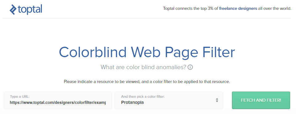
To use the tool, just paste the URL you want to test within the Type a URL box, then choose a filter from the menu to the right. This includes options for three distinct types of color blindness, and one catch-all option:
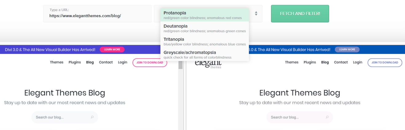
For the best possible results, you’ll want to render the page you’re testing using each filter separately. Then, check if any of your page’s elements become harder to make out for users with the specific form of color blindness. If you find there are elements you need to rework, the key to making them more accessible is to simply increase their contrast, which is often down to picking the right colors.
Step #2: Check For Issues That Affect Users With General Vision Impairment
There are plenty of visual disabilities unrelated to colors. Nearsightedness, for example, causes difficulties with seeing objects far away, making them look blurry. Cataracts, on the other hand, can render your vision cloudy, as if you were looking through a frosted window.
If you can’t focus on elements based on their distance, you can optimize a website’s design to take that into consideration (within reason). On the other hand, if you suffer from a condition that obstructs your vision, it’s more difficult to deal with.
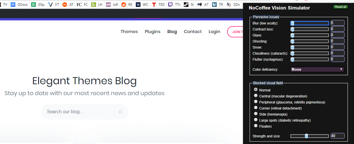
However, there aren’t many tools you can use to simulate what it’s like to experience a website as if you suffered from farsightedness. Our favorite is a Chrome extension called NoCoffee, which enables you to place filters over every page you see and tweak them as much as you want:
The bad news is there aren’t any other tools that pack in as much functionality as NoCoffee for other browsers. However, Google Chrome is available for all major platforms, and its Developer Tools always come in handy.
Once you install the extension, you can click the icon on your menu, then enable the Blur filter. This way, you’ll be able to practically experience what users with farsightedness see when they visit your site. In most cases, there are only two things you can do to improve their experience:
- Make better use of contrast, as we discussed during step number one.
- Increase your font size so your text is easier to read, even for people with visual impairments.
Naturally, there’s only so far you can go when it comes to text size before it affects your website’s design negatively. For example, in this screenshot, you can see the titles of our blog posts, but not their synopses:
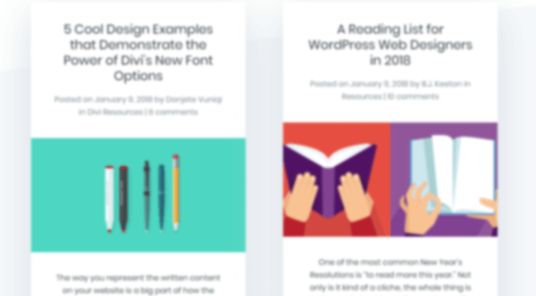
We could increase those text sizes, but there’s a limit and diminishing returns. While this covers text-based issues, we’re left with images – bringing us to the next step.
Step #3: Add Descriptive ‘Alt’ Attributes to Your Images For Visually Impaired Users
Alt attributes – or ‘tags’ – are elements describing the contents of an image. Search engines and screen readers can use the information to figure out what an image is about and better understand its surrounding content.
More importantly, alt text enables visually impaired users to understand what the images in your content are. There are several browsers tailored to that type of user exclusively, and in most cases, they read material aloud so people can rely on their ears instead of their eyes.
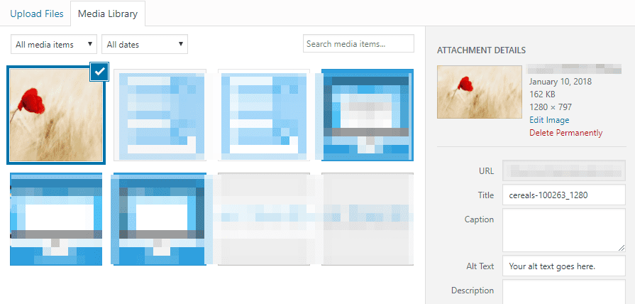
In short, any image you add to your posts and pages should include descriptive alt tags. Take this flower, for example:

If you were in a hurry, you might just type “a flower” as the image’s alt tag. However, it’d be far better to go with an option such as “A red flower in the middle of a field”. Of course, there’s such as thing as being too descriptive, and there are cases where a short alt tag will suffice. However, generally speaking, longer descriptions will improve the experience for visually impaired users.
As you may know, WordPress enables you to tweak your image’s alt tags easily. Simply pick an image, either from your media library or within a post or page, and click on its Edit button. On the next screen, look for the Alt Text field, and type your description:
Now save the changes and you’re all set. Remember though – this is a process you need to go through for every image on your website. It can seem like a lot of work, but over time, it’ll become second nature.
To learn more about how HTML attributes can be used to improve accessibility, check out our post on how to use Accessible Rich Internet Applications (ARIA) to improve your WordPress website.
Step #4: Review Your Video’s Captions
So far, we’ve focused entirely on visual disabilities, because most websites are consumed through the eyes, so to speak. However, nowadays it’s common for sites to use video content within some of their pages, which brings up the issue of having to deal with auditory disabilities.
Optimizing video for people with visual impairment is out of your hands, in most cases. However, what you can do is ensure your audio is easy to understand. Some of your users may be hard of hearing, in which case, you’ll need to resort to captions.
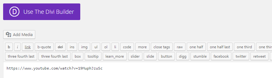
Adding captions to your videos is the most efficient way to ensure the hearing impaired can still get the most out of your content. However, it can be a lot of work to caption even short videos fully. If that’s something you can’t do, you can always try out features such as YouTube’s closed captioning tool:
Of course, if you’ve looked at any video captioning features. you’ll know the technology isn’t perfect. However, it’s a valid option if the alternative is not having any captions. If you upload your videos to YouTube, WordPress will enable you to embed them on your website just by pasting their link practically anywhere within your posts and pages:
This way, your users can choose to turn on closed captioning if they need to. However, keep in mind that if a lot of your content revolves around video, it’d be wise to start looking into dedicated captioning options. That way, you’ll ensure your content is represented accurately and hearing impaired users can enjoy it.
Conclusion
Accessibility is not something a lot of people consider while working on their website’s design. However, it’s an important factor to take into account if you want to provide an optimal experience for your users. Plus, making your website easier to use won’t only benefit users with disabilities, but your entire audience.
The most efficient way to dive into accessibility testing is to check out the WCAG so you have an idea of what you should aim for. Then, follow these four basic steps to tackle the primary accessibility issues you might run into:
- Test your website for issues with color vision impairment.
- Check for issues that might affect users with general vision impairment.
- Add descriptive alt attributes to your images.
- Review your video’s captions.
Do you have any questions about how to make your website more accessible? Let’s talk about them in the comments section below!
Article image thumbnail by E.Druzhinina / shutterstock.com.


Very surprised you did not mention the WAVE Evaluation Tool, which is available as a Chrome extension. Evaluates pages for many factors. Just used this for a Credit Union Website that been hit with legal action for accessibility.
Hi Nate. Thanks for your suggestion. 🙂
…very interesting and will definitely test and make the necessary changes!
Cheers!
No problem Richard. 🙂
This is something I’ve raised with ET support for the builder and their response was for me to adjust my contrast, like I hadn’t already considered it.
The builder is particularly bad from an accessibility point of view and could do with allowing us to choose preset colour schemes of the builder elements themselves.
Very interesting indeed. Looks like another item on my to do list!
No problem Britt. Glad you found it helpful.
Thank you for the info in this post. Some of our clients are visually impaired. I will definitively test and improve my site. Thank you!
You’re welcome Viorel. 🙂
Interesting !
I’m using Paletton dot com to evaluate color schemes.
When using the tool, you can choose for several conditions in the lower right corner “Vision simulation”.
You are also able to generate a contrast palette which shows precisely how contrast works for any of the choosen colors combination.
A great tool really…
Hi Eric. Thanks for the comment. 🙂
Is there a good resource for playing audio descriptions and or having audio descriptions and captions run in a YouTube playlist?
Great tips !
Before, I just care about my page speed to improving my website !
Today, I knew more things to improving my page more better with images and videos!
Cheers
hey, nice article thank you
What about the ‘title’ tag that should be added to each link (which is not self-explained) according to the regulations?
Divi, unfortunately does not offer this tag option and more accessibility matters.
Accessibility regulations are adopted by many countries and it is time to integrate it inside Divi as part of the building process. Relying on 3rd party plugings is not so good solution as no plugin really handles all the requirements.