
As your website grows, there’s a chance its design might start to look somewhat stale. Keep in mind, design trends are constantly evolving, and being able to spot these issues is important if you want your site to look modern and ‘fresh’. Plus, you’ll also need to keep all of the aspects of your design looking uniform (and usable) to provide a good experience.
The best way to spot and correct these issues is with a design audit of your entire website. In this article, we’re going to teach you what these audits are and how they can help you. Then we’ll talk about some tools to help you conduct one, before finally showing you how to do so in three simple steps. Let’s get to work!
What a Design Audit Is (And How it Can Help You)
A design audit is when you sit down to review your website or company’s visual branding elements. In most cases, you’re looking for uniformity, but the process also offers an excellent opportunity to check if your designs are still looking fresh.
To be honest, the term “audit” makes the entire thing feel much more menacing than it is. In any case, there are several benefits to conducting regular design audits for your website. For example:
- An opportunity to check your designs. As design trends go in and out of style, it’s also likely that your visual elements may start looking a bit stale. A design audit can provide you with a reality check and an opportunity to make upgrades.
- Review your branding. Most websites have their own branding based on multiple visual elements, such as their logo, tag lines, header images, and so on. Over time, these elements can become mismatched, which can in turn affect how your brand is perceived.
- You can offer it as a consultancy service. If you have experience conducting successful design audits, you can market your services to other companies and help them with the process. A lot of businesses aren’t aware of the benefits they offer, so the opportunity is ripe if you can convince them they’re needed.
Before you run off to offer your services to other websites, it’s important to know what the basic steps of every design audit are. As you can imagine, you’ll need some tools to help you along the way, so let’s check out a few of the top options.
3 Tools to Help You Audit Your Website’s Design Usability
If you’re a designer, you’ll know there are a myriad of tools online that can make your life easier. However, for this section, we decided to focus only on those that can help you audit your site’s elements and check for any flaws in your design. Let’s take a look at three of them.
1. Crazy Egg
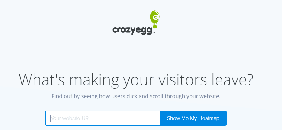
Crazy Egg is an analytics tool focused on helping you find problem areas on your site. It uses heatmap technology to enable you to see which elements are getting the most attention on your pages, and which aren’t drawing enough. Plus, it also includes functionality to help you find out if users are scrolling through your content. Crazy Egg also provides you with valuable data about where your visitors are coming from, then segments their behavior based on it.
From a design perspective, this type of tool is invaluable since it enables you to zero in on the areas of your design that need the most help. For example, if your heatmap reveals that a critical Call To Action (CTA) isn’t getting as much traction as it should, you can prioritize its analysis during your next design audit.
Key Features:
- Implement heatmaps on your website.
- Track how far your visitors are scrolling down your pages.
- Keep an eye on your traffic sources, and segment your user’s data based on them.
Price: $9 per month, paid annually | More Information
2. UsabilityTools
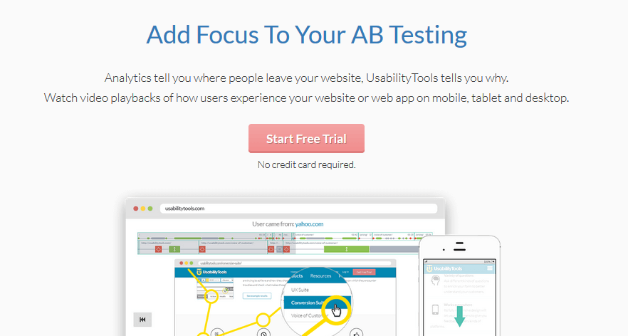
Heatmaps are a powerful tool to help you understand your user’s behavior, but nothing beats actually seeing how they interact with your site, step by step. UsabilityTools enables you to do this by recording every action your users take on your site, including mouse movements, form interactions, and clicks.
It might sound like overkill, but if you’re having a hard time figuring out which of your site’s elements aren’t pulling users in as they should, this is an excellent way to identify them. Furthermore, Usability Tools helps you to segment all of the data you collect from your visitors for quick analysis.
Key Features:
- Track your user’s mouse movements, clicks, and form interactions on your site.
- Segment the data you collect for easy analysis.
- Share recordings easily with any members of your team.
Price: $19 per month | More Information
3. UsabilityHub
Last but not least, we’ve got UsabilityHub. This is a little different – it’s a platform that encompasses several tools, any of which can help you make your design audit successful.
It includes a Five Second Test, which determines whether users can remember your site’s design, along with click and navigation tests that measure usability. Finally, you can also access audience surveys that help you to determine whether they like your designs, and what changes they’d prefer to see.
Key Features:
- Use multiple tests to gauge your site’s usability and the acceptance of your designs.
- Mix and match any of the tests you like to suit your needs.
- Customize each of your tests to measure the elements you’re most interested in.
Price: $2.50 per response to your tests | More Information
How to Conduct a Design Audit of Your Website (In 3 Steps)
Now that we’ve explored some of the tools you can use, it’s time to talk about the steps to a successful design audit. Depending on your website and goals, you might not use all of the tools we’ve discussed – but that’s up to you. Let’s jump to step number one.
Step #1: Gather All of Your Visual Branding Elements
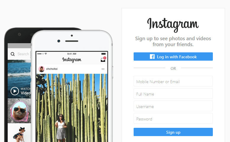
Instagram is a great example of a website with simple, yet consistent branding.
Before you can figure out if there are any problems with your design, you need to collect all of your website’s branding elements. That way, you’ll be able to spot if there’s any dissonance between their styles.
Doing this enables you to analyze all of your key branding elements with a bird’s eye view, and check if they make sense together (which is something we’ll talk about during the next step). Gathering your elements together may sound unnecessary, but some flaws in your designs may not become apparent until you’re looking at the whole picture.
As for which elements you need to gather, here’s a simple list to get you started:
- Your website’s logo in all its formats.
- Any background and header images.
- All of the icons you use throughout your site.
- Samples of all the fonts you use for your content.
- A color palette of the tones you use throughout your designs.
For now, we recommend saving these elements in the format you feel most comfortable with. You can create a PDF for easier sharing, or pass physical copies around to your team. Once your compilation file or document is ready, it’s time to get to work.
Step #2: Analyze Your Website’s Visual Elements

Netflix’s branding strategy is simple but consistent – they make sure to use their logo whenever possible.
As we mentioned earlier, step number two is all about going through your visual branding elements to find any inconsistencies or flaws in your designs.
Design is (of course) subjective in many ways, but that doesn’t mean your website’s style can’t be improved. For example, every business should present a coherent design style, so their customers become accustomed to it, and associate it with their products. The same holds true for websites – your logos, content, and images all need to share the same style and remain consistent.
Let’s go through a few simple tips to make sure your website’s visual elements hit the mark in these aspects:
- Check if your logo remains consistent across all of your pages and if it doesn’t, replace it where necessary.
- Make sure your background images share a similar style, so the transition between your pages and sections isn’t jarring. If you find any images that don’t fit the mold, change them.
- Ensure your icons share a similar style and if they don’t, try replacing them with alternatives from a single family such as Font Awesome Icons (which can be integrated with Divi).
So far, we’ve only talked about online elements, but keep in mind that design audits can – and should – also cover your offline visual elements. If your business has a physical counterpart, you’ll want to gather any branding items you can get your hands on (such as brochures, t-shirts, and calling cards) and repeat steps number one and two for them.
Step #3: Create a Design Standards Manual for Your Website
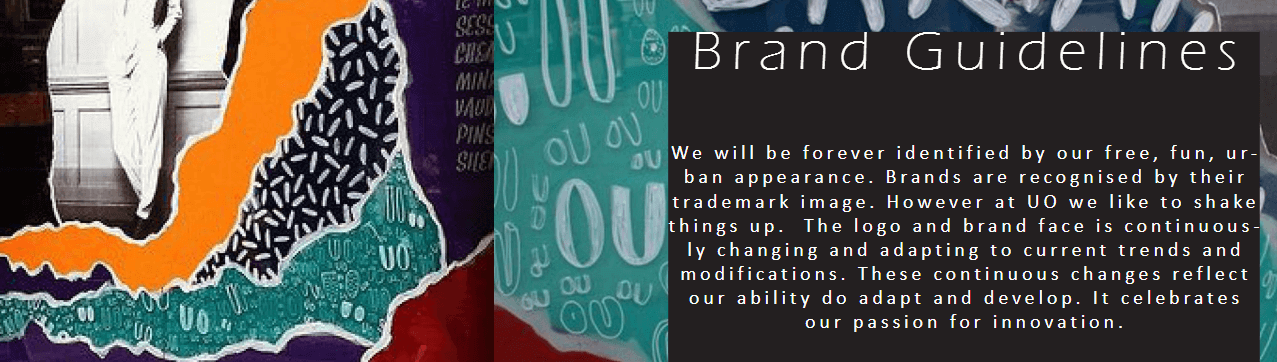
Urban Outfitter’s brand guidelines manual talks about what makes their brand unique.
Now it’s time to plan for the future. One of the best ways to do this is by creating a compilation of rules for any future design changes to your site – also known as a design standards manual.
The purpose of this document is to ensure that going forward, you can outsource design work without having to micromanage it. Plus, as your website grows you’ll likely add more members to your work team. A standards manual can help them understand your visual branding better. In fact, this is such a smart practice that plenty of top companies engage in it.
As for what type of rules to include in your manual, let’s go over a few ideas to get you started:
- Include guidelines about how your logo and its variations should be used (this is also a common practice, by the way).
- Attach examples of the kind of images that contributors should use on your site, as well as rules about how to present them, and the type of content they should avoid.
- Discuss the fonts you should use throughout your website if there’s more than one option available, and under which circumstances they should be used.
- Provide examples of the types of buttons, icons, and other similar elements you want to use in your designs.
Keep in mind, no two design standards manuals are going to be the same. You’ll probably have to add more rules depending on the elements your website uses, and also if you want to talk about offline branding. However, getting this set up early will not only ensure that future design audits go by more smoothly, it’ll also help you train new additions to your team faster.
Conclusion
As time passes, it’s normal for most websites to require a touch up when it comes to their design. For example, some of your elements may not play well with each other visually, but it can be difficult to spot this without conducting a full design audit periodically. What’s more, doing so will ensure that your visitors continue to have a great experience on your site in the future.
Here are the three basic steps to conducting a design audit for your website:
- Gather all of your online and offline visual branding elements.
- Analyze the elements you collected.
- Create a design standards manual for your website.
Do you have any questions about how to carry out a successful design audit for your website? Ask away in the comments section below!
Article thumbnail image by Darko 1981 / shutterstock.com


thanks for writing this amazing article. I found it to be poignant, detailed and fun. valuable information self audit kit is very valuble. Thanks for being awesome Web Savvy!
You’re welcome, Thomas!
Hello, John!
The way you lay out this post- with the links and resources- is so helpful! By following “6 Significant WordPress E-Commerce Trends for 2017” article and implementing it in my e-commerce website helped me gain 10% more traffic. I am surely going to follow this useful tips as well.
Hi Christopher, thanks for your comment! We’re glad you found this post so helpful. 🙂
No doubt, its really important to get an audit of your website, the competition is so high now a days in every field so to be successful , we require excellence in our work , thanks for sharing useful resources and helpful information !!
You’re welcome! Thanks for your comment. 🙂
Thanks for letting me know about this. I will surely do an audit for my site. Thanks.
You’re welcome! Good luck with your site. 🙂
What about spacing and positioning of elements? Are there ways to measure/review this in a practical manner?
Hi Juan! Spacing and positioning are somewhat subjective elements, but you can find plenty of information online that will show you practical ways to better implement both (such as this article: https://webflow.com/blog/web-design-how-element-spacing-works).
Great article! Can’t wait to share with my clients!
Thanks Nora! 🙂
Would love to see an example of a design standards manual!
Hi Karen, thanks for your comment! We’ll keep that in mind. 🙂
Hey John,
After reading this guide, it’s clear that I miss a lot in my website such as fonts and images and will definitely help me in fixing the point.
Thanks for the helpful guide.
You’re welcome, Bijay! We’re glad this post was so helpful for you. 🙂