")
Practically everyone has a website these days, so if you want yours to stand out, you’ve got to bring your A-game when it comes to design. People want sites that are tailored to their specific needs and make them feel like they’re important (which they are!). If you can’t provide that experience, you might not be able to compete in the big leagues.
Conversational design is all about creating websites that are tailored for each user and that anticipate their needs. In this article, we’ll give you a brief crash course in conversational web design and discuss a few examples.
Let’s talk!
An Introduction to Conversational Design
When it comes to conversational web design, there is an important distinction to be made. When people talk about this concept, they’re mostly referring to hyper-personalization. For example, when you log into your Facebook account, the platform asks you what you’re thinking/feeling and refers to you by name:
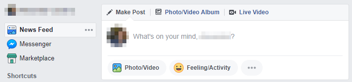
This is one example of conversational design. On the other hand, when people talk about conversational User Interfaces (UI) they’re referring to text-driven experiences, such as chatbots and Slack.
In any case, the term conversational design covers a lot of areas. However, they all have one thing in common, which is the goal to provide more personalized experiences for their users. Here’s why that’s a good thing:
- It can help you build trust. Conversational design can help users feel welcome, which in turn may inspire trust and lead to more conversions.
- You can put the data you collect to good use. Most websites these days collect some personal information from their users. With conversational design, you can put this data to a practical use.
As for which websites can benefit from adopting conversational design, it depends on the level of interaction you provide to your visitors. If your users need to interact with your site in some way, then you should consider looking into conversational design to provide a more personal experience.
Throughout the next section, we’re going to show you some examples of conversational web design and UI. We’ll talk about what they do right and how you can apply their approaches on your own website.
3 Examples of Websites That Use Conversational Design
Conversational design is a vast field, so there are several ways you can implement it on your website. In this section, we’ll explore three examples, each using different approaches to personalization and conversational UI.
1. Buzzworthy Studio
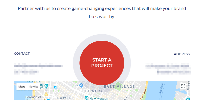
Buzzworthy Studio’s website features a great contact form experience that provides a highly-personalized experience. Once you land on the contact page, you can click on the START A PROJECT call to action:
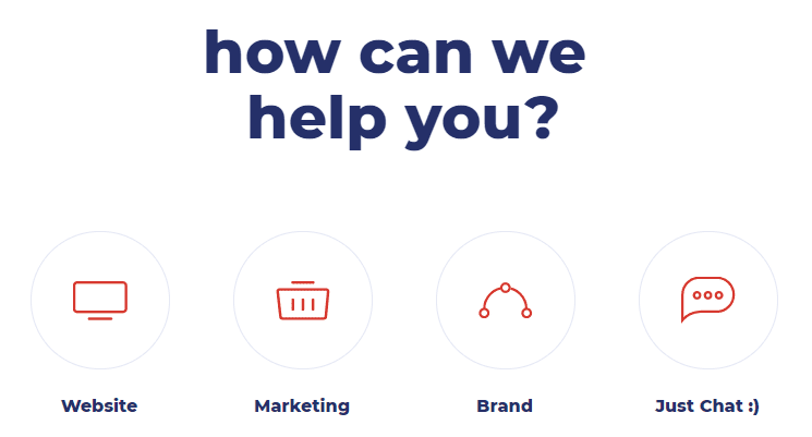
Then, the page asks you what kind of project you’d like to embark on:
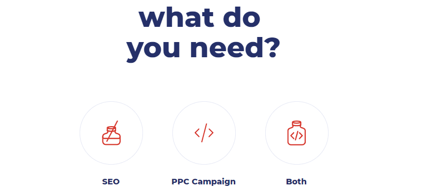
For example, if we click on the Marketing option, we can pick from among SEO, PPC Campaigns, or both:
Once you’ve made your choice, the website gives you a rough budget and a timeline that varies depending on it:
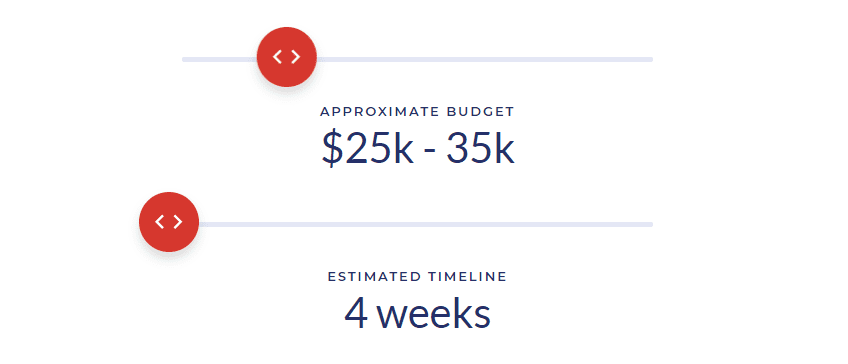
As far as contact pages go, this experience is one of the most engaging we’ve run into. By asking several questions before you giving you a budget, it makes you feel like you’re having a conversation with a freelancer before hiring them.
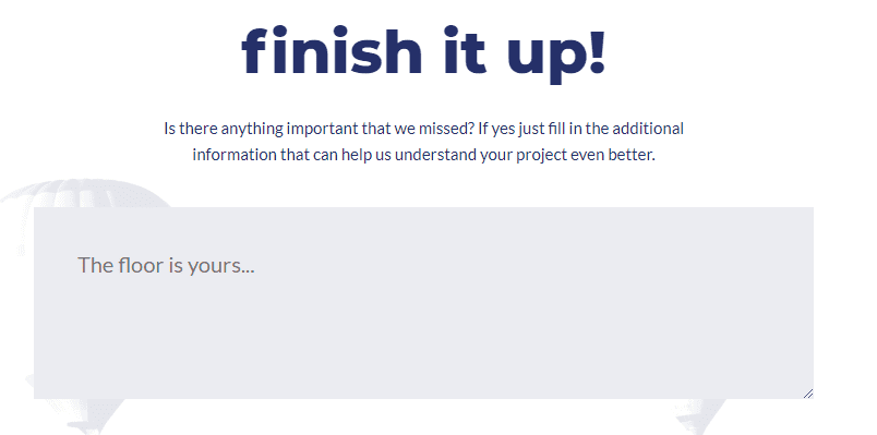
Moreover, they also include a simple form where you can add any details they might want to know before they work up a more thorough project proposal:
Conversational design and contact pages are a match made in heaven, particularly for portfolio pages. One of your biggest challenges is making potential clients feel at ease, and tailoring your pages to them, is a great way to do this.
If you want to take a crack at creating more interactive client onboarding experiences, one great way to do it would be using Typeform. A while ago, we talked about how you can use the platform to create stylish surveys, but you can also use it to ask potential clients questions, similarly to this example.
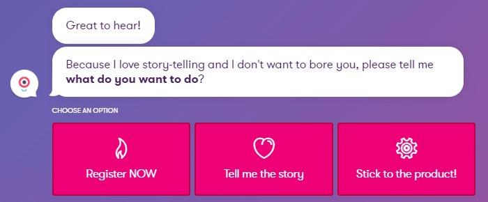
2. Landbot
For our second example, we’re going to explore conversational UI. Platforms such as Landbot approach the concept of conversational design in a very literal fashion, since they’re built entirely around text interactions.
Landbot might not be as well-known as our previous example, but that doesn’t mean that they don’t have something interesting to the table. In short, this service enables you to create chatbot-based landing pages. We’ve talked about how to set up Facebook-powered chatbots for WordPress before, but this platform is much easier to get started with.
The website itself is a masterclass in conversational UIs. It’s all built around a single chat, which uses a clean, modern design:
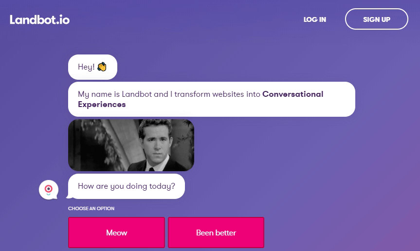
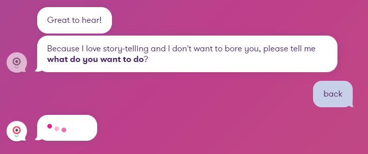
At each stage of the conversation, you can choose how to reply to the chatbot. Since you’re using predetermined options, the chatbot is much easier to program. It’s also an excellent example of how conversational UIs don’t need to be boring.
There are two standout points you should take away from Landbot’s approach to conversational design. Firstly, if you want to include conversational UIs in your website, you need to make them eye-catching. Play with colors, fonts, and even the small animations users see when you’re typing, to create something attention-grabbing:
Secondly, conversational UIs can be great for driving conversions. For example, chatbots enable you to lead users to take the actions you want them to by delivering a strong Call To Action (CTA):
Implementing these types of features may require some technical knowledge, but the results can very well be worth the effort. You can always experiment creating your own Landbot chatbot and using it to funnel users to your website or vice-versa.
3. Cody
For our last example, let’s take a look at another conversational UI. Cody is a showcase of a simple chatbot from the Chop Chop agency. Their business is built around creating chatbots, so it stands to reason they want to show off what they can do.
Unlike the Landbot example, Cody is less geared towards overt marketing. Instead, it tries to make you feel like you’re having a conversation with a friend while giving you important information. For example, Cody asks you if you don’t mind the site uses cookies, which is a great twist on notices:

The conversational UI here is exceedingly simple. The background is clean and the text bubbles are very understated. This is the type of chatbot you could see added to any professional website without taking away from its content.
The key takeaway here is conversational UIs don’t need to be focused solely on marketing and there are plenty of ways you can add some flair to your chatbots. For example, you might give it a face and a name so it feels unique and personal. Likewise, you can optimize the language you use to make conversations feel more casual and less like you’re asking Google a question.
Conclusion
When it comes to web design, there are a lot of schools of thought you can subscribe to. There’s material design, fluid shapes, hand-drawn elements, and much more. However, conversational web design is more than just a trend. If you can provide an experience that’s uniquely tailored to each of your visitors, you have an advantage very few sites can match.
Let’s take another look at some of our favorite examples of conversational design:
- Buzzworthy Studio: With personalization, you can make even contact forms feel more fun.
- Landbot: Offers an eye-grabbing example of a conversational UI.
- Cody: This simple chatbot does a great job at making you feel like you’re talking to a real person and not a machine.
It’s also worth noting that creating a conversational website isn’t just about design. Your website copy is also very important. To learn more, check out our guide on how to maintain a conversational writing style.
What do you think is the best way to implement conversational design on the website? Share your thoughts with us in the comments section below!
Article image thumbnail by Art Alex / shutterstock.com


Great article and thanks for featuring our new site. Also, I really enjoyed reading the comments in here and we will definitely take some of that feedback and discuss it for our next iteration. Cheers!
All new websites should implement this to drive better customer engagements.
Thanks, John for sharing these great tips about conversational design.
You’re welcome, Somide! 🙂
Great article! Thank you John… you inspired me for my next website restyling..
I’m very glad to hear it, Maria. Thank you. 🙂
Hola a todos. Me gustaría saber si los diseños que vienen en este post, se pueden hacer con DIVI. Gracias y saludos.
Hello everyone. I would like to know if the designs that come in this post, can be done with DIVI. Thanks and regards.
Hi Jose. 🙂 I recommend you contact support or refer to the official documentation for more specific information: https://www.elegantthemes.com/contact/
Buzzworthy.
Well done. Lots of white space. But for me, someone with ADHD, I got SO LOST in where I was and what I was doing I couldn’t find the contact form Lisa was referring to and I didn’t get to the pricing or Finish it up. The ultra bold, extra large type was readable from across the room but I felt like they were yelling at me. In my mind, that’s NOT a conversation.
Extremely talented folks but I’m hard pressed to even remember what it is that they do.
You’ve raised a good point here, Randy. They’ve clearly favored exuberance in the design, which will be off-putting or difficult to use for many. It’s something worth considering when implementing similar types of design.
I did say smartly put together. But yes it is bit confusing, agree with you there. Looks like they were having too much fun one day in the office.
Their site performs reasonably well on Pingdom with all the bells and whistles, so fair play on that score.
OMG How did Buzzworthy do that form???? I want one like it.
Haha! Thx
Recommend people look around the Buzzoworthy site. Very smartly put together.
You’re absolutely right, it’s a very impressive site. 🙂