
It’s time again for our monthly Divi Showcase where we take a look at 10 awesome Divi websites made by our community members. Each month we showcase the best Divi websites that were submitted from our community and today we want to share with you the top ten websites for the month of June. Throughout the post I’ll point out some of my favorite design features that draw me to each of the websites.
I hope you like them!
Divi Design Showcase: New Submissions from June 2018
1. Hello Digital
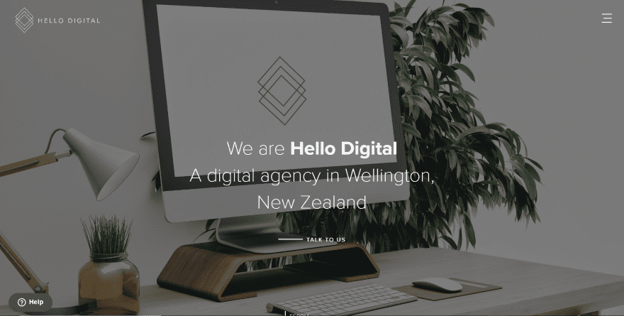
This site was submitted by Angus Allan. A full-screen background image with overlay and tagline describes what the site is about. Scrolling reveals an overlapping image and text that presents one of the primary benefits. Services are described within solid blocks followed by client icons. Another section displays links to child themes within solid blocks. The site makes excellent use of alternating white and gray backgrounds, shadow effects, and typography.
2. Jazz Manouche
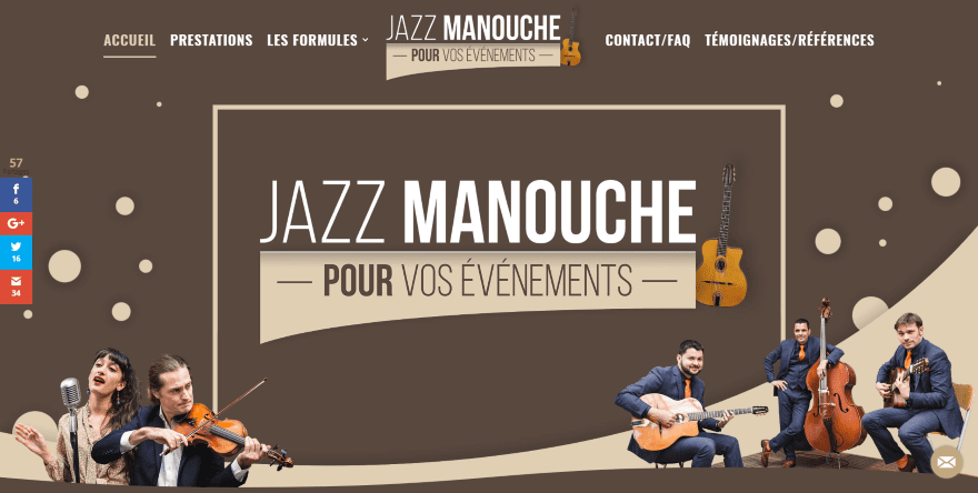
This site was submitted by Clement Reboul. This site makes use of Divi’s specialized section divider styling, including multiple rounded and circular styles, clouds, and several angled styles. Styled text modules zoom on hover and display angled numbers that straighten on hover. All of the elements are styled to match the brown color scheme. Embedded videos with shadow effects overlap their sections. The logo overlaps the header on scroll. Blurbs use large icons that animate on hover. I love the colors and images in this site.
3. La Ruche Agence Marketing
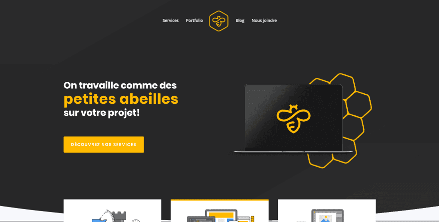
This site was submitted by Etienne Champagne. It uses a black and white color scheme with bold yellow highlights that make it stand out. The header and hero area show elements from the logo along with a call to action. Elegantly designed blurbs with hand drawn graphics overlap the first section and show the services. A section that links to the portfolio shows an image over a yellow circle and is similar to the section with a contact link that uses a hexagonal pattern with shadow effects. Both sections are separated by client icons that link to the portfolio page. This site makes great use of color.
4. Bytestand
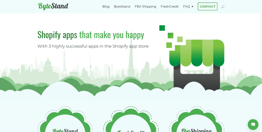
This site was submitted by Todd Trimakas. This site makes interesting use of clouds, color, and angles. The hero section displays a skyline in the background and a shop that overlaps the clouds which separate the first two sections. The blurbs continue the cloud design and overlaps a barely visible map in the background. This site has one of the most unique newsletter opt-in designs that I’ve seen, with angles and outlines that remind me of 1960’s futuristic design. A FAQ section continues this design. The contact form is placed within an envelope. The footer elements are placed over a background drawing that grounds the site.
5. Siervo Fiel
This site was submitted by Daniel Aidea. This is a one-page layout without navigation. The hero section displays a full-screen video with an overlay that blends into the next section, which provides a CTA with a contact form. Styled blurbs show the services using icons that match the color of the overlay. The projects section displays an animated graphic to draw attention. Testimonials and blurbs use box shadows that look clean and elegant. I love the use of orange in this site.
6. Server Guy
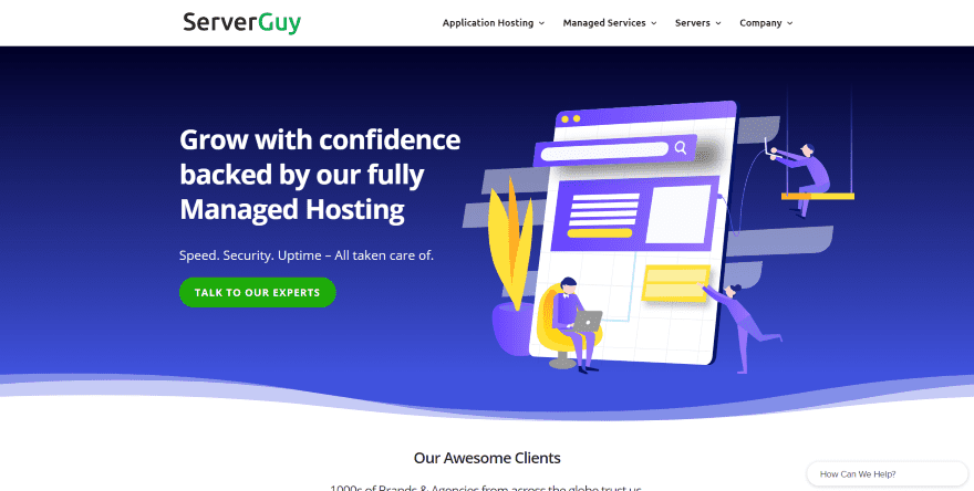
This site was submitted by Sakshi Behl. This one uses a nice blue highlight throughout the site for backgrounds and icons. The blue backgrounds have an elegant gradient with wavy section divider styling. The layout is clean and uses alternating graphics and text. Blurbs present information without a border so they blend well with the graphics and create bullet points. The graphics have animated portions that are interesting to watch. The blog displays cards with box shadows over a styled background. I love the use of color and animation in this site.
7. Wedding in the Rose Garden
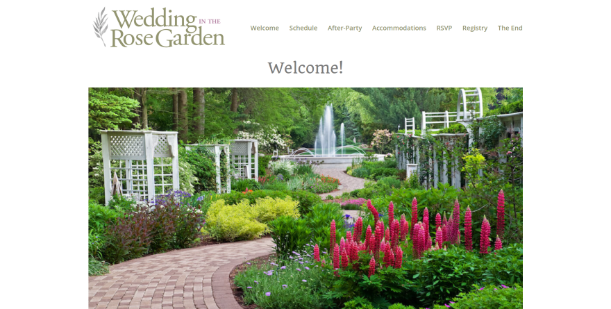
This site was submitted by Randy Martin. This site utilizes both multi-column and single column elements within both boxed and full-width rows. Information is placed within boxes with solid backgrounds, rounded corners, and box shadows. Some of the boxes overlap images. Hand-drawn graphics accompany portions of information. The map also includes rounded corners and a box shadow, which makes it stand apart and gives it a sleek 3D look. The colors, images, and art work perfectly for the website’s genre.
8. Mighty Fine Design Co.
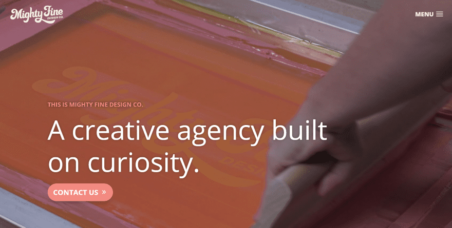
This site was submitted by Frank Rodriguez. It displays a full-screen video background behind the tagline and contact call to action. A full-width section displays styled titles and buttons for each of the services over a background overlay. My favorite section shows the process of working with the company. It includes a background with three colors that create an angled pattern with a graphic over a couple of the colors. Text modules with solid background colors stand off from the background with rounded corners and shadow effects. The colors match perfectly with the website’s branding.
9. Totem PD
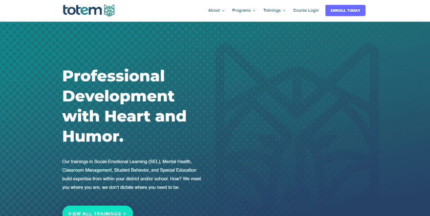
This site was submitted by Josh Allan. It has several sections with interested background patterns behind the text and CTA’s that work as graphic elements and for breaking up the page. Information about the classes are shown within blurbs that use graphics as icons. The blurbs combine to create a single block. A book CTA displays the book’s cover with a box shadow. A testimonial slider section displays two testimonials that overlap the following section. The colors and graphics work great with the site’s branding.
10. Roofing Matters
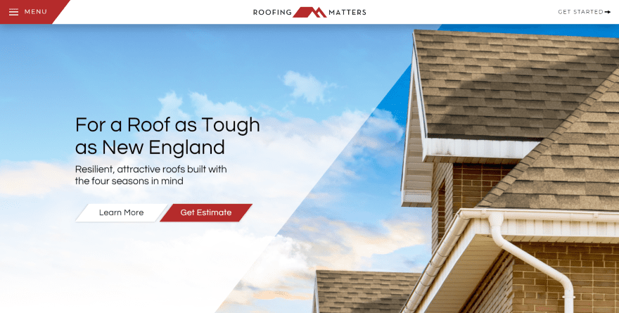
This site was submitted by Jon Langberg. The hero section displays a background in true parallax with animated clouds. A call to action in the overlay includes two styled buttons that match the menu button in the header. The next section also displays a background in true parallax with information placed within a box with an arrow. Clicking the arrow takes you to the next section, which displays a large box of information that’s styled to match the buttons. Blurbs display the benefits with large icons and matching text. The last section is my favorite- it provides links to several pages using images with hover animation that are styled with the same angles as the buttons.
Conclusion
That’s our 10 best community Divi website submissions for the month of June. These sites look amazing and as always we want to thank everyone for your submissions!
If you’d like your own design considered please feel free to email our editor at nathan at elegant themes dot com. Be sure to make the subject of the email “DIVI SITE SUBMISSION”.
We’d also like to hear from you in the comments! Tell us what you like about these websites and if there is anything they’ve done you want us to teach on the blog.
Featured image via Boris Rabtsevich / shutterstock.com


I like the roofing site the best. Nice clean and just enough color combos. The company that built the sites agency site is very cool. Hello digital is very nice also. Always like to pick up ideas from the showcase.
Oh my goodness, that Roofing Matters site is so beautifully integrated. What a great interpretation and extension of the brand. The menu is simply exquisite. So much to like there!
My website is a place of which many things have to reveal me that is to say the videos until anothers precious look at from partners.
In addition I truly thank you for everything you to do in order to boost my website.
WOW! These sites are amazing! I have been using Divi for years and it’s nice to see different ideas! I love Jazz Manouche and Bytestand – the clouds are amazing!
I think Jazz Manouche looks nice although I also think they over did it a bit with the section dividers.
Wow, some great examples here of what you can do with Divi. Would be nice if there would be a “how to” chapter. I’m also interested in “overlapping” where a form overlaps a frame.
And why is it so hard to have an image widget that enables a line of text below the picture, “photograph by…”
Thank you for your good work.
Great sites! They all look good their own way. Nice logo centered in the middle (several sites) I need that for my next project:-)
“Server Guy”’s website is superb. How are the animations created? I hope you will make a tutorial about this soon. Best regards.
For the homepage all I see are some animated .gif files.
Thanks, Divi team for featuring ServerGuy. Love the showcase series. It is always nice to see people creating brilliant websites using your theme!
Keep up the wonderful work 🙂
Jazz site, Byte Stand, and Roofing are exceptional! Kudos to the artists! Great job peoples!
Thank you for SHARING!
DREW
I love to see what people can do with divi.
Also, i want to know how can i summit my work?