Oftentimes, the logo is a company’s first impression. And making a killer first impression is critical to all businesses as it can impact customers’ perception and purchase decisions. A well-designed logo says to the world that you’ve a point of recognition and are ready to cement your place in your niche.
From Starbucks’ “mermaid”, to Redbull’s “bulls fighting under the sun” symbol, companies take great care of their logos. However, designing an effective logo can be a significant challenge because it’s easy to overthink the design process (it’s not easy to incorporate a company’s ideology into a small graphic).
How do you create simple and highly recognizable logos? And how do you differentiate it from competitors? Here are some expert logo design tips to help you out:
Make It Unique
How many times have you seen cliché logos like a rooftop to represent a real estate business and a globe to denote international? Such logos make it difficult for customers to differentiate a brand from its competitors.
For instance, the logos of several social media apps have chat bubbles in them. Although it’s relatable to the concept these apps portray, the idea has been overdone.

Image source: softonic
Instead of relying on bubble shapes in illustrator, spend a few weeks sketching out new ideas to come up with something better. Make sketches using pencil and paper to organize a large amount of information into manageable pieces.
Making a unique logo isn’t just about avoiding clichés, it’s also about making something out of the box. Renowned graphic designer David Airey says in his book that it’s important to think creatively. According to him, the Virgin Atlantic logo isn’t just an airplane, the Mercedes logo doesn’t just represent a car, and the Apple logo isn’t a PC – they’ve some meaning and purpose behind them.
Be Smart with Typography
Typographic logos are timeless and classy. The most elegant imagery, the most harmonious color combinations, the best ideas can be blighted with inferior typography.
You can either create a custom typeface or proceed with an existing one when using this approach to logo design. To add contrast to a custom typeface, experiment by pairing thin fonts with thick, small text with big, plain fonts with fancy, expanded character spacing with tight, and so on.
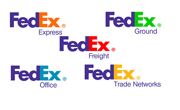
Image source: Fine Print NYC Blog
That’s how the famous FedEx logo came into being. Lindon Leader, who created the mark in 1994, played with two typefaces and letter spacing, from locked together to extremely wide, mixing and tinkering, lowercase and uppercase. The result was an iteration with a lowercase x and a capital E.
You can also follow the A, B, C rule to balance out different sections in the text. A = company name (most important information), B = sub-heading (next most important information), C = smallest heading (less important information). Increase “tracking” (the space between letters) to give the words some room to breathe.
With a custom typeface, consider using a custom font; font originality goes a long way in distinguishing a brand. Examples of logos with custom fonts include Coca Cola, Yahoo! and Twitter.
When you adapt an existing typeface, you can remove, join or extend letters to create a unique design. It’s possible to produce a simple execution for your brand with the strength of existing letters alone. To learn more about typography, consider reading “Stop Stealing Sheep and Find Out How Type Works”.
Use Color to Your Advantage
Most logo design tips talk about color theory – a complex subject matter. The key to getting this right is to understand the basics before diving in deep. Basics include knowing when to use bright colors, using colors that are near each other on the color wheel, and understanding how colors evoke moods and feelings (for instance, red evokes feelings of passion, strength, and love. Yellow evokes attention and optimism).
According to a research conducted by University of Loyola, Maryland, color can boost brand recognition by 80 percent. A lot of memorable logos use a single color scheme, but if you plan to use more than one color, make sure the end result isn’t a logo that looks confusing and busy. Color gradients can be used to add polish to the mix without overdoing it. That said, it’s recommended not to go beyond 3 colors (in exceptional cases you can).
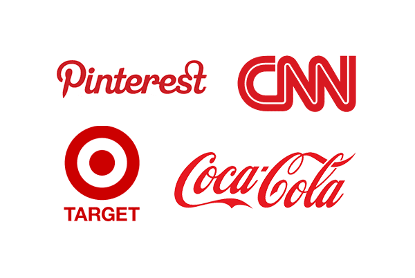
Image source: Elegant Themes
Some brands have created a slight variation of a simple color for their logos, which are now recognized by their own distinct colors. For instance, when you think of Starbucks, you think of the “Starbucks green” color, which sets the coffee brand apart from its competitors, making it all more recognizable.
You can even give black and white a shot, especially if the logo needs to be used often on invoices and letterheads. The choice of color scheme will have a ripple effect throughout your “look-and-feel” collateral and digital properties, so it shouldn’t be taken lightly.
Incorporate a Story
Almost every logo has a story behind it. If it was a mere work of art or a pattern of text, consumers wouldn’t be able to unravel the deeper meaning behind it. While it varies from case to case, the goal of most companies with a logo is to help consumers instantly remember the brand.
The popular graphic designer Milton Glaser (the man behind I Love New York logo) told Design Informer that when people first see a logo…they should get the idea, because the act between understanding and seeing is critical. A story could be as simple as depicting the company’s values and culture.
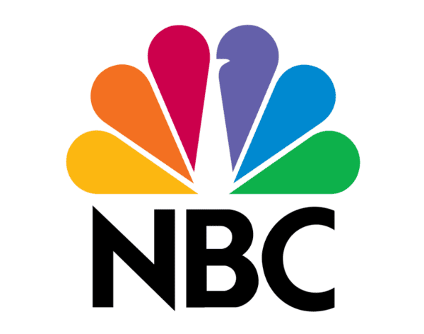
Image source: Yahoo! News
For instance, NBC (before known as the Peacock Network) leveraged a bird in its logo in 1956. Over the years, the peacock evolved into a new shape and it now has a 6 colored tail which represents the different departments of NBC: Networks, Productions, Entertainment, Stations, News, and Sports. And the fact that the peacock is facing right depicts the network has a bird’s eye view of the future.
Another example is A Place Called Home, a South-American charity company that provides educational opportunities and other programs to youth.
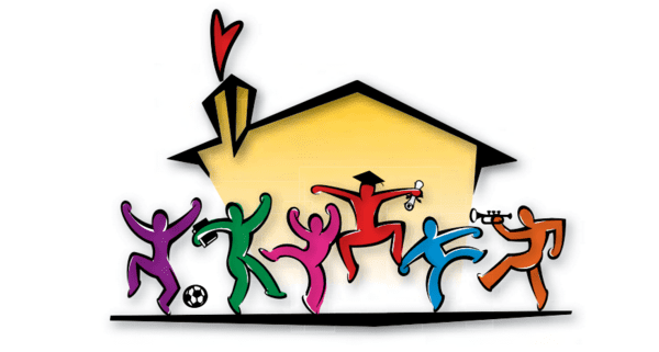
Image source: Twitter
Their logo depicts their mission and tells a story with excited figures (playing instrument, sporting a graduation cap) and bright colors.
Bottom line: make sure your logo conveys your identity, values and ethics, and it does this all effectively.
Use a Logo Grid to Create a Stunning Design
Logo grids are used to create designs with geometric harmony. They’re made from square grids, but the structure can be expanded to a greater extent. For instance, some designers create a unique grid system for specific projects featuring whitespace, spaced elements, and heights with invisible lines. Others use a square or circular grid system for their projects.
There are many benefits of using grids, one being that they give users the focus to create something timeless. Some grids help you design with greater flexibility; the lines in the grid help the designer see more options for how to move lines and where to put pieces together so that the outcome is aesthetically pleasing.
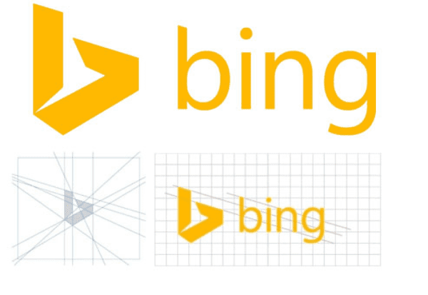
Image source: Graphics Magazine
Bing’s logo, introduced in 2013, revealed design principles that rely on grid layouts. The grid layout system assisted the logo designer in mapping coordination and a balanced approach to design. When this logo is placed on a simple grid, it offers consistency, balance, sightlines and angles while aligning to the layout instantly. The same grid layout has been used to create logos for all Microsoft products.
When using grid layouts, don’t apply mathematical ratios to a logo when it’s not required. A great logo may not adhere to standard geometry, and numbers might not add up to the golden ratio. In other words, perfect geometry isn’t always appealing for the viewer. Apple’s logo is not geometrically precise, but it’s aesthetically pleasing and has stood the test of time.
Remove the Clutter
A big roadblock to creating great logos is clutter – too many things in one place. Clutter can sneak into your design and it comes in different forms. The availability of typefaces, fonts, and other elements makes it easy to over-indulge in unnecessary details.
As a result, effective logo design tips post questions like “Does this addition makes sense?”, “Is that typeface really needed?” and “Does this match the requirement?” When you can’t justify an element that’s present in your logo, it needs to be removed. Remember, the simplest logos are often the strongest.
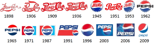
Image source: Reddit
Notice how the Pepsi logo has evolved over the years. They removed the word “cola” and even the background colors in the past few years. The use of white space (also referred to as negative space) has been a smart move as it keeps the design from being too confusing or cluttered. White space can represent any color that stands for negative space in a logo.
The final design doesn’t have to reflect your company’s entire functioning. A clothing brand doesn’t have to show clothes in its logo (H&M, Zara, etc.).
Final Thoughts
Because your logo is one of the most identifiable components of your company, it’s vital that you get it right. These logo design tips will help you be creative and generate new ideas to experiment with. At the end of the day, great logos are the outcome of little things done right.
Tell us about your logo design experience and if you have additional tips in the comments below.
Article thumbnail image by Bloomua / shutterstock.com.


Thank you for this article – I especially liked the Grid System for creating a logo – this is actually the first time I’ve heard about this method.
I’m not a graphic designer and can only use pre supplied fonts and elements to create logos. This grid system is structured and would help a person like me quickly create unique logos.
thanks again
Great informational article, accompanied by on-the-mark graphic examples. Thanks for publishing it for all to benefit.
My personal opinion is,logo is the first thing that attracted a customer.If your logo is unique and eye catching then your half job is done.This article is really important for every person who are going to open a new business or something like that.
That was really helpful, much appreciated, I’ve working on building a logo for my blog, although I didn’t find any satisfactory results from automated logo making available on Internet! Thanks to your tips, I’ll work on designing it myself!
Like the hidden arrow in the FedEx 🙂
Thanks for the tips!
I was surprised that the arrow wasn’t mentioned it in the post 😉
Excellent tips, thank you!
Muy buenos consejos, muchas gracias.
Great read Dan, as always.
I am using red color logo for my website.
We took one week to find our name and logo, then we was inspired by The Giants of Monte Prama, a group of giants made by stone, discovered in Sardinia (Italy) in the 70’s and dated by archaeologists IX Century b.C.
This is awesome. The logo and the history lesson are great! Much success!
Thanks Dan. Useful thoughts
Great post, and a great follow on from a post we wrote a few days ago on our blog section on the business website. Logo design is great when it is done right.
Perfectly said at the end of the article “Because your logo is one of the most identifiable components of your company, it’s vital that you get it right.” Logo is very important for any business, so do it right.
VERY NICE!
THANX A LOT.