
Designers everywhere should know about the Golden Ratio. It is a mathematical ratio that creates aesthetically pleasing designs. Since the Golden Ratio exists so frequently in nature, it’s not a surprise that its results are natural-looking.
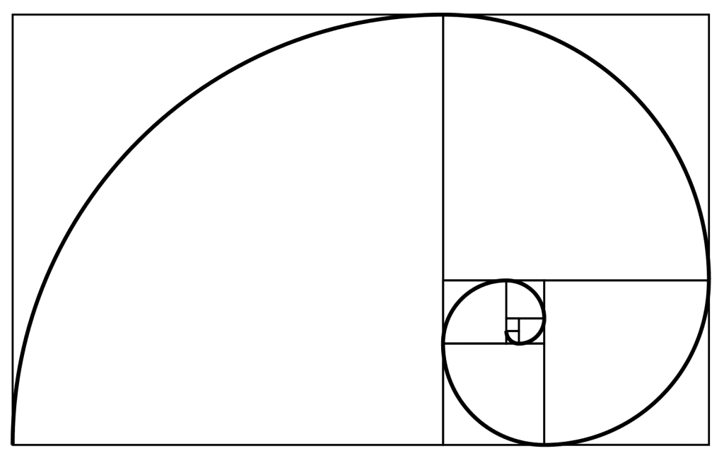
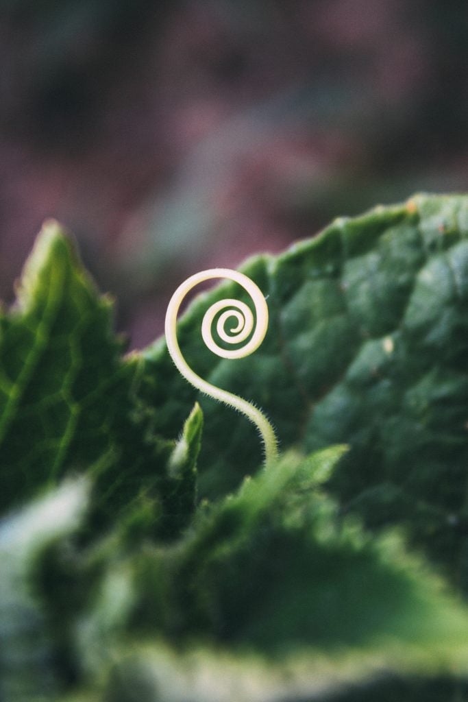
Photo by Bogomil Mihaylov on Unsplash
The Golden Ratio goes by several other names, too:
- Divine Proportion
- Golden Mean
- Golden Section
- Phi (Greek letter)
The Math Behind the Golden Ratio
I’m going to explain the Golden Ratio’s math as simply as possible and without going into the details you don’t actually need to know. If you can keep up with the math, great. But if you can’t, that’s okay – you’ll still be able to use the concept in your designs.
To understand the Golden Ratio, you have to first understand the Golden Rectangle
The Golden Rectangle is a large rectangle that has a square inside it. The sides of the square are equal to the shortest length of the rectangle:
Source: Wikipedia
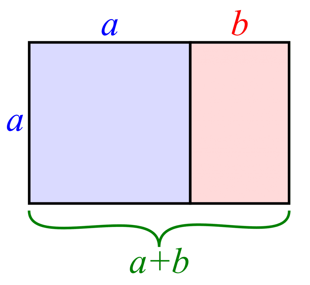
The Golden Ratio is a number that’s (kind of) equal to 1.618, just like pi is approximately equal to 3.14, but not exactly.
You take a line and divide it into two parts – a long part (a) and a short part (b). The entire length (a + b) divided by (a) is equal to (a) divided by (b). And both of those numbers equal 1.618. So, (a + b) divided by (a) equals 1.618, and (a) divided by (b) also equals 1.618.
Back to the Golden Rectangle, because it’s so much easier to understand
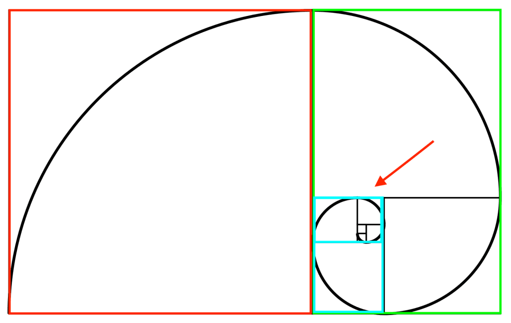
When you place a square inside the rectangle, it creates another, smaller rectangle. Ignore the black lines and look at the red and green boxes:
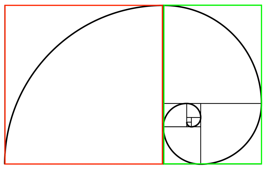
The red square has four sides equal in length, and that length is equal to the shortest length of the rectangle. By sectioning off that square, you automatically create another, smaller rectangle (outlined in green). Together, they create a complete Golden Ratio layout and a base for the Golden Spiral.
You can also make a new Golden Rectangle out of the smaller rectangle, like this one I’ve outlined in blue:
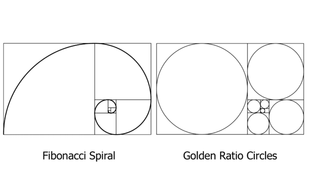
A traditional Golden Ratio diagram has eight Golden Rectangles:
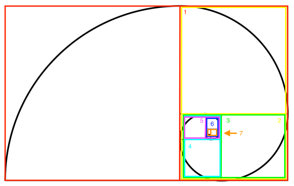
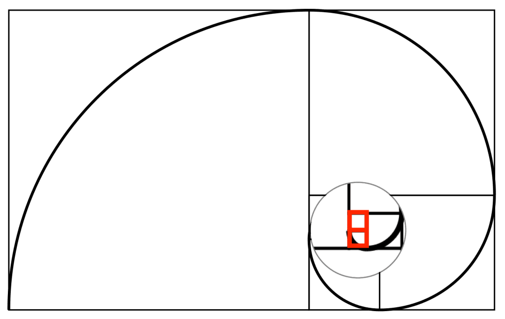
And here’s the smallest Golden Rectangle, #8:
If you start in the bottom left and make an arch to connect the far side of each square-and-small-rectangle cross section, you’ll get the Golden Spiral.
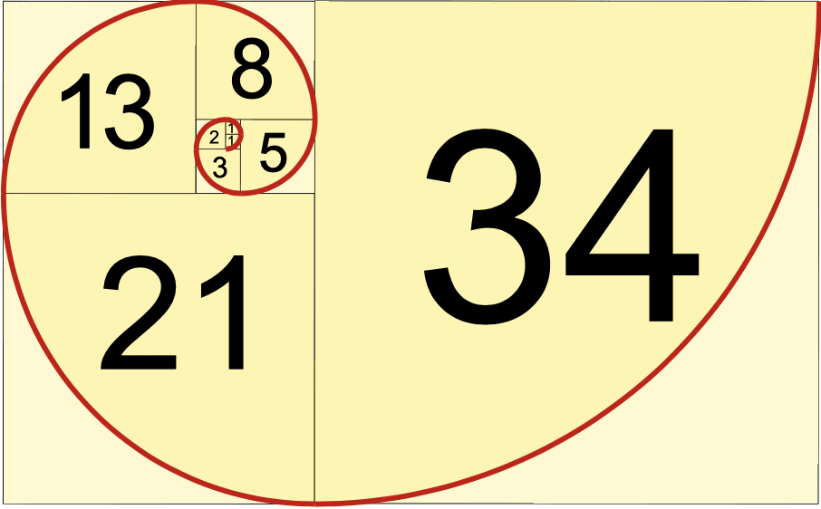
The Fibonacci Sequence
The Fibonacci Sequence is pretty simple to understand: you start with zero and 1, then get the next number by adding up the two numbers before it. 0 + 1 = 1, then 1 + 1 = 2, etc. The first few numbers in the sequence are 0, 1, 1, 2, 3, 5, 8, 13, 21, 34.
If you use those numbers to create squares with those widths, you can pretty much create a Golden Spiral:
Source: Math is Fun
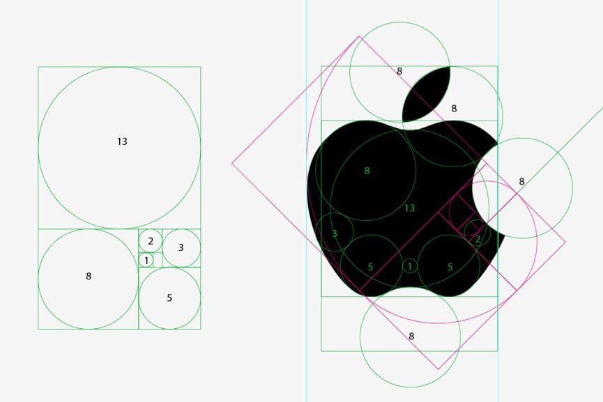
The Golden Circles
Sometimes, you’ll see circles drawn in the squares instead of or in addition to the spiral. If you draw perfect circles in the boxes of the Golden Ratio overlay, they’ll have the 1:1.618 ratio with one adjacent circle.
Source: Limelight Department
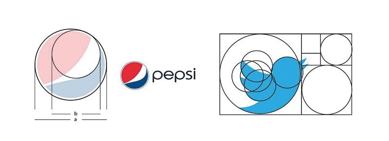
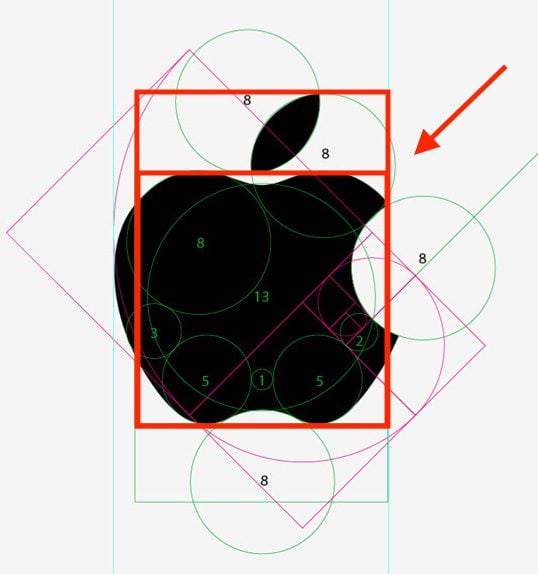
The Pepsi and Twitter logos use the Golden Circles:
Source: Hybrid Talks
You’ve Seen This Before, A Lot
Nature is full of the Golden Ratio. It’s in flora, shells, weather…

Source: Photo by Annie Spratt on Unsplash

Source: Photo by NASA on Unsplash
And because we see it so often, our brains prefer it. That innate attraction is why it’s such a powerful layout for designers to use.
The Golden Ratio in Art and Design
Sometimes the Golden Ratio super easy to recognize:
Source: staceysdetailinginc.com
Sometimes you go, “I have no idea what you’re talking about… oh wait. Now I see it. I think.”
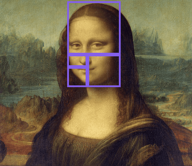
Source: Marketing Insiders
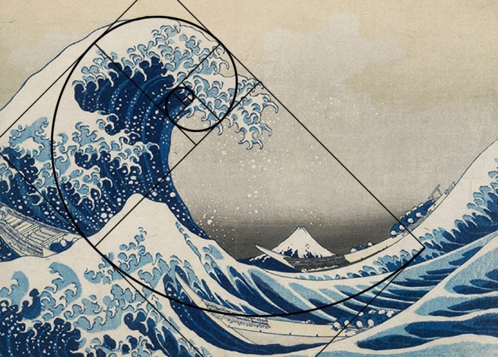
Other times you could go crazy looking at it…
Source: Widewalls
…but if you zero in on the main Golden Rectangle, it becomes a little more clear:
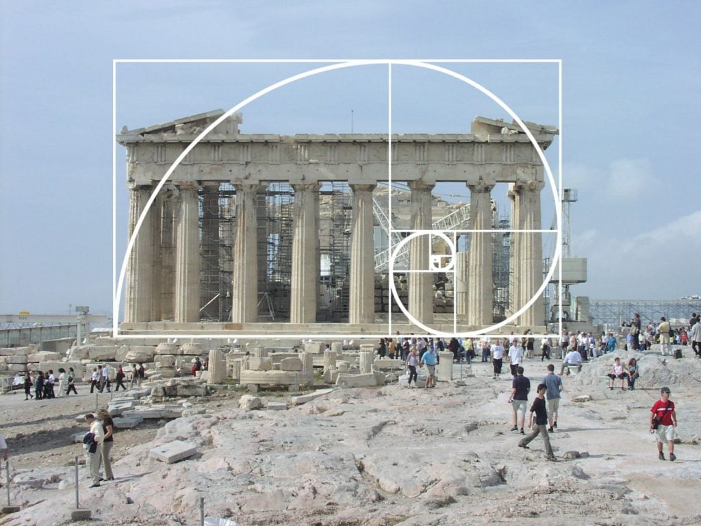
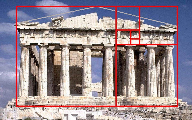
Let’s take a look at a commonly-referenced example: the Parthenon
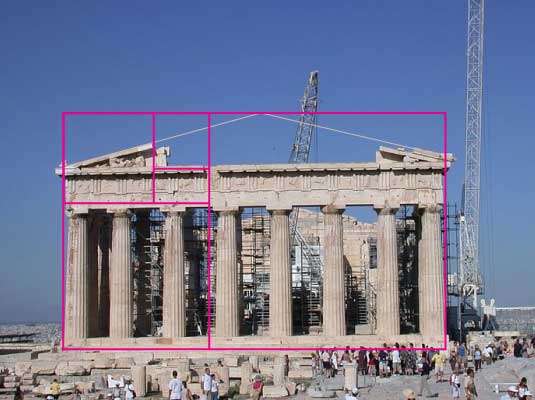
Source: Creative Bloq
At first, you might see this and go, “That just looks symmetrical to me. How does what I’m looking at fit into that Golden Rectangle Spiral thing?”
The Golden Ratio isn’t about how each part of a design fits completely and only into the specific sections. If that was the point, the right side of the Parthenon would be one big block and the left side would be sectioned into smaller blocks.
Instead, the ratio is used to create harmony and proportion, and that can be interpreted in a few different ways.
While the Golden Ratio is grounded in math, it can be adapted in creative ways. In the case of the Parthenon, the Golden Ratio determines the height and placement of design components. Plus, there are a number of ways to lay Golden Ratio diagrams over it:
Source: Archinect
Source: Esther Sugihto on Medium
Source: GoldenNumber.net
The Golden Ratio and Website Design
Whether you’re into math or your head’s about to explode, the Golden Ratio is a bit easier to understand in terms of design. You’ve done the heavy lifting. Now it’s time to take the basic overlay and make your web components perfectly pleasing.
The Golden Ratio and Layout
If you want a perfect Golden Ratio layout, set the dimensions to 1:1.618. For example, you can set the width to 960 pixels and the height to 594 pixels. The Golden Rectangle is 594 pixels on each side and the rectangle takes up the rest of the layout (594 x 366).
Calculator Soup has a helpful Golden Ratio calculator where you can set any term (A, B or A + B) to find the correct Golden Ratio values.
Or, you can simply use this type of two-column layout, where one column is quite a bit wider than the other column. It’s organized and clearly shows hierarchy.

Source: National Geographic
I use this on my website because the homepage is a collection of my blog posts, and I feel like this is one of the most-recognized layouts for blogs:

In my opinion, though, the symmetrical layout we use on Elegant Themes is more modern:
The Golden Ratio and Spacing
The Golden Ratio can help you determine where to place elements of your design, the proportions to use and where to leave negative space. Here’s a simple example, and you can almost see the Golden Ratio overlay without even having to put it on top:

Source: Digiarts 2011
Here’s what it looks like when I apply the Golden Spiral in Photoshop:
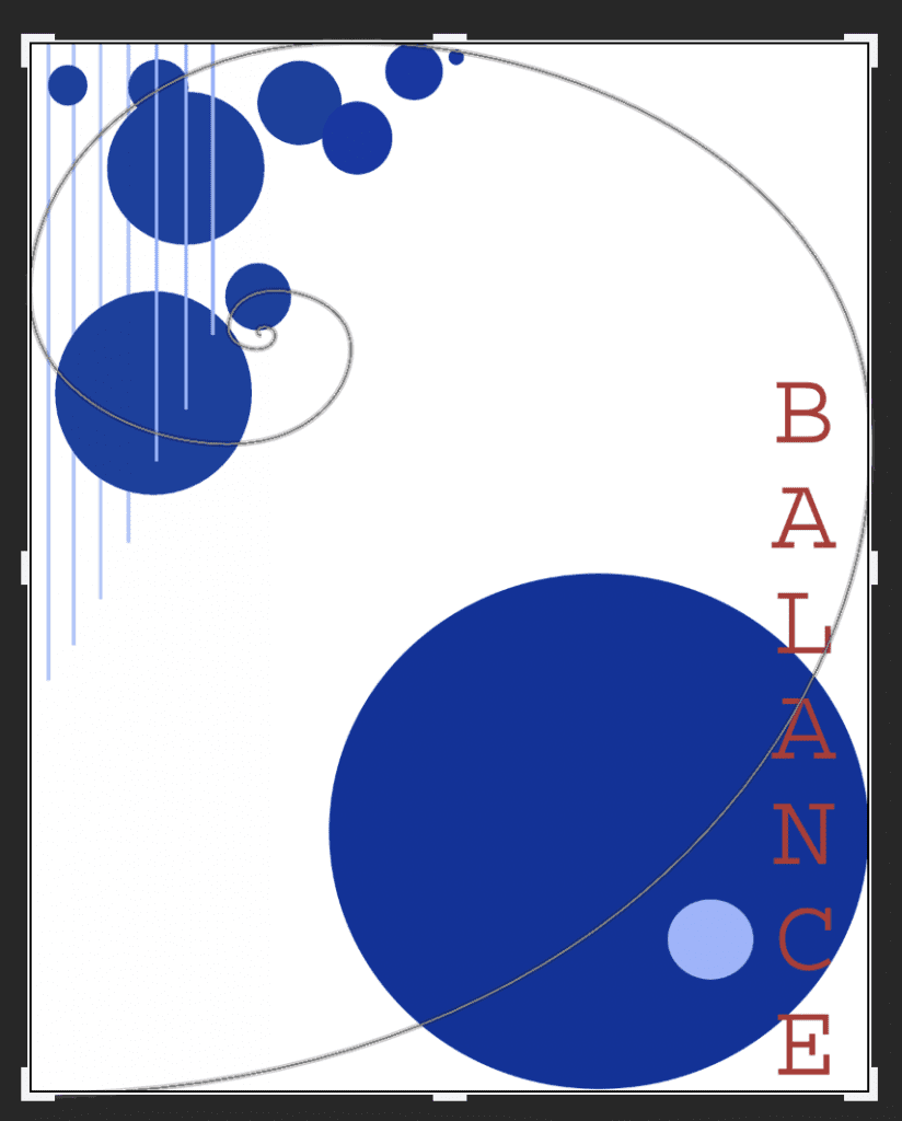
Again, the Golden Ratio is grounded in math, but when it comes to applying it to design, it’s not perfect. That design isn’t created on a Golden Rectangle, so the Golden Spiral is out of normal proportions. However, you can see how it can guide a designer to choose where to put the largest element of the design, as well as the smallest elements and negative space.
You can also layer the Golden Ratio overlay to apply it to different elements of the same design:
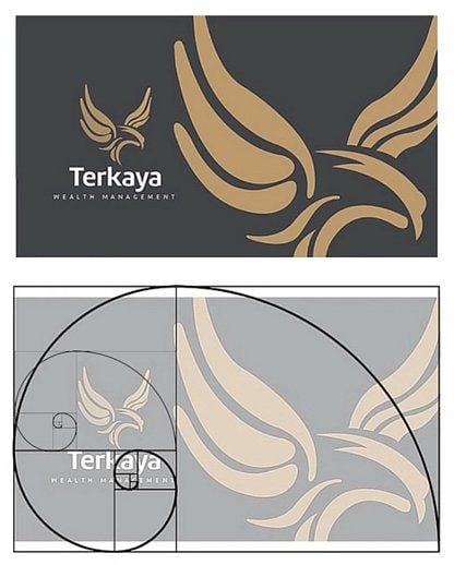
Source: Branding by Lemongraphic. Example from Canva.
The Golden Ratio and Content
When you think about the Golden Ratio’s layout and spacing together, you can start deciding where to place content on your website.
Let’s look at the National Geographic website again, this time with Canva’s Golden Ratio overlay on it:
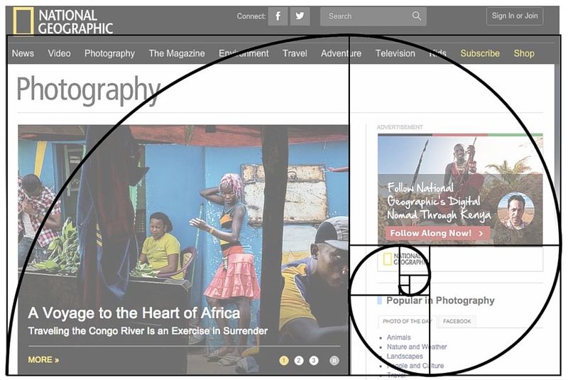
The layout is split so that content lines up along the spiral’s center line. To the left, there’s a large block of content. To the right, the content becomes denser and there’s a lot more negative space. Toward the center curlicue of the spiral, you’ll see a second National Geographic logo – there’s no better way to drive home branding than to place it where the eye naturally goes.
Here’s a great example of how the Golden Spiral can lead your eye through a design, even past its main component. This is useful if you have a lot of content to squeeze onto one page. You’ll also notice that even with such a packed and detailed design, there’s still negative space in there.

Source: Design by Helms Workshop. Example from Canva.
Honorable Mention: The Golden Ratio and Images
The Golden Ratio is also used in photography composition. Instead of creating a Golden Spiral, the Golden Ratio splits the image into six blocks. The same Golden Ratio is used in this type of grid: the widths and heights of the sections are either 1 or 0.618.
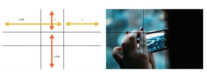
Source: Canva
You then use the intersections to compose the shot. The goal is to put a subject or main part of a subject on one of the intersecting lines – the subject shouldn’t be centered, and some blocks should be left empty (in most cases, at least – macro photography and close-up portraits will fill almost all of the frame). By doing this, you create a more interesting portrait than if the subject were centered.
A much simpler and more accessible way to follow this rule is to use the Rule of Thirds grid, which you probably have on your phone’s built-in camera or your DSLR.
Here’s a picture I took of my cousin’s son. I’ve laid the Rule of Thirds grid over it to show you where the subject does, and does not, fill the frame.
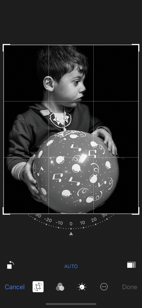
Also, look how the Golden Spiral almost-perfectly wraps around the subject:

The Golden Ratio differs from the Rule of Thirds because the Rule of Thirds grid has sections with equal lengths and widths. However, it’s so close – and so much easier – that this is what photographers commonly use when composing or editing a photo.
Wrapping Up
The Golden Ratio can be used as-is or adapted to your purposes and tweaked for size – math may have hard-and-fast rules, but creativity doesn’t. While you can use the Golden Ratio from the get-go to guide your design, you can also use it after you’ve started designing to make tweaks and improvements. The goal is to have the ratio guide you, not to force fit a design into it.
Ready to play with your website layout even more? Check out our article about using Divi’s new height and width options to create responsive design.


Sine (666) + Cosine (6×6×6) = -1.618… (golden ratio).
I think the most interesting part of this equation is how it equals the negative sign of the golden ratio.
Very interesting. This is timeless design.
I’ll try the Golden Ratio and/or the Rule of Thirds for my next project.
It should be easy on desktop but I wonder how challenging it will be with mobile devices.