
An exit popup is your last chance to engage readers before they leave your site. Whether you want them to continue browsing your site, take advantage of a special offer, or subscribe to your newsletter, a properly designed exit popup can help you accomplish your conversion goals.
In this article, we’ll introduce exit popups, explain what you can accomplish with them, and suggest some strategies to help ensure that your exit popups are optimized for maximum effectiveness.
- 1 What Are Exit Popups and Why Do You Need Them?
- 2 Two of the Best Exit Popup Tools Available
-
3
15 Ways to Optimize Exit Popups for Maximum Conversions
- 3.1 1. Know Your Audience
- 3.2 2. Keep Branding Consistent
- 3.3 3. Grab Attention
- 3.4 4. Tweak Your Popup’s Behavior
- 3.5 5. Offer a Discount or Freebie
- 3.6 6. Keep Surveys Simple
- 3.7 7. Make Your CTA Button Stand Out
- 3.8 8. Make Your Popup Fun
- 3.9 9. Express Urgency or Scarcity
- 3.10 10. Use Numbers
- 3.11 11. Offer a Reminder
- 3.12 12. Assume Intent
- 3.13 13. Overcome Objections
- 3.14 14. Suggest Related Posts or Products
- 3.15 15. Offer Support
- 4 Conclusion
What Are Exit Popups and Why Do You Need Them?
Exit popups appear when a visitor is about to leave your site. At a minimum, they typically include a message and a call to action (CTA), and they may also include images and videos. There are at least five different ways you can use exit popups to improve the performance of your website:
- Lead Collection: Email marketing outperforms social media marketing. Use an exit popup to add subscribers to your newsletter and you’ll be mining for digital marketing gold.
- Sales and Promotions: Any website selling a product or service can use an exit popup as a last-gasp effort to close the deal. Use the exit popup to sweeten the deal and add a more persuasive edge to your marketing copy and watch your exit popup make the sale.
- Surveys: Exit popups can be an excellent way to obtain information from your readers. Gather information about their experience on the site, ask for demographic information, or perform market research for upcoming products.
- Warnings: Exit popups can also be used to let visitors know about an adverse consequence that will be triggered by clicking away. For example, an e-commerce site might warn visitors that the shopping cart will be emptied upon exit. This may be enough to persuade a certain percentage of exit-bound visitors to stick around and complete their purchase.
- Navigation: Another use for exit popups is to advertise related content. Visitors that take the bait will end up sticking around for longer and reduce your site’s bounce rate.
Two of the Best Exit Popup Tools Available
Before we dive into exit popup tactics, we need to talk about tools. Many of the tactics we’re going to recommend will require the use of a robust, full-featured marketing toolset, and not just any free popup plugin. A couple of our favorite full-featured popup plugins are Optin Monster and Thrive Leads, which are two of the best WordPress popup plugins.
Let’s take a quick look at each.
Optin Monster
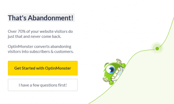
An example of an Optin Monster exit popup.
Optin Monster offers a suite of popup options, all highly customizable in terms of both design and behavior. Exit popups can incorporate exit-intent technology to detect user behavior and offer appropriately targeted popups. The image above shows an exit popup from Optin Monster’s website; it uses a few of the tactics we’ll be talking about momentarily.
Price: Starting at $9 per month | More information
Thrive Leads
An example of a Thrive Leads exit popup
Thrive Leads is another plugin that offers popups that are triggered when a visitor signals that they’re headed for the exit. Thrive Leads popups are highly customizable and you can also tweak their behavior to carefully target specific groups of users.
Price: $67 | More information
15 Ways to Optimize Exit Popups for Maximum Conversions
Now that we know what exit popups are, what they can accomplish, and the tools needed to build high-quality exit popups, it’s time to figure out how you can get the most out of them. Let’s get started!
1. Know Your Audience
Knowing your audience is imperative. Dig into your site’s analytics data. Take the time to get to know your audience, study how they use your site, and work to discover what they want and need.
When designing popups, include offers that are aligned with what you know about your audience, and make your CTA as easy as possible for visitors to locate and act upon.
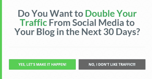
The example below from Entrepreneur On Fire is far from generic. It is designed to pique the curiosity of a specific audience with a well-defined set of goals and interests.
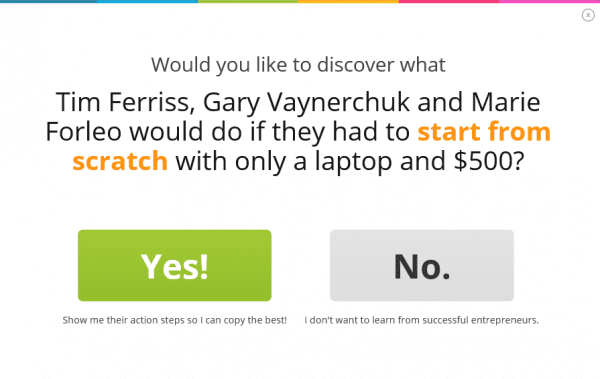
Entrepreneur On Fire exit popup.
2. Keep Branding Consistent
Creating an exit popup that doesn’t match the branding and feel of the site where it appears is a recipe for poor performance. Your exit popup should match your site’s branding so that people know it’s authentic and so that it will resonate with them in the same way that your brand does.
The example below is from Gwen’s Nest. It features imagery and fonts that stay true to the website’s branding. The friendly dialogue is also in tune with the familiar and casual tone of the site. In other words, it’s a natural extension of the experience of visiting Gwen’s Nest.
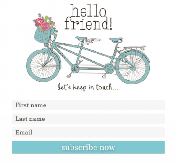
Gwen’s Nest exit popup
3. Grab Attention
Your visitor already has one foot out the door, so you need to really get their attention if you want them to take notice.
Exit popups are eye-catching by design. They appear in the middle of the screen and typically overlay the entire page with a partially transparent background. However, there are plenty of ways to get even more attention. For example, some exit popups use striking images, large bold copy, and animations to grab attention. You can even have the popup slide in or vibrate as it appears.
Take a look at this example from Gap. The attention-grabbing headline and dazzling image work together to capture your attention. The image is also fun and conveys movement to provide an even more impactful ad.
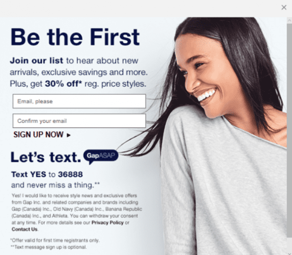
An Attention-Grabbing Popup from Gap
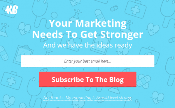
4. Tweak Your Popup’s Behavior
When it comes to popup behavior, the number of options available to you will depend entirely on the tools you are using. However, all high-quality popup plugins will allow you to tweak popup behavior in a variety of ways.
When setting up exit popups, make sure to carefully adapt their behavior to fit your business and audience. For example, if your tools will allow it, you could display one popup to new visitors and a different popup to visitors who have previously subscribed to your newsletter.
The exit popups shown below form part of a series that appears on the KlientBoost website. The popup you see is decided by pre-determined criteria that take into account visitor activity and history on the site.

One of a series of KlientBoost popups
5. Offer a Discount or Freebie
If someone is on the fence about signing up for a newsletter or taking a survey, offering up a freebie might be enough to sway them. You could offer a free gift, valuable subscriber-only content, or an entry in a competition or drawing.
If you’re using an exit popup in an attempt to boost sales, craft your exit popup to further enhance the sale. Discounts and free-trial periods are common tactics. If you sell physical products, offering free shipping is an effective way to avoid shopping cart abandonment.
This simple popup from DODOcase emphasizes a 15% discount in an attempt to encourage shoppers to stay on the site.
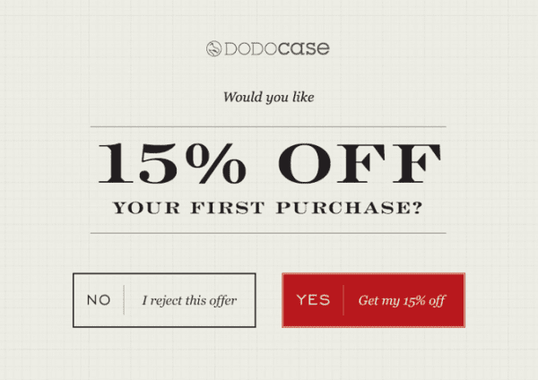
DODOcase Popup
6. Keep Surveys Simple
Another popular use of exit popups is to use them to gather information about your visitors. However, if you do decide to use exit popups in this way, keep your survey short and simple with just one or two questions.
If you really need to get answers to additional questions, don’t list them all out at once. Instead, use a series of popups and keep each one short and manageable. If you do use multiple popups, be sure to add a progress bar or some other indication of progress to each one. In addition, you’ll get better results if you include a free offer to be fulfilled upon survey completion.
This popup from Reiss subtly asks the visitor for their gender information as part of the newsletter signup. This small piece of information can be used to target email correspondence more effectively and also provides useful website analytics data.
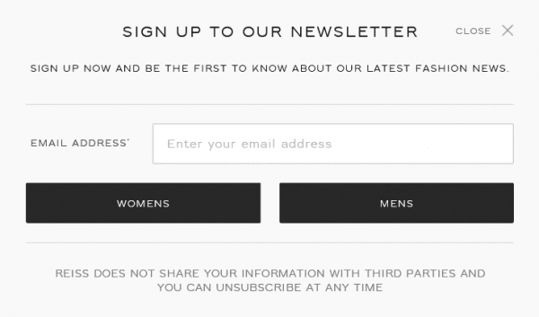
Reiss Opt-In Popup
Your CTA button is ultimately where you want your visitor to click. Make sure it pops, perhaps by using a contrasting color or an animation. Don’t forget to optimize your button copy to maximize persuasiveness.
Also, consider including a creative “wrong” button to offer visitors an unattractive alternate option. You don’t want to insult your visitors, but you can have a little fun with the copy on these sorts of buttons.
This super simple exit popup from RazorSocial features just a line of text and two CTA buttons. The “right” button pops with a bright green color and enthusiastic text. The alternate “wrong” button is dark and bleak, but still playful and funny.
RazorSocial exit popup
8. Make Your Popup Fun
Depending on your target audience, think about adding some humor to your exit popup. Visitors are so used to seeing popups that they can get pretty good at ignoring them.
Catch their attention with a cartoon, a joke, or a meme. You can even add a fun animation or video to entice them to pay attention.
The following popup from ZooShoo has fun bright colors that match the website’s overall branding. There is also a pun at the bottom that reinforces the fun casual tone.
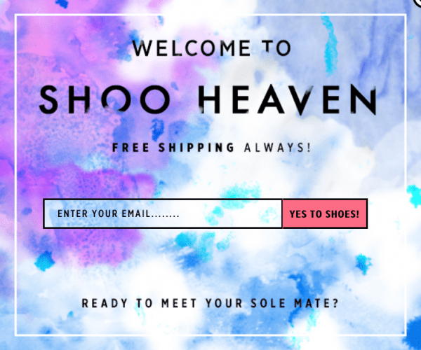
ZooShoo Opt-In Popup
9. Express Urgency or Scarcity
It’s natural for people to procrastinate, particularly when it comes to tasks aren’t absolutely necessary. To overcome this natural tendency, express urgency or imply scarcity to prompt your visitors to take immediate action.
For lead generation, include a limited-time or limited-quantity offer. For sites marketing products or events, create a sense of urgency by offering a limited-time discount, and imply scarcity by listing the number of products or tickets that are left.
The popup below from Search Engine Journal offers a hefty discount for signing up by a specified date. It reinforces a sense of urgency by using the word “Help!” in the copy, and injects even more urgency into the offer by using insistent wording in the CTA button copy.
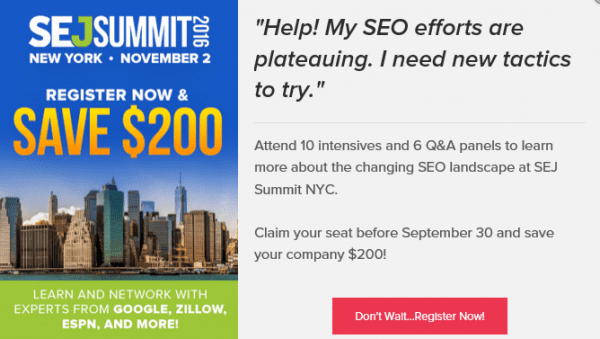
Search Engine Journal Popup
10. Use Numbers
Your exit popup offers very little space in which to get your point across. The timeframe you have to work with is also quite limited since your visitor was already headed out the door.
Including statistics, guaranteed result percentages, and other quantifiable values can help you make the most out of the available space.
The example below from Matthew Woodward‘s blog makes good use of numbers. The social proof of tens of thousands of readers is a definite plus, and the idea that changing the color of a button can increase profits by 20% is interesting.
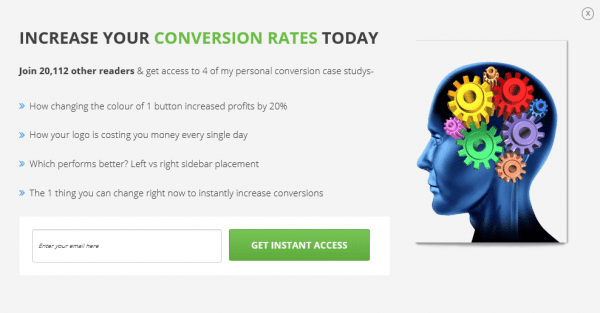
Matthew Woodward Exit Popup
11. Offer a Reminder
Offering a reminder is a commonly used tactic for sites with shopping carts. If a site visitor has items in their cart and seems to be about to click away without making a purchase, use an exit popup to remind them about the unpurchased items.
If the webpage being visited includes forms, you could remind people that any information they have entered will be lost upon exiting. Using attention-grabbing language such as “Wait!” or “Hold on!” is an effective complement to this tactic.
This exit popup from Autograph pulls out all the stops in attempting to entice the shopper to enter their email address. Aside from offering to email the cart contents, it also lets the visitor know they can shop on any device, and that they have almost reached the minimum order value to qualify for free shipping.
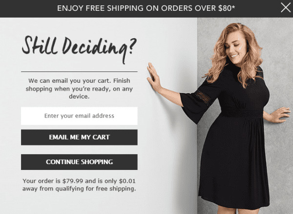
Autograph exit popup
12. Assume Intent
Assuming that a visitor has decided to accept an offer is a bold tactic, but it can be effective if you know your audience. In your exit popup copy, assume that the visitor will be following through with your call to action by using presumptive language.
For example, if you have a two-tier price package, you could ask “Which package will you choose?” Or if you’re running a two-day event, you could ask “Which day will you attend?”
This popup from Neil Patel puts this tactic to use by assuming that the visitor will be attending a webinar and asking them to choose a date and provide registration details.
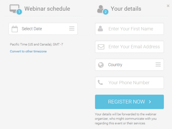
Neil Patel exit popup
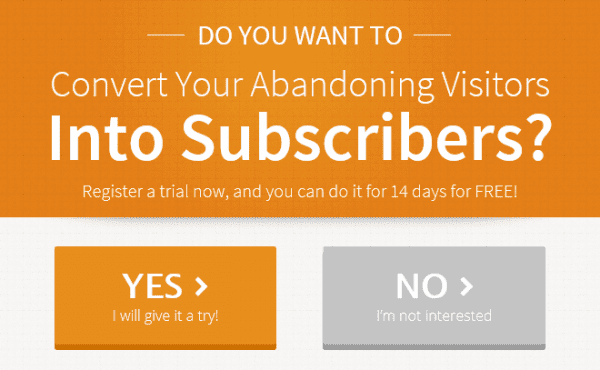
13. Overcome Objections
If you know your audience well, you will likely be able to anticipate their objections. There’s no need to avoid talking about objections; in fact, you should highlight them. Empathize with the visitor about the decision they’re making and offer ways to overcome their concerns.
If it’s something as simple as handing over their email address, let them know that their information will not be shared and that they can opt out any time. If it’s a product or service, consider offering a free trial period or money back guarantee.
This Optimonk exit popup offers a free 14-day trial period so that the customer can test drive the product before making a real commitment.
Optimonk exit popup
If your goal is to lower your site’s bounce rate, an exit popup can do the job for you. Just use an exit popup to advertise related products or content that will catch your visitors’ attention and persuade them to stay.
A similar tactic is to display products or posts that have been popular with other readers. The “popular” label provides social proof that the product or content may be worth checking out.
This popup from ASOS suggests items based on products the customer has previously viewed or added to their cart.
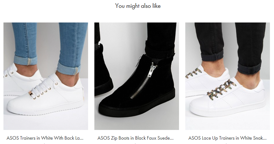
ASOS popup
15. Offer Support
If your site offers a complex product or service consider offering support in your popup.
If you have a dedicated support page, you could direct customers there to answer any questions. Alternatively, if you have the means to do so, you could offer live chat to go over any questions. If live chat is out of the question you could also use email or set up a scheduled time to chat.
Offering support helps customers make a decision and personalizes their experience. The support popup below from Xchop appears after leaving the product purchase page. It offers the name and a photo of a support staff member to further emphasize the realness of the interaction.
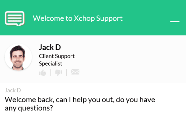
Xchop popup
Conclusion
Exit popups offer a final opportunity to convert your visitors before they leave your site. If executed correctly, exit popups can boost sales, generate leads, and lower bounce rates.
In this post, we’ve covered fifteen tactics you can implement to design exit popups that work.
Which tips will you be implementing in your exit popups? Let us know in the comments section and don’t forget to subscribe so you can follow the conversation!
Featured Image via Dooder / Shutterstock.com


Isn’t google penalizing sites with pop-ups (regarding SEO)?
Only on mobile.
I personally use Thrive Leads plugin. it built top of marketing .i recently grow 10k subcribed in 9month. i hope every one should sucess. In this conversion lots of things to increasing and get more traffic.
Thanks for sharing this article.
Thanks for sharing your insight, Mike. 🙂
We can get more conversion doing proper optimization.According to me,Poor exist popup optimization means low leads.so,we should optimize our landing page to get highest possible conversion. Personally I love thrive leads.I haven’t used optinmonster plugin.thanks for your great optimization ideas
Thanks for your kind words and insight, Mithun!
I heard first time about exit popup. Really like the features of it. Thanks for the awesome share.
No problem!
The exit popups can be very useful to inform the users about the special products or special discounts that the company offer. If the exit popup feature is used properly then it can help a company to gain more traffic.
The competition is increasing in the market day by day. The companies have to come-up with different strategies to gain more customers. Even small features can help in improving the number of users.
Thanks for your insight, Claire. 🙂
I think one of the things I don’t like about pop-ups is the kind of language you see in the Entrepreneur On Fire example. I don’t like when the “no, thanks” option has some sort of smart-ass comment like, “No, I’m not interested in doing better with my business,” or “No, I don’t want to learn from successful people.” That drives me nuts. The first time seeing something like that can be kind of eye-rolling, but after a while it just gets old because it’s kind of an insult to the person trying to click out with “no, thank you.”
There may be a number of reasons why a visitor chooses not to engage with the pop-up option, everything from 1) it’s too expensive for them right now, 2) it’s not something they’re interested in, 3) they’ve already purchased it, but the pop-up keeps showing up anyway, asking them if they want something they already have (grrr!!), 4) maybe they think it’s a lousy offer, etc. So many reasons why someone might not choose to say yes.
So I think it’s kind of rude and annoying to make the visitor have to click a button whose wording insults them like they’re stupid or foolish or lousy at business or not motivated enough, simply for not choosing to take the offer at that moment. There are nicer *and* funnier wordings to display for the yes and the no answers, without insulting the customer you’re trying to engage and keep.
Side question: how do the new Google rules about pop-ups fit in with this article?
I think the language is used to provoke the reader into action. However, it’s ultimately the user who decides what action to take. 🙂
As for your other question, it’s just mobile search that will be affected for now (http://mashable.com/2016/08/23/google-pop-up-mobile-search-results/).
Thank you for the response, John! I appreciate the link.
There may be nothing that I despise more than pop ups.
Any website with a popup I leave immediately and never come back to.
With annoying pop-ups i do the same. But if is decent and have a good offer why not.
The content was great, clearing any confusion that could arise. But doesn’t having popup will lead to google penalization after the new interstitial ads rule?
That’s just going to affect mobile search for now (http://mashable.com/2016/08/23/google-pop-up-mobile-search-results/).
Thanks for your question and kind words. 🙂
The others have paid the license fee to use the tech. ET doesn’t seem to be interested in paying in order to use the tech in Bloom. Period.
This makes no sense to me at all. Tell us about some competitor products that do have the exit functionality, and ignore your own product which is crying out for this functionality. They are not worried about being sued, why are you?
Here, here Rosalind!
The only thing missing in Bloom is and ‘Exit Intent Popup’.
Include that and Bloom would be the ultimate popup.
aka how to piss of your customers!.. Haven’t met many people who like to be annoyed with these CS disasters.
So I’ve spent months designing the perfect site, testing and tweaking, all my UX rules rock and my design is winning awards… then I go and spoil it all by covering my pages with a last ditch attempt to get noticed by waving my flyer in my users’ faces.
Hmmm not so sure about that. There has to be a better way…
Although I understand these nasty things work, I personally dont like them and I never fill those things in, but hey, that’s just me!
And your conversion rate will always be terrible compared to what it could be with exit popups. Period.
I agree! I’ve added sites to a blacklist before for their egregious use of exit pop ups. It’s not going to convert me in any way – it’s just a nuisance. In fact, yet another nuisance that eventually warrants a trip to the plugin/extension store to block this menace!
You’re thinking like a developer – not an end user.
The simple fact is they work. We all hate them but the people we’re marketing to don’t and will react positively to them a lot if executed properly.
No, I’m thinking like an end-user because I am an end-user. My website makes me nothing because it’s not monetised in any way, nor would I see any benefit in monetising it. Therefore, for the purposes of this discussion, I am nothing but an end-user.
I don’t doubt they “work” just like I don’t doubt that cold-calling to sell people kitchens works, or that mailspamming one-hundred thousand people to send them to dodgy links promising massive member growth or whatever works. People do these things and there would be no benefit in doing them if there wasn’t some result from it.
But as an end-user, they annoy me. When I read an article on some site and then navigate away, attempting to coerce me into sticking around isn’t actually going to get me to stick around. Depending on how you do it, it might even get you blacklisted and I’ll never come back. I find the tactic as frustrating as those who build sites and then plaster them with adverts.
Content is why I visit a site, and if the content is good enough on its own merits then that site is much more likely to see me come back.
The question, therefore, is how many people like myself are immediately turned off a site that employs such things versus the number of people who are not and convert in some way and whether the sacrifice of the former is sufficient to target the latter? In some cases, I have no doubt it may well be. In others, perhaps not so much and people shouldn’t be blind to that.
“… I find the tactic as frustrating as those who build sites and then plaster them with adverts.
Content is why I visit a site, and if the content is good enough on its own merits then that site is much more likely to see me come back….”
Well that is the point, now isn’t it? How to keep you at a site without annoying you, by offering you something that will pique your interest, instead of something you have to swat away like an annoying fly. That’s the entire point of this article – and maybe what would work for an end-user like you will not work for a different end-user. You seek content, so a popup that points you to related content on the site that you may have missed… that popup goes from annoying to useful.
That’s the point I took away from this article. I don’t want my exit popups to engage and entice. The last thing I would want to do is annoy an end-user. Exit popups that are thoughtfully prepared and executed are the goal.
For me though the pop up is never “useful” – unless it is offering a discount, in which case I’ve already checked. That is the one benefit of “exit” pop ups – they are so thoroughly predictible that it takes all of half a second to check if a discount is coming.
But when it’s just to sign me up to a mailing list or to tell me I might like such and such a post? Most blogs have a “Related Posts” section, most blogs have a sidebar that contains recent and/or related posts. I’ve already seen them. If the content is good I’ve likely already gone for a browse unless I’m in a rush. The moment I’m going to leave and it pops up something in my face, it becomes tiresome.
Perhaps the problem is I’m quite tired of being treated as nothing more than a “goal” or object by content marketers? They either just want my details to make it easier to shill their products, or they want me to stick around so I get hit with more ads (in theory, my adblocker gets rid of most). In both cases they care nought for me as an individual. I’m a walking dollar sign – or pound sterling sign in my country – and after so many years of this, I’ve grown so tired of being treated like that. It’s the reason I deploy an adblocker… I’ve nothing against people producing quality content using ads to fund their site, but too many people have abused ads to the point of me detesting them.
In the past week five or six sites have tried to get my details by offering the carrot of some sort of wonderful guide. Firstly, as a former copywriter, I know that these guides probably won’t be that interesting to me and will more than likely be an attempt to upsell me to a product/service they offer. Secondly, it’s also almost certainly an attempt to add me to their mailing list.
I know this starts to dally into the realm of anecdotal evidence, but I get the feeling most people don’t tend to unsubscribe from such lists even if they can’t be bothered to read the emails. It’s much easier to click on an email and let the IMAP server mark it as read, or do a ‘Select All’ – ‘Mark Read’ than it is to click a link, enter your email and then often be presented with some nagging thing asking why you want to unsubscribe.
Sites with good content will get me to return without needing such tactics. I’ll even disable my adblocker on them, although it’s very unlikely I’ll actually click an ad.
Again, this is not all about *you*. This is about the average web user and studies have shown again and again and again that exit popups will increase conversions a bazillion percent.
This is not about personal preference for professional marketers (like me) – this is about results.
True pros are happy to sacrifice *you* for the 1000 other conversions they’ll get. You’ll never visit one of my sites twice. I get it and I’m fine with it.
Hmm… curious. I have re-read what I’ve written just in case I was sleep-typing and needed to make an emergency neurosciences appointment, and yet, I still cannot find where I suggested it was all about me.
Therefore, if you wouldn’t mind, could you point that out to me? Because I may need to make an emergency optician appointment instead!
Facetiousness aside, I get it. You’re a true pro. Good for you. I’ve already conceded I get that this works, otherwise people wouldn’t be paying money to do it. That’s fine. I mentioned I was a former copywriter – I know how marketing works, and how marketers like to use simple shortcuts and jump on bandwagons like exit popups. I’ve written enough sales spiel, produced enough brochures, leaflets, documents, blog posts etc. myself to know how it all works. Fortunately, I was good at it, so I no longer have to do it and can indulge my real passions instead. There’s nothing more draining than spending a week working on website copy only for the client to become aware of some trend that they want to tap into and demanding that everything be re-written. If only they could have told me on the Wednesday, you know…?
But I digress.
I accept you do these things, I know why you do these things. I don’t even hold it against you that you do these things. But (you knew that was coming, right?) I don’t like them and sod it, I’ll tell people I don’t like them because I can.
It doesn’t mean I expect them, or you, or anyone to change an entire marketing strategy to satisfy little old me. It’s just a way of killing some time while my dinner is cooking.
Oops – typo! I DO want my exit popups to engage and entice.
Well, I identify as a marketer and a lead generator ultimately and can say without a doubt that we’re better off with exit popups that we ever were without them.
Since you have no interest in monetizing anything (let’s call it a hobby then) we’re talking about 2 very different things (although I have people just like you fill in our exit popups every day).
I may have an interest in monetising something in the future, which is part of the reason the second site I’m working on is using Divi – as stressful as I find it to work with – as opposed to the theme I use on my primary site.
But even then, I have a bigger interest in not annoying people and I’m certainly not going to pay extra for a tool to annoy them with! I’d rather work on content to bring people back, and engage with them when they do than interrupt their browsing experience. But I concede, for me to make any money from what I do, I need to drive them to a third-party anyway.
I’m not sure you have people “just” like me filling in your exit popups every day. I’ll confess, I fill in discount ones but that’s only because I’ve already checked if a site does that by mousing up to the tab bar. I’m not going to pay full price for something I don’t have to even if I want it and am a guaranteed sale.
But mailing list subscriptions and the rest of it? Nah… never filled one of those in, never will. It’d just lead to my spam box getting fatter.
I can certainly understand where everyone in this thread is coming from. @AussieGeekGirl and @Kath raise some common critiques of pop-ups and to an extent I agree: they can be annoying! And, as a result, a UX pain point.
Here’s what changed my mind about them:
1) The results.
Here on the ET blog our subscriber rate increased by 6000% when we implemented our popups.
2) The retention.
These new sign-ups are not people who were tricked into signing up and couldn’t wait to get off our list. By far the greater number of those who subscribe stick around. This is why our list, which we started in 2014, is now over 200,000.
3) Self reflection.
When I saw these numbers I had to ask myself: was I so different from everyone else that I found something so seemingly effective, annoying and repulsive?
Not at all. But what I did discover is that my annoyance with pop-ups was more connected with my overall web experience than with individual sites.
For instance, when I click on a news story or a humor story on facebook (especially on my phone) and it takes me to a website where I get a pop-up that blocks the story–I get frustrated. Angry even. When that happens over and over again, I want to quit the internet.
However, when I am on a site that has free content I find useful and want to receive more of–I’m more than happy to sign up for their newsletter. And the pop-up prompting me to do so does not bother me. In fact, I’m happy to sign-up. Especially if they are offering an extra carrot of free useful content, a discount, etc.
The problem, as I see it, is that we all tend to visit sites we don’t care that much about beyond a quick laugh or a click-bait story. When those sites hit us with a pop-up it gets under our skin. When that happens all over the place, it spoils us on pop-ups in general–even if they’re done in the most polished, professional way possible.
But knowing what I know about how effective these tools are and (as a content producer) how expensive it is to run a quality blog, I try to realize that if I’m on a site where a well crafted and well executed pop-up is annoying, then I’m probably not their ideal audience.
ALL THAT SAID…there are still some general UX issues that pop-ups need to figure out. And we ourselves could probably improve our own in a number of ways. But I don’t think we or others should give them up. Just work to improve them.
They do work. Offering a discount voucher on exit is particularly strong.
And……
They WORK extremely well.
Try split testing before you make such a general statement. 🙂
Sure, there are countless marketing techniques that “work,” but that doesn’t mean you should be doing them. Do you care more about numbers in a spreadsheet than you do about your loyal customers? Quite frankly, “it works” isn’t a good enough reason for me to annoy potential lifetime customers. If you’re excited about a few more email addresses on your list, in the name of annoying the vast majority of visitors, more power to you I guess.
Any chance that the Bloom optin will have an exit intention trigger added? Love using Bloom on my website, but with Google’s upcoming penalties for optin forms that cover a website on mobile sites, an exit intention option would solve this problem!
I’ve begged, and bugged them about this a ton. Apparently there’s some patents around the exit intention functionality and they’re not willing to touch it. The patents are bogus and stupid of course (preexisting and obvious technology), but ET is afraid of getting sued, and so won’t get anywhere near that kind of functionality.
We don’t have plans to at the moment. There are some patent issues that prevent it.
If there is a patent, how come there are other plugins that do have an exit popup?
That’s like asking… If Sony has a patent why is china copying there stuff 🙂
You’ll have to ask a patent attorney. It’s not about “everyone else is doing it so we can too”. For the same reasons, you’ll never see another web shop using true “one-click checkout”. Amazon would sue them into the stone age.
When will bloom redirect to a thank you page after signing up? Biggest feature missing in Bloom.
Unfortunately I don’t have a date for you but we are working on updates for all our products. So it’s possible this will be in the next major Bloom update.
when is Nathan B.Weller going to update his pic?!!! lol.