
There are currently over 3 million shopping websites using WooCommerce as their platform of choice. This means there are plenty of WordPress sites to peruse when searching for inspiration for your latest project.
In this article we have chosen 12 beautifully designed WordPress shopping websites. These all display a variety of interesting, helpful and sometimes just simply stunning design elements. So take a look, decide what would work for your WordPress eCommerce store, and then get started on your own design.
1. Formerly Yes
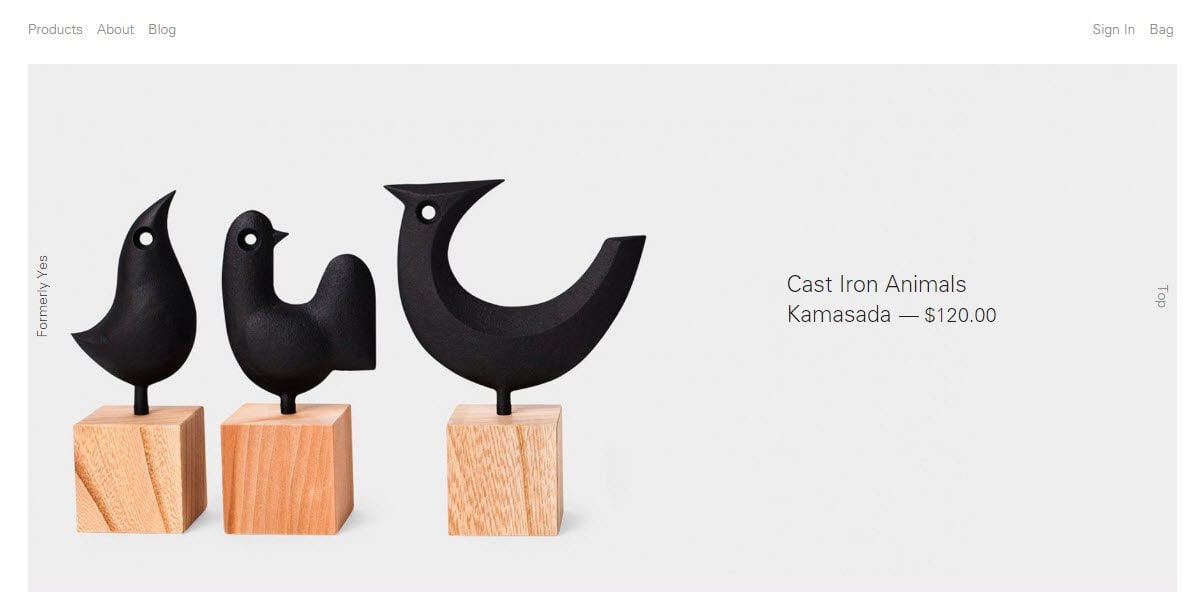
Formerly Yes is a creative and beautiful eCommerce store. Minimal is the key here, with a clean, simplistic and organized layout. All images displayed are the same size, and all products are set upon a gray background. A discrete and artistically positioned store name (Formerly Yes) sticks to the right-hand side of the page so it is seen, yet does not distract, from any items on the page.
The About Page gives this business an intimate feel. Here a full-screen picture of the owners is displayed, and a blurb about them and their business inspiration. This is followed by their store’s address, a map showing their location so customers can easily find them, and those all-important opening times.
2. Bata
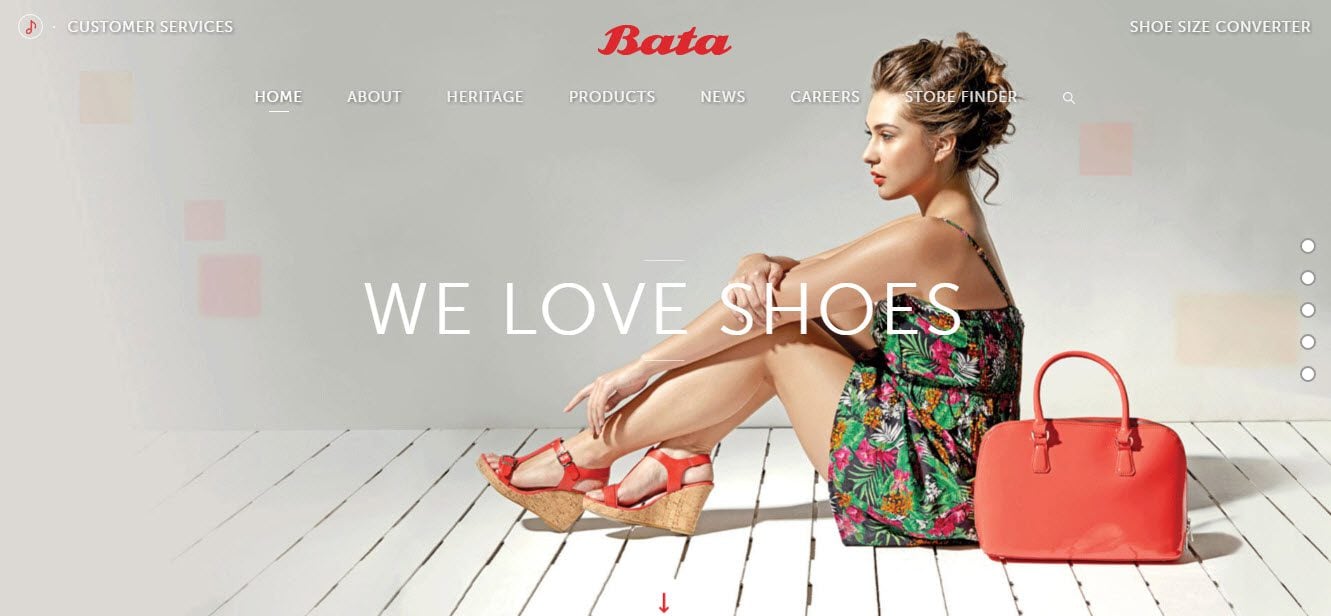
Bata provides a fun and vibrant experience for their audience, much in line with the image they have created for their shoe collection. A full-screen image with text overlay greets visitors, setting the scene for a stylish and fashionable website.
A collage of busy and colorful images and videos make up the homepage, encouraging the audience to find out about the company, products, news, and more. A second menu bar is displayed a the bottom of each page, helping visitors to navigate the site. And the footer displays an extensive number of social media buttons to encourage follows.
3. Salt and Straw
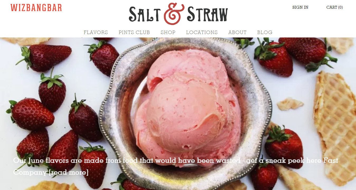
Salt and Straw is a photo heavy site, using stunning close-up images and visuals of their products. From the full page slider on the homepage, to the multiple images of ice cream flavors displayed in a grid layout, this WordPress website has spent time considering which images will best entice visitors to make a purchase.
Salt and Straw is not just an eCommerce store, having numerous physical stores around the US. Under ‘Location’ they display large full-width photographs of the different storefronts. This is a clever way to help their customer base find and recognize their stores.
4. Quero Hand Made Shoes
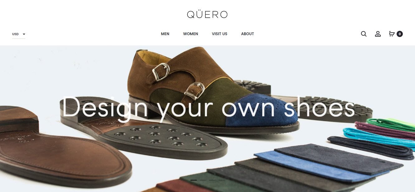
Quero Hand Made Shoes homepage displays a full-width slider, showing images of their shoes and the design process, immediately captivating the audience. Underneath a second slider shows the newspapers and magazines that Quero has been mentioned in, helping to elevate the Quero brand in the eyes of their visitors.
The rest of the homepage is dominated by images of their products. These are classically displayed in a layout, divided by white borders. When you hover over a product, another image of that item from a different angle is displayed, as well as a discrete add-to-cart button.
5. Picky Bars
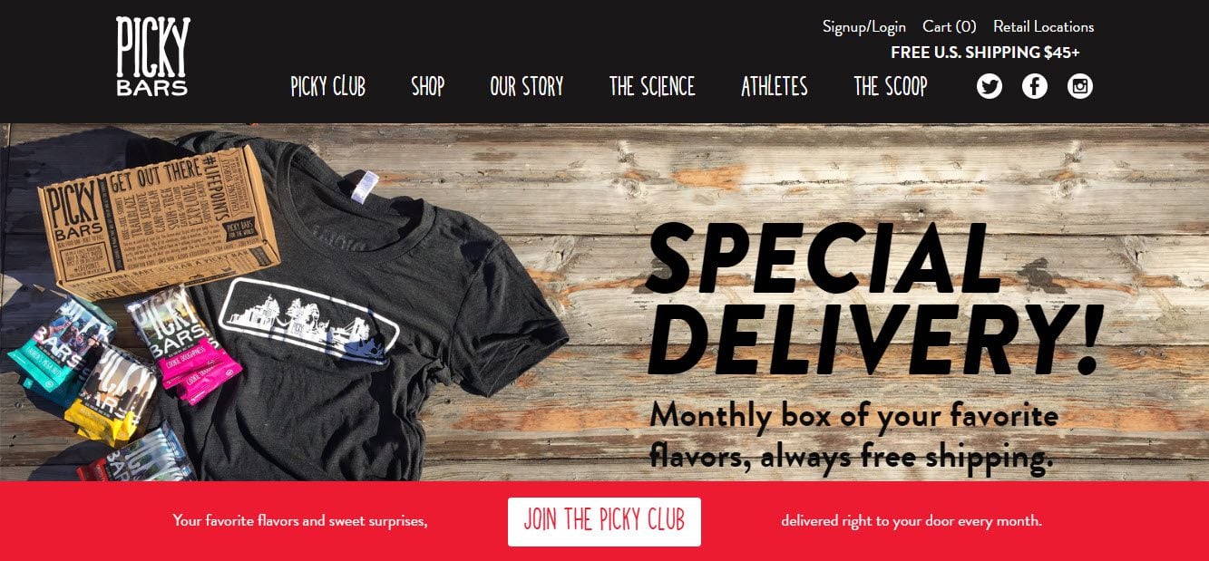
Picky Bars has a bright, fun and refreshing style and feel to it, helping it stand out from the numerous other online shopping websites. The website uses bold colors, text, and buttons to make a strong impact. A full-screen slider displays images, with text overlay sharing news and promotions, grabbing the attention of the audience.
A pop-up is displayed on the homepage to collect emails and push sales with a 10% discount offer. Social media buttons are also displayed in the menu at the top of the page, and in the footer, to help grow a following. In the shop, items are easily searchable using the detailed product menu on the left-hand side of the screen.
6. The Good Batch
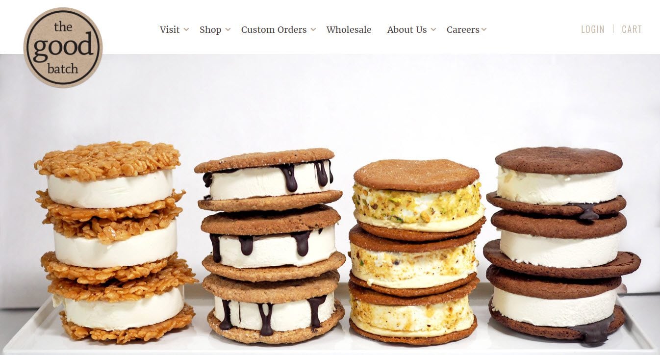
The Good Batch uses a combination of dark and light browns for their color scheme. This fits perfectly with the products they are selling. The site also displays a large logo in the top left corner of every page, helping to ingrain their branding in the audience’s minds.
The drop down menu makes the site easy to navigate and helps visitors quickly find the products they are interested in buying. The footer at the bottom of each page also has a very functional job, displaying the shop’s address, a link to the contact page, social media follow buttons, and an email opt-in form.
7. Mooshu Trainers
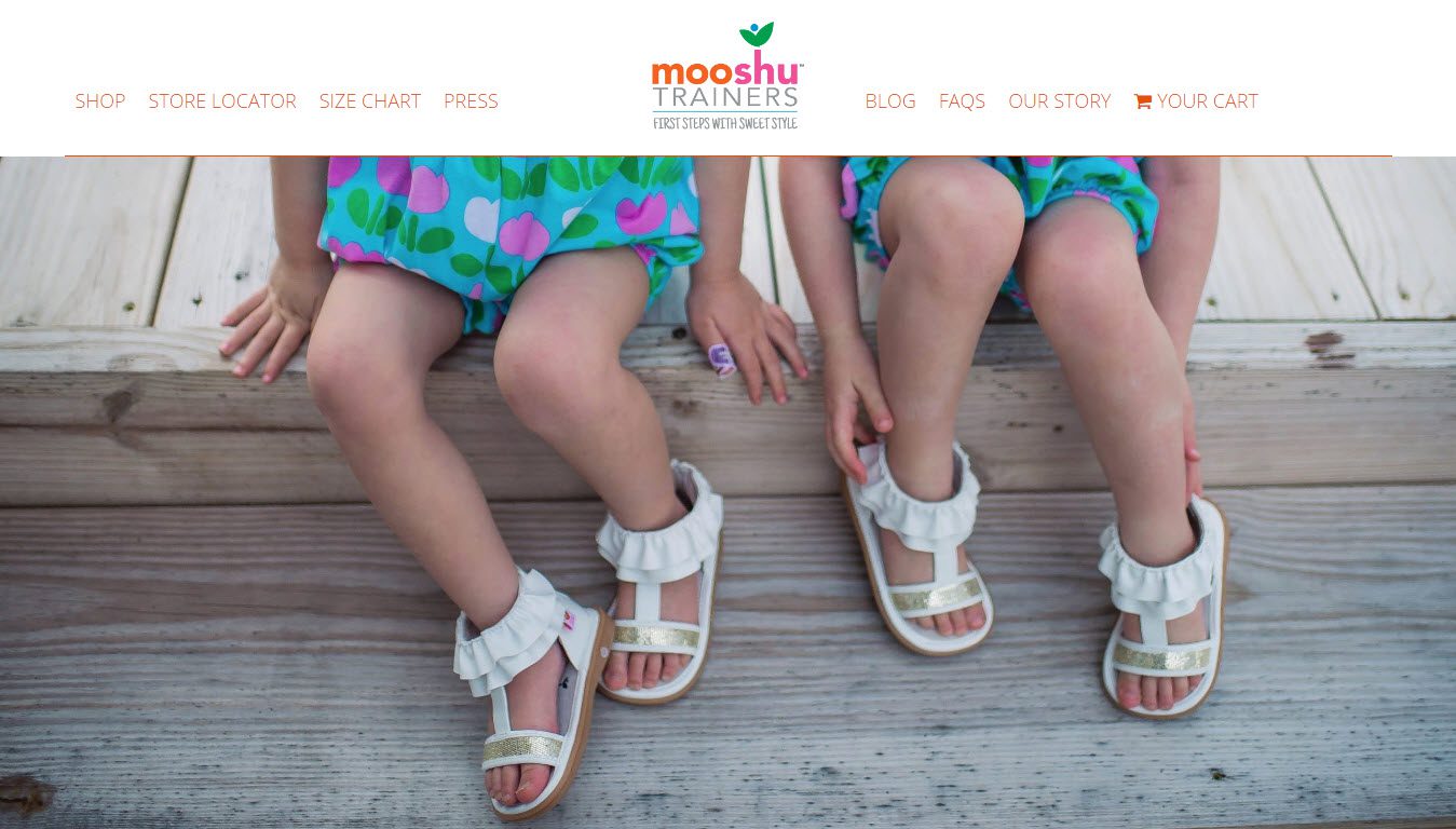
Mooshu Trainers stands out from other shopping websites with its stunning, bright and vibrant images. The homepage uses a parallel effect. Sections display a variety of full-width images, individual products, and other important information. Bold colors are used to help the text pop, buttons stand out, and enthuse a feeling of happiness.
Mooshu Trainers offers a number of incentives that are given prominent positions on the homepage. These include free shipping for orders over a certain amount as well as a discount for first-time buyers if they sign up to the site’s email list. A search bar and impressive Instagram feed are also displayed towards the bottom of the homepage, to help increase engagement.
8. Jack Ruddy Cocktail
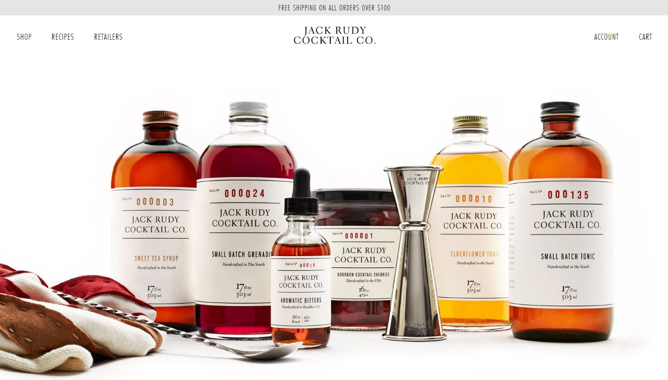
A classically defined website, Jack Ruddy Cocktail uses simplicity to their advantage. Using a gray, white, and black color scheme allows the products to ‘pop’. On the homepage, a minimal menu ensures no distractions from the full-screen image. A discrete hello bar offering ‘free shipping’ is displayed across the top of the page to help encourage sales.
The ‘Shop’ follows a similar theme of less is more, showing only images of the products, their names and prices. Products can be bought on-site, with the payment gateway Stripe being used to process payments.
9. NC Fitness
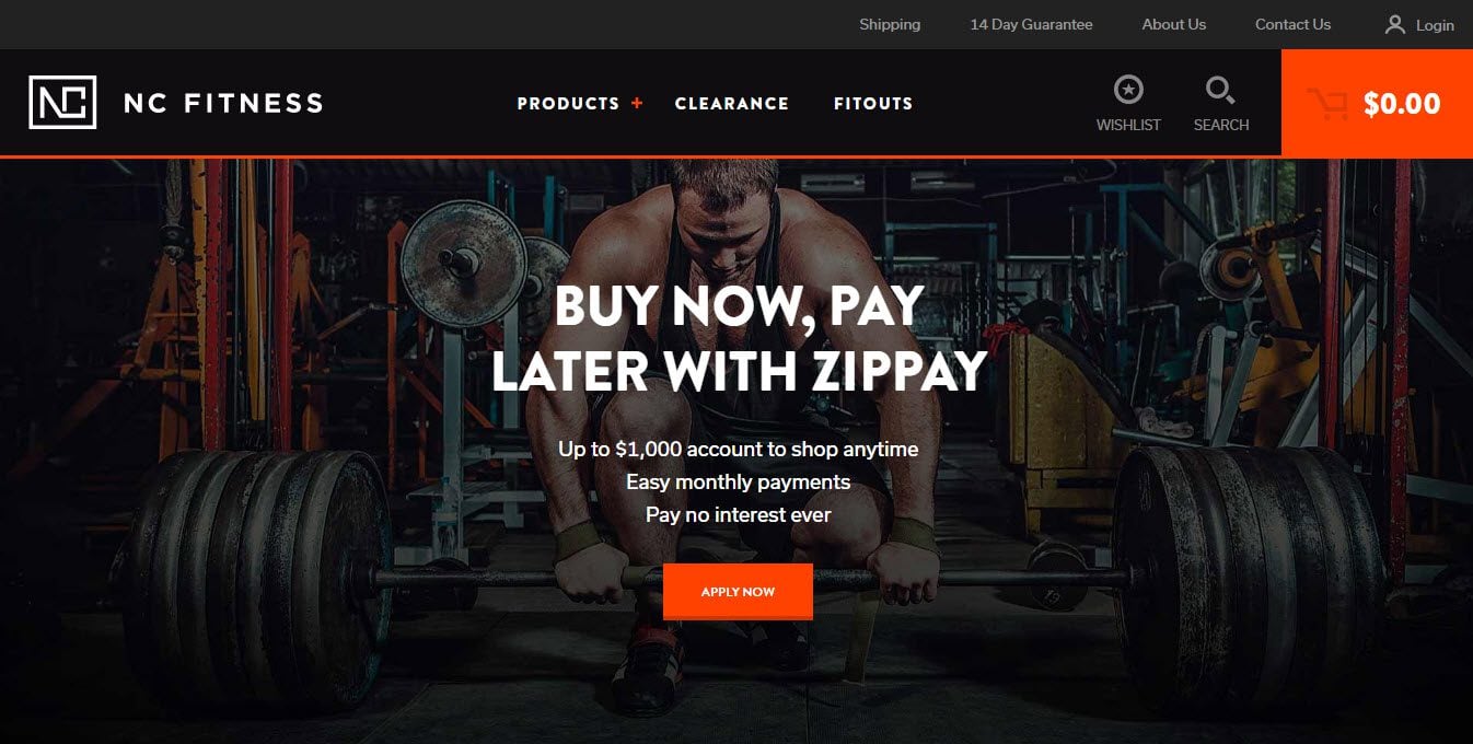
NC Fitness gives a lasting impression of a site that means business. It uses a black and white color scheme, with a hint of orange to add bold and bright streaks of light. The layout is clear and well organized, with all images, text, and buttons having a purpose.
Products are easy to search for, with detailed options to select from to help users find exactly what they are looking for. Products display a ‘wish list’ icon, enabling customers to save items they are interested in for future possible purchase. This is a great option for those site owners who use remarketing adverts. Buyers can also purchase products on site, with automatic payments being taken through a number of payment gateways including PayPal.
10. Over
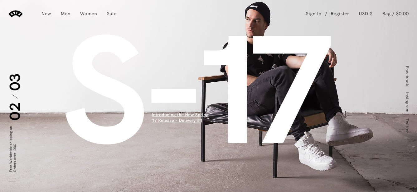
Over is a stylish, clean and modern eCommerce store. A large full-size image with bold text overlay greets visitors on the homepage. Products are displayed in rows of three with no other information immediately available. This ensures items are given the audience’s full attention. Hovering over each product will display the name and price of each item.
Over also displays a pop-up offering 10% off if you subscribe to their newsletter. This is a clever lead generation tactic as not only does it help grow their mailing list, it also incentivizes people to make a purchase.
11. Dark Horse
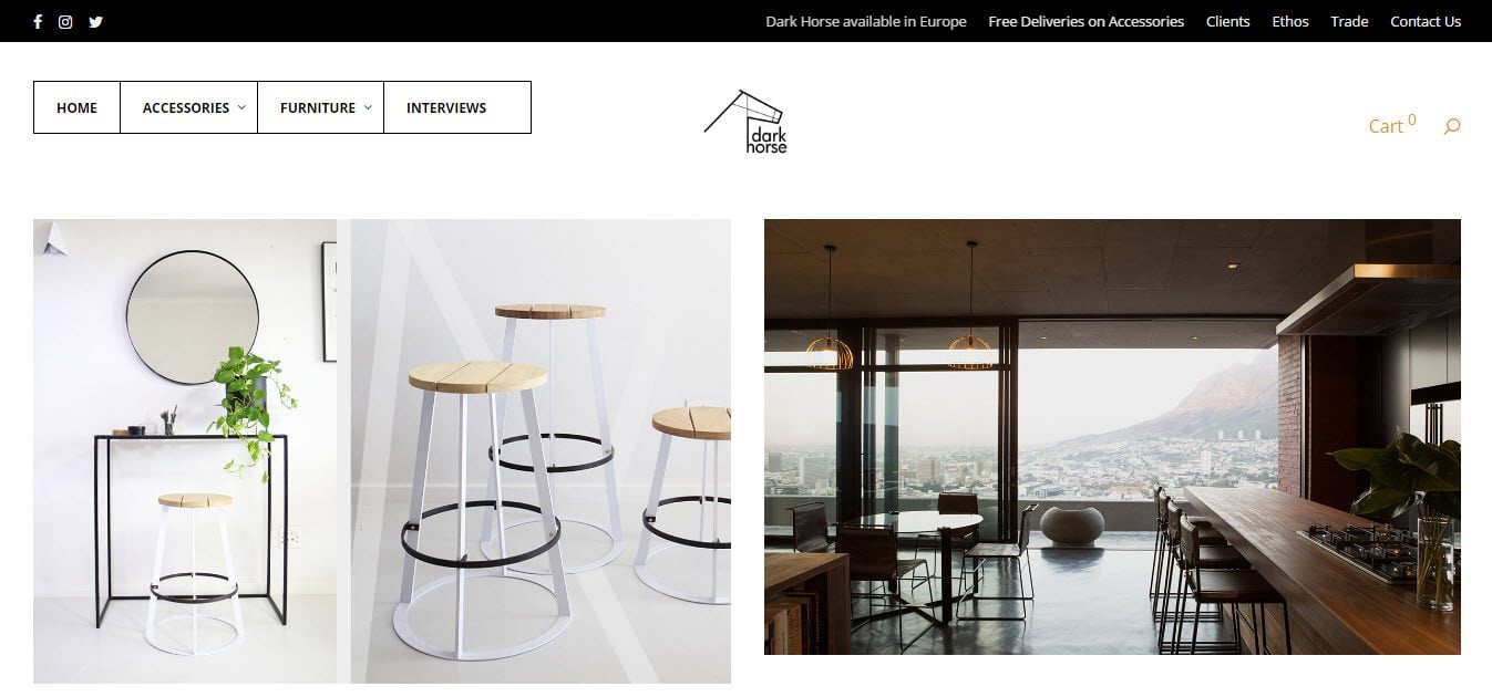
It is immediately clear that Dark Horse has its own unique style, setting it apart from other shopping websites. The edgy and super cool style is portrayed through their site’s uncluttered layout. A simple color combination is used consisting of just white, black, and gray. And their products are displayed through eye-catching images.
Under ‘Interviews’ Dark Horse show their products being used in a selection of restaurants, bars, and houses around the world. This helps not only inspire visitors to use their products in different ways but helps create a community around the brand. An Instagram widget also encourages Dark Horse’s audience to join them on social media.
12. Blue Star Coffee Roasters
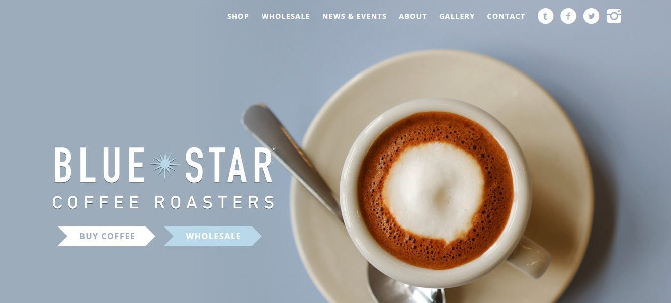
Blue Star Coffee Roasters uses a bold design, with block colors, chunky text, and close-up images. The homepage has strongly defined sections which divide the information displayed and grab visitors attention.
Blue Star displays a sticky menu bar, making the menu visible at all times. This makes it easy for the audience to select new pages, and navigate around the site. Tricks like this can often lead to much longer viewing times, and the longer visitors spend on a site, the more likely they are to make a purchase.
Final Thoughts on Shopping Websites
It is fascinating to note the differences between the numerous shopping websites out there. The diversity in characteristics, be it design, style, layout, or other features, ensures that those researching WordPress eCommerce stores will easily manage to find inspiration for their own project.
However, when creating your own WordPress website, always bear in mind your products and audience. Create a site that reflects the items you are selling, your business, and branding. And always consider what your audience will react well to, and what will encourage them to make a purchase.
Have you got any favorite WordPress shopping websites? Please share in the comments below…
Featured Image by A. Zakharchenko / shutterstock.com


wow, are they using Divi theme? If yes, that really amazing !
This article has great examples of Divi eCommerce stores…
https://www.elegantthemes.com/blog/divi-resources/16-examples-of-ecommerce-websites-built-with-divi
How many of these website are made with DIVI from Elegant Themes?
All of them?
I love them all. Would you have any tutorials on how to customise the header like 8. Jack Ruddy Cocktail or in general?
Hey! Any tips on how I can get a customization product view like quero products?
These offer some great ideas for product, but did you happen to see any that were selling documents while you were investigating ecommerce this article?
all of them are bold design ! great stuff !
Glad you like them Jerry!
Some of these are stunning!
Yes, it just shows what you can do with WordPress for eCommerce sites.
Thanks for commenting Simon,
Megan
Thanks for showcasing these e-commerce sites! I realize I can go to each of them to explore, but I was most interested in seeing how the product pages (group and single) are set up. Woocommerce is based on posts; we don’t have the kind of control over the design and layout of posts as we do with standard pages. This is the most challenging thing about Divi and WordPress: design control over posts and custom posts. It’s a real hassle to override so many defaults to even get close to something that looks good and works well.
I like Bata. It is so cool!
Me too Samix!