
There are plenty of marketing tools that enable you to create responsive email designs with ease. The thing is, you might prefer to have more control over how your emails look, and the best way to do so is to design them from scratch. Using a framework such as Foundation for Emails provides you with a superb compromise. You won’t need to design every single component from scratch, but you do get full control over how, when, and where to use them.
In this article, we’ll firstly explain what email frameworks are and how they can help you. Then, we’ll move on to discussing Foundation for Emails, and how you can use it to create your own custom, responsive email campaigns. Let’s get to work!
What Email Frameworks Are (And How They Can Help You Create Better Emails)
Frameworks still require you to do some coding, but the process is very simple for emails.
In general, a framework is a compilation of practices, files, and code designed to aid in the development of specific types of products. Think of them as building blocks of code that can help you create complex projects faster, by enabling you to not reinvent the wheel each time.
There are frameworks for email too, and that’s what we’re going to be talking about in this article. Let’s explore some of the benefits:
- Pre-built elements help you design emails faster. Nowadays, most emails include elements beyond images and text, such as buttons and menus. Including these elements can be time-consuming, but a framework enables you to insert and customize them instantly.
- Responsive out of the box. As more and more people turn to mobile devices, you need to ensure your emails display well on their screens. Most modern frameworks are responsive by default, which means you have one less thing to worry about.
- Templates can help you kickstart your designs. A lot of modern email frameworks include a variety of templates to help you create campaigns quickly.
As you can see, the common theme here is that frameworks enable you to save time. There are a lot of cases where you’ll want to code your projects from scratch, but a framework that can enable you to get things done faster at a higher quality is worth using.
An Introduction to the Foundation for Emails Framework
Before going any further, it’s important to note there are two Foundation frameworks available online – Foundation for Sites and Foundation for Emails – and we’re going to focus on the latter throughout this article. The main selling point is its responsive grid. This type of system isn’t revolutionary, but Foundation’s popularity is based on its ease of use.
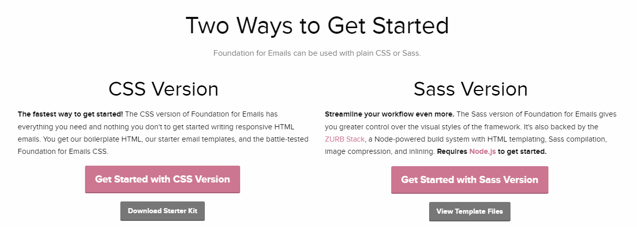
Picking up the framework is fairly straightforward (even if you don’t have any coding experience), and you can choose between two versions – one based on Cascading Stylesheets (CSS) and the other on Sass. Naturally, the Sass version enables you to save even more time by eliminating the need to repeat CSS stylings, but it does require some familiarity with Node.js.
Finally, Foundation for Email also provides you with plenty of ‘patterns’ such as buttons and menus to make your job even simpler. To save more time, you can even use a template instead of designing a layout from scratch.
Key Features:
- Uses a responsive grid to create modern email campaigns.
- Offers either a CSS or Sass version of the framework.
- Lets you take advantage of patterns to add common elements to your emails quickly.
- Uses layouts to streamline the email creation process even further.
Price: Free | More Information
How to Use Foundation for Emails to Create Modern Designs (In 4 Steps)
As we mentioned, there are two versions of Foundation for Emails. For this section, we’re going to use the CSS variation since it requires less work to set up. Plus, the end results should look the same – all that changes is how you get there.
If you want to see the Sass version in action or learn more about how to use it, you can start with this great tutorial.
Step #1: Download the Foundation for Email Files
First of all, head to the Foundation for Email Getting Started page, and click on the Download Starter Kit button under the CSS Version subheading:
Once you’ve got the file, unzip it and extract its contents into a new folder. At this stage, your folder should contain an index.html file and two subfolders – one for your CSS and another for your templates.
For now, run your favorite text editor and open the index.html file with it. It should be pretty bare, but we’ll fix that in a moment.
Step #2: Familiarize Yourself With the Grid System
Foundation for Email’s responsiveness is based on its flexible grid system. If you’re putting together an email from scratch, you’ll want to create your own grid to segment your email’s sections. To do that, we’re going to use three different components: containers, rows, and columns.
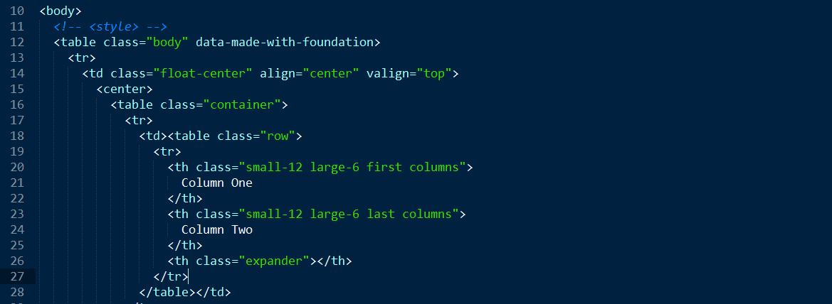
Open your Foundation’s index.html file within your text editor, and scroll down to the body section:
<body>
<!-- <style> -->
<table class="body" data-made-with-foundation>
<tr>
<td class="float-center" align="center" valign="top">
<center>
<!--  Your grid goes here  -->
</center>
</td>
</tr>
</table>
</body>
</html>
As you can see, the body of your email contains a preset table that we’re not going to touch. Instead, we’re just going to add our own grid elements to the section where it reads <!– Your grid goes here –>. Let’s start with the code you need to use for your containers:
<table class="container">
<tr>
<td></td>
</tr>
</table>
Now, let’s add a row in there:
<table class="row"> <tr> <th></th> </tr> </table>
Finally, we can divide that row into columns:
<table class="row">
<tr>
<th class="small-12 large-6 first columns">
Column One
</th>
<th class="expander"></th>
</tr>
</table>
Keep in mind that each row consists of up to 12 columns. The code above tells your email client that it should display your content using the full 12 columns on small screens such as mobile devices (small-12), but only take up six on desktops (large-6).
The problem is, if your email is showing on a large screen there are six empty columns, so we need to add a second table to fix it:
<table class="row">
<tr>
<th class="small-12 large-6 first columns">
Column One
</th>
<th class="small-12 large-6 last columns">
Column Two
</th>
<th class="expander"></th>
</tr>
</table>
As you can see, both columns are basically the same. However, they have two different classes, first columns and last columns. These tell your email client which are the first and last columns on your row, and any columns in between don’t need to use them.
If you were to now open your index.html file in a browser, here’s what you’d see:
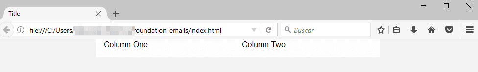
It’s pretty bare, yes, but the mechanics should be evident at this stage. Each email can have as many rows as you want, and you can have up to 12 columns for each row. For now, keep playing around with the grid system until you find a layout you like, and use text placeholders to help you identify them until you begin to add elements.
Step #3: Add Components to Your Emails
Foundation for Email packs in plenty of components, and the most commonly used are buttons, background images, and subheadings. They’re pretty simple, so let’s go through them in order. To add buttons, you’ll need to use the following code within one or more of your columns:
<table class="button tiny success">
<tr>
<td>
<table>
<tr>
<td><a href="#">The text of your button</a></td>
</tr>
</table>
</td>
</tr>
</table>
This code adds a simple small button with a green background to your email. The key elements here are the tiny and success classes. The first governs the size of your button, and the second its color. Instead of adding all of the available classes here, we’re going to link you to Foundation’s official resource on buttons where you can peruse them at your leisure.
Now let’s move on to background images. These are a bit trickier, because you need to use the wrapper class to make them take up the entire width of your row and assign a specific background to them using CSS:
<table class="wrapper" align="center">
<tr>
<td class="wrapper-inner">
Your content
</td>
</tr>
</table>
Last but not least, let’s talk about subheadings. These are the simplest of the bunch – all you need to do is wrap your text within the requisite tags:
<h1>h1. This is a very large header.</h1>
<h2>h2. This is a large header.</h2>
<h3>h3. This is a medium header.</h3>
It’s as easy as that! Using these three elements is enough to create some good-looking emails. The secret, of course, is to style them with CSS to your heart’s content, which brings us to our final step.
Step #4: Style Your Email Using CSS
Some email clients (such as Microsoft Outlook) strip some of the style tags from your HTML files. This is done so that emails render without any issues, as well as to remove potential security threats. However, the result is that your emails will look pretty boring unless you add your CSS directly to your HTML (or inline it).
That way, both your content and its style will be loaded as a single file, and they should work perfectly on most modern email clients. Here’s how an HTML element with inlined CSS looks:
<table class="wrapper" align="center"><tbody><tr><td class="wrapper-inner" style="padding:20px">content</td></tr>
This can get a bit messy, so we recommend working on your HTML and CSS files separately, then using a tool such as the Foundation Inliner to combine them for you. Simply paste in your code, click on a button, and it’ll take care of the rest for you.
Once you have your inlined HTML file, you can go ahead and test it using an email marketing tool, which is always a good idea, before sending it to your subscribers.
Conclusion
There are plenty of ways to create functional and responsive emails. However, using a framework such as Foundation for Emails is a great option if you’re looking for flexibility. It enables you to either design emails from scratch using pre-built components, or speed up the process by using templates. Regardless of what you choose, it should cut your time spent creating emails drastically.
To recap, here are the four steps you need to create modern emails with Foundation for Emails:
- Download the framework’s files.
- Familiarize yourself with the grid system.
- Use components for your emails.
- Style your email using CSS.
Do you have any questions about how to use the Foundation for Emails framework? Ask away in the comments section below!
Article thumbnail image by Faberr Ink / shutterstock.com.


Leave it to you guys to help me understand somebody elses work. You guys just know how to explain stuff really well. Very thankful for this article. I was exploring Zurb, but the concept didn’t quite make total sense, this helped fill some gaps.
Thanks David! 🙂
Great post.
May you could also add some e-mail wordpress plugins like WP HTML MAIL https://wordpress.org/plugins/wp-html-mail/ or
Email templates https://wordpress.org/plugins/email-templates/
Thank you Jonh.