
Using CSS inline parallax backgrounds can really help enhance your website’s look and feel and this tutorial is the perfect example. We’ll use multiple module backgrounds to create a stunning and coherent outcome that shows multiple parts of your background image. You’ll be able to download the JSON file for free as well!
Let’s get to it.
- 1 Preview
- 2 Download The Inline Parallax Layout for FREE
- 3 Download For Free
-
4
Let’s Start Recreating
- 4.1 Add New Section
- 4.2 Add New Row
- 4.3 Column 1 Settings
- 4.4 Column 2 Settings
- 4.5 Column 4 Settings
- 4.6 Add 1st Text Module to Column 1
- 4.7 Add 2nd Text Module to Column 1
- 4.8 Add Button Module to Column 1
- 4.9 Add 1st Text Module to Column 2
- 4.10 Add 2nd Text Module to Column 2
- 4.11 Duplicate Text Modules from Column 2 to Column 3
- 4.12 Adjust 1st Text Module in Column 3
- 4.13 Adjust 2nd Text Module in Column 3
- 4.14 Add 1st Text Module to Column 4
- 4.15 Add 2nd Text Module to Column 4
- 4.16 Duplicate Button Module from Column 1 to Column 4
- 5 Preview
- 6 Conclusion
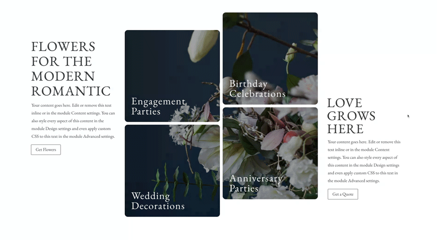
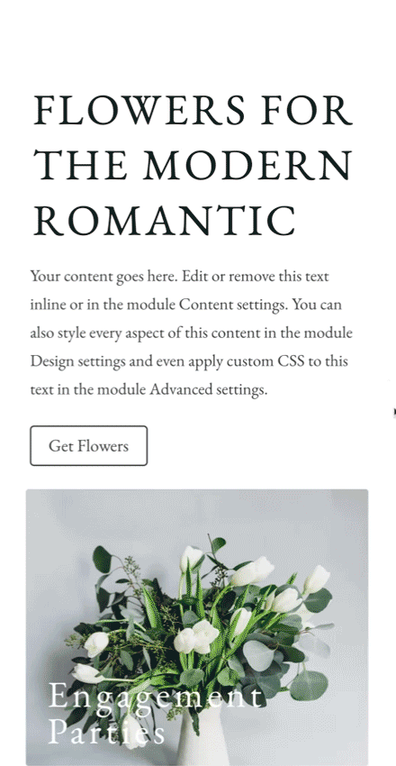
Preview
Before we dive into the tutorial, let’s take a quick look at the outcome across different screen sizes.
Desktop
Mobile
Download The Inline Parallax Layout for FREE
To lay your hands on the free inline parallax layout, you will first need to download it using the button below. To gain access to the download you will need to subscribe to our newsletter by using the form below. As a new subscriber, you will receive even more Divi goodness and a free Divi Layout pack every Monday! If you’re already on the list, simply enter your email address below and click download. You will not be “resubscribed” or receive extra emails.

Subscribe To Our Youtube Channel
Let’s Start Recreating
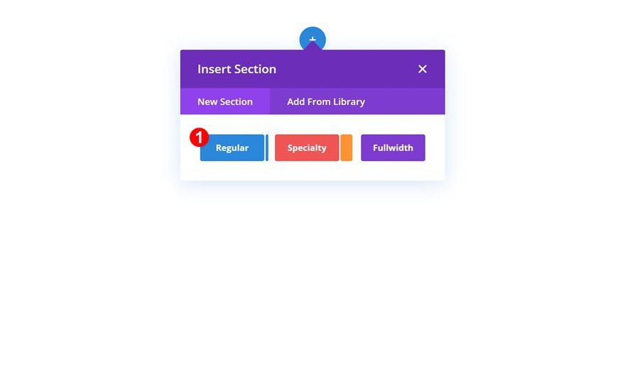
Add New Section
Start by adding a new regular section to the page you’re working on.
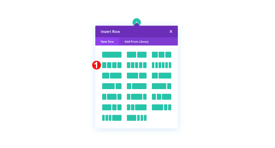
Add New Row
Column Structure
Continue by adding a new row using the following column structure:
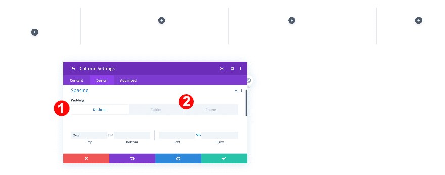
Column 1 Settings
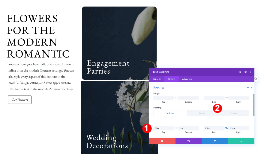
Spacing
Add a top padding value to the first column.
- Top Padding:
- Desktop: 2vw
- Tablet + Phone: 6vw
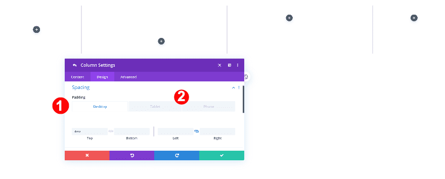
Column 2 Settings
Spacing
Add a top padding value to the second column as well.
- Top Padding:
- Desktop: 4vw
- Tablet + Phone: 6vw
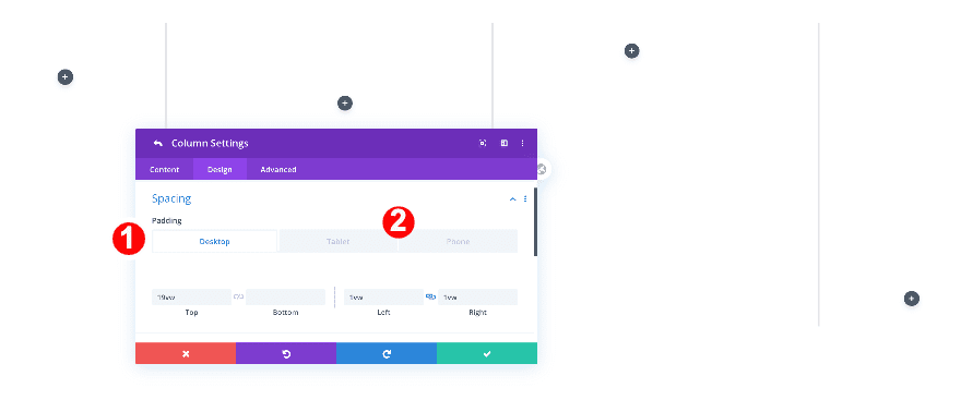
Column 4 Settings
Spacing
Skip column 3 and add some spacing values to column 4.
- Top Padding
- Desktop: 19vw
- Tablet: 0vw
- Phone: 1vw
- Left and Right Padding
- Desktop and Tablet: 1vw
- Phone: 0vw
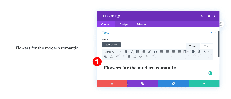
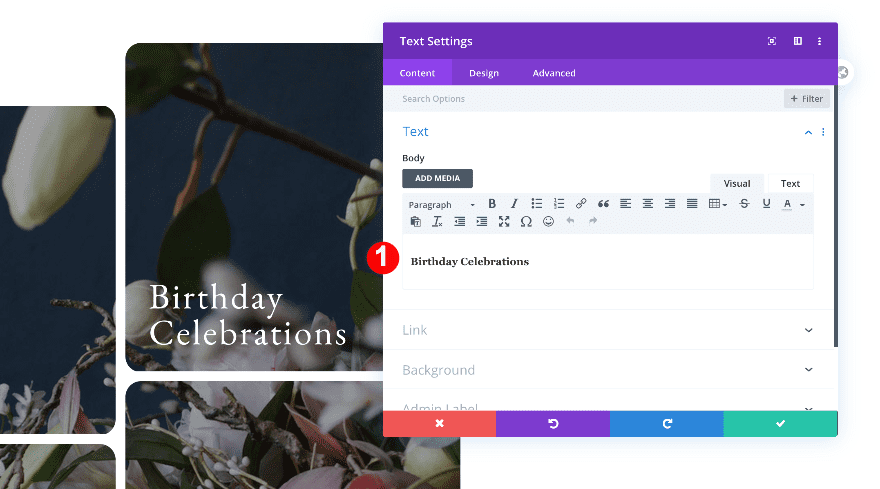
Add 1st Text Module to Column 1
Add H2 Content
Now, add the first text module to column 1. Insert some H2 content of your choice.
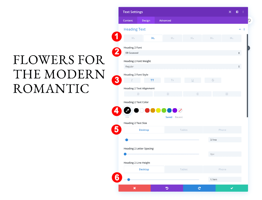
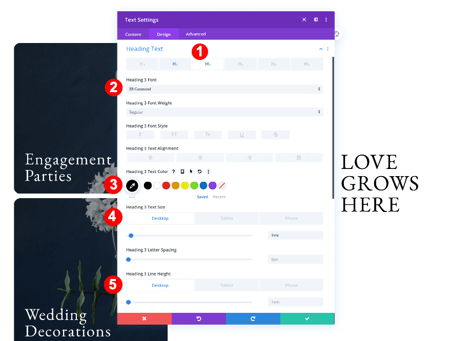
Heading Text
Move on to the design tab and change the H2 text settings accordingly:
- Heading Text Level: H2
- H2 Font: EB Garamond
- H2 Font Style: TT
- H2 Text Color: Black #oooooo
- H2 Text Size:
- Desktop: 3.1vw
- Tablet: 5.4vw
- Phone: 10vw
- H2 Line Height:
- Desktop + Tablet: 1.1em
- Phone: 1.3em
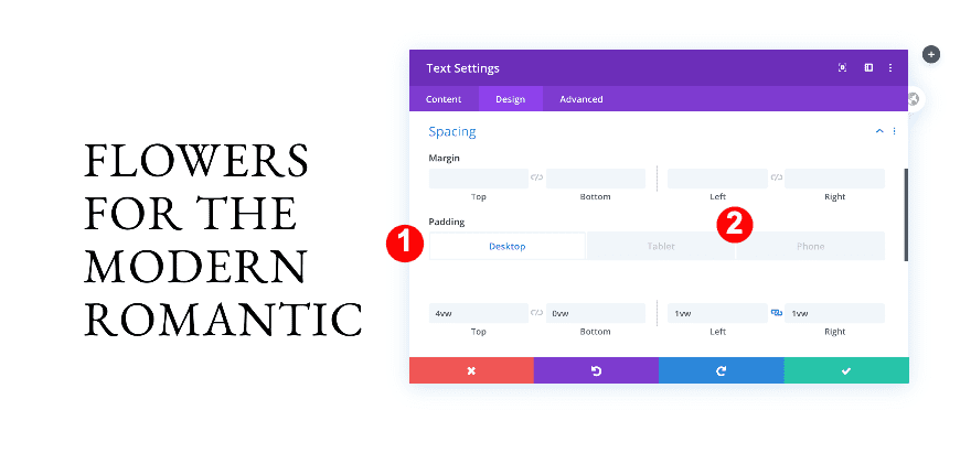
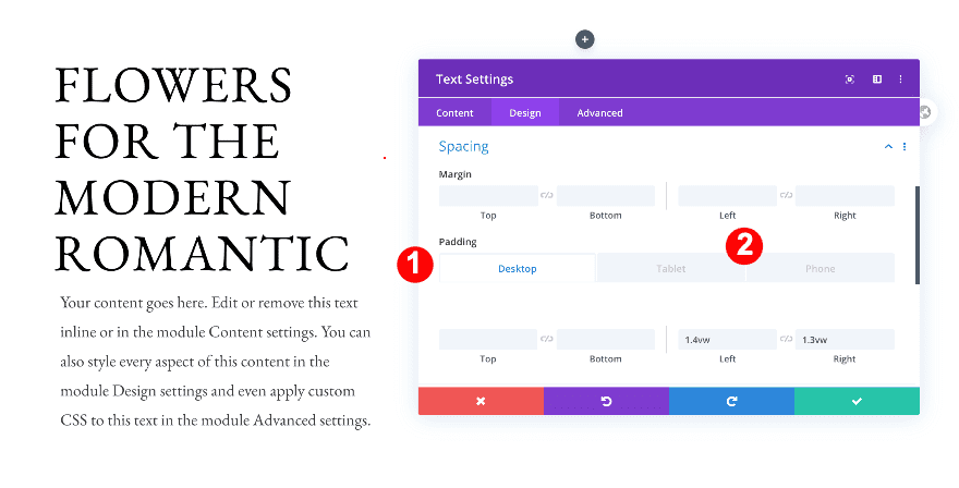
Spacing
Then, add some spacing to the module.
- Top Padding:
- Desktop: 4vw
- Tablet + Phone: 0vw
- Left Padding:
- Desktop and Tablet: 1vw
- Phone: 2vw
- Right padding
- Desktop and Tablet: 1vw
- Phone: 0vw
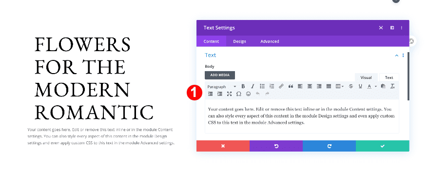
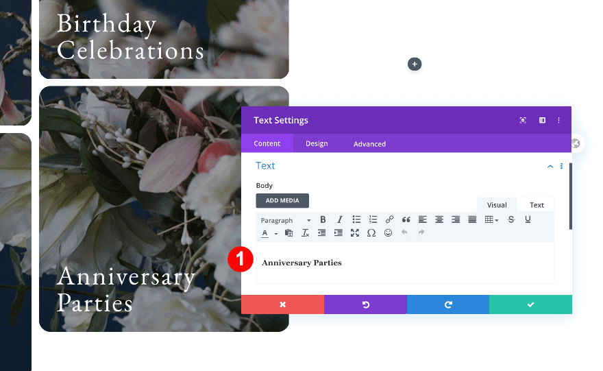
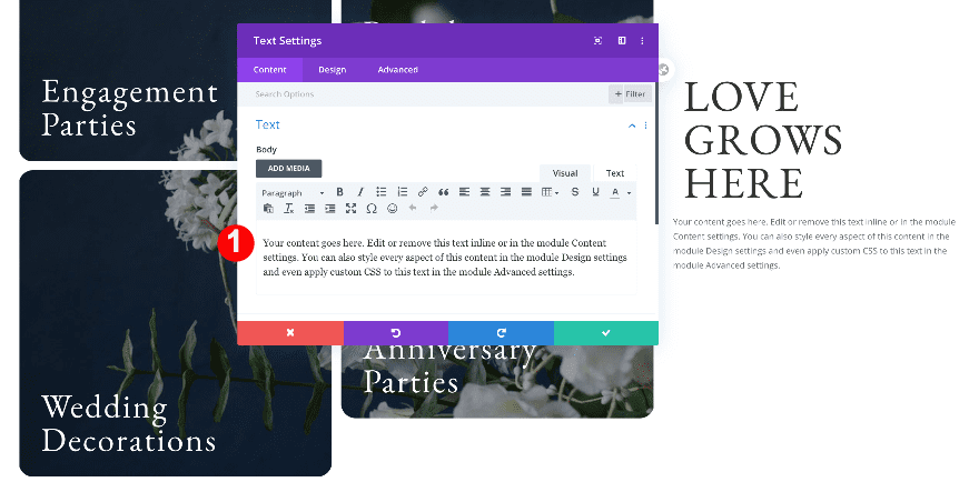
Add 2nd Text Module to Column 1
Add content
Now, add a second text module below the first. Insert some paragraph content.
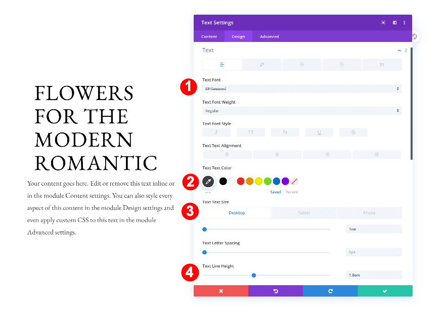
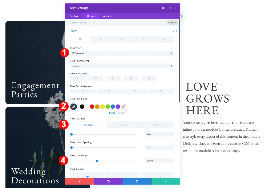
Text
Move on to the design tab and change the text settings as follows:
- Text Font: EB Garamond
- Text Color: Dark Grey #3d3d3d
- Text Size:
- Desktop: 1vw
- Tablet: 2.2vw
- Phone: 3.8vw
- Text Line Height: 1.8em
Spacing
Adjust the spacing settings of the module next.
- Bottom Padding:
- Phone: 4vw
- Left Padding:
- Desktop + Tablet: 1.4vw
- Right Padding:
- Desktop: 1.3vw
- Tablet + Phone: 1.7vw
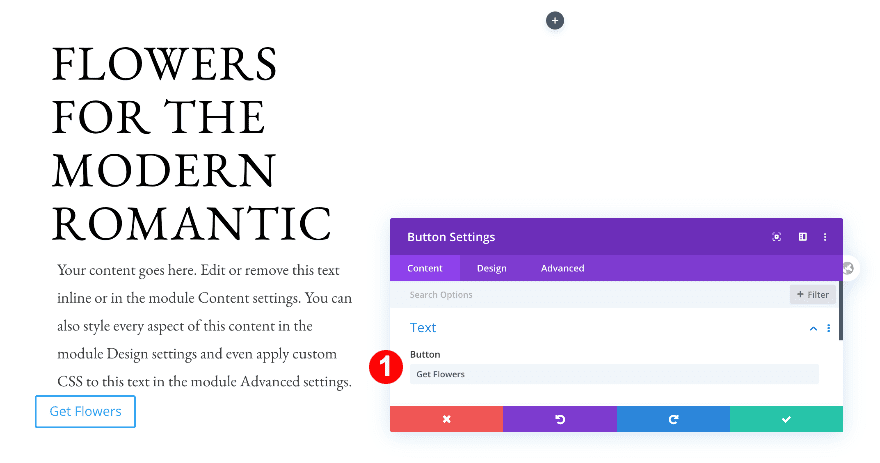
Add Content
To complete the first column, add a button module. Insert some copy.
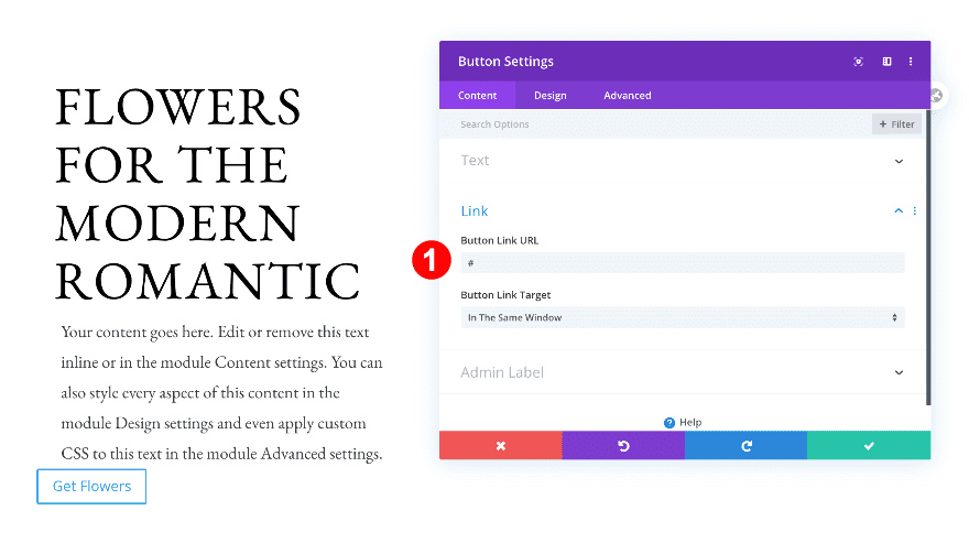
Add Link
Add a link to the button as well.
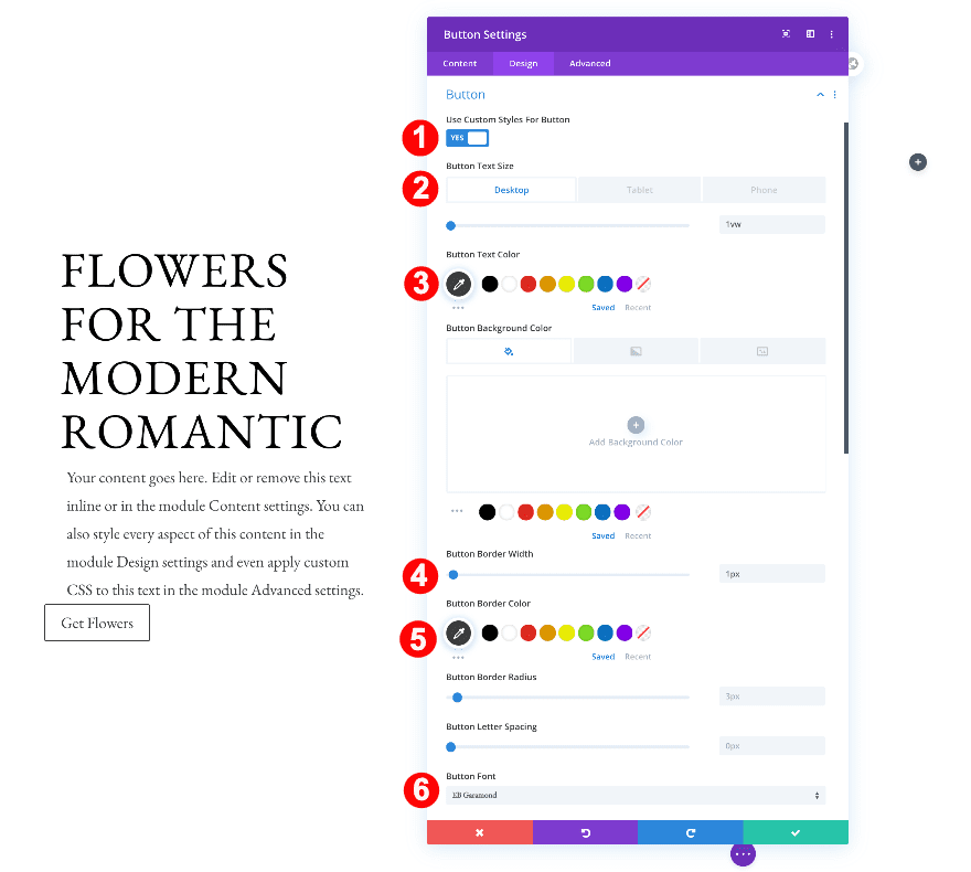
Button
Move on to the design tab and style the button settings accordingly:
- Button Text Size:
- Desktop: 1vw
- Tablet: 2vw
- Phone: 4vw
- Button Text Color: Dark Grey #3d3d3d
- Button Border Width: 1px
- Button Font: EB Garamond
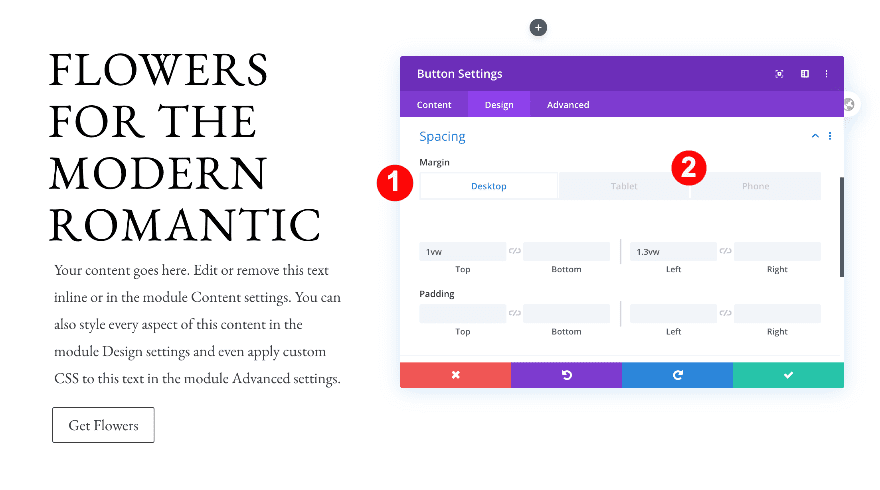
Spacing
Then, adjust the spacing settings of the button.
- Top Margin:
- Desktop + Tablet: 1vw
- Bottom Margin:
- Phone: 5vw
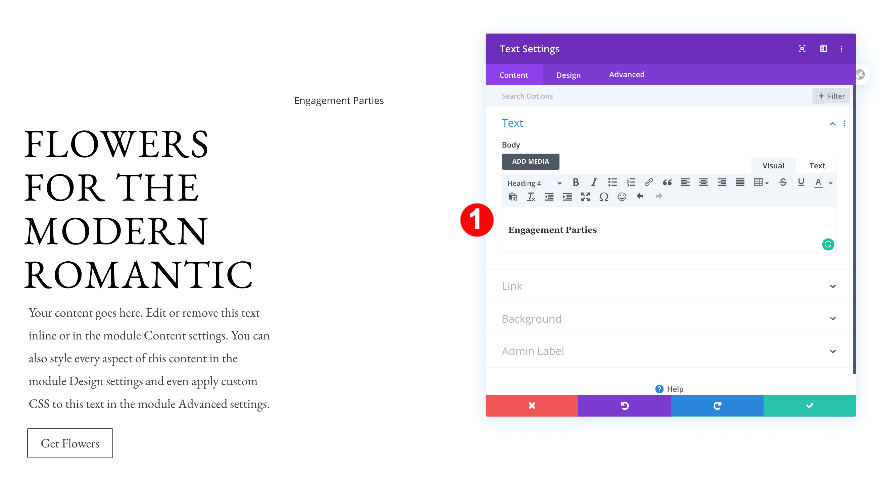
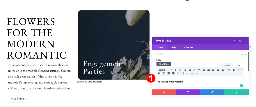
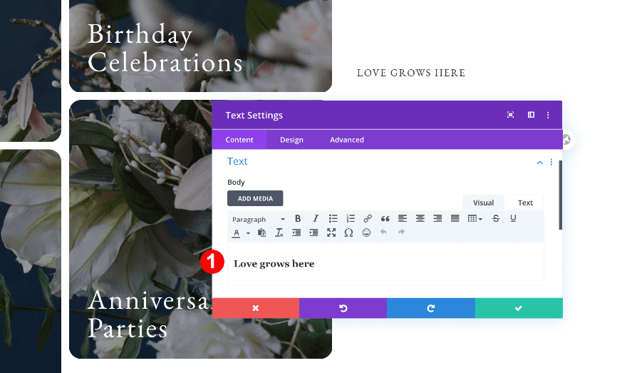
Add 1st Text Module to Column 2
Add Content
On to the next column! Add a Text Module with some H4 content of your choice.
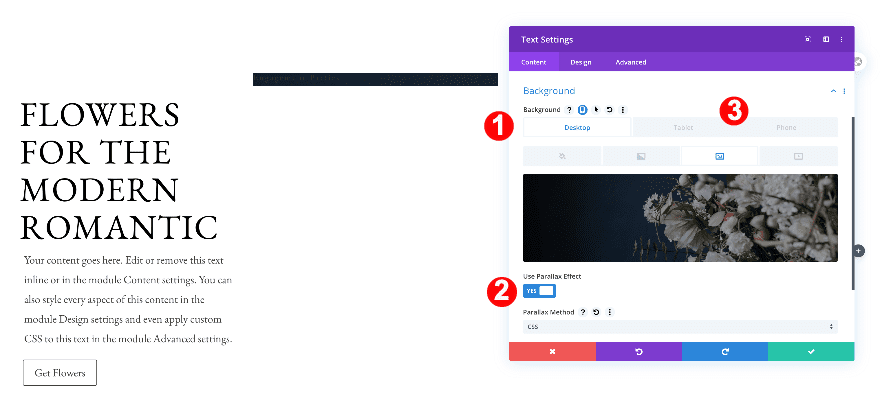
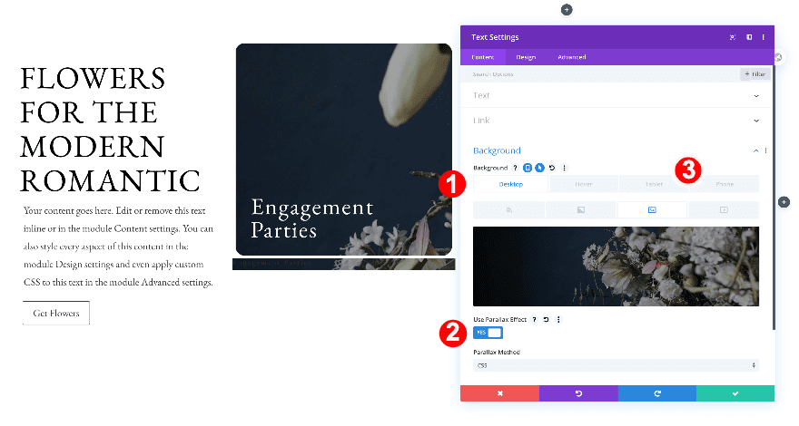
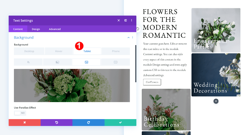
Background
Continue by adding a background image. Upload a CSS parallax background image for desktop and use a regular image on smaller screen sizes (without CSS parallax).
- Desktop Background: Image
- Parallax: CSS
- Tablet + Phone Background: Image
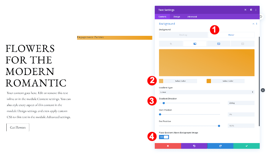
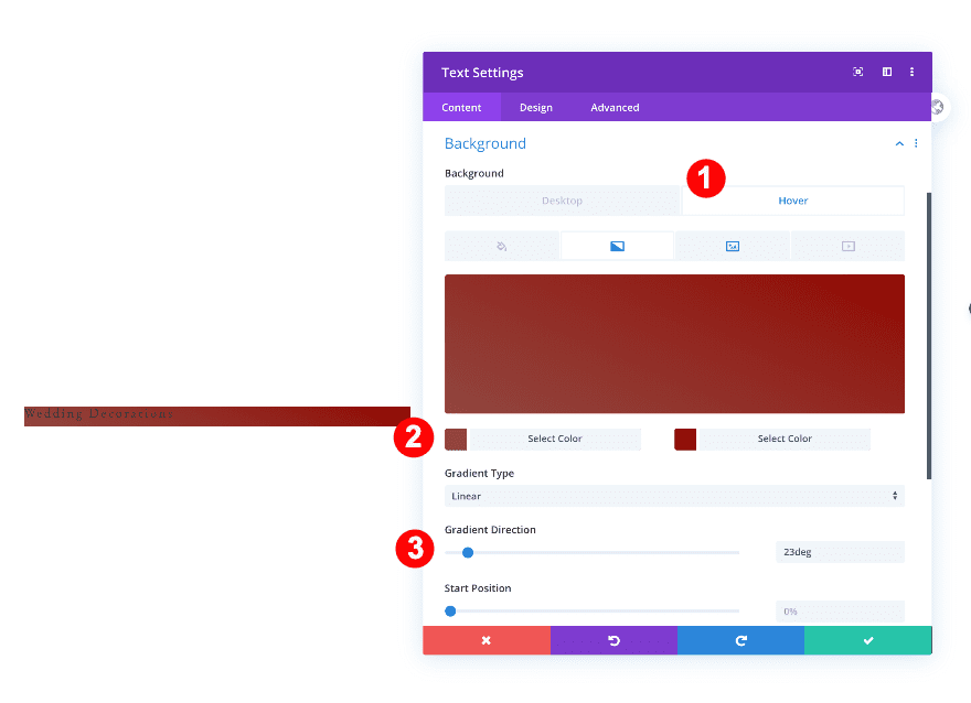
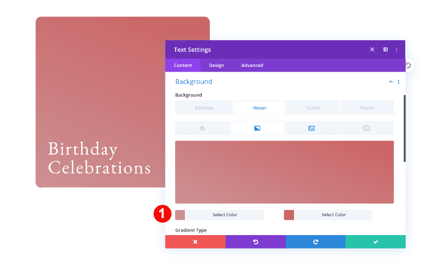
Background Hover
Next, add a gradient background on hover only.
- Background Hover: Color Gradient
- Color Gradient 1: Light Golden Yellow #edba63
- Color Gradient 2: Golden Yellow #ed9d12
- Gradient Direction: 23 deg
- Place Gradient Above Background Image: Yes
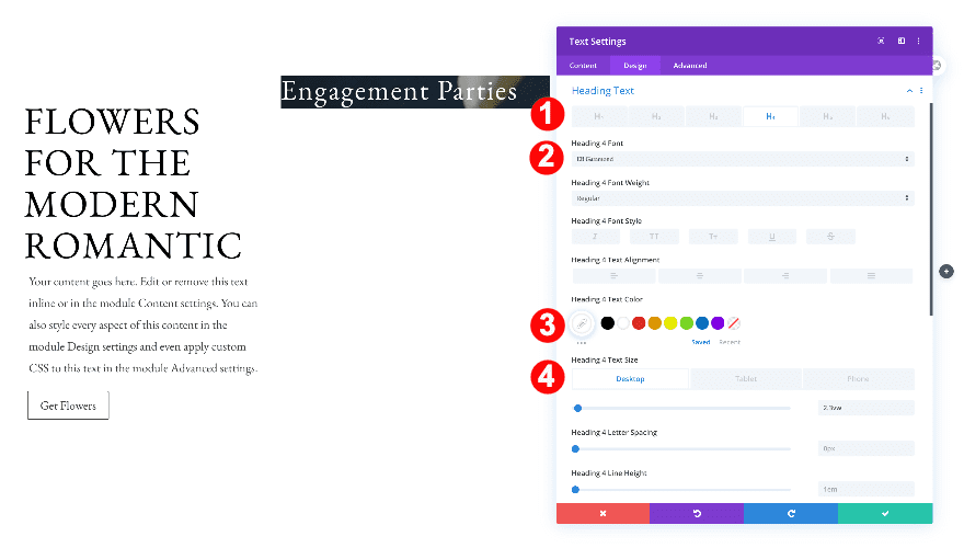
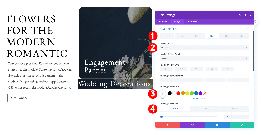
Heading Text
Move on to the design tab and change the H4 text settings.
- Text Heading Level: H4
- H4 Font: EB Garamond
- H4 Text Color: White #ffffff
- H4 Text Size:
- Desktop: 2.3vw
- Tablet: 4.5vw
- Phone: 8.5vw
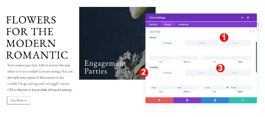
Spacing
Then, adjust the spacing.
- Top Margin:
- Phone: -6vw
- Top Padding:
- Desktop: 15vw
- Tablet: 22vw
- Phone: 43vw
- Bottom Padding:
- Desktop + Tablet: 1vw
- Left and Right Padding:
- Desktop and Tablet: 1.5vw
- Phone: 5vw
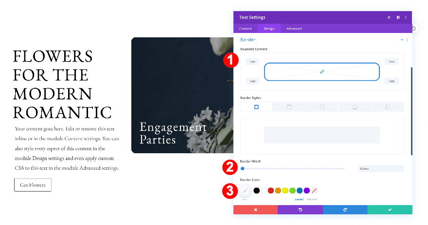
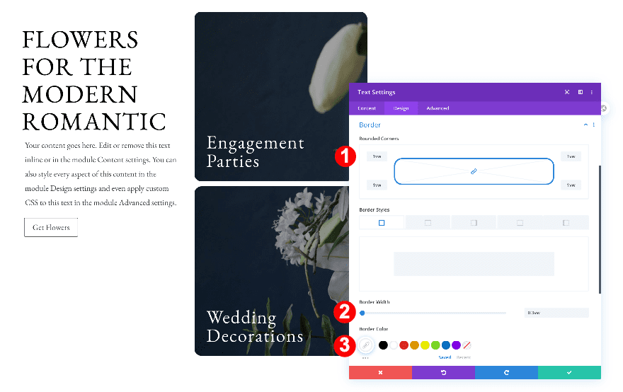
Border
Continue by styling the borders.
- Rounded Corners: 1vw all corners
- Border Styles: all sides
- Border Width: 0.3vw
- Border Color: White #ffffff
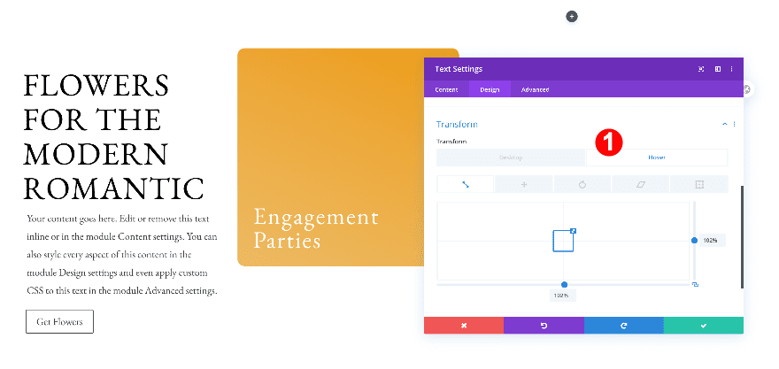
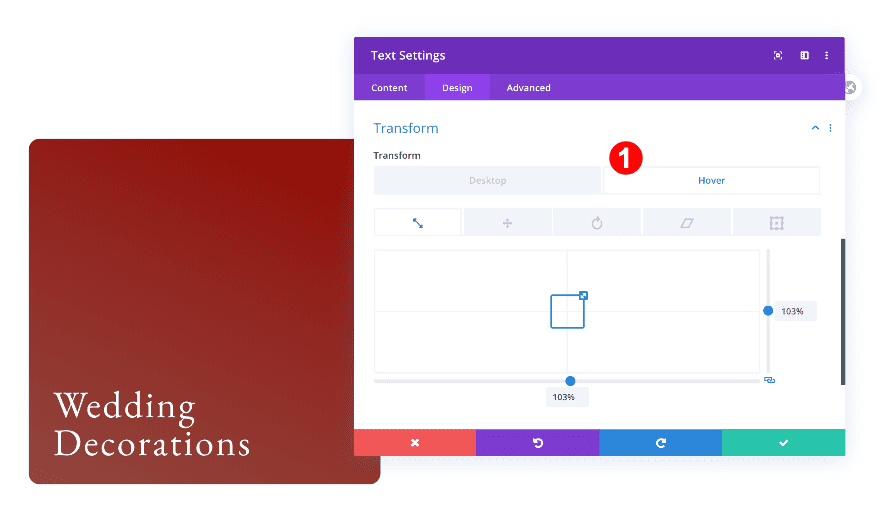
Transform Scale Hover
Complete the module’s settings by adding a zoom effect on hover.
- Transform Scale on Hover: 102%
Add 2nd Text Module to Column 2
Add Content
Add a second module to the second column with some H4 content of your choice.
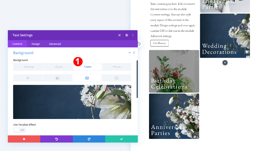
Background
Just like the previous text module, add a CSS parallax background image on desktop and a regular background image on smaller screen sizes.
- Desktop Background: Image
- Parallax: CSS
- Tablet + Phone Background: Image
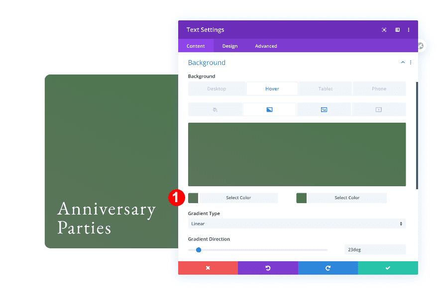
Background Hover
Add a hover gradient background too.
- Background Hover: Color Gradient
- Color Gradient 1: Light Magenta #91463f
- Color Gradient 2: Magenta #910400
- Gradient Direction: 23 deg
- Place Gradient Above Background Image: Yes
Heading Text
Style the H4 text settings next.
- Text Heading Level: H4
- H4 Font: EB Garamond
- H4 Text Color: White #ffffff
- H4 Text Size:
- Desktop: 2.3vw
- Tablet: 4.5vw
- Phone: 8.5vw
Spacing
And modify the spacing settings.
- Top Padding:
- Desktop: 15vw
- Tablet: 21.1vw
- Phone: 43vw
- Bottom Padding:
- Desktop + Tablet: 1vw
- Left and Right Padding:
- Desktop and Tablet: 1.5vw
- Phone: 5vw
Border
Change the border settings too.
- Rounded Corners: 1vw all corners
- Border Styles: all sides
- Border Width: 0.3vw
- Border Color: White #ffffff
Transform Scale Hover
Last but not least, add a zoom in effect to the text module.
- Transform Scale on Hover: 102%
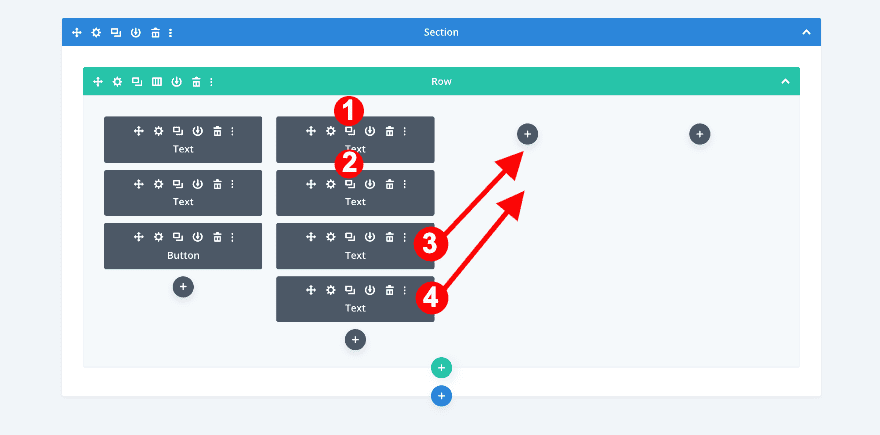
Duplicate Text Modules from Column 2 to Column 3
Duplicate and drag text modules
Clone both text modules and place them in the third column of the row.
Adjust 1st Text Module in Column 3
Change H4 Content
Open the first duplicate text module in column 3 and change the content.
Change Background For Tablet and Phone
Change the background image on smaller screen sizes next.
Change Color Gradient on Hover
Continue by changing the colors in the gradient hover.
- Color Gradient 1: Rose Pink #cc9293
- Color Gradient 2: Pink #cc9293
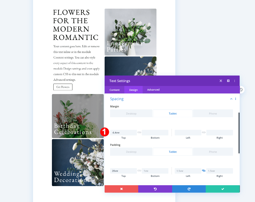
Spacing
Finally, adjust the spacing as follows.
- Top Margin:
- Tablet: -6.4vw
- Phone: 0vw
Adjust 2nd Text Module in Column 3
Change H4 Content
First, change the content.
Change Background For Tablet and Phone
Then, change the background image on smaller screen sizes.
Change Color Gradient on Hover
Change the gradient background too.
- Color Gradient 1: Soft Pine #5c755c
- Color Gradient 2: Pine Green #4D754D
Add 1st Text Module to Column 4
Add Content
Moving on to column 4, add a text module. Insert some H3 content of your choice.
Heading Text
Move on to the design tab and change the H3 text settings as follows:
- Heading Text Level: H3
- H3 Text Font: EB Garamond
- H3 Font Style: TT
- H3 Text Color: Black #oooooo
- H3 Text Size:
- Desktop: 3vw
- Tablet: 5vw
- Phone: 12vw
- H3 Line Height
- Desktop + Tablet: 1em
- Phone: 1.1em
Add 2nd Text Module to Column 4
Add content
Add another text module below the first. Insert some paragraph content.
Text
Move on to the design tab and change the text settings accordingly:
- Text Font: EB Garamond
- Text Color: Dark Grey #3d3d3d
- Text Size:
- Desktop: 1vw
- Tablet: 2.2vw
- Phone: 3.8vw
- Text Line Height: 1.8em
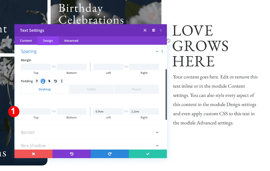
Spacing
Then, adjust the spacing.
- Bottom Padding:
- Phone: 4vw
- Left Padding: 0.9vw
- Right Padding: 2.2vw
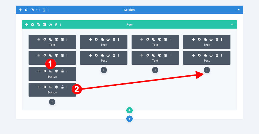
Duplicate and drag the button module
- Duplicate the button module in column 1.
- Drag it to column 3 below the text modules.
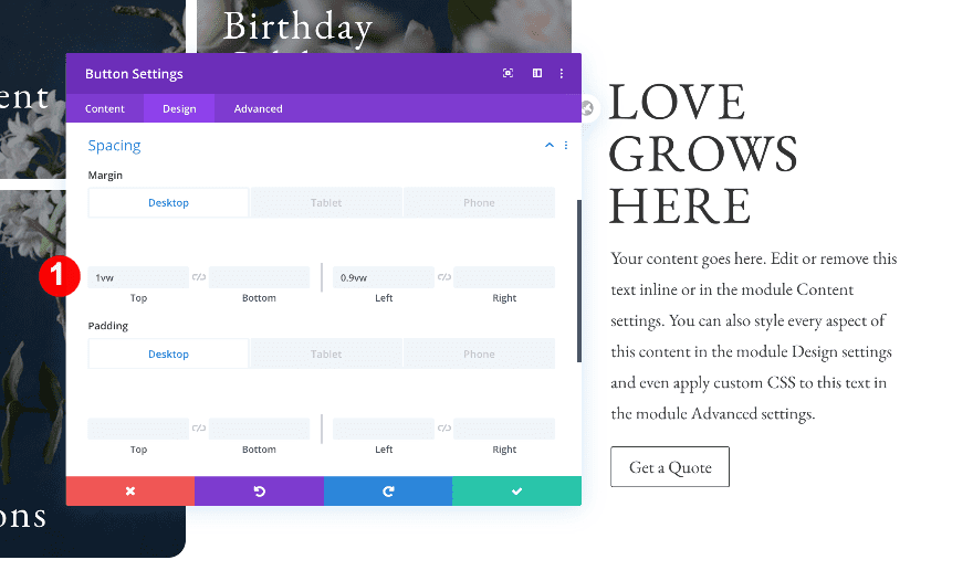
Spacing
Adjust some spacing values in the duplicated button module and you’re done!
- Bottom Margin: 0vw
- Left Margin:
- Desktop + Tablet: 0.7vw
- Phone: 0.9vw
Preview
Now that we’ve gone through all the steps, let’s take a final look at the outcome across different screen sizes.
Desktop
Mobile
Conclusion
In this post, we’ve shown you how to create an inline parallax design with four text boxes that show a different part of the same image. We hope you enjoy this design and if you have any questions or suggestions, make sure you leave a comment in the comment section below!


Gracias Elisandro. Cuándo se carga en la biblioteca DIVI no tiene el tipo Layout por lo que después no lo puedes importar.
Saludos
I like this.
Nice one, will make plan for it
First of all, it’s an amazing article with great representation and second thanks for the download as well it’ll be of great significance to us and the instructions are detailed and to the point as well. great work keep it up.
I’m not seeing how your instructions make “four text boxes that show a different part of the same image”.
Your instructions say to add a background image to 2 text modules in Col 2, then duplicate the text modules in Col 3.
I can’t see how that makes the 4 text boxes show a different part of the same image.
Am I missing something?
Paul, all four text boxes are showing a different part of the same image because we’ve applied a CSS parallax effect.
Wow, Orana! You nailed it! Thank you for the download! <3
Thanks Elisandro. 🙂
How hard would it be to have text appear above the gradient background on hover?