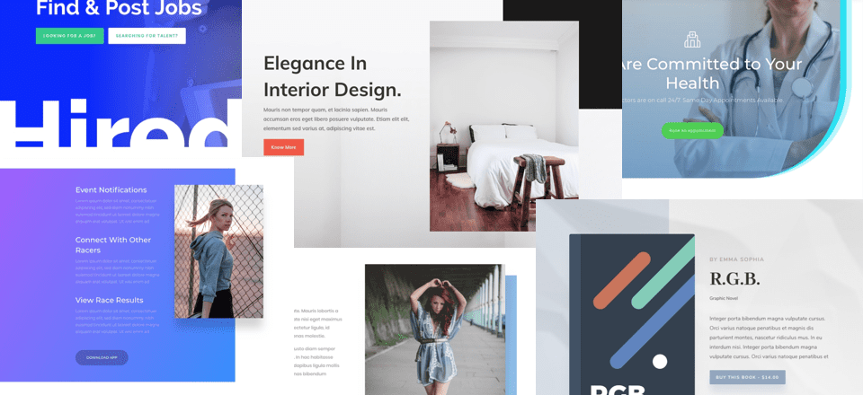
Designing broken grid layouts is a modern trend in web design. More traditional grid layouts tend to play it safe by keeping all the content of your site neatly organized in their proper place. And to be fair, all websites rely on the structure this type of harmonious grid provides. Broken grid design, on the other hand, is about breaking free of the constraints of the grid in an effort to create more engaging layouts by layering and overlapping elements on the page.
Many of our Divi Layouts have used broken grid design elements. And, using Divi’s premade layouts to bring this modern design to your own site can be a huge timesaver, not only for design inspiration but also for development. But, if you haven’t learned the methods behind the creativity, you may miss out on some cutting-edge techniques that can boost your design skills.
So if you are interested in learning the secret behind broken grid design using Divi, this is the post for you. I’ll be walking you through 6 design techniques used on our Divi layouts to offset your content in elegant and creative ways.
Let’s get started.
- 1 #1 Overlapping Elements
- 2 #2 Adding Custom Sizes for Rows and Sections
- 3 #3 Using Borders to offset sections and rows
- 4 #4 Using Box Shadow to Create Offset Backgrounds
- 5 #5 Using Column Backgrounds and Custom Margins to offset Content
- 6 #6 Using Background Gradients to Offset Content
- 7 Final Thoughts
#1 Overlapping Elements

Overlapping is a popular design trend and it is a common feature on many Divi layouts. You can overlap content vertically by pulling section content to overlap adjacent sections or rows, or you can overlap content horizontally to pull content into adjacent columns. This is great way to pull content into your headers to make elements standout and/or lead the user down the page or for overlapping those images and blurbs that feature your services.
Example
For a great example of how to overlap content vertically in your header, the Job Recruiter layout pack uses this technique to pull large text as an informative design element to complement the header design in a unique way.

How It’s Done
For starters, a new section is added under the header section with a custom width of 100% so that it spans the full width of the section.
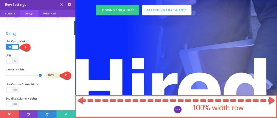
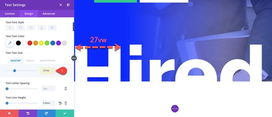
Inside the row, a text module is added with the text you want to use. In this case, the word “Hired” is added as the content. The text is then given a custom text size using the vw length unit. This is important to scale the letters with your width of your browser window so that the large text doesn’t break to another line on smaller browsers.
In this example, the text is given a text size of 27vw. Since 1vw is relative to 1/100 of the width of the browser, setting the text size to 27vw means that each letter will be 27/100 (or 27%) of the width of the browser window. This isn’t an exact science since the width of each letter in web fonts can vary so you may need to adjust the width to get it right.
To offset the text so that it overlaps into the header above, a negative top margin value (-14vw) is added to the text module. Additionally, a negative left margin value (-2%) is added to the text module to pull the text over to hug the left side of the page.
Notice that the vw length unit is used for top margin and the % length unit is used for left margin. In this case, both % and vw length units would work to accomplish very similar results. For example, you could use a top margin of -14% and a left margin of -2vw and you would get basically the same results. However, in general, you will want to avoid using percentage for top and bottom margins because percentage is based on the width of the containing element and will cause your content to move up and down (not stay in place) as you adjust your browser resulting in inconsistent design. It is also common to use pixels for top and bottom margins as well. This will ensure exact and consistent vertical placement on all browsers.
For left and right margins, it is generally preferred to use % since all Divi sections, rows, modules are based on percentage widths.
More on Overlapping
This same technique is used on the Business Consultant Landing page layout to bring a CTA up into the header.

There are many other examples of overlapping content throughout the Divi Layouts. For an in-depth tutorial on how to do this, check out this post on how to overlap modules and rows in Divi.
#2 Adding Custom Sizes for Rows and Sections

Another way to introduce broken grid design in Divi is by resizing sections and rows. Normally, sections span the full width of the page and rows are centered with the section. By resizing your section, you can offset your content in a unique way. This can be done by adding a custom size (max-width) to your sections or rows. Then you can align them to the left or right of your page.
A good example of this can be found on the Marathon Layout pack. Check out the section on the App Page Layout that has a purple gradient background with an offset image in the right column. In this example the layout uses percentage length units to space the elements in a way that is both offset and symmetrical. Notice the text lines up with the center of the purple background and the image overlaps halfway through the empty space on the right.
How It’s Done
Let’s go through how this design is accomplished.
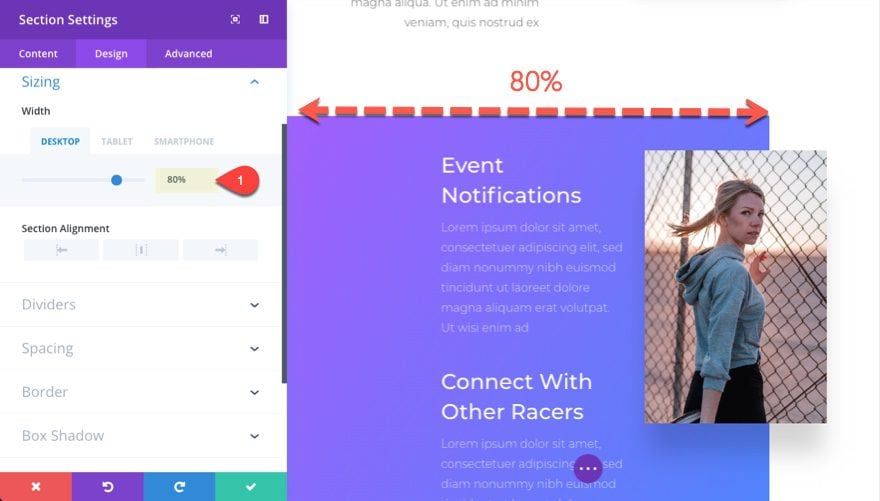
First, the section is given a custom width of 80%.
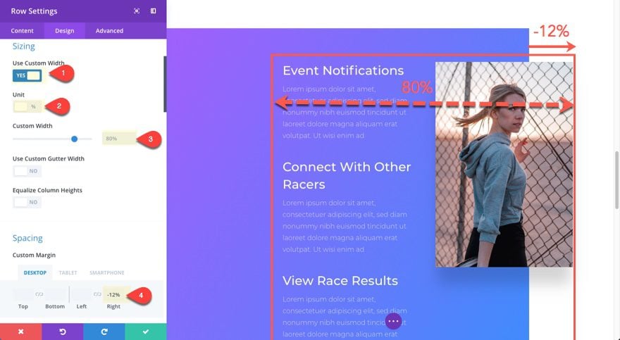
Next, the row is also given a custom width of 80%. Because percentage length units are relative to the parent (containing) element. The row will be 80% of the width of the section (which is 80% of the page container).
To offset the row, you simply add a -12% right margin to pull the row to the right of the section. Notice how the text is aligned in the center of the purple section and the image is overlapping halfway into the exposed white content area. This is a great way to offset your content in a way that creates a unique layout and looks pleasing to the eye.
The Content Area Background
The white area to the right of the section is actually the color of your default content area background. You can change this default setting for all pages in the Theme Customizer under General Settings > Background.
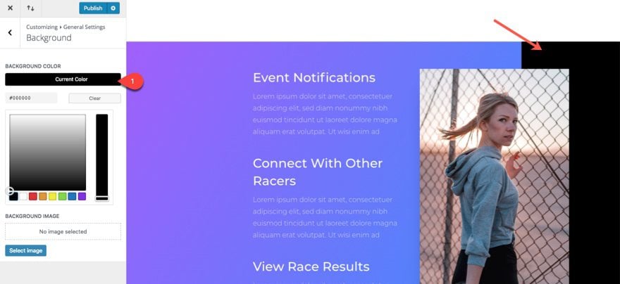
If you want to change the content area background color only for the current page you are editing, you can go to page settings from the visual builder and change the content area background color option.
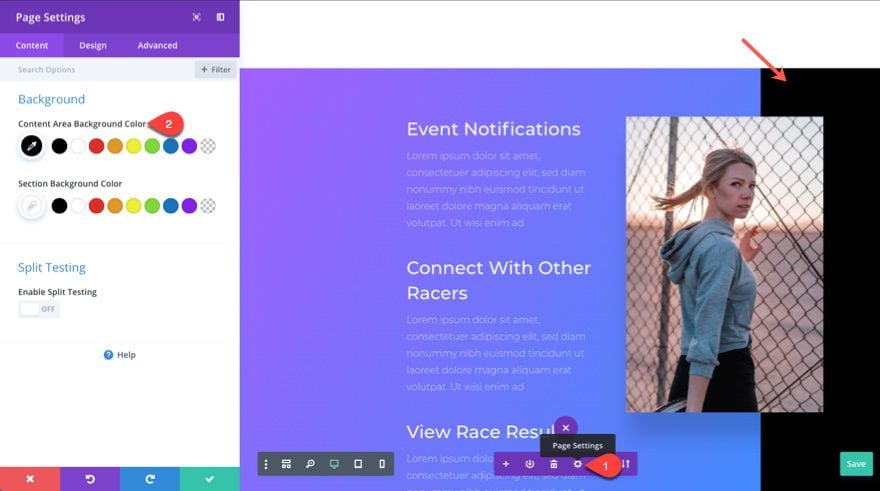
This will come in handy if your layout is using a different background color throughout your sections, allowing your content area background color to match the other section background colors.
The Doctor’s Office Layout pack also uses this technique to offset header sections along with a custom border design.

#3 Using Borders to offset sections and rows

Adding left or right borders to your sections, rows, or modules can be useful for offsetting your content in creative ways. Because Divi determines box sizing using the border-box CSS property, the width of your row will be contained inside the box of an element. Because of this, if you add a left border to a section (or box), the content of the section shifts to the right to accommodate for the row. This is how the offsetting effect is done.
Example
An great example of using borders to offset elements can be found on the Law Firm Layout Pack. On the landing page layout, you can see that each section has a border that offsets the content.
How It’s Done
This design technique is pretty straightforward. Check out the settings for the second section of the landing page layout:
Border Styles: Right Border
Right Border Width: 8vw
Right Border Color: rgba(255,186,96,0.6)
Right Border Style: Solid
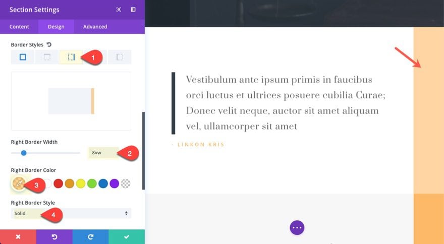
Notice that the border with is 8vw (8/100 of the viewport width). This will make sure the border scales nicely with your browser. You could also set a percentage unit (8% would be 8% of the width of the section) for very similar scaling.
#4 Using Box Shadow to Create Offset Backgrounds
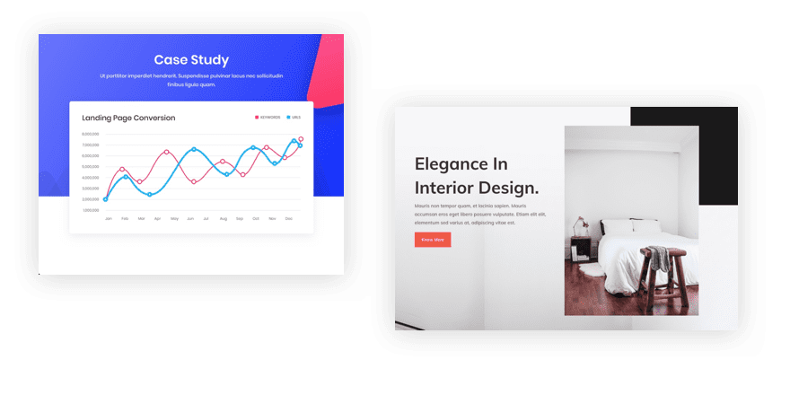
Box shadows can be used for creative design elements other than the traditional “shadow” effect. In fact, it is a great way to add offset backgrounds without having to use custom margins to move elements vertically or horizontally.
Example #1
A good example of this can be found on the SEO Agency Case Study Layout. Notice how the image featured in the header section appears to have been moved below the section into the section below. Actually, this effect is accomplished using box shadow. What you are actually seeing is a white box shadow that matches the background color of the section below.
How It’s Done
Take a look at the section settings so you can see how this box shadow is applied:
Box Shadow Horizontal Position: 0px
Box Shadow Vertical Position: -220px (movies it up 220px inside the row)
Box Shadow Blur Stength: 0px
Box Shadow Spread Strength: 0px
Shadow Color: #ffffff (this color should match the background of the section below)
Box Shadow Position: Inner Shadow (this makes sure the shadow moves inside the row)
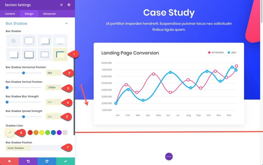
The key here is to take advantage of the inner shadow position with a negative vertical position (so the shadow comes up from the bottom of the section). The vertical position value (-220px) is what determines how much overlap you have for the design.
Example #2
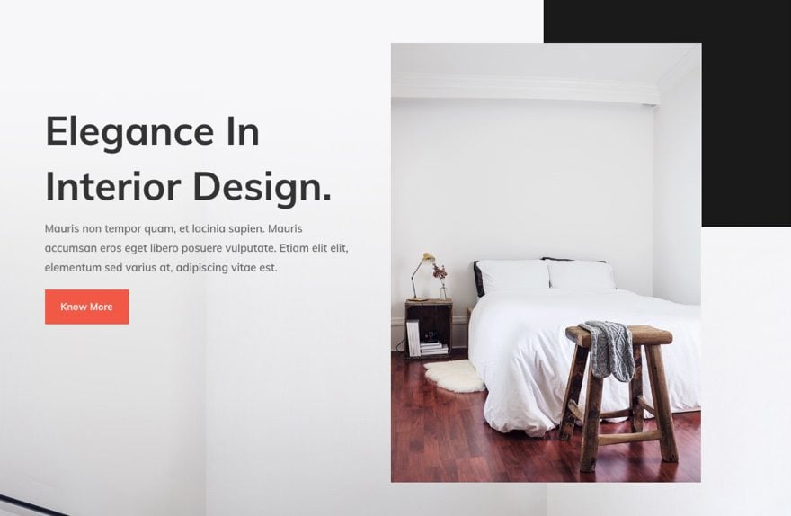
You can also position your box shadow in different ways to create offset background blocks. This is one of my favorite design tricks. A good example of this can be found on the Interior Design Company Landing Page Layout
How It’s Done
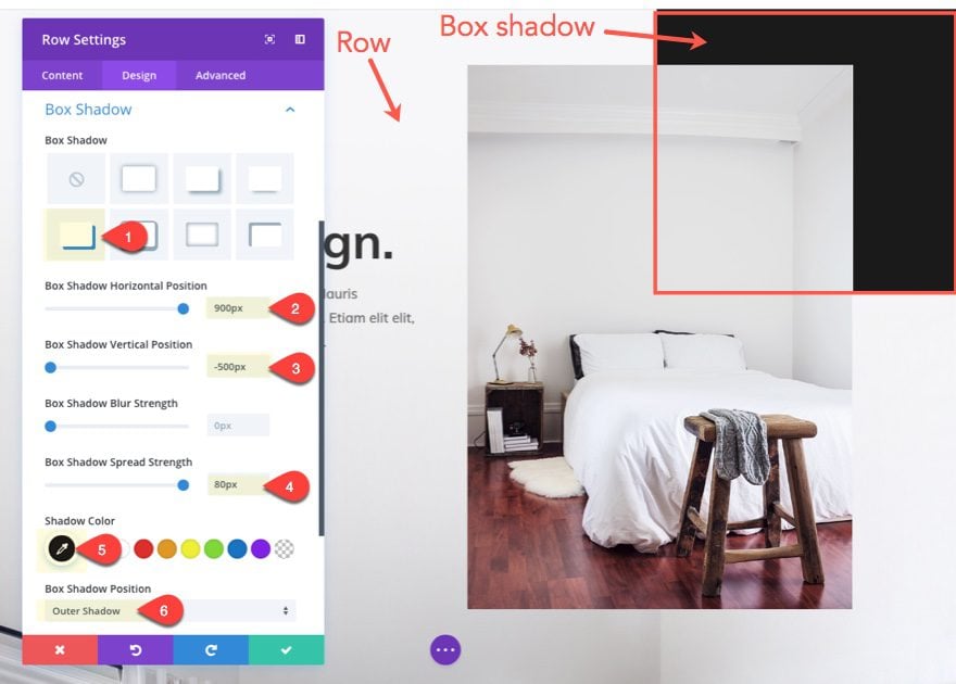
You may have wondered how that dark colored block appears in the top right of the page header. It is actually a box shadow of that top section’s row. The “box” of the box shadow is moved to the upper right to the point that most of it is hidden from view. All we can see is the bottom left portion of the box. As a result, you have a nice decorative box that overlays the section background image and creates a nice broken grid effect.
To better understand this concept, let’s take a look at the row settings needed to create this box shadow.
Box Shadow Horizontal Position: 900px (moves it to the right 900px)
Box Shadow Vertical Position: -500px (movies it up 500px)
Box Shadow Spread Strength: 80px (adds 80px of more shadow around the box)
Shadow Color: #1a1a1a (this is the color of the box)
Box Shadow Position: Outer Shadow (this makes sure the shadow moves outside the row)
For more on this concept, check out some “outside the box” examples of how to use box shadows.
#5 Using Column Backgrounds and Custom Margins to offset Content
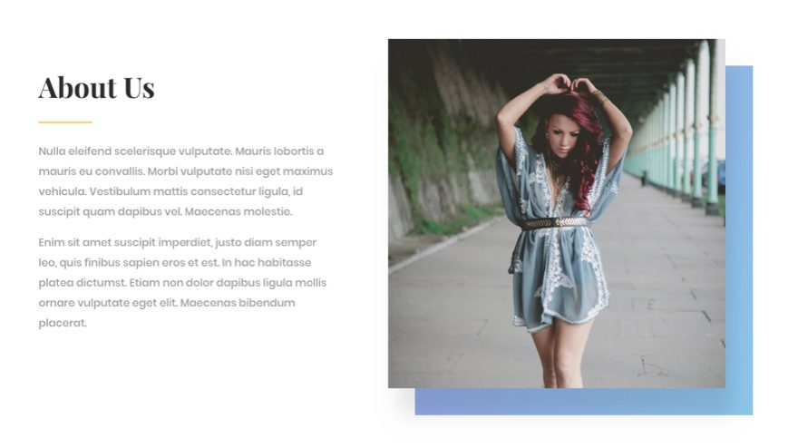
Another way to offset content is to set a column background color and then use custom margins to adjust the modules inside the column. This is a unique way to frame images.
Example
One example of this can be found in the Fashion Layout Pack. On the Fashion Landing Page layout, notice the section below the header with the title “About Us”. The right column has a gradient background color with an image module that has been offset using custom margins.
How It’s Done
To create this design, first the Column 2 background gradient colors need to be added.
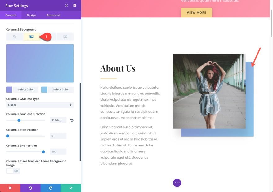
After that, you can move the image module residing in that column by giving it some custom margins. For this example, the following custom margins are added:
Custom Margin: -40px Top, 40px Bottom, -40px Left, 40px Right
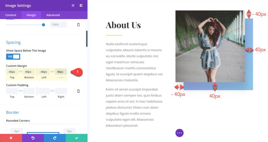
Notice that the top negative margin value (-40px) also has a complimentary positive bottom margin value (40px) and the left negative margin value (-40px) also has a complimentary positive margin value (40px). This is because the size of your column is based on the size of the content it contains. Simply moving the image up or to the left with negative margins will not create the spacing needed to expose the column background on the right and bottom of the image. You will need to create this space with additional positive margins (or padding).
One of best reasons to use this technique instead of creating a box shadow to create an offset background is the ability to create gradient backgrounds and images. A box shadow is more limited to a single color background.
#6 Using Background Gradients to Offset Content
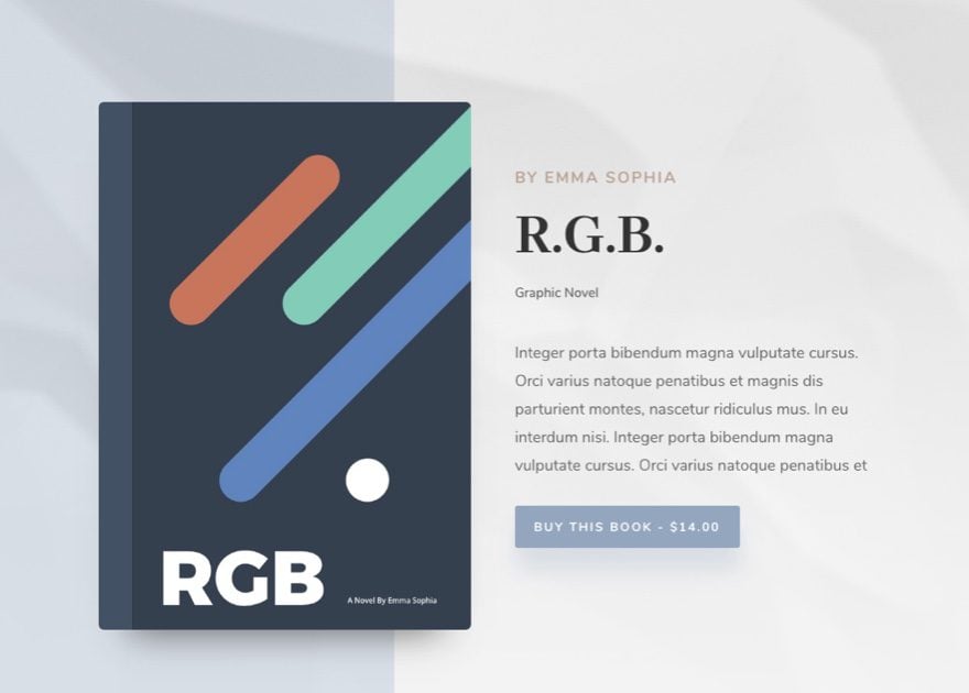
One unique way to create overlapping effects is to use gradient backgrounds. Normally, we wouldn’t think of gradients in this way, but with the right settings in place, gradients can be a convenient way to split your background into 2 different colors and have the dividing point start at any percentage value.
Example
A good example of this can be found on the Author Layout Pack. The top header section of the Author Landing Page layout uses two gradient background colors to create a division that offsets the book image (without actually moving the book image at all).
How It’s Done
Let’s take a look at how this design works.
First, a section is created with the following background gradient options:
Background Gradient Left Color: rgba(148,166,191,0.34)
Background Gradient Right Color: #f4f4f4
Gradient Type: Linear
Gradient Direction: 90deg
Start Position: 40%
End Position: 0%
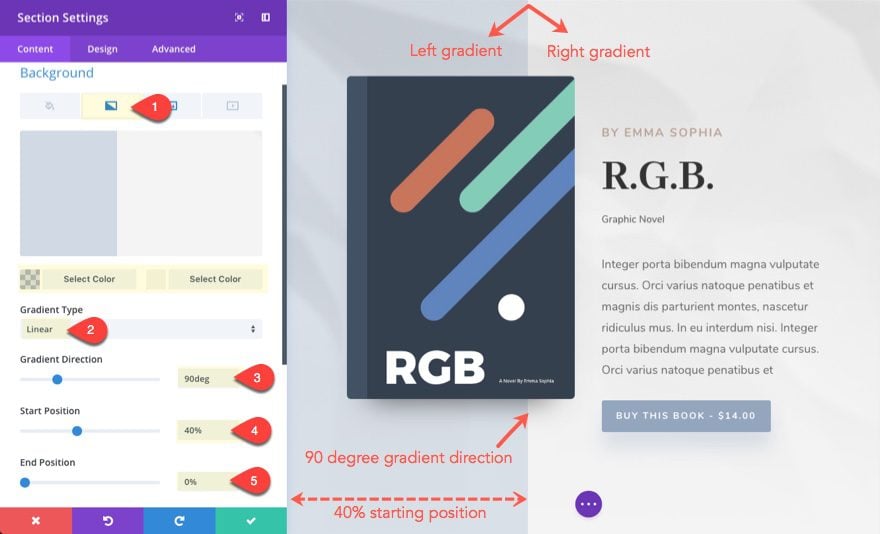
The gradient type is set to linear with a gradient direction of 90deg. This ensures the division of the two gradients is at a 90 degree angle (straight up and down).
After that, the start position can be adjusted to a precise location across the section. In this case, setting the start position to 40% will cause the division of the two colors to sit behind the book image, creating an overlapping effect. Setting the end position to anything less than or equal the value of the starting position (40%) will make sure the two colors will not blend together like a traditional gradient would.
Final Thoughts
With Divi, your grid structure is built using sections, rows, and modules. And you can easily customize these elements to incorporate broken grid design anywhere you want if you take the time to learn some key techniques. The six examples covered in this article will hopefully inspire you to think outside the box (or grid) to create something completely unique for your next project.
I look forward to hearing from you in the comments below.
Cheers!



Very helpful!
Thank you Jason,
This was laid out nicely and explained well.
I will be referring back once I start using this – very helpful.
Thanks for the detail instruction. I’ve used some of the effects, but this opens up so much more possibility. Keep it coming. (You make me look good).
Ben
Thanks for this post! I’m aiming to create sites with a modern look, so these tips are for me. 🙂
Very useful, thanks for sharing!
Great article! The use of gradient to achieve that background effect is convenient. 🙂 Thanks!
Excellent post! Inspirational.
How cool, helps with understanding exactly how you guys created these effects. I agree they are an awesome and easy way to add new design elements to the page. Thanks for sharing these tutorials and explanations.
Some great tips that I can use throughout my site. I’ve only just switched over from Rapidweaver to WordPress and Divi, so these blog posts are proving amazingly invaluable. Thanks, Divi.
Thank you for this detailed explanation and walk through. And for using the native design templates!