

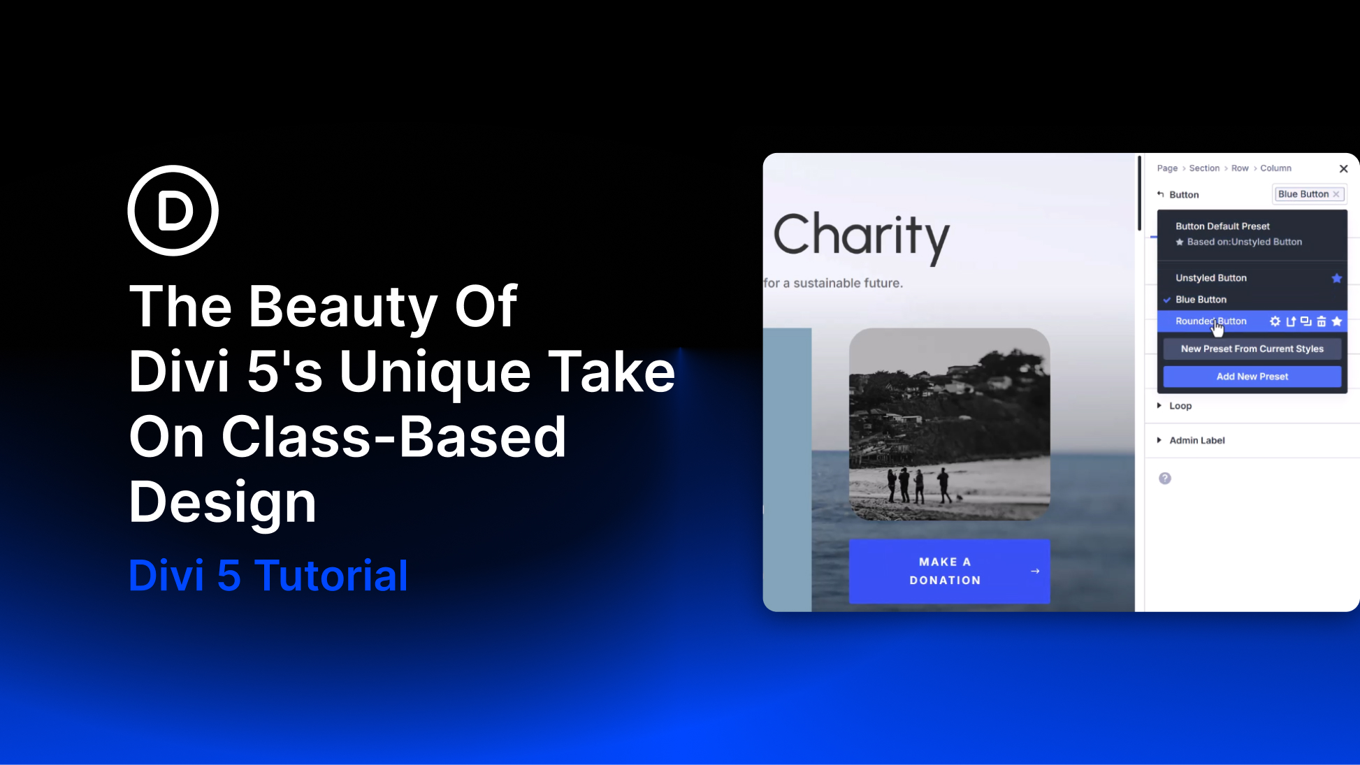
A growing website is easier to maintain when repeated styles share a common source. CSS classes support that approach by letting multiple elements use the same style rules. Change a shared rule, and the elements using it can update together.
Divi 5 brings that principle into the Visual Builder through a connected design system. Design Variables provide reusable values, presets organize shared settings, and the Preset Manager gives you a central place to maintain them. Composable Settings and Nested Option Presets extend those connections to the individual parts inside modules.
Let’s look at how these features work together and how they compare with a class-based CSS workflow.
What Is Class-Based Design?
A CSS class lets you target multiple elements with shared style rules. For example, a .primary-button rule might define a background color, padding, and font weight. Buttons using that class share those declarations without needing a separate copy on each element.
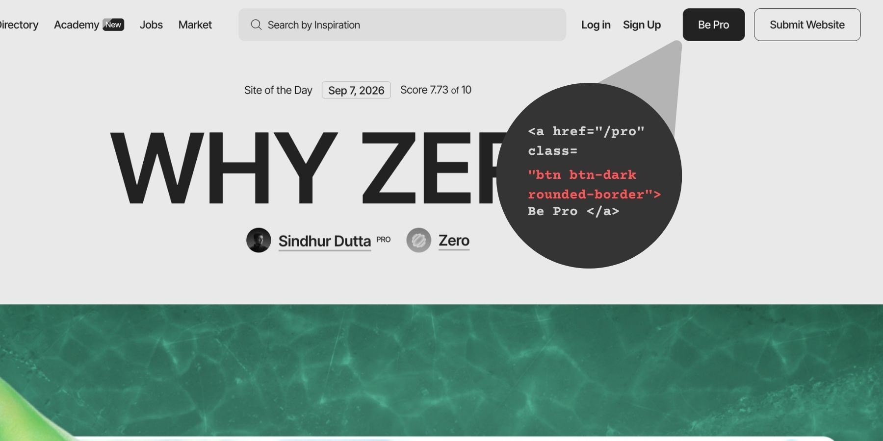
Updating the rule updates the properties it controls wherever it applies. Additional classes and responsive rules can introduce variations, so shared foundations do not require every element to look identical.
The practical benefits are consistency and easier maintenance. A new page can reuse established button, heading, and spacing styles. A client revision can update a shared definition instead of requiring the same edit across many elements.
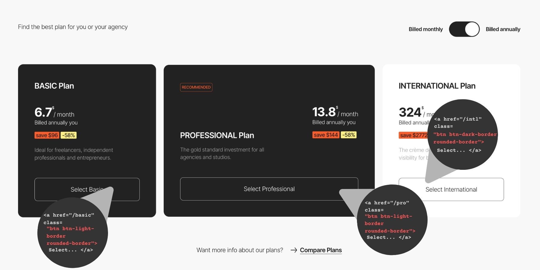
Clear names and responsibilities make the system easier to use. A class for rounded corners, for example, can serve several components without controlling their colors or typography.
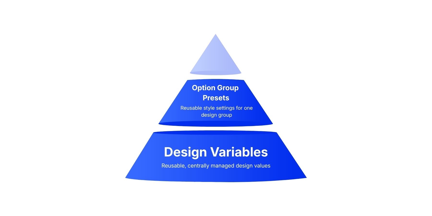
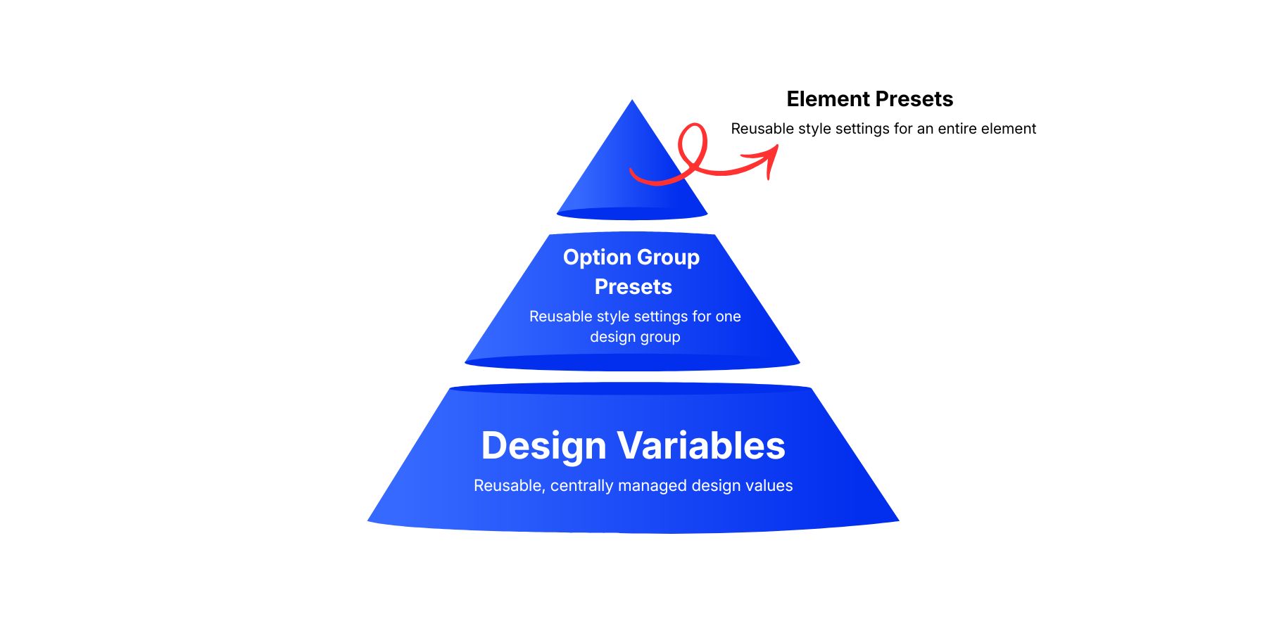
Divi lets you create reusable values and styles while working in the builder. Design Variables, Option Group Presets, and Element Presets each handle a different level of the design.
Design Variables Provide Reusable Values
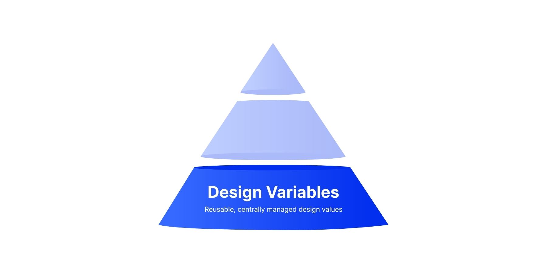
Design Variables let you define a value once and reference it in compatible fields. A primary color can supply buttons, links, and icons; a spacing value can be reused across several card designs.
Variables support both styling and content:
- Colors and Fonts: Shared palette values and typefaces.
- Numbers: Sizes, spacing, widths, and corner radii, including supported CSS functions such as
clamp(). - Images and Gradients: Reusable assets and fills, including those created with the Gradient Editor and Gradient Variables.
- Text and Links: Repeated labels and destinations.
Open the Variable Manager from the Visual Builder’s sidebar, choose a type, and enter a descriptive name and value. Names such as Primary Color and Heading Size help explain each variable’s purpose.
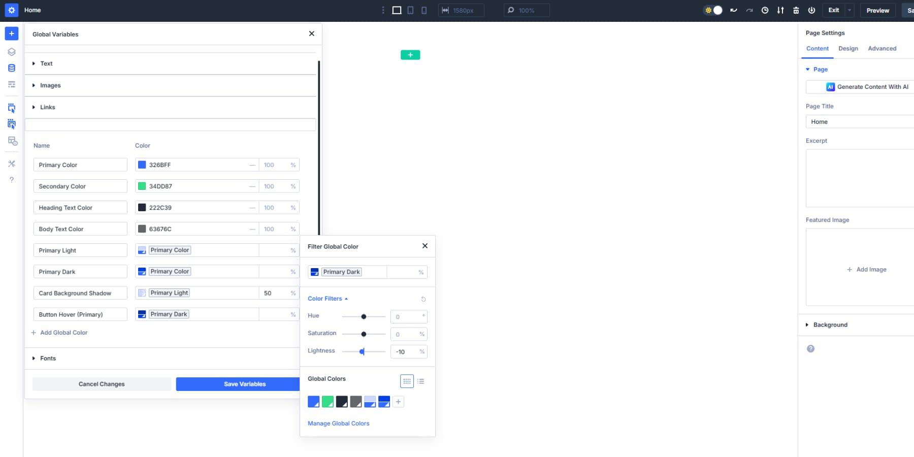
In a compatible field, use the variable or Dynamic Content picker to select it. The available choices depend on the field type.
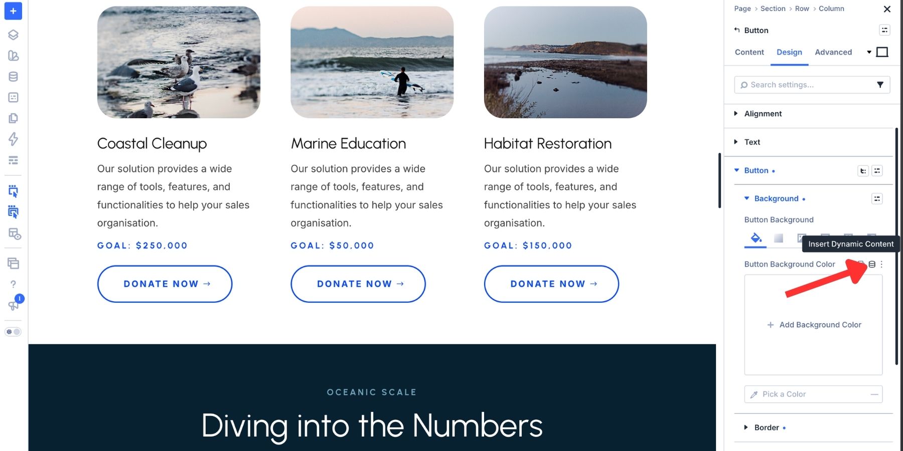
Updating the variable then updates its linked fields. Entering the same value manually does not create that connection.
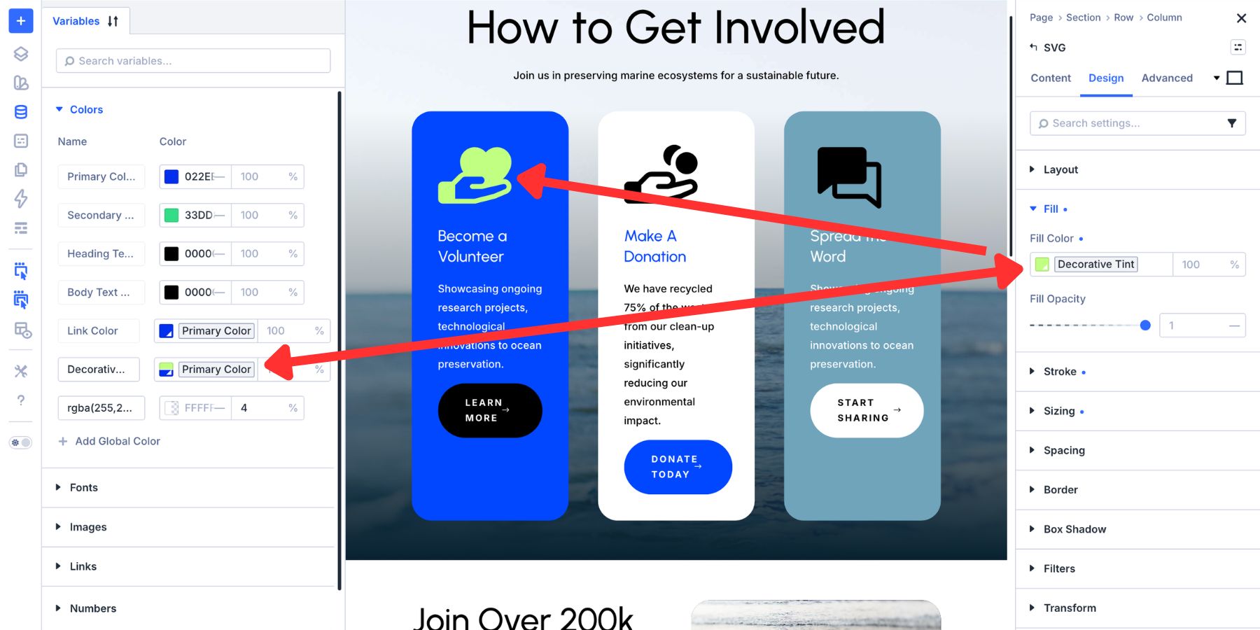
Variables can be referenced directly on elements or inside presets. This lets several reusable styles draw from the same palette, typefaces, and spacing values.
Option Group Presets save settings for a particular group, such as typography, spacing, borders, backgrounds, or shadows.
A Border preset can give images, columns, and cards the same corner treatment wherever a compatible Border group is available. Those elements can keep their own colors and layouts while sharing that detail.
| Use Option Group Presets When | Example Scenario |
|---|---|
| Styling repeats across multiple element types | A box shadow that appears on sections, columns, and modules |
| Building foundational design systems | Typography settings for all H1 headings sitewide |
| Button styles appear in different modules | Contact forms, blurbs, and CTAs all need the same button treatment |
| Creating reusable spacing patterns | Consistent padding that applies to various containers |
| Setting up border treatments | A 2px radius border used on images, rows, and buttons |
| Configuring scroll effects | Fade animations that work across sections and modules |
| Defining background styles | Gradient backgrounds applied to multiple element types |
To create one, configure the relevant group, hover over its heading, and click the preset icon. Select New Preset from Current Styles and give it a recognizable name.
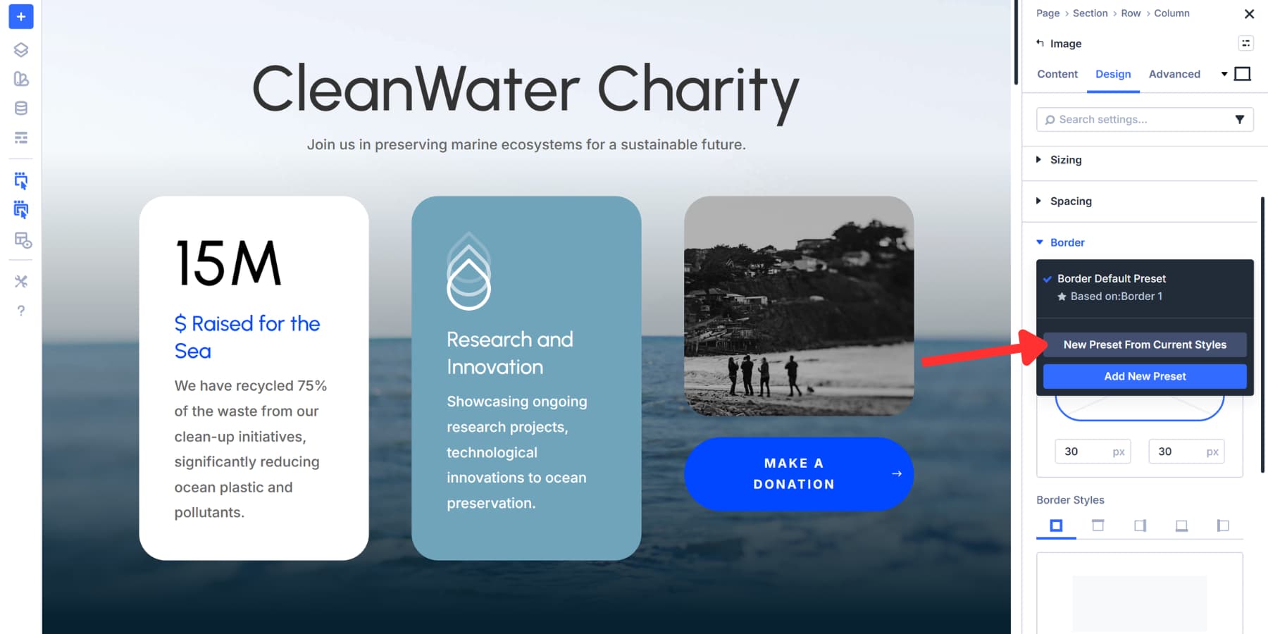
To reuse it, select the preset from a compatible option group elsewhere. Use its star icon if it should become the default for that group.
Keep each preset’s purpose clear. A Border preset might control a complete border treatment or only its corner radius. Focused presets are easier to combine without introducing unrelated changes.
Element Presets Bring A Design Together
An Element Preset combines settings for an element, including its typography, backgrounds, spacing, and other configured attributes. Presets also apply to layout elements such as sections, rows, and columns.
Element Presets follow their element type: a Button Element Preset is for Button modules, while a Text Element Preset is for Text modules. Option Group Presets provide the reusable pieces that can work across compatible groups in different elements.
| Use Element Presets When | Example Scenario |
|---|---|
| Creating complete module designs | A fully styled CTA module with typography, colors, spacing, and effects |
| Building recurring page sections | Hero sections that appear on multiple landing pages |
| Styling testimonial layouts | Testimonial modules with consistent design across your site |
| Deploying pricing tables | Pricing modules that need identical styling throughout |
| Setting up feature sections | Feature rows with specific layouts and styling patterns |
| Creating branded content blocks | Blurb modules with your company's visual identity baked in |
| Building navigation elements | Menu modules styled to match your header design |
To create an Element Preset, style the element, open the Element Preset menu at the top of its settings, and choose New Preset from Current Styles. Name it by its role, such as Primary CTA.
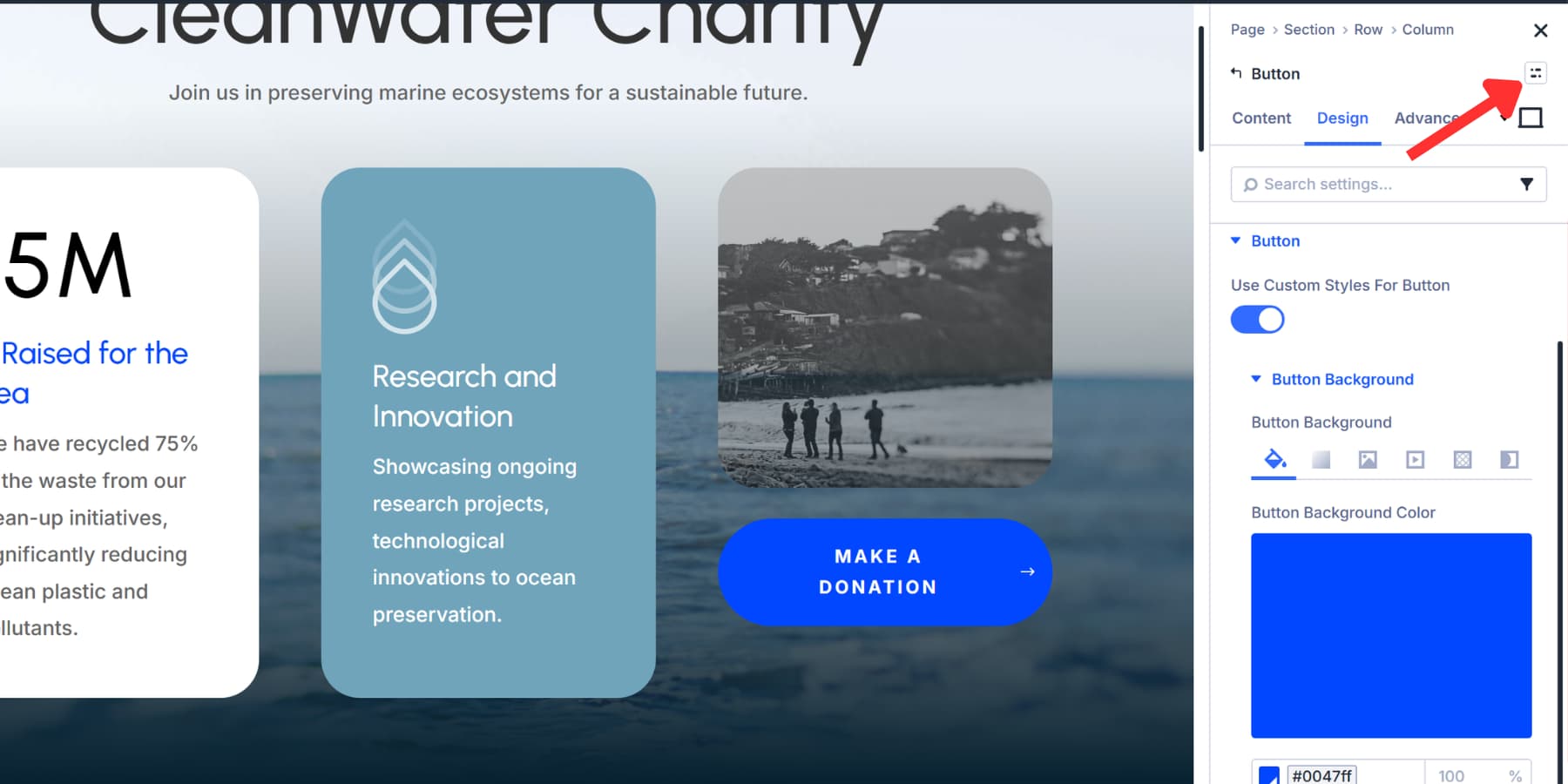
Use the same menu to apply it to another matching element. Setting it as the default gives new elements of that type a shared starting point.
An Element Preset can also reference Option Group Presets. A card design can use a shared Border preset, keeping that treatment connected to other designs instead of maintaining its own independent copy.
Manage And Preview The System In One Place
The Preset Manager, available from the Visual Builder’s sidebar, brings Element Presets and Option Group Presets into a searchable, filterable panel. You can create, edit, duplicate, delete, reorder, and set defaults without first finding an example on a page.
This gives you another way to start a project: establish your reusable button and card styles, then use them to build the layout. Descriptive names such as Border / Rounded and Button / Primary make those choices easier to find.
Creating or editing a preset opens a dedicated Preset Preview. You can refine its appearance using a sample element and preview background colors, including your site’s color variables. Saving an existing preset updates its linked uses.
The Preset Manager and Variable Manager also offer import and export controls for carrying definitions into another site. Those exports provide a reusable starting point, rather than ongoing synchronization between sites. See the Preset Manager documentation for the full workflow.
A Blurb contains an image, title, and body text; a Call To Action includes a button. Divi’s design system can reach those individual parts through Composable Settings and Nested Option Presets.
Expose Additional Controls With Composable Settings
Composable Settings let you enable additional design groups for a module’s internal elements. For example, to expose more button controls in a Call To Action:
- Open the module’s settings and go to the Design tab.
- Hover over the Button option group and click Toggle Options.
- Enable the groups you need, such as Sizing or Spacing.
- Expand those nested groups to configure the button.
These controls target the button itself. You can also enable groups while editing a preset, making them available to elements using that preset. A default preset can therefore establish both your usual styling and the controls you want available. The Composable Settings documentation covers this in more detail.
Connect Those Controls With Nested Option Presets
Nested Option Presets let you apply presets within nested groups, including placing one Option Group Preset inside another. The extra controls you enable can become part of your shared design system.
For example, Call To Action → Button → Border can use a shared Border preset.
You could nest a Pill Border preset inside a Solid Button Option Group Preset, then use Solid Button inside a Dark CTA Element Preset:
Pill Border → Solid Button Option Group Preset → Dark CTA Element Preset
Here, Solid Button styles the Button option group inside the CTA. It is separate from an Element Preset for a standalone Button module.
Changing Pill Border updates its linked settings through those parent presets, unless a setting is overridden. The CTA can keep its own container and text styling while its button shares details with other designs.
| Use Nested Presets When | Example Scenario |
|---|---|
| Building modular design systems | Create a Blurb Element Preset with nested Typography, Spacing, and Border presets that clients can swap individually |
| Managing brand variations for clients | A parent company Element Preset contains nested Color and Logo presets that swap out for each subsidiary brand |
| Creating tiered service packages | Your Pricing Table Element Preset nests different Badge and Button presets for Basic, Pro, and Enterprise tiers |
| Handling multilingual typography | Your base Section preset nests different Font presets that swap based on language without touching layout or spacing |
| Testing design iterations | Nest multiple Typography presets inside your Hero Section preset to A/B test different heading styles quickly |
| Building white label templates | Your agency Element Presets nest swappable Brand Color and Typography presets for different client projects |
| Managing seasonal content updates | Holiday sections nest different Icon and Decoration presets that swap monthly while structure stays consistent |
Combine Variations With Stacked Presets
Stacked Presets let multiple presets contribute settings to the same element or option group.
A Dark Mode Blurb preset might control background and text colors, while a Left Image Blurb preset controls image placement. Applying both combines those treatments without requiring another complete preset for that variation.
When settings overlap, later presets in the stack take precedence. Direct styles on the element can override preset values too. Keeping each preset focused makes these combinations easier to predict.
| Use Stacked Presets When | Example Scenario |
|---|---|
| Combining base styles with contextual variations | A feature card with your standard Element Preset plus a Dark Background Option Group Preset for sections with dark layouts |
| Adding alignment options to existing designs | Apply your CTA Element Preset, then stack a Center Alignment Option Group Preset for hero sections |
| Layering responsive adjustments | Stack a Mobile Spacing Option Group Preset on top of your default section to adjust padding on smaller screens |
| Mixing temporary or seasonal styling | Add a Holiday Theme Option Group Preset to existing modules during promotional periods |
| Applying accessibility enhancements | Stack a High Contrast Option Group Preset over standard elements for improved readability |
| Creating layout variations quickly | Combine your base Blurb Element Preset with different Image Position Option Group Presets |
| Adding hover effects to multiple elements | Stack a Hover Animation Option Group Preset across different module types |
How This Compares With CSS Classes
The common principle is reusing shared definitions. In CSS, a .button class might supply a button’s main styling, while a .pill class adds rounded ends. In Divi, an Element Preset and a focused Border Option Group Preset can divide those responsibilities in a similar way.
These are practical parallels, rather than identical features or a description of Divi’s internal implementation:
| Design Task | CSS Approach | Divi 5 Approach |
|---|---|---|
| Reuse A Value | Use a named custom property for a repeated styling value. | Reference a Design Variable in a compatible field. |
| Share A Focused Treatment | Apply a utility class such as .pill wherever that treatment belongs. | Apply an Option Group Preset to compatible groups across elements. |
| Define A Component | Organize component rules, such as a CTA and its button selectors. | Use an Element Preset with configured settings and references to Option Group Presets. |
| Combine Variations | Apply several classes, with conflicting declarations resolved by the cascade. | Stack compatible presets, with later presets taking precedence for overlapping settings. |
| Style An Internal Part | Target that element with an appropriate selector, such as .cta__button. | Enable the needed groups with Composable Settings and apply presets within those groups. |
| Maintain Shared Definitions | Organize and edit stylesheets using your chosen code and design-system tools. | Create, preview, organize, and export definitions through the Preset Manager and Variable Manager. |
CSS class rules and Divi presets both benefit from clear, reusable responsibilities. CSS custom properties offer a useful comparison for shared styling values, while Design Variables also support content such as text and links.
There are two distinctions worth keeping clear:
- Stacking is not the same as ordering HTML classes. Changing the order of class names in HTML does not decide which style wins. CSS uses the cascade and specificity; Divi’s preset stack uses preset order to resolve overlapping preset settings.
- Nested Presets are linked definitions. A preset can reference another preset. This differs from CSS nesting or inheritance between parent and child elements.
Divi’s appeal is the connected visual workflow. You can organize shared styles, preview them, expose controls inside modules, and connect those controls to presets from the builder. CSS offers its own flexibility; Divi makes this kind of design organization available through visual editing.
Build A System You Can Keep Using
The strength of Divi 5‘s approach is how its features work together. A color variable can feed a button preset, a shared Border preset can shape that button, and a CTA preset can bring the connected design into a page.
Start with decisions that repeat across your site, then expand as useful patterns emerge. Keep shared styles connected, use local changes where they serve a specific design, and turn recurring exceptions into reusable variations. The result is a system that can evolve without requiring the same edits everywhere.






Leave A Reply