
The products on your eCommerce website need to pop–I think that’s something we can all agree on. The more attention they pull and the clearer they are, the more chances you have to turn visitors into customers. WooCommerce is often the obvious choice when you’re creating an online store with WordPress. But sometimes, it’s hard to start off with a product page and turn it into exactly what you had in mind.
It’s not really necessary either. With Divi, you can design any kind of product showcase and include a functioning Add to Cart button right there, within your Divi design. That way, you won’t necessarily have to guide your visitors to each product page for them to do the shopping they want on your website. In this tutorial, we’re going to show you how to create stunning product sections with functioning Add to Cart buttons which you can use on any online store you’re building for yourself or a client.
Let’s get to it!
Result
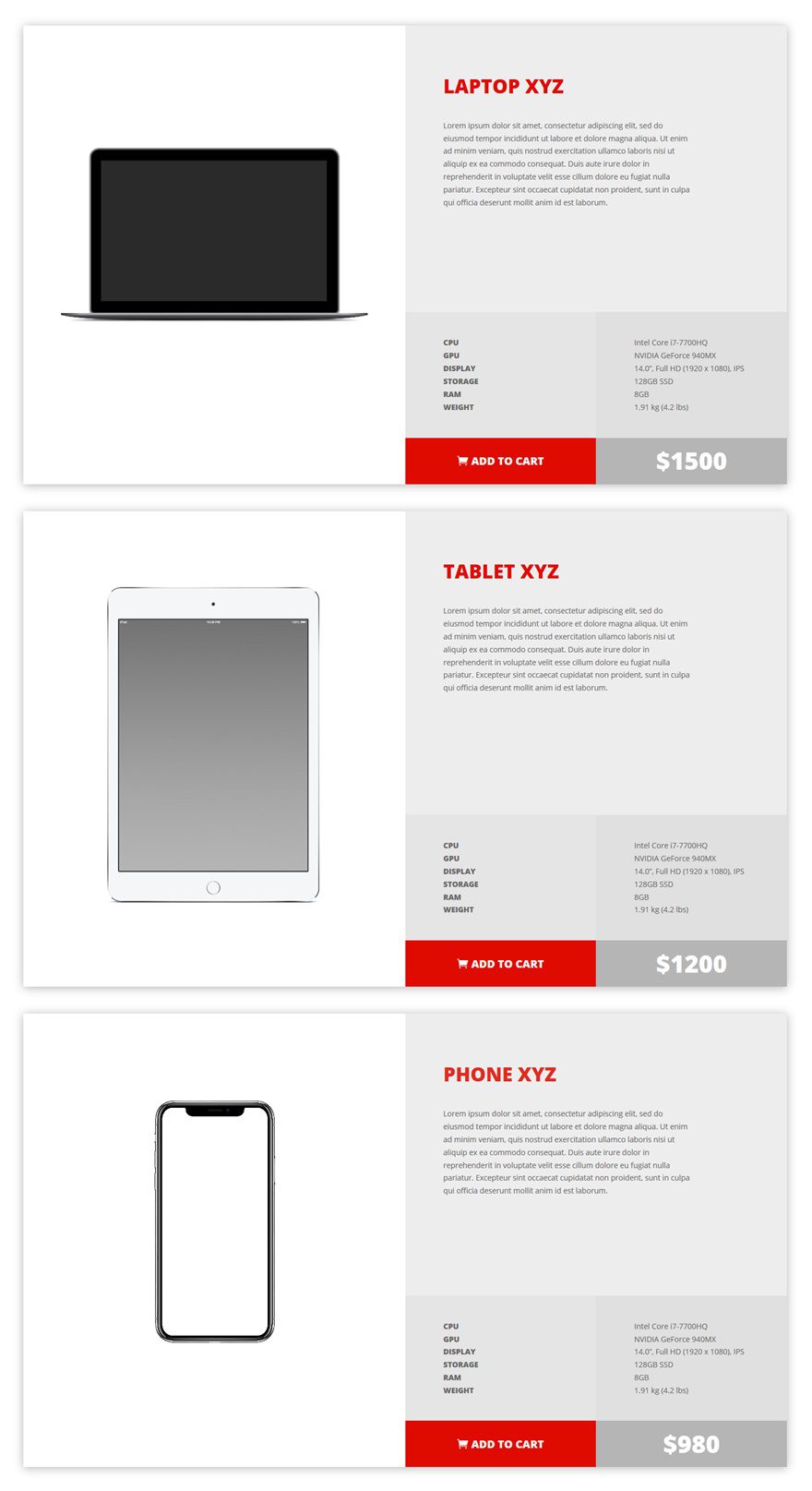
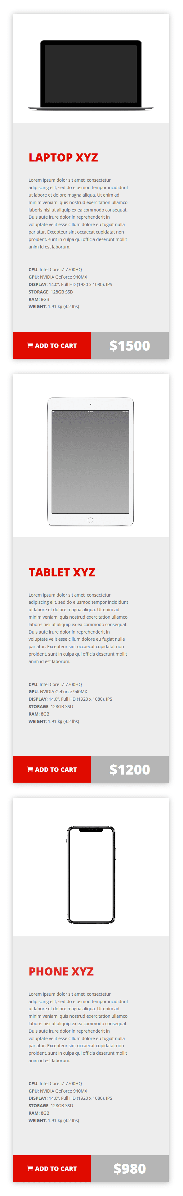
Now, before we dive into the tutorial, let’s take a quick look at the products sections that we’ll recreate within this tutorial and what they look like on different screen sizes.
On Desktop
On Tablet
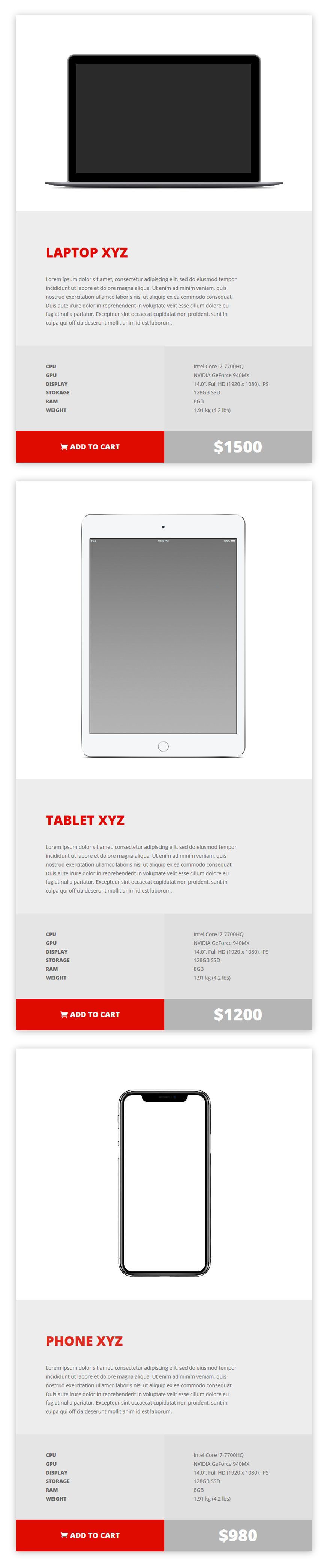
On Phone
Subscribe To Our Youtube Channel
Approach
- An entire section is dedicated to one product
- To create multiple products on a page, a section can be cloned and modified (add as many product sections to a page as you want)
- For each product section, we’re using three rows with different column structures
- We’re removing the space between the rows to create a coherent result
- Each Add to Cart button will have a unique link that matches the product within your WooCommerce plugin
- After clicking on the Add to Cart button, the item will immediately be added to the visitor’s cart (without being redirected to the actual product page)
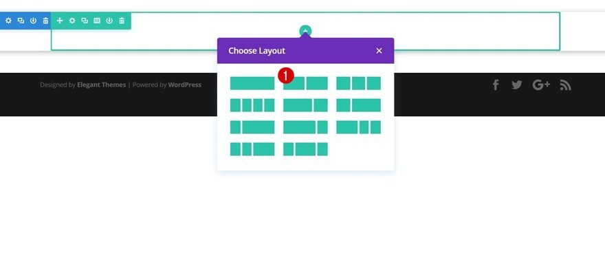
Add New Standard Section
Spacing
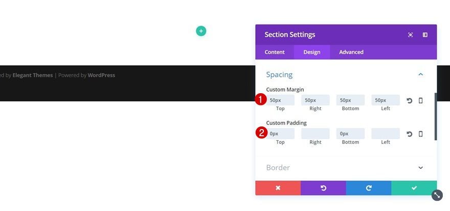
Open an existing page or create a new page and add a new standard section. Open the section settings, go to the Design tab and add the following margin and spacing:
- Top, Right, Bottom & Left Margin: 50px
- Top & Bottom Padding: 0px
We’re adding the margin so the box shadow (which we’ll add in the next step) will show up on the page. The zero top and bottom padding are needed to remove all the space between the top and bottom of the section and the rows that will be added later in this tutorial.
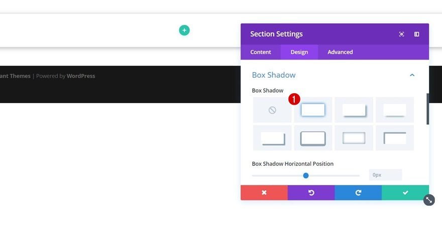
Box Shadow
Open the Box Shadow subcategory next and select the first option. You can modify the box shadow according to your needs but for this example, we’re using the default settings.
Add Row #1
Row Settings
Column Structure
Once you’re done with the section settings, go ahead and add the first row using the following column structure:
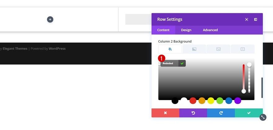
Column 2 Background Color
Without adding any modules yet, open the row settings and add ‘#ededed’ as the background color of the second column.
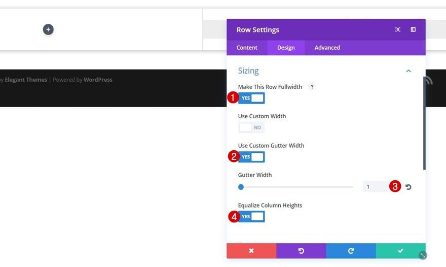
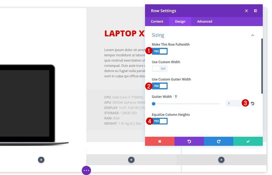
Sizing
Move on to the Design tab, open the Sizing subcategory and apply the following settings:
- Make This Row Fullwidth: Yes
- Use Custom Gutter Width: Yes
- Gutter Width: 1
- Equalize Column Heights: Yes
This will remove all of the left and right space between the row and the section.
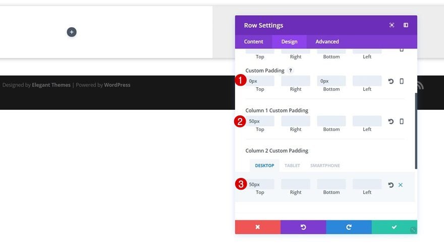
Spacing
We’ll also need to remove the top and bottom space between the row, the section and the rows that are to follow. Open the Spacing subcategory and apply the following settings:
- Top & Bottom Padding: 0px
- Column 1 Top Padding: 50px
- Column 2 Top Padding: 50px
- Column 2 Bottom Padding: None (Desktop), 50px (Tablet), 20px (Phone)
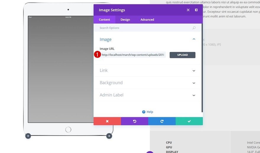
Add Image Module to Column 1
Image Requirements
The next step is adding an Image Module to the first column. Make sure you’re using a product image with either a transparent background color or the same color as the column 1 background color of your row.
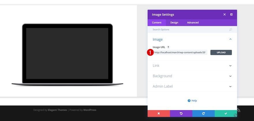
Upload Image
Once you add the Image Module, upload the product image.
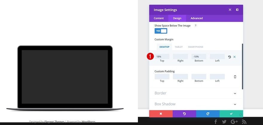
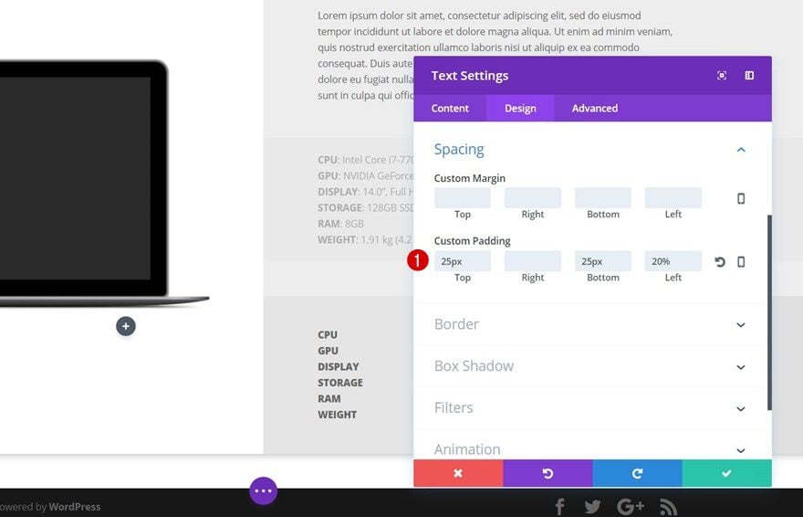
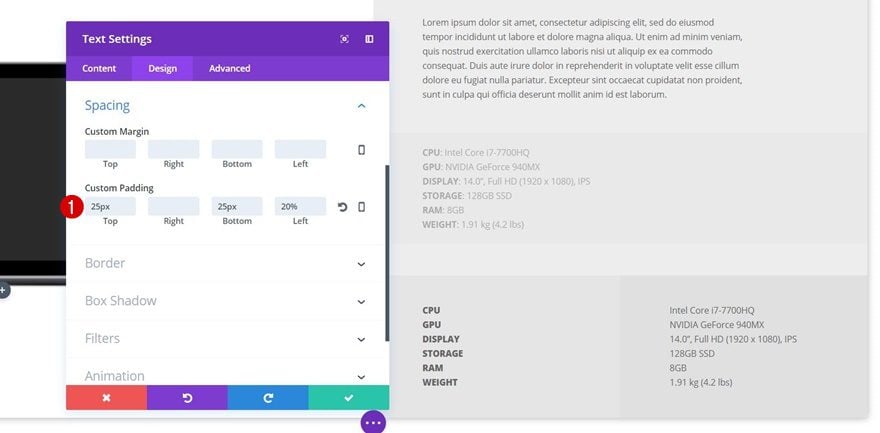
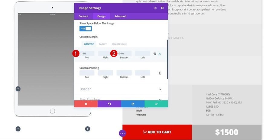
Spacing
Move on to the Design tab, open the Spacing subcategory and apply the following custom margin:
- Top: 18% (Desktop), 0px (Tablet & Phone)
- Bottom: -10% (Desktop), 0px (Tablet & Phone)
These values depend on the product image you’re using. You’ll have to experiment with these values after adding all of the rows to make sure the image appears centered among all rows that are to follow. The negative bottom margin allows your image to overlap the other rows.
Add Text Module #1 to Column 2
Text Settings
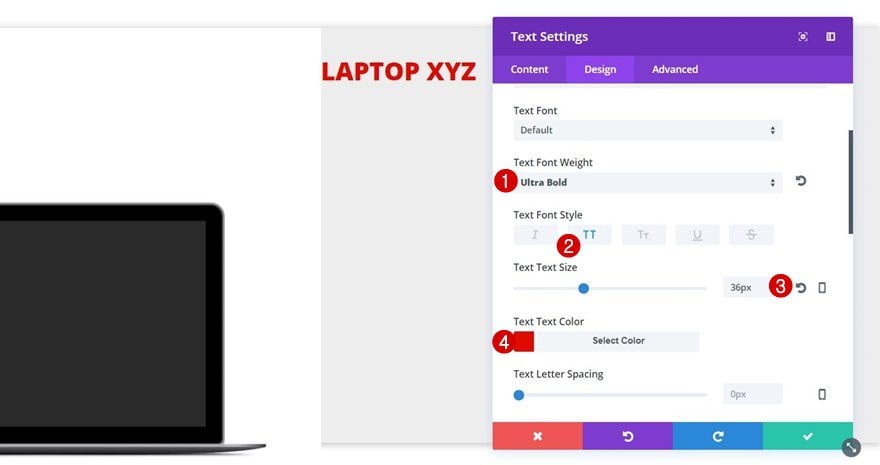
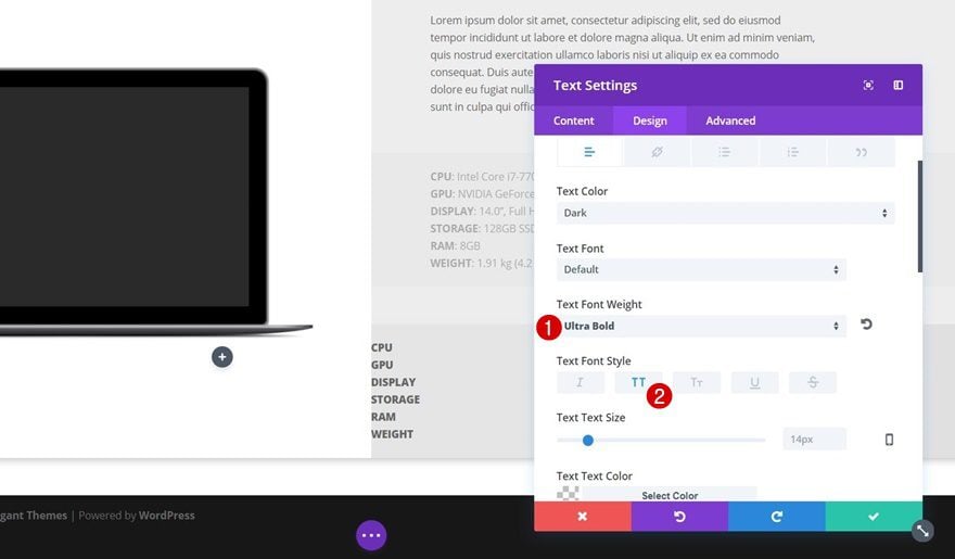
The only thing needed within the first column is the Image Module we’ve added in the previous step. We can now start adding the different Text Modules to the second column. Add a first Text Module containing the product name and apply the following text settings to it:
- Text font Weight: Ultra Bold
- Text Font Style: Uppercase
- Text Size: 36px
- Text Color: #e00b00
Spacing
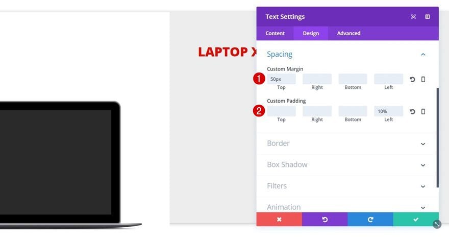
To create some left and top space for the Text Module, apply the following settings to the Spacing subcategory:
- Top: 50px
- Left: 10%
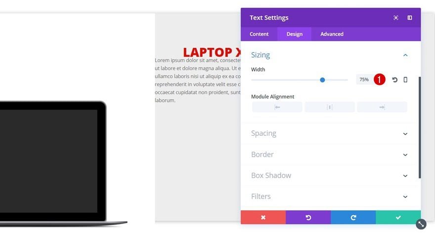
Add Text Module #2 to Column 2
Text Settings
Add the description of your product in a second Text Module and modify the text settings according to your preferences. The text in the example doesn’t include any changes.
Sizing
We are, however, going to modify the Width within the Sizing subcategory. Instead of ‘100%’, use ‘75%’.
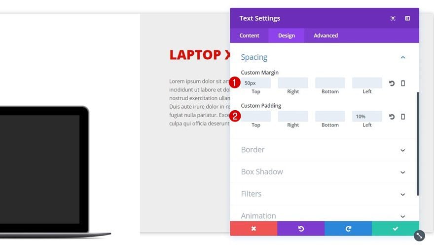
Spacing
For this Text Module, we’re also creating some left and top space by using the following settings:
- Top Margin: 50px
- Left Padding: 10%
Add Text Module #3 to Column 2
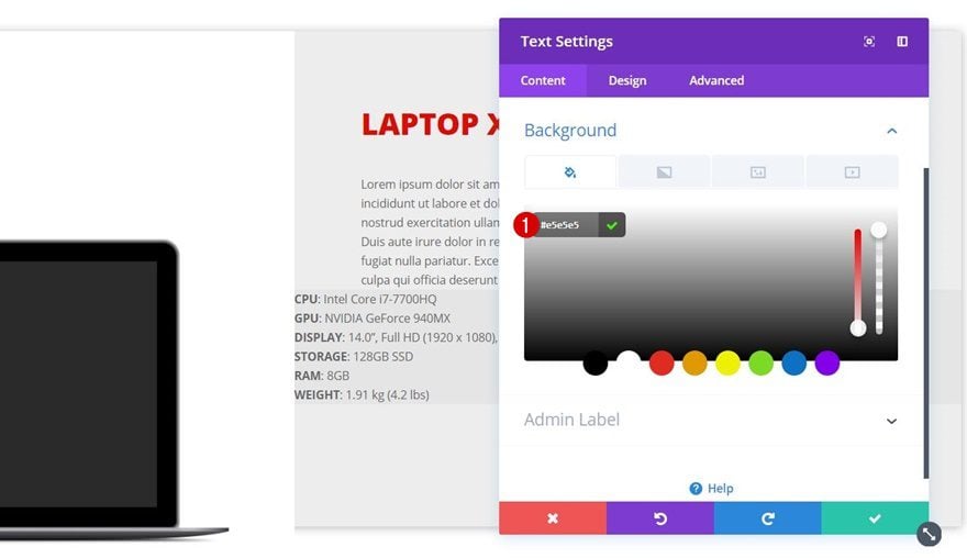
Background Color
The last Text Module within this column includes certain specifications of your product that you’d like to share with your visitors/customers. We’re using this Text Module on phone only since we’ll be creating a separate row and appearance for it on desktop and tablet. The desktop and tablet version we’ll be creating isn’t mobile-friendly, that’s why we’re using this alternative instead. Start by adding a new Text Module and use ‘#e5e5e5’ as its background color.
Text Settings
Besides making the specs titles bold, we’re keeping the default text settings of this Text Module. Of course, feel free to modify these to your needs.
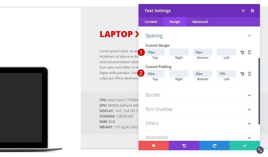
Spacing
We do want to create some space for this Text Module as well by going to the Spacing subcategory and applying the following margin and padding:
- Top & Bottom Margin: 50px
- Top & Bottom Padding: 20px
- Left Padding: 10%
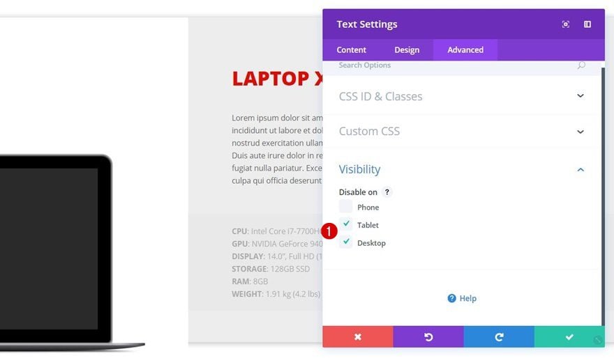
Visibility
As mentioned before, we want this Text Module to appear on phone only. Go to the Advanced tab, open the Visibility subcategory and disable this Text Module on tablet and desktop.
Add Row #2
Row Settings
Column Structure
Now that we’ve finished the first row, go ahead and add a second row right below it containing the following column structure:
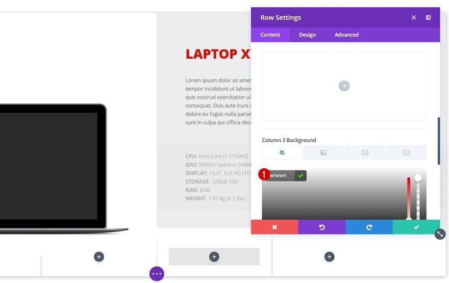
Column 3 Background Color
Before adding any modules to this row, open the row settings and use ‘#e5e5e5’ as the background color for the third column.
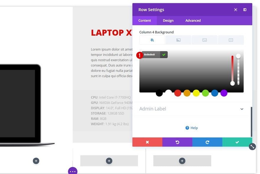
Column 4 Background Color
Scroll down a bit, and use ‘#e0e0e0’ as the background color for column 4.
Sizing
Again, we’re removing all the distance on the left and right side of the row (and between the columns) by applying the following settings to the Sizing subcategory:
- Make This Row Fullwidth: Yes
- Use Custom Gutter Width: Yes
- Gutter Width: 1
- Equalize Column Heights: Yes
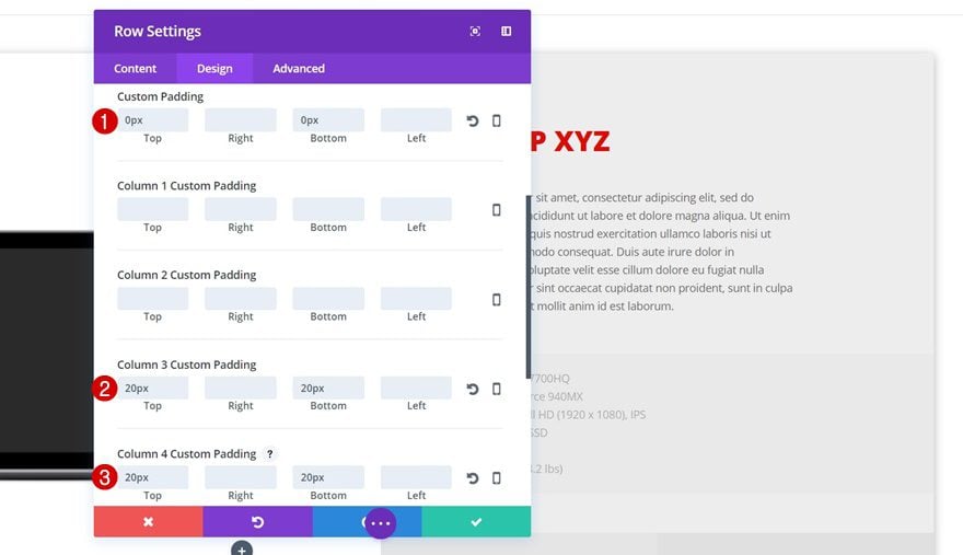
Spacing
We’ll remove the top and bottom space as well and we’ll add some space to each column by using the following settings in the Spacing subcategory:
- Top & Bottom Padding: 0px
- Column 3 Top & Bottom Padding: 20px
- Column 4 Top & Bottom Padding: 20px
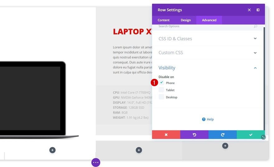
Visibility
This row will contain the specifications of your product. Since we’ve created a mobile-friendly alternative in the previous row, we’re going to disable this entire row for phone within the Visibility subcategory of the Advanced tab.
Add Text Module #1 to Column 3
Text Settings
Add a first Text Module to the third column of this row containing the specifications titles. Then, go to the Design tab and apply the following settings to the Text subcategory:
- Text Font Weight: Ultra Bold
- Text Font Style: Uppercase
Spacing
We need to create some additional space for this Text Module using the following custom padding values:
- Top: 25px
- Bottom: 25px
- Left: 20%
Add Text Module #2 to Column 4
Text Settings
The Text Module within column 4 is made using the default text settings. Again, feel free to modify these text settings according to your needs.
Spacing
We’ll create the space for this Text Module as done for the Text Module in the third column:
- Top Padding: 25px
- Bottom Padding: 25px
- Left Padding: 20%
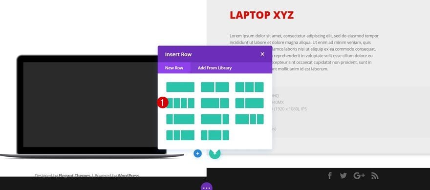
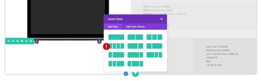
Add Row #3
Row Settings
Column Structure
The last row for this sections contains the price and call to action. To create this row, we’re going to use the following column structure:
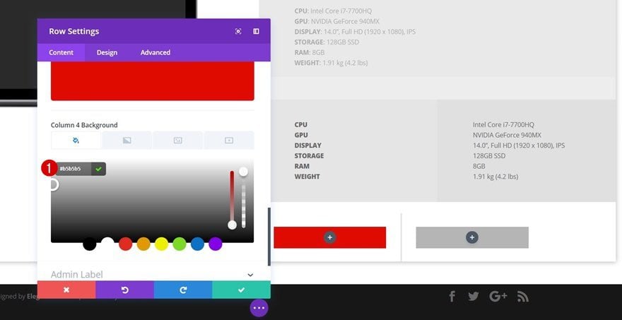
Column 3 Background Color
Without adding any modules to this row yet, open the row settings and use ‘#e00b00’ as the third column background color.
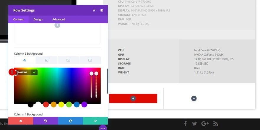
Column 4 Background Color
Likewise, use ‘#b5b5b5’ as the background color for column 4.
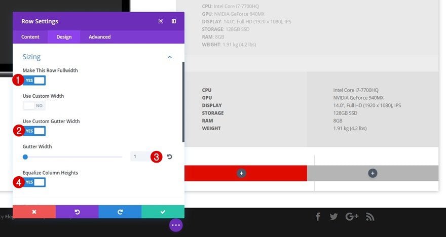
Sizing
We’ll remove the space between this row, the columns and the left and right side of the section by applying the following Sizing settings:
- Make This Row Fullwidth: Yes
- Use Custom Gutter Width: Yes
- Gutter Width: 1
- Equalize Column Heights: Yes
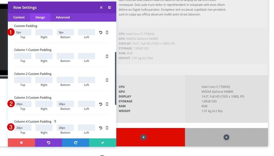
Spacing
Likewise, we’re going to remove the space between this row, the previous row and the bottom of the section. We’ll also create some additional padding for column 3 (containing the CTA) and column 4 (containing the price):
- Top & Bottom Padding: 0px
- Column 3 Top & Bottom Padding: 20px
- Column 4 Top & Bottom Padding: 20px
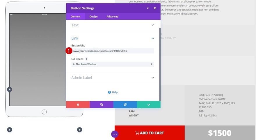
Button Link
Now that the row settings are done, we can start adding the modules to our columns. Start by adding a Button Module to the third column. This Button Module will allow visitors to immediately add a product to their cart without having to go to the product page. Add the following link to the Button URL option:
- www.yourwebsite.com?add-to-cart=PRODUCTID
Obviously, you’ll have to use your own websites URL for this.
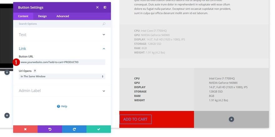
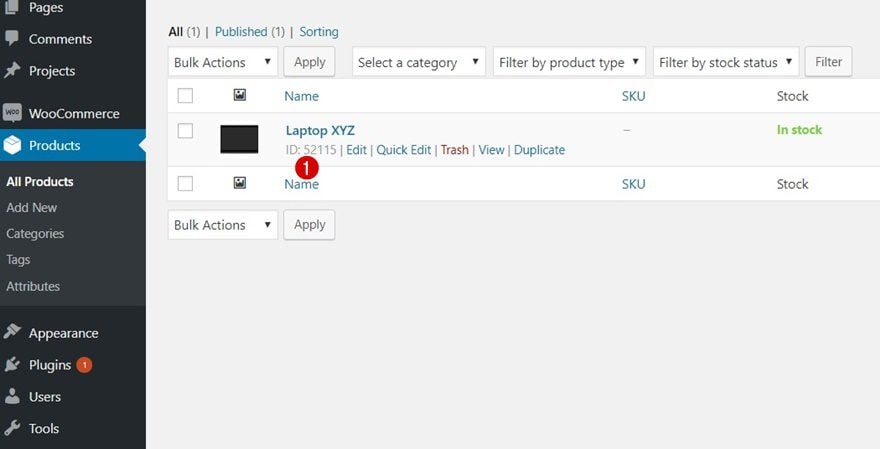
And replace the ‘PRODUCTID’ at the end of the URL with the right product ID. You can find a product ID by navigation to your WordPress Dashboard > Products > All Products > Hovering the right product & you’ll see the ID number appear.
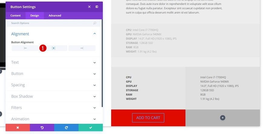
Button Alignment
Once that’s done, you can open the Design tab of the Button Module and enable center Button Alignment.
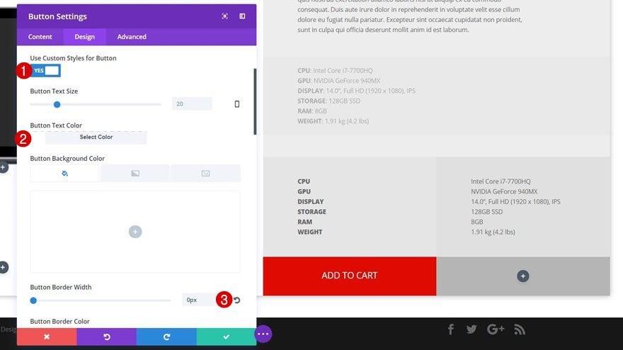
Button Settings
Continue by opening the Button subcategory and apply the following settings to it:
- Use Custom Styles for Button: Yes
- Button Text Color: #FFFFFF
- Button Border Width: 0px
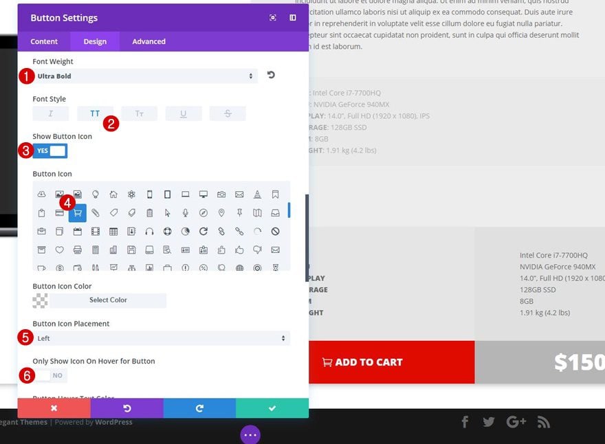
- Font Weight: Ultra Bold
- Font Style: Uppercase
- Show Button Icon: Yes
- Button Icon: Select Cart Icon
- Button Icon Placement: Left
- Only Show Icon on Hover for Button: No
Add Text Module to Column 4
Text Settings
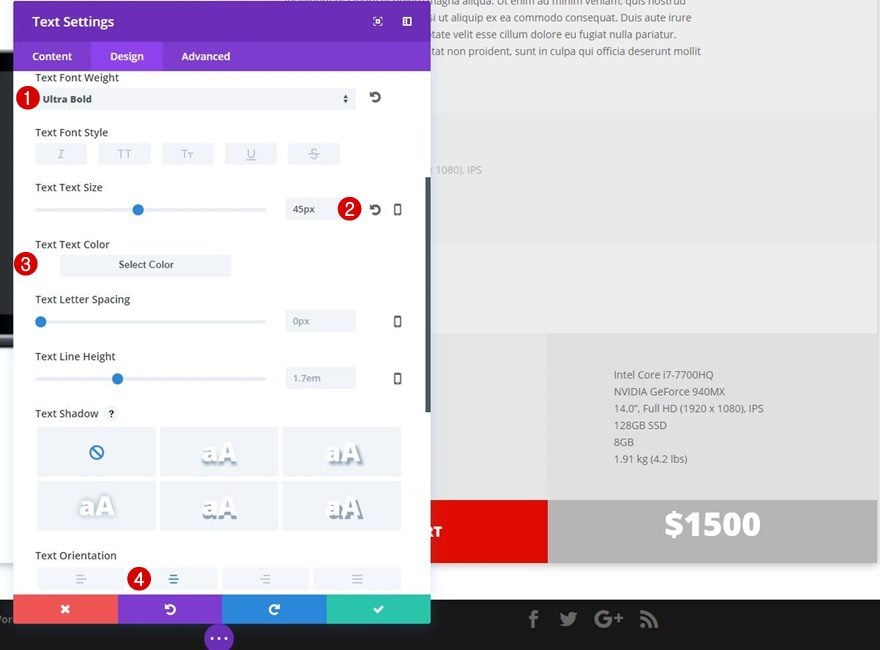
Lastly, add the price Text Module to the fourth column of the row and apply the following text settings to it after adding the price:
- Text Font Weight: Ultra Bold
- Text Size: 45px
- Text Color: #FFFFFF
- Text Orientation: Center
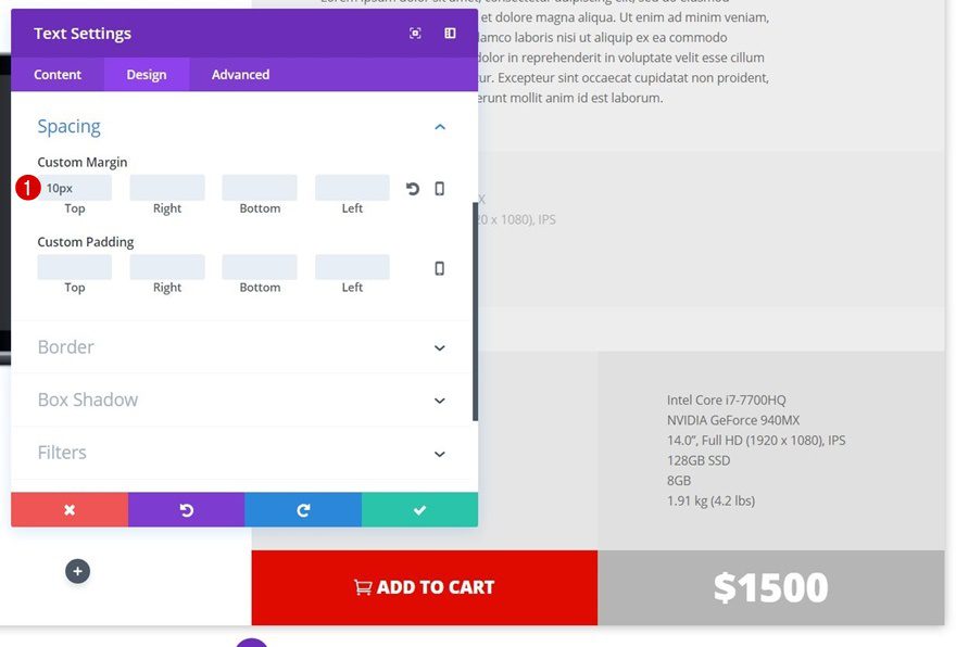
Spacing
We’ll need to add some top margin of ’10px’ to the Button Module as well, to make sure it’s on the same height as the Button Module is.
Clone Section According to Number of Products
Change Images
For each section you clone, you’ll need to modify the product image.
Adjust ImageTop & Bottom Padding According to Image
Depending on the dimensions of your image, you’ll also need to modify the top and bottom margin. These values totally depend on your image. You’ll have to play around with the values until you see the product image being centered between all rows.
Modify Add to Cart Link
And, of course, you’ll also need to modify the link of each Button Module according to the product it represents. That’s it!
Result
Let’s take a final look at the result we’ve recreated within this blog post on different screen sizes.
On Desktop
On Tablet
On Phone
Final Thoughts
In this tutorial, we’ve shown you how to create product sections with functioning Add to Cart buttons using Divi’s built-in options only. You can create whichever design you want, without having to focus on WooCommerce product pages only using this method. If you have any questions or suggestions; make sure you leave a comment in the comment section below!


Help! For some reason my buttons add qty 2 to the cart every time. I thought I had fixed it, but just noticed it is still happening!
Where you describe about changing woo button styles? Is there easy way to match woo style button with theme style button?
The tutorial was really great, but I have a question: before adding the product to the Cart, how do you select the quantity for the product in the Cart? I found the tutorial really helpful and plan on using it as soon as I can have a setting for the quantity. This Divi page can be SO much better than the standard Woocommerce one and I look forward to using it.
Great tutorial, with great ideas. Thank you so much !
Thanks for sharing this. It’s really quite inspiring.
Does anyone have a thought on how to display multiple images cleanly?
I’ve tried the Gallery (not great) and the slider (Better, but the user can’t see multiple images).
Ok, so I found a way! I wasn’t using the Gallery properly. It’s a great tool combined with the rest of this tutorial.
Hey Girlfriend!
You Always come up with the Greatest & Coolest stuff! Thanks so much for taking the time to share it all.
Hi Donjete,
This is absolutely fantastically sensational.
As others have already mentioned, the little trick of button url being http://www.yourwebsite.com?add-to-cart=PRODUCTID has opened up a gazillion possibilities for me and others reading this article. The added extra infor you have shown is some serious sprinkles on icing on the amazing divi cake.
Thank you sooooooooooo much 🙂
I forgot to mention, I didn’t know this could be done, the thought had never occurred to me, I was always focused on Woo Commerce and how bland the product layout or display was within the Woo Commerce plugin. Any more ideas or suggestions from you about making products display better with Divi, just like this are very welcome. It’s such an awesome way to make product displays look great. Thank you once again 🙂
Hi Liz, you’re very welcome & I’ll keep the request in mind 🙂
Thank you so much for these ideas and the tutorial on how to do it, It’s really appreciated Donjette. XXX 🙂
Hi, Donjete Vuniqi!
This is fantastic, these methods for how to create this unique page also enable me to do some other interesting things, thank you so much for sharing your amazing skills!
You’re welcome, Matthew! 🙂
Great post Donjete, indeed.
Question:
Now that we have successfully created a stunning product page…. what happens to the standard woocommerce one? It needs to be active or the product can’t be purchased…. but we don’t want users to see that ugly layout anymore.
Should we simply redirect users going to http://website.com/woocommerce-default-url to http://website.com/our-stunning-layout-we-just-created-thanks-to-Donjete ?
Thanks for your kind feedback!
M
Hi Mic, that’s indeed something you can do. The default product pages will still exist (and will be linked to in the cart/checkout). So, it’s not a 100% product page alternative but it helps to have a more appealing design for first interactions on your shop page.
Hi Donjete,
Thank you for the great tutorial 🙂 I agree with Logan above – the (www.yourwebsite.com?add-to-cart=PRODUCTID) trick is great to know. I can see how this tutorial works for a simple product but would you know any way how to display product variations as well?
Kind regards,
Neil.
Hi Neil, you’re welcome! And that’s a great question. The first approach that pops into my mind is hiding/showing sections on click; once ‘color #1’ product variation is clicked on, that section becomes active and the other color product sections become hidden. This would require a product section for each one of the variations and some jQuery code though.
Donjete, beautiful work … thanks for sharing, finally a different design to the common woocommerce ..
You’re very welcome, Agustin!
In fact could be used as both prototype and imported template for woo commerce custom template.
It’s a great solution to improve the look & feel of your e-commerce and for me, add the product id to the url it’s new. ¡That was great!
I don’t want to sound ungrateful, but sadly that’s a temporal solution. It would be great to give great style to the product page with the divi theme.
Thanks Raul! Let’s hope that possibility will soon come knocking at our door.
It’s a great solution to improve the look & feel of your e-commerce and for me, add the product id to the url it’s new. ¡That was great!
I don’t want to sound ungrateful, but sadly that’s a temporal solution. It would be great to give great style to the product page with the divi theme.
Is there an ElegantThemes referral program?
Hi Christina, we don’t have a referral program at the moment.
Hi, Donjete Vuniqi
its outstanding layout for woocommerce product page
Thanks
ersonusaini
Thanks for the feedback! 🙂
Looks great! Thank you!
Anytime 🙂
providing a great deal of knowleadge thankyou very much
You’re welcome, Sachin!
use something like the Woo Layout Injector plugin here and hook up this layout to woocommerce very easily.
Sounds like a great next step for this tutorial!
Learning this trick alone (www.yourwebsite.com?add-to-cart=PRODUCTID) was worth the read! Thank you!
Good to hear & you’re welcome, Logan!
Another useful tutorial, one I am going to run trough on my testing site for ideas.
I see complaints that the layout pack are all starting to look the same. People need to realise that the layout packs are suggestions and can look the same as they are coming from the same in-house style. You can use them as is or the foundation for something else.
Personally I find the useful for learning new design concepts. Just getting really comfortable using Divi and now expanding my skills in terms of what I can do with it design wise. Just doing Kenny SIng’s tutorial article from Divi 2.4 (in Divi 3) on using image content blended into section backgrounds and it’s these simple design concepts that are really valuable:
https://www.elegantthemes.com/blog/resources/exploring-divi-2-4-a-free-layout-pack-built-from-everything-weve-learned-in-the-divi-2-4-blog-series
Might be a good one to re-publish with up to date instructions for Divi 3 (or Divi 4, Nick is going to surprise us soon with that isn’t he?)
All that being said and, being Devil’s advocate, why not, as was mentioned on Monday, publish some open submissions, subject to scrutiny of course and maybe by competition:
https://www.elegantthemes.com/blog/divi-resources/get-a-free-delightful-tea-shop-layout-for-divi#comment-wrap
Something like this would really promote the potential of Divi.
Anyway. Glad I went for lifetime licensing. Great value for money with all the tips and tricks.
Glad to have you as part of the community! Thanks for the suggestions as well.
Can you make this downloadable so we do not have to recreate this from scratch thank you very much
Mooooooooo!
don’t be so ridiculously lazy. Do the work, learn how to do it.
Agree! Its 15 minutes!
Donjete, beautiful work … thanks for sharing, finally a different design to the common woocommerce ..
thank you for posting this. Any chance of downloading these?