
When trying to convince visitors to reach out through your website, giving them the right incentives is key. When thinking of incentives, clear and irresistible calls to action pop into mind right away. But CTAs are usually the last part of the acquisition process. You’ll most likely build your way there by showing your company’s worth. One of the best ways to do that is by sharing your approach and unique value proposition. If you’re searching for a smooth way to design your approach, you’ll love this tutorial. Today, we’ll show you how to include different sticky steps that change while people are scrolling and reading. You’ll be able to download the JSON file for free as well!
Let’s get to it!
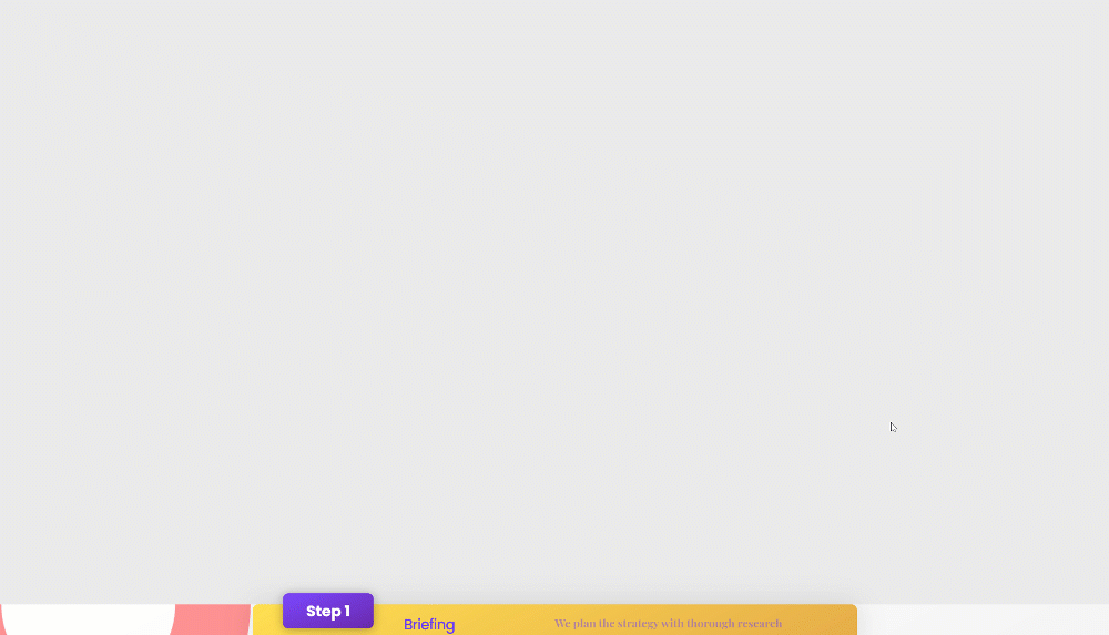
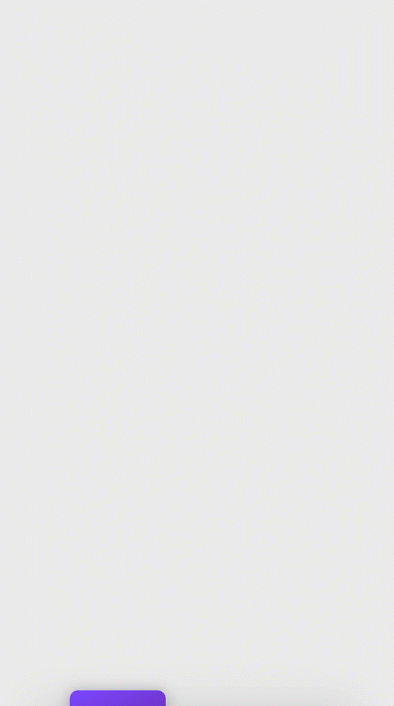
Preview
Before we dive into the tutorial, let’s take a quick look at the outcome across different screen sizes.
Desktop
Mobile
Download The Sticky Steps Layout for FREE
To lay your hands on the free sticky steps layout, you will first need to download it using the button below. To gain access to the download you will need to subscribe to our newsletter by using the form below. As a new subscriber, you will receive even more Divi goodness and a free Divi Layout pack every Monday! If you’re already on the list, simply enter your email address below and click download. You will not be “resubscribed” or receive extra emails.

1. Create Section Design
Add Regular Section
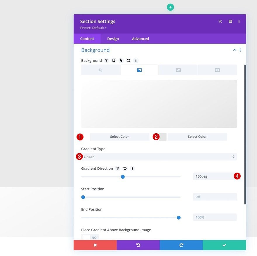
Gradient Background
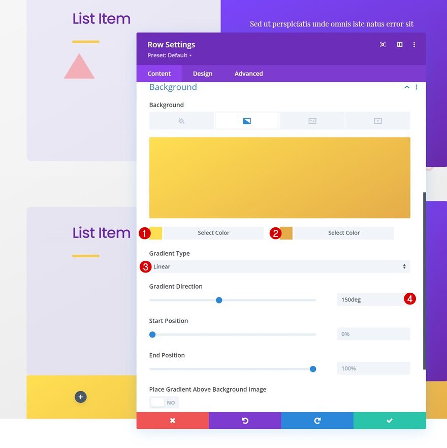
Start by adding a new section to the page you’re working on. Open that section’s settings and apply a gradient background:
- Color 1: #ffffff
- Color 2: #e5e5e5
- Gradient Type: Linear
- Gradient Direction: 150deg
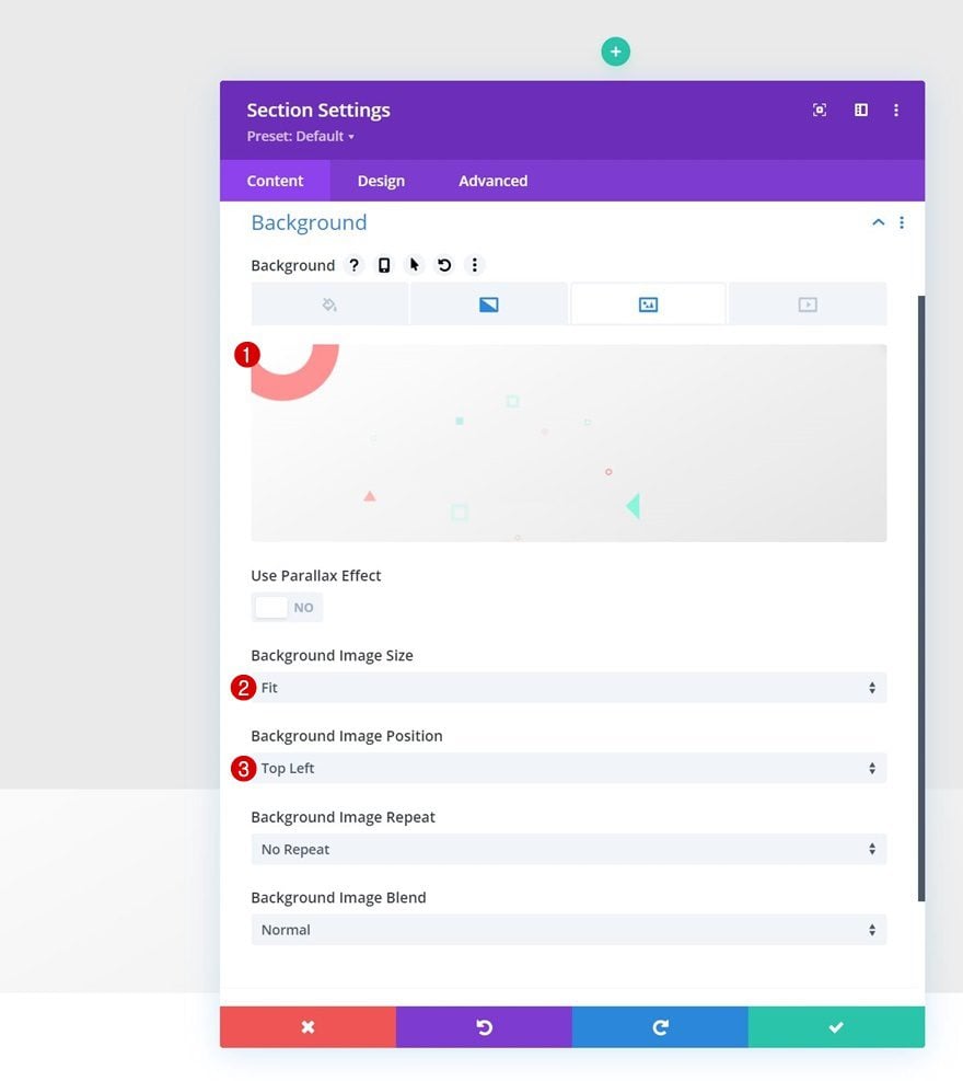
Background Image
Upload a background image next. You can find the one we’re using throughout this tutorial in the download folder that you can find at the beginning of this post. You can use the background image for free and without any restrictions.
- Background Image Size: Fit
- Background Image Position: Top Left
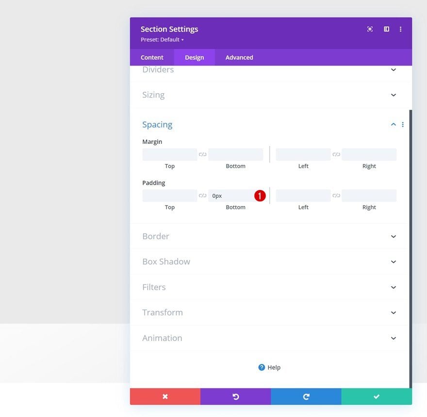
Spacing
Remove the section’s default bottom padding by adding “0px”.
- Bottom Padding: 0px
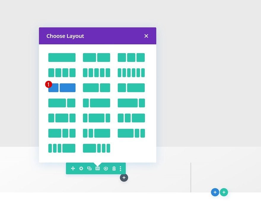
Add New Row
Column Structure
Continue by adding the first row to the section using the following column structure:
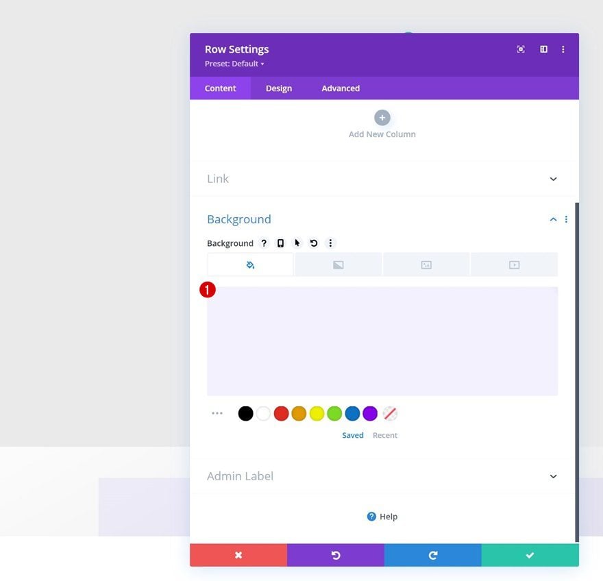
Background Color
Without adding modules yet, open the row settings and change the background color.
- Background Color: rgba(130,100,239,0.09)
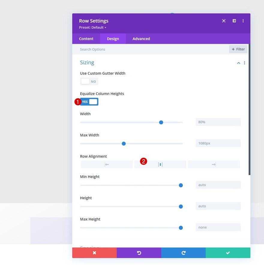
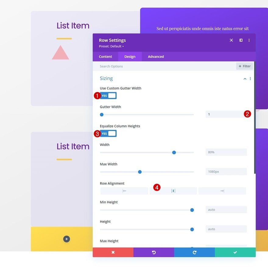
Sizing
Move on to the row’s design tab and modify the sizing settings accordingly:
- Equalize Column Heights: Yes
- Row Alignment: Center
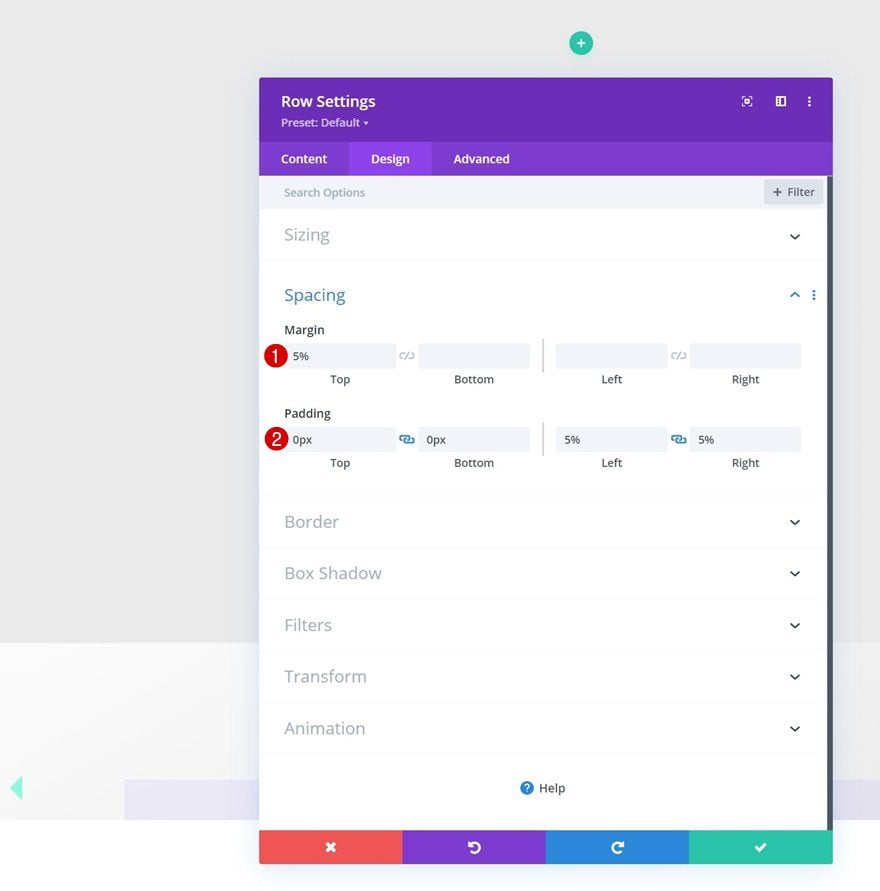
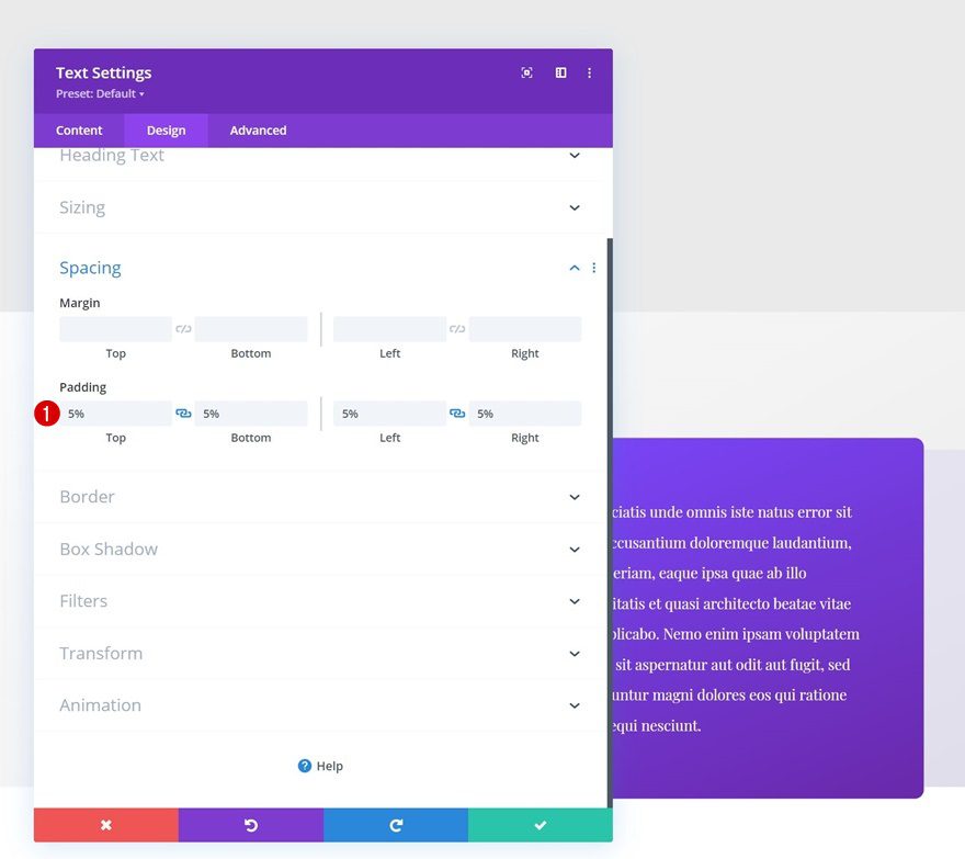
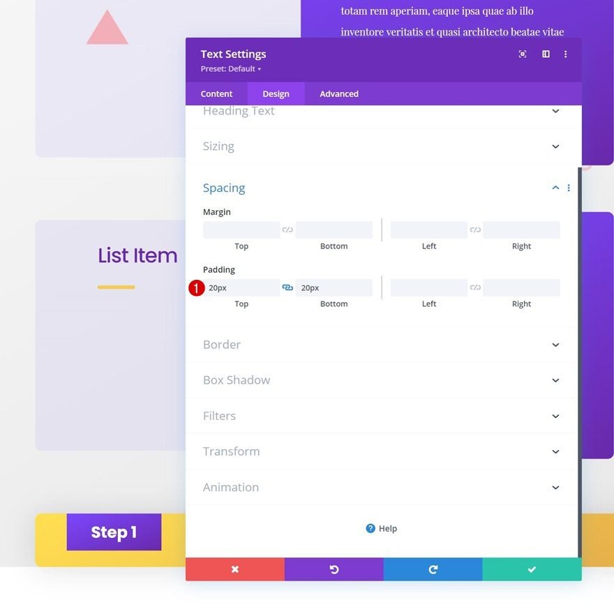
Spacing
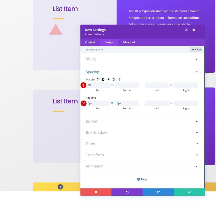
Apply some custom spacing values too.
- Top Margin: 5%
- Top Padding: 0px
- Bottom Padding: 0px
- Left Padding: 5%
- Right Padding: 5%
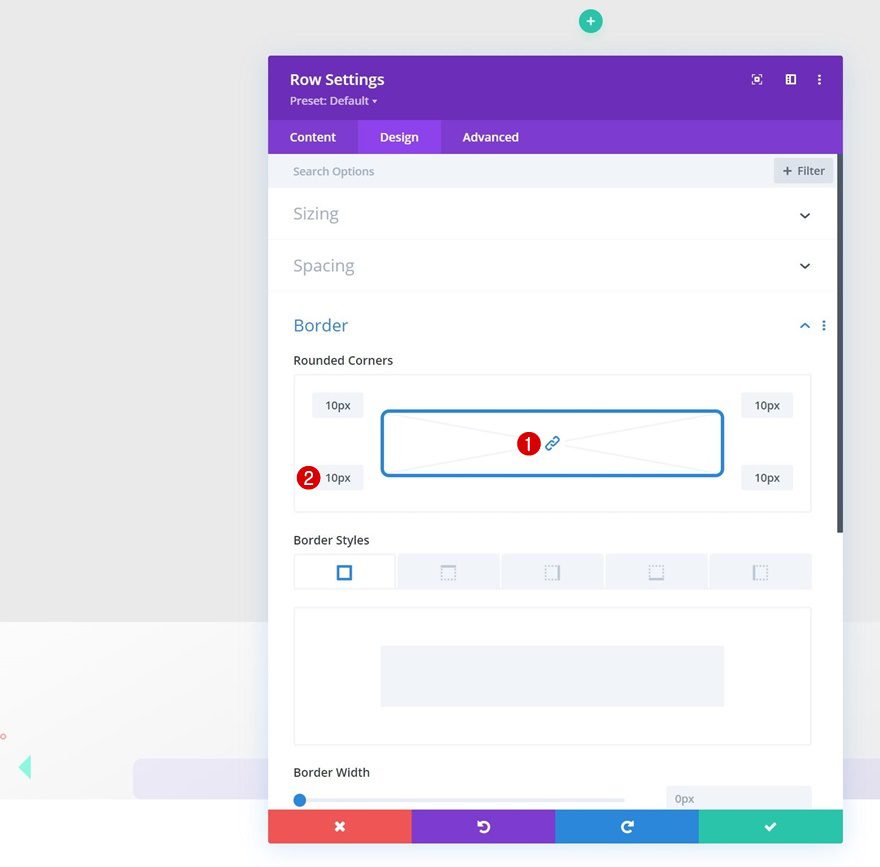
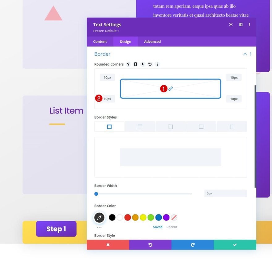
Border
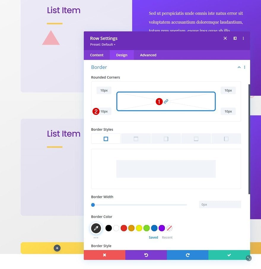
Then, go to the border settings and use some rounded corners.
- All Corners: 10px
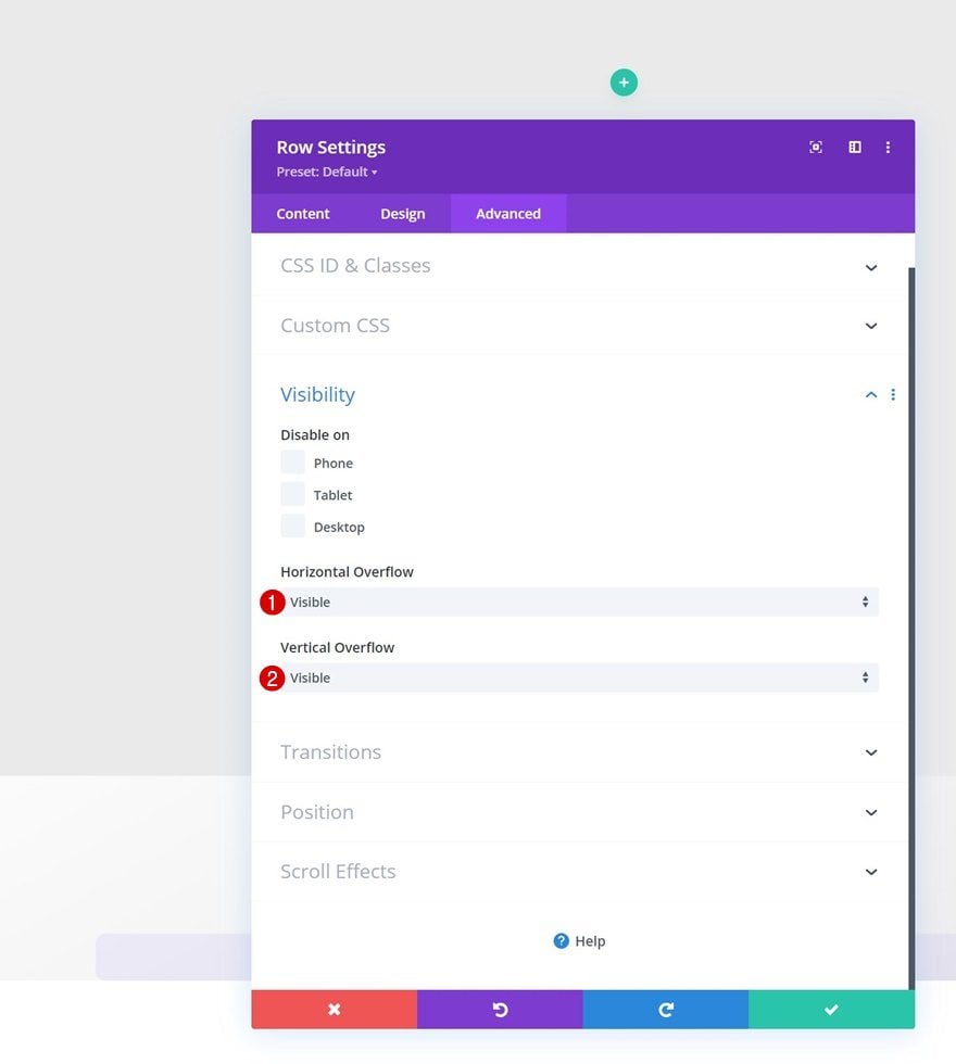
Overflows
We’re changing the row overflows to visible too. This will make sure that everything that surpasses the row container won’t be hidden.
- Horizontal Overflow: Visible
- Vertical Overflow: Visible
Column 1 Settings
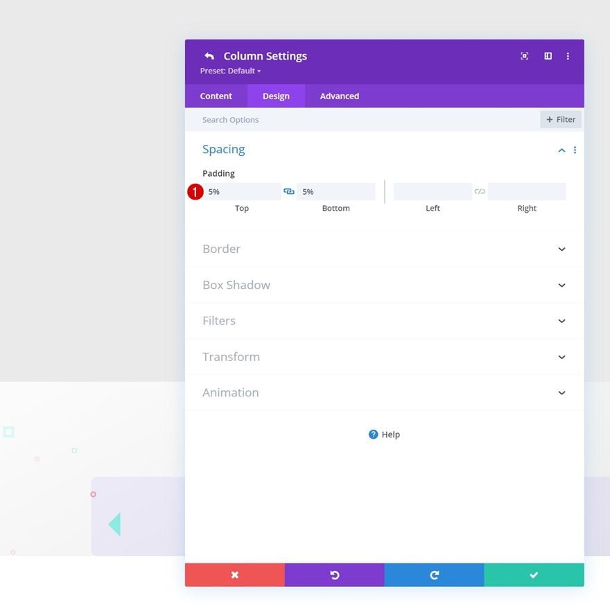
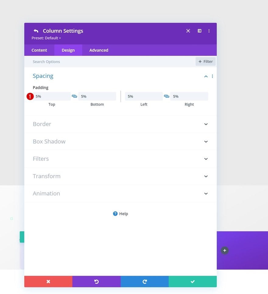
Spacing
Then, open the column 1 settings and add some custom top and bottom padding.
- Top Padding: 5%
- Bottom Padding: 5%
Column 2 Settings
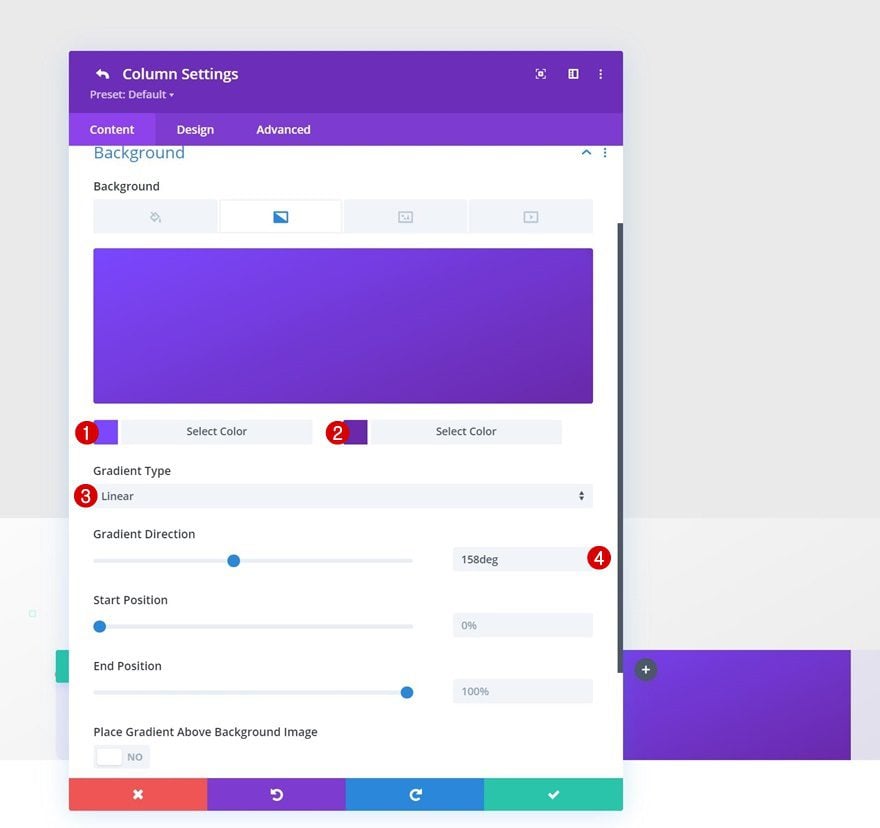
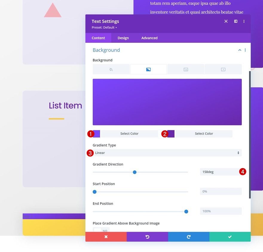
Gradient Background
Moving on, we’ll add a gradient background to column 2.
- Color 1: #7b47ff
- Color 2: #6929aa
- Gradient Type: Linear
- Gradient Direction: 158deg
Spacing
We’ll add some custom padding to that column too.
- Top Padding: 5%
- Bottom Padding: 5%
- Left Padding: 5%
- Right Padding: 5%
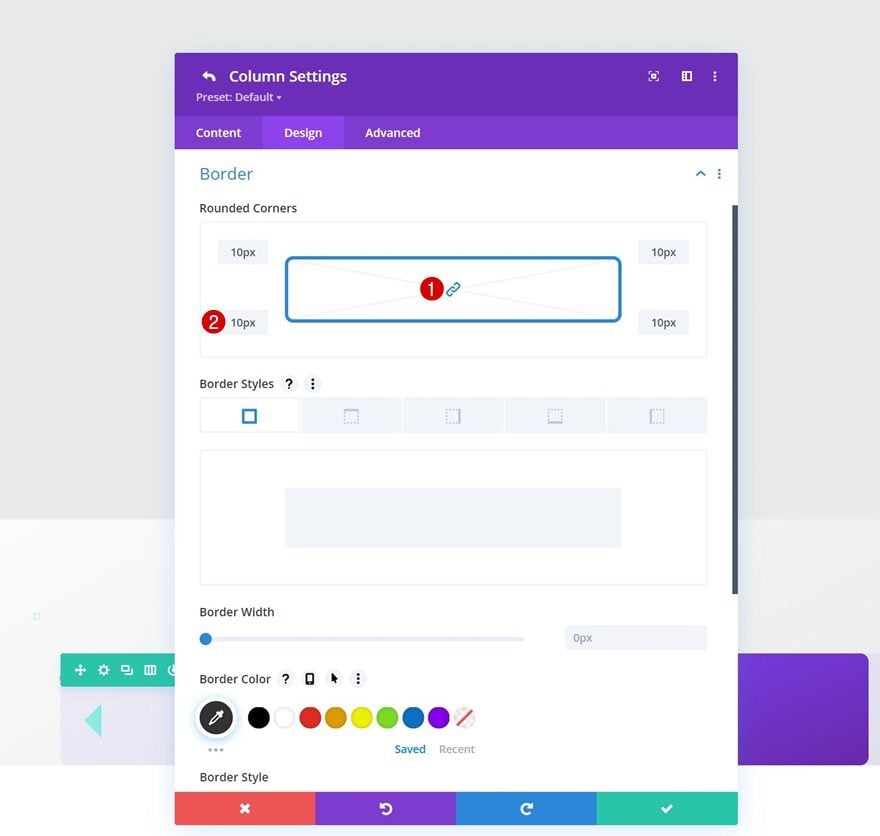
Border
Along with some rounded corners.
- All Corners: 10px
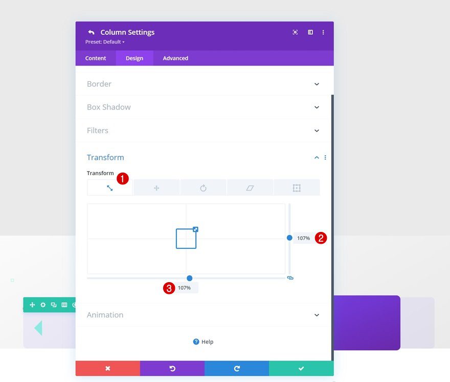
Transform Scale
And we’ll increase the column’s size in the transform settings by applying the following transform scale values:
- Both: 107%
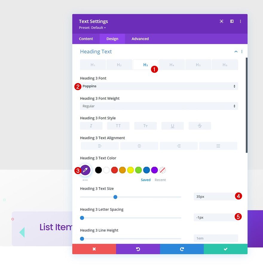
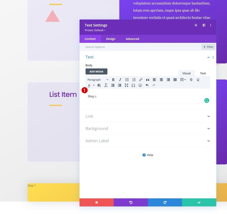
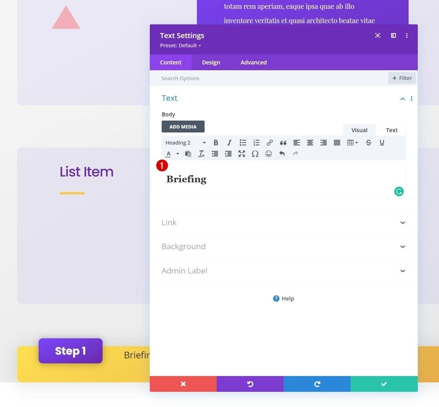
Add Text Module to Column 1
Add H3 Content
Time to add modules, starting with a Text Module in column 1. Enter some H3 content of your choice.
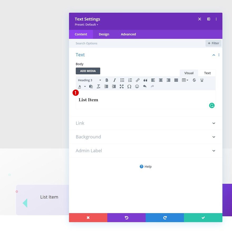
H3 Text Settings
Move on to the module’s design tab and change the H3 text settings accordingly:
- Heading 3 Font: Poppins
- Heading 3 Text Color: #6929aa
- Heading 2 Text Size: 35px
- Heading 3 Letter Spacing: -1px
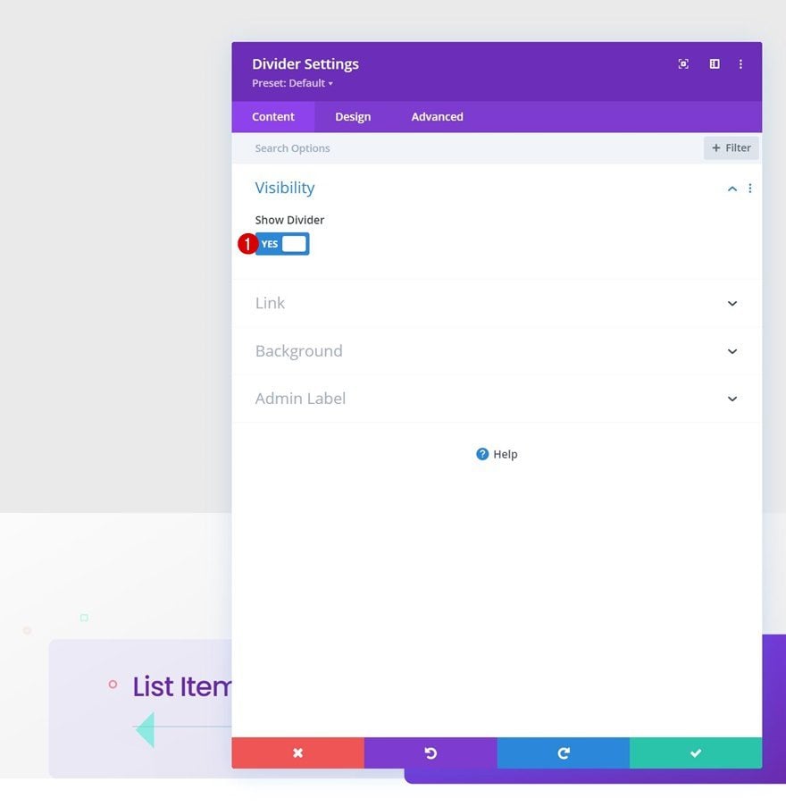
Add Divider Module to Column 1
Visibility
Next, we’ll a Divider Module to column 1. Make sure the “Show Divider” option is enabled.
- Show Divider: Yes
Line
Move on to the module’s design tab and change the line color.
- Line Color: #f5ca4e
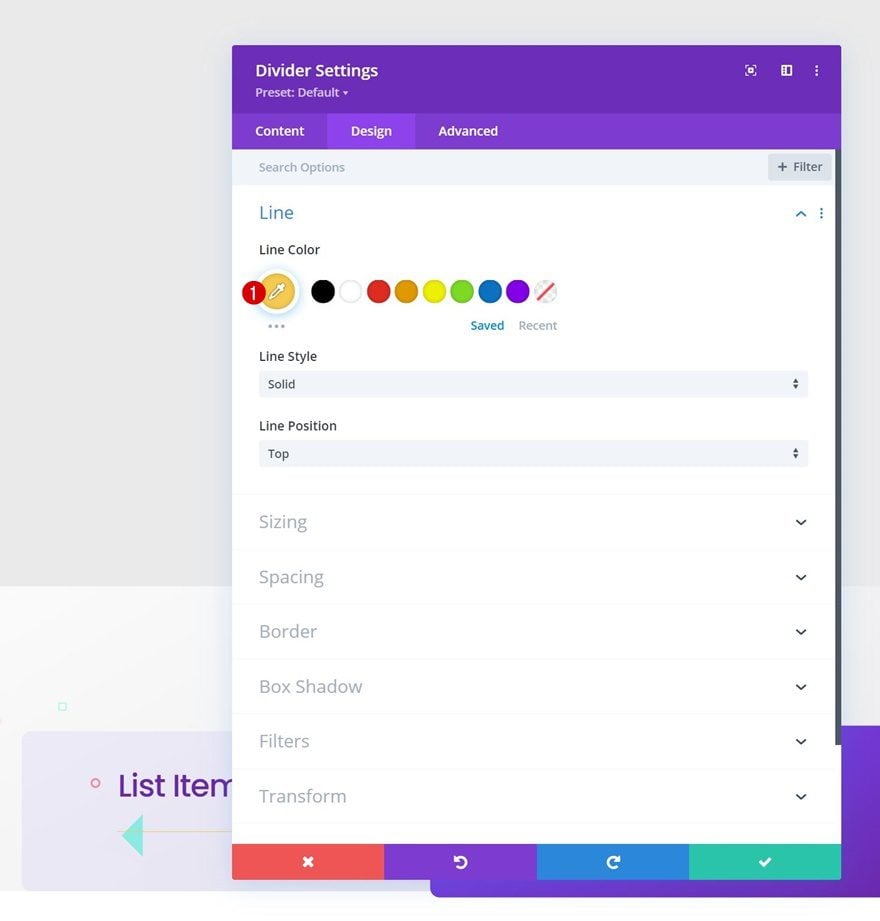
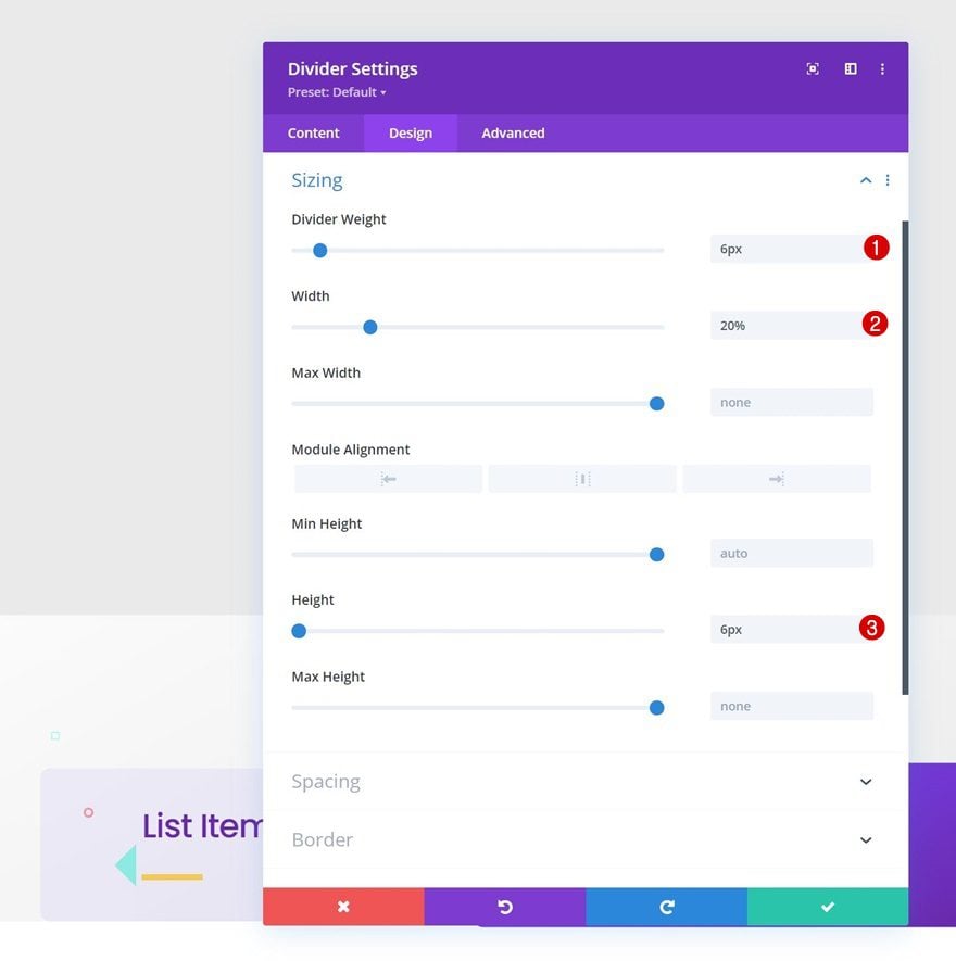
Sizing
Modify the sizing settings too.
- Divider Weight: 6px
- Width: 20%
- Height: 6px
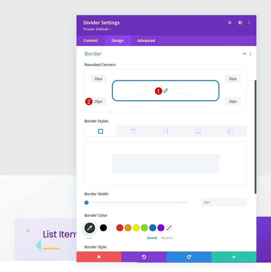
Border
Complete the module settings by including some rounded corners in the border settings.
- All Corners: 20px
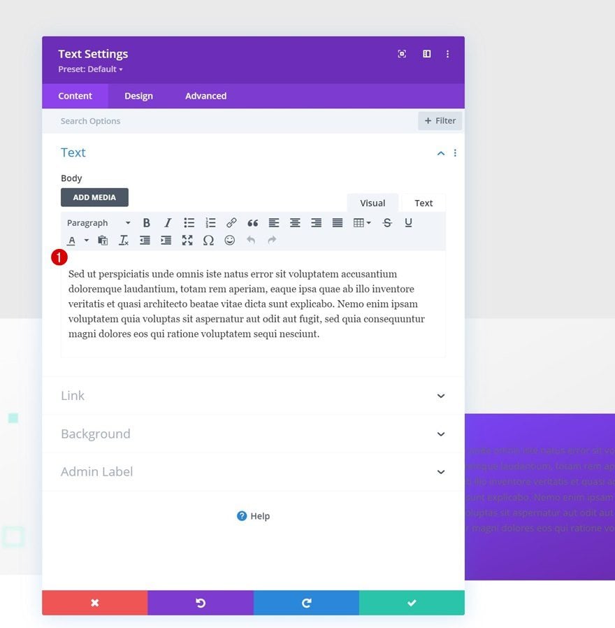
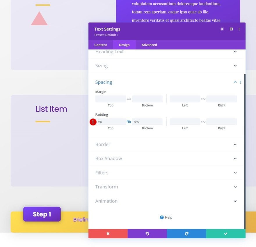
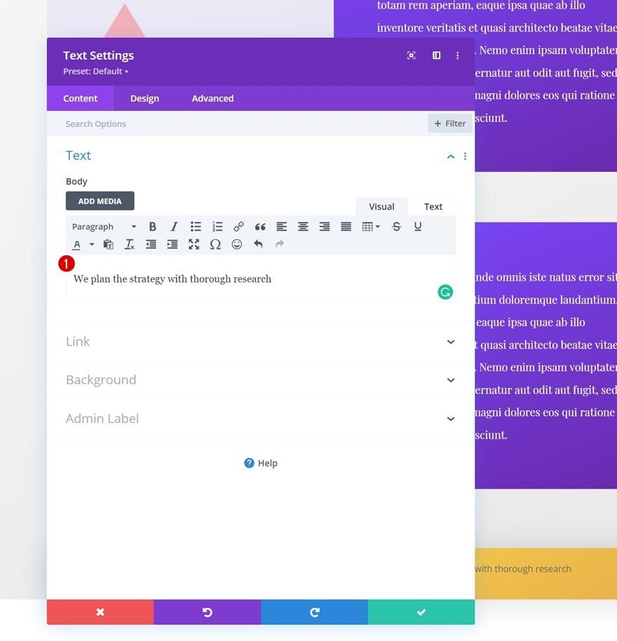
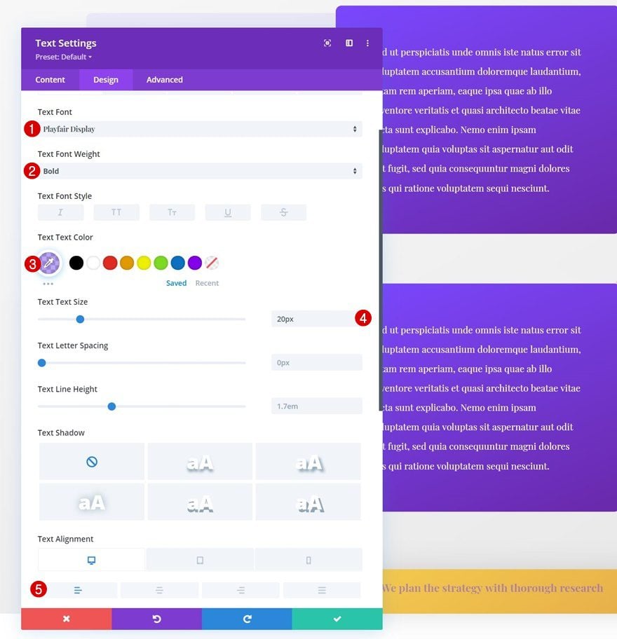
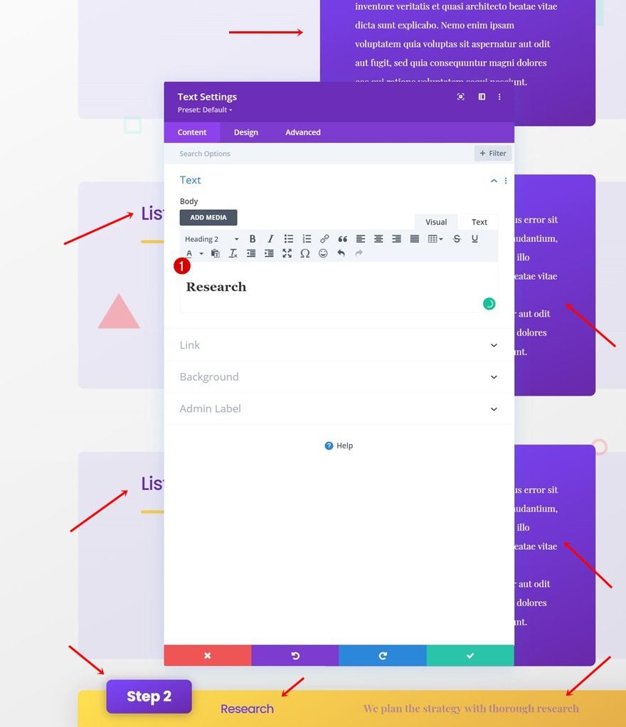
Add Text Module to Column 2
Add Content
In column 2, the only module we need is a Text Module with some description content.
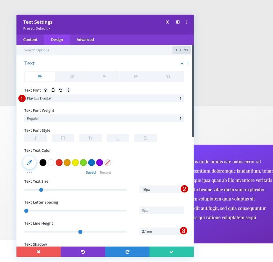
Text Settings
Move on to the module’s design tab and change the text settings as follows:
- Text Font: Playfair Display
- Text Size: 16px
- Text Line Height: 2.1em
Spacing
Complete the module settings by adding some custom padding values.
- Top Padding: 5%
- Bottom Padding: 5%
- Left Padding: 5%
- Right Padding: 5%
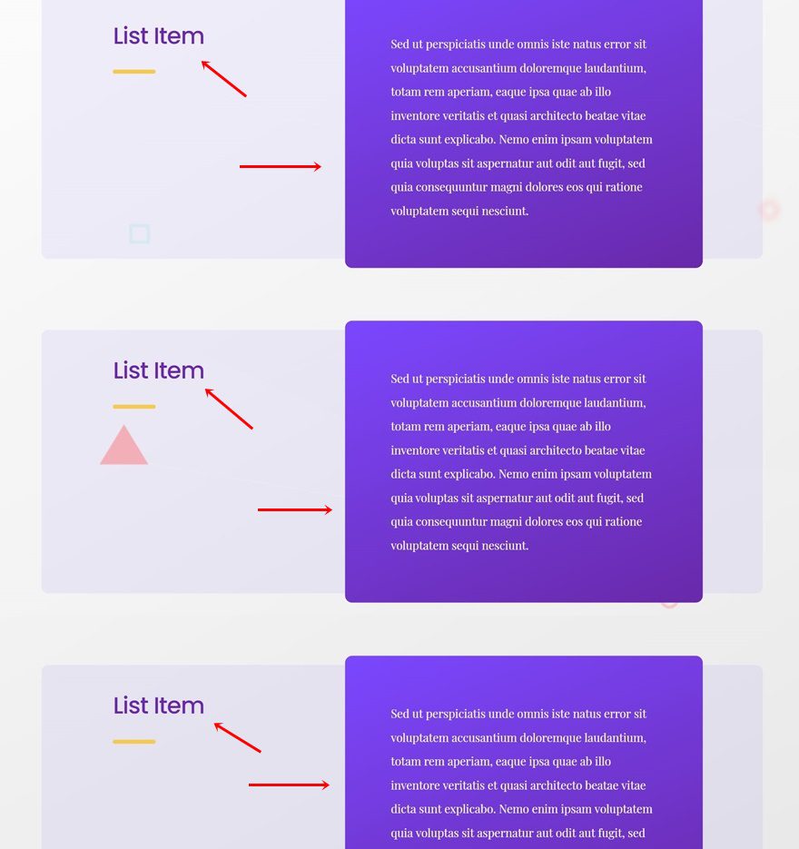
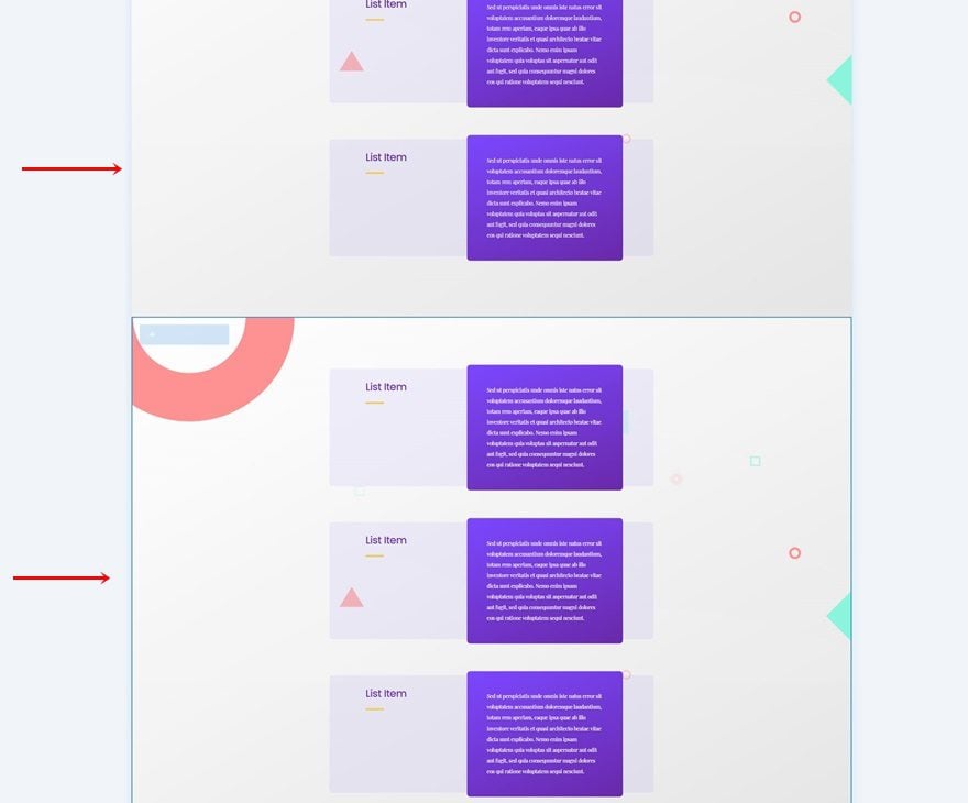
Clone Entire Row as Many Times as Needed
Once you’ve completed the first row, you can clone it up to as many times as you want, depending on how much info you want to share about your first step.
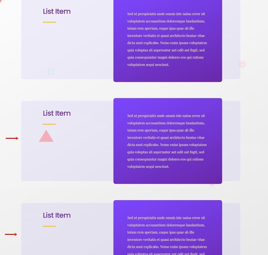
Change All Copy
Make sure you change all copy in duplicate rows.
2. Add Step Row Bar to Bottom of Section
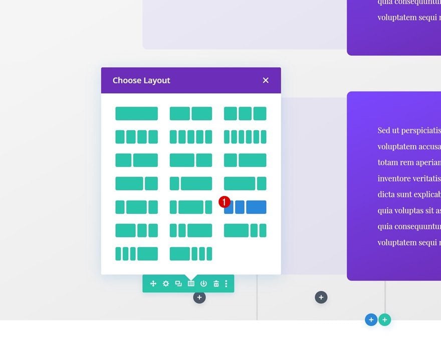
Add New Row
Column Structure
Now that we have all the explanatory rows in place, we can add our sticky step row bar. Add a new row using the following column structure:
Gradient Background
Open the row settings and use a gradient background.
- Color 1: #ffdf51
- Color 2: #e5ac49
- Gradient Type: Linear
- Gradient Direction: 150deg
Sizing
Move on to the row’s design tab and change the sizing settings as follows:
- Use Custom Gutter Width: Yes
- Gutter Width: 1
- Equalize Column Heights: Yes
- Row Alignment: Center
Spacing
Apply some custom spacing values next.
- Top Margin: 5%
- Top Padding: 0px
- Bottom Padding: 0px
Border
Then, go to the border settings and add some rounded corners.
- All Corners: 10px
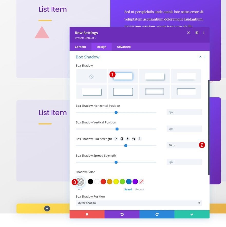
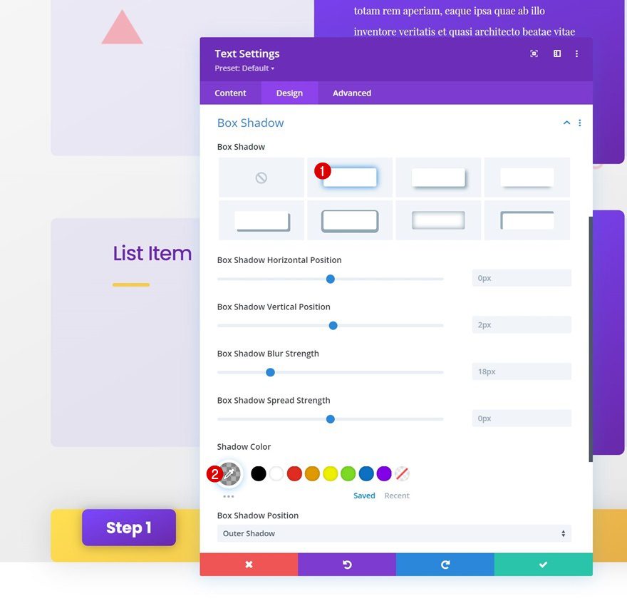
Box Shadow
Apply the following box shadow too:
- Box Shadow Blur Strength: 50px
- Shadow Color: rgba(0,0,0,0.13)
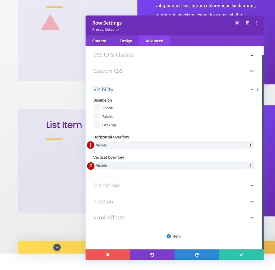
Overflows
Then, navigate to the advanced tab and set the overflows to visible.
- Horizontal Overflow: Visible
- Vertical Overflow: Visibile
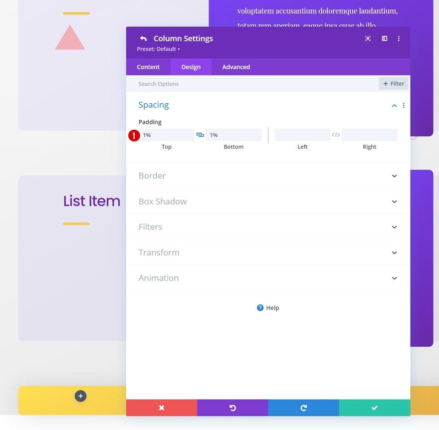
Column 2 Spacing
Next, open the column 2 settings and use some custom top and bottom padding.
- Top Padding: 1%
- Bottom Padding: 1%
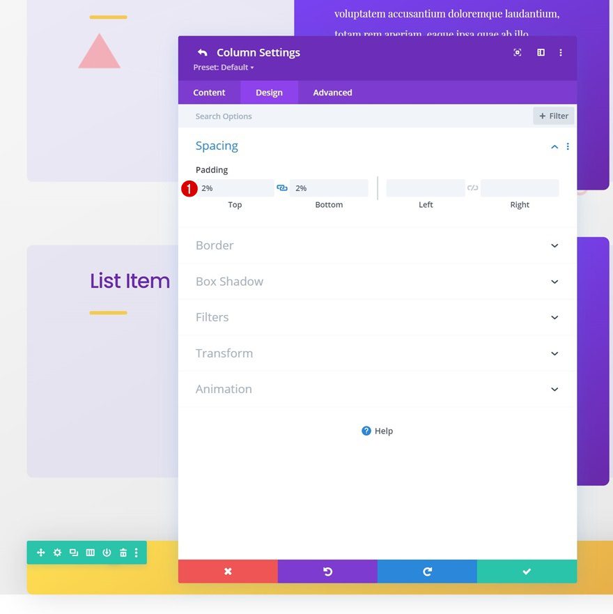
Column 3 Spacing
We’re adding some custom top and bottom padding to column 3 as well.
- Top Padding: 2%
- Bottom Padding: 2%
Add Text Module to Column 1
Add Content
Time to add modules to our sticky step row bar. Add a Text Module to column 1 and mention the step in the content box.
Gradient Background
Next, apply a gradient background.
- Color 1: #7b47ff
- Color 2: #6929aa
- Gradient Type: Linear
- Gradient Direction: 158deg
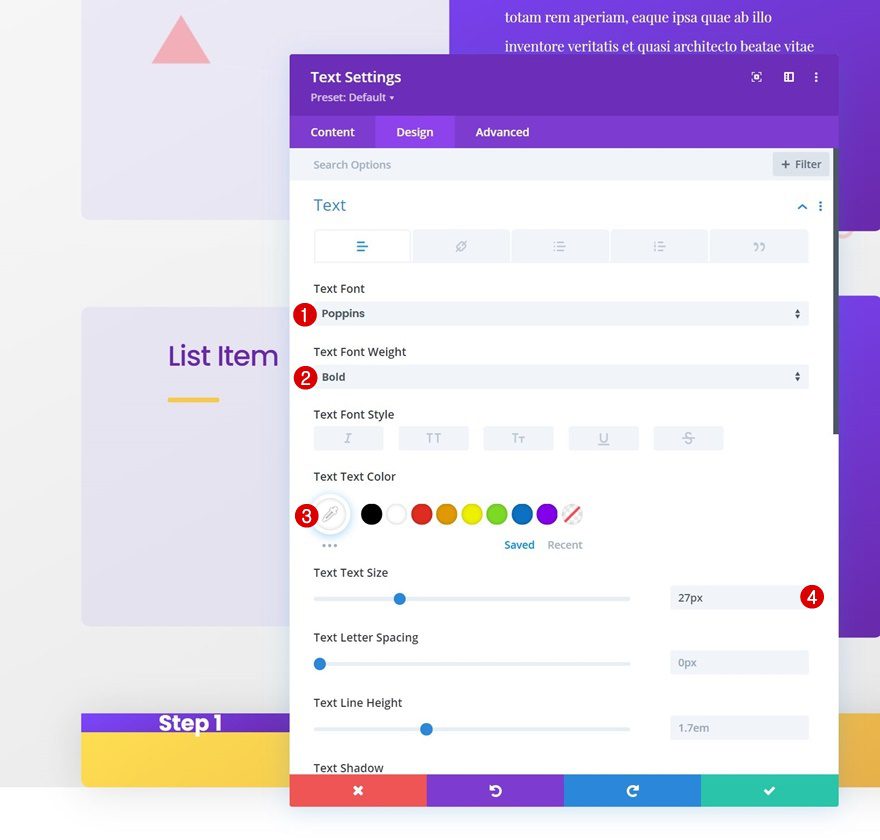
Text Settings
Move on to the module’s design tab and style the text accordingly:
- Text Font: Poppins
- Text Font Weight: Bold
- Text Color: #ffffff
- Text Size: 27px
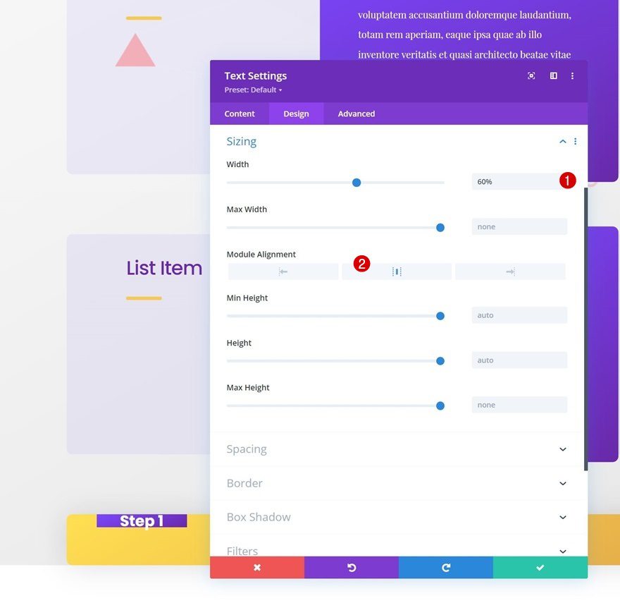
Sizing
Make some changes to the sizing settings too.
- Width: 60%
- Module Alignment: Center
Spacing
Then, add some custom top and bottom padding to the spacing settings.
- Top Padding: 20px
- Bottom Padding: 20px
Border
Add some rounded corners to the border settings next.
- All Corners: 10px
Box Shadow
We’re also using a subtle box shadow.
- Shadow Color: rgba(0,0,0,0.3)
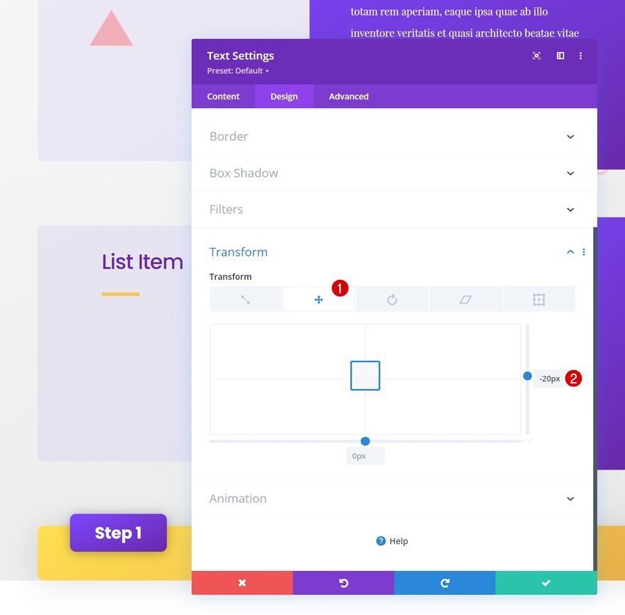
Transform Translate
And we’ll complete the module settings by slightly repositioning the module using Divi’s transform translate settings.
- Right: -20px
Add Text Module to Column 2
Add H2 Content
In column 2, we’re adding a Text Module with some H2 content describing the step we’re at.
H2 Text Settings
Move on to the module’s design tab and style the H2 text settings as follows:
- Heading 2 Font: Poppins
- Heading 2 Font Weight: Medium
- Heading 2 Text Alignment:
- Desktop: Left
- Tablet & Phone: Center
- Heading 2 Text Color: #6d40ed
- Heading 2 Letter Spacing: -1px
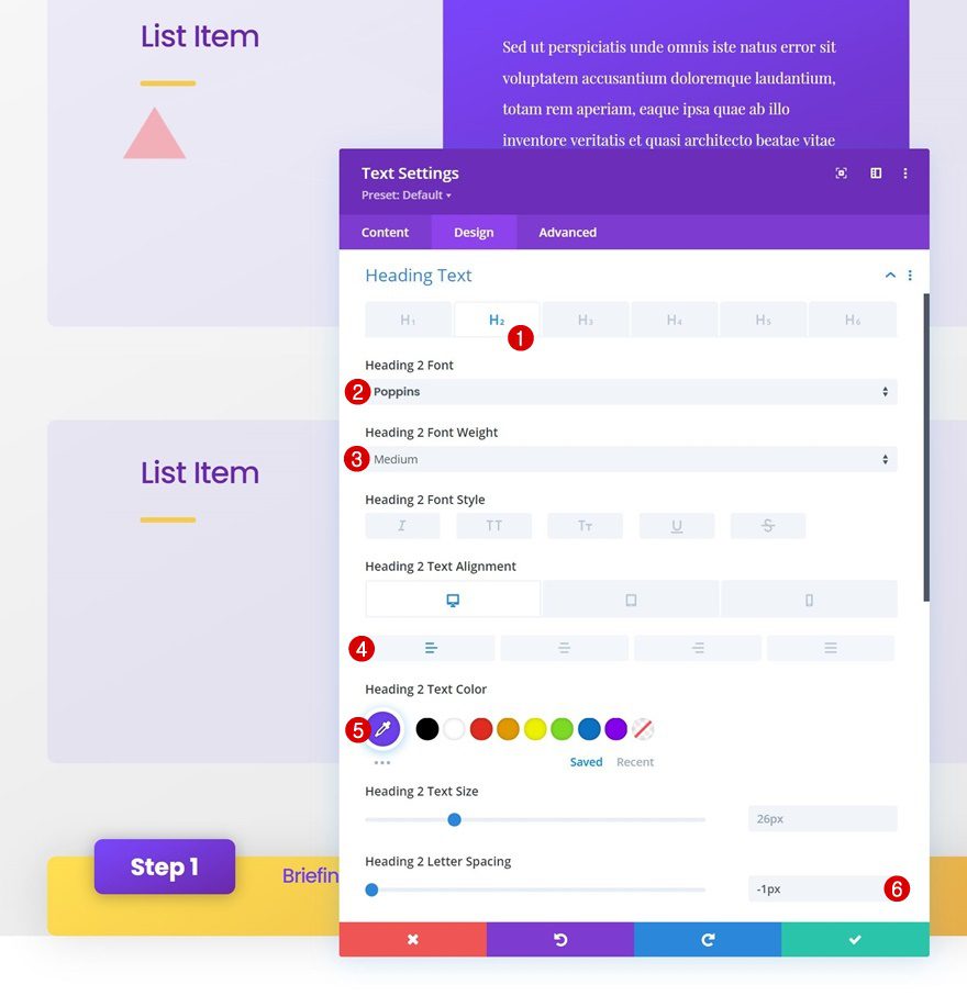
Spacing
Add some custom top and bottom padding too.
- Top Padding: 5%
- Bottom Padding: 5%
Add Text Module to Column 3
Add Content
On to the next and last column. Add a Text Module with some description content.
Text Settings
Move on to the module’s design tab and change the text settings accordingly:
- Text Font: Playfair Display
- Text Font Weight: Bold
- Text Color: rgba(109,64,237,0.46)
- Text Size: 20px
- Text Alignment:
- Desktop: Left
- Tablet & Phone: Center
3. Apply Sticky Effects to Step Row Bar
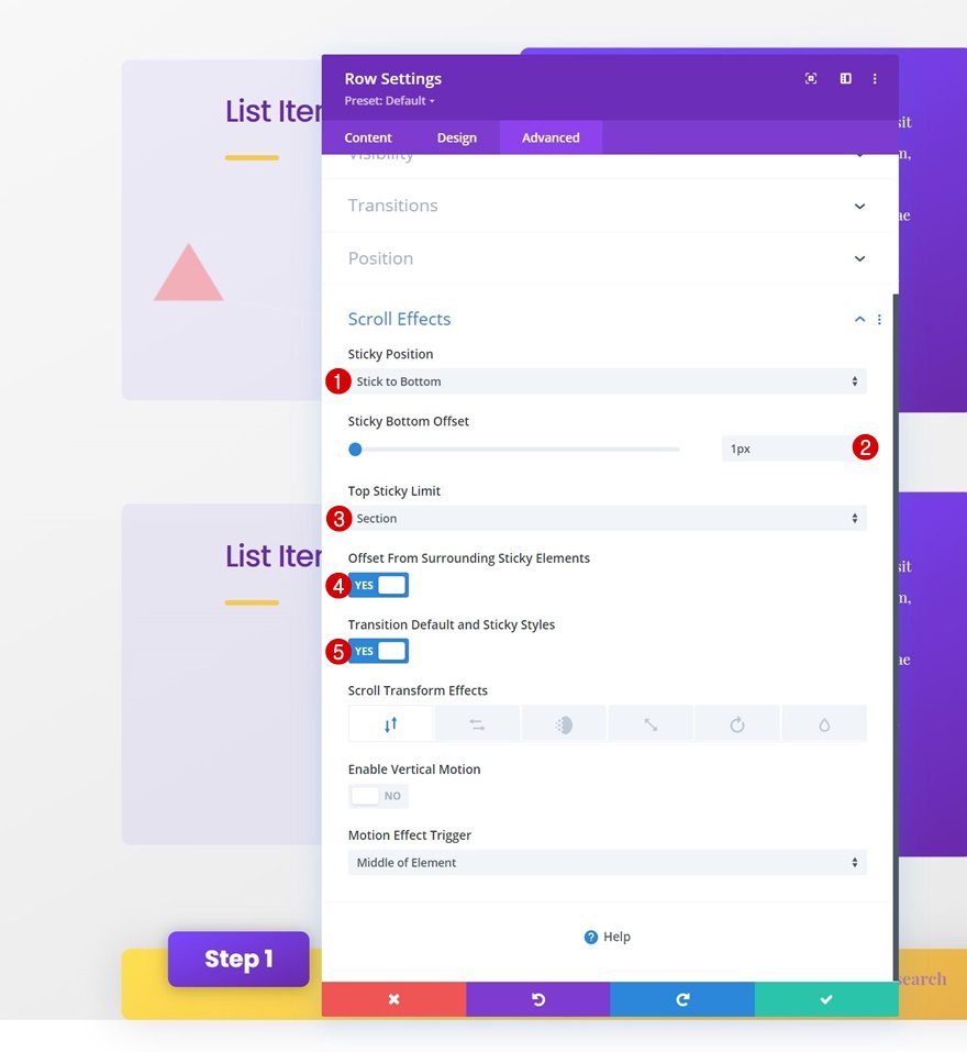
Sticky Row Settings
Now that our sticky step row bar design has been completed, it’s time to make it stick to the bottom. Open the row settings, go to the advanced tab and apply the following sticky position settings:
- Sticky Position: Stick to Bottom
- Sticky Bottom Offset: 1px
- Top Sticky Limit: Section
- Offset From Surrounding Sticky Elements: Yes
- Transition Default and Sticky Styles: Yes
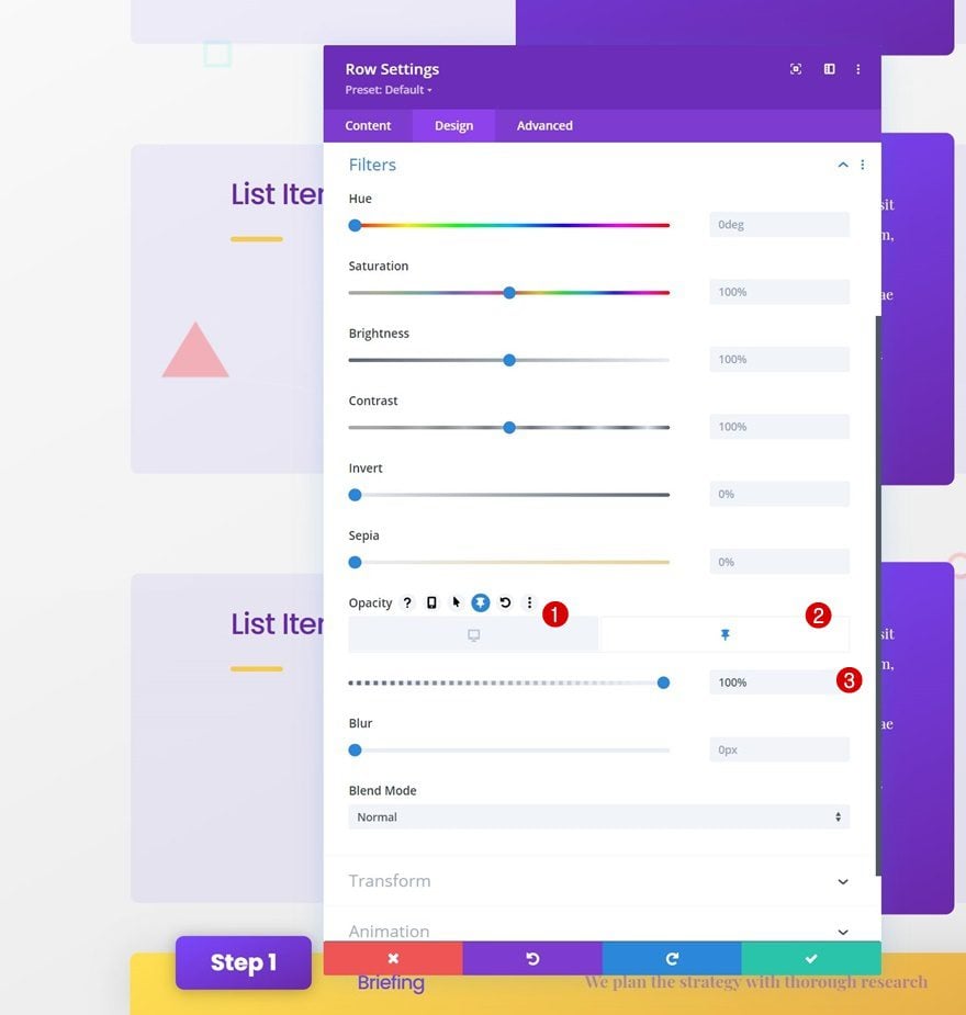
Sticky Row Filter
In a default state, we don’t want the row bar to be visible. Once it’s turned sticky, however, we want it to appear. To make that happen, we’ll modify the opacity filter in the filters settings:
- Default: 0%
- Sticky: 100%
4. Reuse Entire Section for Next Steps
Clone Section as Many Times as Needed
Now that our first section, which is dedicated to step #1, has been created, we can reuse the entire section based on the number of steps we have.
Change All Copy in Duplicate Sections
Make sure you change all copy in the duplicate sections. That’s it!
Preview
Now that we’ve gone through all the steps, let’s take a final look at the outcome across different screen sizes.
Desktop
Mobile
Final Thoughts
In this post, we’ve shown you how to get creative with your website’s approach design. More specifically, we’ve shown you how to use Divi’s sticky options to create different sticky steps bars that’ll help your visitors navigate through different parts of your approach. You were able to download the JSON file for free as well! If you have any questions or suggestions, feel free to leave a comment in the comment section below.
If you’re eager to learn more about Divi and get more Divi freebies, make sure you subscribe to our email newsletter and YouTube channel so you’ll always be one of the first people to know and get benefits from this free content.


Your blog made me feel stupid. I had to look up CTA (Chicago Transit Authority, California Teacher’s Association, etc) and never did learn what “sticky steps” are or their effectiveness in web sites. JSON was not far behind. I Just feel dumb reading this blog…but now I know another thing CTA can stand for.
I’m not a troll, but s neophyte that wants to learn. All I need is clear descriptions of purpose and use. I can follow directions but the real value is in relating the software to efficacy.
Seems like an educational blog should educate, not confound the reader. I would respond to any comments you have, Donjete.
Call to Action (CTA) is something that folks in the web design community are usually very familiar with. Apologies for not making that clear in this post.
Nice template useful for many different types of designs. Thank you
A little bit of a dry read, but I do want to take the time to go through these steps as I’m sure repeating them will help me along greatly in my design goals. I know you have the images of what it should look like behind each step, but can I view what it actually looks like irl?
also, tyvm for this, it’s my first one actually going through it all…