
With all various Divi built-in options and regular feature updates, the quality of the websites designs you create can go up quickly. One of the feature updates that was long expected was the filters and blend modes one. We’ve already shared some great examples that you can recreate and we’d like to add one to that list; how to stunningly combine Divi’s column and module backgrounds. Blend modes work like layers do within Photoshop; once you apply a blend mode to a module, for instance, the blend mode will include the next thing it comes across, which is in this case, is a column. To show you how that works, we’re going to recreate a stunning example that you can use for any kind of website.
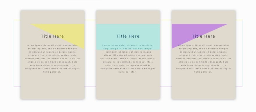
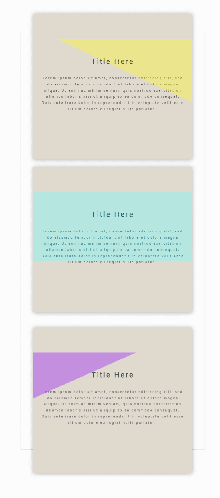
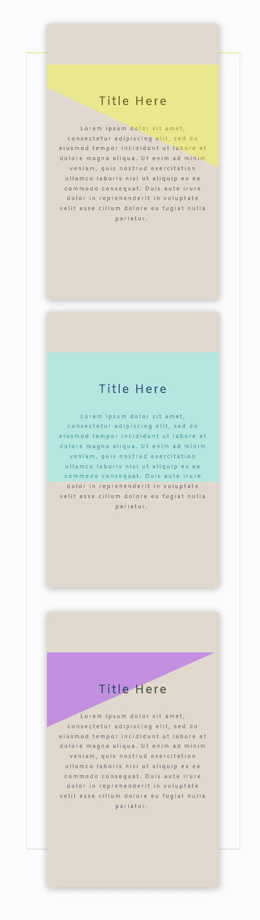
Result
Before we dive into the tutorial, let’s take a look at the example we’ll show you how to recreate, step by step.
On Desktop
On Tablet
On Mobile
Add a Row
Column Structure
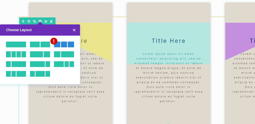
Start by opening or creating a new page, adding a standard section and a row with three equal columns.
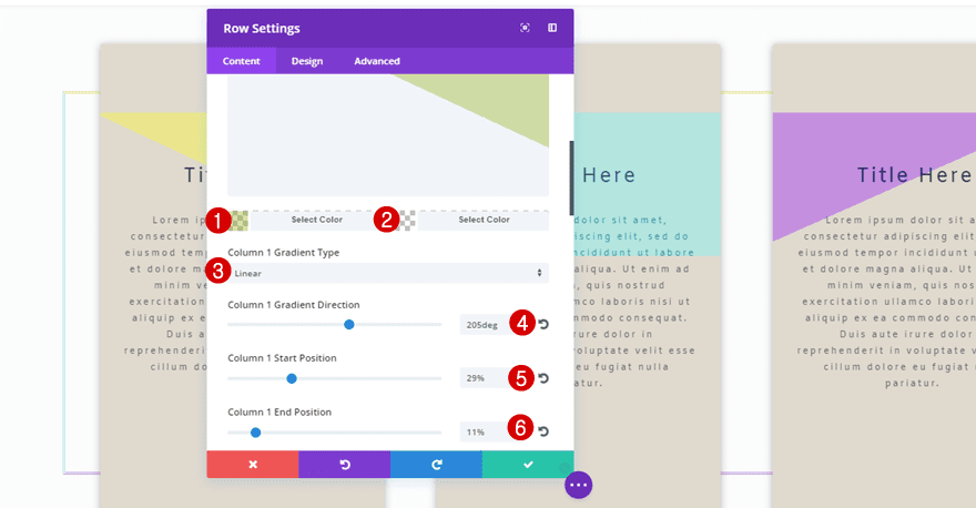
Column 1 Gradient Background
Each one of the columns of this row will need its own gradient background. You can choose whichever gradient background (or background image) you’d like to add to your column. But if you want to achieve the same result as the example, use the following gradient background for the first column:
- First Color: rgba(140,170,3,0.34)
- Second Color: rgba(0,0,0,0)
- Column 1 Gradient Type: Linear
- Column 1 Gradient Direction: 205deg
- Column 1 Start Position: 29%
- Column 1 End Position: 11%
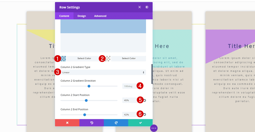
Column 2 Gradient Background
The second column makes use of the following gradient background:
- First Color: rgba(12,113,195,0.34)
- Second Color: rgba(0,0,0,0)
- Column 2 Gradient Type: Linear
- Column 2 Gradient Direction: 180deg
- Column 2 Start Position: 45%
- Column 2 End Position: 42%
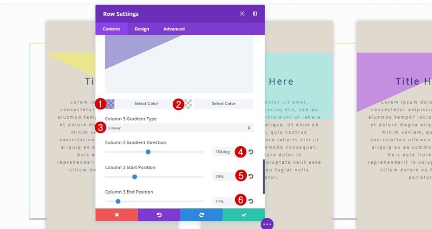
Column 3 Gradient Background
The last column needs the following settings:
- First Color: rgba(19,0,147,0.34)
- Second Color: rgba(0,0,0,0)
- Column 3 Gradient Type: Linear
- Column 3 Gradient Direction: 156deg
- Column 3 Start Position: 29%
- Column 3 End Position: 11%
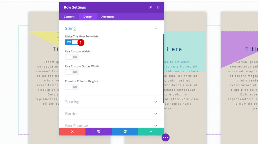
Sizing
Once you’re done with the column gradient backgrounds, move on to the Design tab, open the Sizing subcategory and enable the ‘Make This Row Fullwidth’ option.
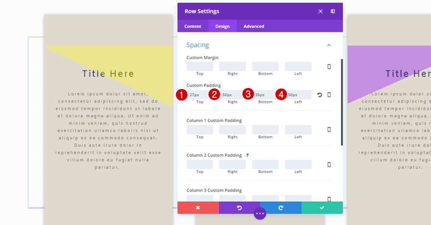
Spacing
Move on to the Design tab and apply the following custom padding to your row:
- Top: 27px
- Right: 50px
- Bottom: 35px
- Left: 50px
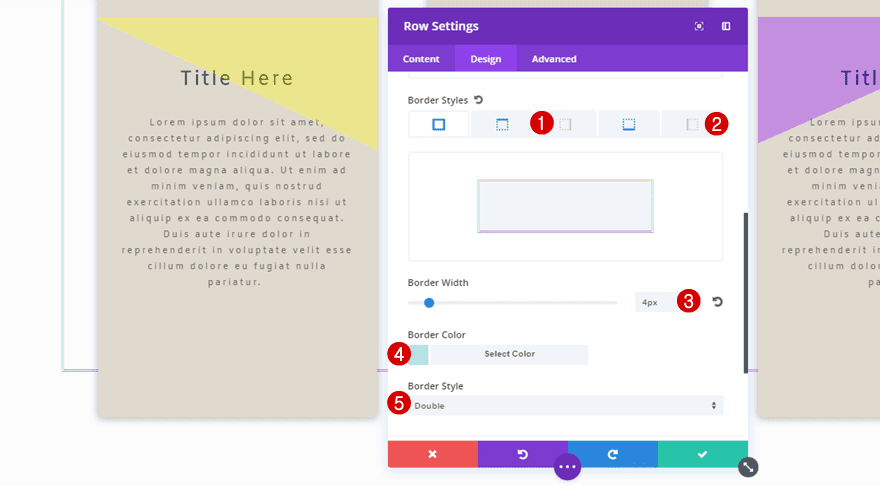
Border
Lastly, we’ll need a border for our row as well. Begin by assigning the following settings to the left and right border styles:
- Border Width: 4px
- Border Color: #b4e6df
- Border Style: Double
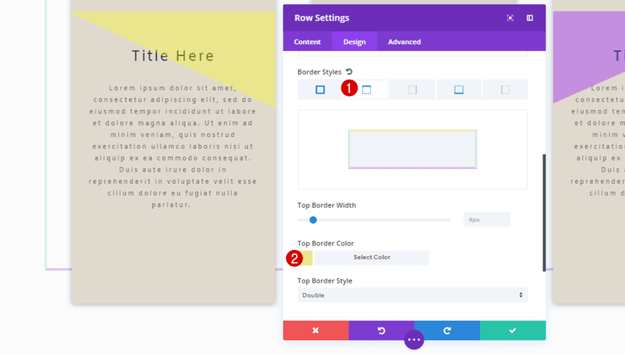
Move on to the top border style, add the same border width and border style but use ‘#ebe68d’ as your border color instead.
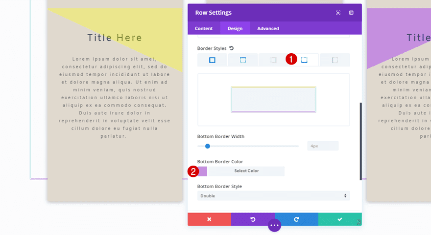
The bottom border style is using the ‘#c58fdf’ color code for its border color.
Add a Text Module
Add Title & Content
Now that you’ve finished your row settings, it’s time to move on to adding a Text Module. We’ll be creating this Text Module once, cloning it afterwards and place it in the two remaining columns. The first thing you’ll need to do after adding a Text Module to the first column of your row is adding some text to the content box; one heading and a paragraph.
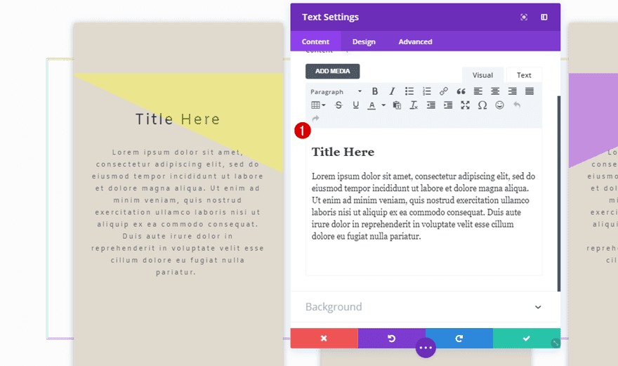
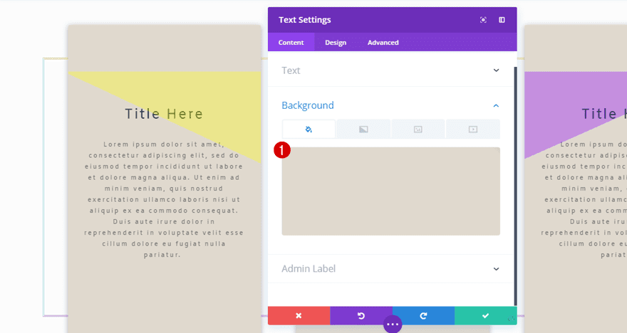
Background Color
Then, open the Background subcategory and use ‘#e0d9ce’ as your background color.
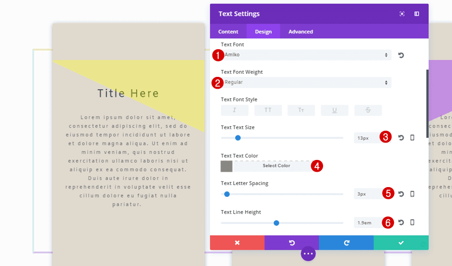
Text Settings
Move on to the Design tab and use the following settings for the Text subcategory:
- Text Font: Amiko
- Text Font Weight: Regular
- Text Size: 13px
- Text Color: #8A8680
- Text Letter Spacing: 3px
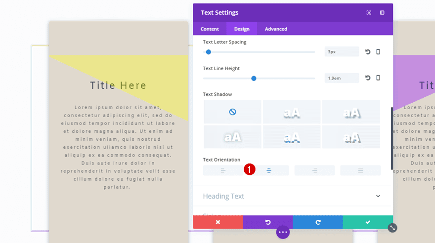
- Text Line Height: 1.9em
- Text Orientation: Center
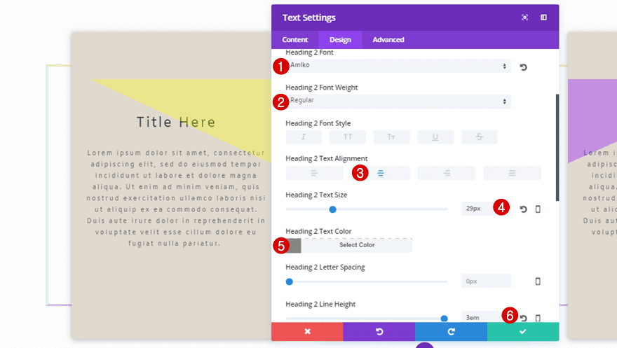
Heading Text Settings
For the heading text of your Text Module, choose the following settings:
- Heading Font: Amiko
- Heading Font Weight: Regular
- Heading Text Alignment: Center
- Heading Text Size: 29px
- Heading Text Color: #8A8680
- Heading Line Height: 3em
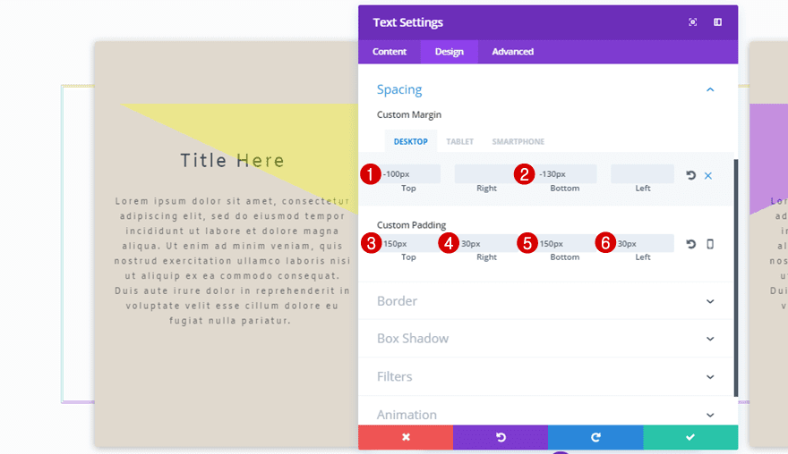
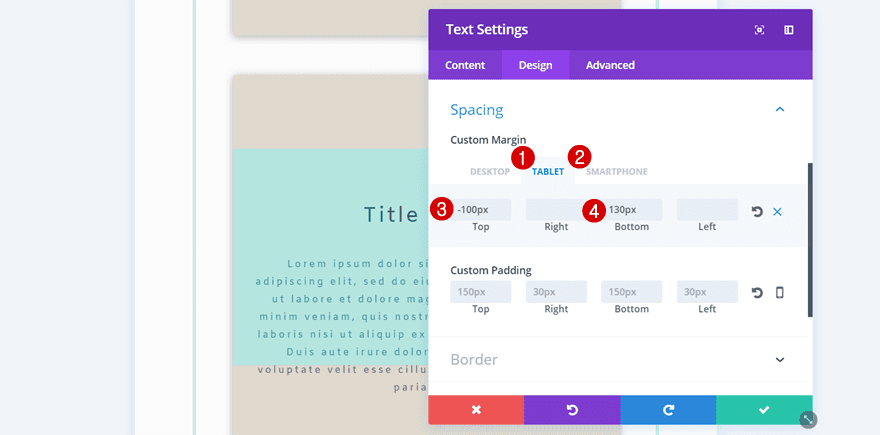
Spacing
The custom margin and padding you apply to your Text Module give different results on desktop, tablet and phone. That’s why it’s necessary to make sure these values match each one of the options. It’ll help you keep the same look and feel wherever your visitors might be getting in touch with you. The custom margin and padding you need to use for your Text Module is the following:
- Top Margin: -100px
- Bottom Margin: -130px (Desktop), 100px (Tablet & Phone)
- Custom Padding: 150px
- Right: 30px
- Bottom: 150px
- Left: 30px
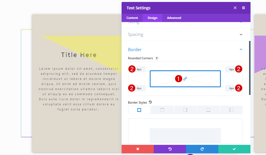
Border
Next, open the Border subcategory and use ‘4px’ for all of the corners.
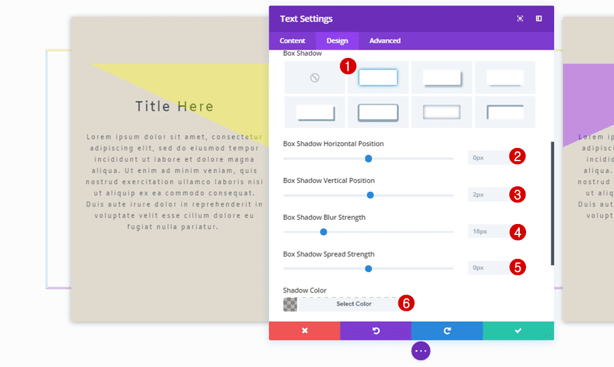
Box Shadow
Then, open the Box Shadow subcategory and use the following settings for it:
- Box Shadow Horizontal Position: 0px
- Box Shadow Vertical Position: 2px
- Box Shadow Blur Strength: 18px
- Box Shadow Spread Strength: 0px
- Shadow Color: rgba(0,0,0,0.3)
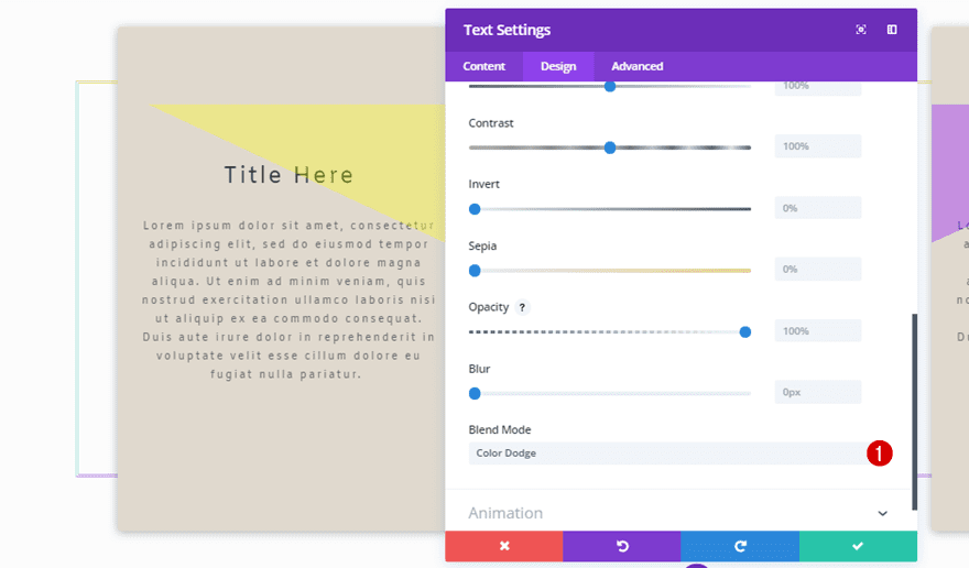
Filter
Last but not least, enable a blend mode on your Text Module. This will make your Text Module blend nicely with your column gradient background. For this example, we’ve chosen ‘Color Dodge’.
Clone Text Module Three Times & Place in Remaining Columns
Clone the Text Module you’ve just created twice and place them in the two remaining columns. The only thing that’ll need to be changed is the custom margin of the Text Module.
Change Spacing Subcategory of Second Text Module
Change the Custom Margin on tablet and phone, while keeping the desktop version the way it is, to:
- Top: -100px
- Bottom: 130px
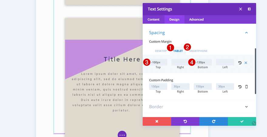
Change Spacing Subcategory of Second Text Module
The second Text Module needs some different Custom Margin values for tablet and phone as well:
- Top: -100px
- Bottom: -130px
Result
We’re done! Let’s take a final look at the result we’ve shown you how to recreate on all screen sizes.
On Desktop
On Tablet
On Mobile
Final Thoughts
In this post, we’ve shown you how to combine column backgrounds and modules with blend modes to obtain advanced and unique results. You can use this design on any type of website to empower your website’s design and draw the attention of your visitors. If you have any questions or suggestions; make sure you leave a comment in the comment section below!
Featured Image by VectorsMarket / shutterstock.com


On my build I had to alter your instructions to get the same results. The custom margins of the second text module did not have to be altered as instructed, but rather it was altering the third text module that made the text boxes extend past the bottom border for pad and phone.
Lovely design, and fun doing it.
Thanks!
Aside from border radius specifications, I would submit that the paddings and margins should be done in relative units to retain proper proportions as the design responds to varying screen widths (not just huge adjustments at Divi’s media breakpoints).
Coding in this way is not only best practices, but also the way ET should spec out design spacing in its tutorial content. After all, it is the way Divi itself is coded.
I was recently at a talk about Hawaiian history and how they named things. The instructor said he was having his students name some of the things we had no documented names for (the types of winds). He said some people would say he had no right to have contemporary kids naming something the kupuna (seniors) would have input on. His position was that sometimes, that is exactly the best thing to do because if there is no prior name they would remain silent, but by taking the position to name something, if it already had a name, it would awaken the kupuna from their silence by making them say, “Hey, the name for that is X, not Y”.
Similarly, I hate the design but love the concept. What I will create from your instruction is different from what you have created. Had I not read your article, however; I would not have been spurred on creatively to do anything. So thank you. I will be lazy and take your idea and turn it into something else. Maybe I’ll make a .json file and sell it to some lazy designers. 🙂
Thank you! I really appreciate the clear step by step instructions in the process. I can see the design possibilities here.
Super :-)!
Very detailed presentation Donjete. The effects are great. Thank you for sharing. I
Divi is supposed to be easy. People just buy it, `cause their lazy. You should have made a .json file and shared the layout. People just love to Download Freebies. Nice Design, by the way.
Thanks.
🙂
Alice Martins: Two kinds of people: lazy people and creative people. I’d rather think people use Divi because of the almost unlimited creative design possibilities. That’s why I bought the lifetime license.
Sadly, that is not the case. There are the few creative ones and then everyone else who seems to think that everything needs to be downloaded. Plus, Divi is not exactly easy if you don’t know how to code and manipulate things to your likings. The worst part about Divi is the overabundance of wannabes that shouldn’t be designing websites while trying to pass themselves off as professional web designers. For everytime that someone has done something great with Divi, it seems that 10 or 20 others put out subpar designs because they don’t understand the basics of web design such as design theory, UI, UX, CSS.
Divi is only a powerful tool if you know how to use it and do things without it as well. It is merely a screwdriver in a toolbox. The trouble with Divi is that the beginner users tend to treat it as if it were a hammer, if the only tool you have is a hammer, you begin to treat everything as if it were a nail.
That’s very useful, thank you. I would find it useful to see a list of the blend modes and a short description of what they do.