
Designing a five column layout with enough room for your content can be challenging. Not to mention the greater challenge of making sure it scales nicely on all browser sizes. In this tutorial, I’m going to show you how to maximize the space needed to fit content inside a five column layout without compromising the design on smaller screen sizes (like tablet and smartphone). This design is ideal for showcasing products, services, and projects. I’ll even throw in a few bonus design features for a little inspiration.
Let’s get started.
Sneak Peek

Responsive Techniques Used
Use a Custom Row Width and Gutter Width
The key to making a five column layout responsive is first to give your columns enough space to hold content. In the design for this tutorial, I’m going to give the row holding the five columns a custom width to 89%. Then I’ll create even more space by setting the gutter width to 1, which is basically taking out any margin between the columns. For this design, it is important to use a custom width of 89% instead of setting the row to fullwidth because you can set the gutter width to 1 and still keep a margin on each side of your row. You will see what I mean.
Use vw length units for spacing and heading text
Another key to keeping things responsive on a five column layout is to space out your content using vw length units. And it’s important to be consistent with using vw throughout all of your spacing. This will make sure to keep things scaling consistently on all browser sizes without making elements break or jump around while you adjust the width of your window. Using the vw length unit for heading text will also be key so that the text doesn’t break into a new line on smaller browser windows. However, for heading text, we will need to assign a px unit for tablet and smartphone in order to accommodate for the text shrinking too much.
Part 1: Getting Started
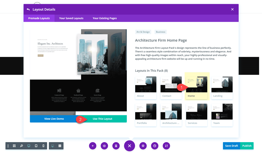
All you need for this tutorial is the Divi Theme. We will be using the Visual Builder along with the Architecture Firm Home Page Layout.
So to get started, create a new page, give your page a title, and deploy the Visual Builder. Select the option “Choose a Premade Layout”. In the load from library popup, select the Interior Design layout pack and then load the Architecture Firm Home Page Layout to your page.
Part 2: Creating the Title Section
For starters, duplicate the second section containing the three blurbs.
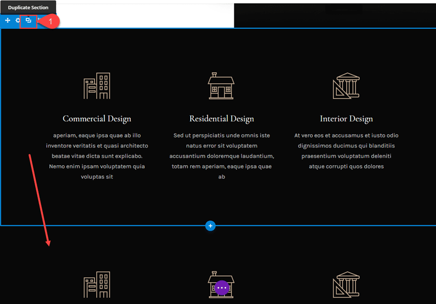
We need two sections for this design because the top section will serve two purposes. First, it will hold the title of our section below. And second, it will allow us to add a unique design using a section divider.
Let’s continue.
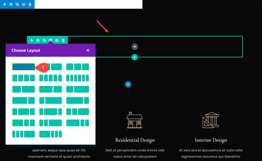
In the original section (not the duplicate), delete the three blurbs and change the column structure of the row to one-column.
Then scroll down to the bottom of the layout to the last section and copy the text module in the left column.
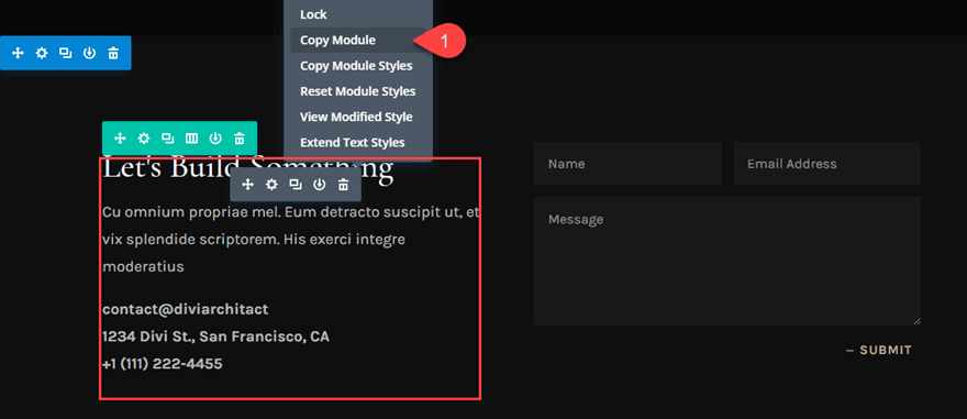
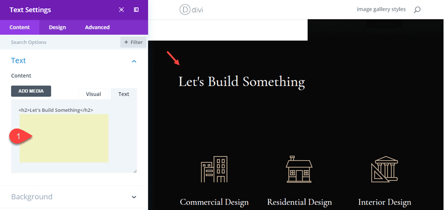
Then paste it inside the one column row you just created and delete all the text content under the h2 heading so that only “Let’s Build Something” is left.
Part 3: Customizing Blurbs for a Five Column Layout
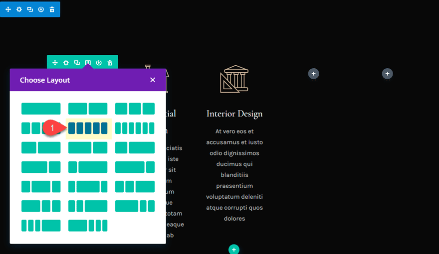
Now it’s time to visit the section we duplicated with our original three blurbs inside the 3 column row. First, let’s change the row structure to a five-column layout.
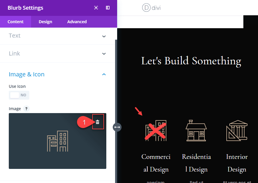
Open the blurb settings of the blurb module in the first column and then delete the image being used as the icon.
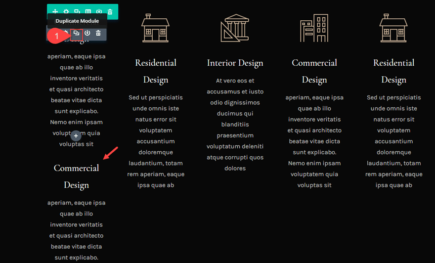
Then duplicate the blurb module in the first column. We are going to use two blurbs per column for this design because we need the top blurb to hold our background image.
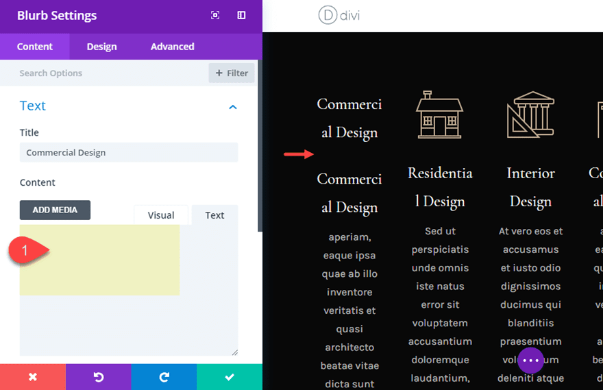
Open the settings for the top blurb in the first column and delete the body text in the content box.
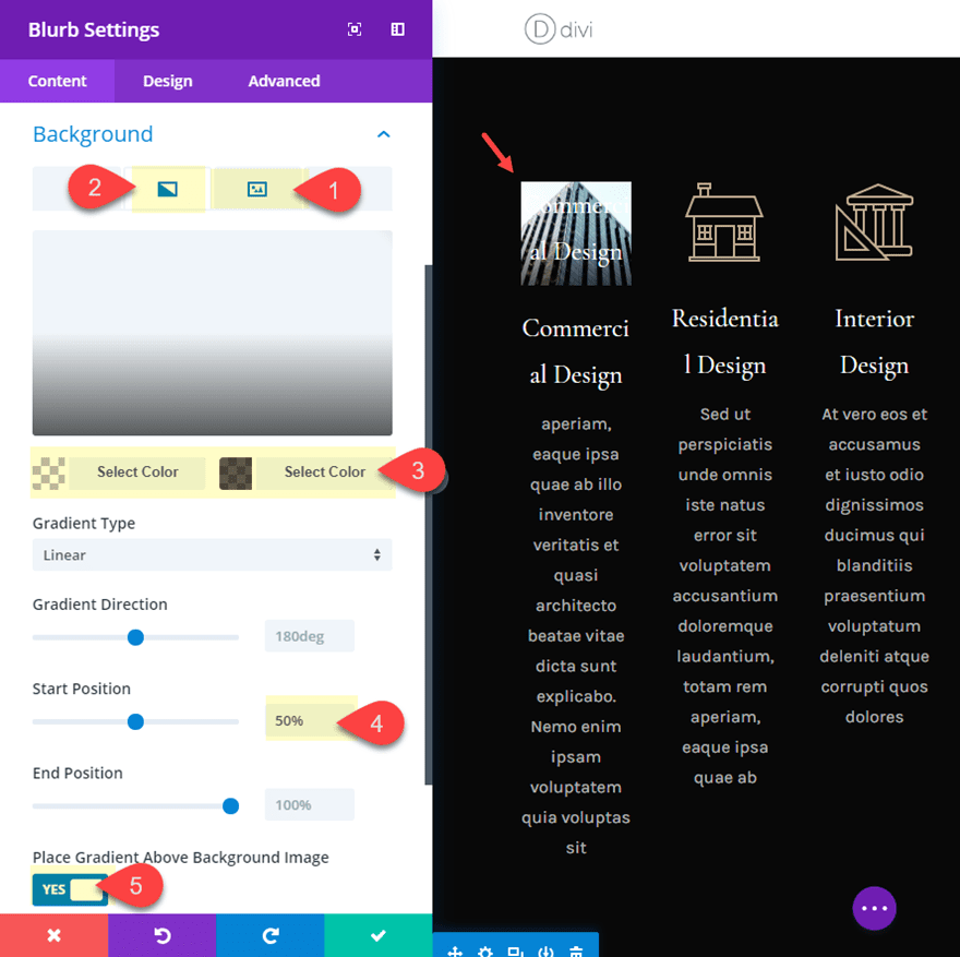
Add a background image and gradient to the top Blurb module
Then give the same blurb a background image and add a gradient to overlay the image as follows:
Add Background Image
Background Gradient Left Color: rgba(255,255,255,0)
Background Gradient Right Color: rgba(18,18,18,0.65)
Start Position: 50%
Place Gradient ABove Background Image: YES
The gradient is necessary to help our title text to become more readable with lighter background images.
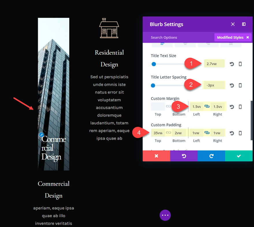
Use VW Units for the Title text and spacing
Then update the design tab settings as follows:
Title text Size: 2.7vw (desktop), 46px (tablet), 36px (smartphone)
Title Letter Spacing: -3px
Custom Margin: 1.5vw left, 1.5vw right
Custom Padding: 35vw Top, 2vw Bottom, 1vw Left, 1vw Right
Save settings.
The custom top padding of 35vw is what creates the unique long vertical image design. The title text is given a 2.7vw value in order keep the text scaling consistently on different browser widths. The rest of the spacing will make more sense once we add more spacing to our row later on.
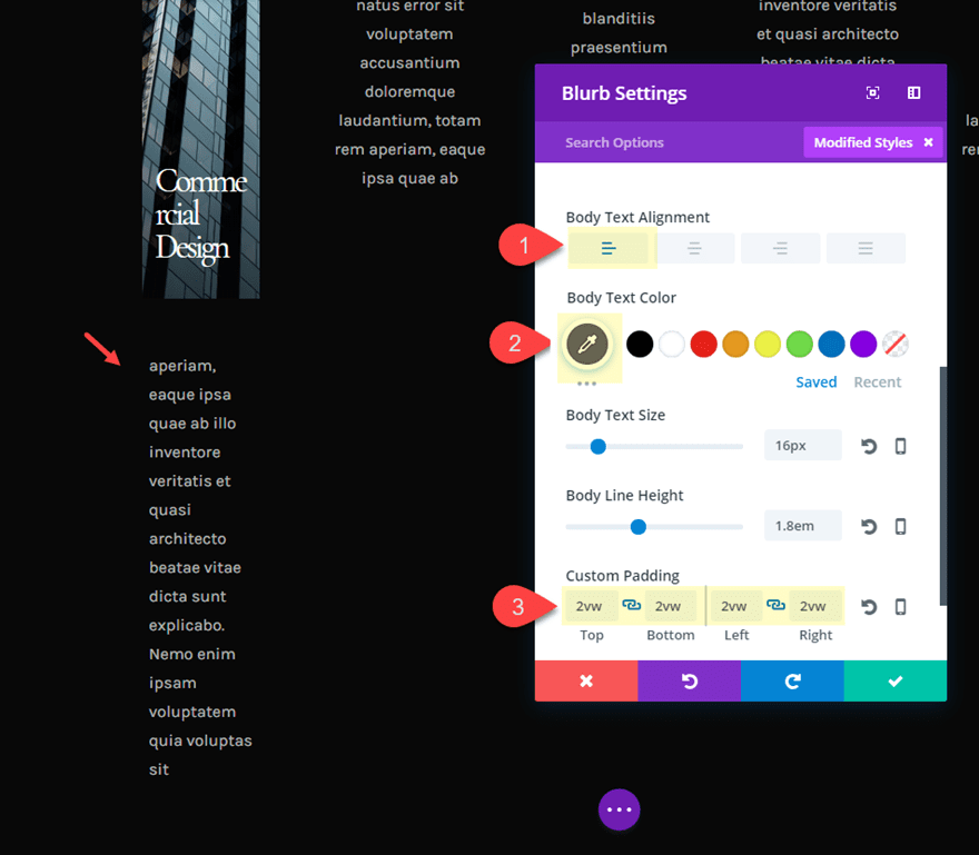
Customizing the bottom blurb
Then open the settings of the second blurb module underneath in the first column and delete the Title text. Then update the following:
Body Text Alignment: Left
Body Text Color: #666666
Custom Padding: 2vw Top, 2vw Bottom, 2vw Left, 2vw Right
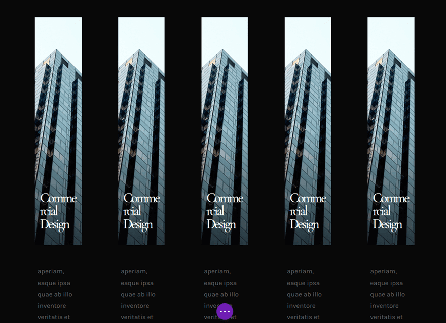
Now that we have our two blurbs designed in our first column. Copy both of them and paste them in each of the remaining columns. You will need to first delete original blurb modules in columns 2 and 3 first. Now your design should look like this.
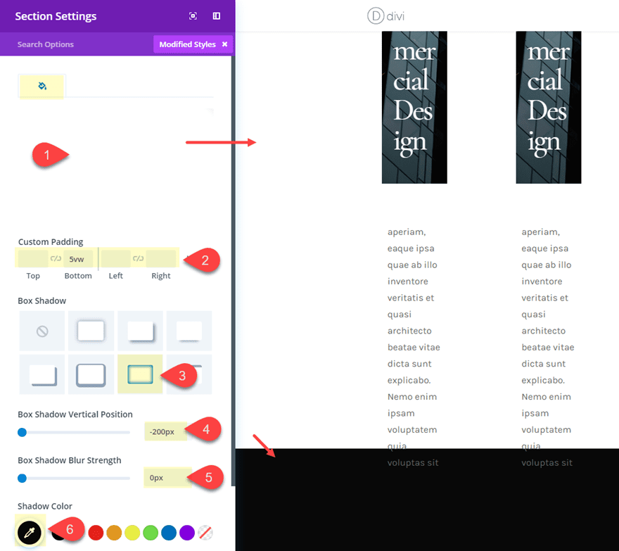
Part 4: Customizing the Section Settings
Now let’s update our section settings to have a white background and a box shadow at the bottom that will create a space for our row to overlap.
Background Color: #ffffff
Custom Padding: default Top, 5vw Bottom, default Left, default Right
Box Shadow: see screenshot
Box Shadow Vertical Position: -200px
Box Shadow Blur Strength: 0px
Shadow Color: #121212
Part 5: Customizing the Row Settings
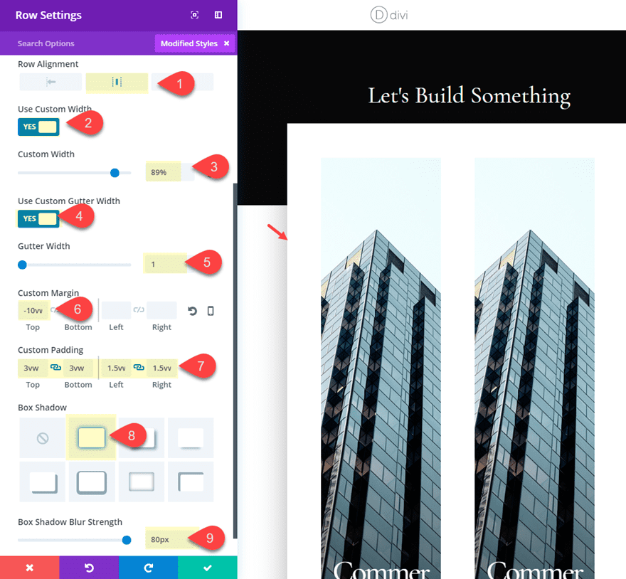
Now let’s go back to our row and update the settings as follows:
Background Image: #ffffff
Row Alignment: Center
Custom Width: 89%
Gutter Width: 1
Custom Margin: -10vw
Custom Padding: 3vw top, 3vw Bottom, 1.5vw Left, 1.5vw Right
Box Shadow: see screenshot
Box Shadow Blur Strength: 80px
As mentioned earlier in the tutorial, the custom width and gutter width are essential for creating the content space we need for a five column layout.
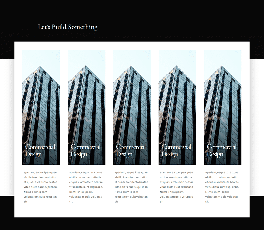
At this point, the basic structure of the design is finished. Here is what the design looks like so far.
Part 6: Adding the Final Touches
Now we can add a few more design tweaks to finish it off.
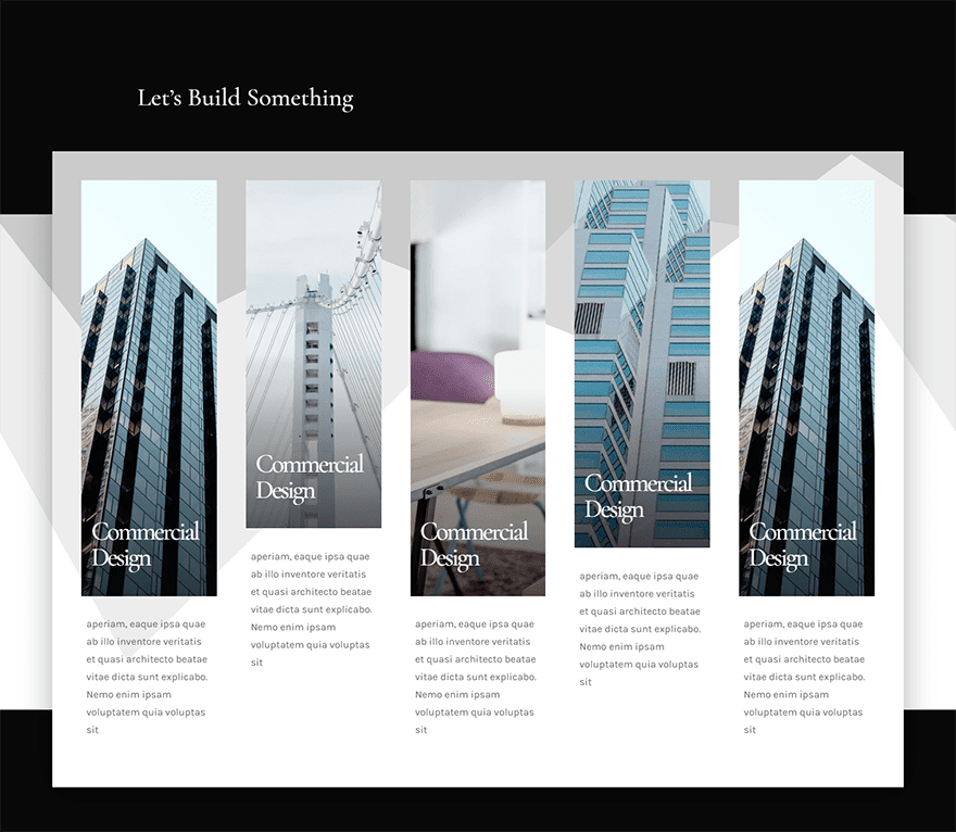
Staggering the Blurbs
First, let’s stagger the height of the blurb background images by decreasing the padding of a few. Open the settings of the top blurb module in the second row and update the padding as follows:
Custom Padding: 28vw Top
And for the top blurb in the third column, give change the top padding to 30vw.
Add an Section Divider to add texture to your Five column Row
One cool design technique is to add a top section divider to the section directly above the section with our five columns. The divider background will show on the background of the five column row even even though it is overlapping the section above. To do this, go to the section containing the title “Let’s Build Something” and give it a divider as follows:
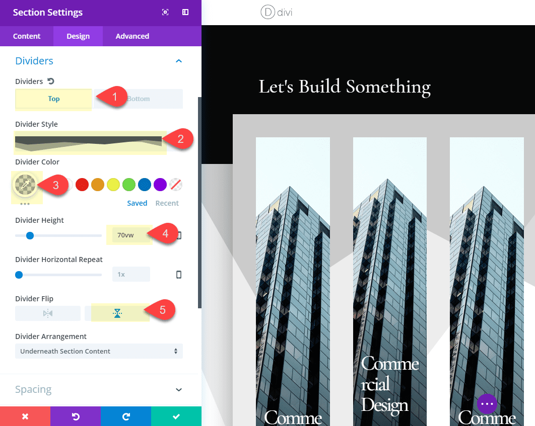
Because the color of the divider is the same color of the section background with an opacity of 15%, the divider isn’t visible on the top section, but becomes visible in the section below and on the overlapping row. And because we gave the row a box shadow, this creates a unique design.
I went ahead and update a few of the background images to get a better idea of what the design would look like with different images.
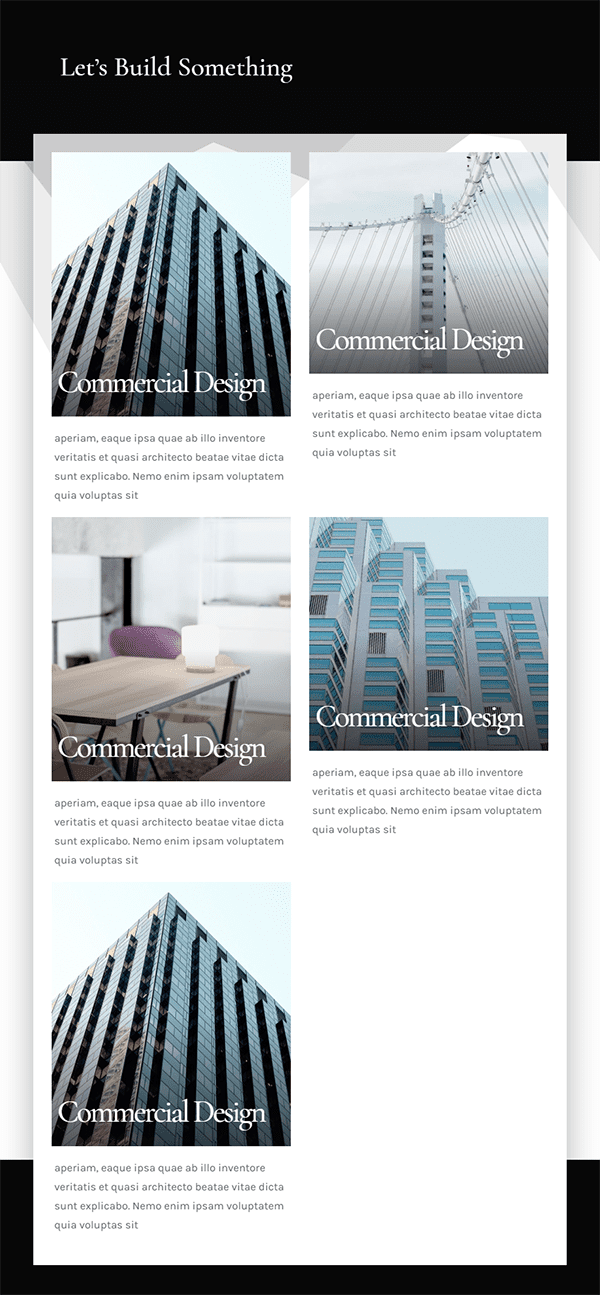
Here is the final design.
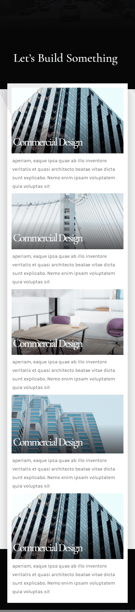
One of the great things about the five column layout is that you get a nice two column layout on tablet.
And here is what it looks like on smartphone.
Final Thoughts
I love exploring the power of Divi to create responsive layouts. The challenge of a five column layout is that there is really not much room for content unless you use the right techniques to space out your content appropriately to scale nicely on all browser sizes. I hope that this design was helpful to introduce some possibilities for using a five column layout for your next project.
I look forward to hearing from you in the comments.
Cheers!


This was a fun tutorial to do. Love the more frequest use of vw in tuts. It’s great to see other measurement units getting some attention. 🙂 This particular 5 column layout has some fun possibilities, too. Thanks!
Thanks for this great tutorial, Jason! It was really good.
Very relevant topics here surrounding responsiveness. Very clean tutorial here, much appreciated Jason! Does anyone know if there is a high-level list of common vw measurements to reference?
Here ya go CJ… https://www.elegantthemes.com/blog/divi-resources/a-guide-to-understanding-and-applying-css-length-units-in-divi
Hope that helps. Thanks for the comment!
Thank you Jason. Excellent styling. Easy to follow. And opened my eyes to other creative possibilities. It is so rewarding to learn something new everytime I use Divi.
What a lovely layout and design. Thank you for sharing this!
Glad you liked it, Pam!
How did you do the background to match the section and the row so perfectly?
I used a section divider with the the same color as the top section background with an opacity so that it doesn’t show on the dark background. Is that what you mean?
Wow, this is great Jason!
Going to put this to work for a current client, Thank You
Awesome Matthew. Great to know! thanks