
A website’s hero section is one of the best candidates for fluid design. Unlike traditional responsive design that adjusts at different breakpoints, fluid design scales seamlessly with the browser viewport and keeps the design consistent on any device. After all, the hero section is the first thing users see on a website.
You may have seen fluid design demonstrated in previous tutorials on fluid typography, fluid modules, and/or fluid buttons. In this tutorial, we are going to show you how to create an entire fluid hero section in Divi. The key to creating this fluid design is adding a fluid root font size to each of the modules used and then incorporating the em length unit (which is relative to the root body font size) throughout the module’s settings.
Let’s get started!
Sneak Peek
Here is a quick look at the design we’ll build in this tutorial.
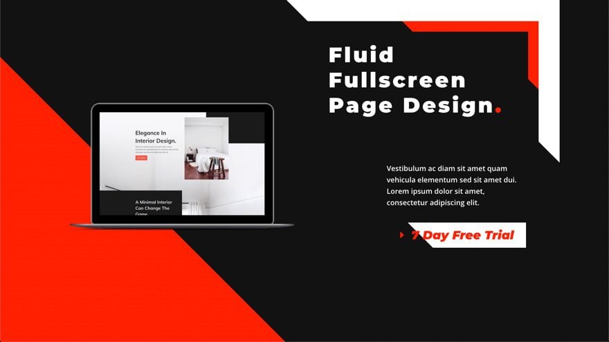
Notice how the fluid design scales smoothly with the browser viewport width.
Download the Layout for FREE
To lay your hands on the designs from this tutorial, you will first need to download it using the button below. To gain access to the download you will need to subscribe to our newsletter by using the form below. As a new subscriber, you will receive even more Divi goodness and a free Divi Layout pack every Monday! If you’re already on the list, simply enter your email address below and click download. You will not be “resubscribed” or receive extra emails.

To import the section layout to your Divi Library, navigate to the Divi Library.
Click the Import button.
In the portability popup, select the import tab and choose the download file from your computer.
Then click the import button.

Once done, the section layout will be available in the Divi Builder.
Let’s get to the tutorial, shall we?
What You Need to Get Started

To get started, you will need to do the following:
- If you haven’t yet, install and activate the Divi Theme.
- Create a new page in WordPress and use the Divi Builder to edit the page on the front end (visual builder).
- Choose the option “Build From Scratch”.
After that, you will have a blank canvas to start designing in Divi.
How to Design a Fluid Hero Section in Divi
To build the fluid hero section, we are going to add a fluid root font size to each of the three modules. These modules will make up the heading, subtitle, and button. Then we are going to use the em length unit within the modules design settings to make sure the design elements are relative to the fluid root font size. Then we are going to position the image on the left side of the page with an absolute position and offset. The result will be a fluid hero section that scales perfectly with the viewport width so that the design is consistent on all devices.
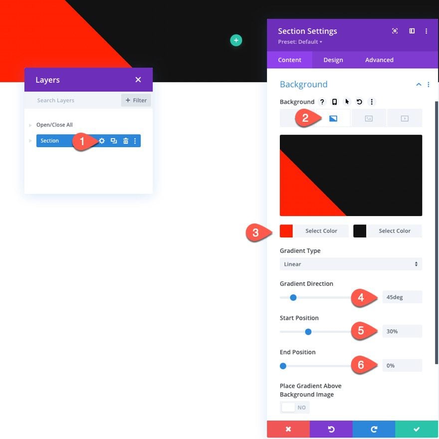
Section Settings
To start, let’s update the existing design settings for the section. Open the section settings and update the following:
- Background Gradient Left Color: #ff2000
- Background Gradient Right Color: #121212
- Gradient Direction: 45deg
- Start Position: 30%
- End Position: 0%
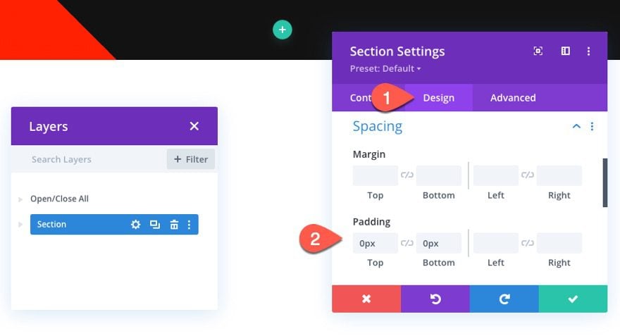
Under the design tab, update the padding:
- Padding: 0px top, 0px bottom
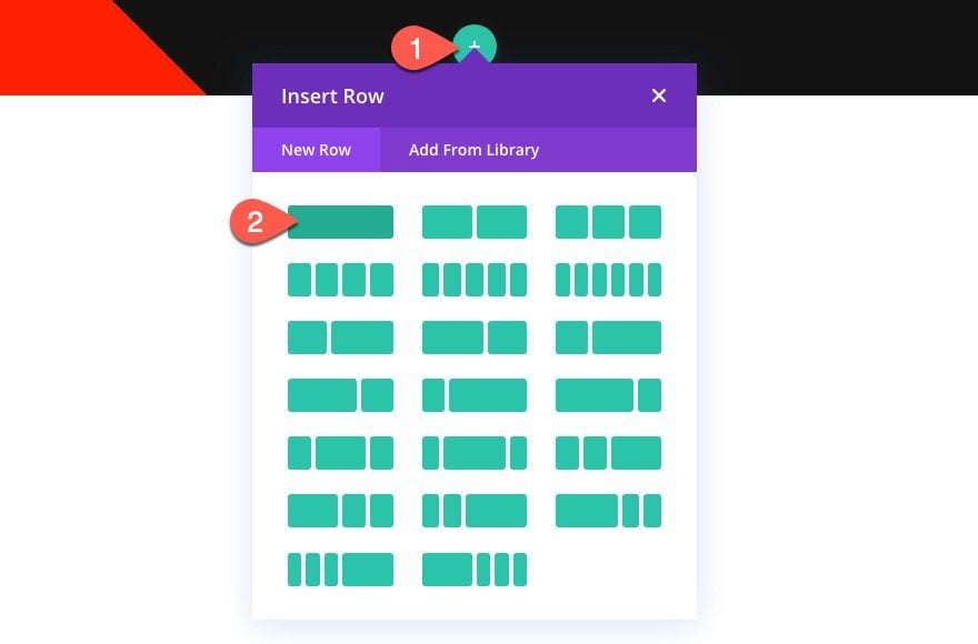
Create Row
Next, add a one-column row to the section.
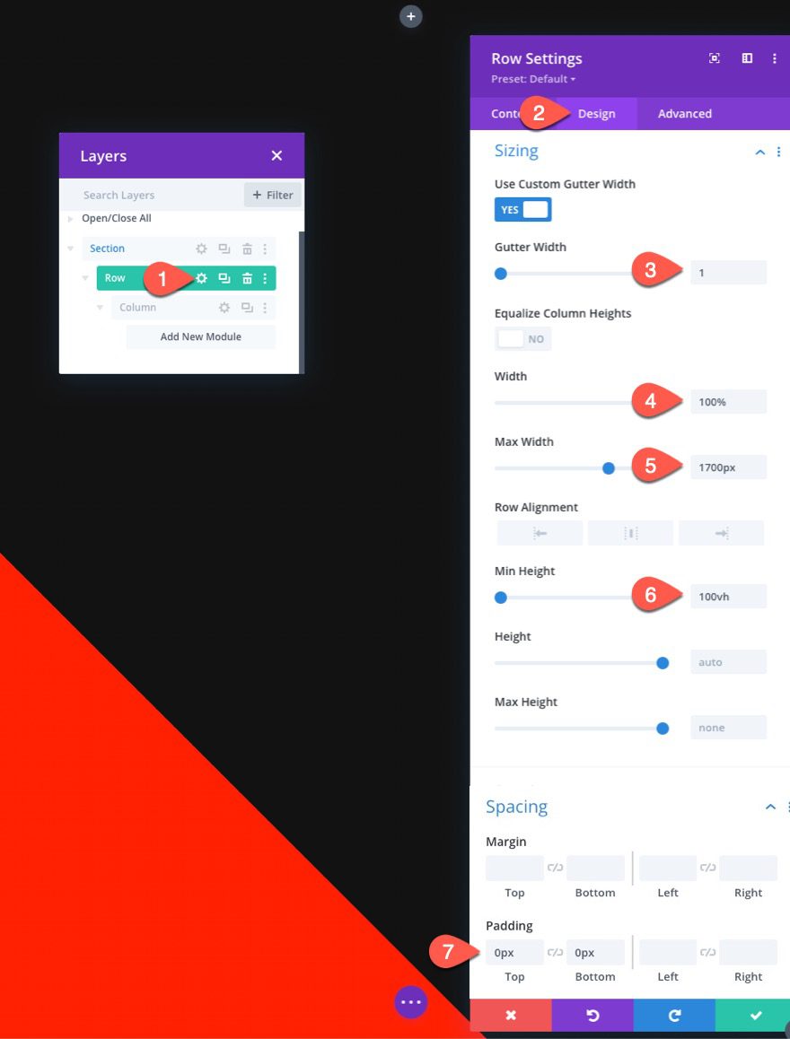
Row Settings
Open the settings for the row and update the following under the design tab:
- Gutter Width: 1
- Width: 100%
- Max Width: 1700px
- Min Height: 100vh (desktop), none (tablet and phone)
- Padding: 0px top, 0px bottom
Create Fluid Heading Text with Border
Now that the section and row are finished, we can add the fluid heading text to the hero section. We are also going to add a fluid border to the text module for a creative design element.
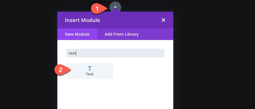
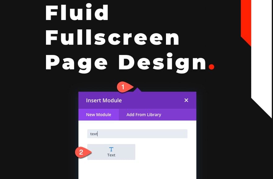
Add Text Module
To create the heading text and border, add a new text module to the column.
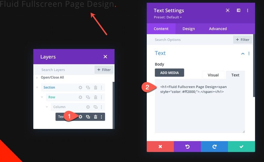
Text Settings
Under the content tab, update the body content with the following HTML:
<h1>Fluid Fullscreen Page Design<span style="color: #ff2000;">.</span></h1>
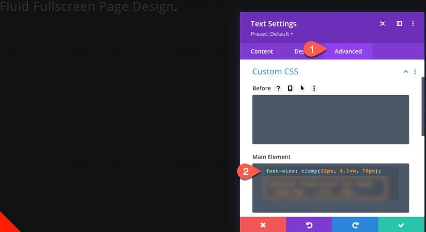
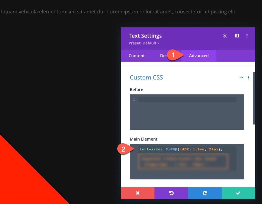
To make the design elements fluid, we first need to add a fluid root font size to the module using the CSS Clamp() function. Under the advanced tab, past the following CSS snippet:
font-size: clamp(32px, 4.1vw, 70px);
With the fluid root font size in place, we are ready to update the design settings. It is important to use the em length unit throughout because the em length unit is relative to the element’s root font size.
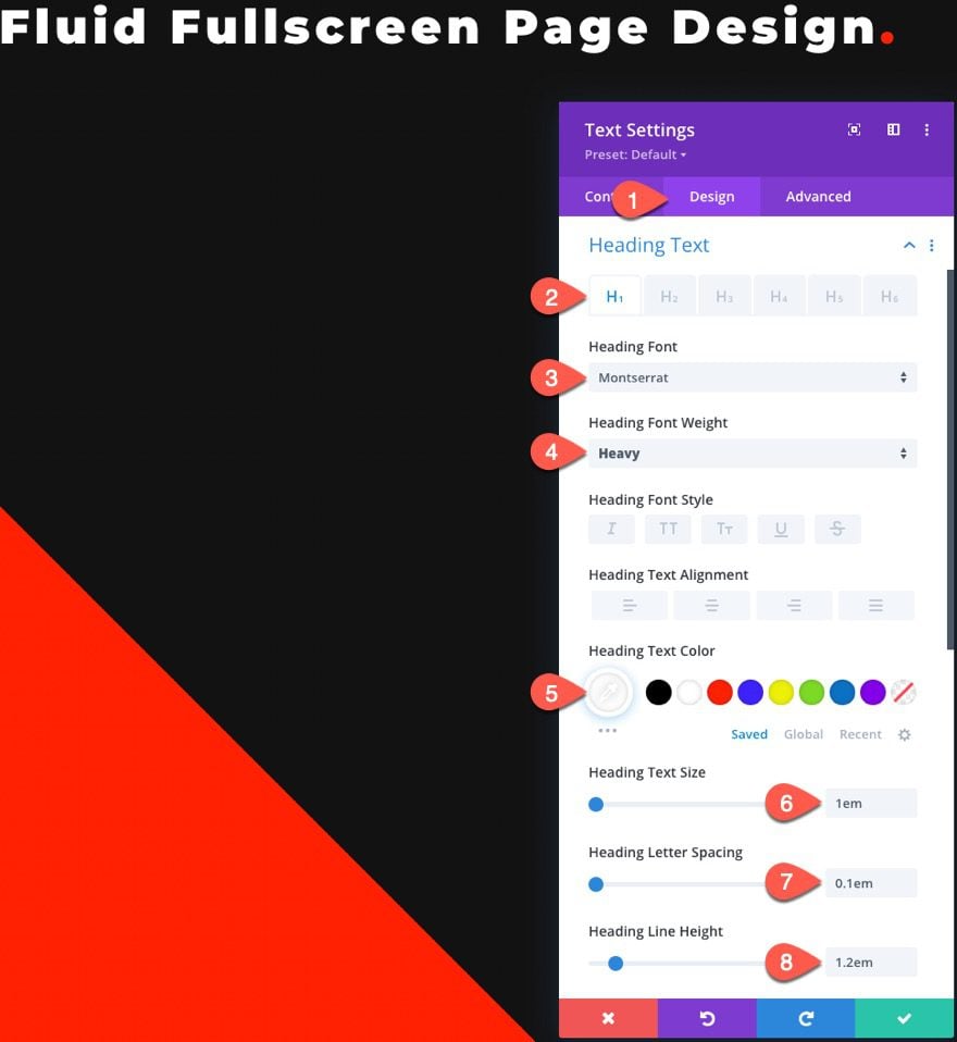
Under the design tab, update the following heading text design settings:
- Heading Type: H1
- Heading Font: Montserrat
- Heading Font Weight: Heavy
- Heading Text Color: #ffffff
- Heading Text Size: 1em
- Heading Letter Spacing: 0.1em
- Heading Line Height: 1.2em
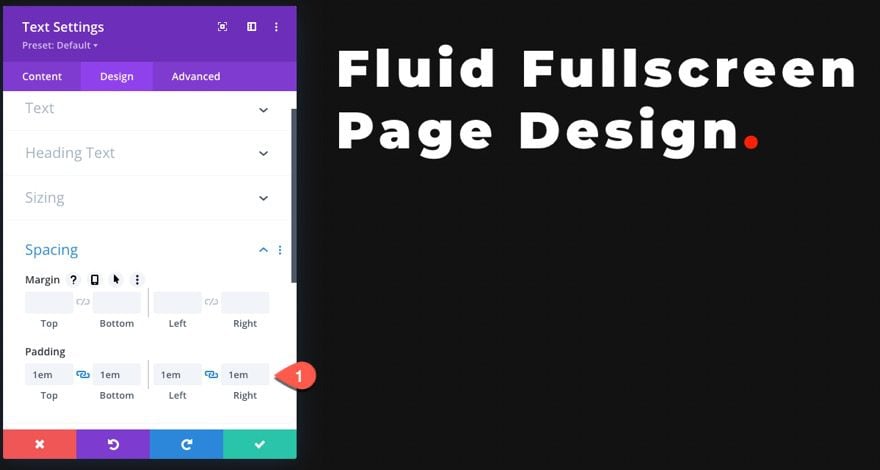
Also, update the modules padding as follows:
- Padding: 1em (top, bottom, left, right)
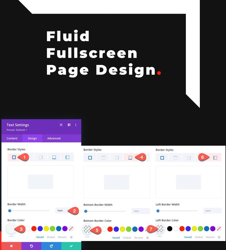
To create the fluid border design, update the following:
- Border Width: 1em
- Border Color: #ffffff
- Bottom Border Color: transparent
- Left Border Color: transparent
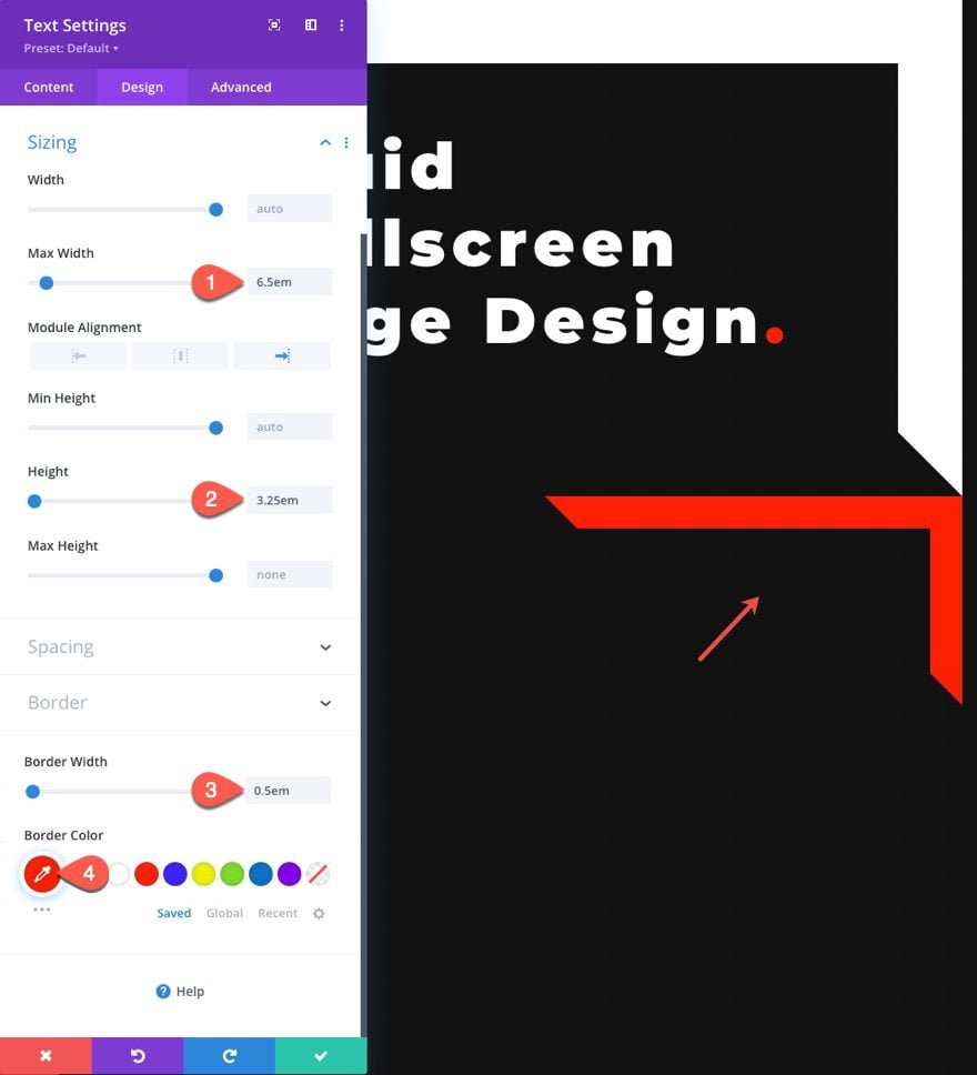
Creating the Accent Border
To create the accent border, we can duplicate the existing text module.
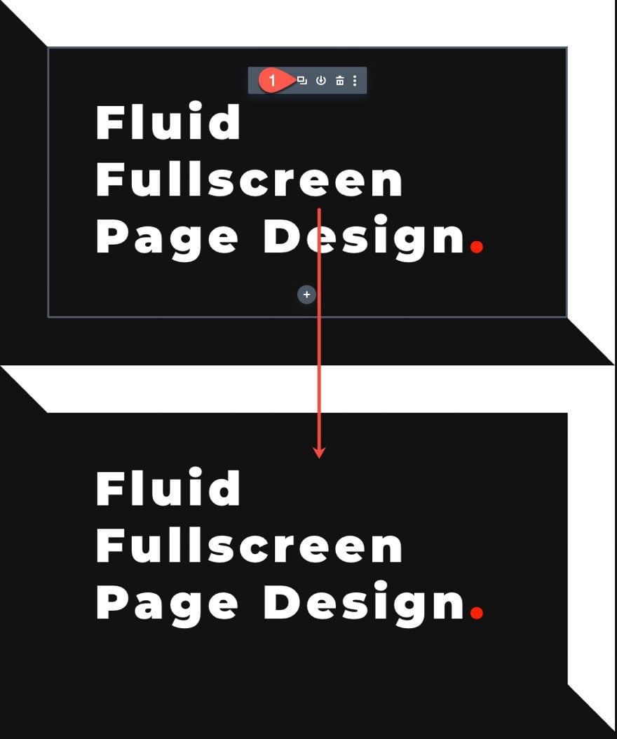
Take out the existing body content and update the design settings as follows:
- Max Width: 6.5em
- Height: 3.25em
- Border Width: 0.5em
- Border Color: #ff2000
Remember, the same fluid root font size is included in this duplicate module. So, we can use the em length unit to adjust the size and width of the border. This will make sure the design will adjust along with the design of the heading text module.
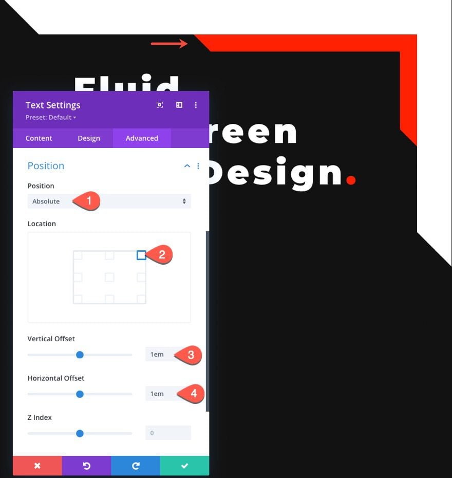
To position the accent border, add an absolute position with an offset that is equal to the width of the border in the heading text module (1em). Under the advanced tab, update the following Position options:
- Position: Absolute
- Location: top right
- Vertical Offset: 1em
- Horizontal Offset: 1em
Create the Fluid Subtitle Body Text
Below the heading text, we are going to add the fluid subtitle body text. Because this text is smaller, we are going to add a smaller fluid root font size.
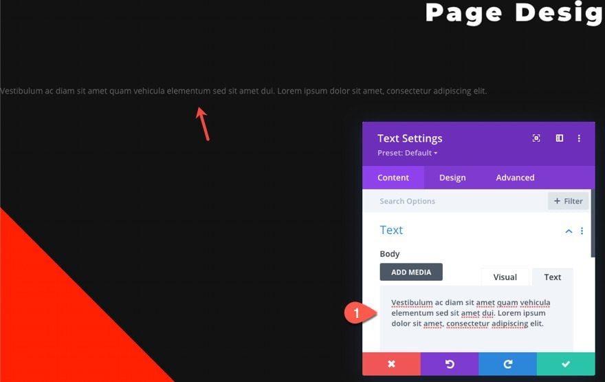
Add New Text Module
To create the subtitle text, add a new text module below the existing heading text module.
You can add a few sentences of filler text as follows:
- Body Content: Vestibulum ac diam sit amet quam vehicula elementum sed sit amet dui. Lorem ipsum dolor sit amet, consectetur adipiscing elit.
Add Fluid Root Font Size
Next, we need to add a new fluid font size that is more appropriate for smaller text. Under the advanced tab, paste the following CSS snippet under the Main Element:
font-size: clamp(14px, 1.4vw, 24px);
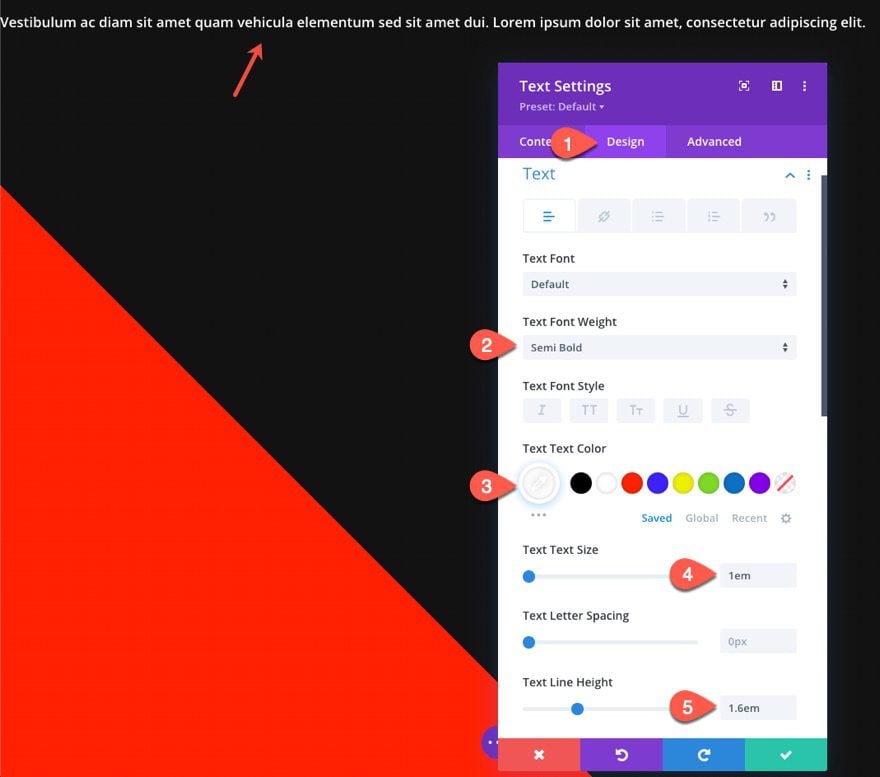
Text Design Settings
Under the design tab, update the following:
- Text Font Weight: Semi Bold
- Text Text Color: #ffffff
- Text Text Size: 1em
- Text Line Height: 1.6em
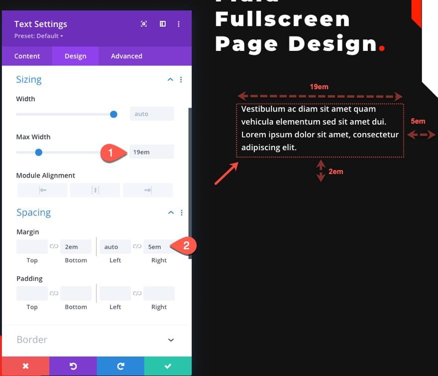
Then update the size and spacing as follows:
- Max Width: 19em
- Margin: 2em bottom, auto left, 5em right
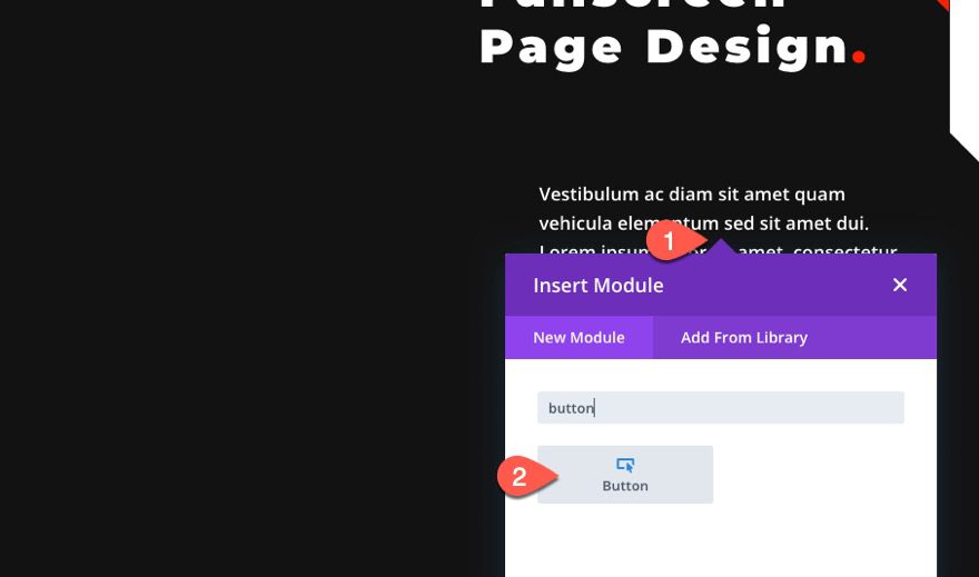
To create the fluid button, add a new button module below the subtitle text module.
Then update the button text to read “7 Day Free Trial”.
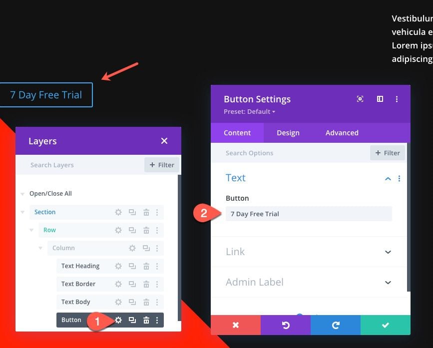
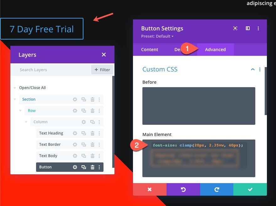
Add Fluid Root Font Size
Next, we need to add a new fluid font size that is appropriate for a button. Under the advanced tab, paste the following CSS snippet under the Main Element:
font-size: clamp(20px, 2.35vw, 40px);
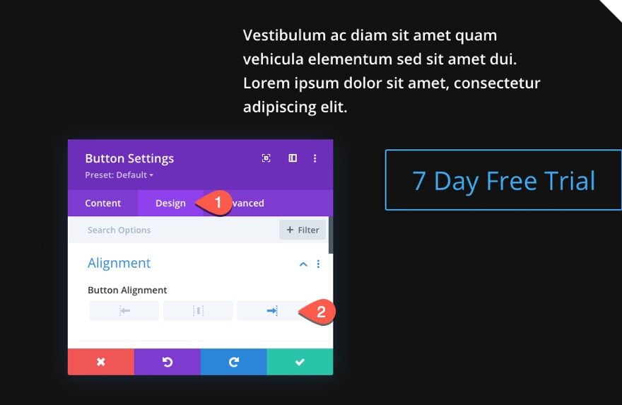
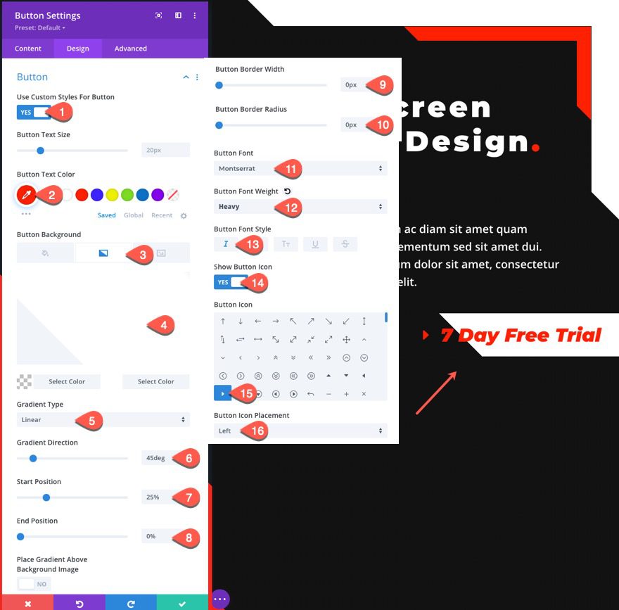
Button Design Settings
Under the design tab, update the following:
- Button Alignment: Right
- Button Text Color: #ff2000
- Button Background Gradient Left Color: transparent
- Button Background Gradient Right Color: #ffffff
- Gradient Direction: 45deg
- Start Position: 25%
- End Position: 0%
- Button Border Width: 0px
- Button Border Radius: 0px
- Button Font: Montserrat
- Button Font Weight: Heavy
- Button Font Style: Italic
- Button Icon: right triangle arrow (see screenshot)
- Button Icon Placement: Left
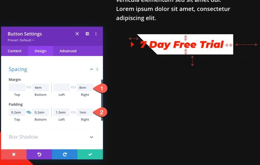
- Margin: 8em right
- Padding: 0.2em top, 0.2em bottom, 1.5em left, 1em right
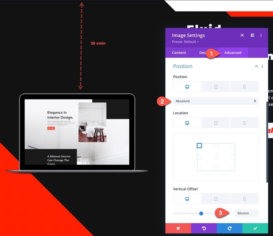
Create Image for Hero Section
With all of the hero section content on the right size of the page, we are ready to add the hero section image to the left side. To do this, first add an image module under the button.
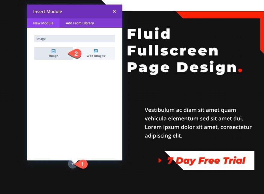
Open the image settings and upload an image.
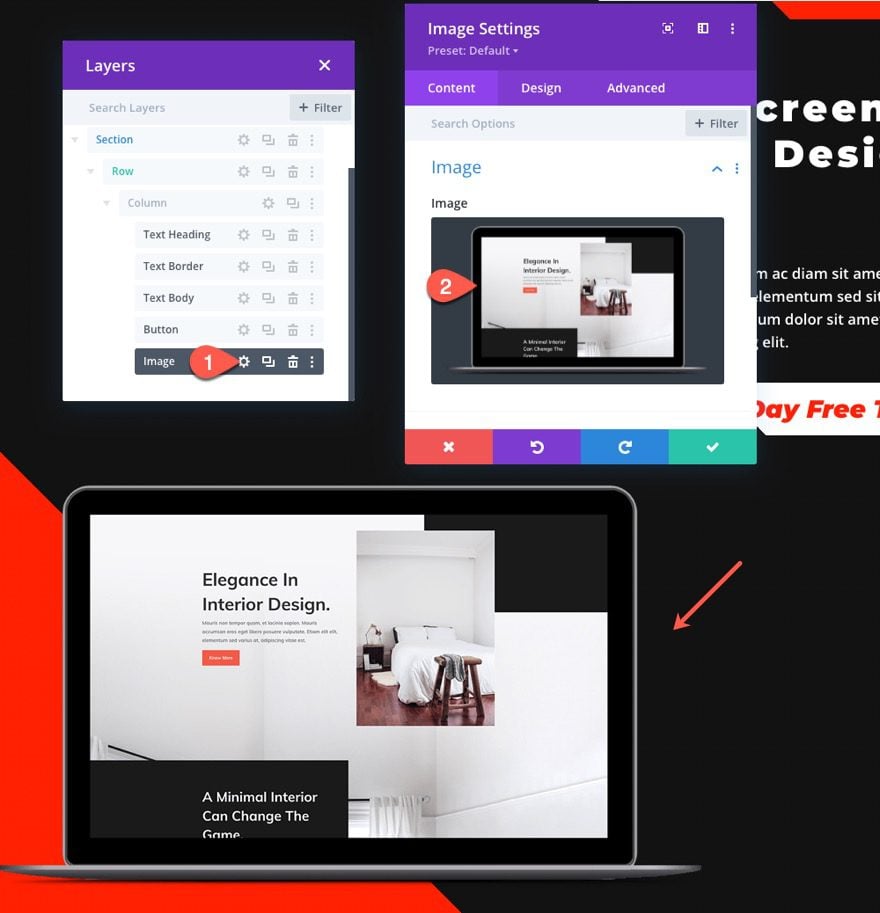
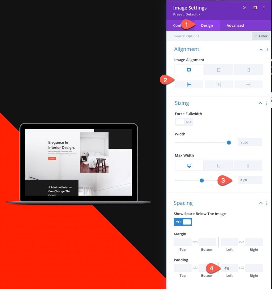
Image Design Settings
Under the design tab, update the following settings:
- Image Alignment: Left (desktop and tablet), Center (phone)
- Max Width: 48% (desktop and tablet), 70% (phone)
- Padding: 4% Left
Finally, give the image an absolute position with an offset using vmin length unit as follows:
- Position: Absolute (desktop and tablet), Relative (phone)
- Location: Top Left (desktop and tablet)
- Vertical Offset 30vmin (desktop and tablet), 0px (phone)
Final Result
Here is the final result on a live page.
Here is how the fluid design scales smoothly with the browser viewport width.
Browser Support
The CSS clamp() function (used for the fluid font size in this tutorial) is surprisingly well supported by all major browsers except IE. There is a weird safari bug that doesn’t scale dynamically when adjusting the browser window, but does show correctly on page load. To fix this, all you seemingly need to do is give each of the modules a min-height of 0vw.
Final Thoughts
Adding fluid design to a hero section can be a convenient way to ensure the above-the-fold looks beautifully consistent on all browser sizes, without the hassle of updating the design at specific breakpoints or using media queries.
Don’t forget to check out our other articles on fluid design, including how to create fluid typography, fluid modules, and fluid buttons.
I look forward to hearing from you in the comments.
Cheers!


Hi Jason,
This is a great tutorial. I haven’t heard of the clamp() function before and it has solved a problem I’ve been trying to resolve for ages.
I’m a relative beginner with Divi and I guess as a plea for people at my level and lower, could you please check that the blog accurately reflects the final output. I’m less than halfway through following the blog and am not seeing on my screen what you have on yours and having spent considerable time comparing the video with the blog I have discovered 3 problems so far (there may be more later)
1. Font size for the heading for tablets and phones is ‘auto’ not ‘none’
2. The module alignment for the accent border should be set to ‘right’ (this isn’t mentioned)
3. You need to set a Max Width on the heading text element and align the module to the right so it doesn’t span the full screen and the text breaks onto multiple lines. This isn’t mentioned anywhere in the blog
I enjoy following these tutorials but when vital information is missed out it can be frustrating and off-putting, especially for newbies, to follow along.
Keep up the good work.
Hi Jason,
Thanks for the new tutorial!
One point: it will be cool if you test bigger breakpoints than 1920px. Now it’s real headache to customize the Divi design for the following desktop screens: 5120x2880px, 4096x2034px, 3840x2160px, 2560x1440px. Many elements smashed or stretched by the screens’ resolution.
It will be cool if the dev team adds maybe the few more breakpoints (options) for the big screens. In many business niches more than 50% of a potencial clients are using desktop computers.
Sincerely,
Igor
P.S. Maybe you have (or know) some kind of the tutorial how to solve big screen problems? And maybe you know online tools to test a view of responsive design for the desktop computers.
Igor,
Thanks for the suggestion. And Yes, I agree this is an area we need to address. Have you tried the developer tools in Chrome or Firefox (responsive design mode/device toolbar)? You should be able to add custom dimensions for larger monitors.
Good Design
Thats a great desing, thank you very much!