
Fluid button design is the process of designing a button that scales fluidly with the size of your browser window (or viewport). It involves applying the practices of fluid web design to all the design properties of a button. This makes the design of the button predictable and consistent on all devices. And, it is a refreshing alternative to traditional responsive design techniques that involve making numerous adjustments to the design at certain breakpoints.
In this tutorial, we are going to show guide you through the process of creating fluid button designs in Divi.
Because fluid button design relies on the implementation of fluid typography, it may help to check out our complete guide on fluid typography in Divi.
Let’s get started!
- 1 Sneak Peek
- 2 Download the Layout for FREE
- 3 Download For Free
- 4 What You Need to Get Started
- 5 The Anatomy of a Divi Button
- 6 How to Make a Fluid Button in Divi
-
7
Creating Fluid Button Designs in Divi
- 7.1 #1 Basic Example
- 7.2 #2 Fluid Button with Rounded Corners and Box Shadow
- 7.3 #3 Fluid Button with Unique Box Shadow and Icon Placement
- 7.4 #4 Fluid Button with Tri-Colored Background Gradient
- 7.5 #5 Fluid Button with Custom Fluid Width
- 7.6 Final Results
- 7.7 Fluid Buttons Using Clamp() for Font Size
- 7.8 Final Results with Clamp()
- 8 Final Results Again
- 9 Using clamp() to set a min, scaler, and max font size
- 10 Final Thoughts
Sneak Peek
Here is a quick look at the design we’ll build in this tutorial.
And here is a codepen that demonstrates this fluid button design concept.
Download the Layout for FREE
To lay your hands on the designs from this tutorial, you will first need to download it using the button below. To gain access to the download you will need to subscribe to our newsletter by using the form below. As a new subscriber, you will receive even more Divi goodness and a free Divi Layout pack every Monday! If you’re already on the list, simply enter your email address below and click download. You will not be “resubscribed” or receive extra emails.

To import the section layout to your Divi Library, navigate to the Divi Library.
Click the Import button.
In the portability popup, select the import tab and choose the download file from your computer.
Then click the import button.

Once done, the section layout will be available in the Divi Builder.
Let’s get to the tutorial, shall we?
What You Need to Get Started

To get started, you will need to do the following:
- If you haven’t yet, install and activate the Divi Theme.
- Create a new page in WordPress and use the Divi Builder to edit the page on the front end (visual builder).
- Choose the option “Build From Scratch”.
After that, you will have a blank canvas to start designing in Divi.
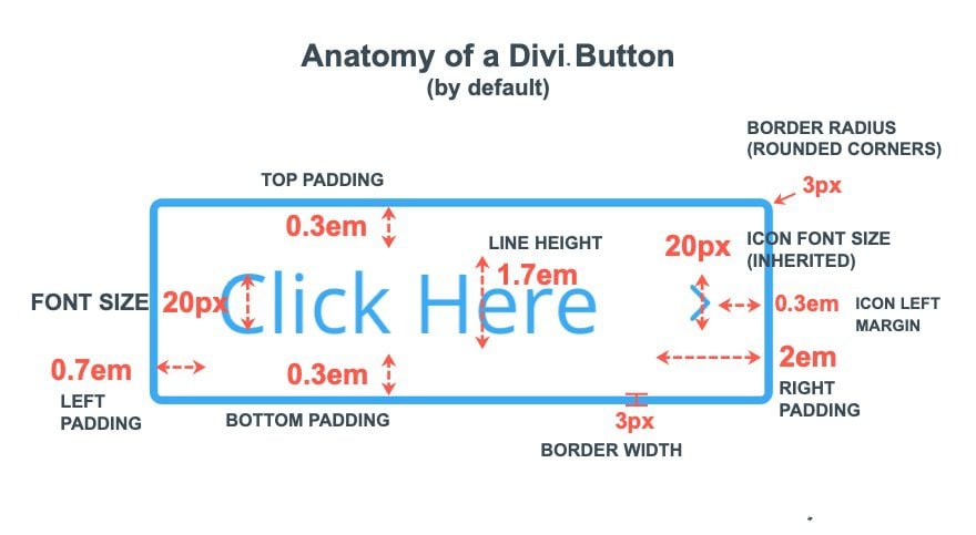
By default, a Divi Button will have built-in styles that include both px and em length units (see illustration above). The properties that use the px length unit include:
- Font size: 20px
- Rounded Corners: 3px
- Border Width: 3px
- Icon Font Size: inherited by font size (20px)
These px values are absolute and will remain the same no matter if you change the font size or the size of the browser viewport.
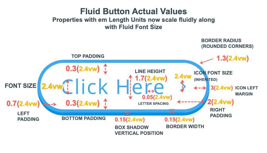
The properties that use the em length unit include:
- Padding: 0.3em top, 0.3em bottom, 0.7em left, 2em right
- Line Height: 1.7em
- Icon Left Margin: 0.3em
These em values are relative to the element’s (or button’s) font size and will change (scale) whenever the font size changes.
Understanding the em Length Unit
The key to creating a fluid button in Divi is understanding how em length units work. The em length unit is relative to the element’s font size (whatever it may be). Essentially the value of em is a multiple of the element’s font size. For example, if the element’s font size is 20px, 2em is the same as 2(20px). This means that the em length unit will change whenever the element’s font size changes. The px length unit, however, will not change.
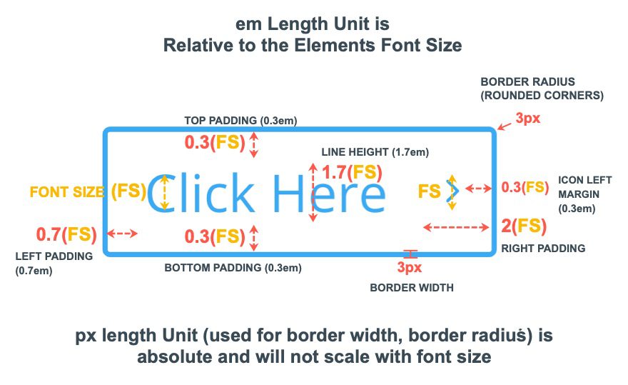
Continuing with our default example, the default right padding for the button is 2em (or 2 multiples of em). Because the button font size is 20px, the right padding is 2 times 20px (which is 40px). The top and bottom padding is 0.3em. So the top and bottom padding is 6px (0.3 times 20px equals 6px).
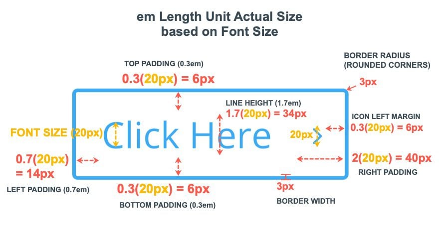
See the illustration below to understand the actual value of the em length units based on the font size.
When designing a fluid button using em length units, everything depends on the size of the button font size. To say it another way, the font size will be applied to the value of all the properties using the em length unit for the button. So, if you want the button styles to become fluid, you must give the button a fluid (or scaler) font size. The most common fluid length unit to use is the vw length unit which is relative to the browser viewport width. In other words, the vw length unit changes as the browser width changes.
To make a fluid button, substitute the 20px font size to something like 2.4vw. Because this value changes with the browser width, all button properties, using the em length unit will also scale with the browser width.
Simply put, building a fluid Divi Button includes two key principles:
- Use a fluid length unit (vw) for the font size
- Use em length unit values for all button style properties
This means you can use em length units for border width, border radius, and even box shadows.
Here is an illustration of a fluid button that includes a fluid font size (2.4vw) and em length units for all style properties.
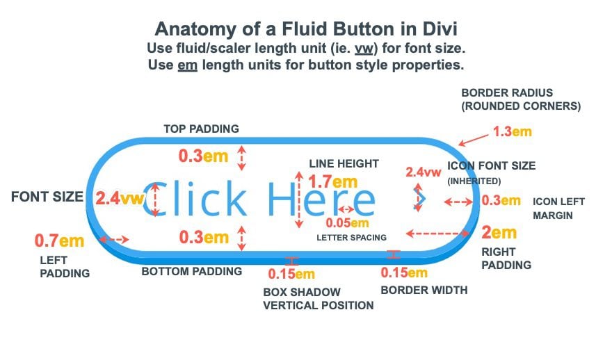
The actual values of each property using em length units will inherit the fluid font-size value and scale relative to the browser viewport width (vw).
Now that we have a better understanding of how to create a fluid button. Let’s create a few fluid button designs in Divi.
#1 Basic Example
To start, let’s create the basic example we illustrated previously.
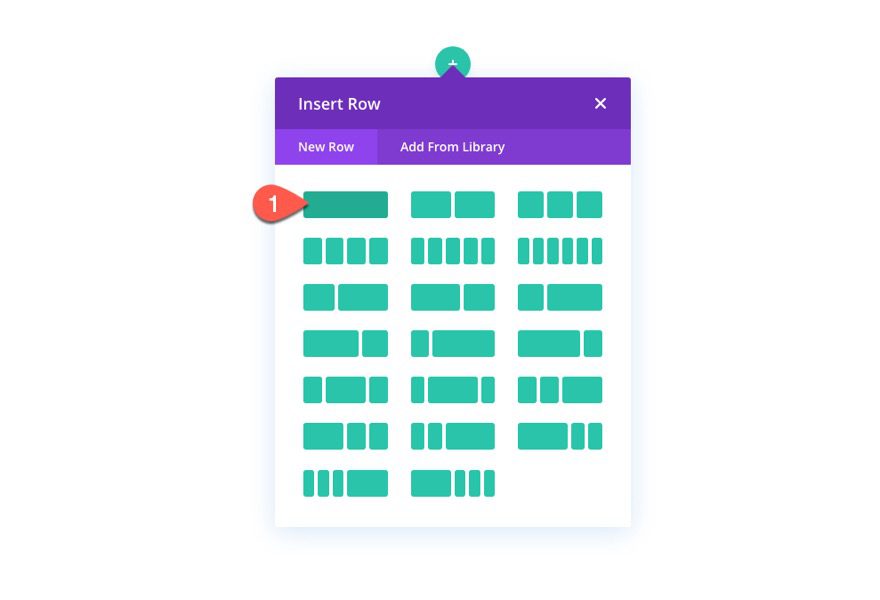
From the Divi Builder, create a new one-column row.
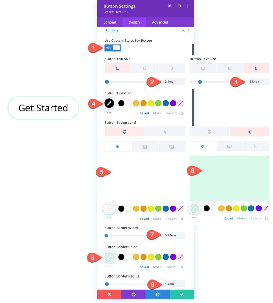
Under the design tab, update the button text size with a vw length unit value so that it will scale with the viewport width:
- Button Text Size: 2.4vw (desktop and tablet), 18.4px (phone)
Then update the following properties with an em length unit value that is relative to the button text size:
- Button Border Width: 0.15em
- Button Border Radius: 1.3em
- Button Letter Spacing: 0.05em
- Padding: 0.3em top, 0.3em bottom, 1em left, 2em right
- Box Shadow: see screenshot
- Box Shadow Vertical Position: 0.15em
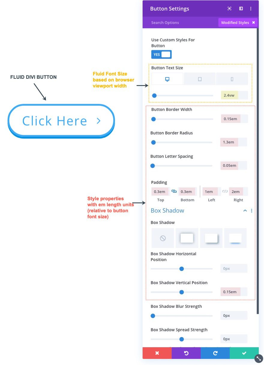
Here is the final result.
To start, create a new button and update the button text to read “Get Started”.
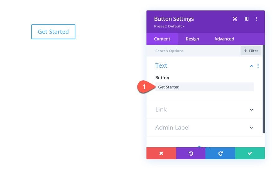
Under the design tab, update the following:
- Use Custom Styles for Button: YES
- Button Text Size: 2.4vw (desktop and tablet), 18.4px (phone)
- Button Text Color: #000000
- Button Background Color: #ffffff (desktop), #d9f9e9 (hover)
- Button Border Width: 0.15em
- Button Border Color: #d9f9e9
- Button Border Radius: 1.3em
- Button Letter Spacing: 0.05em
- Button Font: Jura
- Button Font Weight: Semi Bold
- Button Icon: right arrow
- Button Icon Color: #000000
- Only Show Icon On Hover for Button: NO
- Padding: 0.2em top, 0.2em bottom, 1em left, 2em right
- Box Shadow: see screenshot
- Box Shadow Vertical Position: 0.3em
- Box Shadow Blur Strength: 0.5em
- Box Shadow Spread Strength: -0.3em
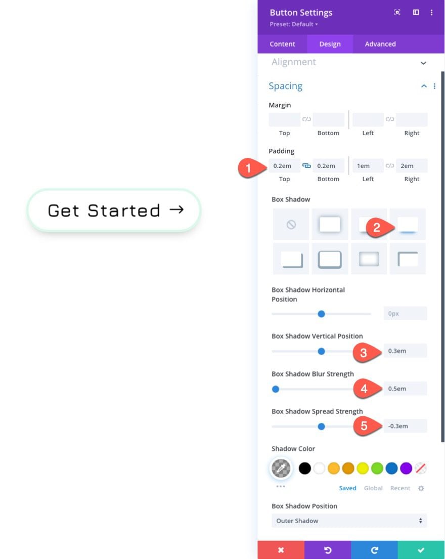
Here is the result.
For this next fluid button design, we are going to use a unique box-shadow and icon placement.
To start, duplicate the previous example #2. Then open the settings for the duplicate button to update the design.
Under the design tab, update the following:
- Button Border Radius: 0px
- Button Icon Color: #ffffff
- Box Shadow: see screenshot
- Box Shadow Horizontal Position: -1.75em
- Box Shadow Vertical Position: 0px
- Shadow Color: #000000
Under the Advanced tab, add the following custom CSS to the After Element:
margin-right: .3em;
right: 0;
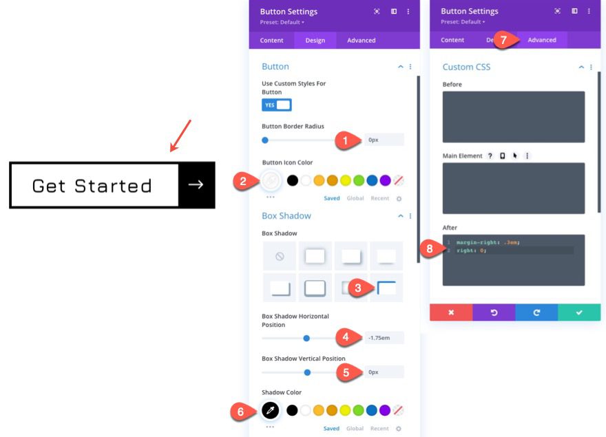
Here is the result.
For this next fluid button design, we are going to create a unique tri-colored background gradient for the button by combining the background gradient with a unique box-shadow style.
To create the button, duplicate the example #3 button previously designed.
Then open the button settings to update the styles.
Under the Advanced tab, delete the custom CSS inside the After Element.
Under the Design tab, update the following:
- Button Text Color: #ffffff
- Button Background Gradient Left Color: #f475ee
- Button Background Gradient Right Color: #9694fc
- Gradient Direction: 90deg
- End Position: 2.5em
- Button Border Width: 0px
- Box Shadow: see screenshot
- Box Shadow Horizontal Position: -2.5em
- Box Shadow Vertical Position: 0px
- Box Shadow Blur Strength: 1.5em
- Box Shadow Spread Strength: -1em
- Shadow Color: #85c6f2
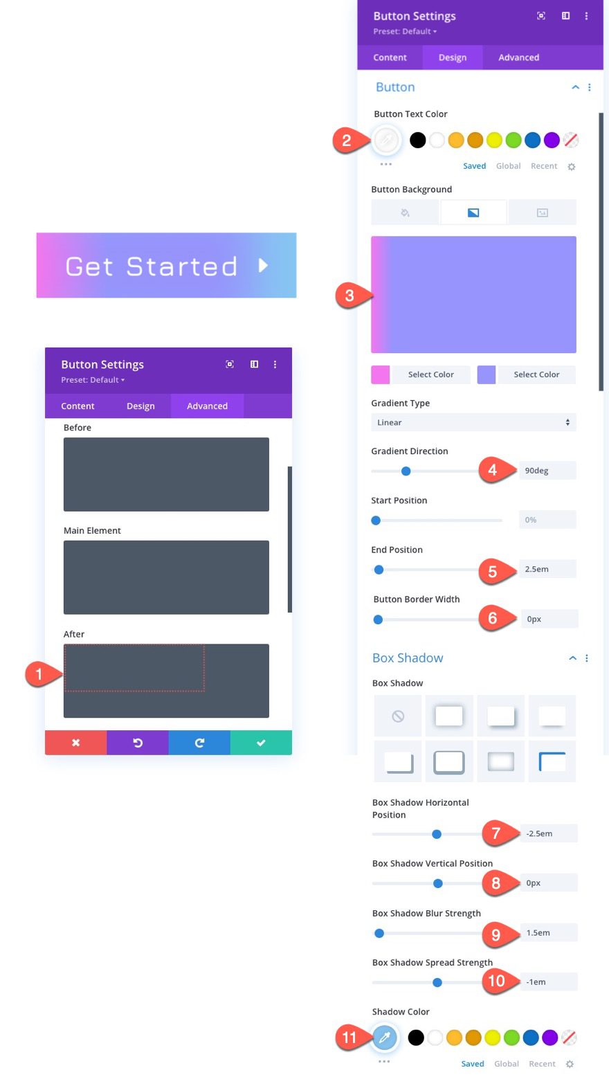
And here is the result.
For this next fluid button design, we are going to add a custom fluid width to our button. This will allow us to create larger buttons that scale fluidly with the browser width.
To create the button, duplicate the example #2 button previously designed.
Under the design tab, update the Button Alignment to centered.
Under the Advanced Tab, add the following custom CSS to the Main Element:
Desktop
display:block;
width: 100%;
max-width: 15em;
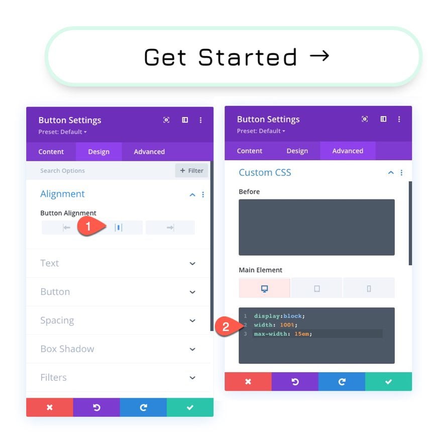
Here is the result.
Final Results
Now see the final results of our 4 fluid button designs.
If you want more control over the min and max size of your fluid button, you can use the CSS Clamp() function to set a min font size, a scaler font size, and a max font size.
To do this, you will need to reset the button text size for each of your buttons so that it is back to the default setting.
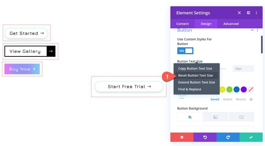
Then, under the advanced tab, add the following CSS to the Main Element of each of the buttons.
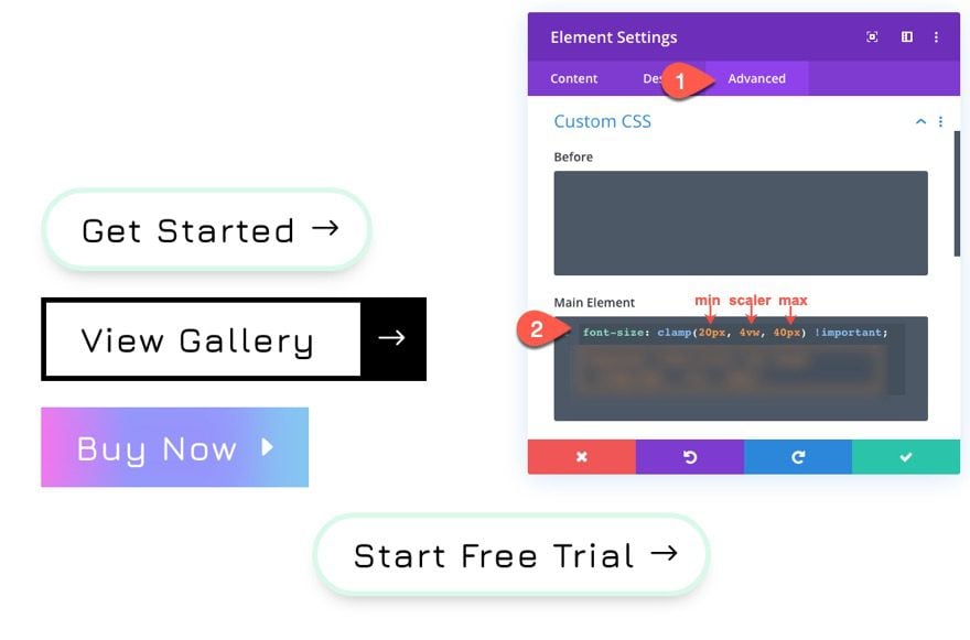
This will make sure the font size has a min size of 20px, a scaler (or fluid) size of 4vw, and a max size of 40px.
The main benefit of using clamp() is that you can stop the button from scaling too big or too small while keeping the fluid responsive design.
Final Results with Clamp()
Final Results Again
And here is a final look at each collection of fluid buttons with and without clamp() as the font size.
Using vw length font size (desktop and tablet) and px length unit (phone)
Using clamp() to set a min, scaler, and max font size
Final Thoughts
Creating fluid buttons in Divi relies on two main principles: (1) Use a fluid length unit (like vw) for the button’s font size, and (2) use em length unit values for all the style properties of the button. Once you understand that, it is important to find the right fluid font size (using vw, clamp(), etc.) and adjust then use various values of em for the rest of the button design. This will make sure the button scales perfectly fluid when adjusting the viewport width of your browser.
Keep in mind. Fluid buttons don’t really work when their parent containers aren’t also fluid. For example, if you have a fluid button inside of a row that is 400px, the button will not have room to scale and the design will break. Giving the row a width of 80% or 90vw would be more suited to fluid button designs.
I look forward to hearing from you in the comments.
Cheers!


How do I apply custom padding to every button on my website and why wouldn’t this be located in Appearance > Customize > Buttons?
I guess id did NOT work for you either
great …and now try t set a different border color on hover….
Norman,
You should be able to do this with Divi’s built-in hover options under the button settings. Is it not working for you?
No that just does NOT work not even in any of the fresh installments.
If this does does work for you please share a screen recording.
Nice and clear and clever information.
Good to know!
thanks Jason!
Great to hear! Glad you liked it.
Seems like a great idea. And thanks for the free download as well.
Have a good weekend.
Thanks, Robin. You too!
This is F…ING great !!! Thanks a lot
You’re welcome, Gman!
Clever! Thanks for posting this!
You’re welcome, Brian. We appreciate the support!