
To further simplify the process of implementing consistent responsive design for a Divi module, we can apply the practices of fluid web design. Unlike the more traditional methods of responsive design, Fluid web design doesn’t break or abruptly jump to a different size/style at different breakpoints. It incorporates responsive length units relative to the viewport width so the design adjusts (or scales) fluidly, keeping the design consistent on all devices.
In this tutorial, we are going to show you how to create a fluid Divi module. Using similar fluid design practices to create fluid typography and/or fluid buttons, we are going to create a fluid Divi module that will scale seamlessly with the browser viewport. As we will find out, the secret combination is adding a root body font size with a relative (or fluid) length unit) to the module and then incorporating the em length unit (which is relative to the root body font size) throughout the module’s settings when needed.
Let’s get started!
Sneak Peek
Here is a quick look at the design we’ll build in this tutorial.
And here is a codepen that demonstrates this fluid module functionality.
Download the Layout for FREE
To lay your hands on the designs from this tutorial, you will first need to download it using the button below. To gain access to the download you will need to subscribe to our newsletter by using the form below. As a new subscriber, you will receive even more Divi goodness and a free Divi Layout pack every Monday! If you’re already on the list, simply enter your email address below and click download. You will not be “resubscribed” or receive extra emails.

To import the section layout to your Divi Library, navigate to the Divi Library.
Click the Import button.
In the portability popup, select the import tab and choose the download file from your computer.
Then click the import button.

Once done, the section layout will be available in the Divi Builder.
Let’s get to the tutorial, shall we?
What You Need to Get Started

To get started, you will need to do the following:
- If you haven’t yet, install and activate the Divi Theme.
- Create a new page in WordPress and use the Divi Builder to edit the page on the front end (visual builder).
- Choose the option “Build From Scratch”.
After that, you will have a blank canvas to start designing in Divi.
How to Create a Responsive Fluid Divi Module
The Row
To begin, create a new one-column row within the default regular section.
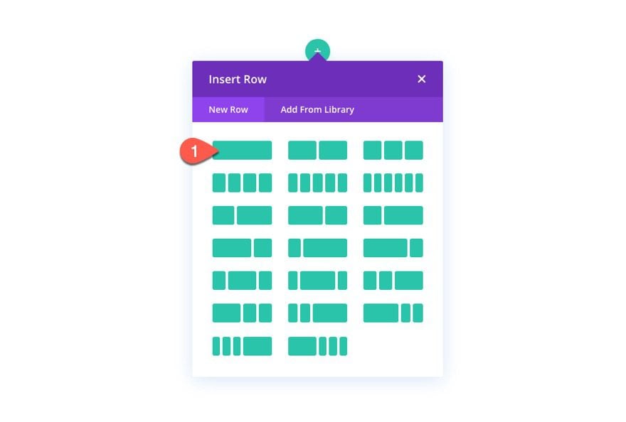
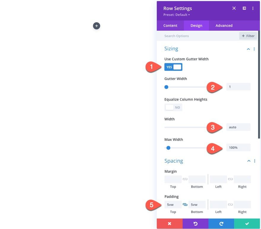
Open the row settings, and update the following:
- Use Custom Gutter Width: YES
- Gutter Width: 1
- Width: auto
- Max Width: 100%
- Padding: 5vw top, 5vw bottom
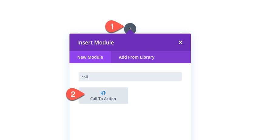
Designing a Fluid Call to Action Module
Although the same fluid design techniques can be added to just about any Divi module, we are going to one of Divi’s call to action modules for this tutorial.
Add a new call to action module inside the column/row.
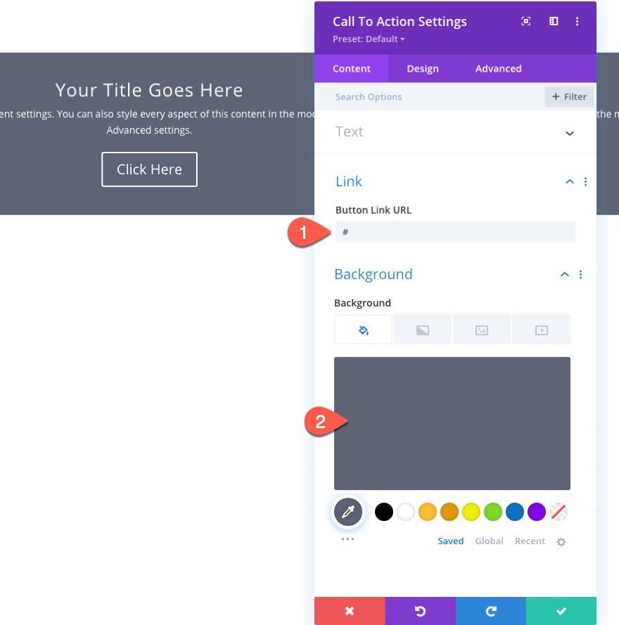
Content Settings
Under the content settings, add a mock button link URL and update the background color as follows:
- Button Link URL: #
- Background Color: #5e6472
Adding a Fluid Root Font Size to the Module
When designing a fluid module, we need to add a fluid root font size to the module. Once it is added to the module, this root font size will incorporated dynamically throughout the rest of our module design settings using the em length unit.
To add the fluid root font size to the module, go to the advanced tab and add the following custom CSS to the Main Element:
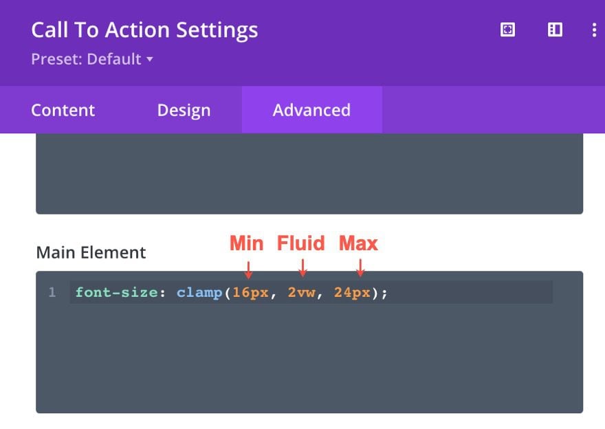
font-size: clamp(16px, 2vw, 24px);
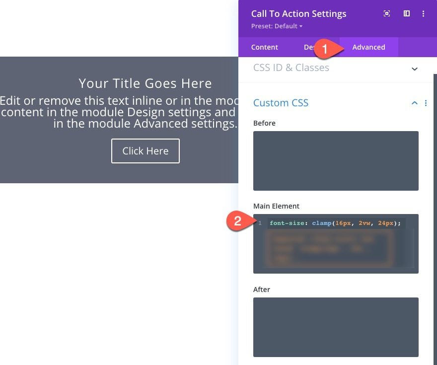
For this font size, we are using the CSS Clamp() function in order to set a min font size, a fluid font size (when needed), and a max font size.
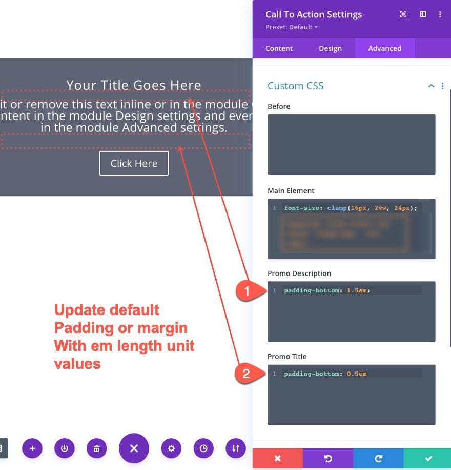
Overriding Any Elements with Default Spacing with em Length Unit Values
Although not be absolutely necessary, to get a true fluid design for the module, we need to override any default (behind the scenes) spacing that the module is currently using with an em length unit value for that property. You can identify these by inspecting your element using a browsers development tools. In this case, the call to action module has a bottom padding both on the promo description and promo title element. Since the bottom padding property is using a pixel (px) length unit, we need to override each with an em length unit that will incorporate the root body font size we just added to the main element.
Updating the Design with em Length Units
Now that our fluid root font size for the module is in place, all we need to do is update the design of the module using em length units. Because the em length unit is relative to the root font size, any design using the em length unit will inherit the fluidity of the font size and scale fluidly with the font size when needed.
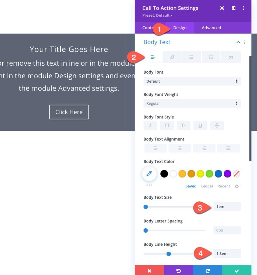
Body Text
The custom root font-size we added earlier is purposefully created with the body text in mind. Therefore we can assign the body text with a value of 1em which inherit the exact value of the root font size. We can also add a body line-height as well. To do this, update the following:
- Body Text Size: 1em
- Body Line Height: 1.8em
Title Text
For the title text element of the module, we can give it a larger size using the em length unit. Update the following:
- Title Text Size: 1.7em
- Title Line Height: 1.3em
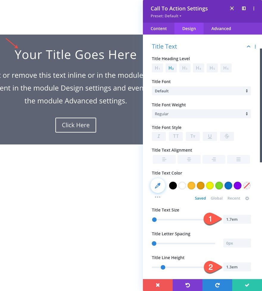
To give you an idea of what the title text size will actually be, we simply multiply the em length value by the root font value. Remember, the root font size is using clamp() to establish a min (16px), fluid (2vw), and max (24px) font size. Therefore the min title text size will be 1.7 times 16px which is close to 27.2px. The fluid font size will be 1.7 times 2vw (2% of the viewport width). And the max font size will be 1.7 times 24px which is close to 69.36px.
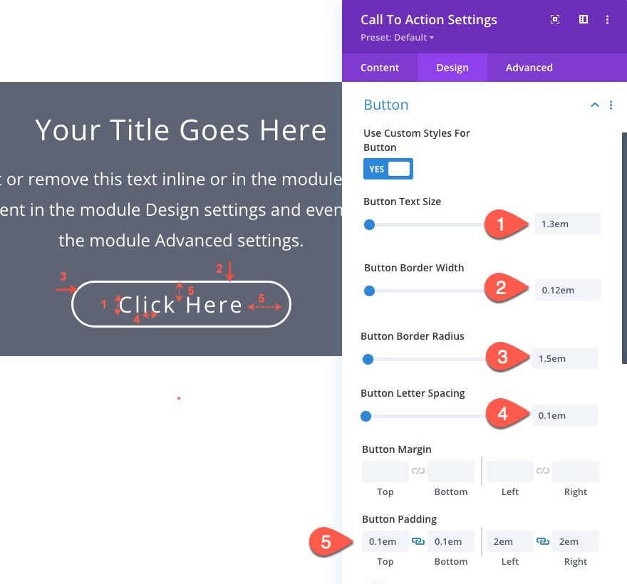
Button Design
The third element of the module is the button. We can update the design settings of the button using em length unit values to incorporate the fluid design as well.
Update the following button settings:
- Button Text Size: 1.3em
- Button Border Width: 0.12em
- Button Border Radius: 1.5em
- Button Letter Spacing: 0.1em
- Button Padding: 0.1em top, 0.1em bottom, 2em left, 2em right
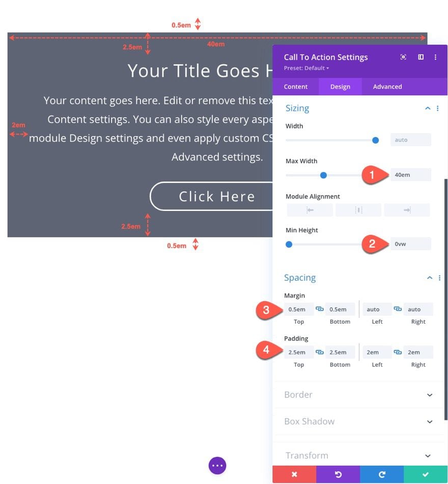
Size and Spacing
To make sure the module has a fluid size and fluid spacing, we need to use em length units for those values as well.
Update the following sizing and spacing settings:
- Max Width: 40em
- Min Height: 0vw
- Margin: 0.5em top, 0.5em bottom, auto left, auto right
- Padding: 2.5em top, 2.5em bottom, 2em left, 2em right
The Result
Now let’s see the result of our fluid module when adjusting the browser width on a live page.
Adding Multiple Fluid Modules in a Row with CSS Grid
In order to add multiple adjacent fluid modules to a row, we need to make sure that our fluid module design isn’t limited or stopped by any parent container widths. In other words, we want the parent container of our modules (the column) to be set to auto so that it scales with the size of the module. We can do this using CSS Grid at the column level to set each of the modules in a grid with each column having an auto width.
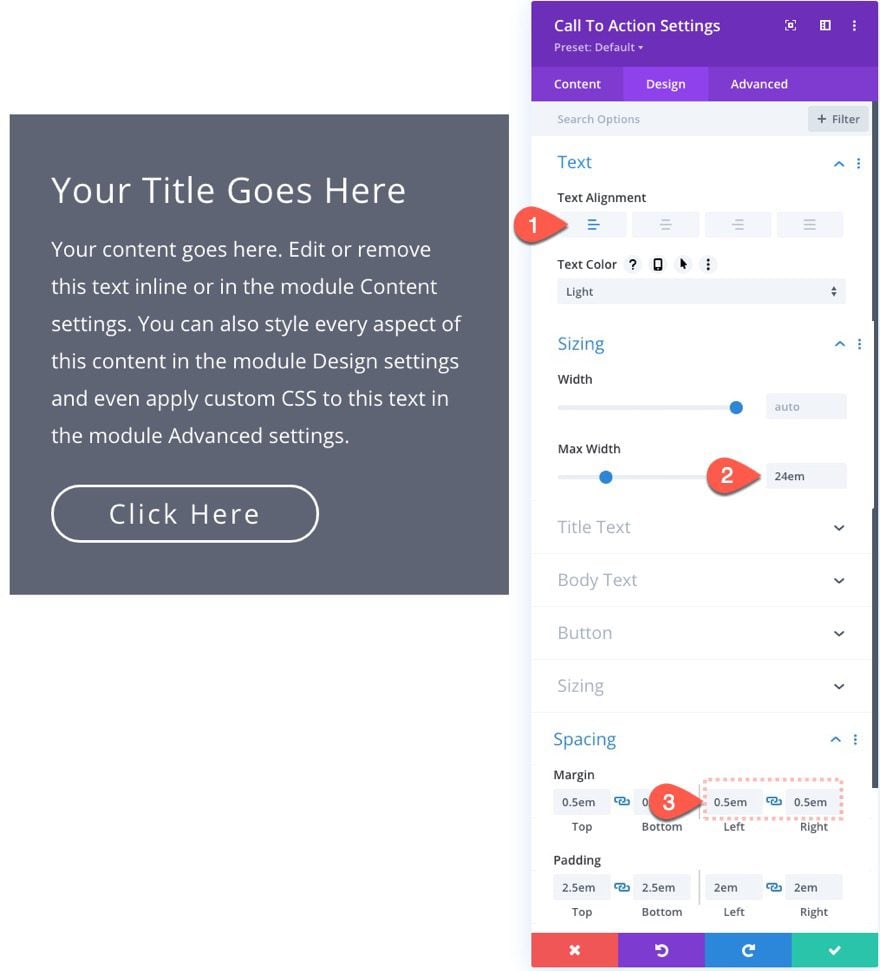
Adjust Module Size and Spacing
Before we create the CSS Grid for the modules, we need to adjust the max-width and margin for our module to a size more fitting for a two-column layout with two modules.
Open the settings for the module and update the following:
- Text Alignment: Left
- Max Width: 24em
- Margin: 0.5em left, 0.5em right
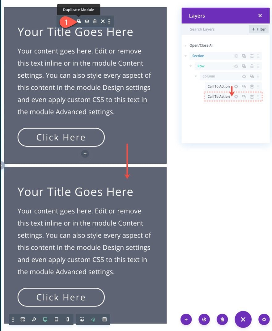
Duplicate Module
Now duplicate the module to create another in the same column.
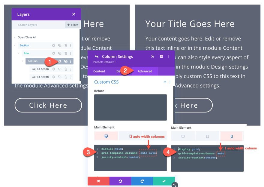
Add CSS Grid to Column
Now we can add the custom CSS to the column to create the CSS Grid for the modules.
Under the advanced tab, add the following CSS to the Main Element on desktop view:
display:grid;
grid-template-columns: auto auto;
justify-content:center;
Then add the following CSS to the Main Element on phone view:
display:grid;
grid-template-columns: auto;
justify-content:center;
This will set the two modules in a two-column grid (each having an auto width) on desktop. Then on phone, the modules will return to a one-column (auto width) grid.
The Result
Now check out the result.
Final Results
Once the fluid module(s) are complete, you can update the module styles using the built-in design settings to give it custom fonts, colors, etc.
Here is a look a the final result using a different font, font color, button color, and background color.
Final Thoughts
As we have seen in this tutorial, incorporating fluid design on a Divi Module can be a convenient way to ensure the module looks beautiful and consistent on all browser sizes, without the hassle of updating the design at specific breakpoints.
Don’t forget to check out our other articles on fluid design, including our guide to creating fluid typography and fluid Divi buttons.
I look forward to hearing from you in the comments.
Cheers!


Hello Jason
How can I make sure that the change of text does not affect the width of the columns and that they remain fixed? If I have a column that has more text than the other, it becomes wider while I would like it to remain fixed
Thanks to you 🙂
Hello,
Great tutorial! Just as with all your other tutorials, well explained with many useful insights!
My questions:
1) For the first example (1-column row layout containing one Call-To-Action module), where does come from the max size of 40em? is it related to the standard Divi 1080px 1-colum row layout?
2) Similarly, for the second example (Multiple Fluid Modules in a Row with CSS Grid): where does come from the max size of 24em? has something to do with the Divi 2-colum row layout 510px by 510px (Sizing -> Content Width shows 550px, when the module used is a blurb)?
3) What would be the max em sizes for a 3-colum row layout containing three different module types with different column widths, say 1/2 by 1/4 by1/4 row layout containing for example (Image, Call-To-Action, Blurb) modules?
Many thanks in advances for any help, and congratulation again for your insightful tutorials!
Brilliant, absolutely brilliant and so much better than jumping to specific breakpoints with so many different screen sizes available these days. BUT WHY OH WHY is this fluidity not built into Divi as standard? Yes, it takes out the hassle of breakpoints but ADDS the hassle of having to go through the fluidity process so very well explained in this tutorial!
Brian,
Great question. I think having this fluid functionality as a standard could be confusing and/or limiting to developers who may not want or need it. For example, you may want a fluid design for some elements (like rows, columns, images, headings) and a more traditional responsive design for things like body text which may need to keep their absolute value on all browsers. Plus, using the fluid design method in the tutorial (the “root font size + em length units” combo) could be confusing to designers who will need to predict the em dynamic values when designing. That’s why I think it is best to use those relative length units wisely to add fluid design when needed, not necessarily as the standard.
I want to learn about Divi. Now i use only GeneratePress Premium WordPress theme, Astra, Hello (Elementor) and OceanWP.
And Elementor free.
You have come to the right place! Check out our product page for more…
https://www.elegantthemes.com/gallery/divi/
Will the Code Module be able to implement fluid design?
Thanks for all your helpful tutorials!
If I understand correctly, yes. The code module can be used to add custom CSS that would implement fluid design. For more, I would check out this post on fluid typography… https://www.elegantthemes.com/blog/divi-resources/the-complete-guide-for-creating-fluid-typography-in-divi-6-methods
Thank you. However the code appears to be missing in the bottom two code snippets.
Ryan,
Thanks for pointing that out! I got it up now.