
One of the most recent Divi updates was long-awaited; the integration of box shadows into sections, rows and modules. In this post, we’ll be focusing on how row box shadows can improve the overall look and feel of your website.
To illustrate the depth box shadows can bring to your website, we’ve created an example that we’ll show you how to recreate step by step.
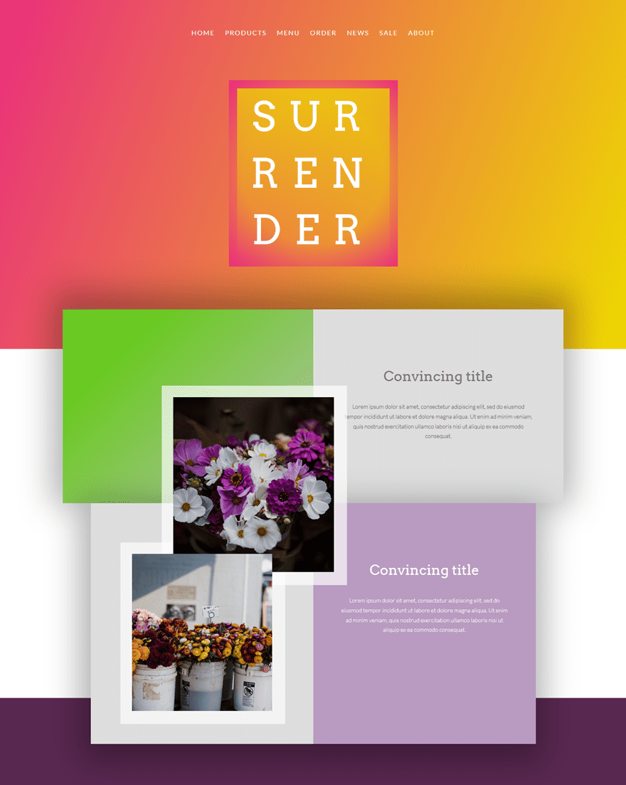
Result
Desktop
The layout we’ll show you how to recreate looks like this on desktop:
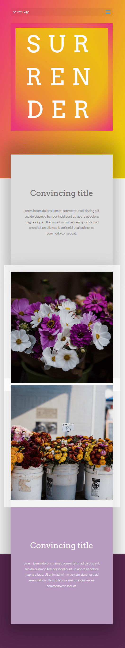
Mobile
And like this on mobile:
How to Creatively Use Row Box Shadows with Divi
Subscribe To Our Youtube Channel
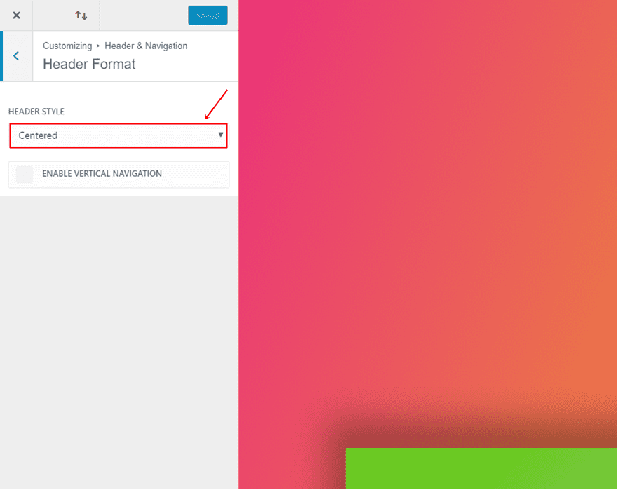
Header Format
The first thing you’ll have to do is choose the right Header Format. Go to your WordPress Dashboard > Customize > Header & Navigation > Header Format > And choose ‘Centered’ as the Header Style.
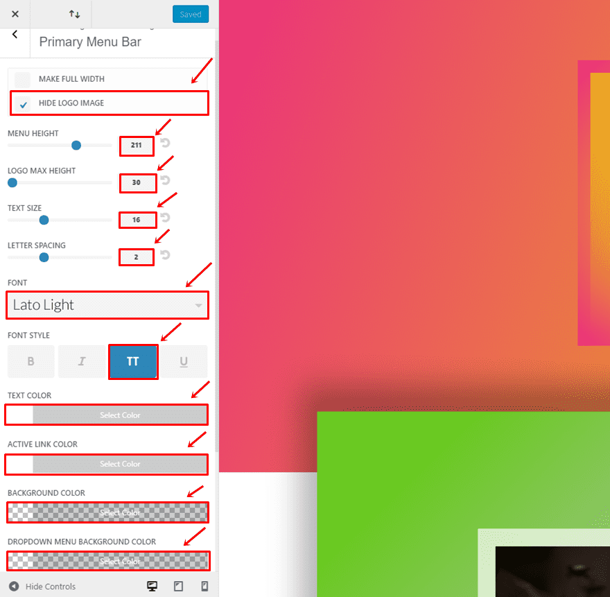
Go back to Header & Navigation > Primary Menu Bar > And make the following adjustments:
- Hide Logo Image: Enable
- Menu Height: 211
- Logo Max Height: 30
- Text Size: 16
- Letter Spacing: 2
- Font: Lato Light
- Font Style: Uppercase
- Text Color: #FFFFFF
- Active Link Color: #FFFFFF
- Background Color: rgba(255,255,255,0)
- Dropdown Menu Background Color: rgba(255,255,255,0)
First Section
Once you’ve made the changes within the Theme Customizer, it’s time to get started with the layout. Create a new page, enable the Divi Builder and switch over to Visual Builder. Then, add a first standard section to the page.
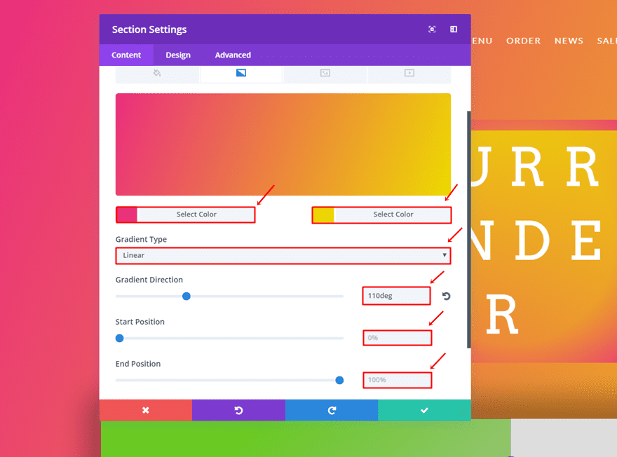
Section Gradient Background
This section will need the following gradient background:
- First Color: #ea2e7d
- Second Color: #edd900
- Gradient Type: Linear
- Gradient Direction: 110deg
- Start Position: 0%
- End Position: 100%
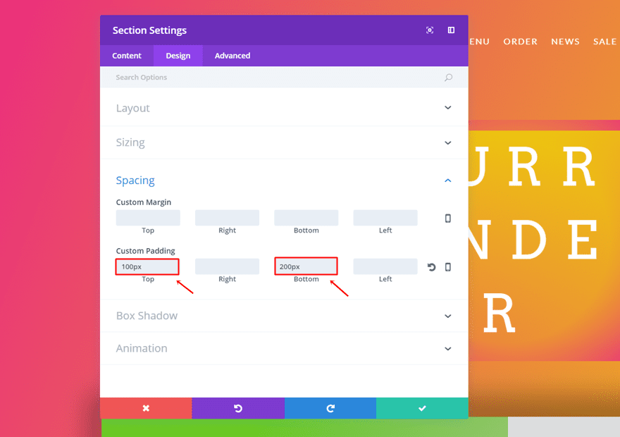
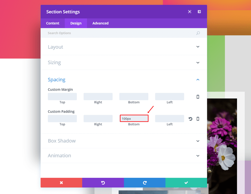
Spacing
Move on to the Design tab. Within the Spacing subcategory, use ‘100px’ for the top padding and ‘200px’ for the bottom padding.
One-Column Row
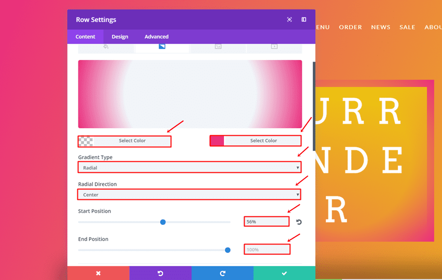
Row Gradient Background
Continue by adding a one-column row to the section and make use of the following gradient background:
- First Color: rgba(255,255,255,0)
- Second Color: #ea2e7d
- Gradient Type: Radial
- Radial Direction: Center
- Start Position: 56%
- End Position: 100%
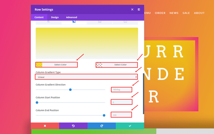
Column Gradient Background
Scroll down and use the following gradient background for the column of that row:
- First Color: rgba(237,217,0,0.77)
- Second Color: rgba(255,255,255,0)
- Column Gradient Type: Linear
- Column Gradient Direction: 180deg
- Column Start Position: 0
- Column End Position: 100
Sizing
Go to the Design tab and make the following changes apply to the Sizing subcategory:
- Use Custom Width: Yes
- Custom Width: 27%
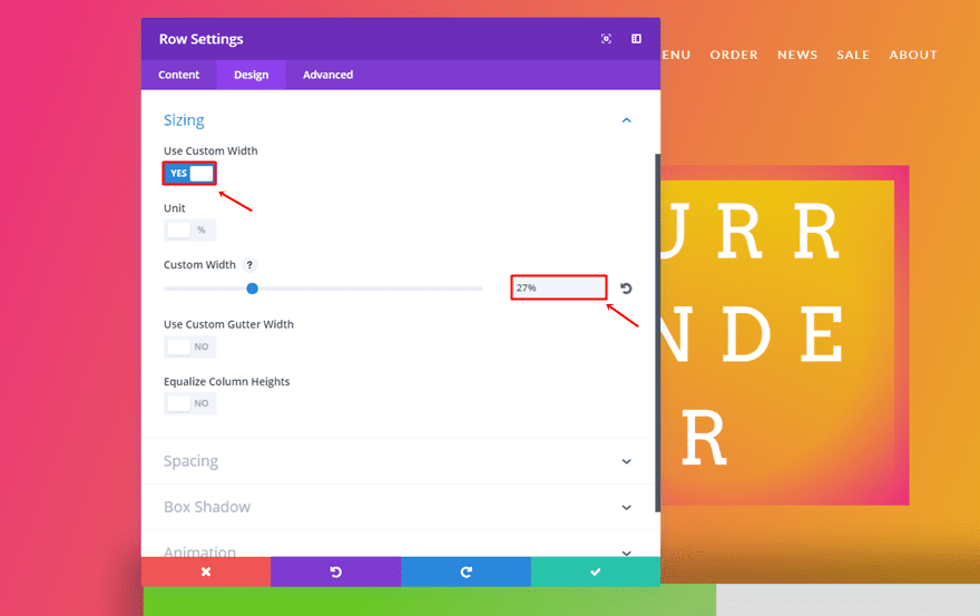
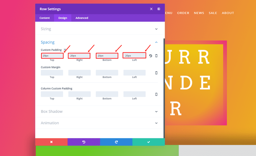
Spacing
Then, use ’20px’ for the top, right, bottom and left Custom Padding of the row.
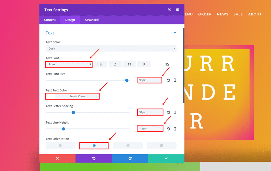
Text Module
Once you’re done with the row settings, add a Text Module and use the following settings for the Text subcategory:
- Text Font: Arvo
- Text Font Size: 98px
- Text Color: #FFFFFF
- Text Letter Spacing: 32px
- Text Line Height: 1.4em
- Text Orientation: Center
Second Section
Add another section right below the first section. This section will contain all the other rows that are present in the layout.
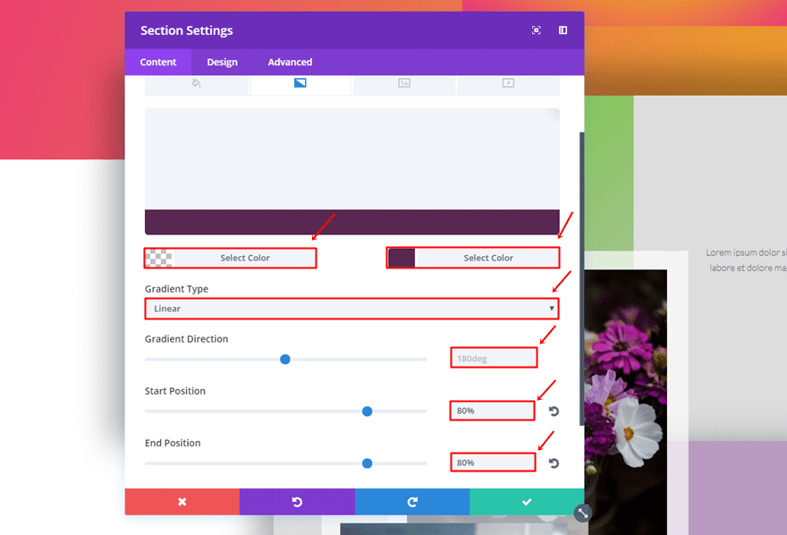
Section Gradient Background
Firstly, use the following gradient background for this section:
- First Color: rgba(255,255,255,0)
- Second Color: #592851
- Gradient Type: Linear
- Gradient Direction: 180deg
- Start Position: 80%
- End Position: 80%
Spacing
Next, go to the Design tab and add ‘100px’ to the bottom padding.
First Two-Column Row
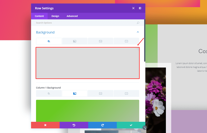
Row Background Color
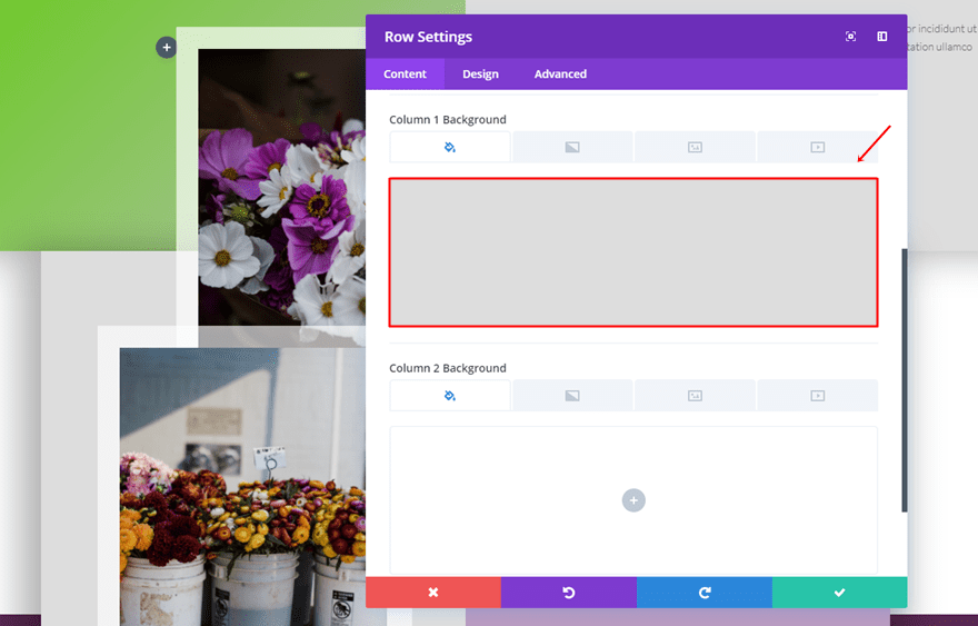
Add the first two-column row to this new section and use ‘#dddddd’ as the background color.
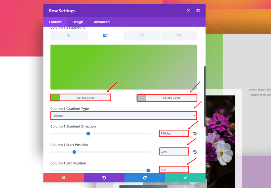
Column 1 Gradient Background
The first column will need the following gradient background:
- First Color: #6ac922
- Second Color: #b6c1b2
- Column 1 Gradient Type: Linear
- Column 1 Gradient Direction: 136deg
- Column 1 Start Position: 23%
- Column 1 End Position: 100%
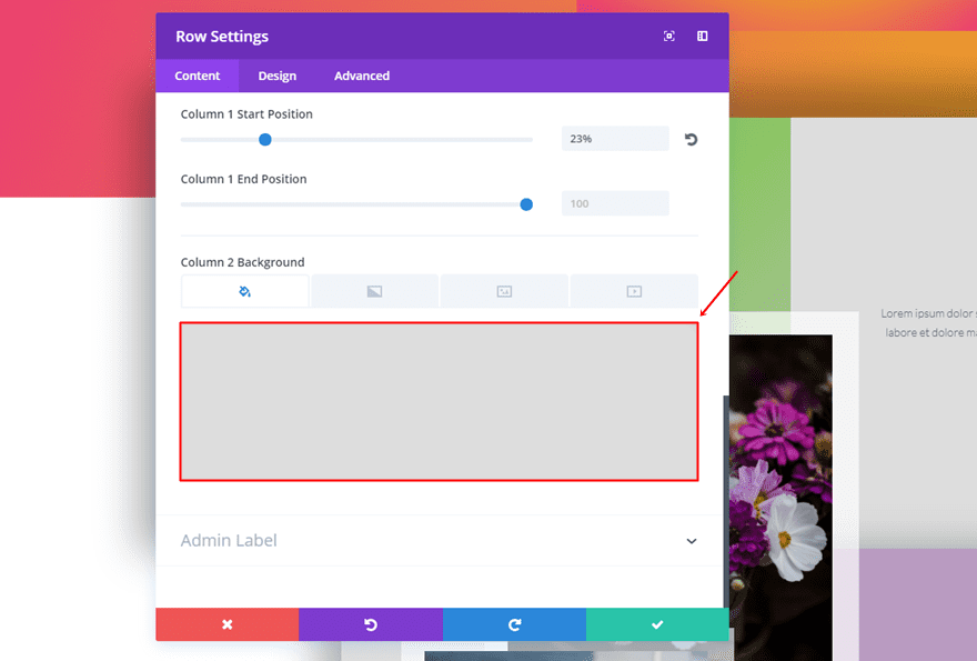
Column 2 Background Color
Scroll down and use ‘#dddddd’ as the Column 2 Background Color.
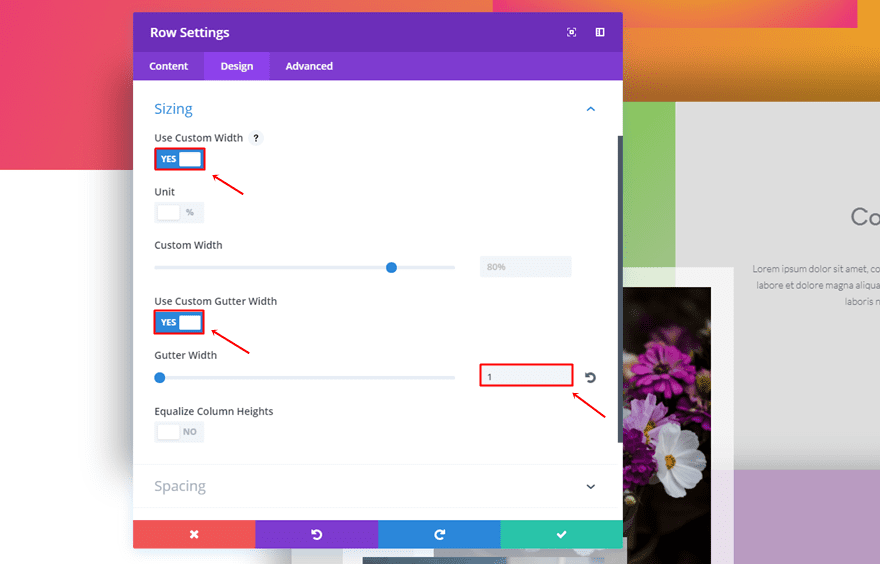
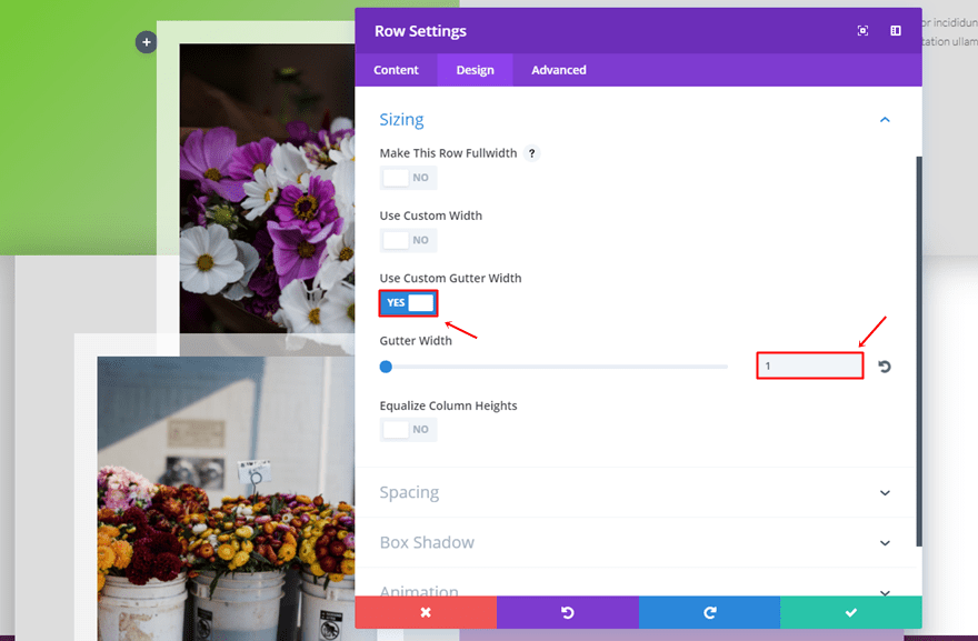
Sizing
Move on to the Design tab and use the following settings for the Sizing subcategory:
- Use Custom Width: Enable
- Use Custom Gutter Width: Yes
- Gutter Width: 1
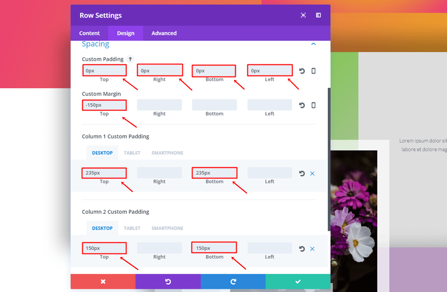
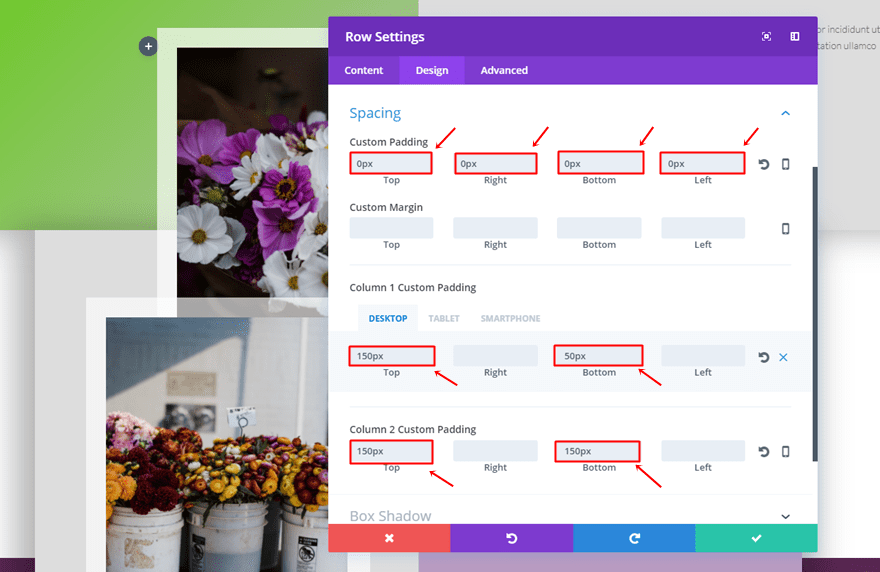
Spacing
The Spacing subcategory will need the following padding and margin:
- Top, Right, Bottom & Left Padding: 0px
- Top Margin: -150px
- Column 1 Top Padding: 235px (Desktop), 0px (Tablet & Phone)
- Column 1 Bottom Padding: 235px (Desktop), 0px (Tablet & Phone)
- Column 2 Top Padding: 150px
- Column 2 Bottom Padding: 150px
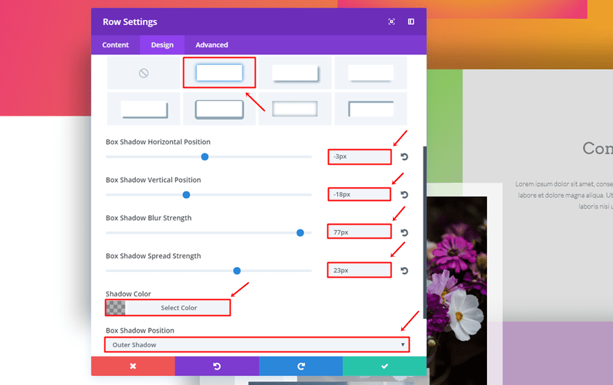
Box Shadow
Open the Box Shadow subcategory and use the following settings:
- Box Shadow Horizontal Position: -3px
- Box Shadow Vertical Position: -18px
- Box Shadow Blur Strength: 77px
- Box Shadow Spread Strength: 23px
- Shadow Color: rgba(0,0,0,0.3)
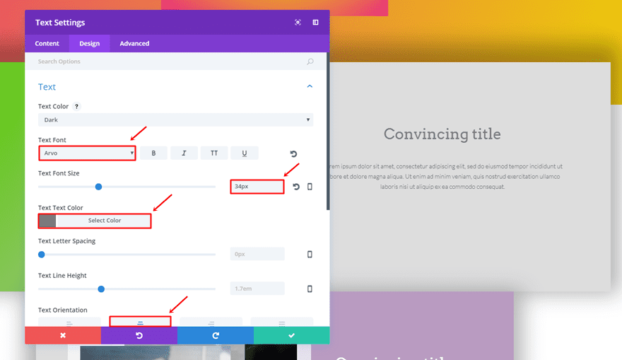
First Text Module
Then, add the first Text Module to the second column and use the following settings for the Text subcategory:
- Text Font: Arvo
- Text Font Size: 34px
- Text Color: #7a7a7a
- Text Orientation: Center
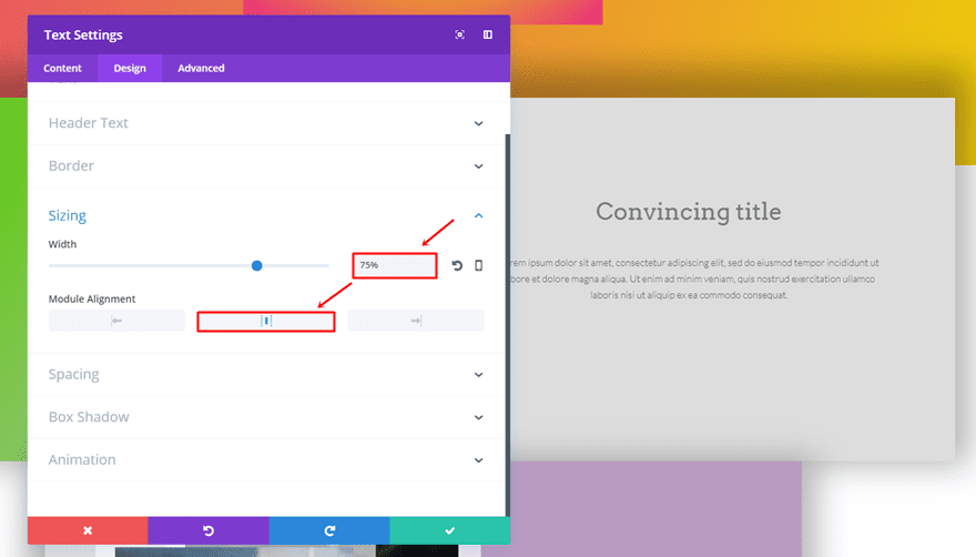
Second Text Module
Add another Text Module but use the following settings instead:
- Text Font: Lato Light
- Text Orientation: Center
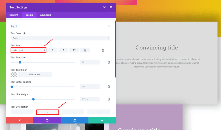
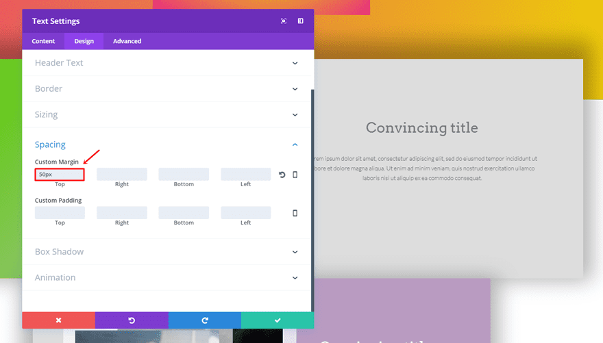
Open the Sizing subcategory, use a Width of ‘75%’ and select the center Module Alignment.
Lastly, add a top margin of ’50px’.
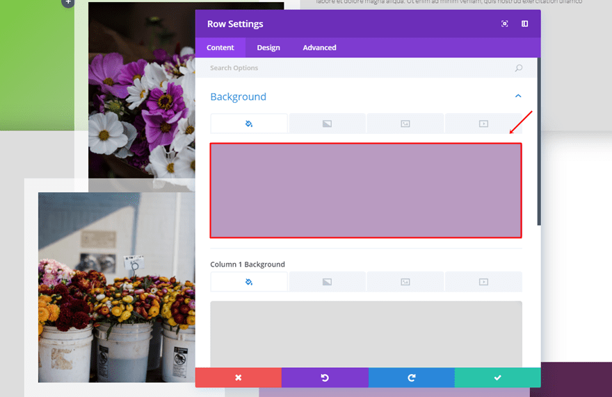
Second Two-Column Row
Row Background Color
Add another two-column row to the section and choose ‘#b99bc1’ as its background color.
Column 1 Background Color
Scroll down and choose ‘#dddddd’ for the Column 1 Background Color.
Sizing
Move on to the Design tab and make the following settings apply to the Sizing subcategory:
- Use Custom Gutter Width: Yes
- Gutter Width: 1
Spacing
Next, use the following padding:
- Top, Right, Bottom & Left Padding: 0px
- Column 1 Top Padding: 150px (Desktop), 0px (Tablet & Phone)
- Column 1 Bottom Padding: 50px (Desktop), 0px (Tablet & Phone)
- Column 2 Top Padding: 150px
- Column 2 Bottom Padding: 150px
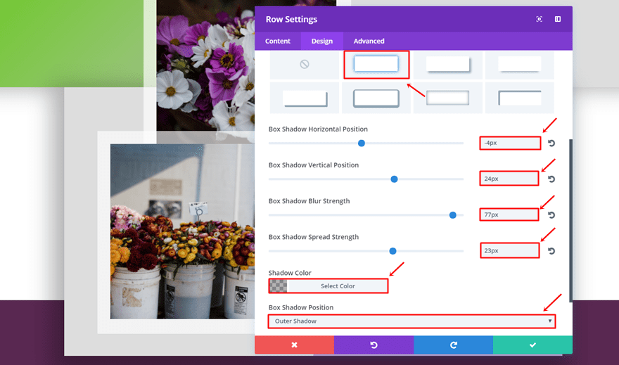
Box Shadow
Open the Box Shadow subcategory and use the following settings:
- Box Shadow Horizontal Position: -4px
- Box Shadow Vertical Position: 24px
- Box Shadow Blur Strength: 77px
- Box Shadow Spread Strength: 23px
- Shadow Color: rgba(0,0,0,0.3)
- Box Shadow Position: Outer Shadow
First Image Module in First Column
Continue by adding a Image Module to the first column. After uploading the image, make the following settings apply to the Spacing subcategory:
- Show Space Below The Image: Yes
- Top Margin: -500px (Desktop), 0px (Tablet & Phone)
- Right Margin: -50px (Desktop), 0px (Tablet & Phone)
- Left Margin: 200px (Desktop), 0px (Tablet & Phone)
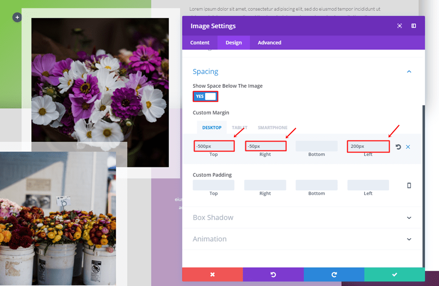
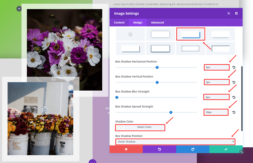
Open the Box Shadow subcategory and use the following box shadow:
- Box Shadow Horizontal Position: 2px
- Box Shadow Vertical Position: 2px
- Box Shadow Blur Strength: 0px
- Box Shadow Spread Strength: 30px
- Shadow Color: rgba(255,255,255,0.68)
- Box Shadow Position: Outer Shadow
Second Image Column in First Column
Add another Image Module to the same column and use the following margin:
- Top Margin: -50px (Desktop), 0px (Tablet & Phone)
- Right Margin: 100px (Desktop), 0px (Tablet & Phone)
- Bottom Margin: 30px
- Left Margin: 100px (Desktop), 0px (Tablet & Phone)
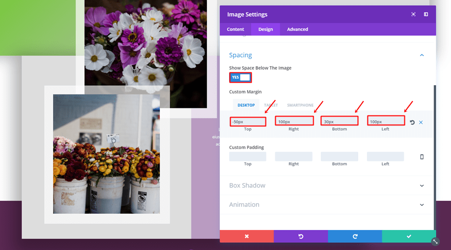
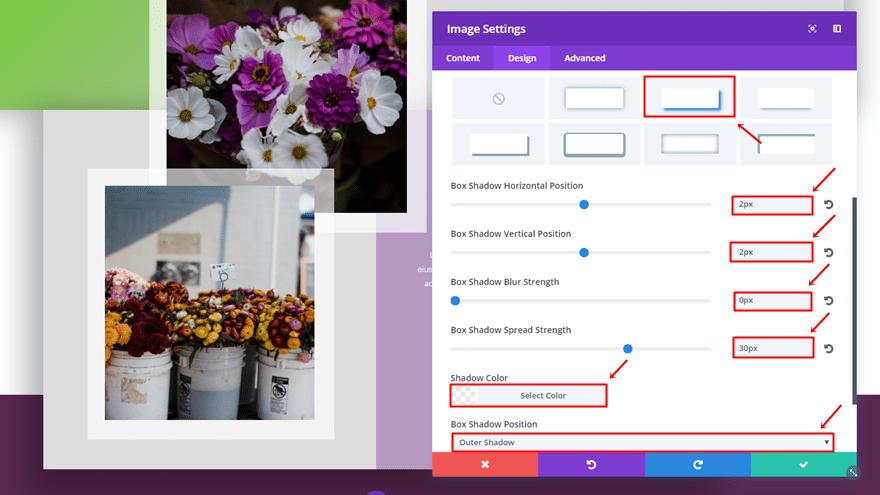
Then, scroll down and make use of the following box shadow:
- Box Shadow Horizontal Position: 2px
- Box Shadow Vertical Position: 2px
- Box Shadow Blur Strength: 0px
- Box Shadow Spread Strength: 30px
- Shadow Color: rgba(255,255,255,0.68)
- Box Shadow Position: Outer Shadow
Clone Text Modules & Place in Second Column
Lastly, clone the two Text Modules of the previous row and place them in the second column of this row. There’s only one thing you’ll have to change; the text color. Open each Text Module’s settings and change the text color into ‘#FFFFFF’.
Result
Desktop
All the steps within this post will lead to the following result on desktop:
Mobile
And the following result on mobile:
Final Thoughts
In this post, we’ve shown you how you can creatively use box shadows on rows. We’ve created a colorful example where you can clearly notice the depth box shadows give to a layout. If you have any questions or suggestions; make sure you leave a comment in the comment section below!
Be sure to subscribe to our email newsletter and YouTube channel so that you never miss a big announcement, useful tip, or Divi freebie!
Featured Image by Dmitry Guzhanin / shutterstock.com


center alignment of the rows does not work!
Nice tuts
Interesting.
Thank you very much. Divi is growing up constantly and I am proud to use that theme for all my projects. Please, keep doing so great job.
DIVI every time it gets better, I started using the shadows in the new design of my website, but this post goes further, thanks Donjete, as always an excellent and complete tutorial to do things with foundation, greetings from Asturias