

Most blog layouts fall apart at the images. One post has a tall portrait, the next has a wide landscape, and the third uses something almost square. The grid starts to look uneven, and the layout feels more like a plain list of posts than the magazine-style feed you had in mind.
Magazine layouts avoid that problem by placing every image inside a fixed frame. The photos can be different, but the crop system stays consistent.
In Divi 5, you can build the same kind of system visually. The Loop Builder repeats one post card across the feed, Aspect Ratio and Framing keep every featured image inside the same crop, and Grid Offset Rules turn selected posts into full-width editorial features.
In this tutorial, we’ll build a magazine-style blog layout with a centered blog heading, one large featured post, a row of standard post cards, and a repeating full-width feature that returns every fifth post.
- 1 Understanding The Tools Behind The Layout
- 2 What We’re Building
-
3
How To Build The Magazine-Style Blog Layout
- 3.1 1. Assign A Theme Builder Template To The Blog
- 3.2 2. Save The Variables The Layout Will Use
- 3.3 3. Prepare The Blog Page Structure
- 3.4 4. Turn One Column Into The Loop
- 3.5 5. Build The Post Card
- 3.6 6. Style The Card
- 3.7 7. Loop The Content Into The Card
- 3.8 8. Lock The Image Crop With Aspect Ratio
- 3.9 9. Create The Full-Width Featured Rows With Grid Offset Rules
- 3.10 10. Make The Layout Responsive
- 4 Turn One Card Into A Feed With Divi 5
Understanding The Tools Behind The Layout
This layout depends on three Divi 5 tools working together: Loop Builder, Aspect Ratio and Framing, and Grid Offset Rules.
Each one solves a different part of the layout.
1. Loop Builder
The Loop Builder turns one design into a full dynamic feed. Instead of designing every blog card by hand, you build one card with an image, date, title, and excerpt. Then you enable the loop and point it at your posts.
Divi repeats that card for every post in the query and fills each card with dynamic content.
That means you design one card, not seven or twenty. Every item starts from the same structure, so every image has a consistent place to land.
In this layout, the looped card is used in two ways. Most posts appear as standard three-column cards. Selected posts use the same card structure but stretch across the full row, creating the large feature moments you see in the final design.
2. Aspect Ratio And Framing
A consistent image slot only works if the image inside it behaves. That is where Aspect Ratio and Framing come in.
Aspect Ratio defines the shape of the image frame. In this layout, we’ll use a 4:2 ratio so every featured image sits inside the same wide editorial crop. A portrait, square image, and landscape image can all fill the same image area without changing the card structure.
Framing controls how the image sits inside that frame. If a photo needs to be cropped to fit, Framing decides which part stays visible. You can center the crop, shift the focal point, or use Object Fit and Object Position to keep the most important part of the image in view.
Aspect Ratio sets the shape. Framing controls the crop.
3. Grid Offset Rules
A tidy grid is useful, but a magazine layout also needs movement. If every card has the same size forever, the feed can start to feel flat.
Grid Offset Rules add the editorial rhythm. They let specific loop items span more columns or rows without rebuilding the card or manually placing individual posts.
For this layout, we’ll make the first post stretch across all three columns as the lead feature. Then we’ll repeat that same full-width treatment every fifth post, so the layout moves from a large feature to standard cards, then back to another large feature.
The loop handles the repetition. Aspect Ratio handles the crop. Grid Offset Rules handle the magazine rhythm.
What We’re Building
We’re building a magazine-style blog layout that keeps its shape no matter which featured images get added to the site.
The final layout starts with a centered Our Blog heading. Under it, the first post spans the full row as a large featured card. The next posts appear as three standard cards across. Then the fifth post stretches full-width again, creating another featured row before the grid continues.
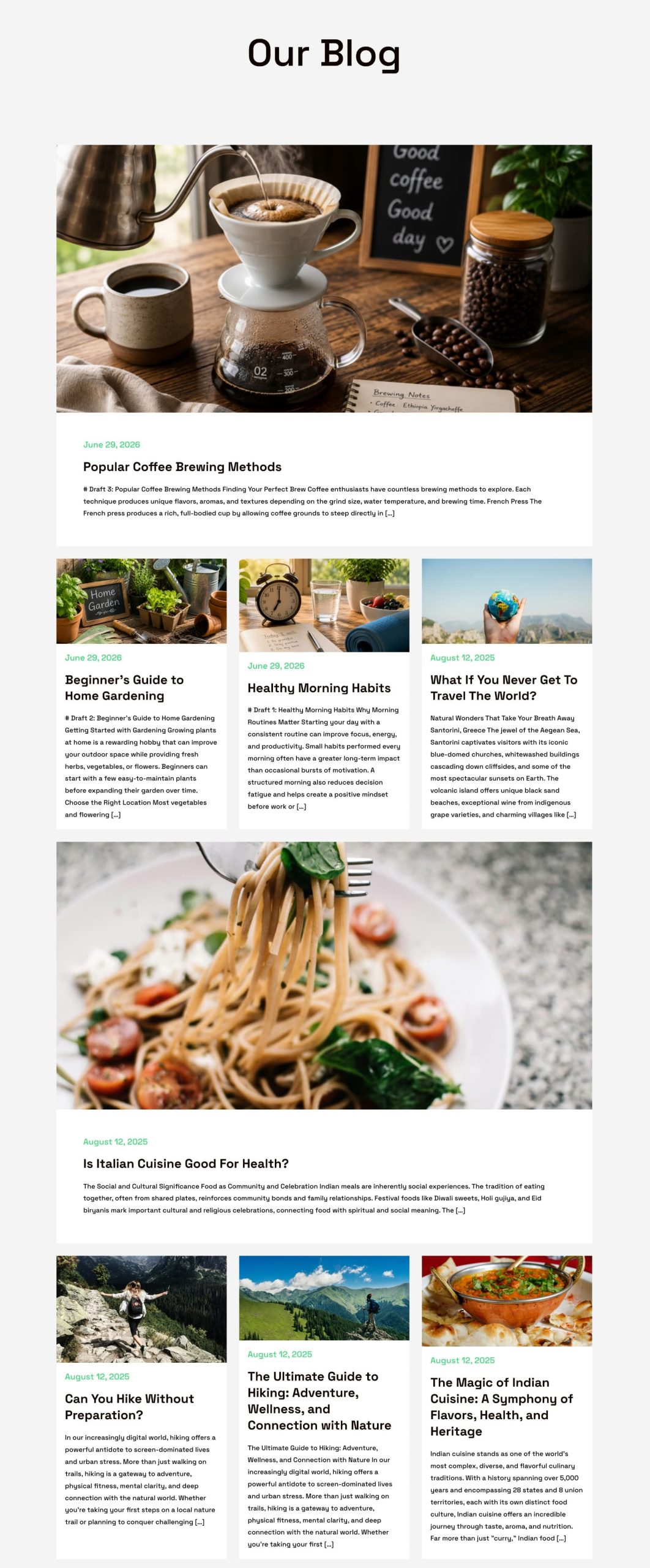
Every image uses the same 4:2 shape, including the full-width featured posts. That keeps the crops consistent across the feed, even when the source images are different sizes.
Once the system is built, new posts drop into the same structure automatically.
How To Build The Magazine-Style Blog Layout
We’ll build the layout in the same order Divi 5 works best. First, we’ll create the Theme Builder template. Then we’ll save the variables the layout uses. After that, we’ll create the grid, turn one column into a loop, build the post card, connect the dynamic content, lock the image crop, create the full-width featured rows, and make the layout responsive.
1. Assign A Theme Builder Template To The Blog
The feed needs a template, and the Theme Builder is where we create it. A Theme Builder template lets you design one layout and apply it to a specific part of the site.
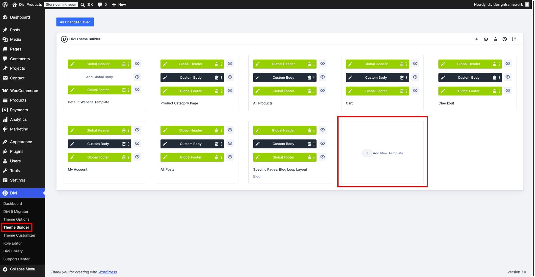
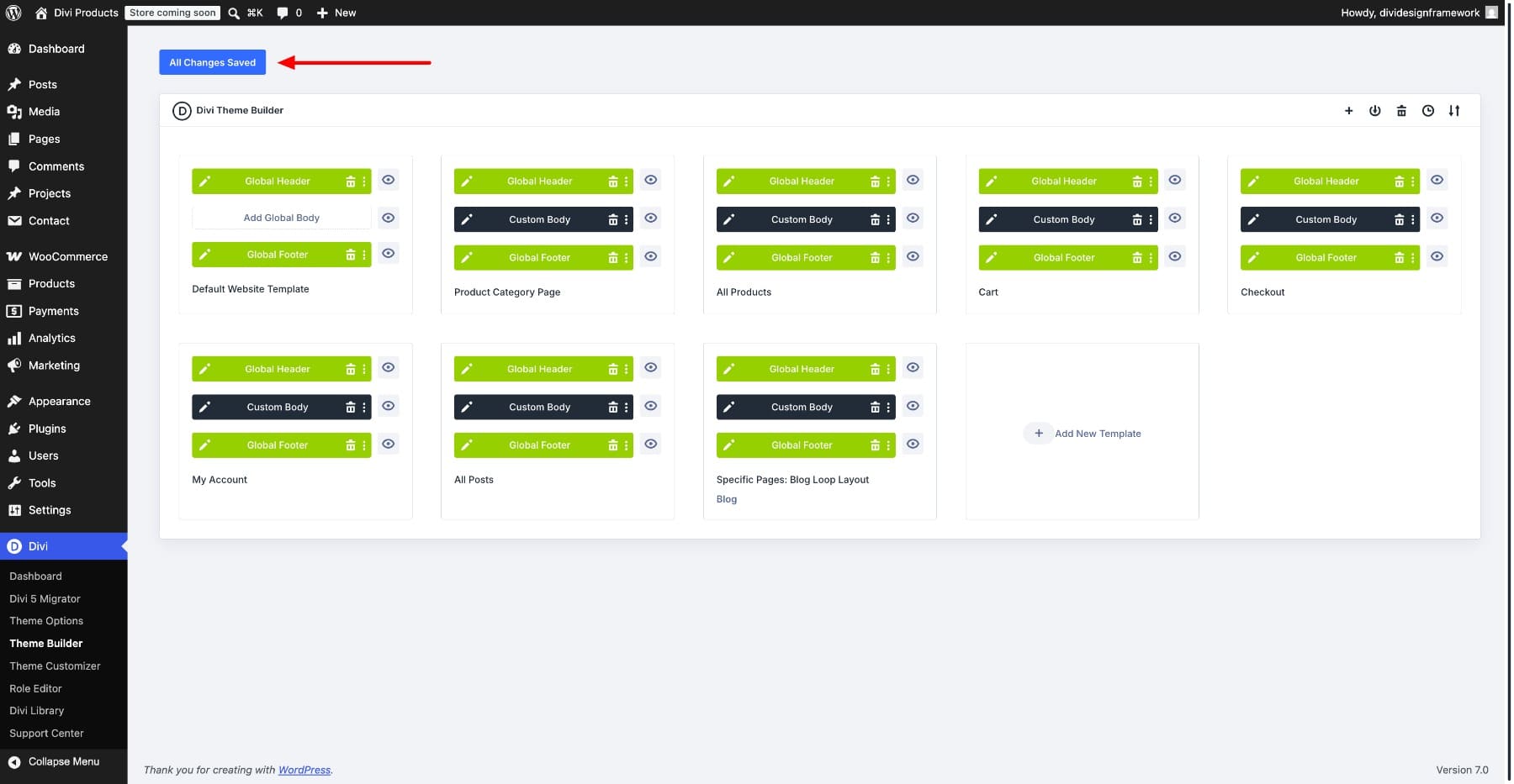
Open Divi > Theme Builder from the WordPress dashboard. You’ll see the Default Website Template next to any templates that already exist. Click Add New Template to create a new one.
A settings panel opens and asks where the template should apply. Under the Posts section, select Blog. This points the template at the main blog feed.
If you want to use this layout on a standalone page instead, choose Specific Pages under the Pages section and select that page. For other template conditions, such as archives or categories, see Divi’s Theme Builder template guide.
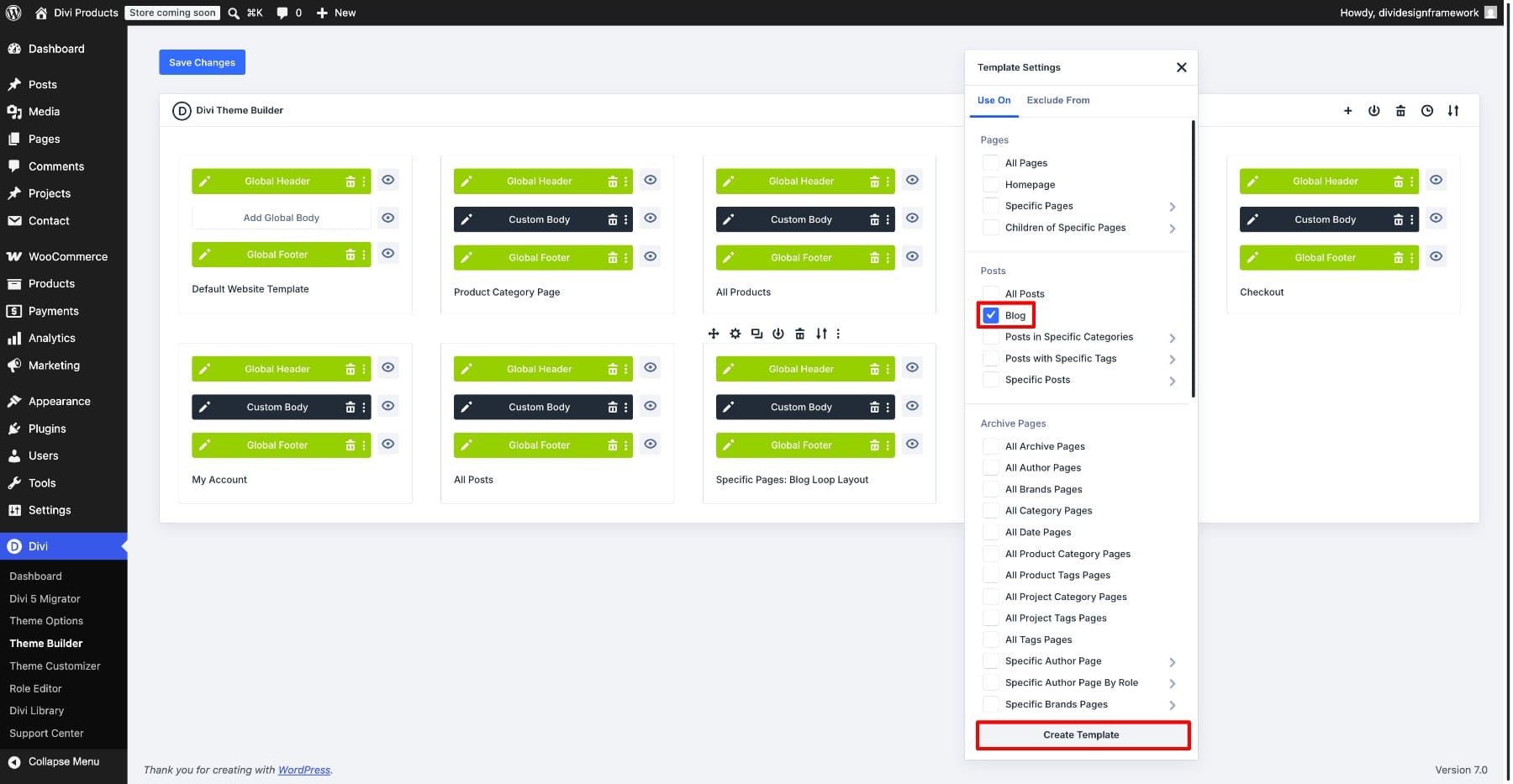
Click Create Template to confirm. The template shows three editable areas: Header, Body, and Footer.
The blog feed belongs in the Body area. Click Add Custom Body, then choose Build Custom Body to open the builder on a blank canvas.
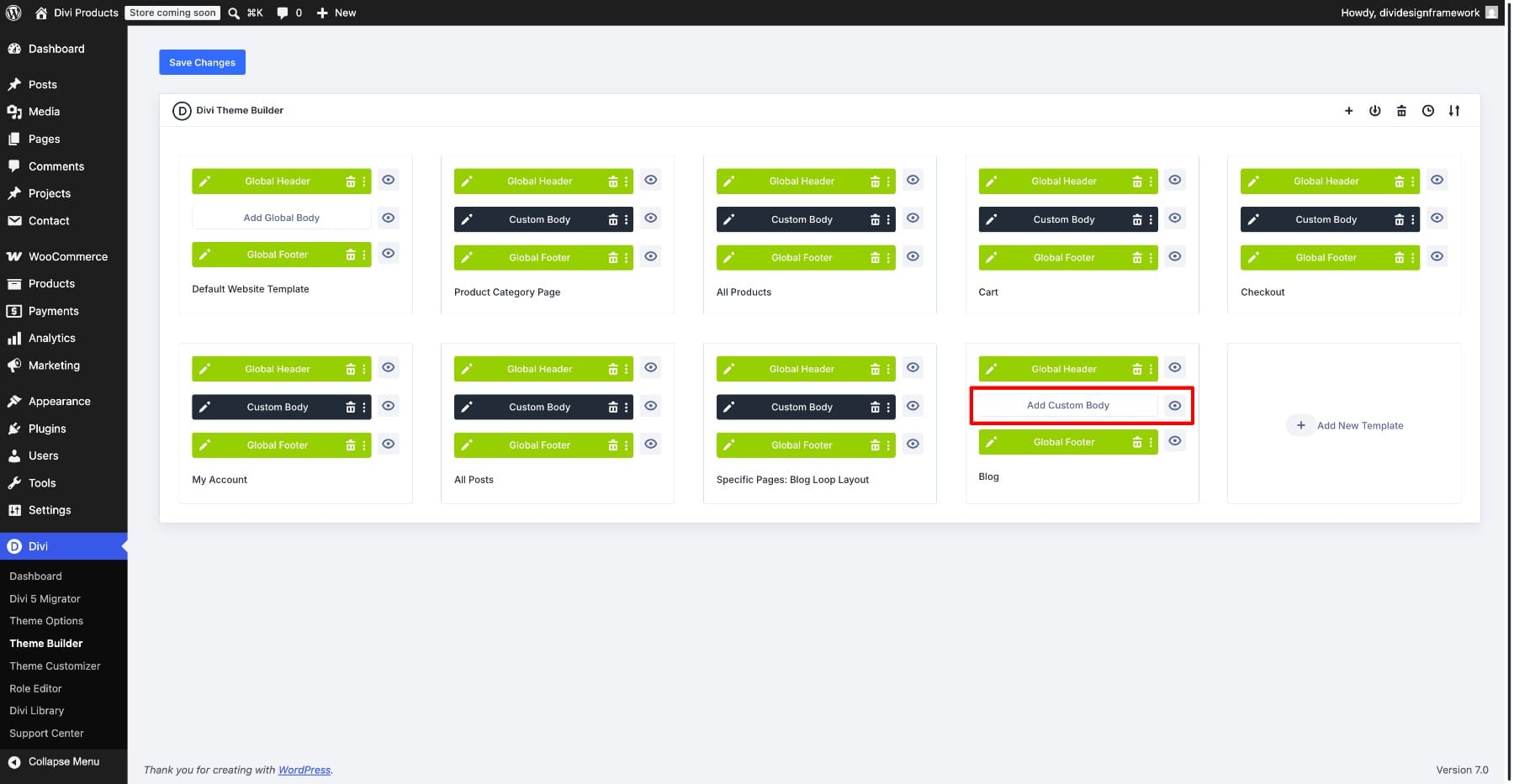
This is where the rest of the layout comes together.
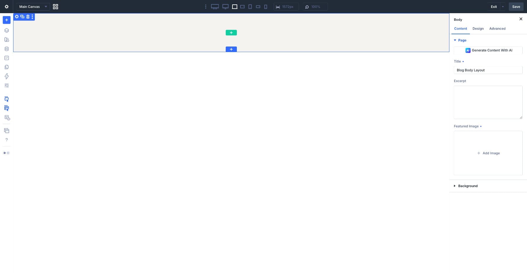
One thing to keep in mind: the Theme Builder has its own Save Changes button. Saving inside the builder saves the body layout, but the template only goes live after you save changes in the Theme Builder.
2. Save The Variables The Layout Will Use
Before building the cards, set up the shared values the layout will use.
Spacing, colors, and fonts should come from variables and presets where possible. That way, one update can flow through the entire feed instead of forcing you to edit every module later.
Open the Variable Manager from the Builder Bar. It is sitewide, so the variables you create here can be used across the full website.
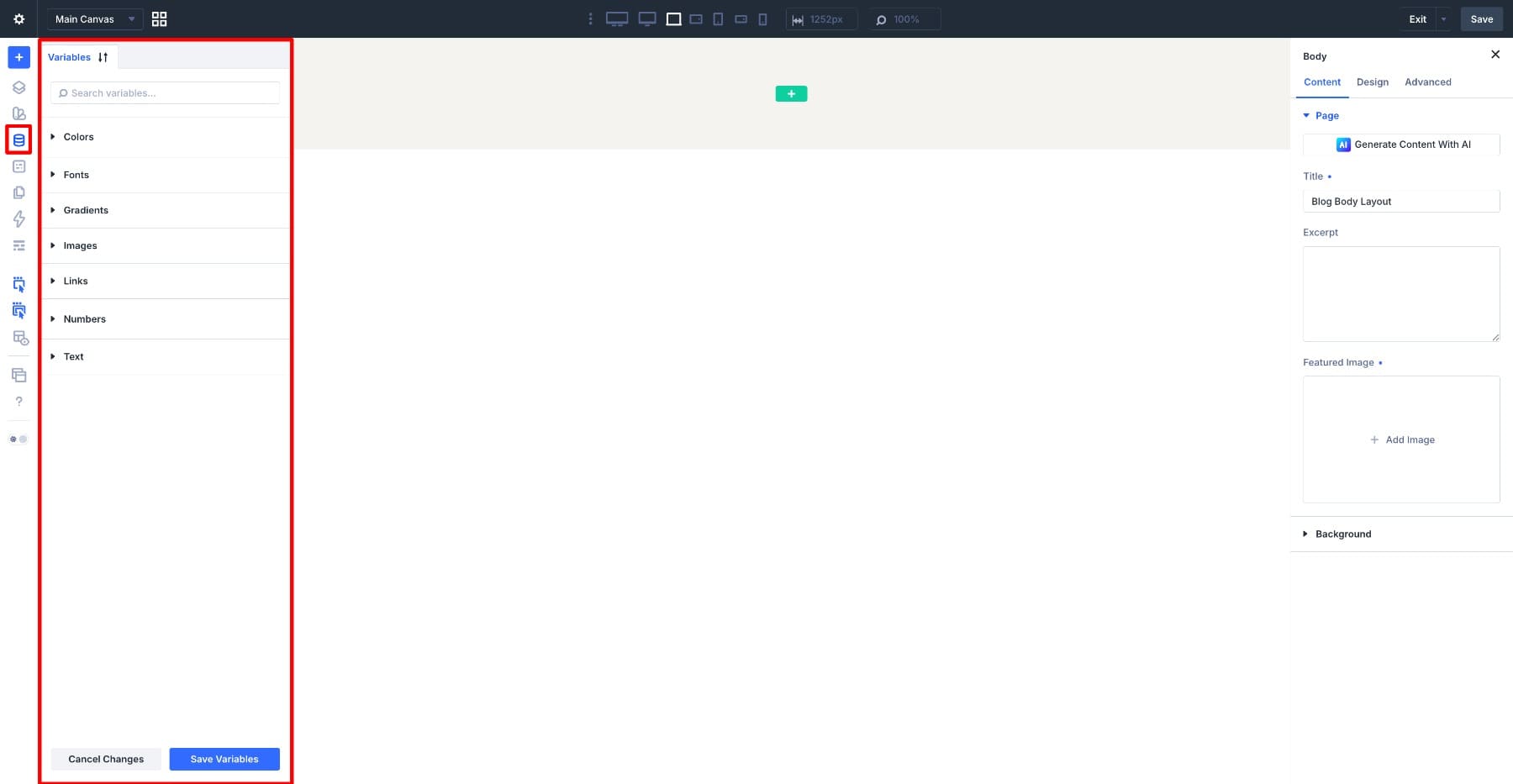
Start with spacing. Create a Number Variable for the space inside the card and set it to 5%. Give it a role-based name such as Group Spacing so its purpose is clear when you use it later.
With the spacing variable saved, create the font and color variables the layout needs. These can power the card backgrounds, text colors, and repeated typographic choices.
We won’t create a separate variable for every heading size. In this workflow, heading sizes come from heading presets, while variables handle shared values like color, spacing, and fonts.
Variables handle the reusable values. Presets handle the reusable style decisions. Together, they keep the blog feed connected to the rest of the site’s design system.
You can learn more about setting up that kind of system in Part 3 and Part 4 of our Divi 5 mastery series.
3. Prepare The Blog Page Structure
With the shared design values ready, we can prepare the page structure.
For this tutorial, we’re starting from a base layout that already includes surrounding page sections, including the centered blog heading. That is the Our Blog title you see at the top of the final layout.
If you are building from a completely blank body, add a Heading module above the feed first, type Our Blog, center it, and style it with your site’s heading preset. Then continue with the feed structure below.
The base layout currently uses the Blog module for the posts. Since we’re replacing that with a custom Loop Builder feed, delete the Blog module.
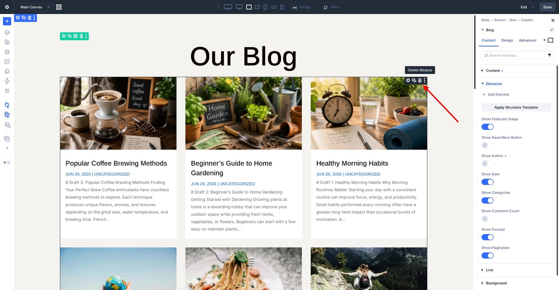
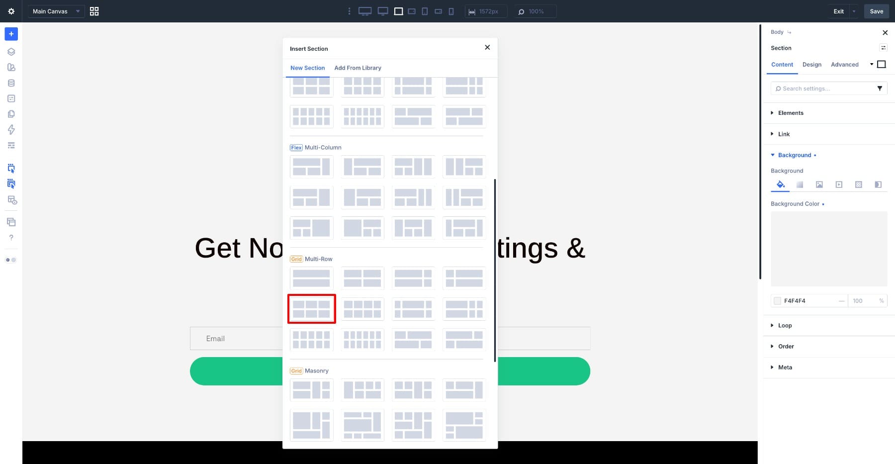
Now add a new Section to the canvas. Inside it, add a Row with a three-column structure.
Those three columns set the desktop rhythm: one full-width feature when a post spans all three columns, followed by standard cards that sit three across.
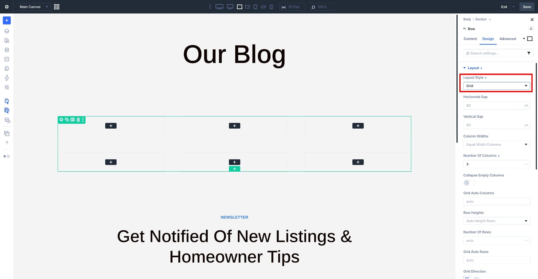
A row from the Grid layout options behaves as a CSS Grid. Open the row settings, go to Design > Layout, and confirm that Layout Style is set to Grid.
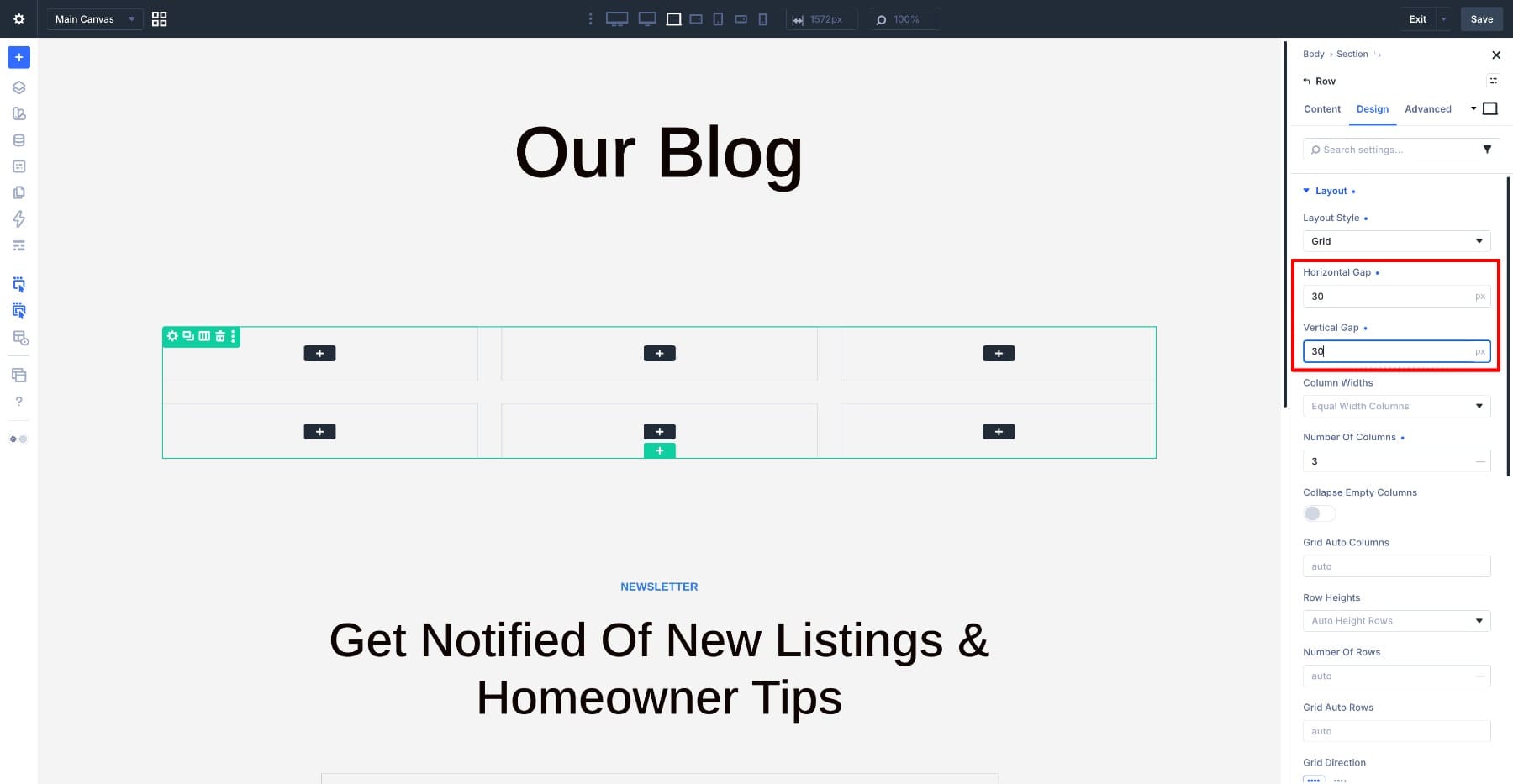
Set both Horizontal Gap and Vertical Gap to 30px. Equal gaps keep the spacing consistent between standard cards and full-width feature rows.
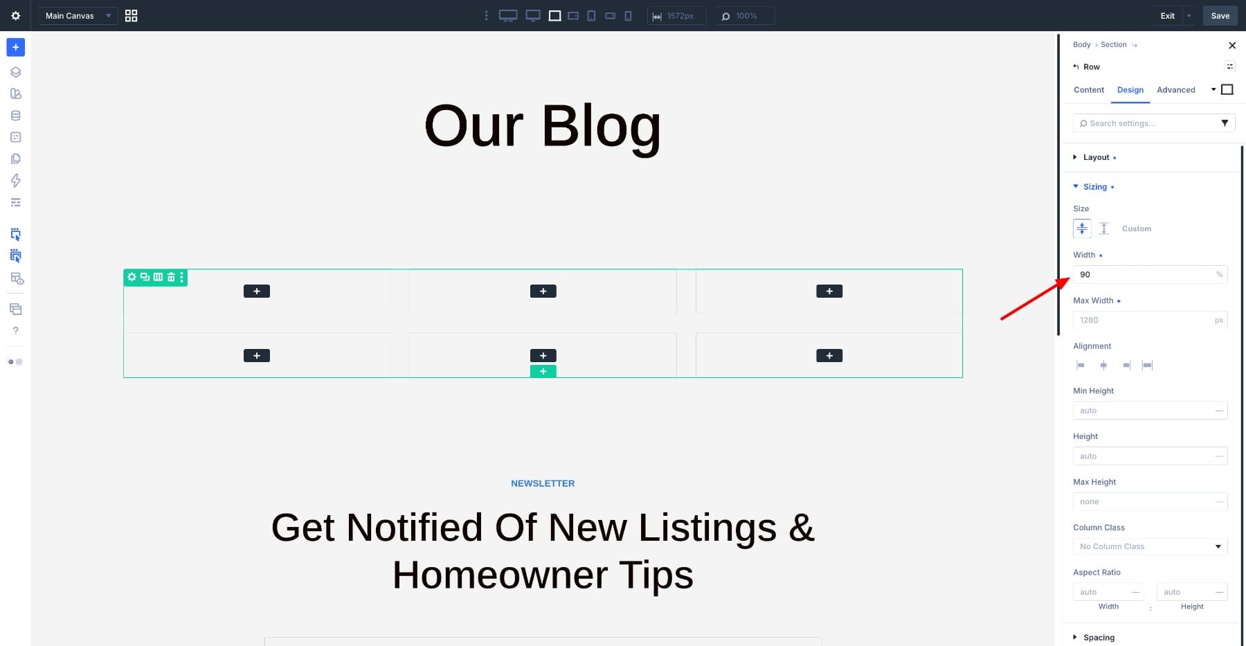
Then go to Design > Sizing and set the row Width to 90%. This keeps the feed away from the browser edges and gives the layout breathing room.
The section, grid row, and spacing are now ready. Next, we’ll turn one column into the repeating post card.
4. Turn One Column Into The Loop
The grid row has three columns, but we do not need to build three separate cards. We’ll design inside one column, enable the loop on that column, and let Divi repeat it across the feed.
Hover over the first Column and open its settings. Go to Content > Loop and switch Enable Loop on.
The column is now a loop container. Whatever you place inside it becomes the template for one repeated blog item instead of one static card.
Now point the loop at the content it should pull. Set Query Type to Post Type, then set Post Type to Posts.
The remaining query settings control things like how many posts appear and how they are ordered. Leave those at their defaults for now, then adjust the count and sorting once the card structure is finished.
With the loop enabled, the builder previews the repeated column. The cards are still empty, but the feed structure is working.
5. Build The Post Card
Now we’ll build the card that the loop repeats.
Start with the wrapper. Add a Group module inside the looped column. This outer Group is the card itself. It keeps the image and text together as one repeatable unit.
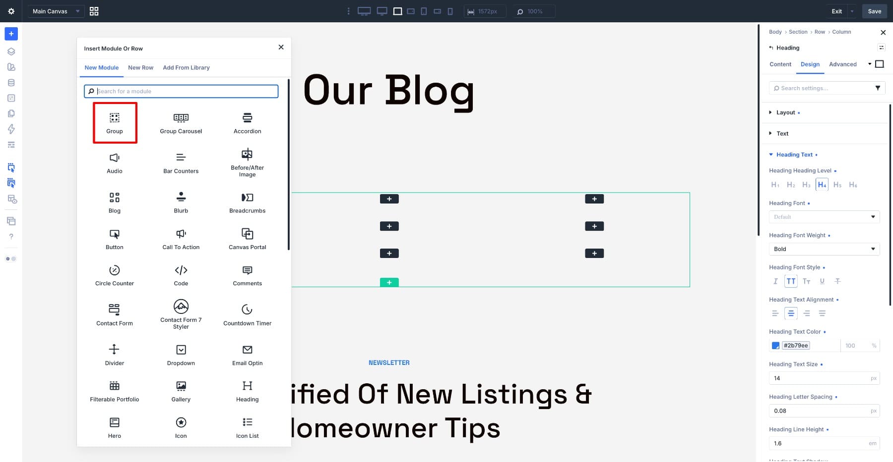
Inside that outer Group, add an Image module first. This will become the featured image at the top of every card.
Below the Image module, add a second Group module for the text block. This inner Group lets the image run edge to edge while the text area gets its own padding and background.
Inside the inner Group, add three modules in this order:
- A Heading module for the published date.
- A second Heading module for the post title.
- A Text module for the excerpt.
That gives the card its full structure: outer Group, Image module, inner Group, date, title, and excerpt.
This same card will power both visual states in the final layout: the compact three-column cards and the full-width featured cards. The difference comes later from the Grid Offset Rules, not from building a separate feature card by hand.
6. Style The Card
With the structure in place, we can style the card using the variables and presets set earlier.
Open the outer Group settings. Go to Design > Layout and set the Vertical Gap to 0. This removes the gap between the image and the text block, so the card reads as one connected unit.
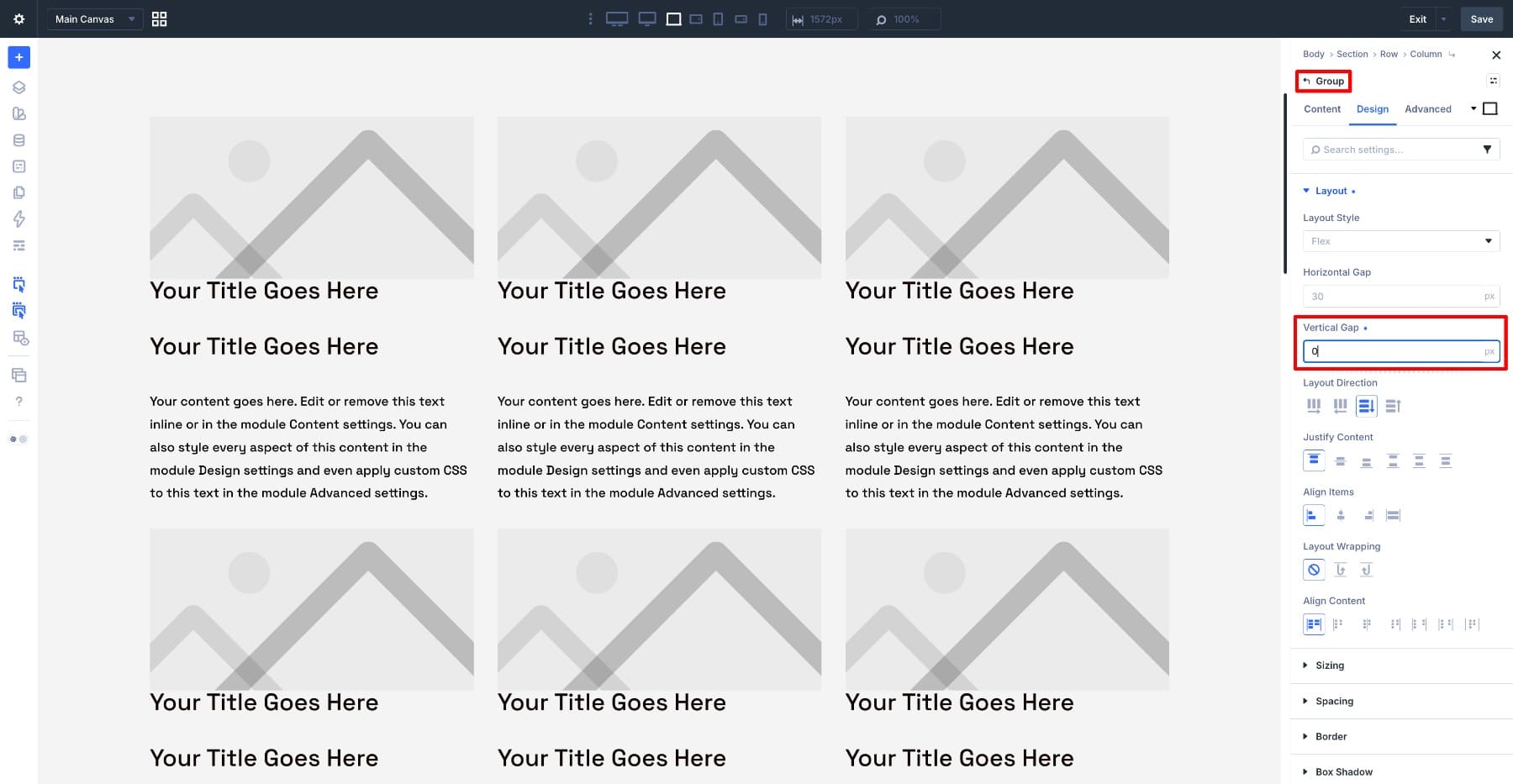
Now open the inner Group that holds the date, title, and excerpt. Give it a white background so the text area feels like a clear card surface.
Then go to Design > Spacing and set the padding using the Group Spacing variable created earlier. Pulling that value from a variable keeps the card inset consistent and easy to update later.
Next, style the typography.
Open the first Heading module and apply the H5 preset for the date. Open the second Heading module and apply the H3 preset for the title.
Because those styles come from presets, the card typography stays connected to the rest of the site.
Then open the Text module for the excerpt and apply the body font. A future change to the body font can then flow through every repeated card.
Set the Vertical Gap of the inner Group to 10px so the date, title, and excerpt stack with tight, consistent spacing.
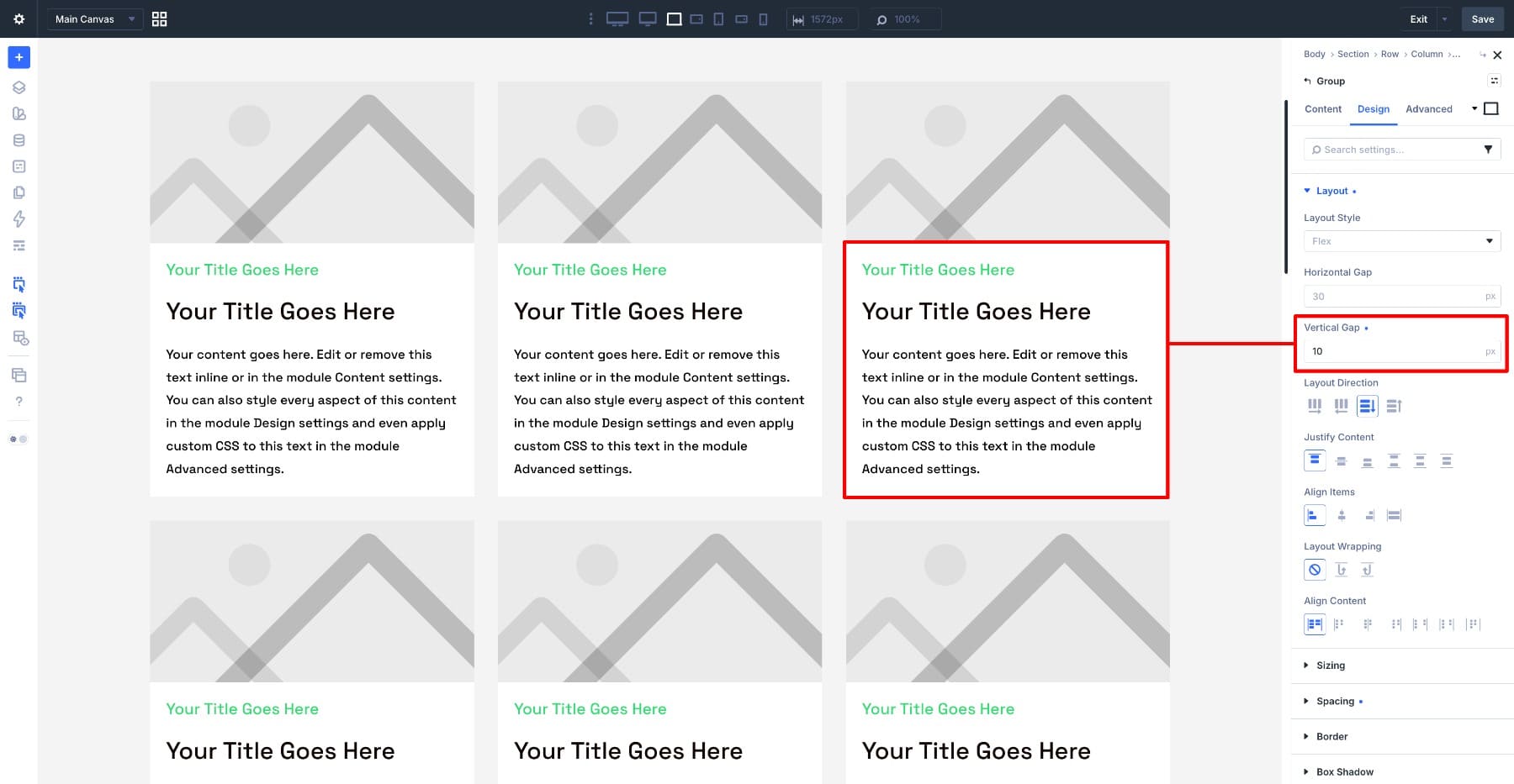
The card now has its structure, spacing, and type system. Next, we’ll connect it to real post content.
7. Loop The Content Into The Card
The card looks right, but the modules still show placeholder content. Now we’ll connect each module to a dynamic field so every repeated card pulls content from its matching post.
Start with the Image module. Open its image setting, switch to dynamic content, and choose Loop Featured Image. Each repeated card now displays its post’s featured image.
Move to the first Heading module, which serves as the date. Switch its content to dynamic and select Loop Published Date.
Open the second Heading module and set its content to the Loop Post Title. Then open the Text module and connect it to the post Excerpt.
Set the excerpt Word Count to 50 and add Read More after the excerpt. Keeping excerpt length under control helps the standard cards stay more even, especially when post summaries vary in length.
Now make the card clickable. Open the Image module, find the link setting, switch it to dynamic content, and choose the post’s Post Link. Do the same for the title Heading module and the excerpt Text module.
At this point, every card is dynamic. The image, date, title, excerpt, and links all come from the post represented by that loop item.
8. Lock The Image Crop With Aspect Ratio
Once real posts appear, the image problem becomes visible. Featured images come from different sources and are often different shapes: wide, tall, square, or somewhere in between.
Without a consistent crop, image heights jump from card to card, the titles stop lining up, and the grid loses its editorial structure.
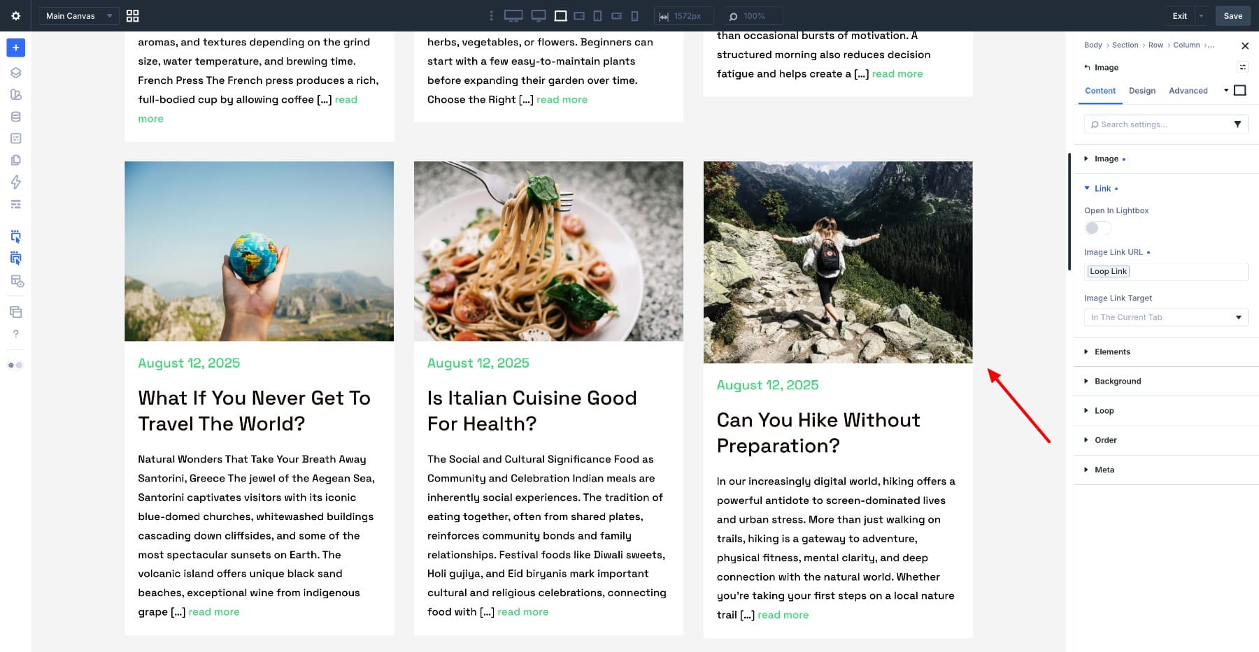
Open the Image module and go to Design > Sizing. Find the Aspect Ratio control and set it to 4:2.
Every image in the loop snaps to that same shape. A portrait and a landscape image now sit inside the same wide frame, which brings the card heights back into alignment.
This matters for the full-width featured posts too. When the first card spans the full row later, it will grow wider, but the image still follows the same 4:2 crop. That is what keeps the large banner from feeling like a different design.
A fixed ratio creates a crop, so the next step is deciding how each image should fill the frame.
Go to Design > Framing. Set Object Fit to Cover so the photo fills the full frame without leaving gaps. Then set Object Position to Center so each crop uses the middle of the image as its default focal point.
If a specific post image has an off-center subject, you can adjust Object Position for that image treatment. But Center is a strong default for a mixed blog feed because it keeps the crop predictable without adjusting every post manually.
Next, enable Grow To Fill on the parent Group module under Design > Sizing. This helps the repeated cards fill their column space evenly.
With the ratio locked and the framing set, the feed reads as one system again. Every card shares the same image shape, titles line up across the row, and new posts drop into the same crop without extra image editing.
9. Create The Full-Width Featured Rows With Grid Offset Rules
The grid is consistent now, but consistency alone can feel flat. A magazine layout needs moments of emphasis.
This is where the one-row featured posts are created. We are not building a separate featured post module. We are taking the same looped card and telling certain items to span across the full grid row.
Select the Row, since the grid is controlled at the row level. Open Design > Layout. In the grid settings, click Add Grid Offset Rule.
For the first rule, target the lead post:
- Target Offset: First item
- Offset Rule: Column Span
- Offset Value: 3
Spanning all three columns turns the first post into the large full-width card at the top of the layout.
Now add a second rule for the repeating rhythm:
- Target Offset: Every fifth item
- Offset Rule: Column Span
- Offset Value: 3
A full-width feature now returns after the first group of standard cards. The final layout follows the pattern you see in the preview: one large lead post, three standard cards, another large featured row, then more standard cards below.
The same loop still drives every item. The offset rules simply tell selected cards to stretch across the grid. That gives the blog feed its magazine-style rhythm without manually placing posts or creating a separate layout for featured items.
10. Make The Layout Responsive
The desktop layout is now in place, but the feed also needs to hold up on tablet and phone.
Some of the work is already handled because the layout uses presets and variables. If your heading presets and body typography use responsive values or fluid sizing, the type can scale more smoothly as the screen narrows.
The grid still needs breakpoint adjustments.
Select the Row, switch to tablet view, and open Design > Layout. Change the Number Of Columns to 2. Then switch to phone view and set it to 1.
The feed now moves from three columns on desktop to two columns on tablet and one column on phone.
Now update the full-width featured rows for each breakpoint.
On desktop, the featured items span 3 columns. On tablet, the grid only has 2 columns, so the featured items need to span 2 columns. Add a responsive offset rule at the tablet breakpoint that uses a Column Span of 2 for the same featured items.
On phone, the grid has one column, so add another responsive rule that spans the featured items across 1 column. At that size, every post is full-width by default, but the rule keeps the offset behavior aligned with the single-column grid instead of letting the desktop span carry over.
With the columns reflowing and the offset rules adjusted at each breakpoint, the magazine-style feed holds from desktop down to phone.
Before leaving, save the layout and return to the Theme Builder. Then click Save Changes to make the template live.
Turn One Card Into A Feed With Divi 5
A strong blog layout does not come from cropping every featured image by hand or manually placing every post. It comes from building the right system once.
In this layout, one looped card controls the structure. Aspect Ratio gives every image the same frame. Framing decides how the image fills that frame. Grid Offset Rules turn selected cards into full-width featured rows. Responsive settings keep the whole feed working across desktop, tablet, and phone.
The next time you publish a post, it drops into the same system automatically: the right card, the right crop, the right pattern, and the right layout on every screen.






Hi Ekta, nice Magazine Style layout.
Unfortunately, for me it does not work. When I set the second grid Offset Rule to
Target Offset: Every fifth item
Offset Rule: Column Span
Offset Value: 3
I get the fifth card again spanning the fill width – that’s OK so far.
But then I have 4 cards in the 3 column style. Meaning I get 2 rows, the first one with 3 cards, the second one with only one card.
And only after this 4 cards the next one (which is the 5.) spans again the following width.
Do you have any solution for this problem?
Hey, Carolin!
Could you please reach out to our Support Team via web chat and enable Remote Access from Divi → Support Center? That will let us take a closer look at the setup and help determine why the grid pattern is behaving differently on your site.