
It is always fun to explore new designs that are possible using Divi. And today, we will be using Divi to explore 3D space! Technically, we will be exploring how to design floating modules that look like they are colliding in 3D space. This design will work well as a creative way to wow visitors by showing that you have an “expanse” of services, products, or resources on your website.
Obviously, this tutorial will not compare with what I imagine real-life space exploration would be like. But, hopefully you Divi explorers out there may learn a few things along the way.
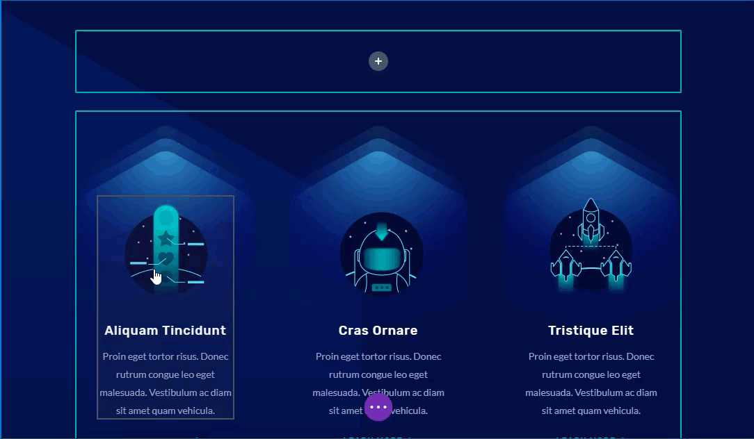
Sneak Peek
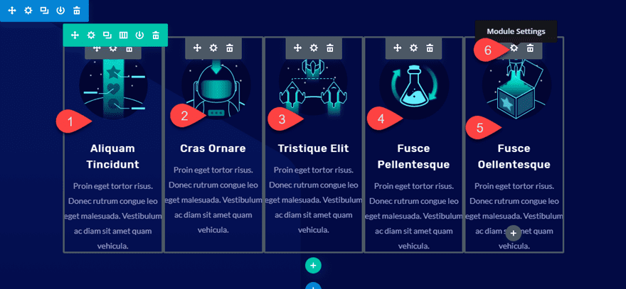
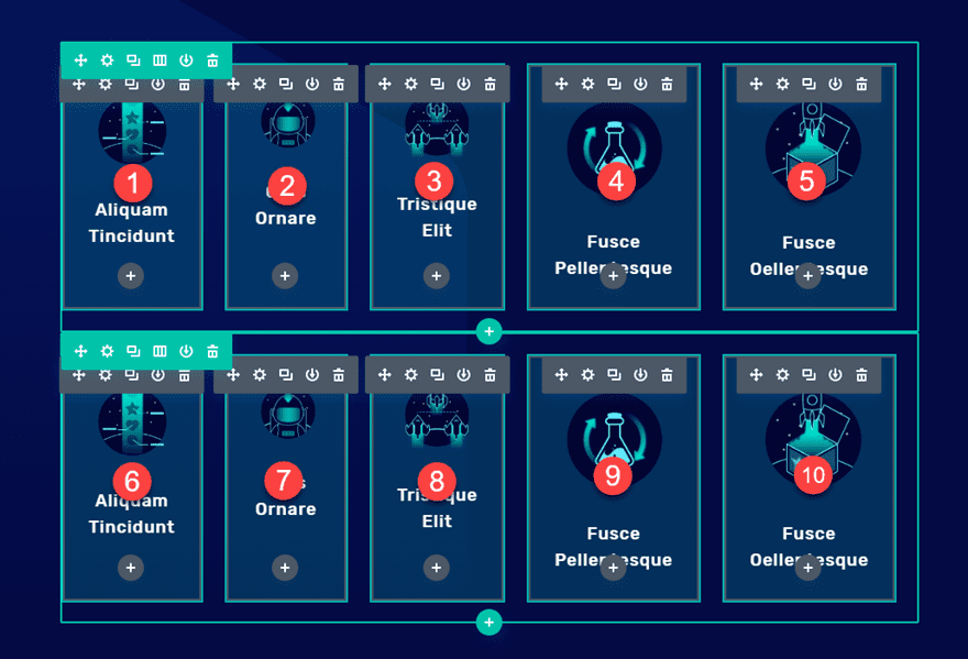
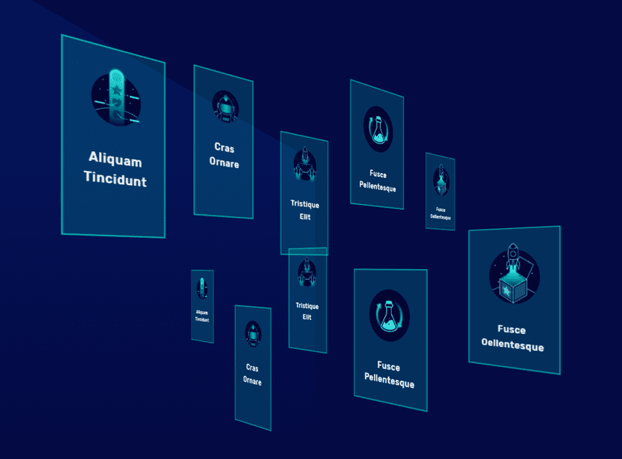
Here is a sneak peek of the design we will build together.
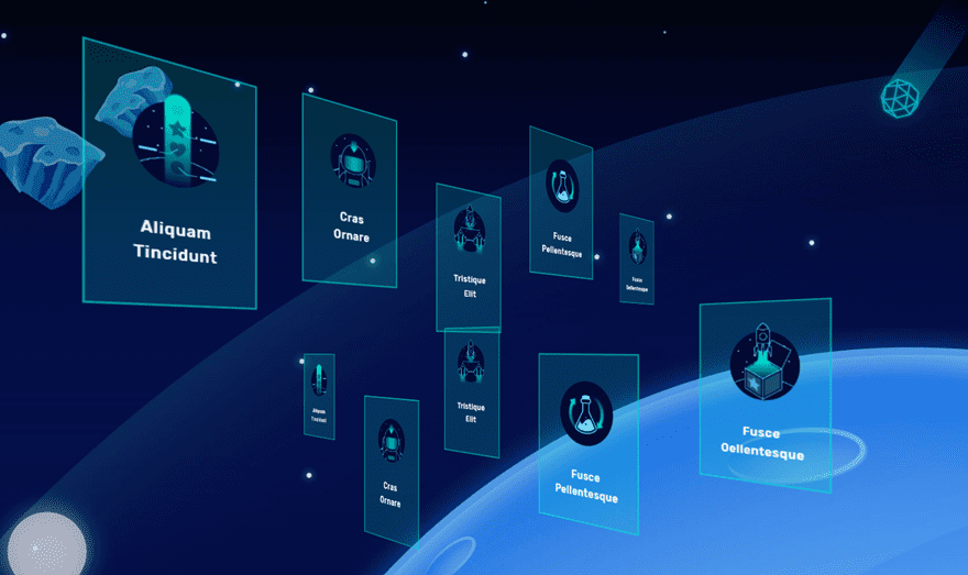
Download the Floating Modules that Collide in 3D Space Layout for FREE
To lay your hands on the design built in this tutorial, you will first need to download it using the button below. To gain access to the download you will need to subscribe to our newsletter by using the form below. As a new subscriber, you will receive even more Divi goodness and a free Divi Layout pack every Monday! If you’re already on the list, simply enter your email address below and click download. You will not be “resubscribed” or receive extra emails.

To import the layout to your page, simply extract the zip file and drag the json file into the Divi Builder.
Let’s get to the tutorial shall we?
Subscribe To Our Youtube Channel
Getting Started with a Premade Layout
To get started, make sure you have the Divi theme installed and active. Then create a new page, give the page a title, and deploy the Divi Builder (on the front end). Select the option “Choose a premade layout”. Then select the Video Game Landing Page layout and import it to your new page.
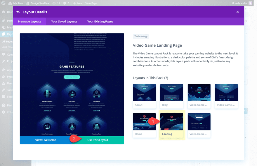
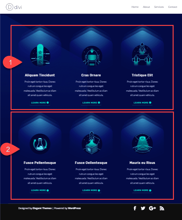
To get a head-start on our design, we are going to be using the section titled “Game Features” which contains the blurbs we are going to use for our design. Since this is the only section we really need, go ahead and delete every section and row except the two rows of blurbs.
Implementing the Floating Blurbs in 3D Space Design in Divi
Creating the First Row of Blurbs
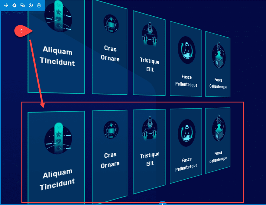
Inside the section of the premade layout containing the two rows of blurbs, create a new one-column row and drag it to the top of the section.
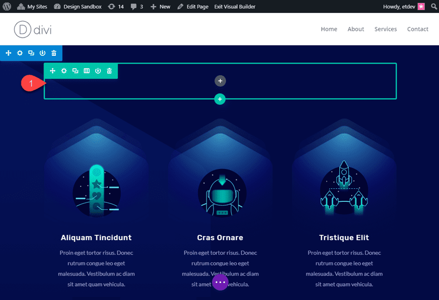
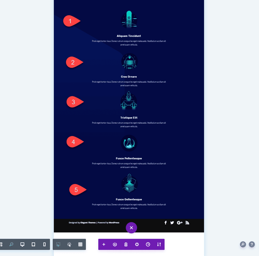
Now using Divi’s multiselect feature (hold ctrl/cmd while selecting each blurb), select 5 of the blurbs in the two columns below and drag them into the new one column row at the top of the section.
Now you can delete the two rows that came with the premade layout below. After that, you should have only a single one-column row containing 5 blurbs.
Adding Perspective to our Section
To get the 3D effect we are looking for in this design, we need to add the perspective css property to our section. This will add the 3D perspective to our row whenever we rotate the row using the transform options.
Open the section settings and add the following custom CSS to the Main Element:
perspective: 1000px;
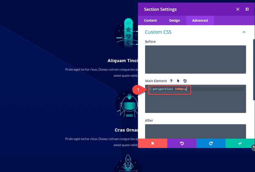
Later on, you may want to increase or decrease the perspective value to bring the 3D elements (in this case, the rows) closer or farther away from the user’s perspective when looking at the screen.
For more info, check out how perspective works with transform options in Divi.
Customizing the Row
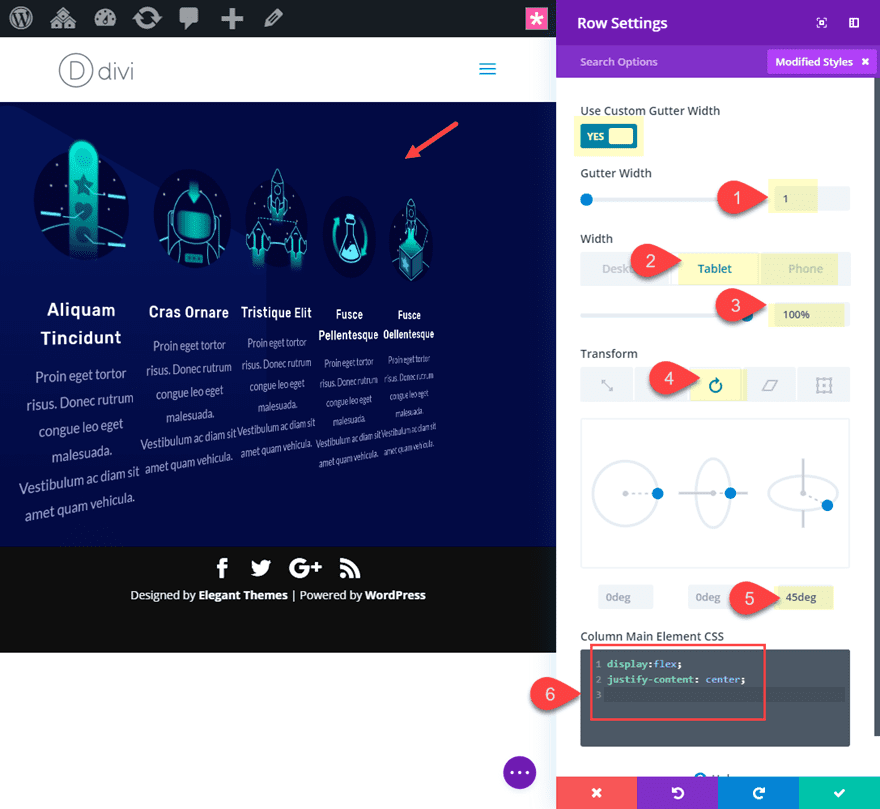
Before we start styling our blurbs, let’s first configure our row settings. There are three main things we need to change at the row level for this design:
- We need to align our blurbs horizontally using “display:flex”. This will keep our design consistent and responsive on all devices (as opposed to using a 5 column layout that will break on tablet and phone).
- We need to get rid of default column margins by setting the gutter width to 1.
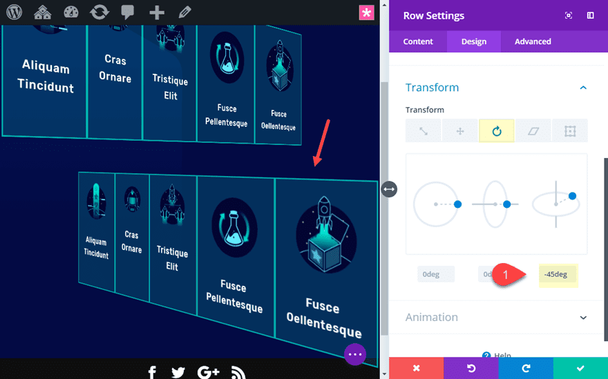
- We need to use transform rotate to rotate the row 45 degrees on the X axis. With the perspective property added to the parent (the section), the row and all of its elements have the 3D effect we are looking for.
Open the row settings and update the following:
Gutter Width: 1
Width: 80% (desktop), 100% (tablet), 100% (phone)
Transform Rotate X axis: 45deg
Column Main Element CSS:
display: flex;
justify-content: center;
Adjusting the Blurb Style and Spacing
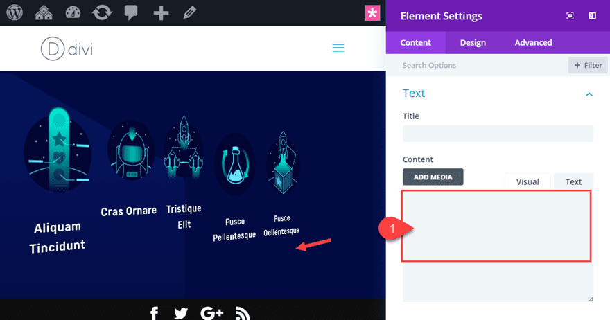
Now it’s time to adjust the content and style of our blurbs a bit.
Since we want to apply the same customizations to all of our blurbs, use multiselect again to select all of the blurbs and deploy the element settings modal.
First, delete the body content.
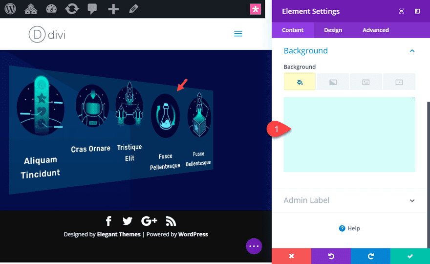
Then add a background color:
Background Color: rgba(20,241,217,0.16)
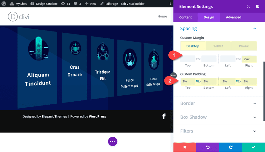
Then update the following spacing:
Custom Margin (desktop): 2vw right
Custom Margin (tablet and phone): 0vw right
Custom Padding: 2% top, 2% bottom, 3% left, 3% right
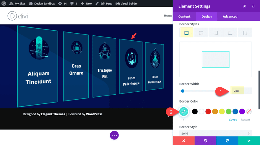
Next, add a border as follows:
Border Width: 2px
Border Color: rgba(20,241,217,0.66)
At this point, all of the blurbs have the styling in place. We still need to use the transform options to change the scale and position of each of the blurbs individually which will add to the 3D floating effect of the blurbs. But before we do that, let’s duplicate the row to create our second row of blurbs.
Creating the Second Row of blurbs
To create the second row of blurbs, simply duplicate the row of 5 blurbs you just customized.
To create a colliding effect, we can rotate the duplicated row in the opposite direction (-45deg).
Open the duplicated row and update the following:
Transform Rotate X axis: -45deg
Increase Top and Bottom Section Padding
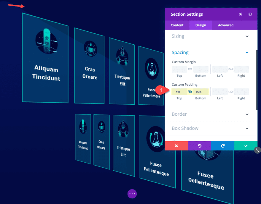
At this point, the front blurbs may be extending outside of the section. To fix this, add the following padding to your section:
Custom Padding: 15% top, 15% bottom
Using Transform Options to Size and Position each Blurb Individually
At this point, you are set up to get creative with how you want each over your blurbs to “float” in 3D space. To do this, you can use the transform options to size and position each blurb one by one exactly where you want it. By doing this, your blurbs will appear to have different depths in 3D space.
To make things easier, I’m going to number the blurbs from 1-10 starting with the far left blurb in the top row (Blurb #1) and ending with the far right blurb in the second row (Blurb #10).
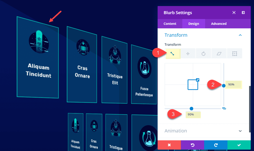
Blurb #1
Let’s start with our first blurb in the top row. Open the blurb settings and update the following:
Transform Scale (x and y axis): 90%
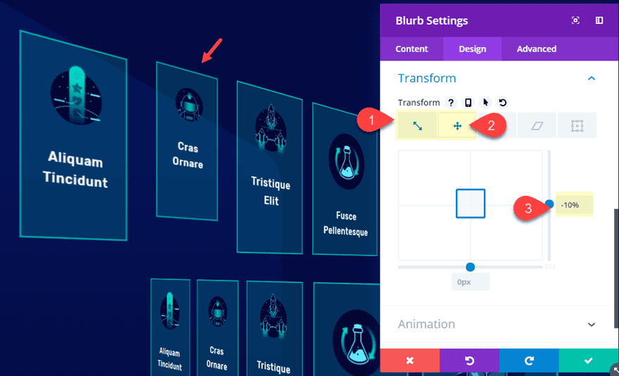
Blurb #2
Open the settings for Blurb #2 and update the following:
Transform Scale (x and y axis): 80%
Transform Translate X axis: -10%
Blurb #3
Transform Scale (x and y axis): 80%
Transform Translate X axis: 20%
Blurb #4
Transform Scale (x and y axis): 85%
Transform Translate X axis: -30%
Blurb #5
Transform Scale (x and y axis): 60%
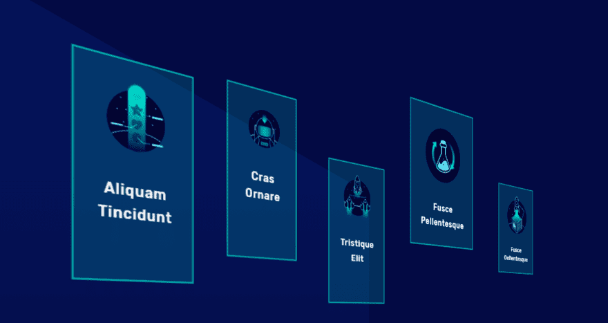
Once done, your first row should look something like this.
Continue customizing the transform options for blurbs 6-10, starting with blurb #6 on the far left of the second row.
Blurb #6
Transform Scale (x and y axis): 60%
Transform Translate X axis: -40%
Transform Translate Y axis: -20%
Blurb #7
Transform Scale (x and y axis): 90%
Transform Translate X axis: 20%
Blurb #8
Transform Scale (x and y axis): 70%
Transform Translate X axis: -50%
Blurb #9
Transform Scale (x and y axis): 80%
Transform Translate X axis: -20%
Blurb #10
Transform Scale (x and y axis): 70%
Transform Translate X axis: -60%
Now let’s check out how the second row looks as it collides with our first row in 3D space.
To complete the design, we can add a nice 3D space background image to the section. I’m using the top section background image that came with the Video Game Landing Page layout we used for this tutorial.
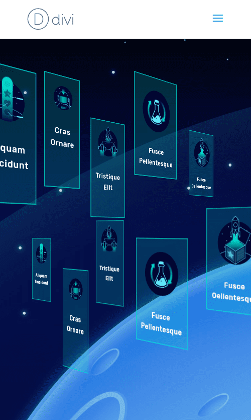
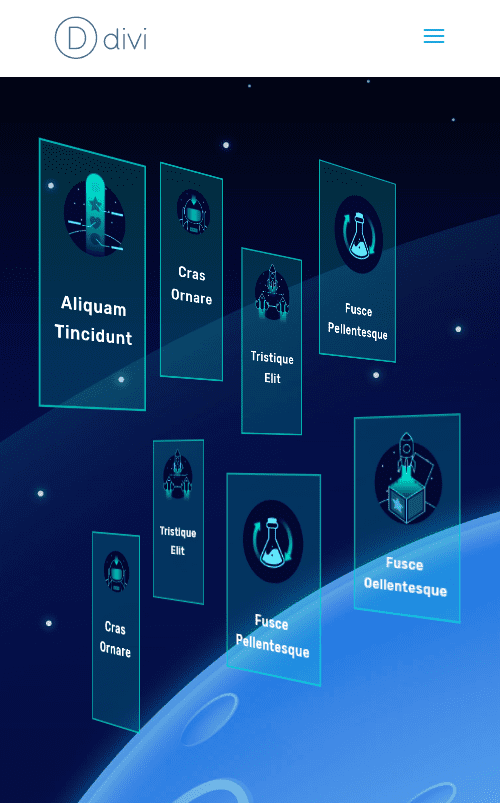
Final Design
Now let’s check out the final design of our 3D floating modules.
Desktop

Tablet

Phone
Because of the 5 blurbs stretching across the row, it is a little more of a challenge to fit all 5 blurbs without it extending outside the viewport. To fix this you can simply hide the far blurb in each row on phone. Or you can give each of your blurbs a smaller size on phone.
Final Thoughts
I hope this tutorial will give you some inspiration for how to create your own floating modules in 3D Space. All it really takes is a few steps to get your entire row of modules rotated in 3D using perspective and transform options. After that, you can position each of the modules to float them anywhere you want.
Have fun exploring.
I look forward to hearing from you in the comments.
Cheers!


can i use this in the wordpress
I think the concept of using 3D images is great and is a good way to differentiate yourself from the competition. You have also gone into a great deal of detail in terms of showing how to implement the module. Thanks.
Great article. However, as the others have mentioned, a quick animated GIF of what the result should be, would be helpfull in deciding to tackle this tutorial.
Agree with the others. This sort of thing needs a live working example. Apparently the image is supposed to be animated. However, it’s not animating.
Absolutely! 🙂
Excellent, great …. More a little hover and it’s great
Glad I’m not the only one – yep it’s totally bizarre to take the time to write this beautiful detailed article and then not show a working example. It would also help me decide if it’s worth the time to do it.
I would also love to see an example other than the screenshots before I start working this into my web site.
It looks pretty amazing if it can do what I would want it to do.
lol no demo again
I have to agree with the others here. I check out most of these articles, and I always wonder why you’re not showing a short vid or gif that demonstrates the end product right at the top.
Hi – looks nice from the screenshots but it would be great with any of these articles to provide a link to a demo in the first instance (and the first paragraph) so that we can immediately see if it is something we would like to read more about. Thanks
Hi – looks nice from the screenshots but it would be great with any of these articles to provide a link to a demo in the first instance (and the first paragraph) so that we can immediately see if it is something we would like to read more about. Thanks
A demo would be nice to see… a .gif or something so we know what is meant by “collide”. Thank you!
fantastic tuto
one question is it possible to animate each module with the mouse ?
wow! and were is link on demo page ith example?
If only you would take the time to fix your own home page to not Always say login and never let your paid users actually be logged in.
You can download json file to import on your own site, but you have to do the 3D trick by yourself 😉
How? This is driving me nuts!