
Section dividers can take your website design to the next level. Additionally, taking advantage of Divi and its built-in design options can save you a lot of time by not requiring image editing software to add unique design elements to your pages.
One of those creative approaches is using section dividers to create background textures for your website. The best way to learn how to do this is practicing. Which is why in this post we’ll recreate a stunning example, which you can see below, but start off by sharing some elements that are crucial to making this concept work.
Let’s get to it!
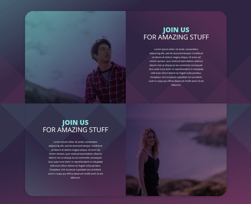
Result
Before diving into the tutorial, let’s take a quick look at what we’ll be recreating on different screen sizes.
On Desktop
On Tablet

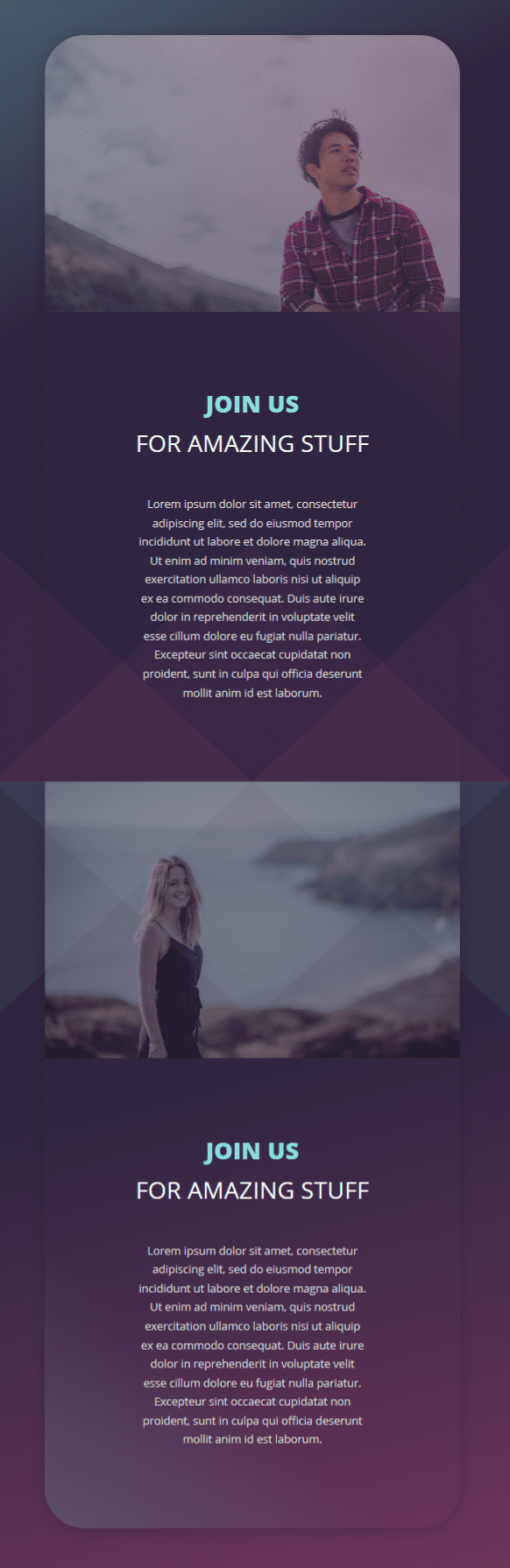
On Mobile
Alternative Divider Style #1
You can use various section dividers for this example. We’ll show you two additional ones, in the same design, that look amazing. This is the first:

Alternative Divider Style #2
And this is the second alternative:

How to Creatively Use Section Dividers to Create Background Textures with Divi
Subscribe To Our Youtube Channel
What You Need to Know
- To make this work, the first thing you’ll need to keep in mind is having zero bottom padding for the first section and zero top padding for the second
- The rows need zero top and bottom padding as well
- This will remove all of the space between the sections and rows and will allow section dividers to collide
- The section dividers will also need a higher value for the divider height and horizontal repeat
- This depends on your design preferences and how much you want the section dividers to come through
- We’re using semi-transparent colors for the section dividers to make sure they don’t overpower the colors you’re using for your modules
- To allow section dividers to come through, your column background colors or gradient backgrounds will need certain transparency as well
Create Section #1
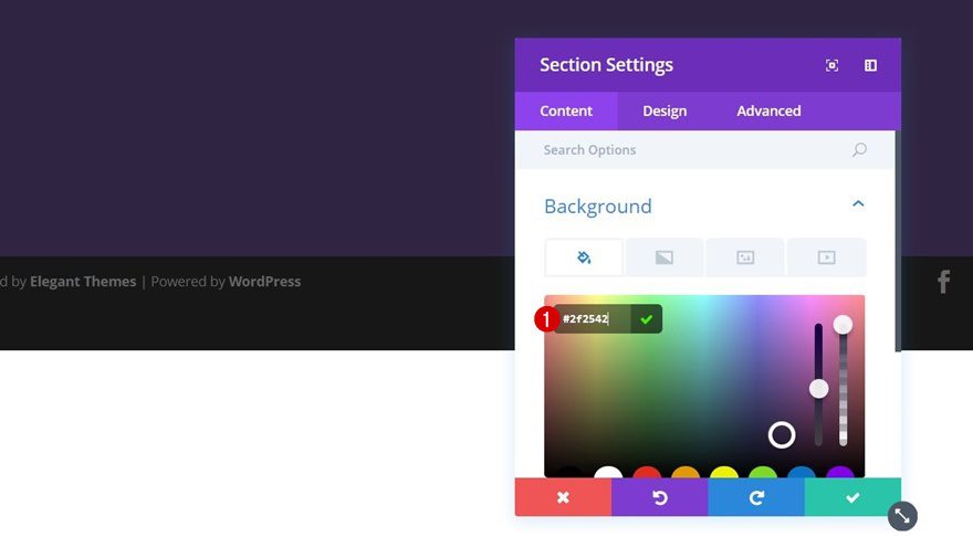
Section Settings
Background Color
Let’s start with the first standard section. The first thing you’ll need to do, after adding this section, is giving it ‘#2f2542’ as its background color.
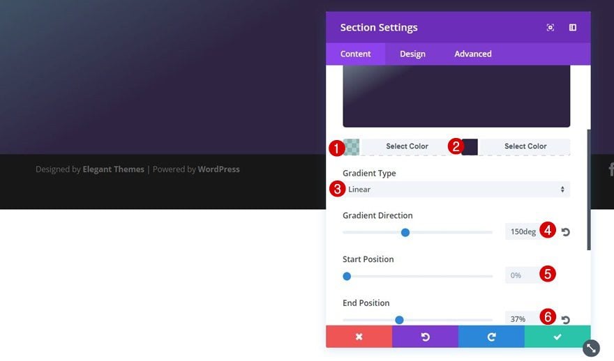
Gradient Background
On top of the background color, we’ll also use a gradient background. We’re combining a background color and a gradient background because of the first semi-transparent color we’re using for the gradient background. It’ll allow both colors to combine. Use the following settings:
- First Color: rgba(96,165,165,0.55)
- Second Color: #2f2542
- Gradient Type: Linear
- Gradient Direction: 150deg
- Start Position: 0%
- End Position: 37%
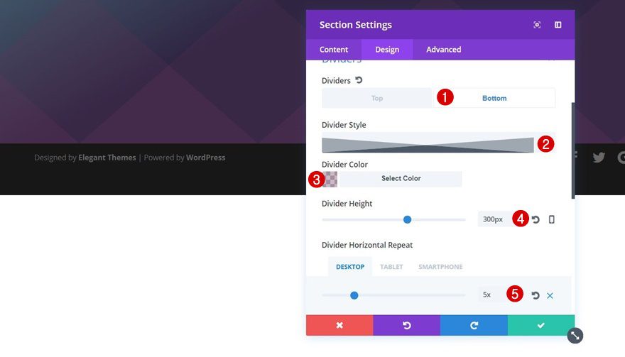
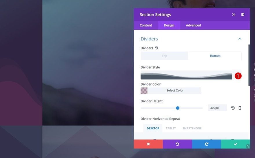
Bottom Divider
Move on to the Design tab of this section and apply a section divider immediately:
- Divider Style: Find in List
- Divider Color: rgba(109,52,93,0.35)
- Divider Height: 300px
- Divider Horizontal Repeat: 5px (Desktop), 2px (Tablet & Phone)
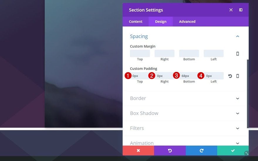
Spacing
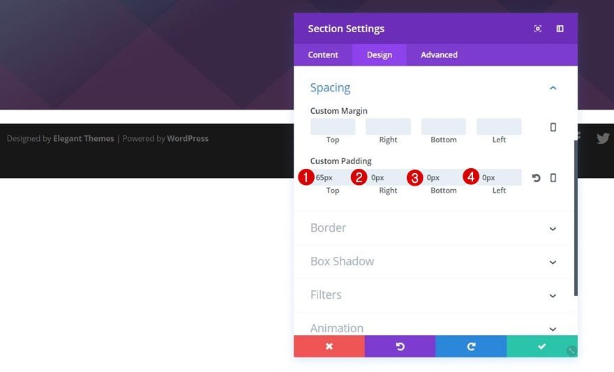
We’re going to continue by changing the spacing of this section. As mentioned before, we’ll definitely need to have zero padding for the bottom of this section to help remove the distance between this section and the row we’ll add in the upcoming steps. These are the padding values we’re using:
- Top: 65px (create space between the top of the section and row we’ll add in the upcoming steps)
- Right: 0px
- Bottom 0px (removes space between row and section at the bottom of the section)
- Left: 0px
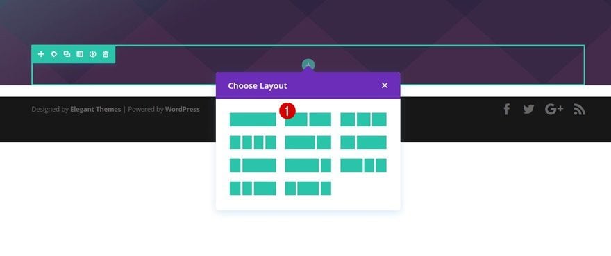
Add a New Row
Column Structure
Now that we’re done with the section settings, we’re going to add a row to it. The column structure we’re using is the following:
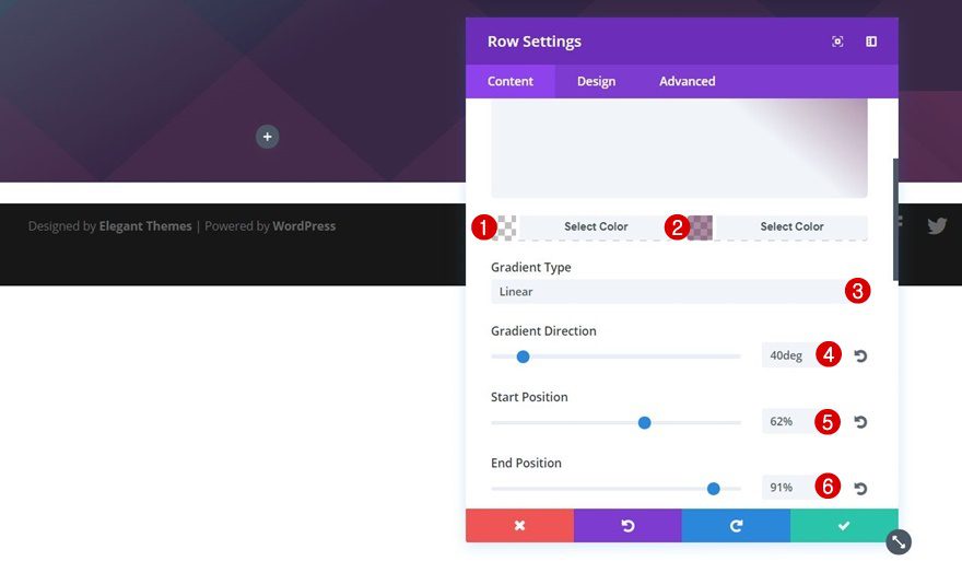
Gradient Background
We’re using a gradient background with transparent colors for this row. This allows us to make the section dividers come through:
- First Color: rgba(255,255,255,0)
- Second Color: rgba(109,52,93,0.56)
- Gradient Type: Linear
- Gradient Direction: 40deg
- Start Position: 62%
- End Position: 91%
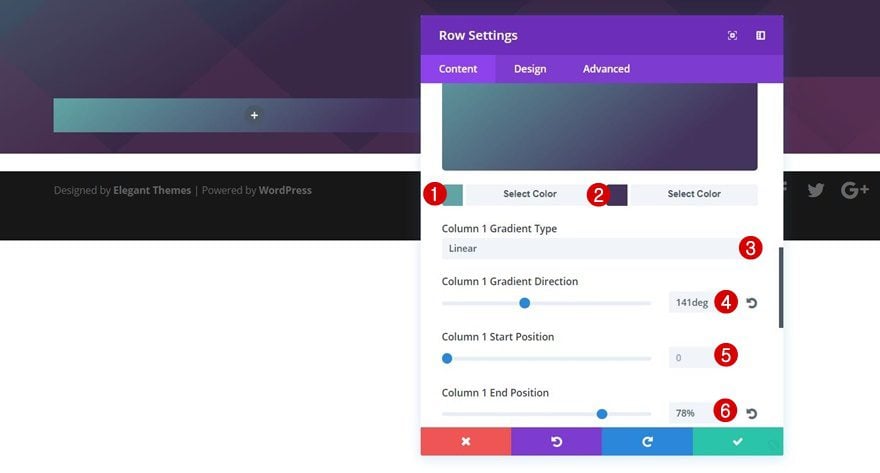
Column 1 Gradient Background
Scroll down your row settings and add a gradient background to your first column as well. In the next step, we’ll combine this gradient background with a column background image:
- First Color: #60a5a5
- Second Color: #44335d
- Column 1 Gradient Type: Linear
- Column 1 Gradient Direction: 141deg
- Column 1 Start Position: 0%
- Column 1 End Position: 78%
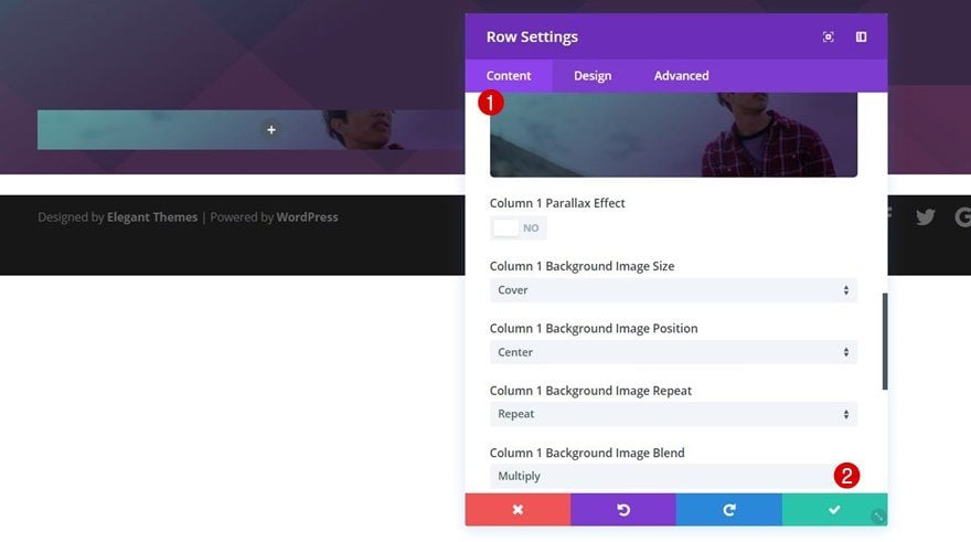
Column 1 Background Image
Now add a background image of choice to your first column and make sure the Column 1 Background Image Blend is set to ‘Multiply’. This will combine the background image and the gradient background we’ve chosen in the previous step. The background image will only appear on desktop, later on this post, we’ll add an Image Module with the same image to appear on tablet and phone.
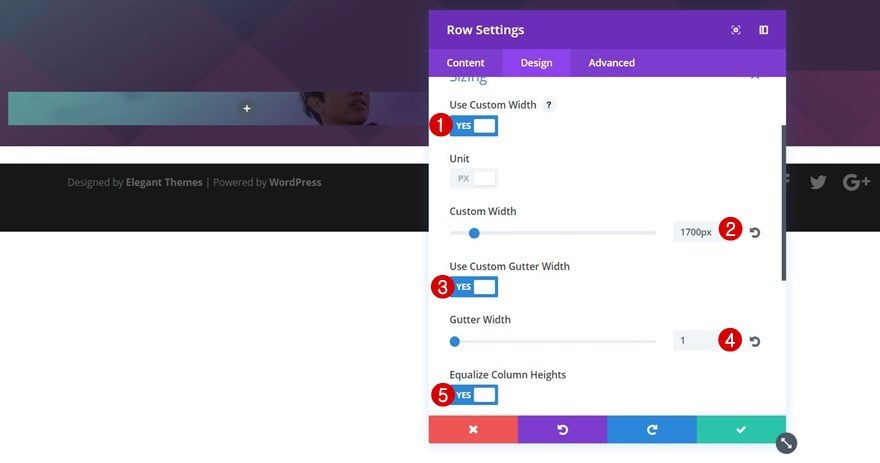
Sizing
Then, move on to the Design tab, open the Sizing subcategory and apply the following settings to it:
- Use Custom Width: Yes
- Custom Width: 1700px
- Use Custom Gutter Width: Yes
- Gutter Width: 1 (removes the space between columns)
- Equalize Column Heights: Yes (makes sure the columns are equally in height)
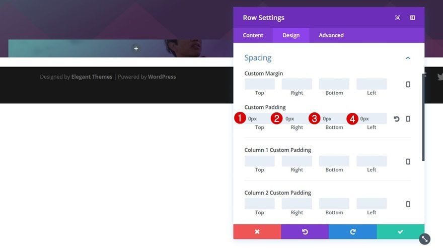
Spacing
Continue by opening the Spacing subcategory and adding ‘0px’ to all of the padding options. This, in combination with a zero bottom padding for the section, will make sure there’s no distance left between the row and bottom of the section.
Rounded Corners
We’re also going to add some rounded corners of ’50px’ to the top left and top right corners.
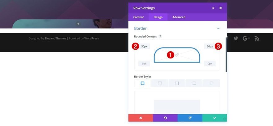
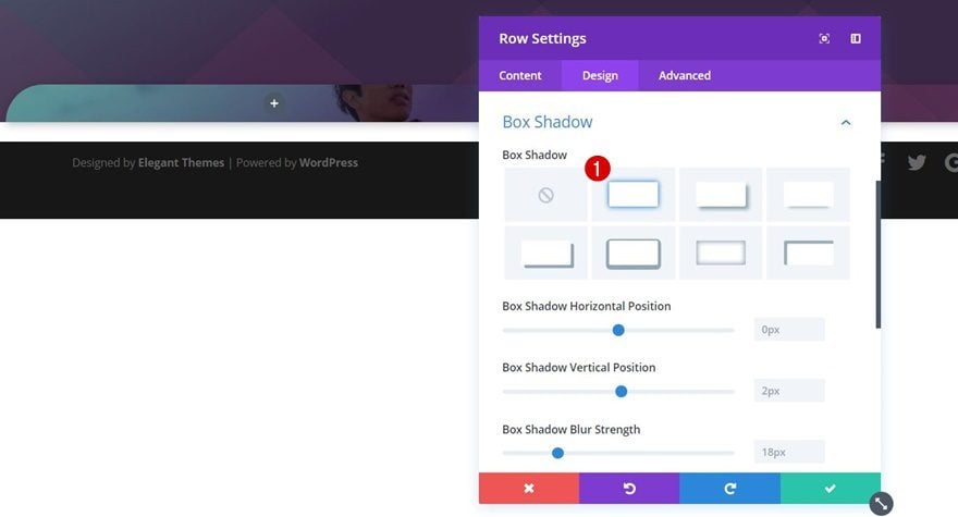
Box Shadow
Lastly, we’ll choose the first option within the Box Shadow subcategory without changing anything about it.
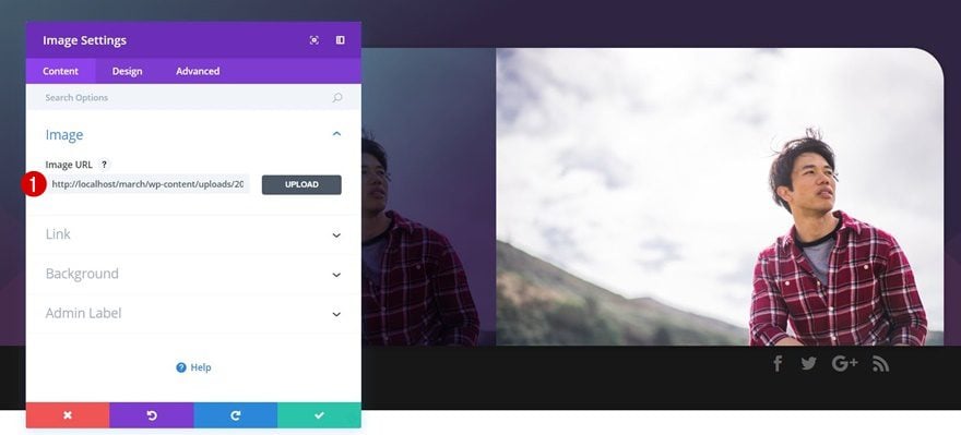
Add Image Module to Second Column
Upload Image
Now that our row settings are done, we can start adding and modifying modules. The first module we’re going to add to the second column is an Image Module. This Image module is meant to show up on tablet and phone only. For desktop, we have the column background we’ve added in the previous steps.
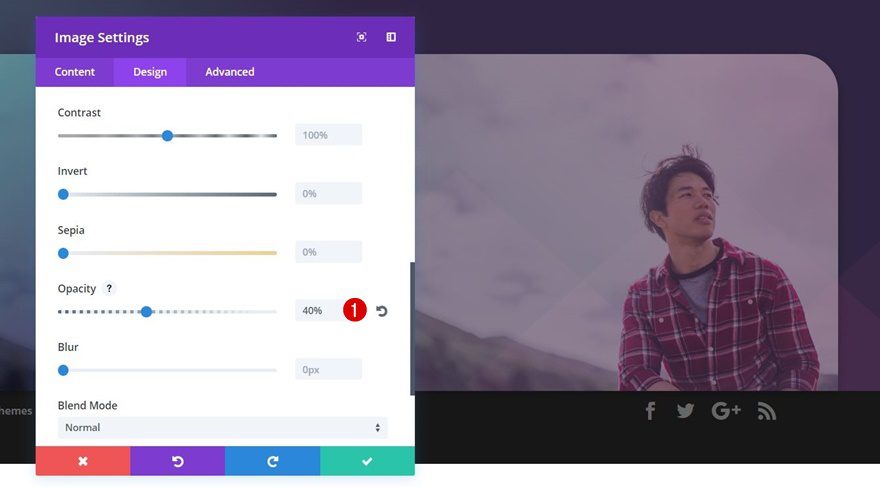
Opacity
To make sure the section divider combines with the image, we’re going to change the opacity of this Image Module to ‘40%’.
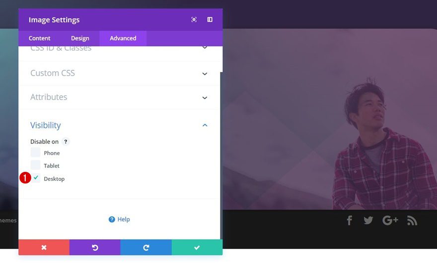
Visibility
Lastly, we’re going to disable this Image Module on desktop.
Upload Text Module #1 to Second Column
Text Settings
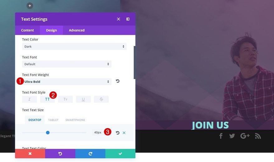
Right below the Image Module you’ve created, add a Text Module and use the following settings for the Text subcategory:
- Text Font Weight: Ultra Bold
- Text Font Style: Capitals
- Text Size: 40px (Desktop & Tablet), 30px (Phone)
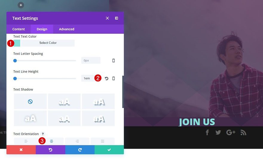
- Text Color: #85e2db
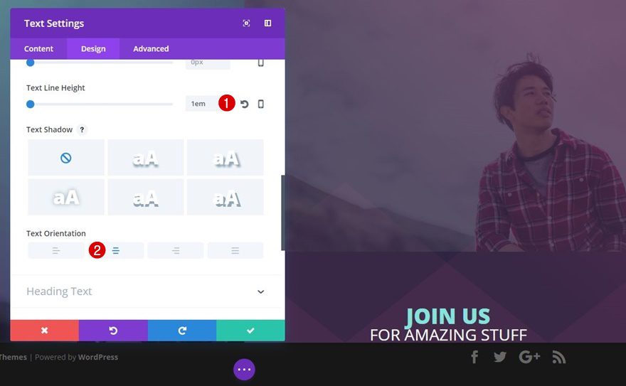
- Text Line Height: 1em
- Text Orientation: Center
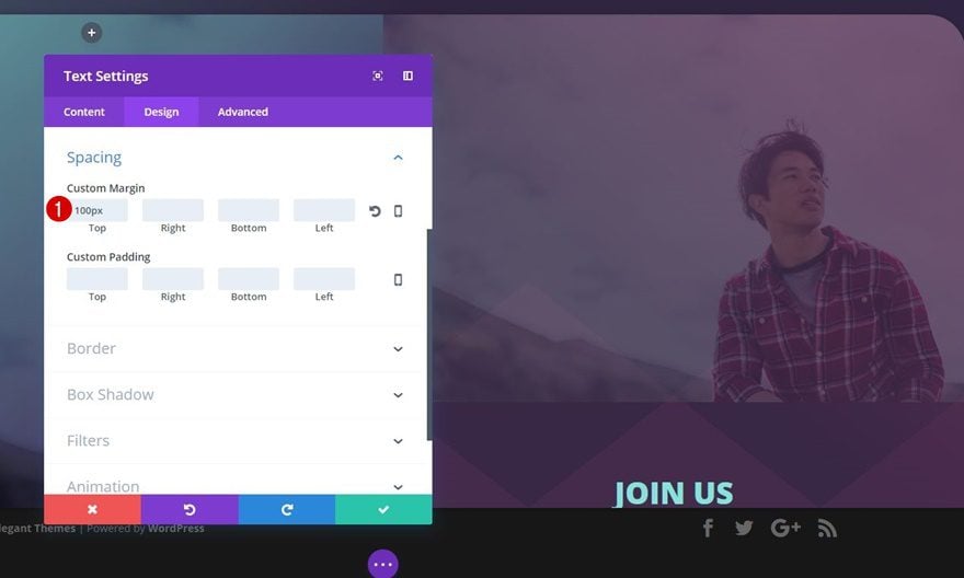
Spacing
To create some space between the Image Module and this Text Module, we’ll also add ‘100px’ to the top margin of this Text Module.
Upload Text Module #2 to Second Column
Text Settings
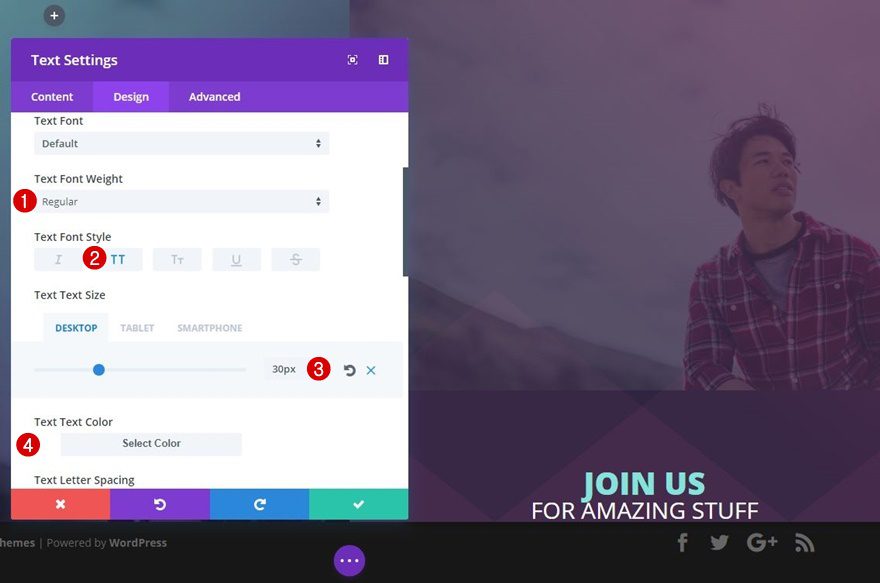
Right below the previous Text Module, add another Text Module with the following text settings:
- Text Font Weight: Regular
- Text Font Style: Uppercase
- Text Size: 30px
- Text Color: #FFFFFF
- Text Line Height: 1em
- Text Orientation: Center
Spacing
We’ll add some top margin of ’20px’ to this Text Module next.
Upload Text Module #3 to Second Column
Text Settings
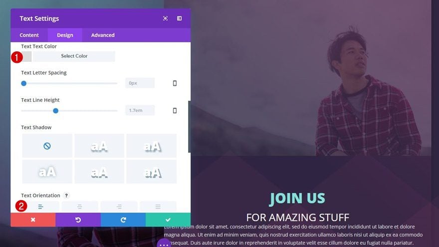
The last Text Module for this column contains a description and uses the following text settings:
- Text Color: #dddddd
- Text Orientation: Left or Center (depending on your preferences)
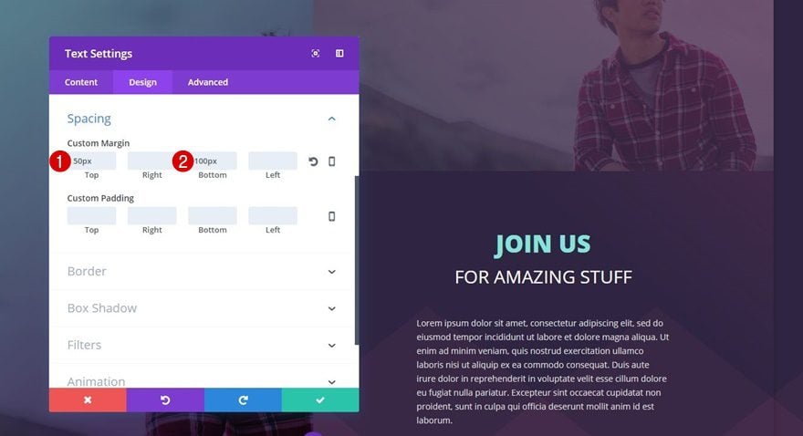
Sizing
Next, open the Sizing subcategory of this Text Module and make the following changes:
- Width: 55%
- Module Alignment: Center
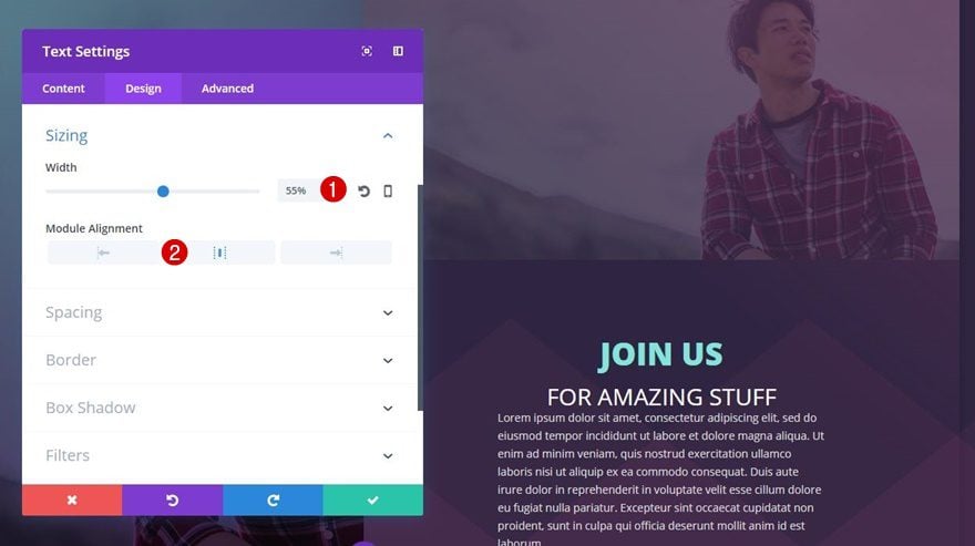
Spacing
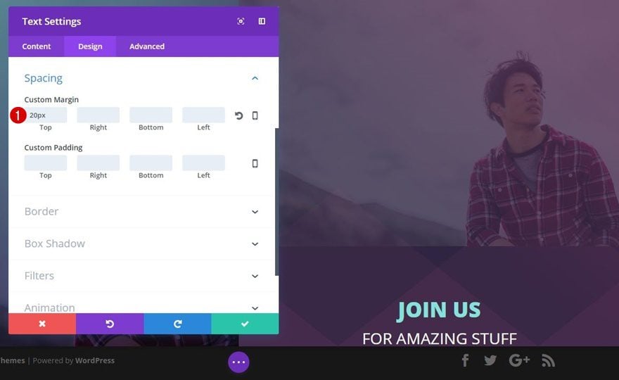
We’ll create some distance between this Text Module, the previous one and the bottom of the row as well by applying the following custom margin:
- Top: 50px
- Bottom: 100px
Create Section #2
Section Settings
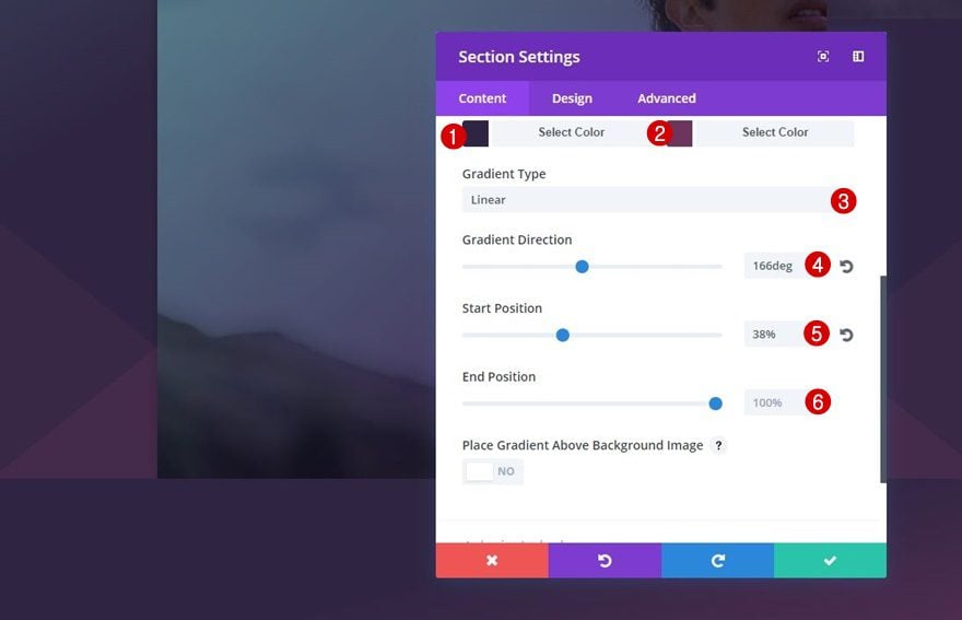
Gradient Background
Right below the previous section, we’re going to add another standard section with the following gradient background (no background color needed in this case):
- First Color: #2f2542
- Second Color: #6d345d
- Gradient Type: Linear
- Gradient Direction: 166deg
- Start Position: 38%
- End Position: 100%
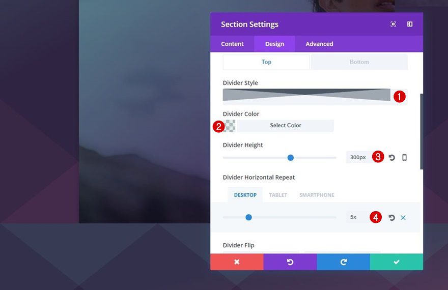
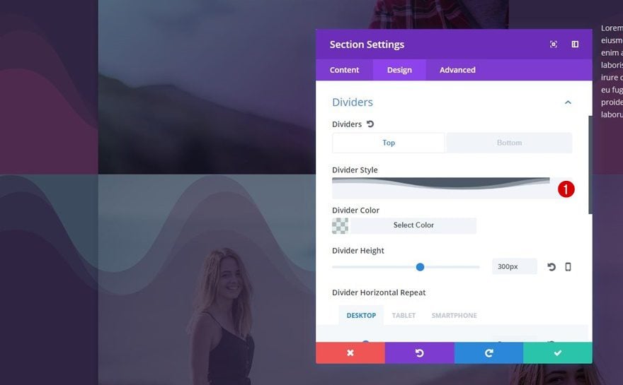
Top Divider
The next step is adding a top divider. We’re going to use almost the same settings as for the previous bottom section divider. The only thing that differs is the color:
- Divider Style: Find in List
- Divider Color: rgba(96,165,165,0.18)
- Divider Height: 300px
- Divider Horizontal Repeat: 5px (Desktop), 2px (Tablet & Phone)
Spacing
Definitely make sure you remove the top padding of this section as well:
- Top: 0px
- Right: 0px
- Bottom: 68px
- Left: 0px
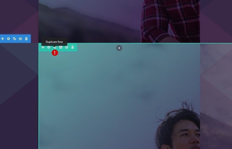
Clone Row of Previous Section & Place in New Section
We’re going to save ourselves some time by just cloning the row we’ve used in the previous section and placing it in this new section.
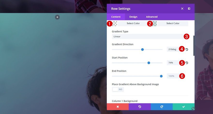
Change Gradient Background
We’ll need some changes to this row, though. One of the things we’ll need to change is the row gradient background:
- First Color: rgba(255,255,255,0)
- Second Color: rgba(96,165,165,0.27)
- Gradient Type: Linear
- Gradient Direction: 219deg
- Start Position: 74%
- End Position: 100%
Remove Column 1 Gradient Background & Background Image
As you can notice in the example print screen, the modules in the second row are on the opposite side. The first thing we’ll need to do to make that work is removing the first column gradient background and background image.
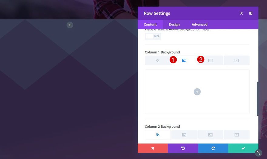
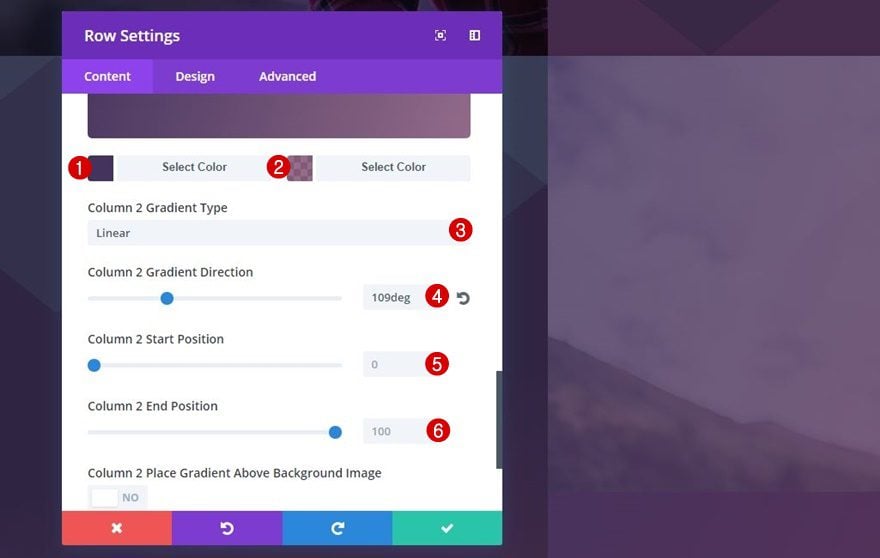
Add Column 2 Gradient Background
Instead, we’re going to add the gradient background and background image to the second column. Start by adding the following gradient background:
- First Color: #44335d
- Second Color: rgba(109,52,93,0.72)
- Column 2 Gradient Type: Linear
- Column 2 Gradient Direction: 109deg
- Column 2 Start Position: 0%
- Column 2 End Position: 100%
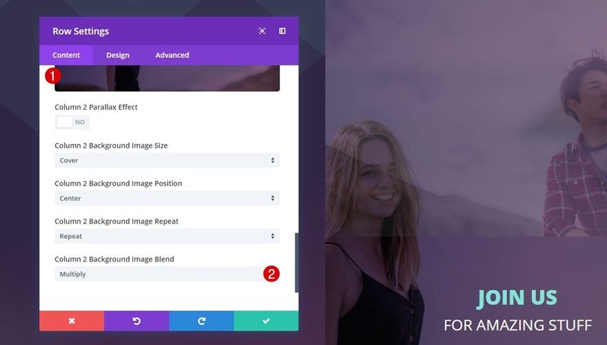
Add Column 2 Background Image
Go to the Background Image tab, upload your background image and make sure you use ‘Multiply’ as the image blend to combine the background image with the gradient background.
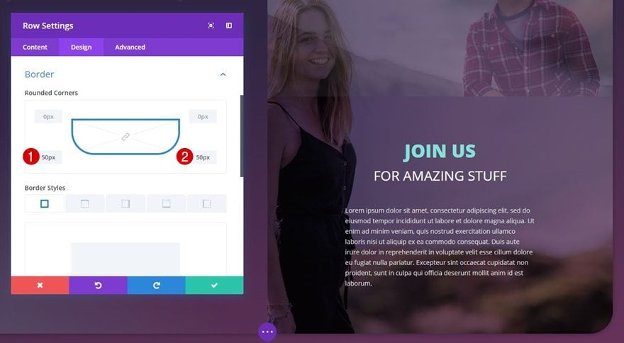
Change Rounded Corners
The rounded corners of this row are located at the bottom left and right instead of top left and right.
Place Existing Modules in Column 1
We’ll also need to place all of the existing columns in the first column instead of the second one by dragging them there one by one.

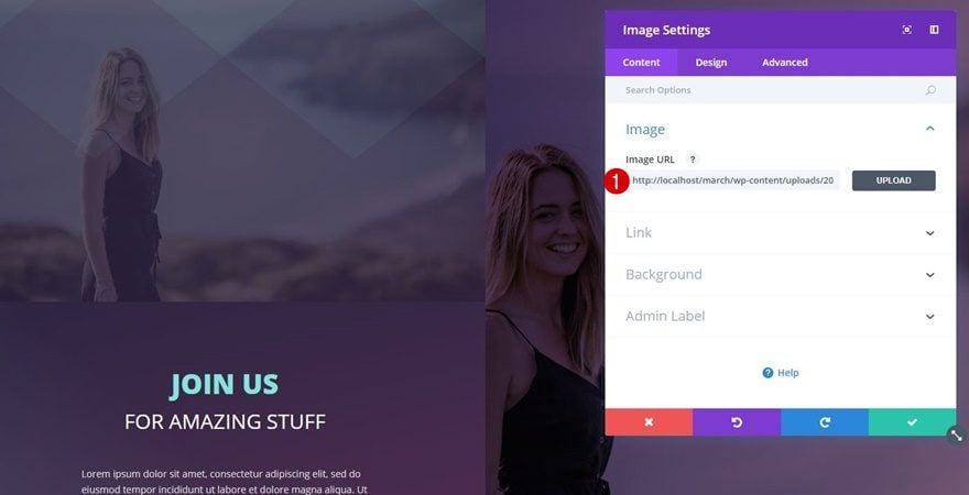
Change Image for Image Module
Lastly, change the image within your Image Module, and you’re done!
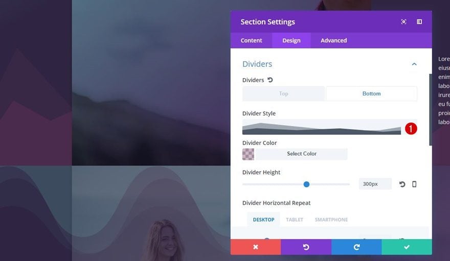
Alternative Section Divider #1
Change Bottom Section Divider of Section #1
To make use of the first alternative section divider, you’ll need to change the Divider Style into the following one (which you can find on the list):
Change Top Section Divider of Section #2
Choose the same one for the top section divider of the second section.
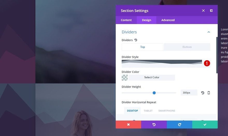
Alternative Section Divider #2
Change Bottom Section Divider of Section #1
The second alternative uses the following divider style:
Change Top Section Divider of Section #2
Again, apply this to the top section divider of the second section as well:
Result
Now that we’ve gone through all the steps let’s take a final look at the result on different screen sizes.
On Desktop
On Tablet
On Mobile
Alternative Divider Style #1
Alternative Divider Style #2
Final Thoughts
In this tutorial, we’ve shown you a creative way to use section dividers to create background textures for your sections. Besides showing you how to recreate the stunning example above from scratch, we’ve also provided some key elements to making this method work on any design you want to create. If you have any questions or suggestions, make sure you leave a comment in the comment section below!


Nice post
Great Tips. Thanks
Great post! Thank you!
Excellent! Where do you get such design ideas for inspiration? I did not even suspect that Divi had such opportunities. Thank you!
Great start from me.
where do you find the divider styles to use in the first place?
Is there something to download to include them?
Thanks
Amazing tutorial and the color you used are amazing. Great textures and you also mentioned color Hex codes as well. Which again very useful.
How do I get these tutorials emailed to me?
Sign up for their newsletter.
There’s a sign up form on any post where they offer something in exchange for your email.
Subscribe to the Elegant Themes newsletter.
WOW!!! Thanx for the inspiration!
Possibly the first interesting post I’ve read here for design. Good job!
Rob your site has several alignment issues on iPad.