
Every week, we provide you with new and free Divi layout packs which you can use for your next project. For one of the layout packs, we also share a use case that’ll help you take your website to the next level.
This week, as part of our ongoing Divi design initiative, we’re going to show you how to create an expanding sticky menu on hover using Divi’s Mechanic Layout Pack. We’ll handle two different design examples that you can recreate from scratch and apply to any kind of website you’re creating! The menu will be shown on hover on desktop screen sizes and activated on click on mobile devices.
Let’s get to it!
Preview
Before we dive into the tutorial, let’s take a quick look at the outcome across different screen sizes.
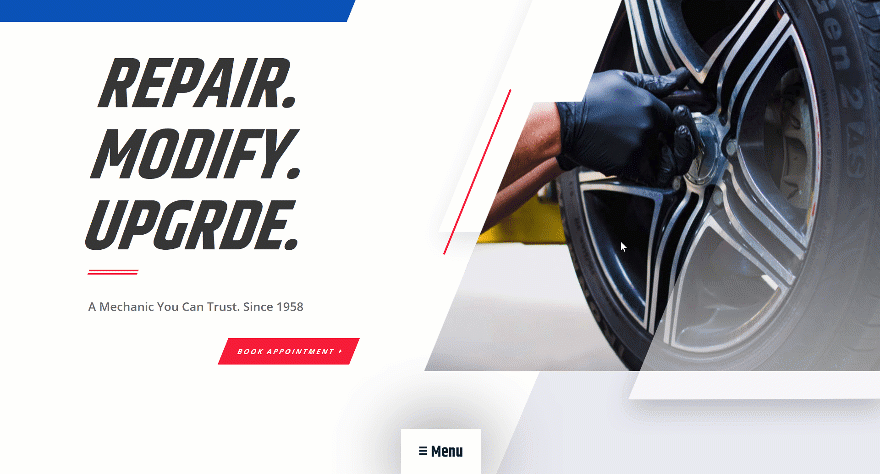
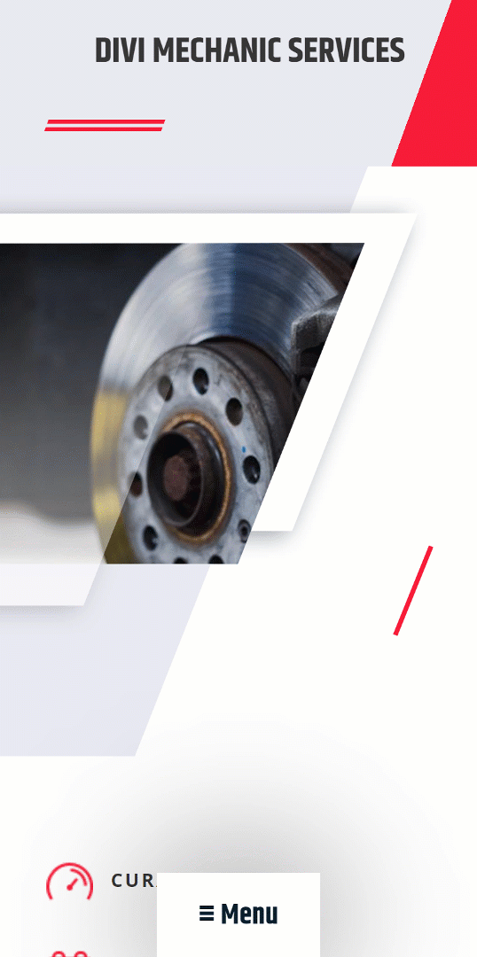
Example #1
Desktop
Mobile
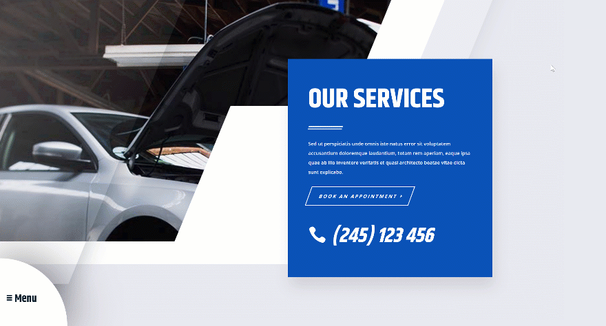
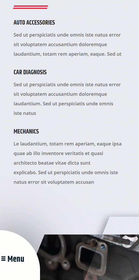
Example #2
Desktop
Mobile
General Steps
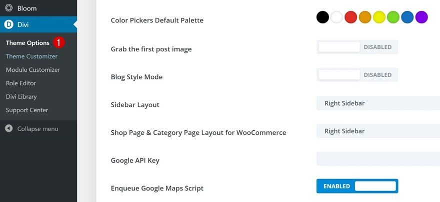
Go to Divi Theme Options
We’ll start off with some general steps. These steps are the same for both examples and are necessary to achieve the desired outcome.
If you’re planning on using an expanding sticky menu at the bottom of your page, you might want to leave out the primary menu bar at the top. To do that, you will need to go to Divi and its theme options.
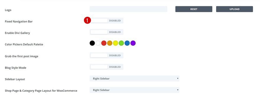
Disable Fixed Navigation
There, you’ll want to disable the fixed navigation bar option to make sure no space remains at the top of your page.
- Fixed Navigation Bar: Disabled
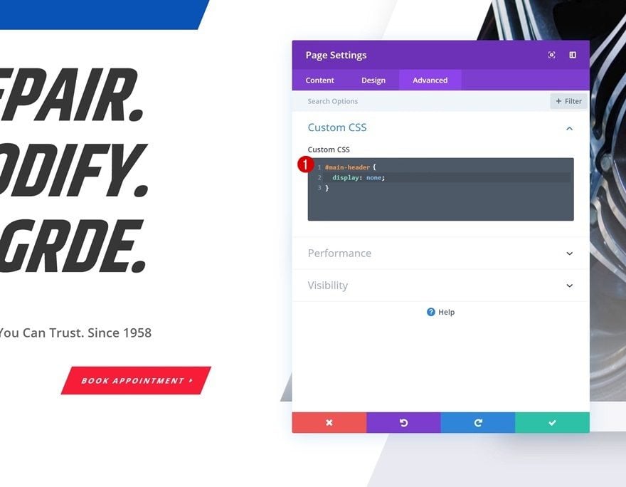
Open Page Settings
Move on to the page you want to add the expanding sticky menu to and open the page settings.
Add Custom CSS
Hide the primary menu by adding the following lines of CSS code to your page.
#main-header {
display: none;
}
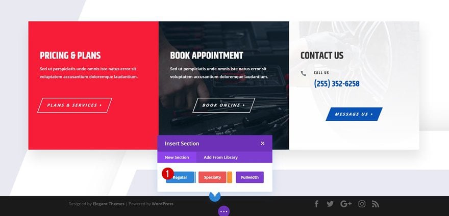
Add New Section to End of Page
Whichever example you want to recreate, some of the basic steps remain the same. The first step is adding a regular section to the bottom of the page.
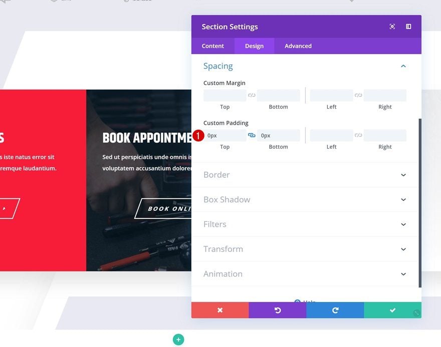
Spacing
Open the section settings and remove all custom top and bottom padding.
- Top Padding: 0px
- Bottom Padding: 0px
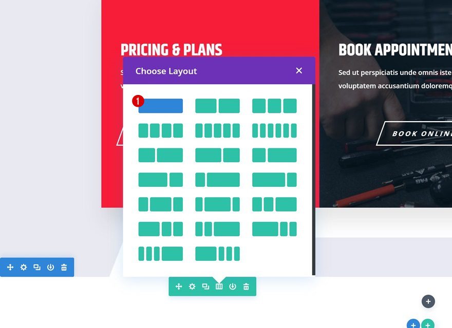
Add New Row
Column Structure
Continue by adding a new row using the following column structure:
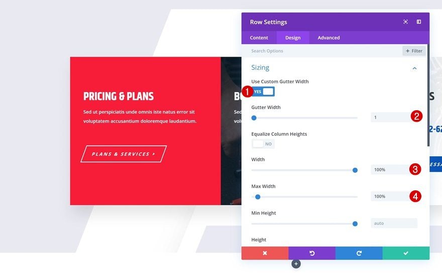
Sizing
Without adding any modules yet, open the row settings and allow the row to take up the entire width of the screen.
- Use Custom Gutter Width: Yes
- Gutter Width: 1
- Width: 100%
- Max Width: 100%
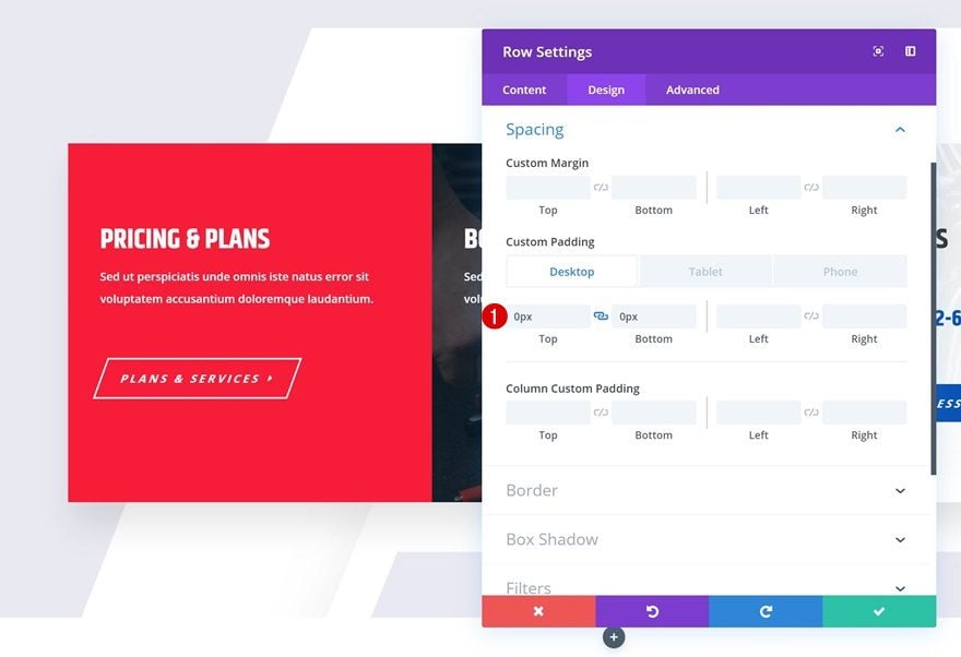
Spacing
Remove all default top and bottom padding next.
- Top Padding: 0px
- Bottom Padding: 0px
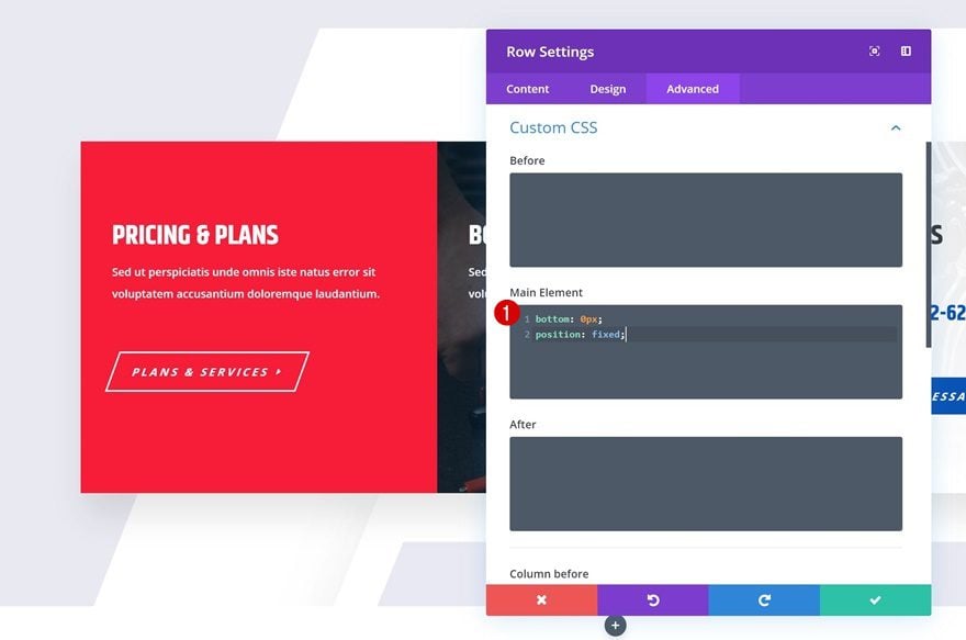
Main Element
We’re allowing the entire row to stick to the bottom of our page by adding two single lines of CSS code to the main element of the row.
bottom: 0px;
position: fixed;
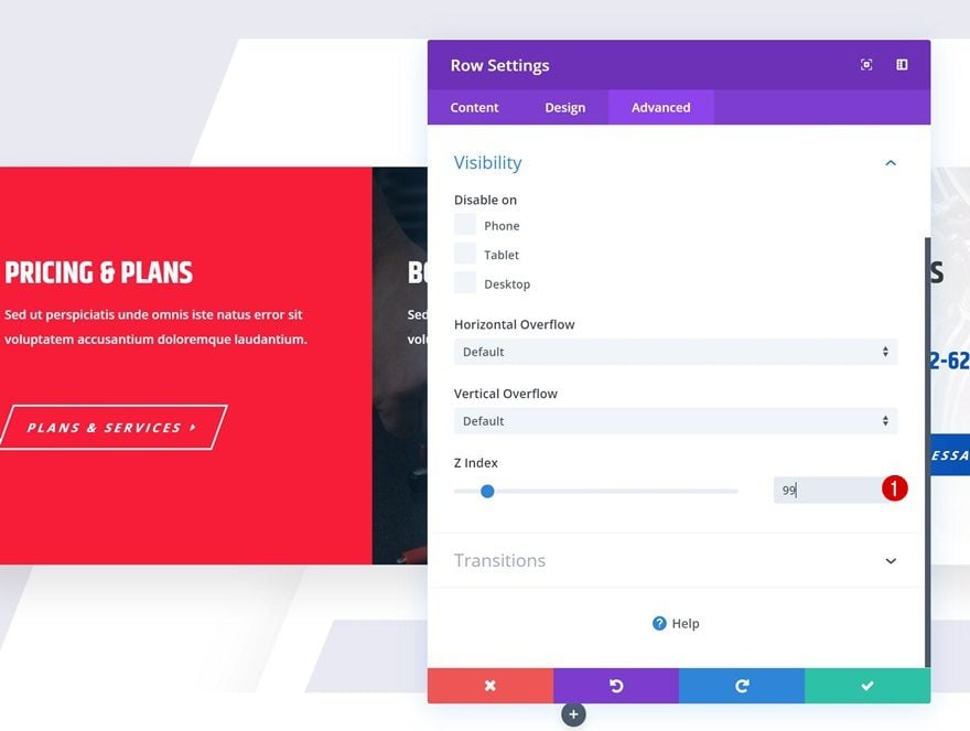
Z Index
And we’ll make sure the row (and the Text Module we add in the upcoming steps) remains on top of all page content by increasing the Z index in the visibility settings of the row.
- Z Index: 99
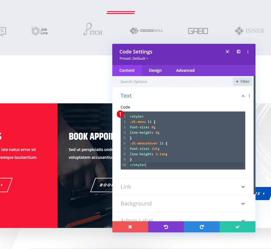
Add Code Module to Column
Add CSS Code Between Style Tags
The last part of the general steps is adding a Code Module to the new row. The CSS code we add inside this Code Module will help us achieve the revealing effect on hover. Paste the following lines of CSS code inside the module:
<style>
.dt-menu li {
font-size: 0;
line-height: 0;
}
.dt-menu:hover li {
font-size: 2vh;
line-height: 2.1em;
}
</style>
Recreate Example #1
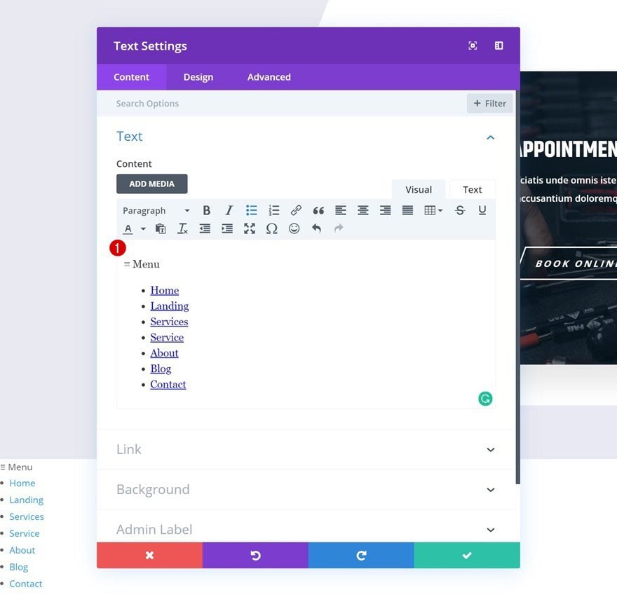
Add Text Module to Column
Add Content
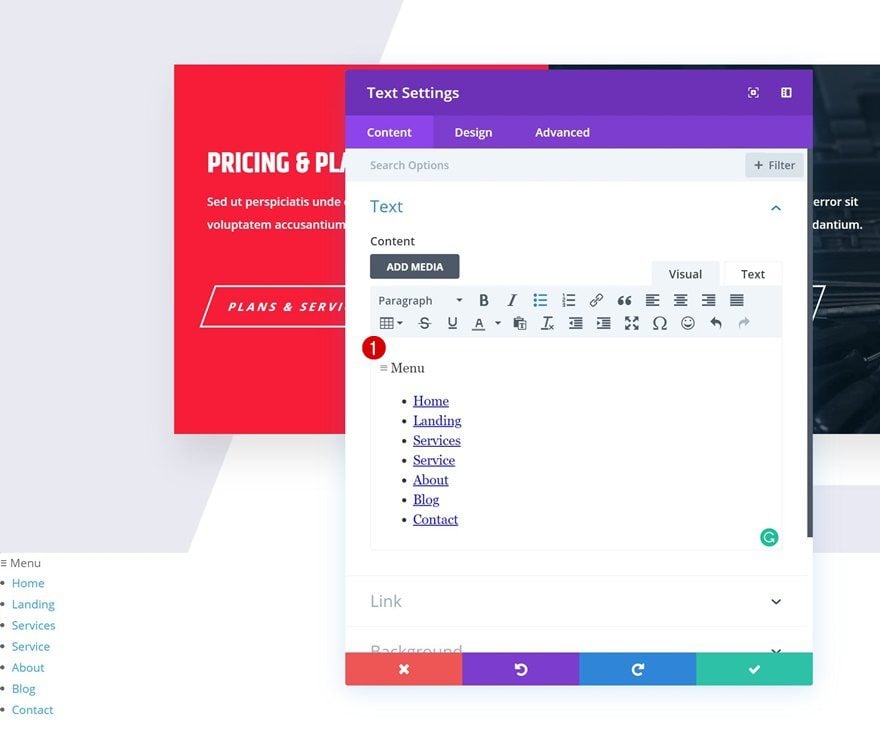
Now that we’ve gone through all the steps, we can start focusing on the two different design examples, starting with the first one! Add a Text Module to the column of your row. In the content box, we’re using the paragraph style to show the ‘≡ Menu’ copy. We’re, then, placing all the menu items in an unordered list. We’ll also add a link to each one of the page titles individually.
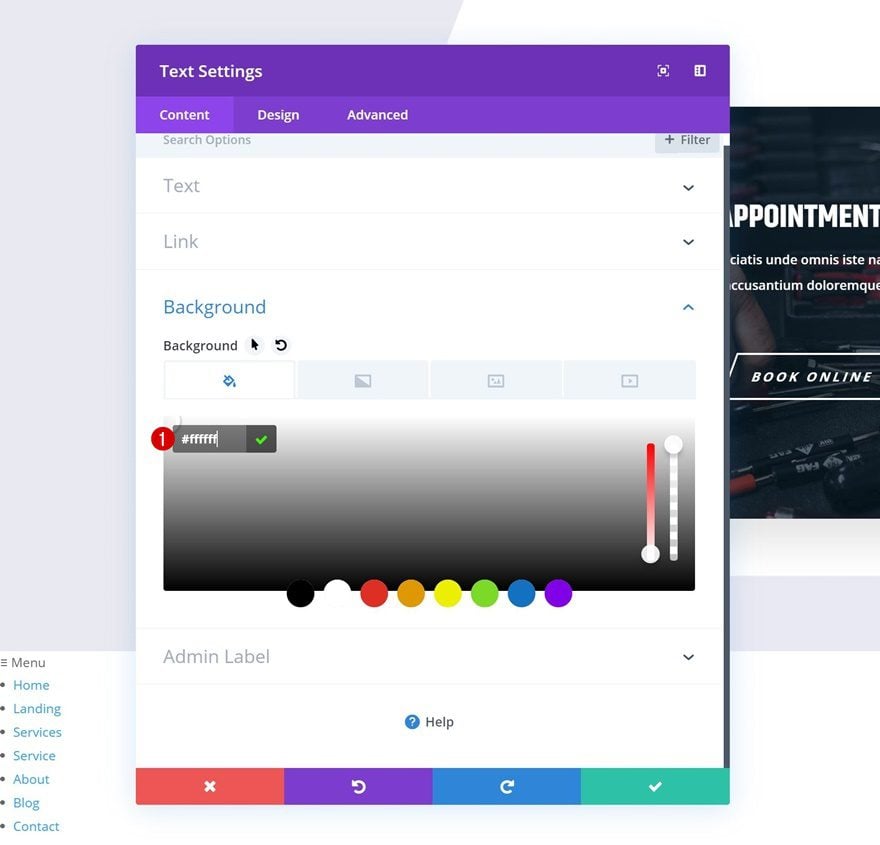
Default Background Color
Move on to the background settings of the module and change the background color.
- Background Color: #ffffff
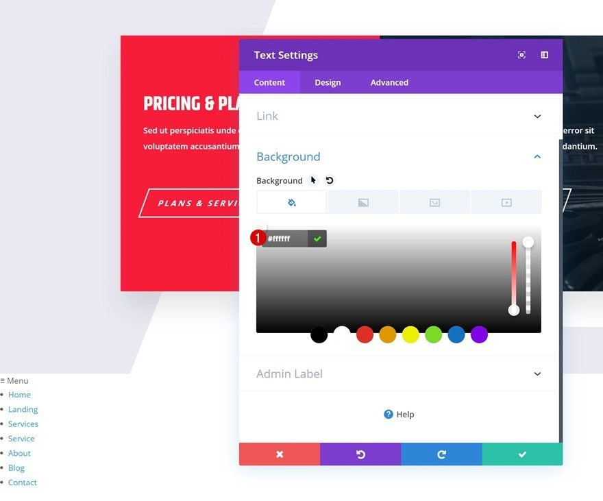
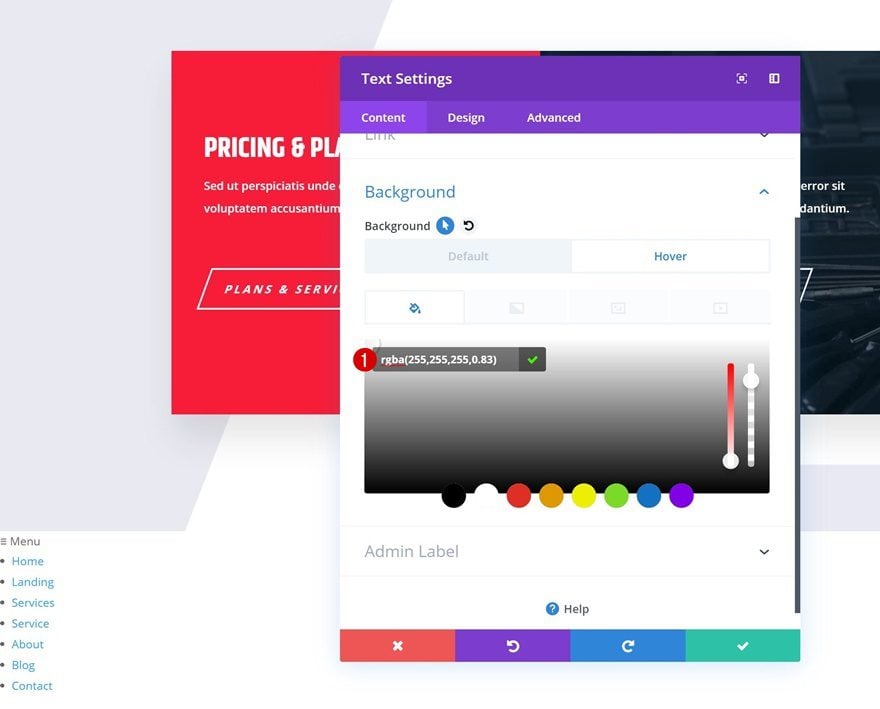
Hover Background Color
Modify this background color on hover.
- Background Color: rgba(255,255,255,0.83)
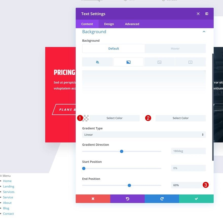
Gradient Background
And add a default gradient background as well.
- Color 1: rgba(255,255,255,0)
- Color 2: #ffffff
- End Position: 60%
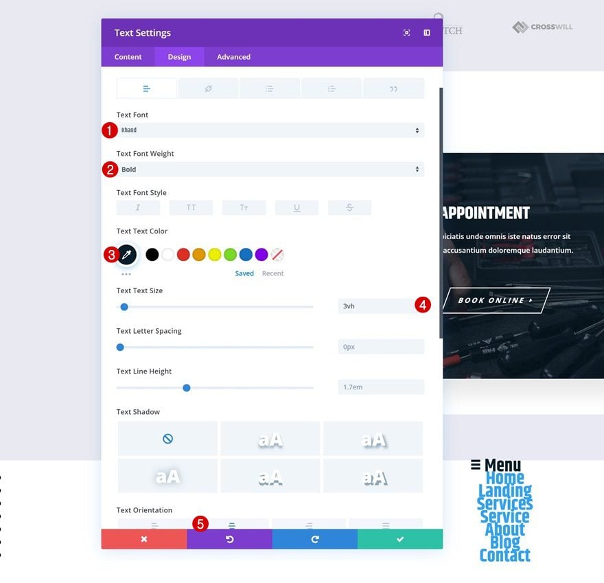
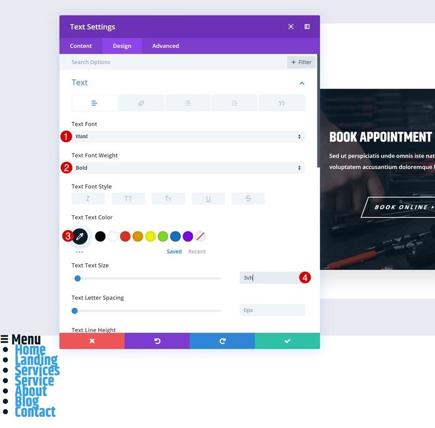
Default Text Settings
Continue by going to the design tab and modifying the text settings.
- Text Font: Khand
- Text Font Weight: Bold
- Text Color: #021827
- Text Size: 3vh
- Text Orientation: Center
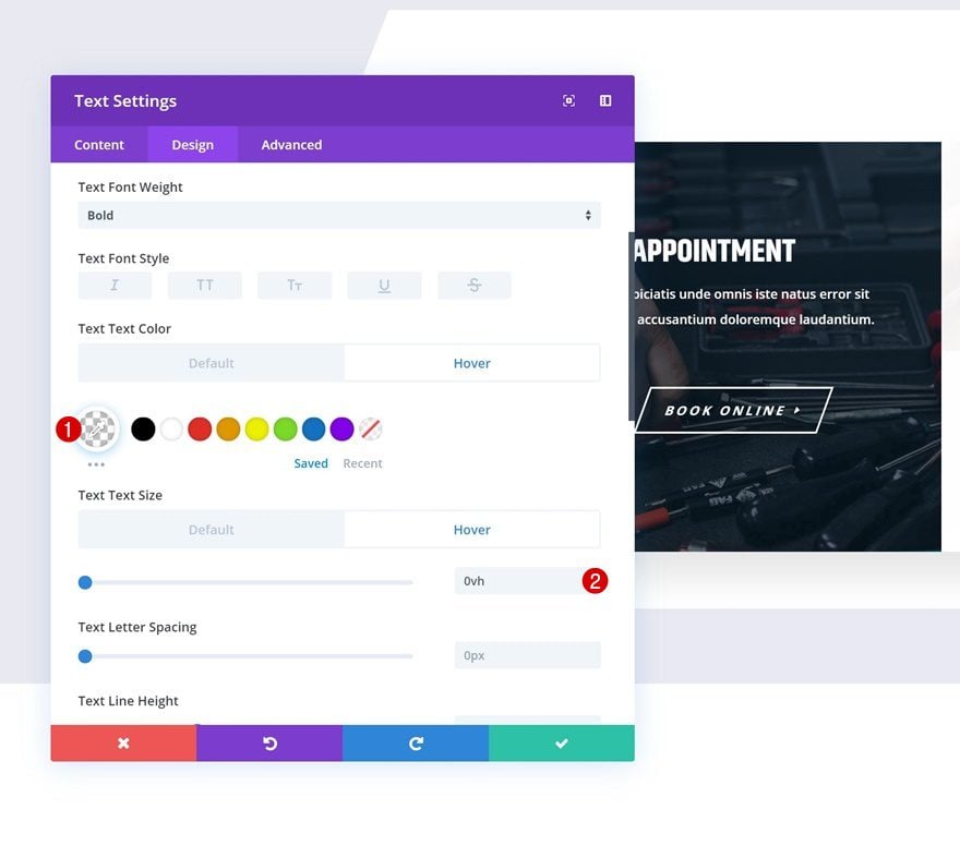
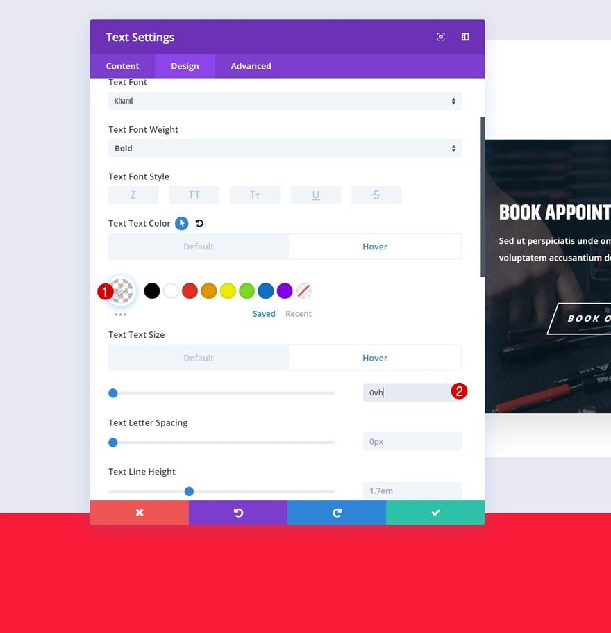
Hover Text Settings
Modify some of the text settings on hover.
- Text Color: rgba(255,255,255,0)
- Text Size: 0vh
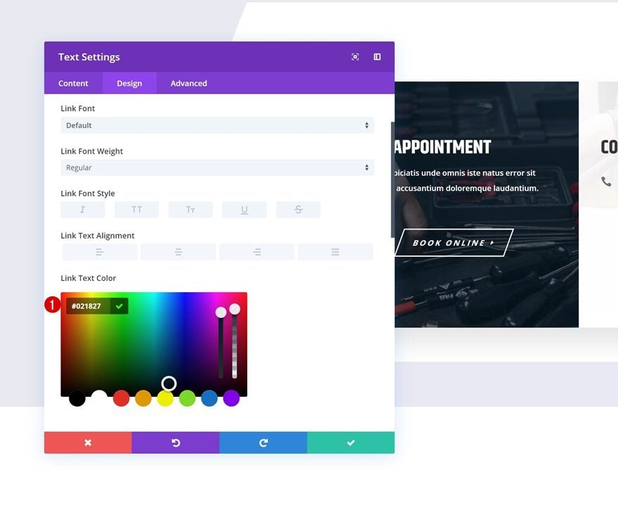
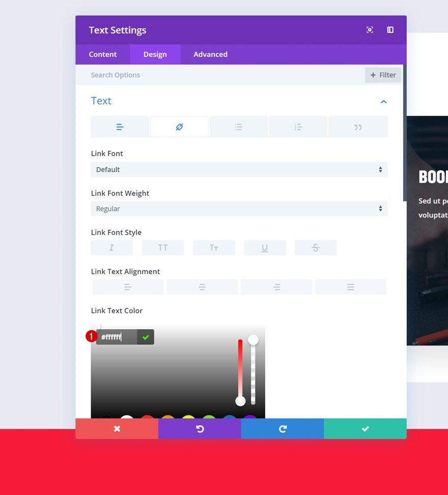
Link Text Settings
Then, go to the link text settings and change the link text color.
- Link Text Color: #000000
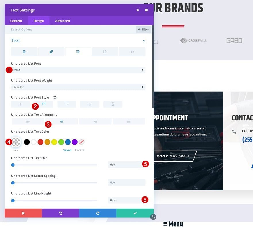
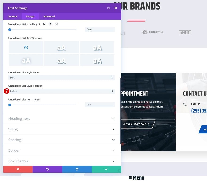
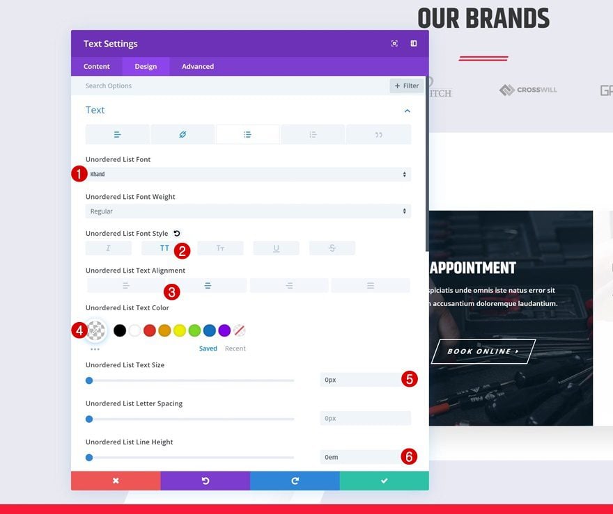
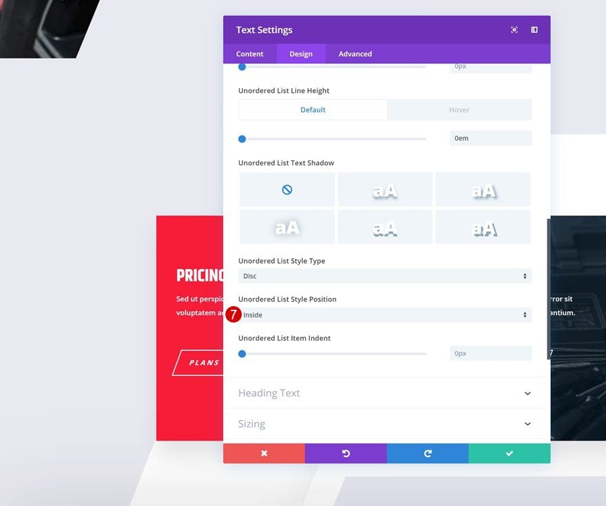
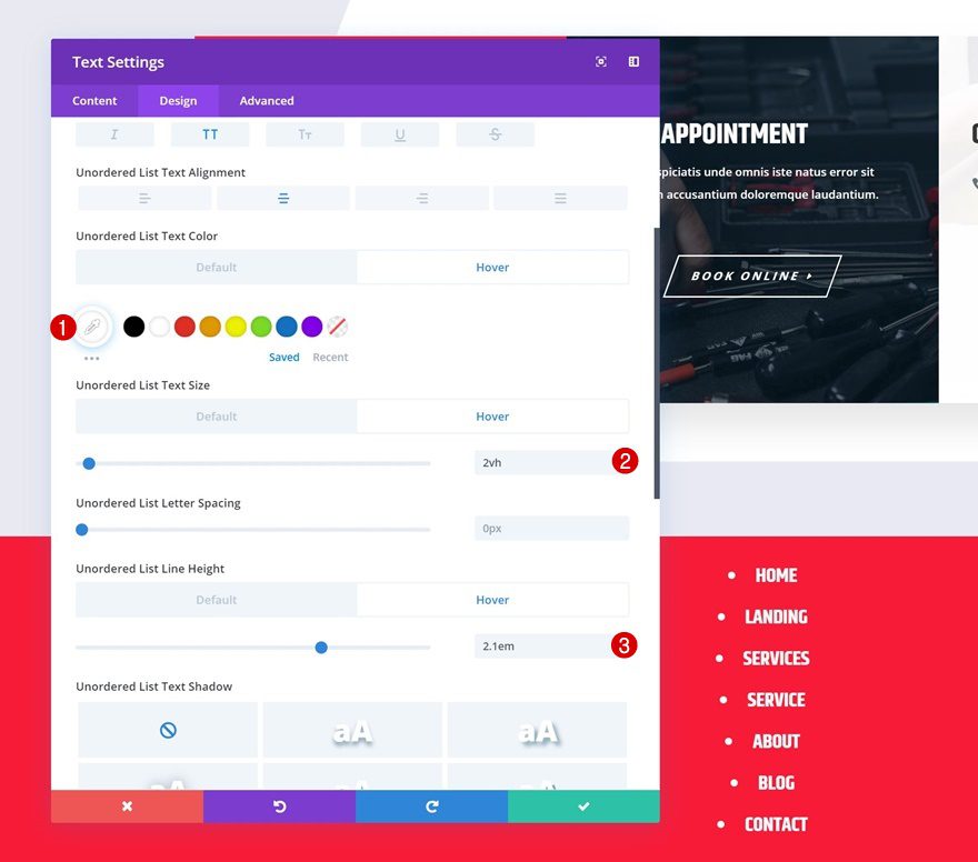
Default List Text Settings
Move on to the default list text settings and style it however you want to. Make sure you’re using ‘0px’ for the text size in its default state.
- Unordered List Font: Khand
- Unordered List Font Style: Uppercase
- Unordered List Text Alignment: Center
- Unordered List Text Color: rgba(255,255,255,0)
- Unordered List Text Size: 0px
- Unordered List Line Height: 0em
- Unordered List Style Position: Inside
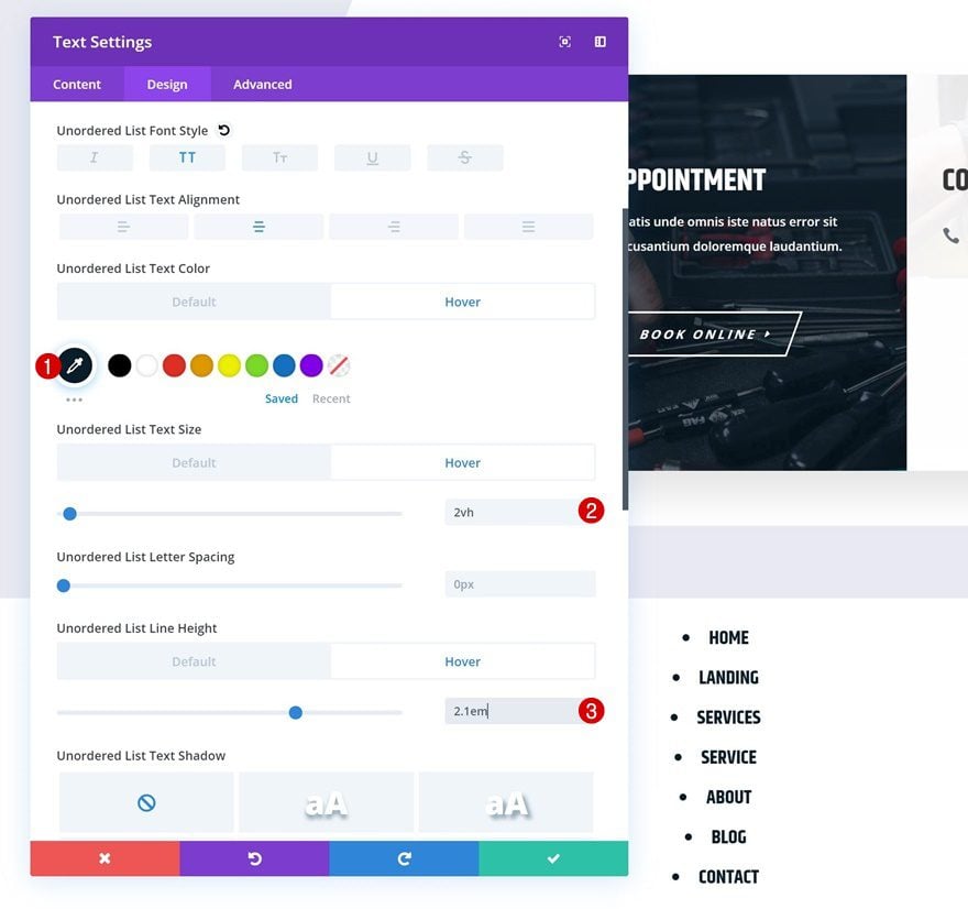
Hover List Text Settings
Then, modify some of the values on hover to allow the menu items to appear.
- Unordered List Text Color: #000000
- Unordered List Text Size: 2vh
- Unordered Line Height: 2.1em
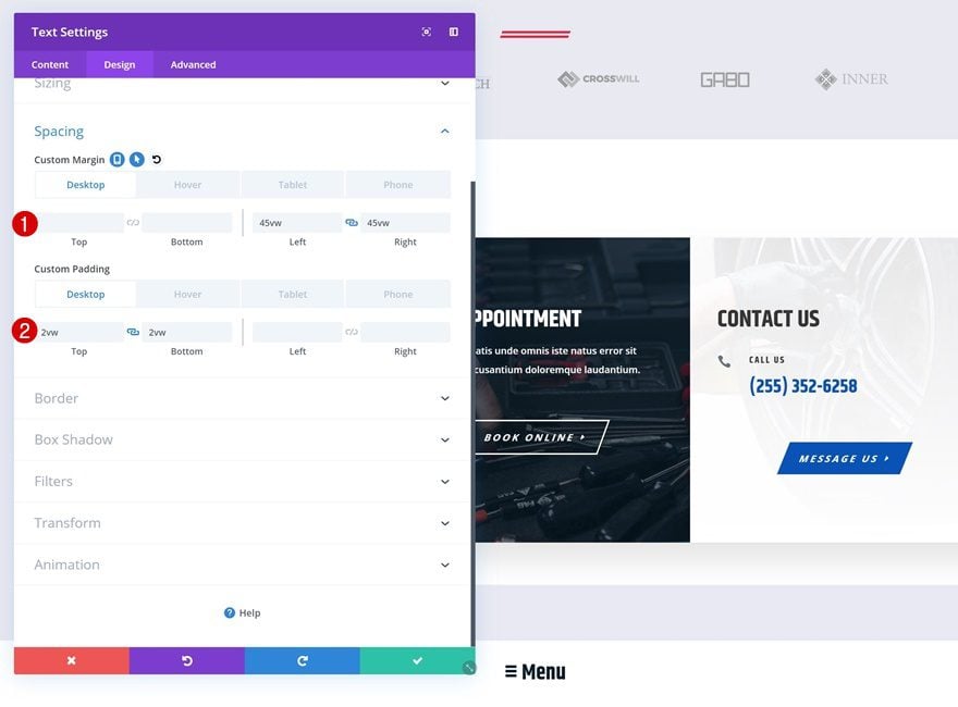
Default Spacing
Go to the spacing settings next and give the Text Module a shape.
- Left Margin: 45vw (Desktop), 39vw (Tablet), 33vw (Phone)
- Right Margin: 45vw (Desktop), 39vw (Tablet), 33vw (Phone)
- Top Padding: 2vw (Desktop), 4vw (Tablet), 6vw (Phone)
- Bottom Padding: 2vw (Desktop), 4vw (Tablet), 6vw (Phone)
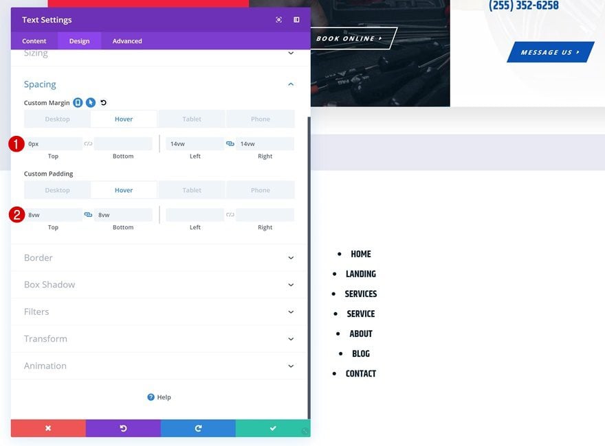
Hover Spacing
Modify these same values on hover.
- Left Margin: 14vw
- Right Margin: 14vw
- Top Padding: 8vw
- Bottom Padding: 8vw
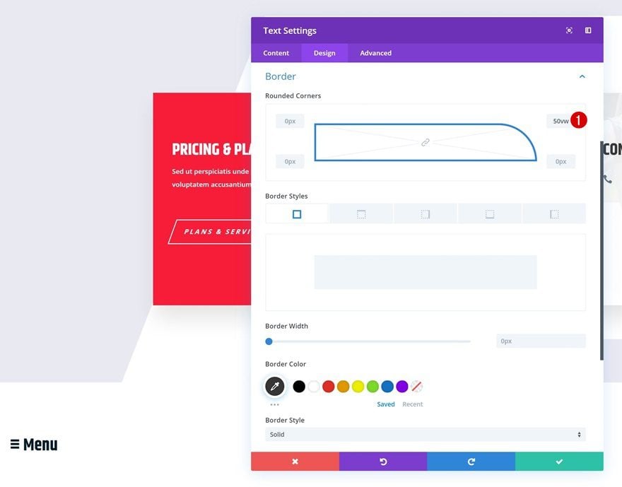
Default Border
Move on to the border settings and make sure each one of the rounded corners has a value of ‘0px’.
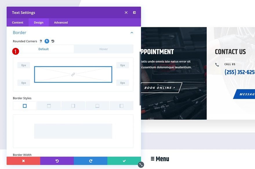
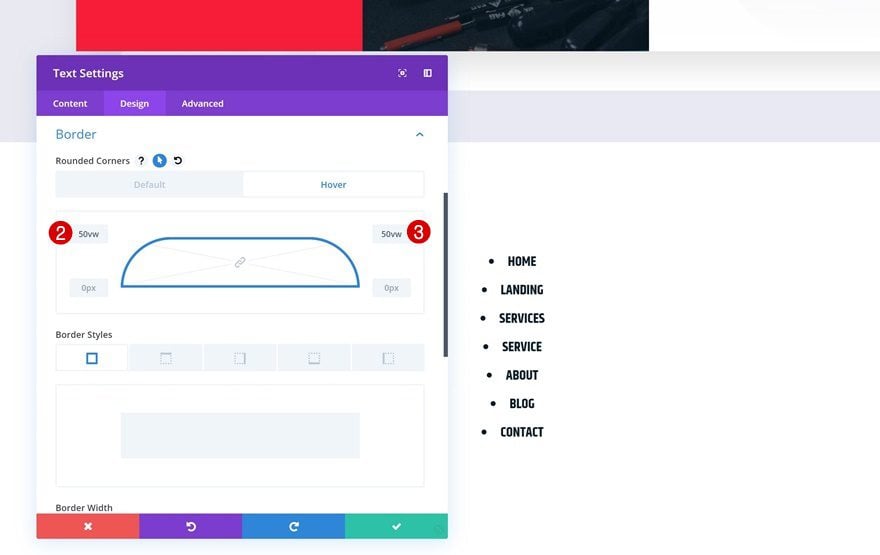
Hover Border
Enable the hover options on the rounded corners and change the top left and top right values.
- Top Left: 50vw
- Top Right: 50vw
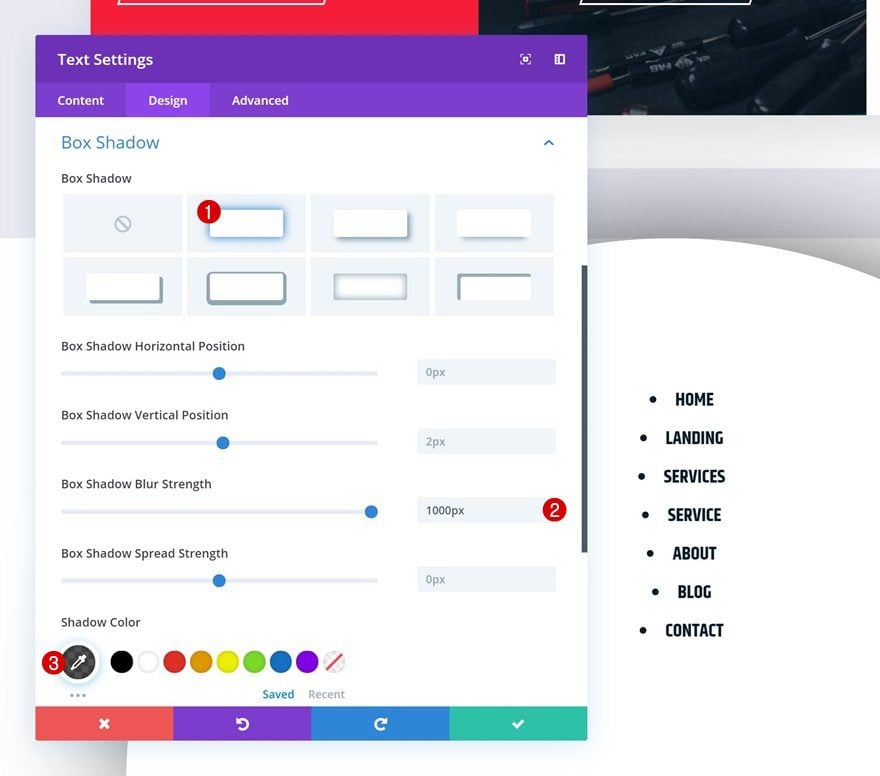
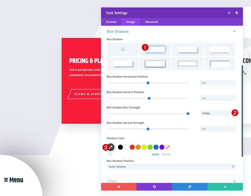
Box Shadow
Continue by giving the module some depth using a box shadow. This will make sure the menu doesn’t go unnoticed on the page.
- Box Shadow Blur Strength: 1000ms
- Shadow Color: rgba(0,0,0,0.68)
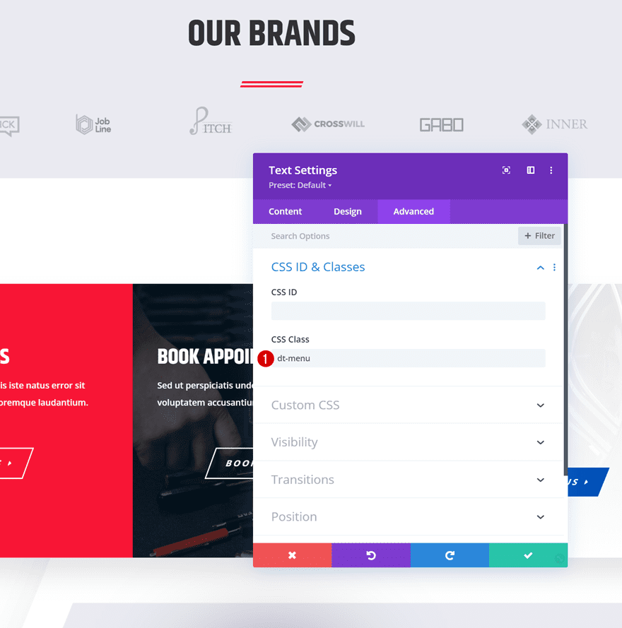
CSS Class
We’re adding a CSS class to the module too.
- CSS Class: dt-menu
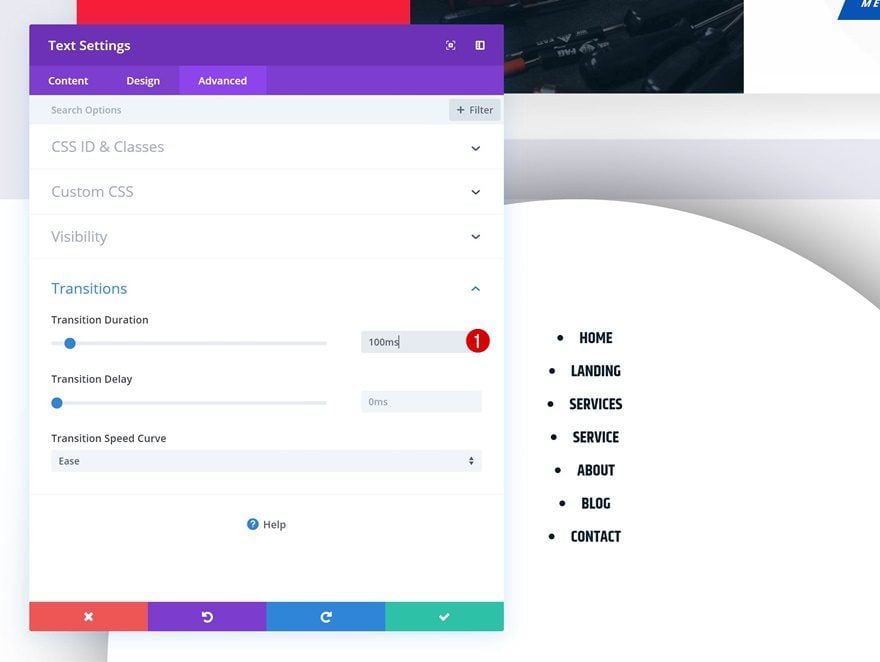
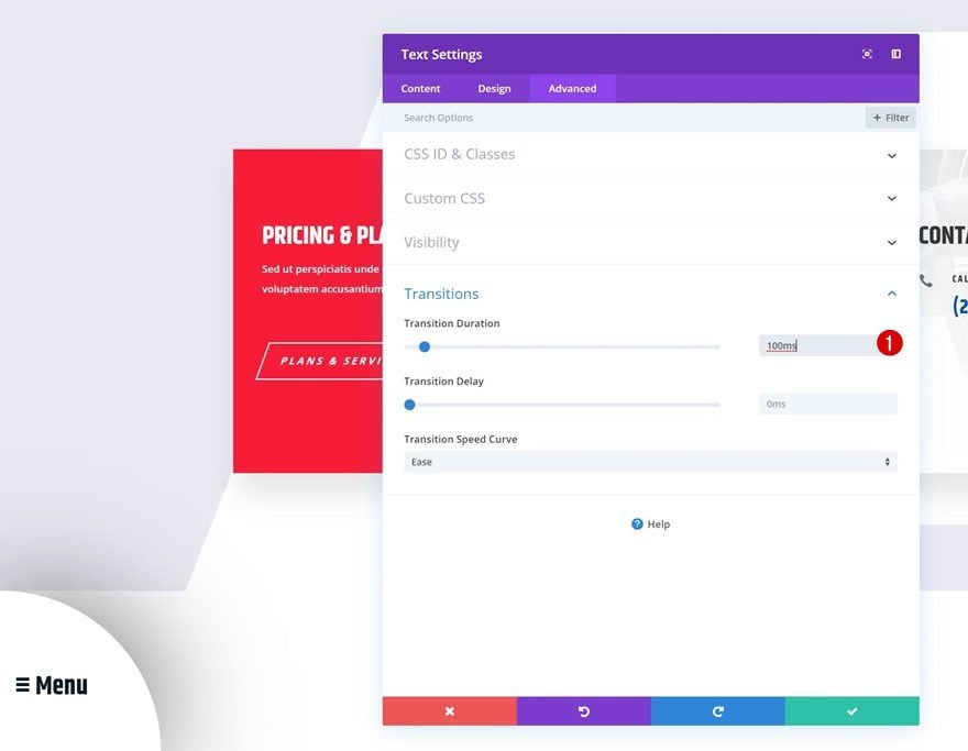
Transitions
Last but not least, decrease the transition duration in the transitions settings.
- Transition Duration: 100ms
Recreate Example #2
Add Text Module to Column
Add Content
On to the second example! Here, we’re again going to add ‘≡ Menu’ using the paragraph text style and the menu items using an unordered list. We’ll also add a link to each one of the menu items individually.
Default Background Color
Move on to the background settings and change the background color.
- Background Color: #ffffff
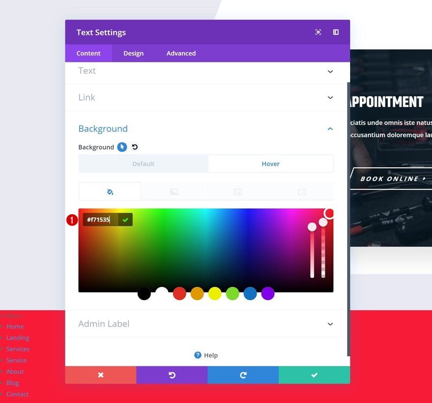
Hover Background Color
Modify the background color on hover.
- Background Color: #f71535
Default Text Settings
Then, go to the design tab and make some changes to the appearance of the paragraph copy.
- Text Font: Khand
- Text Color: #021827
- Text Size: 3vh
Hover Text Settings
Modify these settings on hover.
- Text Color: rgba(255,255,255,0)
- Text Size: 0vh
Link Text Settings
Move on to the text settings and change the link text color.
- Link Text Color: #ffffff
Default List Text Settings
Change the design settings of the unordered list items as well.
- Unordered List Font: Khand
- Unordered List Font Style: Uppercase
- Unordered List Text Alignment: Center
- Unordered List Text Color: rgba(255,255,255,0)
- Unordered List Text Size: 0px
- Unordered List Line Height: 0em
- Unordered List Style Position: Inside
Hover List Text Settings
And modify some of these values on hover.
- Unordered List Text Color: #ffffff
- Unordered List Text Size: 2vh
- Unordered List Line Height: 2.1em
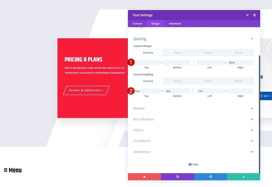
Default Spacing
Then, go to the spacing settings and give the module some space.
- Right Margin: 88vw (Desktop & Tablet), 71vw (Phone)
- Top Padding: 6vw (Desktop), 10vw (Tablet), 18vw (Phone)
- Bottom Padding: 4vw (Desktop), 10vw (Tablet), 12vw (Phone)
- Left Padding: 1vw
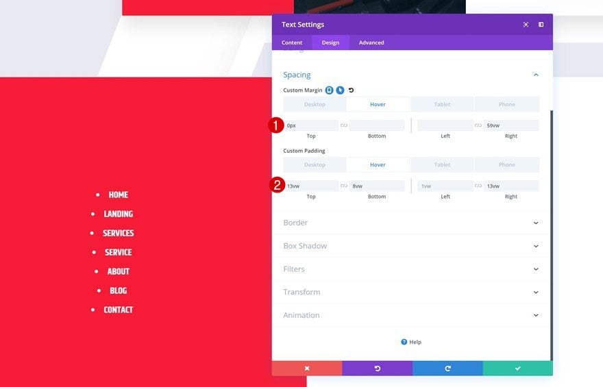
Hover Spacing
Modify the values on hover.
- Right Margin: 59vw
- Top Padding: 13vw
- Bottom Padding: 8vw
- Left Padding: 1vw
- Right Padding: 13vw
Border
And to create this quarter circle design, we’re going to change the top right border in the border settings.
- Top Right: 50vw
Box Shadow
We’ll also add a box shadow to create depth on the page.
- Box Shadow Blur Strength: 1000px
- Shadow Color: rgba(0,0,0,0.68)
CSS Class
Then, we’ll add a CSS class in the advanced tab.
- CSS Class: dt-menu
Transitions
And decrease the transition duration in the advanced tab to create a quick transition.
- Transition Duration: 100ms
Preview
Now that we’ve gone through all the steps, let’s take a final look at the outcome across different screen sizes.
Example #1
Desktop
Mobile
Example #2
Desktop
Mobile
Final Thoughts
In this post, we’ve shown you how to create an expanding sticky menu using Divi’s Mechanic Layout Pack. We’ve handled two different design examples that you can recreate and use on any kind of website you’re building! We hove you’re enjoying this ongoing Divi design initiative, where we try to put something extra into your design toolbox each and every week. If you have any questions or suggestions, make sure you leave a comment in the comment section below!
If you’re eager to learn more about Divi and get more Divi freebies, make sure you subscribe to our email newsletter and YouTube channel so you’ll always be one of the first people to know and get benefits from this free content.


Not the best design for menus
Hi, what a load of inspiration every time, those blogs.
I wondered; could it also be that sample menu #2 can be positioned in the right upper corner instead of left undercorner? Please let me know.
Wondering if this could be used for a secondary menu instead of the main menu? Using the menu module?
Awesome tutorial! Is it possible to do the same expand menu but on the top of site?
Hello,
Thank you for this very good tutorial, easy to understand
and to reproduce.
example 1 is really beautiful.
Nice tutorial. However, it (the menu) will be better without the “dot”
Please give a link to download 🙁
We need ET please
Please provide download
I tried the first one for a Table of Contents on a blog post. It worked, but it didn’t look very good. It was off-centered and the words “table of contents” were too big for the space, so I tried to adjust some of the spacing and sizing, but that messed everything up. So I went back to the original spacing and sizing, but for some reason, it became even more messed up.
Maybe I’ll try the menu in the corner.
This is a great idea, though!!!! Thanks!
Very Excellent!
So is it possible to enlarge the nav window for mega menus? To engulf the page?
Very nice. Thank you Donjete.
Very nice but I am curious what you would do if the menu was used on all the pages with the #main-header disabled the site has no logo!
mmm, i like the layout but i have a problem with this (probably the z index) now all the element under the menu section are unclickable 🙁
Cool, but I would lose those bullet points if you’re going to center the text. Looks goofy.
Great!
Something cool! Love it.