
Creating a vertical sticky timeline can be extremely useful for categorizing content by year and/or month as the user scrolls down the page. The sticky date elements remain fixed beside the content for a convenient UX boost that users will appreciate.
In this tutorial, we are going to show you how to create a complete vertical sticky timeline layout in Divi. The keys to this design are (1) to give your columns a custom width so that the date elements don’t take up too much horizontal space on mobile and (2) to make the year and month sticky, with sticky limits on the section (for the year) and row (for the month).
Although this layout has multi-faceted applications, we are going to build a timeline layout for showcasing photo galleries categorized by month and year. This is a great way to use Divi for a timeline without installing a separate timeline plugin.
Let’s get started!
Sneak Peek
Here is a quick look at the design we’ll build in this tutorial.
Download the Layout for FREE
To lay your hands on the designs from this tutorial, you will first need to download it using the button below. To gain access to the download you will need to subscribe to our newsletter by using the form below. As a new subscriber, you will receive even more Divi goodness and a free Divi Layout pack every Monday! If you’re already on the list, simply enter your email address below and click download. You will not be “resubscribed” or receive extra emails.

To import the section layout to your Divi Library, navigate to the Divi Library.
Click the Import button.
In the portability popup, select the import tab and choose the download file from your computer.
Then click the import button.

Once done, the section layout will be available in the Divi Builder.
Let’s get to the tutorial, shall we?
What You Need to Get Started

To get started, you will need to do the following:
- If you haven’t yet, install and activate the Divi Theme.
- Create a new page in WordPress and use the Divi Builder to edit the page on the front end (visual builder).
- Choose the option “Build From Scratch”.
After that, you will have a blank canvas to start designing in Divi.
Part 1: Building the Stick Heading
The first element we are going to design is the sticky heading that will remain fixed at the top of the page on scroll.
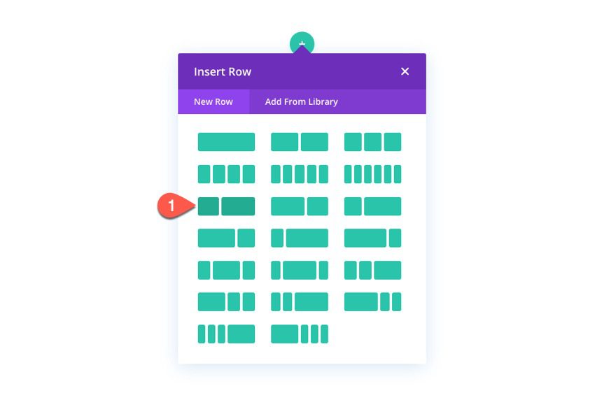
Add Row
To get started, add a two-fifths three-fifths column layout to the section.
Left Heading Text
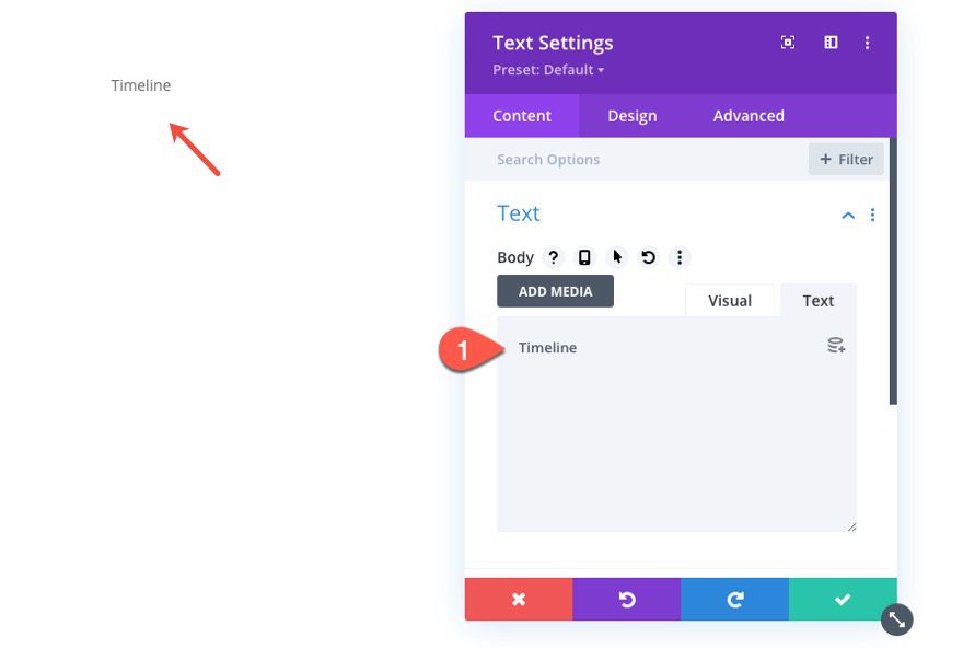
In the left column, we are going to add the heading for the timeline that will be on the left side of the page. To do this, add a text module to the left column.
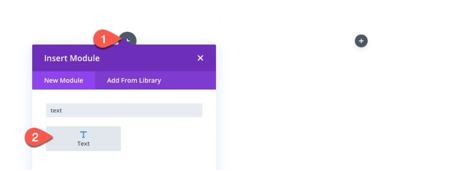
Then add the text “Timeline” to the body of the text module.
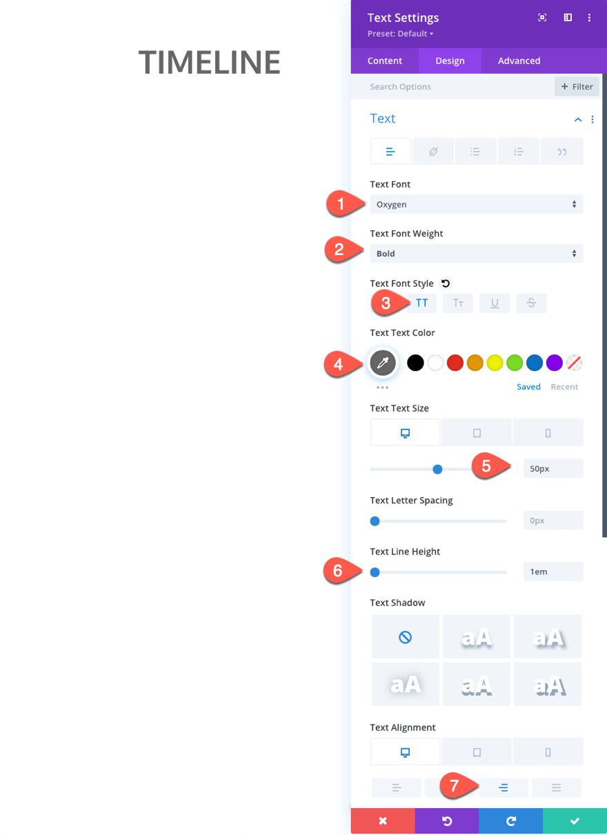
Under the design tab, update the following text styles:
- Text Font: Oxygen
- Text Font Weight: Bold
- Text Font Style: TT
- Text Text Color: #666666
- Text Size: 50px (desktop), 30px (tablet), 18px (phone)
- Text Line Height: 1em
- Text Alignement: right
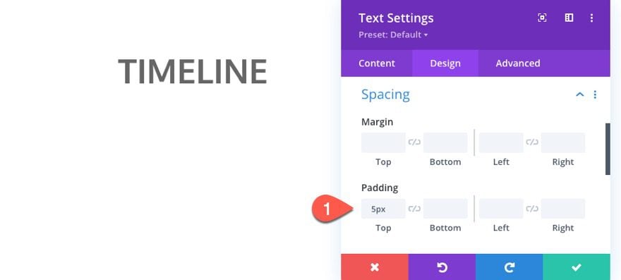
Then update the padding as well:
- padding: 5px top
Right Heading Text
To create the heading for the gallery content on the right side of the page, copy the text module in the left column and paste it into the right column.
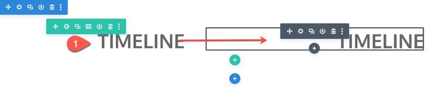
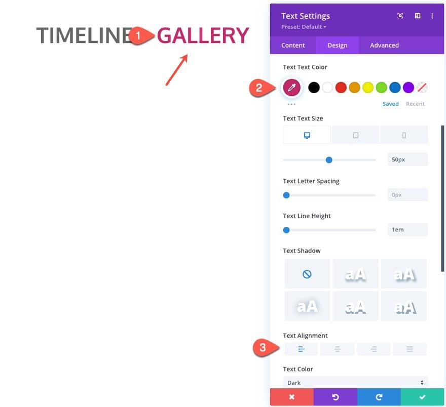
Then open the duplicate text module settings and update the following:
- Text Text Color: #c22969
- Text Alignment: Left (desktop), Left (tablet)
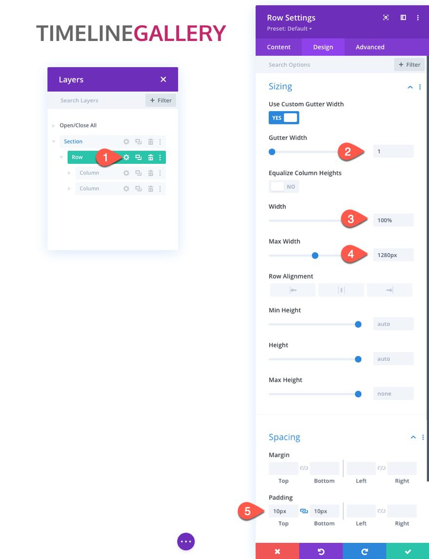
Row Settings
To give us the room we need on mobile, we need to update the row settings as follows:
- Gutter Width: 1
- Width: 100%
- Max Width: 1280px
- Padding: 10px top, 10px bottom
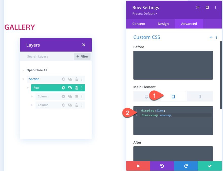
Under the advanced tab, add the following custom CSS to the Main Element on tablet:
display:flex;
flex-wrap:nowrap;
Left Column Settings
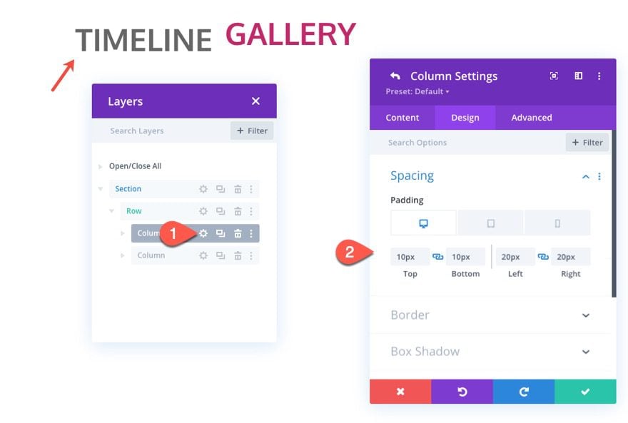
Because we are using a row gutter width of 1, there is no spacing between columns. To add sufficient spacing, open the settings for column 1 and update the padding as follows:
- Padding (desktop): 10px top, 10px bottom, 20px left, 20px right
- Padding (tablet): 10px bottom, 10px left, 10px right
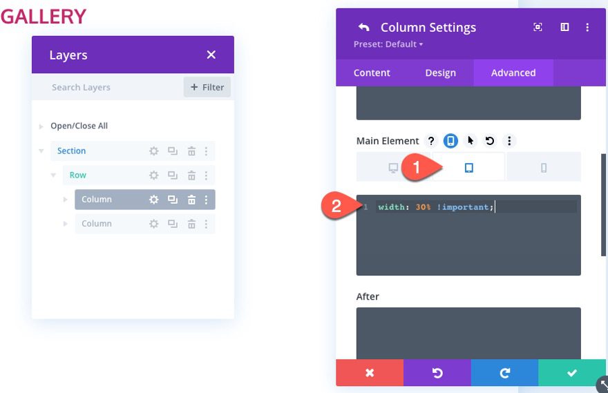
Next, we want to override the default left column width on tablet and phone so that it is 30% of the row’s width. This will match the column width we are going to add to the columns in the timeline below.
To do this, open the settings for the left column (column1) and add the following CSS to the Main Element on Tablet:
width: 30% !important;
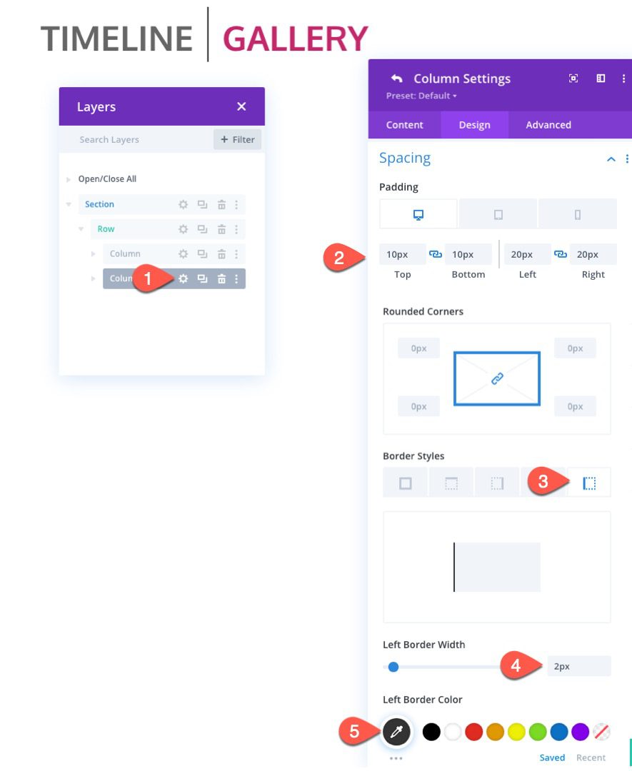
For the right column, we want to add the same padding as we did in column 1. And we will add a left border to the column to serve as a divider as follows:
- Padding (desktop): 10px top, 10px bottom, 20px left, 20px right
- Padding (tablet): 10px bottom, 10px left, 10px right
- Left Border Width: 2px
- Left Border Color: #333333
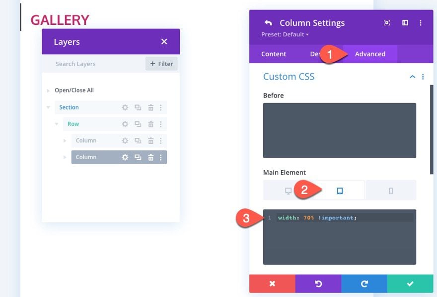
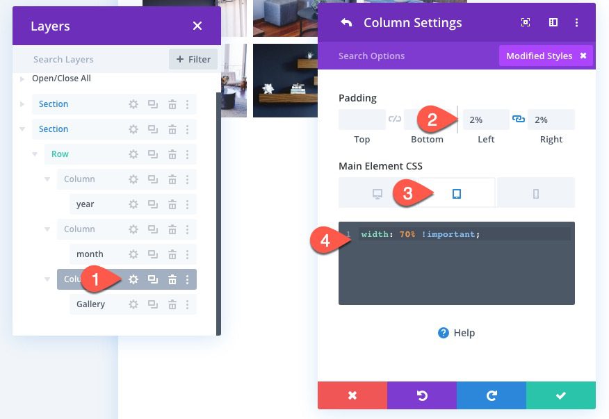
We also want the width of the right column to be 70% of the row’s width. To update the column width, open the settings of column 2 and add the following CSS to the Main Element on tablet:
width: 70% !important;
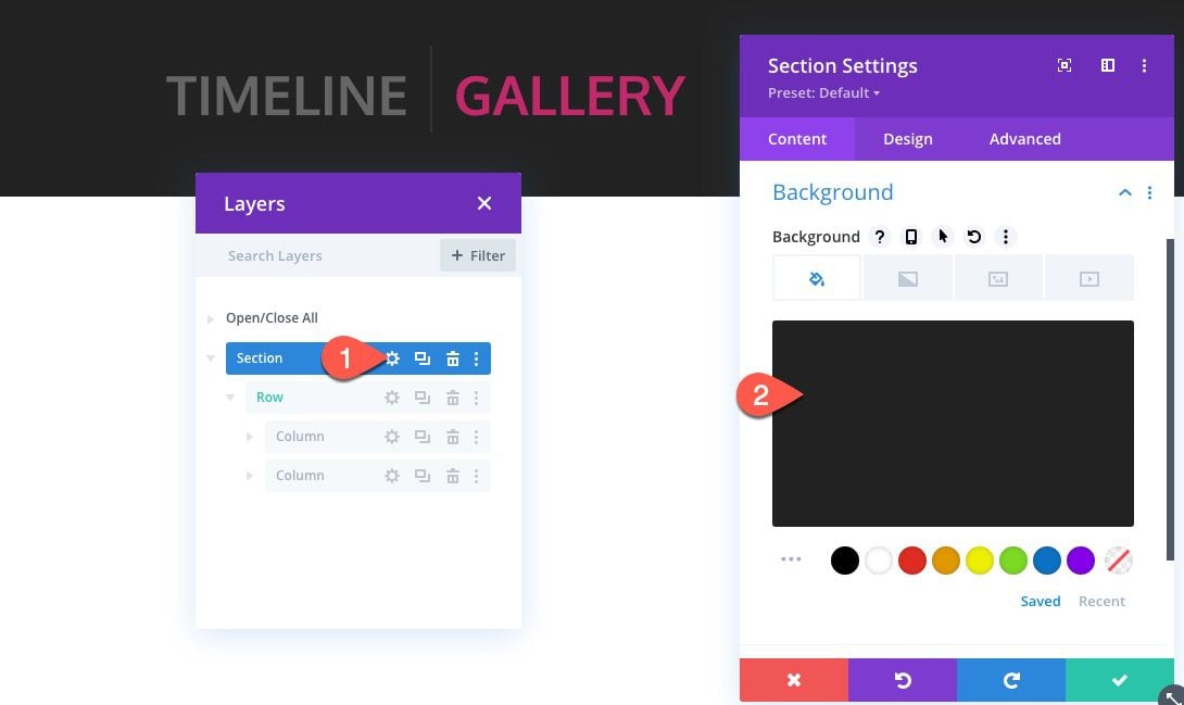
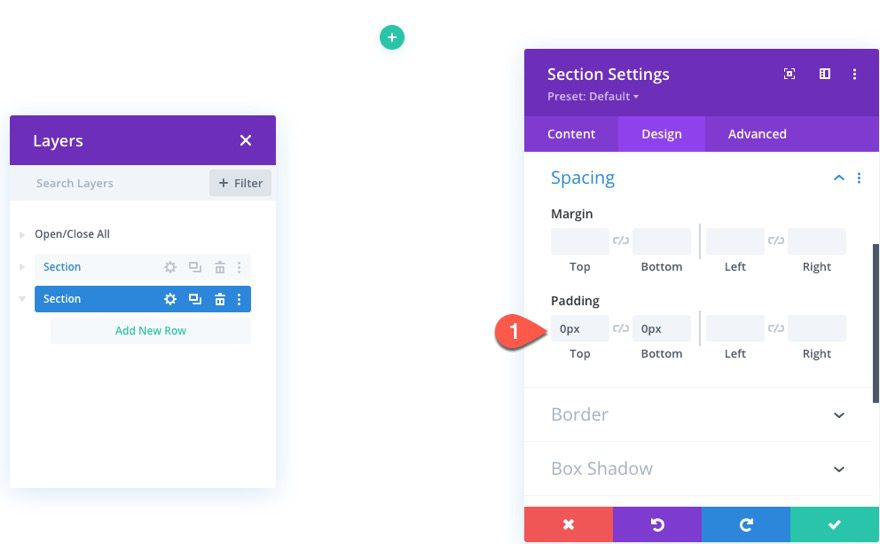
Section Settings
To finish off the heading design, open the section settings, and update the background color:
- Background Color: #222222
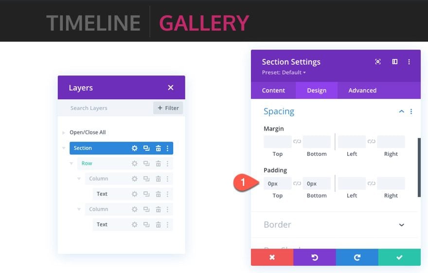
Then update the section padding:
- Padding: 0px top, 0px bottom
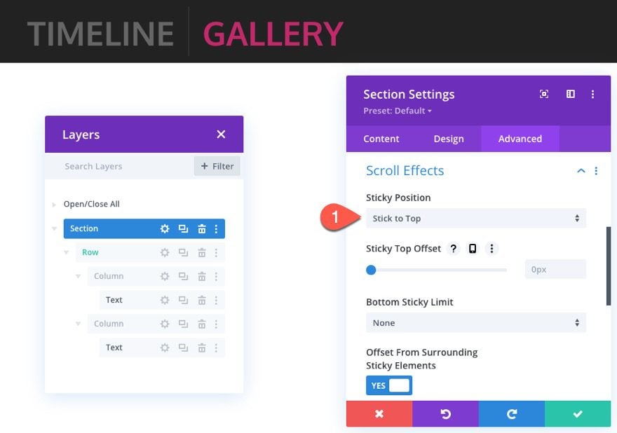
To make the section sticky, go the Advanced tab and update the following:
- Sticky Position: Stick to Top
Part 2: Creating the Sticky Timeline
This next part of the design is where we create the sticky timeline portion of the layout. The key here is to design the first section, row, and modules with all of the elements in place. Then we can duplicate each section or row as needed.
Add Section
To start, add a new regular section under the heading section we just finished.
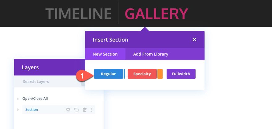
Before we start adding our rows and content, open the section settings and update the following:
- Padding: 0px top, 0px bottom
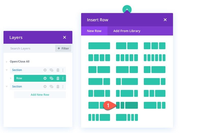
Add the Row, Row Styles, and Column Structure
Next, create a one-fifth one-fifth three-fifths column row to the section.
To jumpstart the design of the row, copy the styles of the row in the heading section above and paste it into the new row.
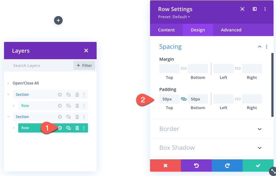
Then open the settings of the new row and update the following:
- Padding: 50px top, 50px bottom
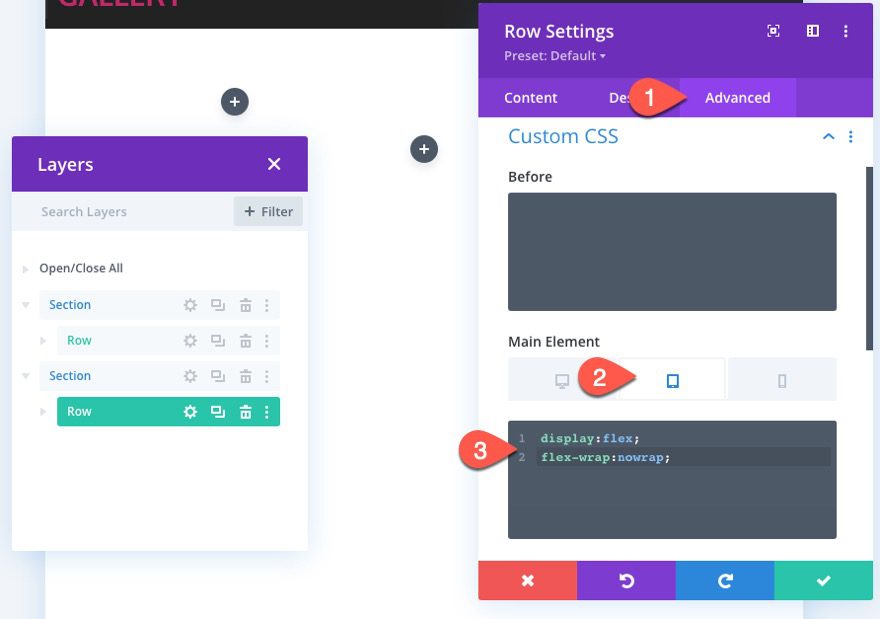
Then add the custom CSS to the Main Element on tablet as follows:
display:flex;
flex-wrap:nowrap;
Creating the Sticky Year
The first sticky date element for the timeline will be the year. This “year” text element will stick to the top of the section on scroll.
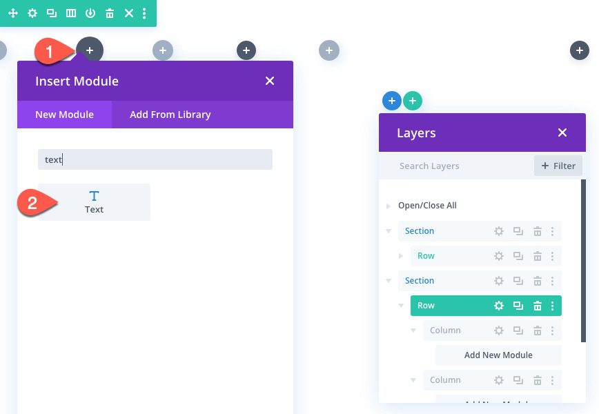
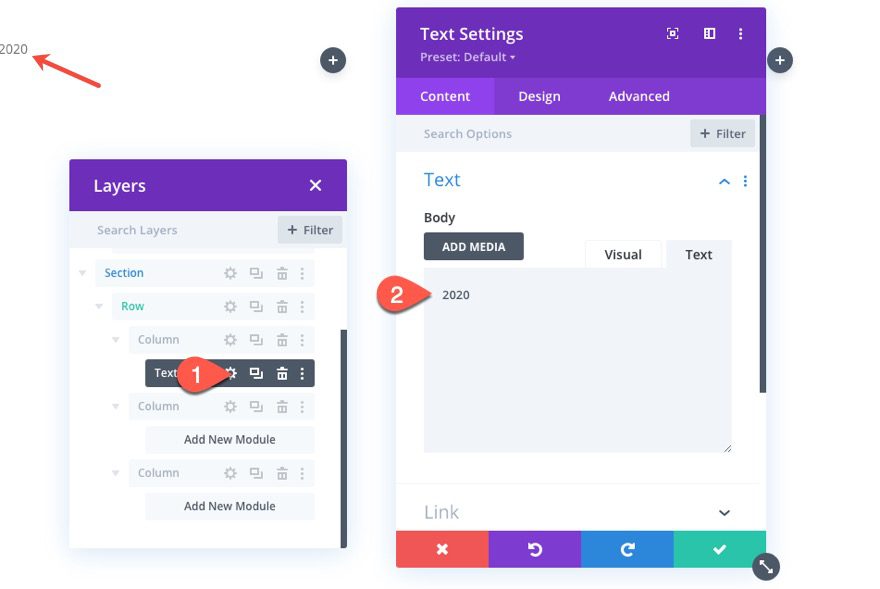
To create the year text element, add a new text module to column 1.
Then add the text “2020” to the body.
Under the design tab, update the text styles as follows:
- Text Font: Oxygen
- Text Font Weight: Bold
- Text Text Size: 40px (desktop), 24px (tablet), 18px (phone)
- Text Alignment: right
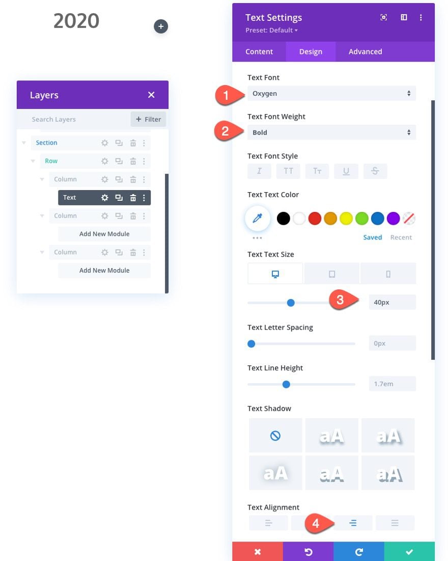
To make the year stick to the top of the section, update the following:
- Sticky Position: Stick to Top
- Sticky Top Offset: 50px
- Bottom Sticky Limit: Section
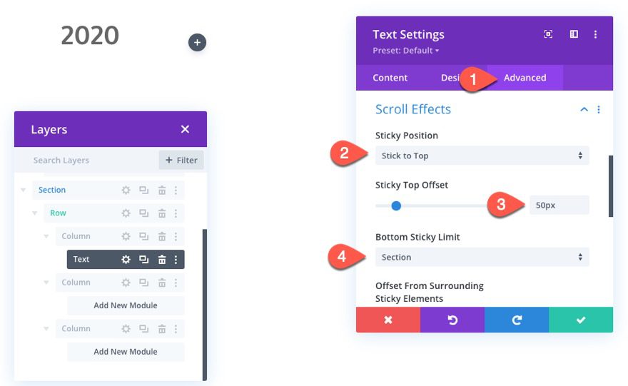
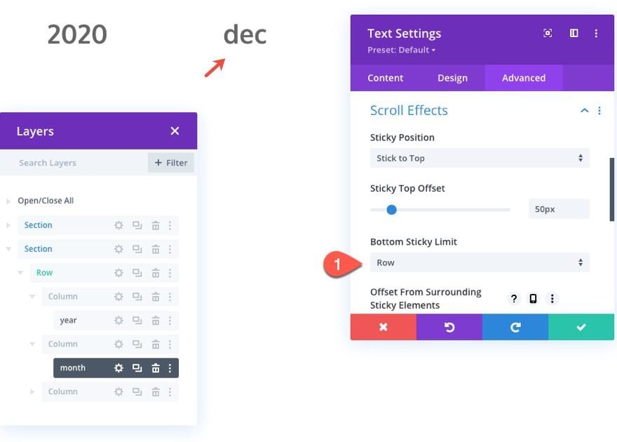
Creating the Sticky Month
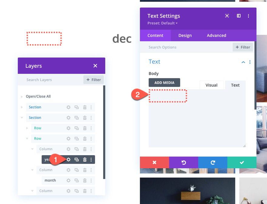
To create the sticky month text, copy the text module containing the sticky year and paste it into column 2.
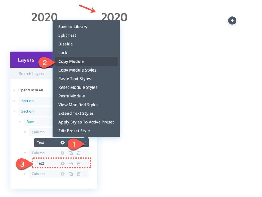
Then open the settings for the new text module in column 2 and update the text body with “dec” (the month abbreviation).
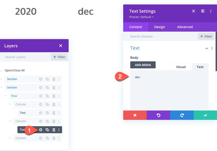
The month text needs to stick to the top of the row instead of the section, so update the sticky limit as follows:
- Bottom Sticky Limit: Row
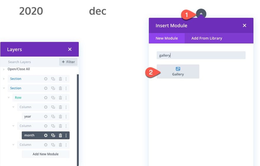
Adding the Gallery Content
In the far right column (column 3), we are going to add the content that correlates to the specific month/year. In this case, we are going to add a gallery module to display a gallery of images.
To create the gallery, add a gallery module in column 3.
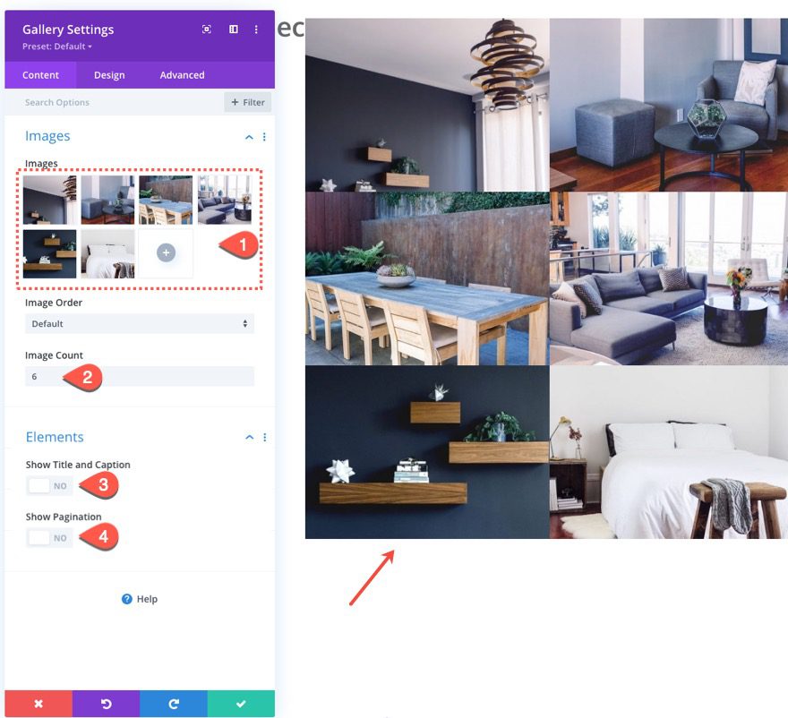
Then add at least 6 images to the gallery (or however many you want) and update the following:
- Image Count: 6
- Show Title and Caption: NO
- How Pagination: NO
Under the design tab, update the following:
- Padding: 3% left, 3% right
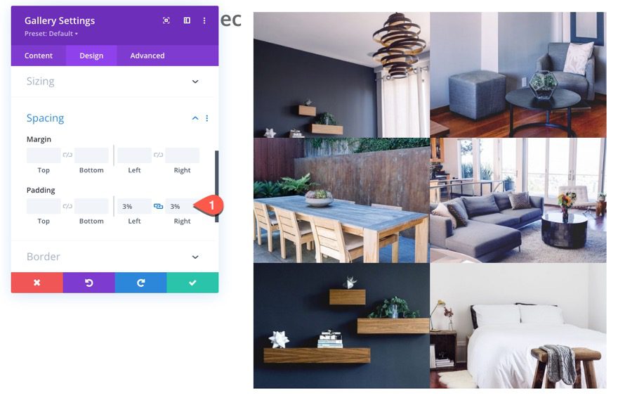
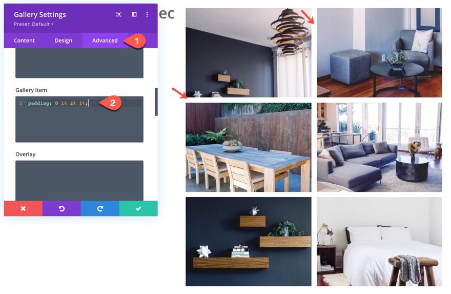
To create some custom spacing between the gallery items, add the following custom CSS to the Gallery Item CSS:
padding: 0 1% 2% 1%;
Update Column Widths and Spacing
Like we did for the columns in the heading section, we are going to give our columns custom spacing and widths (one mobile) so that they line up with the headings and look good on tablet and phone.
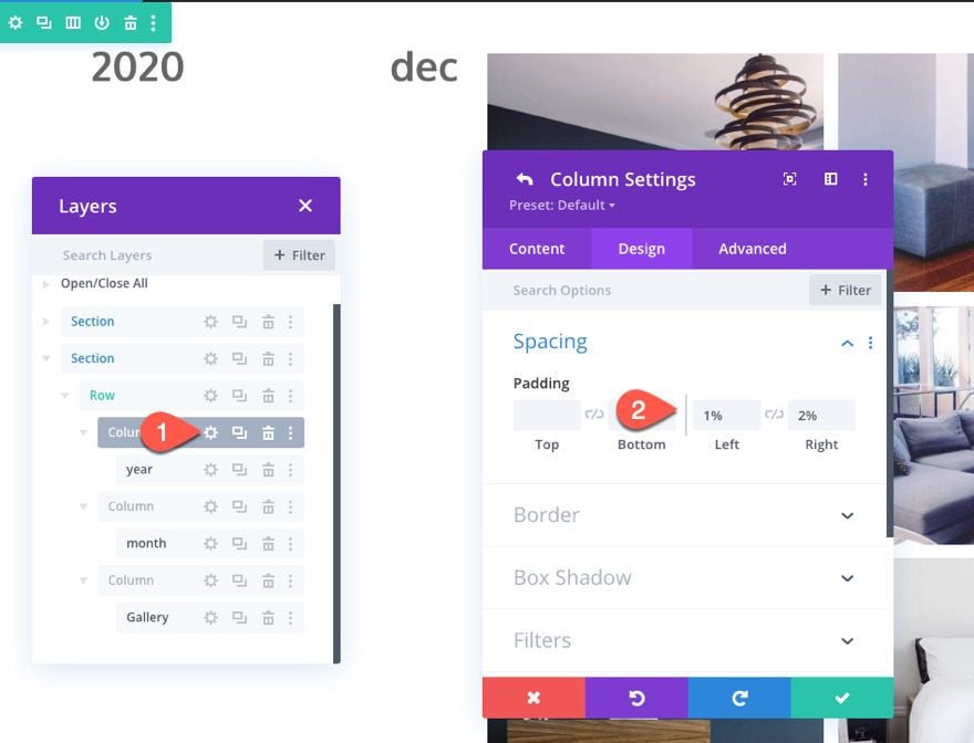
Column 1
Open the settings for column 1 and update the following:
- Padding: 1% left, 2% right
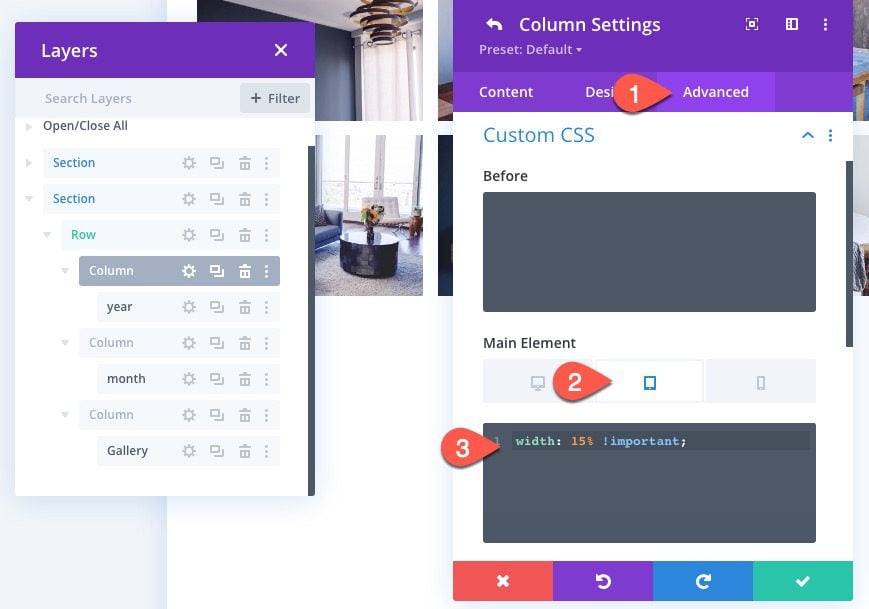
Under the advanced tab, add the following custom CSS to the Main Element on tablet:
width: 15% !important;
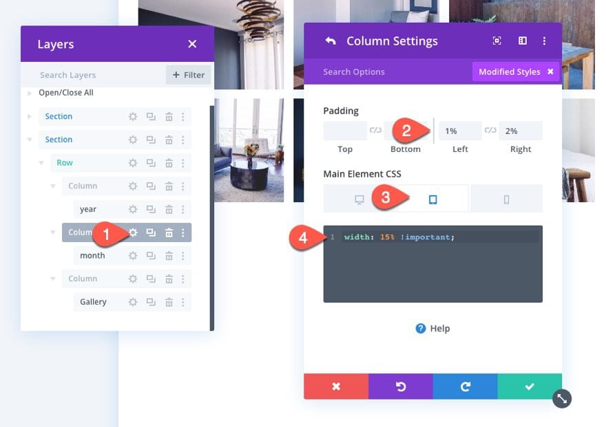
Then open the settings for column 2 and add the same padding and CSS as follows:
- Padding: 1% left, 2% right
Main Element CSS (tablet):
width: 15% !important;
Then open the settings for column 3 and update the padding and Main Element CSS as follows:
- Padding: 1% left, 2% right
Main Element CSS (tablet):
width: 70% !important;
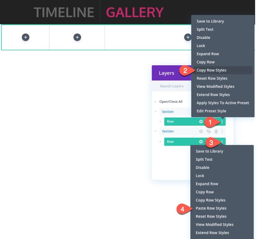
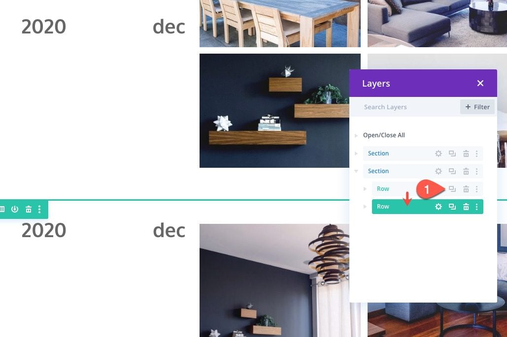
Duplicate the Row for Additional Months
Once the first row is complete, we can duplicate the row for additional months.
Duplicate the row.
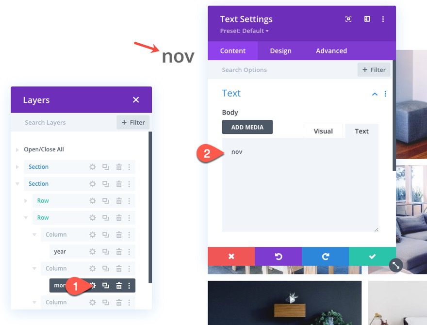
In the duplicate row, take out the text for the year. We only need one year per section since the year will stick to the top and bottom of the section.
Then open the text for the month and update the month abbreviation with a new month.
Duplicate the Section for Additional Years
In the same way we duplicated the row for additional months, we can duplicate the entire section for additional years.
Go ahead and duplicate the section we just created for 2020 content.
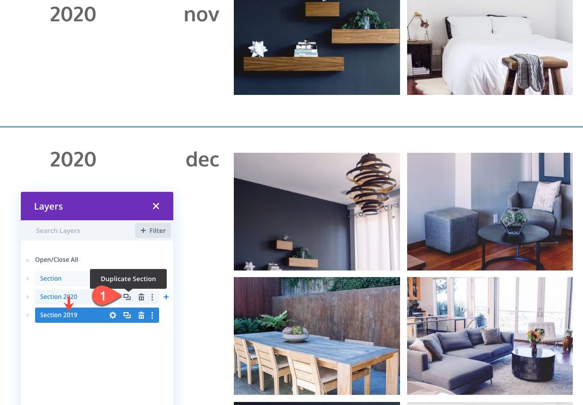
In the duplicate section, update the year text in row 1, column 1 with the year “2019”.
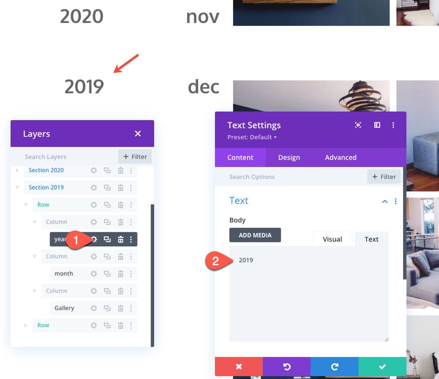
You can continue this process to build addition years and months as needed for your timeline layout.
Final Result
Check out the final result.
Final Thoughts
The brunt of the design work for this timeline layout is to make it responsive by giving the text sizes and column width mobile-specific styles. But, the sticky positioning of the date elements is extremely easy with Divi’s built-in options. Hopefully, this will come in handy for future projects. I can see this being helpful for showcasing a history timeline for an about page or even for a resources page, downloads page, or product updates.
I look forward to hearing from you in the comments.
Cheers!


Amazing Wow! Love it. It’s actually very helping.
That’s really good to hear, John. Glad you loved it.
interesting. I was looking for a plugin to create a sticky timeline layout but now i don’t need any plugin. Thanks for this wonderful post
Awesome!
So useful! This gives me a different and more exciting option when clients are asking for galleries of their work – thank you
Wow! Loved it. Keep up the good work.
Thanks, Daniaa. Will do!
Very cool. Could this be listing posts the same way?
Woow Thats Amazing! Divi is always on the top of the game with design layouts!!!