
Looking for a creative way to display images on your website? Make sure you keep on reading because, in this post, we’ll show you how to create a scroll gallery mockup using Divi and its built-in options only. Concretely, we’re going to turn a section into a mockup and have all the rows in the section be part of the mockup. Once you get the technique, you’ll be able to feature any kind of content you want in a mobile mockup and add interaction to your pages in no time.
Let’s get to it!
Preview
Before we dive into the tutorial, let’s take a quick look at the outcome across different screen sizes.
Desktop
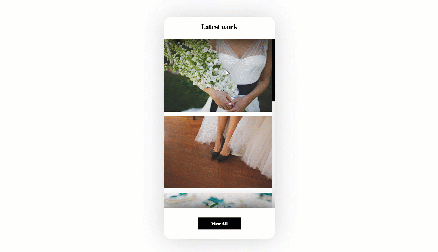
Mobile
Download the Scroll Gallery Mockup Design for FREE
To lay your hands on the free scroll gallery mockup design, you will first need to download it using the button below. To gain access to the download you will need to subscribe to our newsletter by using the form below. As a new subscriber, you will receive even more Divi goodness and a free Divi Layout pack every Monday! If you’re already on the list, simply enter your email address below and click download. You will not be “resubscribed” or receive extra emails.

Let’s Start Recreating!
Subscribe To Our Youtube Channel
Add New Section
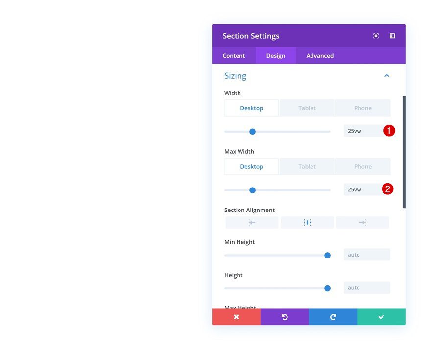
Sizing
Start by creating a new page or opening an existing one and add a regular section to it. Open the section settings and modify the width and max width in the sizing settings.
- Width: 25vw (Desktop), 60vw (Tablet), 80vw (Phone)
- Max Width: 25vw (Desktop), 60vw (Tablet), 80vw (Phone)
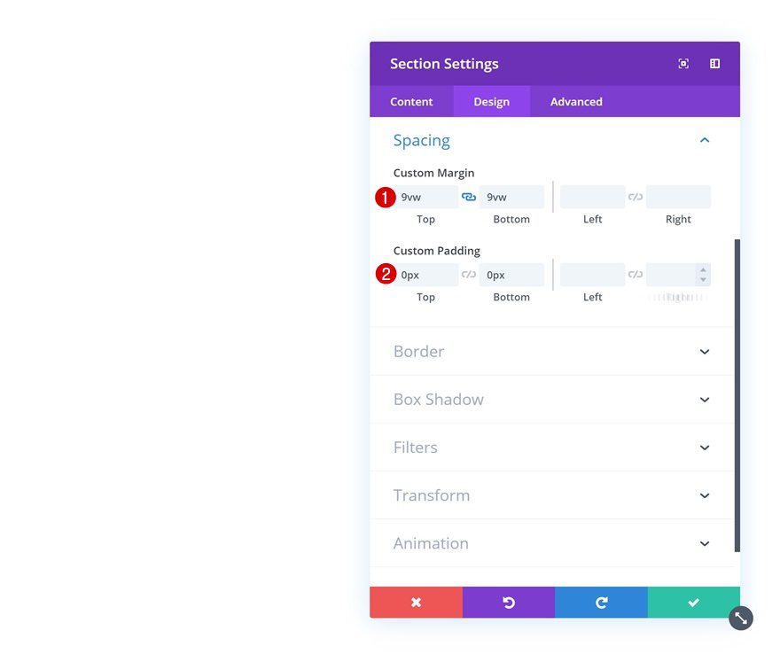
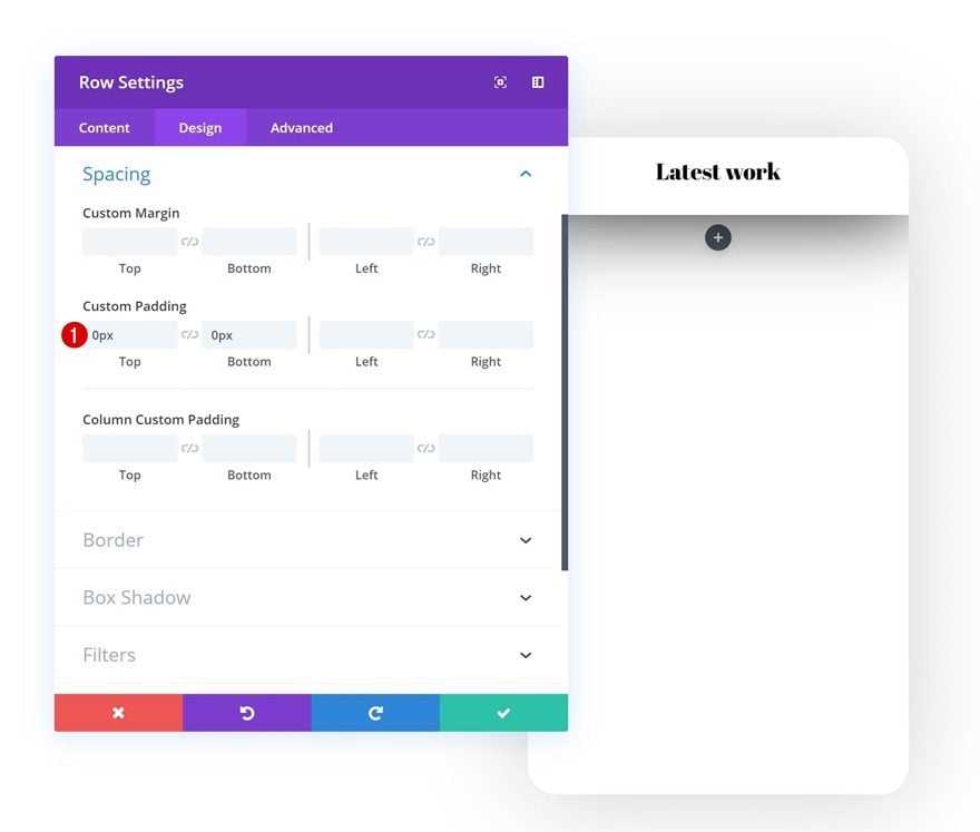
Spacing
Then, go to the spacing settings, remove all default top and bottom padding and add some top and bottom margin to create space.
- Top Margin: 9vw
- Bottom: 9vw
- Top Padding: 0px
- Bottom Padding: 0px
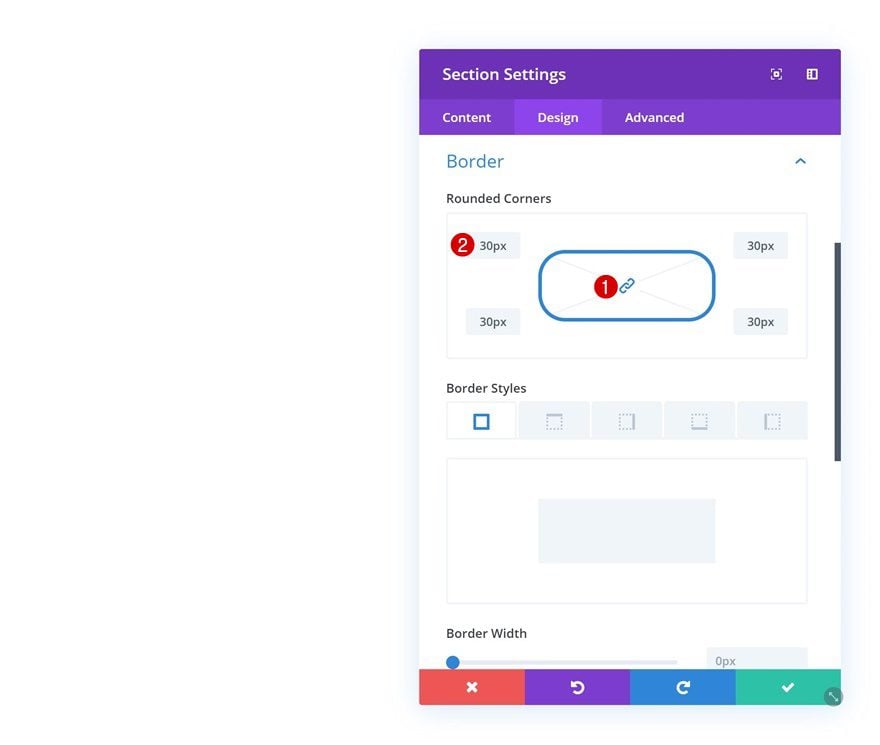
Border
Continue by going to the border settings of the section and create the shape of a mobile mockup by adding ’30px’ to each one of the corners.
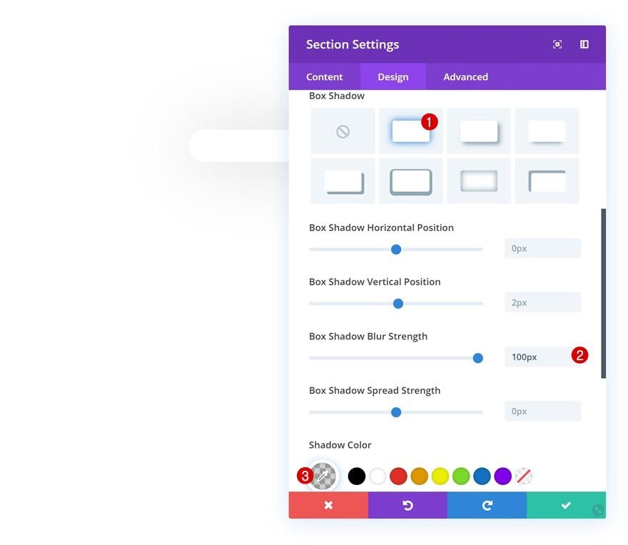
Box Shadow
Add a subtle box shadow to allow the shape to come through.
- Box Shadow Blur Strength: 100px
- Shadow Color: rgba(0,0,0,0.18)
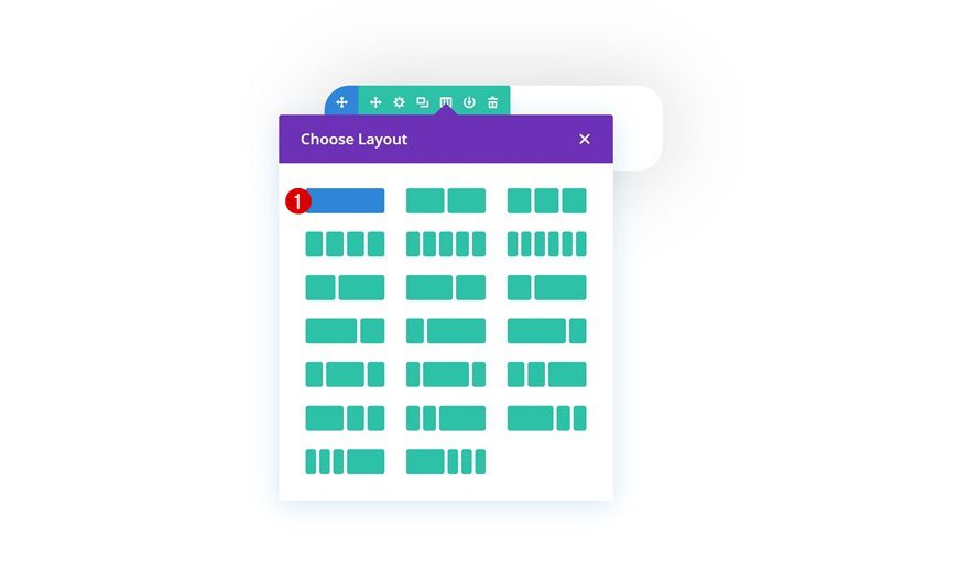
Add Row #1
Column Structure
Continue by adding the first row to the section using the following column structure:
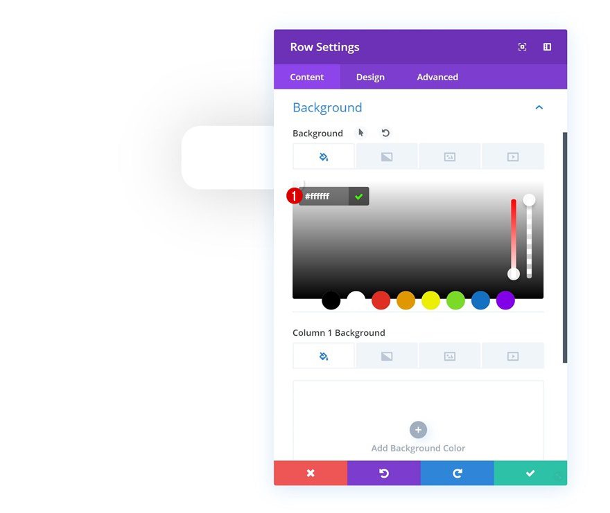
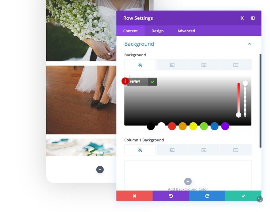
Background Color
Without adding any modules yet, open the row settings and change the background color.
- Background Color: #ffffff
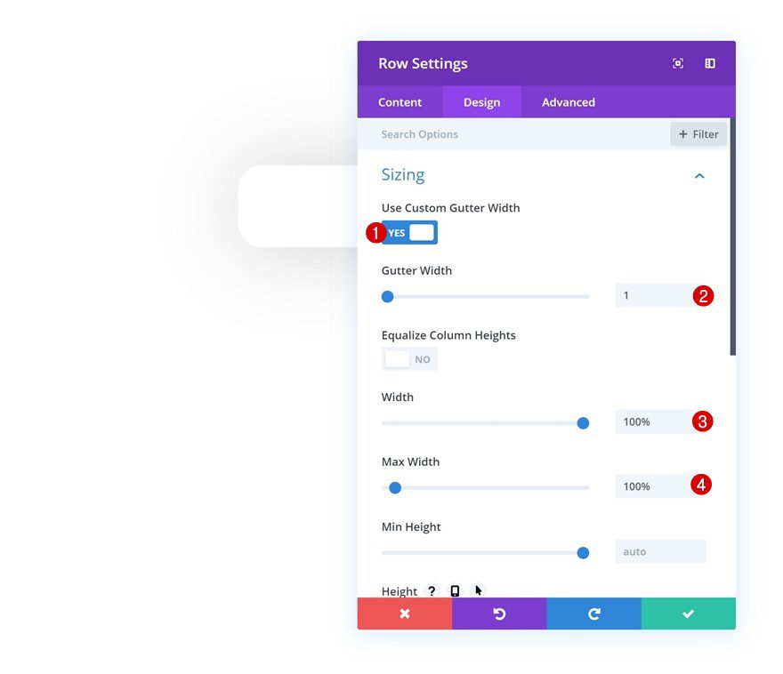
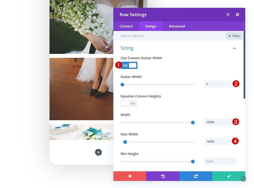
Sizing
Then, go to the sizing settings and allow the row to take up the entire width of the section.
- Use Custom Gutter Width: Yes
- Gutter Width: 1
- Width: 100%
- Max Width: 100%
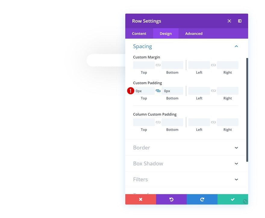
Spacing
Remove the default top and bottom padding next.
- Top Padding: 0px
- Bottom Padding: 0px
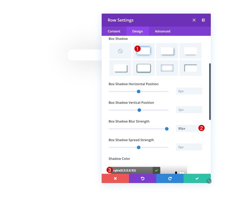
Box Shadow
And add a box shadow as well.
- Box Shadow Blur Strength: 80px
- Shadow Color: rgba(0,0,0,0.92)
Z Index
Last but not least, we’re going to make sure the row (and especially its box shadow) overlaps the row that comes next by increasing the Z index in the visibility settings.
- Z Index: 99

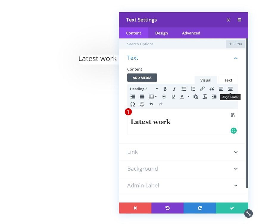
Add Text Module to Column
Add H2 Content
The only module we need in this row is a Text Module with some H2 content.
H2 Text Settings
Once you’ve added the H2 copy, go to the H2 text settings and make some changes.
- Heading 2 Font: Abril Fatface
- Heading 2 Text Alignment: Center
- Heading 2 Text Color: #000000
- Heading 2 Text Size: 1.5vw (Desktop), 3.5vw (Tablet), 5vw (Phone)
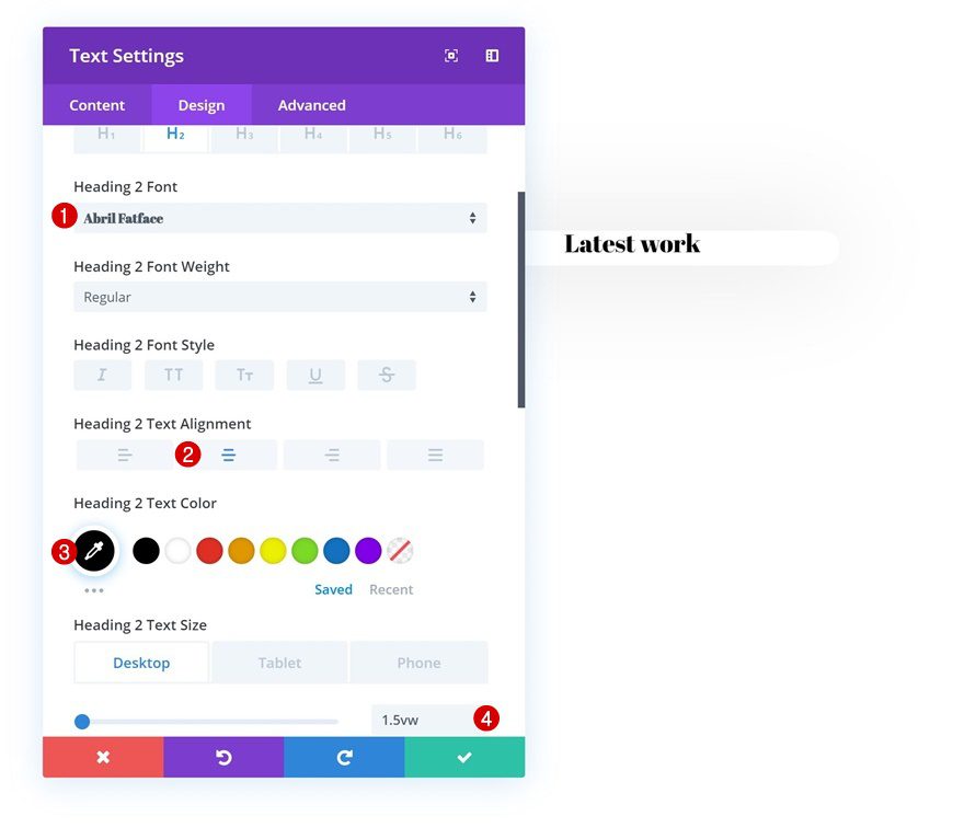
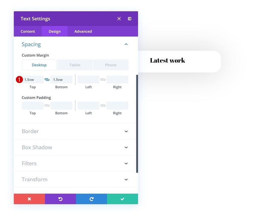
Spacing
Add some custom top and bottom margin next.
- Top Margin: 1.5vw (Desktop & Tablet), 3.5vw (Phone)
- Bottom Margin: 1.5vw (Desktop & Tablet), 3.5vw (Phone)
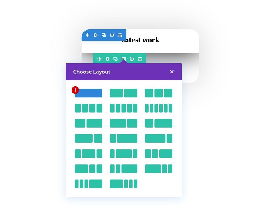
Add Row #2
Column Structure
On to the second row! Here, we’re using the following column structure:
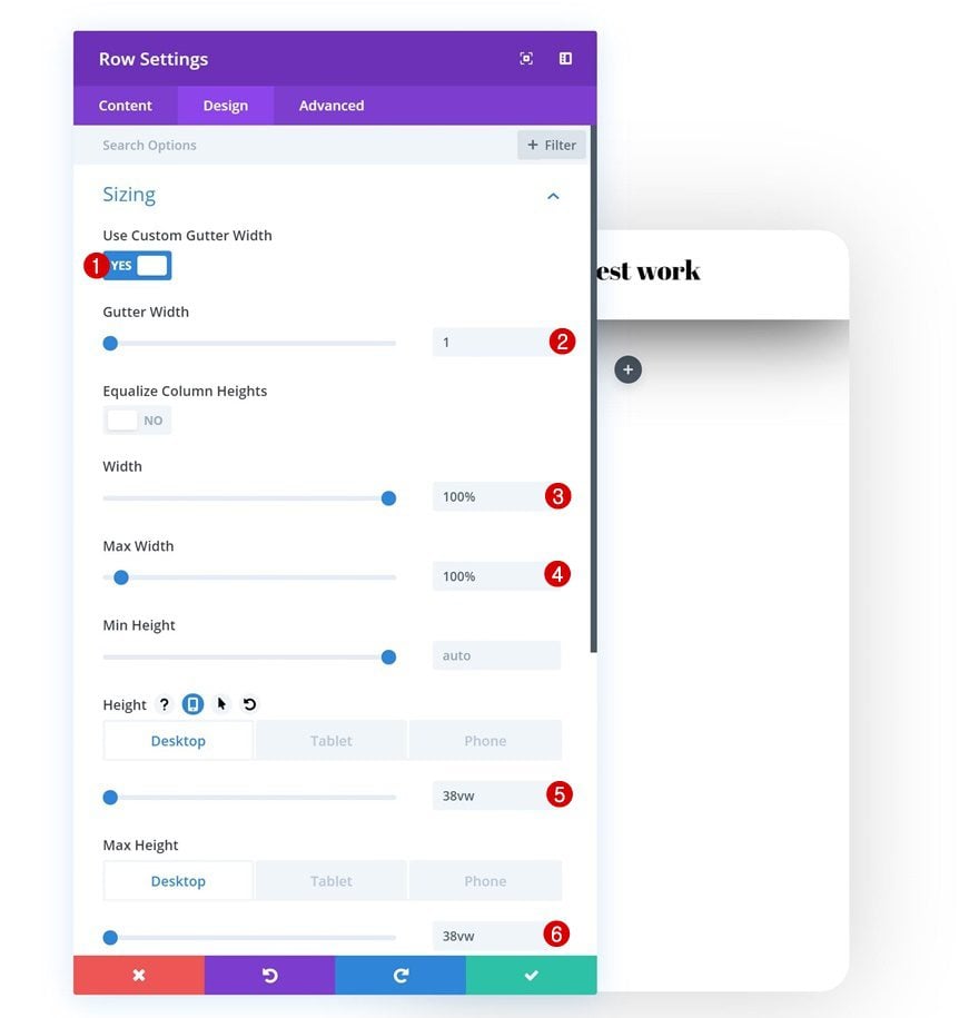
Sizing
Without adding any modules yet, open the row settings and allow the row to take up the entire width of the section. We’re also modifying the height and max height to create a vertical scrolling effect in the upcoming steps.
- Use Custom Gutter Width: Yes
- Gutter Width: 1
- Width: 100%
- Max Width: 100%
- Height: 38vw (Desktop), 100vw (Tablet), 120vw (Phone)
- Max Height: 38vw (Desktop), 100vw (Tablet), 120vw (Phone)
Spacing
Then, go to the spacing settings and remove all default top and bottom padding.
- Top Padding: 0px
- Bottom Padding: 0px
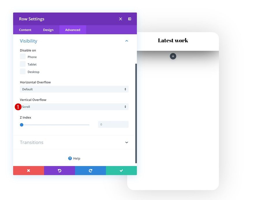
Vertical Overflow
As mentioned before, we’re making this row vertically scrollable. To do that, we’ll need to change the vertical overflow in the visibility settings of the row.
- Vertical Overflow: Scroll
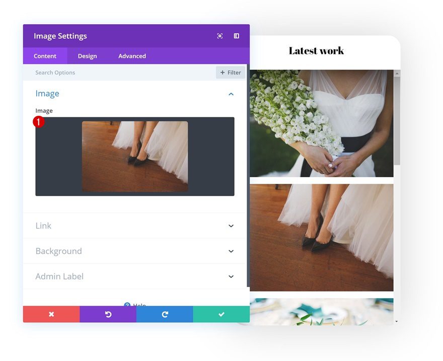
Add Image Module to Column
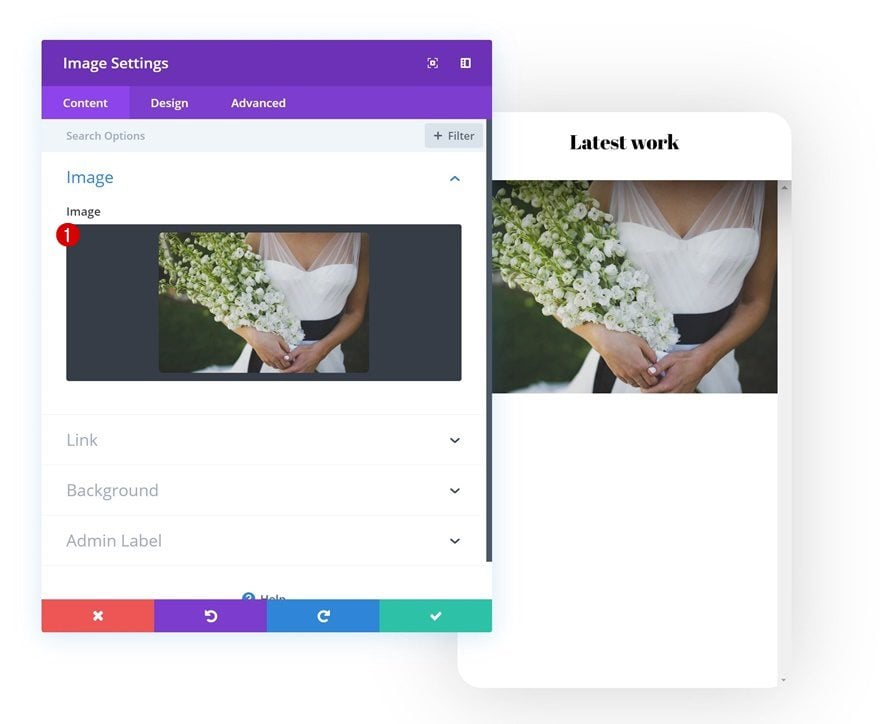
Upload Image
Go ahead and add a first Image Module to the row and upload an image of your choice. You can download the images we’re using throughout this tutorial by going to the Wedding Planner Layout Pack post.
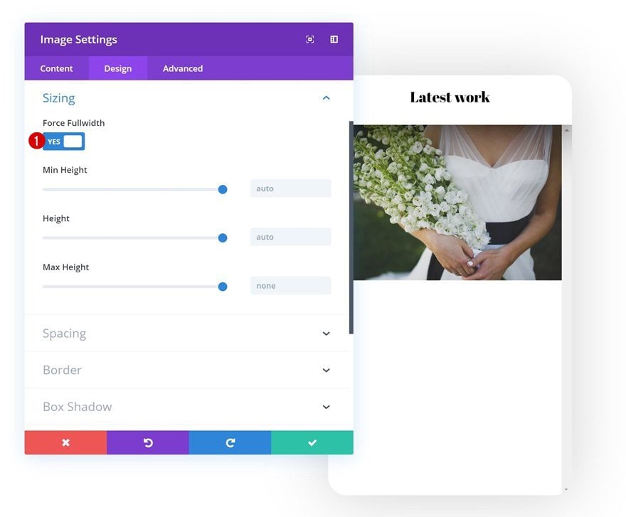
Sizing
Make sure you enable the ‘Force Fullwidth’ option in the Image Module to ensure a responsive outcome.
- Force Fullwidth: Yes
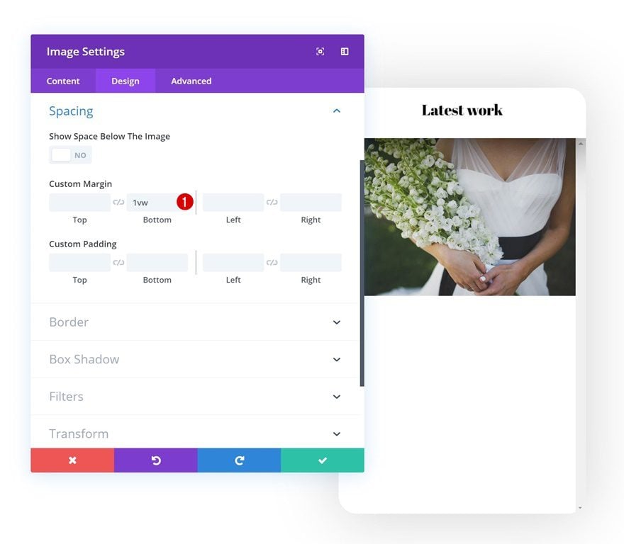
Spacing
Go to the spacing settings next and create some space between this and whichever module comes next by adding some bottom margin.
- Bottom Margin: 1vw
Clone Image Module as Many Times as You Want
Once you’re done modifying the first Image Module, you can clone it up to as many times as you want.
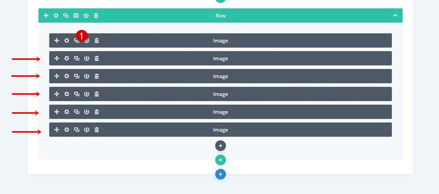
Upload Different Images
Of course, you’ll want to change the image in each one of the duplicates.
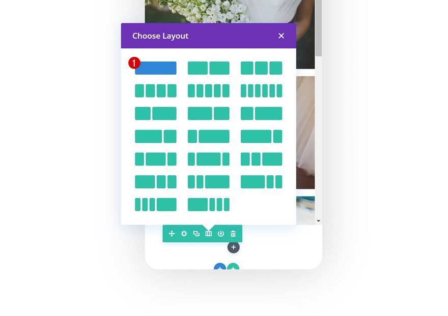
Add Row #3
Column Structure
On to the third and last row! We’re using the following column structure:
Background Color
Without adding any modules yet, open the row settings and add a white background color.
- Background Color: #ffffff
Sizing
Then, go to the sizing settings and allow the row to take up the entire width of the section.
- Use Custom Gutter Width: Yes
- Gutter Width: 1
- Width: 100%
- Max Width: 100%
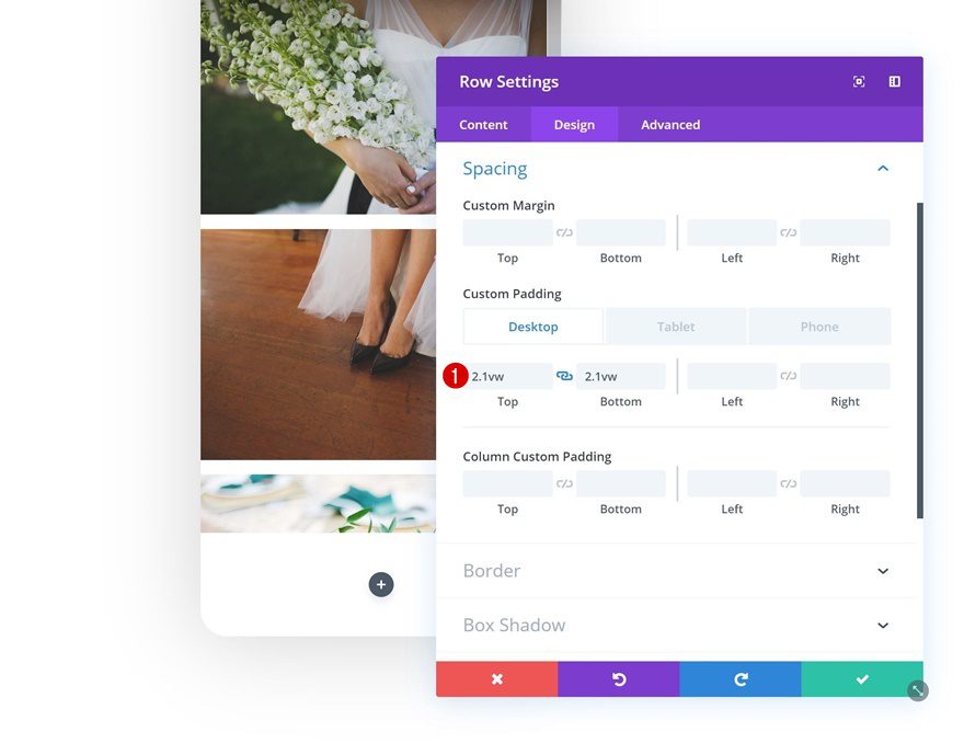
Spacing
Add some custom top and bottom padding values next.
- Top Padding: 2.1vw (Desktop), 3.5vw (Tablet), 5vw (Phone)
- Bottom Padding: 2.1vw (Desktop), 3.5vw (Tablet), 5vw (Phone)
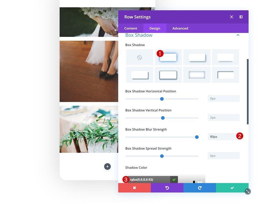
Box Shadow
And add a box shadow to create depth.
- Box Shadow Blur Strength: 80px
- Shadow Color: rgba(0,0,0,0.92)
Z Index
To make sure this row (and especially its box shadow) overlap the previous row, we’re going to increase the Z index.
- Z Index: 99

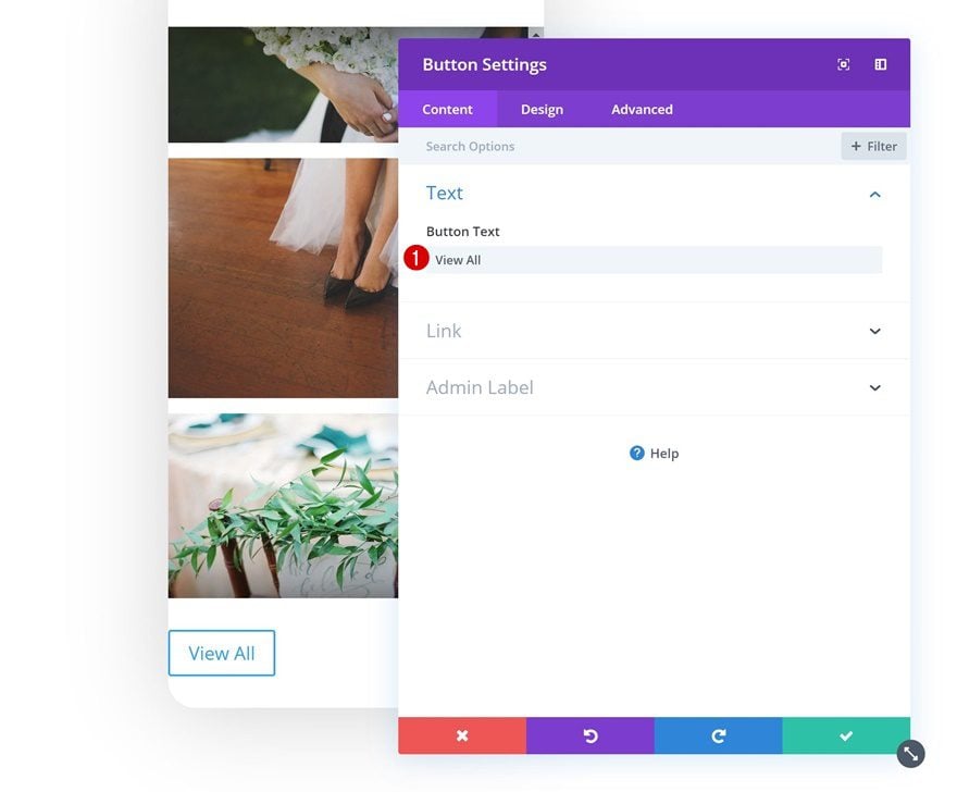
Add Copy
The only module we need in this row is a Button Module. Add some copy of your choice.
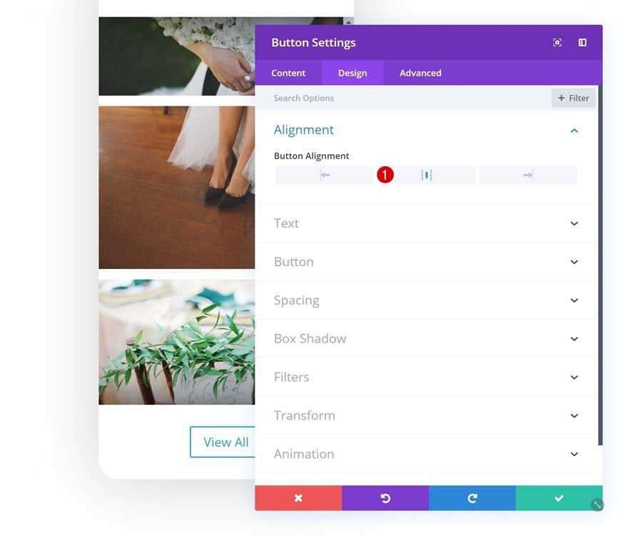
Alignment
Then, go to the design tab and change the button alignment.
- Button Alignment: Center
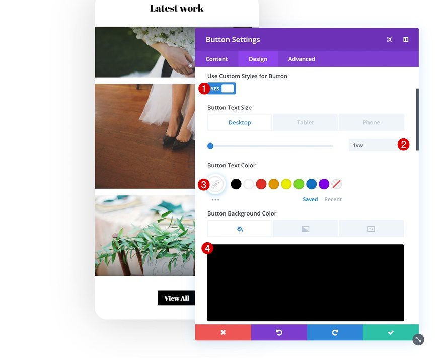
Button Settings
Modify the button settings as well.
- Use Custom Styles for Button: Yes
- Button Text Size: 1vw (Desktop), 2.5vw (Tablet), 3.5vw (Phone)
- Button Text Color: #ffffff
- Button Background Color: #000000
- Button Border Width: 1px
- Button Font: Abril Fatface
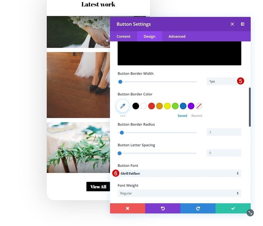
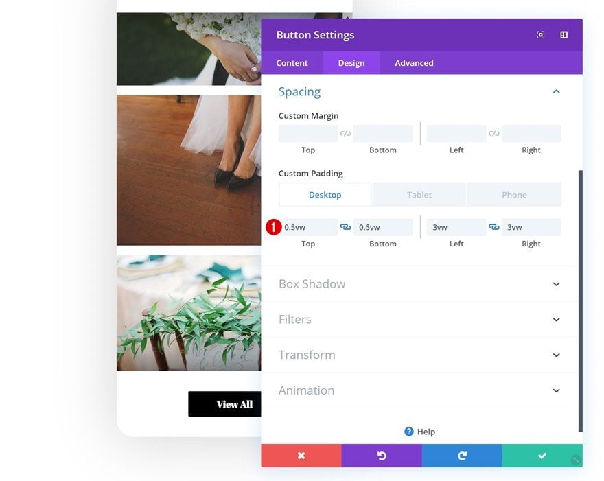
Spacing
And create the shape you want using custom padding values.
- Top Padding: 0.5vw (Desktop), 1vw (Tablet), 2vw (Phone)
- Bottom Padding: 0.5vw (Desktop), 1vw (Tablet), 2vw (Phone)
- Left Padding: 3vw (Desktop), 7vw (Tablet), 9vw (Phone)
- Right Padding: 3vw (Desktop), 7vw (Tablet), 9vw (Phone)
Style Scrollbar
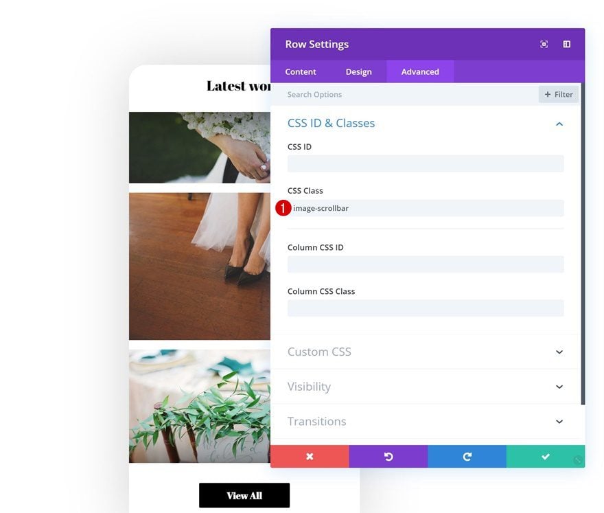
Add CSS ID to Row #2
It’s up to you whether or not you want to style the scrollbar. If you do, open the second row and add a CSS class to it.
- CSS Class: image-scrollbar
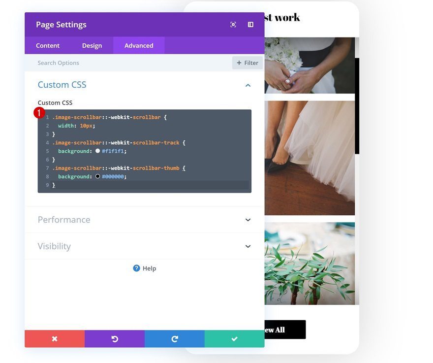
Open Page Settings
Then, open the row settings.
Style Scrollbar Using CSS
And add the following lines of CSS code to the Custom CSS box in the advanced tab:
.image-scrollbar::-webkit-scrollbar {
width: 10px;
}
.image-scrollbar::-webkit-scrollbar-track {
background: #f1f1f1;
}
.image-scrollbar::-webkit-scrollbar-thumb {
background: #000000;
}
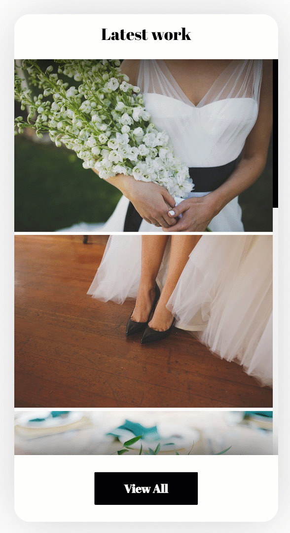
Preview
Now that we’ve gone through all the steps, let’s take a final look at the outcome across different screen sizes.
Desktop
Mobile
Final Thoughts
In this post, we’ve shown you how to create a beautiful scroll gallery mockup with Divi’s built-in options only. At the beginning of this post, you were also able to download the layout JSON for free and use it on any website you’re working on. If you have any questions or suggestions, make sure you leave a comment in the comment section below!
If you’re eager to learn more about Divi and get more Divi freebies, make sure you subscribe to our email newsletter and YouTube channel so you’ll always be one of the first people to know and get benefits from this free content.


Hello,
Interesting layout.
Thanks for the file sharing.
Nice one
There are some good designs with the new functionality added to Divi, keep it up.
There are some good designs coming out, keep it up.
thanks for the clever idea – is it possible to link the images in the gallery separately e.g. each image to it’s own book preview page?
(thank you for that one too 🙂
Hello and thank you! I want to try this out. Downloaded the json, but haven
t a clue what to do with it from my WordPress dashboard. please advise.
Hello, there is an error at the beginning of the article … There is no sample of how it would look on the desktop.
Thanks for the upload free layout. Its seem easy also to do ti.
I am not sure if a gallery like this is really showing the photos / pictures / graphics in a good way, too much restlessness…
Donjete! You simply rock!
Thanks a lot Donjete. It is so nice and clean. I think I will use it into a project in a very short time.
Cheers.