
Split Screen layouts are a great way to add design to your Divi website that is beautifully balanced and unconventional. With Divi’s new position options, we can create a split-screen layout design using two adjacent Divi sections. This opens the door for building even more unique split-screen layouts using the Divi Builder. In this tutorial, we will explore a few unique design features while we create a full split-screen layout with unique toggles in Divi.
Let’s get started.
Sneak Peek
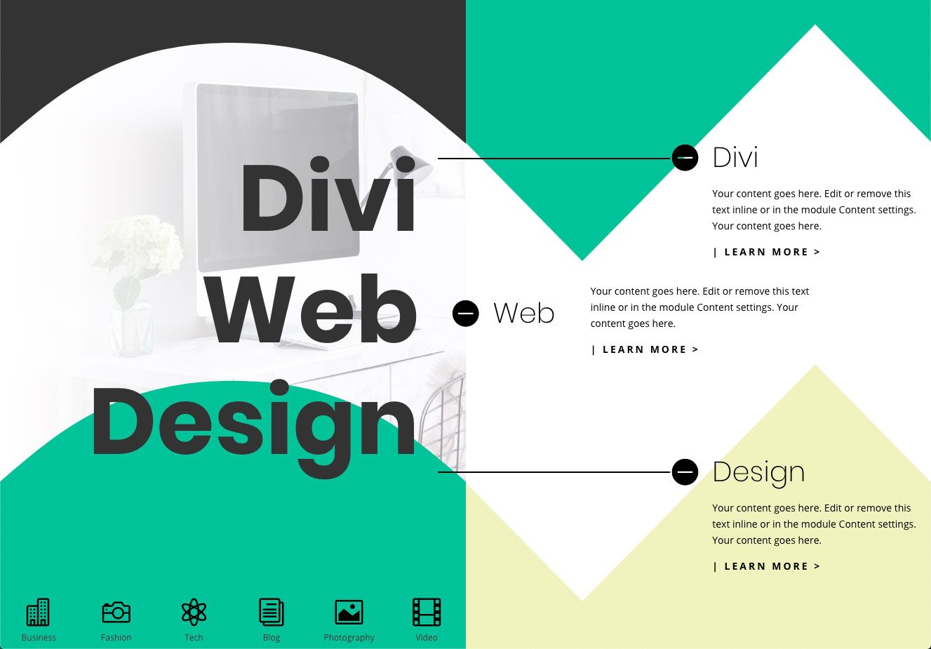
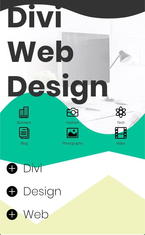
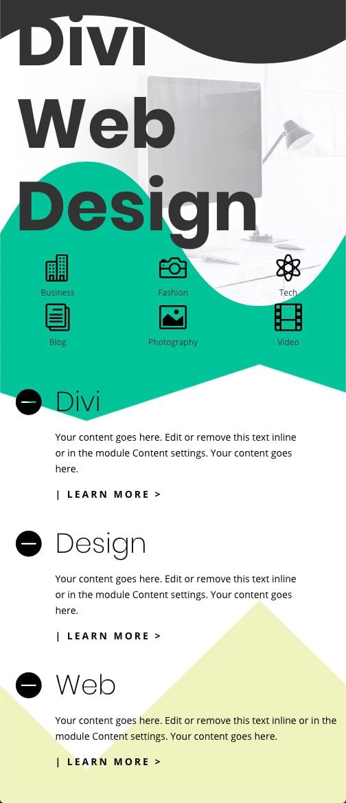
Here is a quick look at the design we’ll build in this tutorial.
Toggles Open
Toggles Closed

Mobile
Download the Layout for FREE
To lay your hands on the designs from this tutorial, you will first need to download it using the button below. To gain access to the download you will need to subscribe to our newsletter by using the form below. As a new subscriber, you will receive even more Divi goodness and a free Divi Layout pack every Monday! If you’re already on the list, simply enter your email address below and click download. You will not be “resubscribed” or receive extra emails.

To import the layout to your page, simply extract the zip file and drag the JSON file into the Divi Builder.
Let’s get to the tutorial, shall we?
What You Need to Get Started

To get started, you will need to do the following:
- If you haven’t yet, install and activate the Divi Theme.
- Create a new page in WordPress and use the Divi Builder to edit the page on the front end (visual builder).
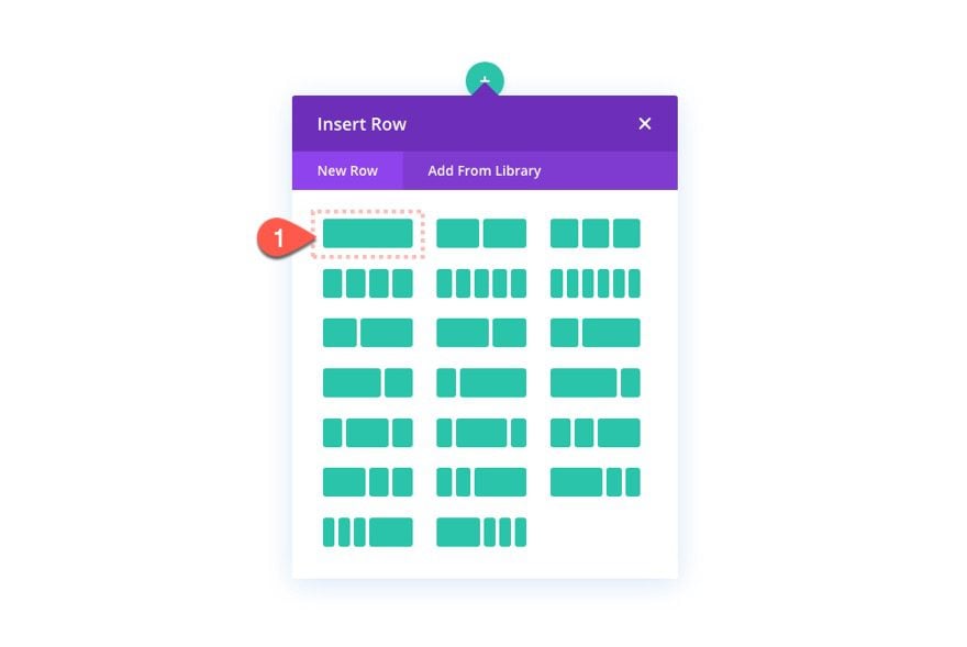
- Choose the option “Build From Scratch”.
After that, you will have a blank canvas to start designing in Divi.
Part 1: Creating the Split Screen Layout with Two Sections
For this design, we are going to introduce a new technique that positions two Divi sections adjacent to one another to create the split-screen design. To start, add a one-column row to the default section. This will kick off the design of our first section.
Section 1 Settings
For this first of two sections, let’s begin by adding the following design settings:
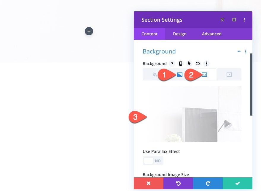
Background
- Add Background Image
- Gradient Background Left Color: #ffffff
- Gradient Background Left Color: rgba(255,255,255,0.45)
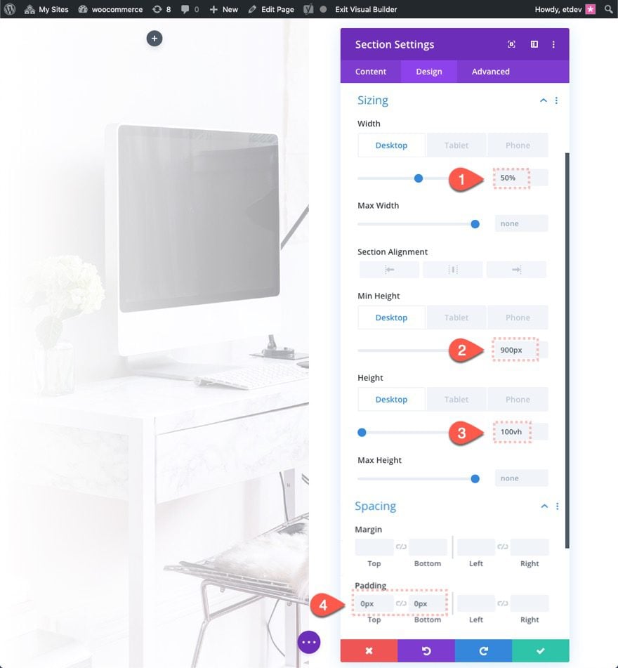
Size and Spacing
Then update the size and spacing so that the section takes up 50% of the browser width and 100% of the browser height.
- Width: 50% (desktop), 100% (tablet and phone)
- Min Height: 900px (desktop), none (tablet and phone)
- Height: 100vh (desktop), auto (tablet and phone)
- Padding: 0px top, 0px bottom
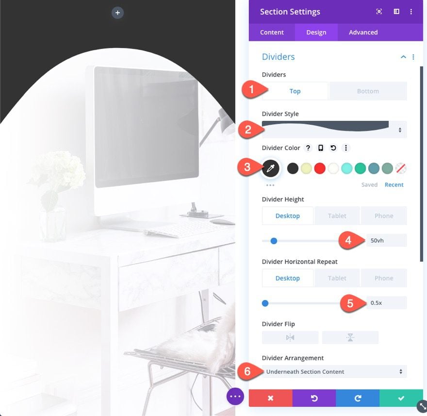
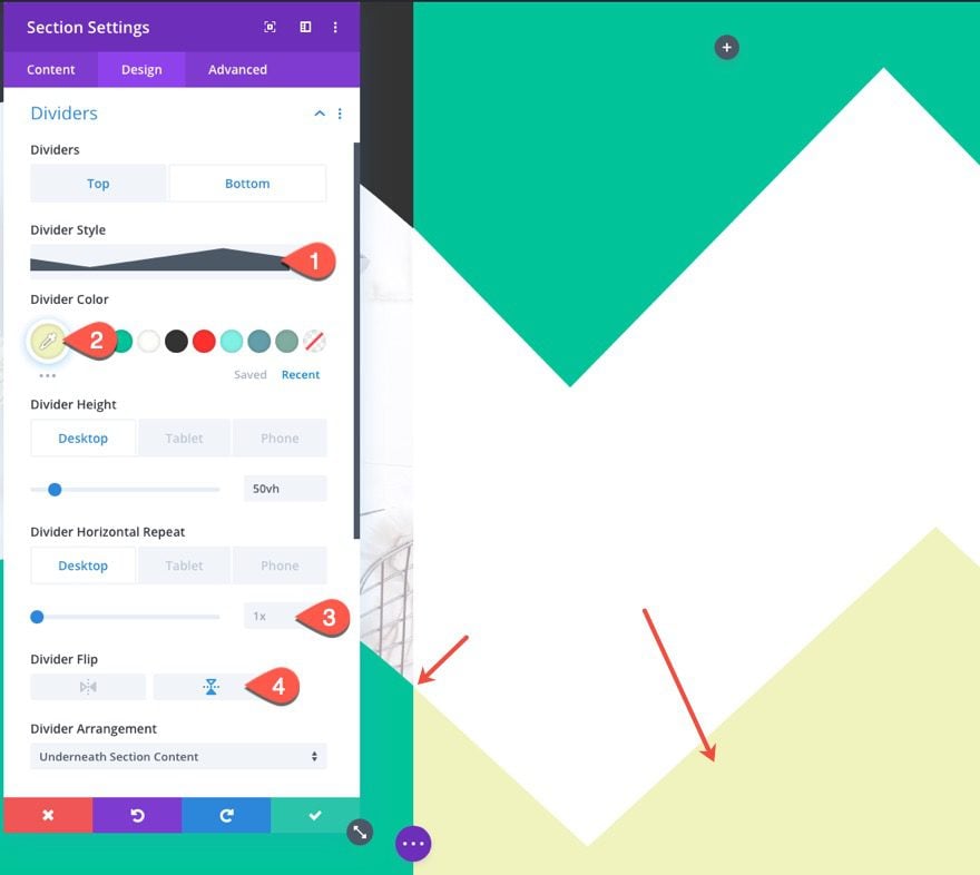
Top Divider
- Top Divider Style: see screenshot
- Top Divider Color: #333333
- Top Divider Height: 50vh (desktop), 10vh (tablet and phone)
- Top Divider Horizontal Repeat: 0.5x (desktop), 1x (tablet and phone)
- Top Divider Arrangement: Underneath Section Content
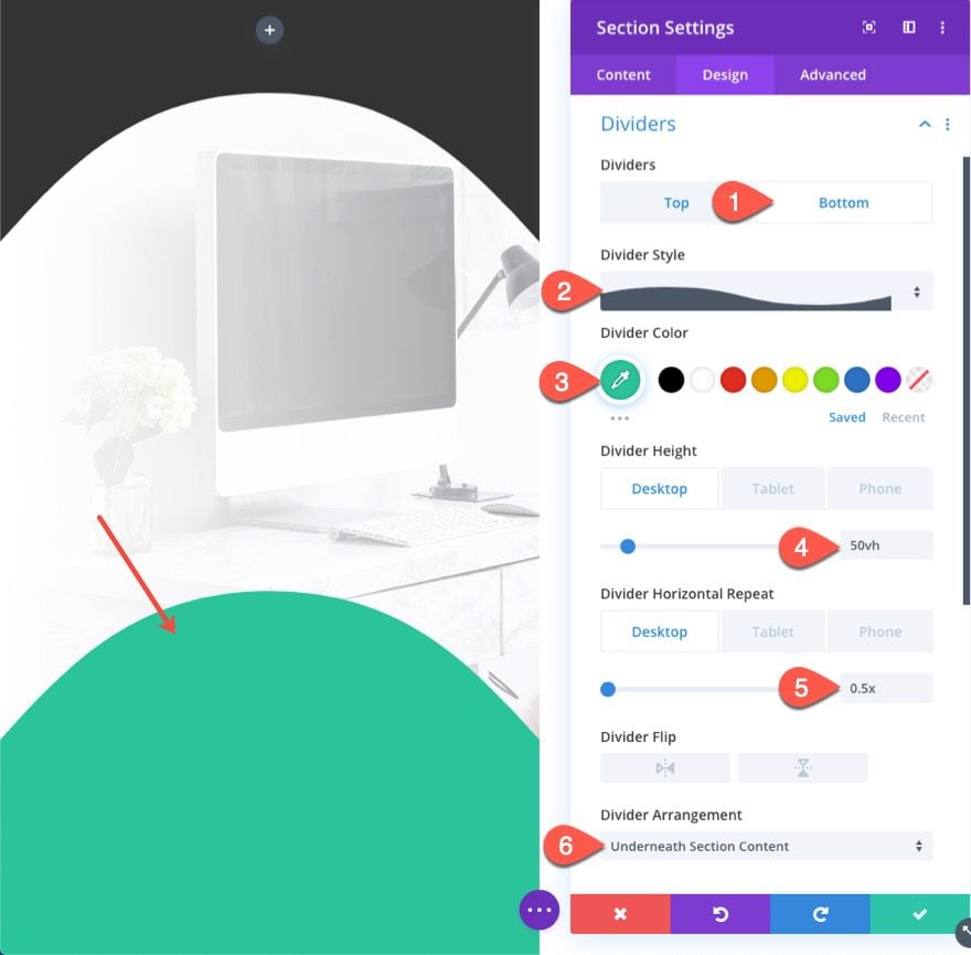
Bottom Divider
- Bottom Divider Style: see screenshot
- Bottom Divider Color: #02c39a
- Bottom Divider Height: 50vh (desktop), 30vh (tablet and phone)
- Bottom Divider Horizontal Repeat: 0.5x (desktop), 1x (tablet and phone)
- Bottom Divider Arrangement: Underneath Section Content
Section 2
Duplicate Section 1
To create the adjacent section that will occupy the right side of the split-screen layout, duplicate section 1.
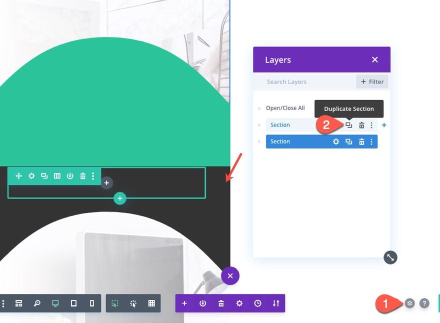
Then update the settings as follows:
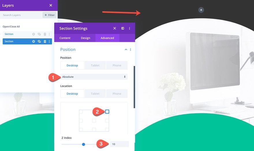
Position
- Position: Absolute (desktop), relative (tablet and phone)
- Location: Top Right
- Z Index: 10
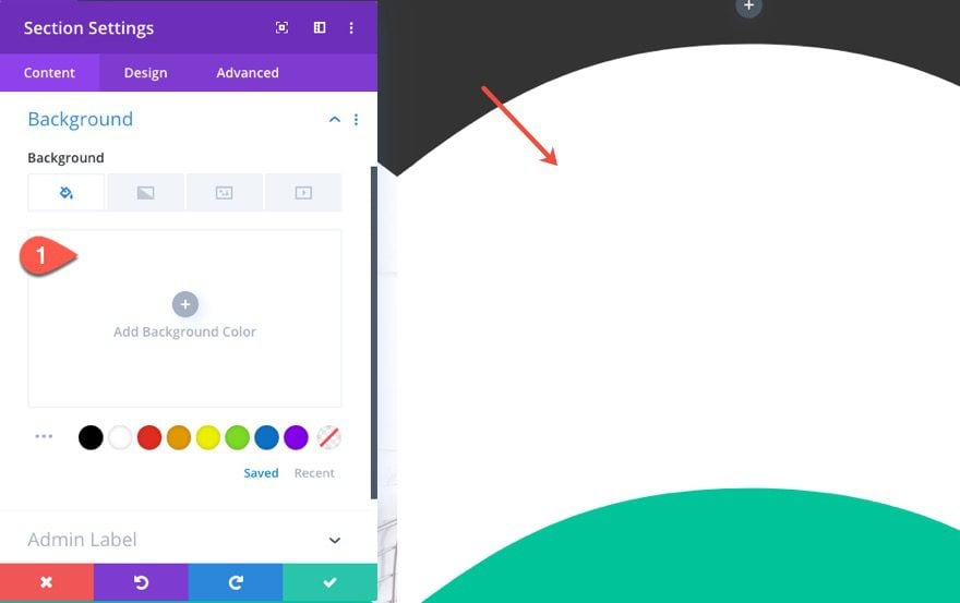
Background
- Background Color: none/white
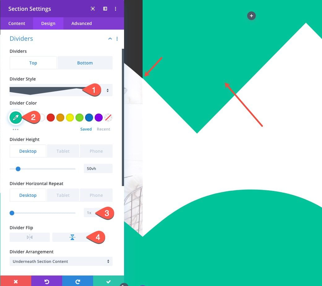
Top Divider Updates
- Top Divider Style: see screenshot
- Top Divider Color: #02c39a
- Top Divider Horizontal Repeat: 1x
- Top Divider Flip: Vertical
The divider should align perfectly with the adjacent top header in section 1.
Bottom Divider
- Bottom Divider Style: see screenshot
- Bottom Divider Color: #f0f3bd
- Bottom Divider Horizontal Repeat: 1x
- Bottom Divider Flip: Vertical
Now that the two-section layouts are ready, we can start adding the content to each of the sections.
Creating the Title
To start, we will create a large title in the left section.
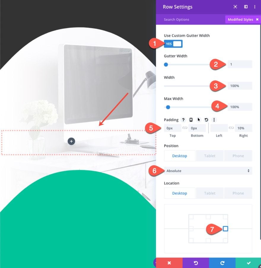
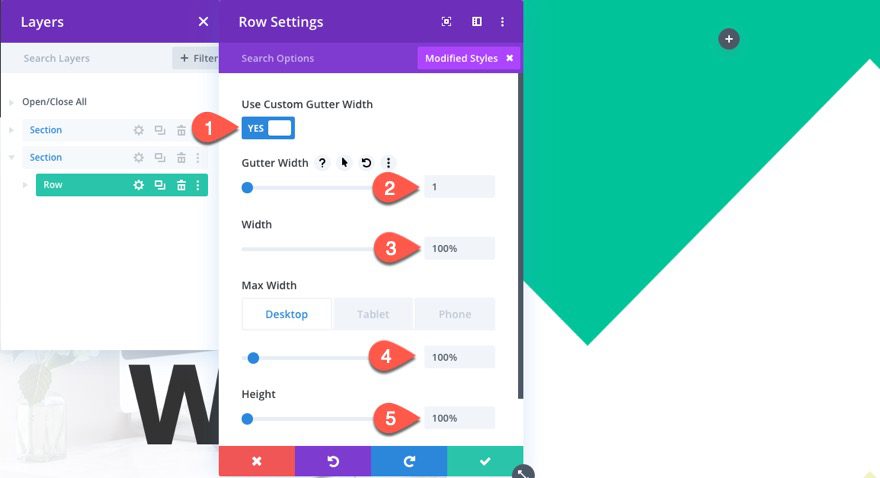
Row Settings
Before we add a text module, we need to update the row settings for the row in section 1 as follows:
- Gutter Width: 1
- Width: 100%
- Max Width: 100%
- Padding: 0px top, 0px bottom, 10% right
- Position: Absolute (desktop), relative (tablet and phone)
- Location: Center Left
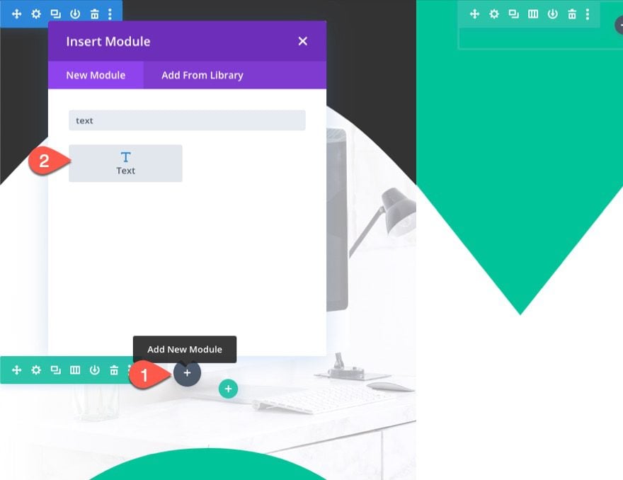
Text Module
Once the row settings are in place, the row should be vertically aligned within the section. Next, add a new text module to the row.
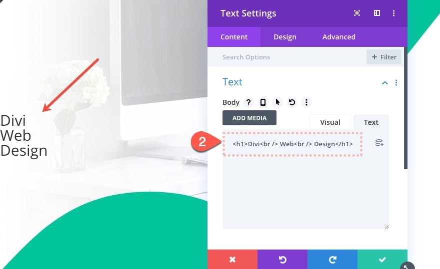
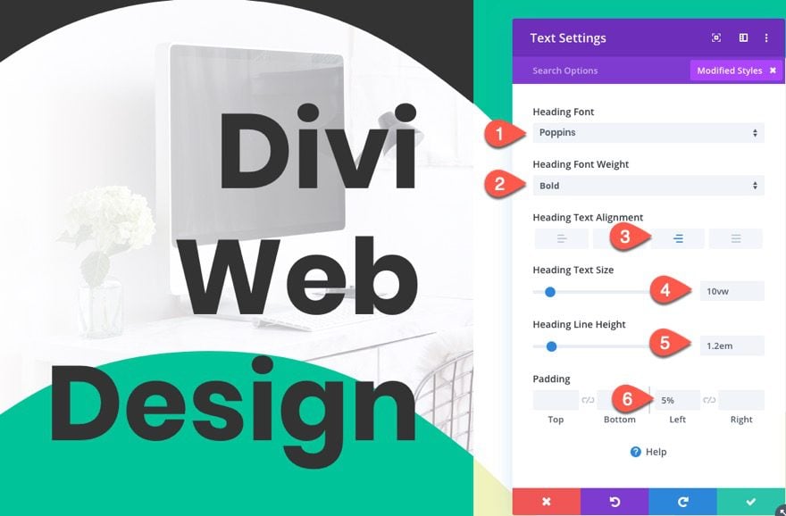
Text Content
Open the settings for the text module and update the following content:
<h1>Divi <br />Web <br />Design</h1>
Text Design
Then update the text design settings as follows:
- Heading Font: Poppins
- Heading Font Weight: Bold
- Heading Text Alignment: Right
- Heading Text Size: 10vw
- Heading Line Height: 1.2em
- Padding: 5% Left
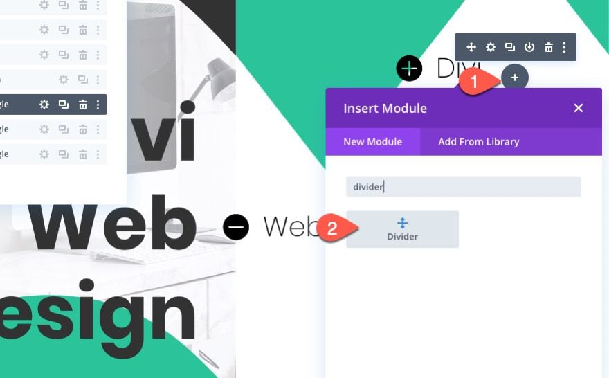
For this layout, since we have two adjacent sections, we have the opportunity to add a 6 column layout to one or both of the sections. This is great for creating a nice icon menu at the bottom of the section.
Here’s how to do that…
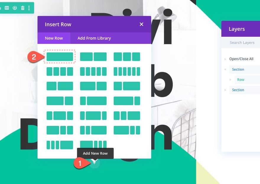
Add New Row
To create the bottom menu, add a new one-column row under the row in section 1. We are adding a one-column layout initially because we will duplicate the column later on to create all six columns.
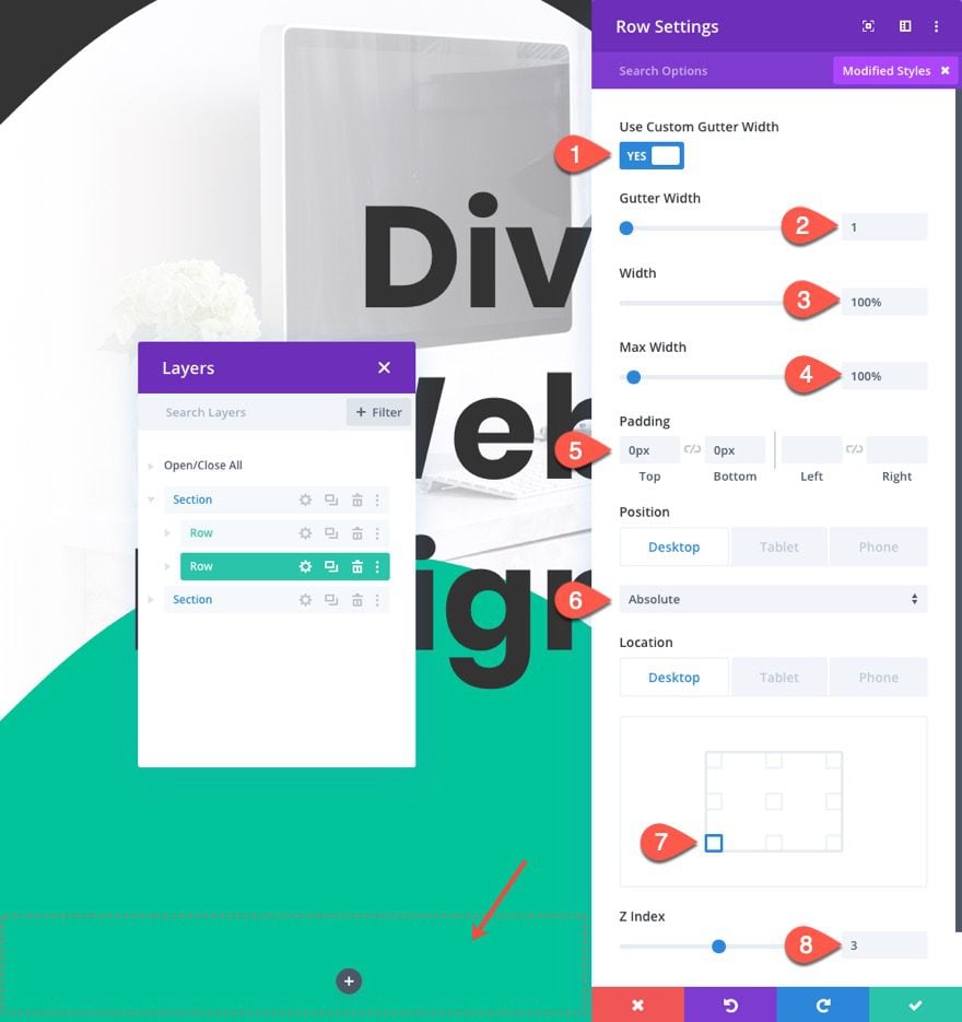
Row Settings
Then update the following row settings:
- Gutter Width: 1
- Width: 100%
- Max Width: 100%
- Padding: 0px Top, 0px Bottom
- Position: Absolute (desktop), Relative (tablet and phone)
- Location: Bottom Left
- Z Index: 3
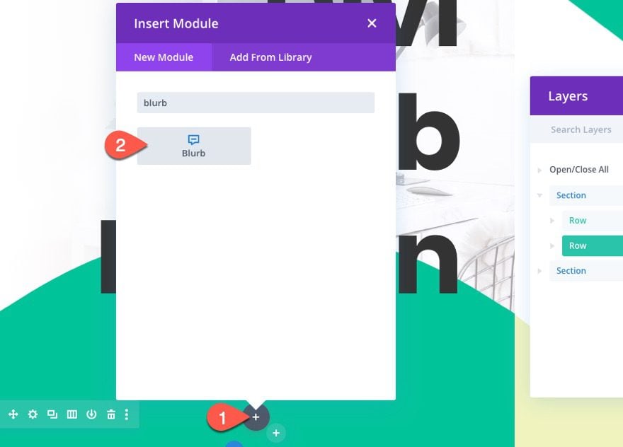
Blurb Module
Next, add a blurb module to the new row.
Blurb Content
Then update the blurb content as follows:
- Title: Business
- Icon: Buildings
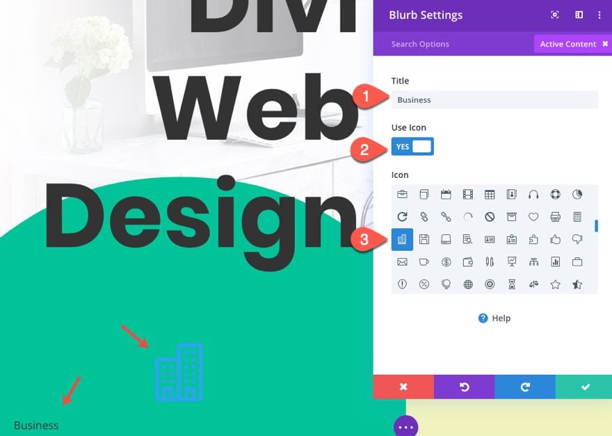
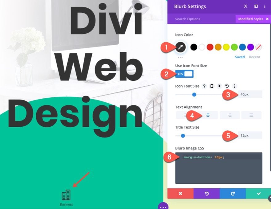
Blurb Styling
Then update the design settings as follows:
- Icon Color: #333333
- Icon Font Size: 40px
- Text Alignment: Center
- Title Text Size: 12px
Then add the following custom CSS to the Blurb Image
margin-bottom: 10px;
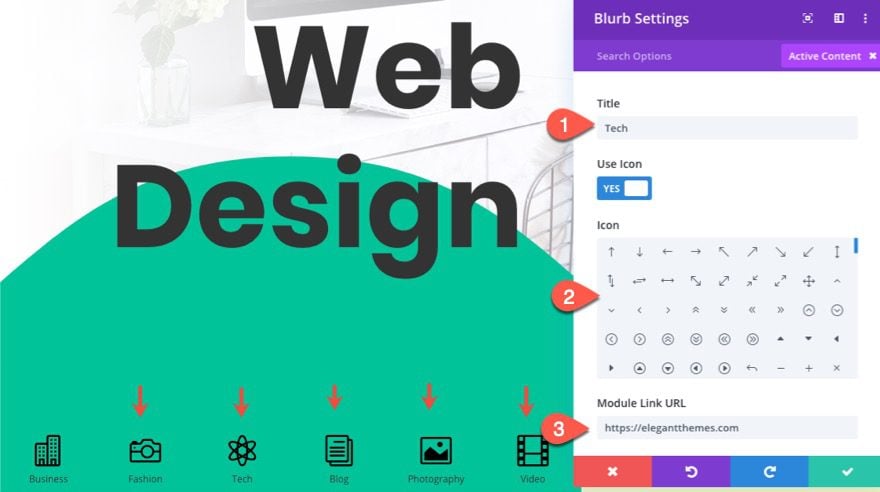
Duplicate Column
Now that we have our icon designed in column one, we can speed up the creation and design for the other 5 icons by duplicating the entire column 5 times.
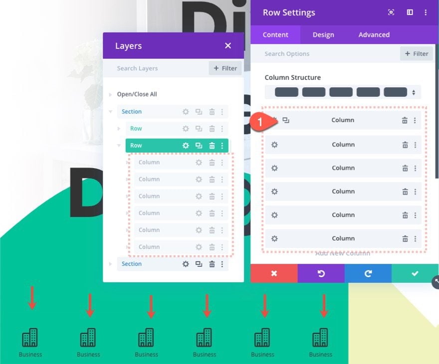
Update Content for Blurbs
Once all 6 columns/icons are created, go back and update the title, icon, and URL for each blurb.
Part 3 Section 2 Toggles
Now that section 1 is complete, we can start to add the toggles to the right section of our split-screen layout. There will be a total of three toggles that correspond to the large words in each title on the left. Each of the toggles will be given a custom absolute position on desktop that will keep them in place.
Row Settings
Before we start adding the toggle modules, we need to optimize the size and spacing of the row. Open the row settings for the row on the right section and update the following:
- Gutter Width: 1
- Width: 100%
- Max Width: 100% (Desktop), none (tablet and phone)
- Height: 100%
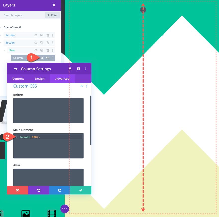
Column Height
Now that the row has a height equal to the section height, we need to do the same for the column. To do this, add the following custom CSS to the main element for the column:
height: 100%;
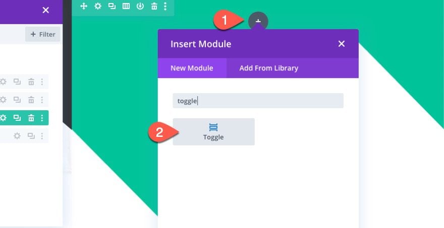
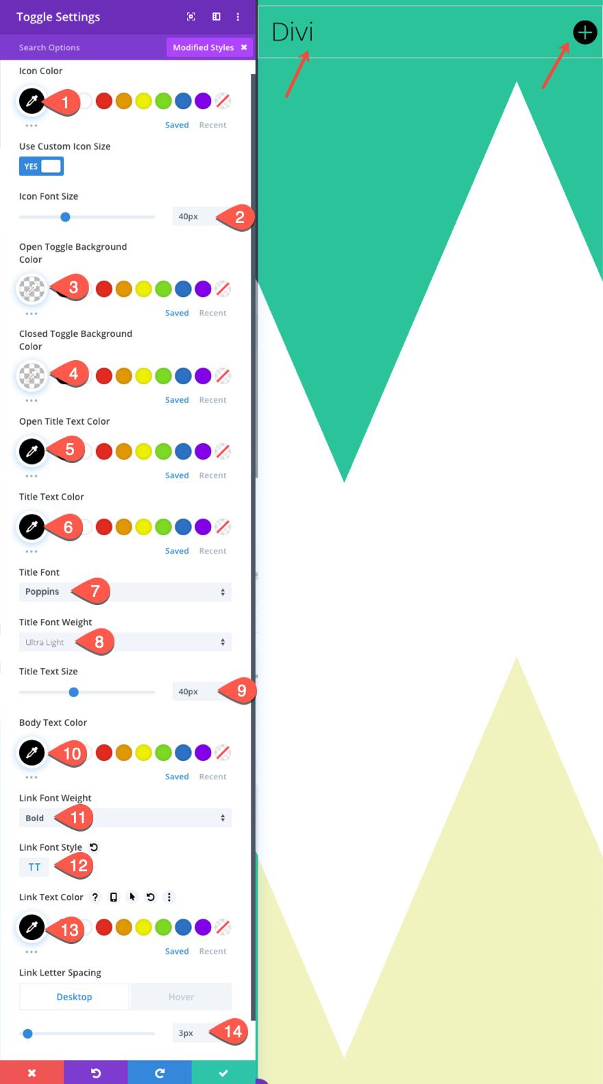
Top Toggle Module
With the column height in place, let’s add the first toggle module to the row.
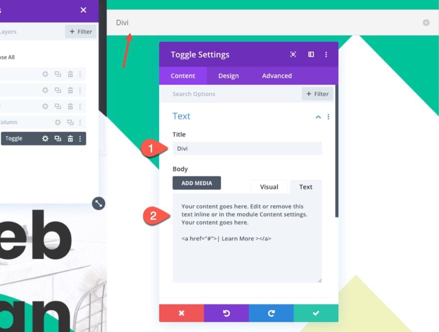
Toggle Content
Then update the toggle content with the title “Divi” and paste in the following body content:
Your content goes here. Edit or remove this text inline or in the module Content settings. Your content goes here.

<a href="#">| Learn More ></a>
Toggle Design
Update the toggle design as follows:
- Icon Color: #333333
- Icon Font Size: 40px
- Open Toggle Background Color: transparent
- Closed Toggle Background Color: transparent
- Open Title Text Color: #333333
- Title Text Color: #333333
- Title Font: Poppins
- Title Font Weight: Ultra Light
- Title Text Size: 40px
- Body Text Color: #333333
- Link Font Weight: #333333
- Link Font Weight: Bold
- Link Font Style: TT
- Link Text Color: #333333
- Link Letter Spacing: 3px (desktop), 5px (hover)
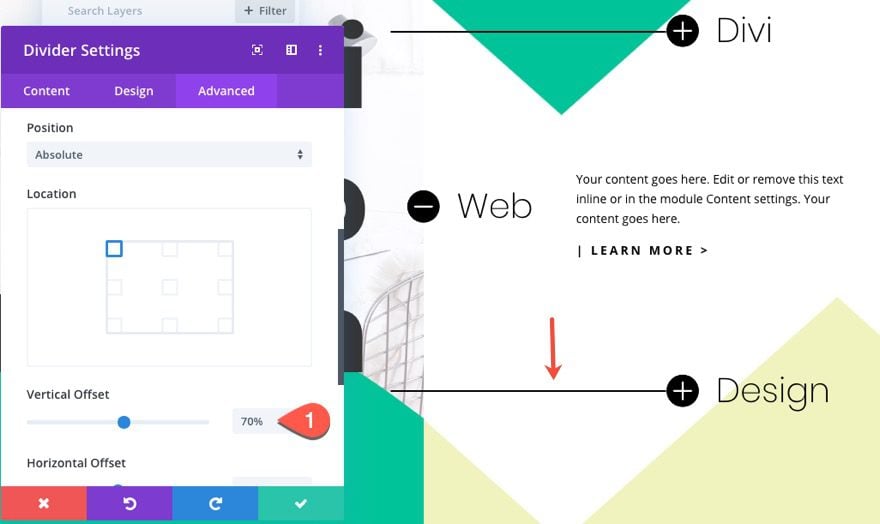
Toggle Size and Position
- Width: 50% (desktop), 80% (tablet and phone)
- Max Width: 400px
- Border Width: 0px
- Toggle Icon Custom CSS:
left:-60px;
- Position: Absolute (desktop), Relative (tablet and phone)
- Vertical Offset: 22%
- Horizontal Offset: 50%
- Z Index: 2
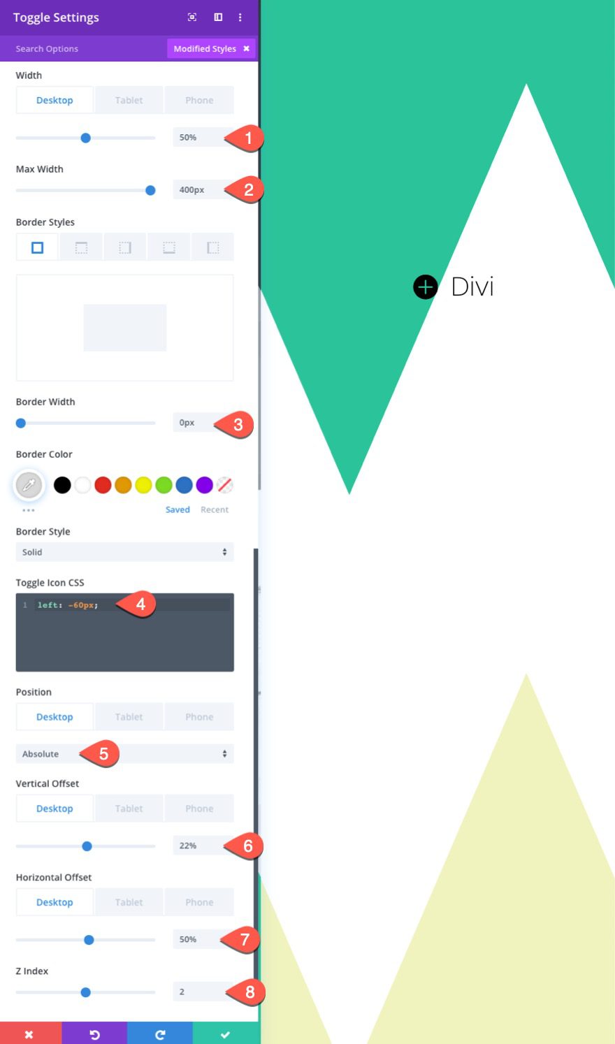
The custom CSS added to the toggle module places the toggle icon on the left size of the toggle. And the position settings place the toggle in an absolute position using the percentage length unit which will scale with the browser width.
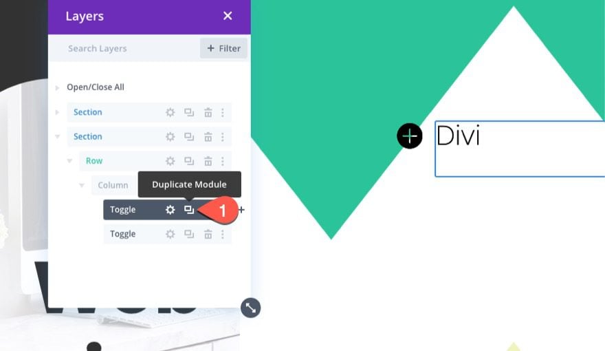
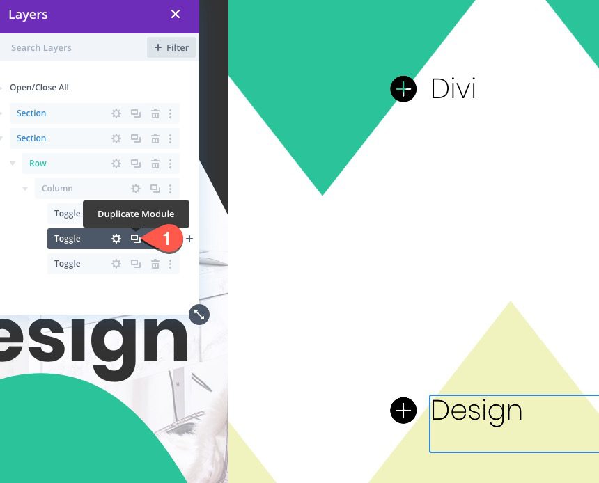
Bottom Toggle Module
Duplicate Top Toggle
To create the bottom toggle, duplicate the toggle just created.
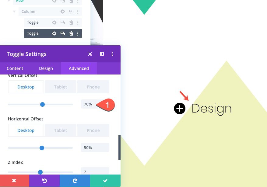
Update Position
Then open the duplicate toggle settings using the layers box and update position offset as follows:
- vertical offset: 70%
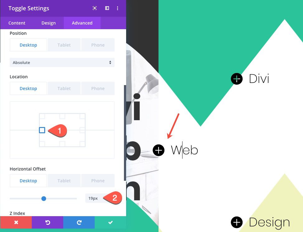
Middle Toggle Module
Duplicate Bottom Toggle
To create the middle toggle, duplicate the bottom toggle.
Update Position
Then update the following:
- Location: Left Center
- Horizontal Offset: 19px
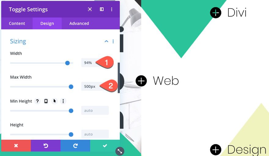
Update Size
- Width: 95%
- Max Width: 500px
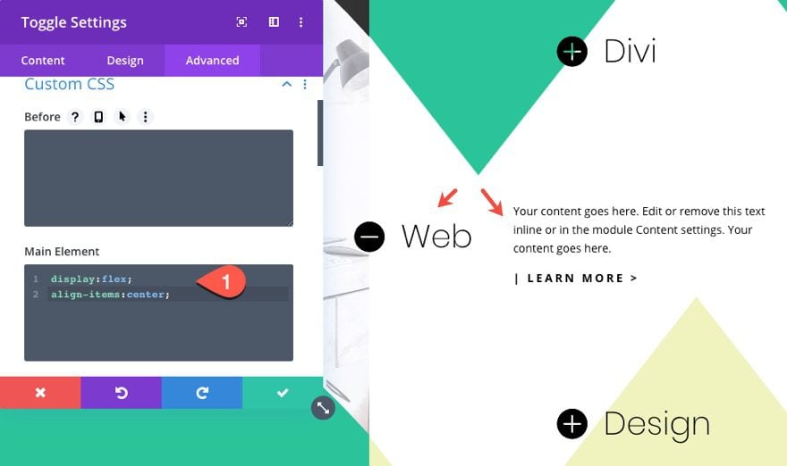
Custom CSS
For an optional design feature, we can add a custom CSS snippet to the main element to align the text on the right of the title.
To do this, paste the following CSS in the Main Element:
display:flex;
align-items:center;
Divider Lines
Now that our toggles are in place, we can add a few divider lines to connect the top and bottom toggles with the corresponding word in the left section.
Top Divider Module
To create the top divider line, add a new divider module under the top toggle.
Divider Design
Then update the divider design settings as follows:
- Line Color: #333333
- Line Position: Vertically Centered
- Divider Weight: 2px
- Width: 50%
- Transform Translate Y Axis: 29px
- Transform Translate X Axis: -12px
- Animation Style: Slide
- Animation Direction: Right
- Animation Duration: 2000ms
- Animation Intensity: 10%
- Animation Starting Opacity: 100%
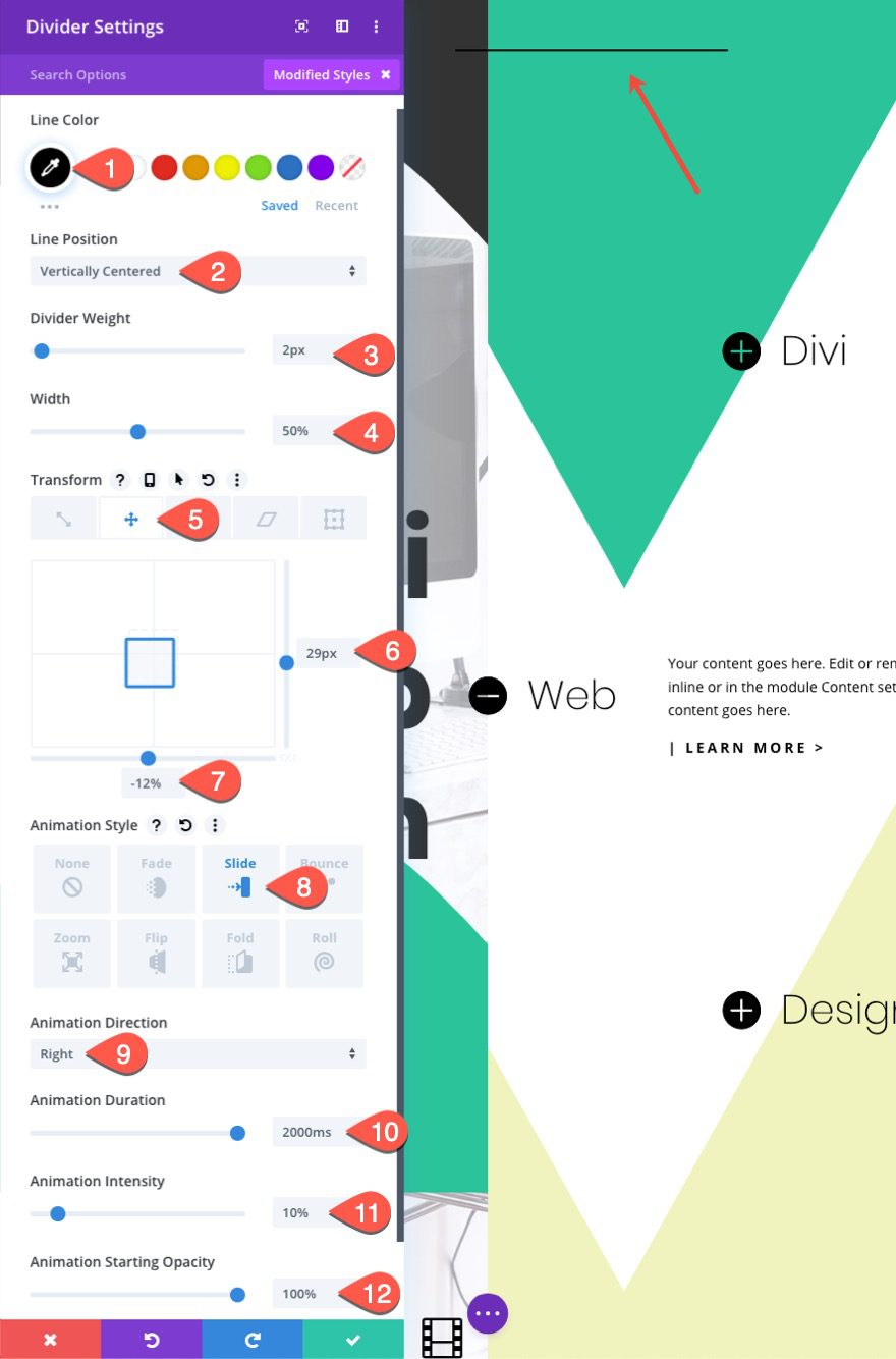
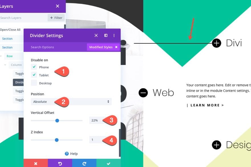
Divider Visibility and Position
Now, all we need to do is hide the divider on mobile and position it so that it aligns with the top toggle.
- Disable on: Phone and Desktop
- Position: Absolute
- Vertical Offset: 22%
- Z Index: 1
Bottom Divider Module
Duplicate Top Divider Module
To create the bottom divider, duplicate the top divider module.
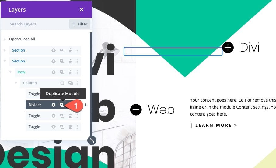
Update Position
Then update the position offset to align with the bottom toggle:
- Vertical Offset: 70%
Final Result
Once done, check out the final result on the live page.
Toggles Open
Toggles Closed
Mobile
Final Thoughts
This full split-screen layout features a few unique design techniques that will come in handy for a lot of designs going forward. The dual sections offer countless column combination and section divider designs. And the ability to place toggles absolutely will come in handy for precise placement of important info. I hope it helps!
I look forward to hearing from you in the comments.
Cheers!


I have two hero sections with an +image in the first section and no +image in the second section below the first split-screen layout. I seem to only be able to change the image in the top hero section, the image in the second hero section below does not change. The top hero section is not visible on my website. The second hero section below (the one with no +image) contains the text which is correct, just the old image.
If you mean you can’t access the Section Settings to change the background image, it could be the Sections are overlapping each other, however, you can use Wireframe View or Layers View to access the Section Settings.
Wireframe View:
https://prnt.sc/Ln4bEfdslRoI
Layers Views:
https://prnt.sc/5qmbUJZS2w4a
You then change the Section Background in the Section Settings > Content > Background > Background Image:
https://prnt.sc/4WPC5xbIqjeW
Hi,
The JSON file will not upload to the page! 😕
I’m not new to WordPress but I am new to Elegant Themes, and was hoping to use this tutorial as a starter!
Where would you advise to go for a thorough learning package?
Thanks.
Upload it to the Divi Library. It should work
Great themes and great info as usual. I’m not a friend of Divi, but keep it up.
Thanks
Hey, Thank you for this post!!! I was looking for a new theme for my website and came across your blog. This is an informative piece of article. Keep posting!!!
Thanks for the great tutorial once again! This is pretty interesting and I’ve got just the right client to try this with. It’s always great to get some good tutorials and templates for web design, while allowing for continued development of our skills!
Great to hear! Hope it works out.
Jason its not possible to see the sneak peak
Thanks
Sorry about that. I fixed it. Thanks.
Where is the live demo page? I didn’t see the link?
Sorry, Jen. We don’t have a live demo for this kind of tutorial yet. But you can download the layout if you want to see it live on your own test page.