
Sidebars aren’t really as popular as they used to be. In many cases, they end up being more distracting than they are helpful. But sometimes a sidebar makes perfect sense, especially when dealing with lengthy content. That is why I set out to create a sidebar that makes a lot of sense.
Today I’m showing you how you can use the Divi Builder to create a responsive fixed (or sticky) sidebar with smooth scrolling anchor links (or jump links). Because the sidebar remains visible and the anchor links smoothly scroll to different sections on the page, the sidebar stays married to the content, making it a helpful UX feature. Like a document outline, this combination makes your web page content more accessible and easier to read. It is a refreshing solution for those long scrolling pages.
Check it out!
- 1 Sneak Peek
- 2 The Concept
- 3 What You Need to Get Started
- 4 Adding the Layout to your Page
- 5 Creating a New Section
- 6 Adding the CSS IDs to the Sections and Rows
- 7 Creating the Fixed Sidebar Layout
- 8 Making Adjustments for Mobile
- 9 The Final Result
- 10 Learn More About Fixed Elements and Anchor Links
- 11 Final Thoughts
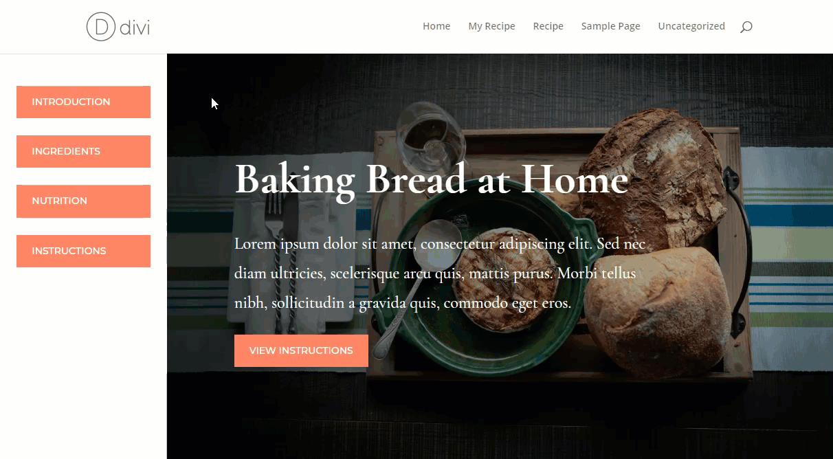
Sneak Peek
Here is a sneak peak of what we will be building together.
The Concept
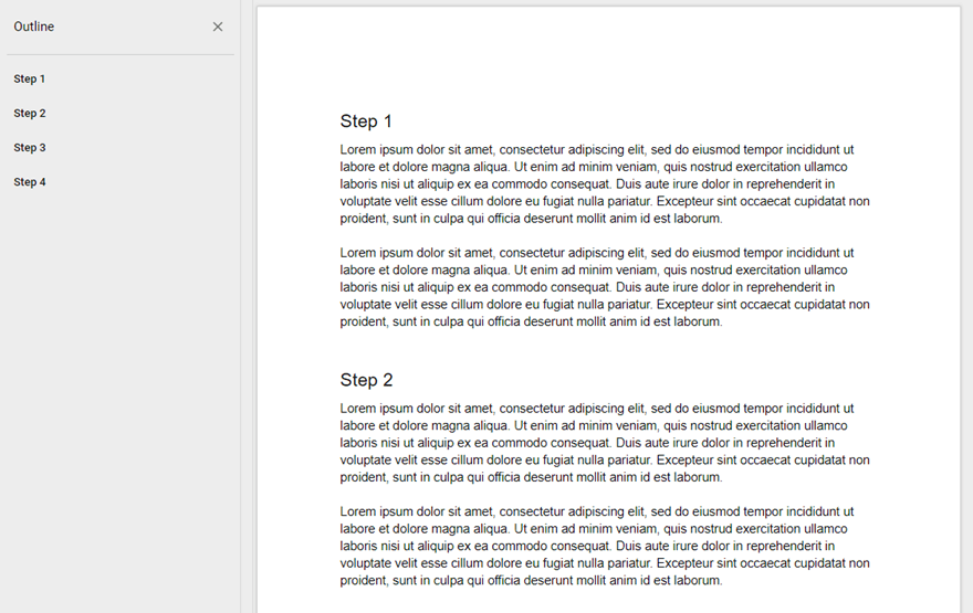
For those of you who live in Google Docs as much as I do, you are aware of that helpful document outline tool that allows you to easily deploy a fixed sidebar with a clickable outline that jumps to the different headings on your document. I love it because it helps me find information a lot faster. In some ways, it functions like a clickable table of contents without having to use one of these plugins.
What You Need to Get Started
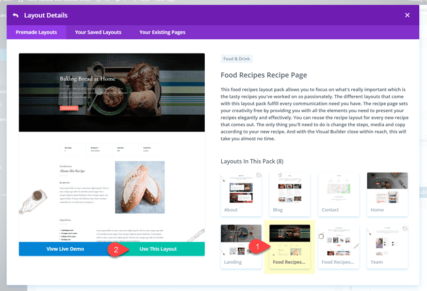
For this tutorial, all you really need is Divi! We will be also be using the Recipes Page from the Food Recipes Layout Pack which is freely accessible from the Divi Builder.
Adding the Layout to your Page
Subscribe To Our Youtube Channel
To get started, go ahead and create a new page and deploy the Divi Builder. Select the option to “Choose a Premade Layout”. From the Load From Library popup, select the Food Recipes Layout Pack and then click to use the Recipes Page.
After the layout loads, click to build on the front end.
Creating a New Section
From the front end Divi Builder, create a new section and drag it to the very top of the layout.
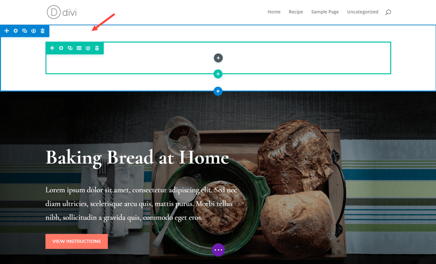
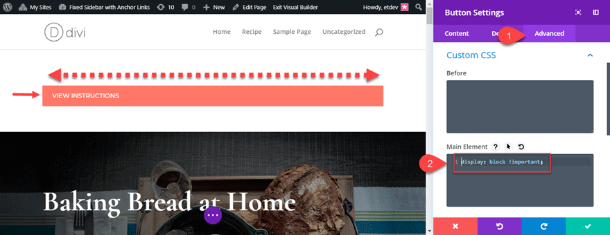
Copy the button in the layout’s header section and paste it into the one-column row of the new section you created.
Open the button settings and add the following custom CSS to the Main Element under the advanced tab:
display: block !important;
This simply allows the button to span the full width of the column.
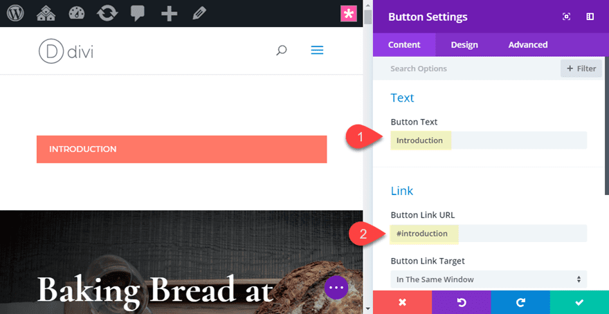
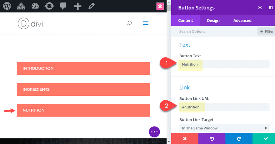
Change the button text to read “Introduction”. And then add the following for the button link url:
#introduction
This is how you create an anchor link. The hashtag (#) tells the browser you are going to be linking to a CSS ID. The following text “introduction” will correspond to the name of the CSS ID which we will add to one of our sections in the layout. The name of the CSS ID can be anything you want. Just make sure it matches the CSS ID you give the section later on.
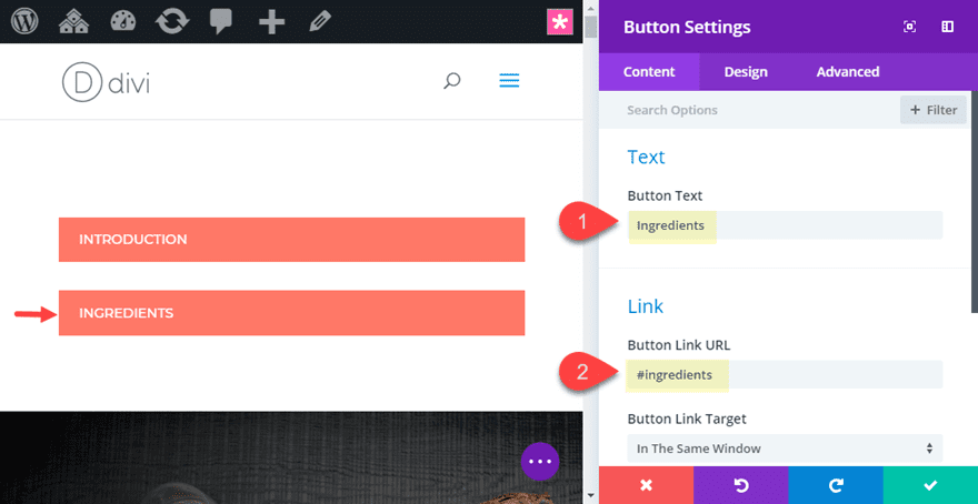
Duplicate the button and then repeat the process of givin the button a new Button Text and a new Button Link URL. Since this will be an anchor link that jumps to a different section of the page, make sure the CSS ID (the text after the “#”) in unique and corresponds to the name you will give your section later on.
For this button, change the button text to “Ingredients” and the button link URL to “#ingredients”.
Duplicate the button again and then give the new button the button text “Nutrition” and change the button link URL to “#nutrition”.
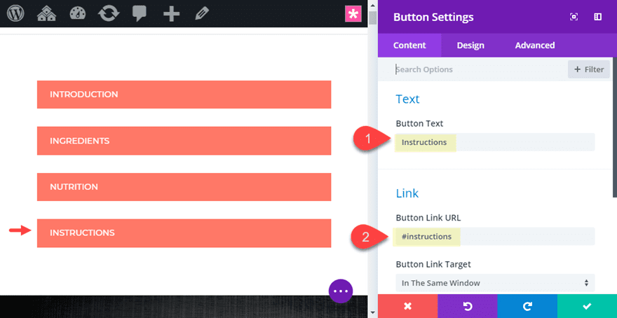
Duplicate the button one more time and then give the new button the button text “Instructions” and change the button link URL to “#instructions”.
That’s all we need to do for now. We will circle back to this section turn it into a fixed sidebar in a bit.
Adding the CSS IDs to the Sections and Rows
Now that we have all of our button created with the anchor links in place, we are ready to add the corresponding CSS ID names to our sections and rows.
Anchor links will automatically jump to any element on the page with the corresponding CSS ID. A CSS ID can be applied to inline text, modules, rows, or sections. If you wanted to add a CSS ID to heading using HTML, it would look something like this:
<h2 id="introduction">Introduction</h2>
However, since we want to jump to a section of the page, we can add the CSS ID to the specific section of the page. This will provide the user with enough comfortable viewing space so the visitor can easily recognize where they are on the page. Jumping to inline text or to a module may cause confusion for the visitor.
As we covered earlier each of the button urls we created are meant to correspond to the CSS IDs of the sections they need to jump to.
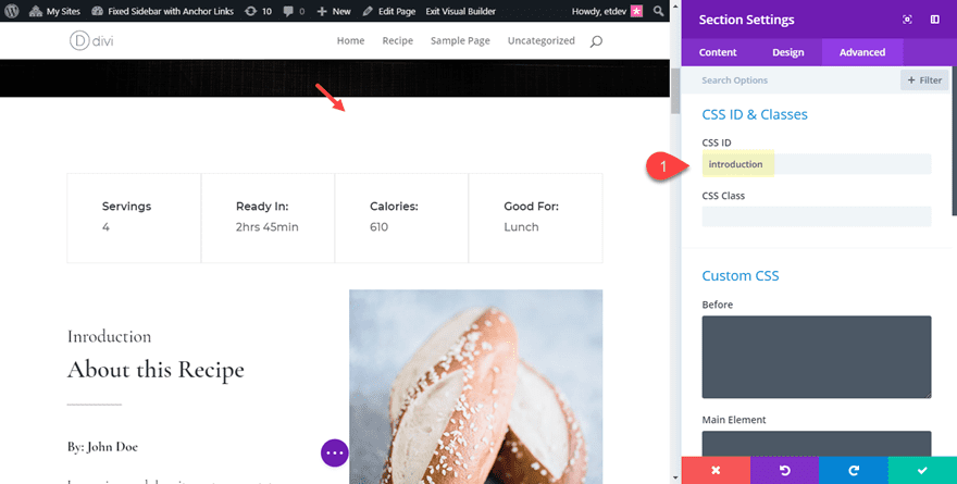
For the “Introduction” button, we need to add the CSS ID to the section of the page containing the introduction content. To do this, open the section settings of the third section of the page (the section directly under the header) and add the following CSS ID under the advanced tab:
CSS ID: introduction
This will correspond to the Introduction anchor link button we created earlier.
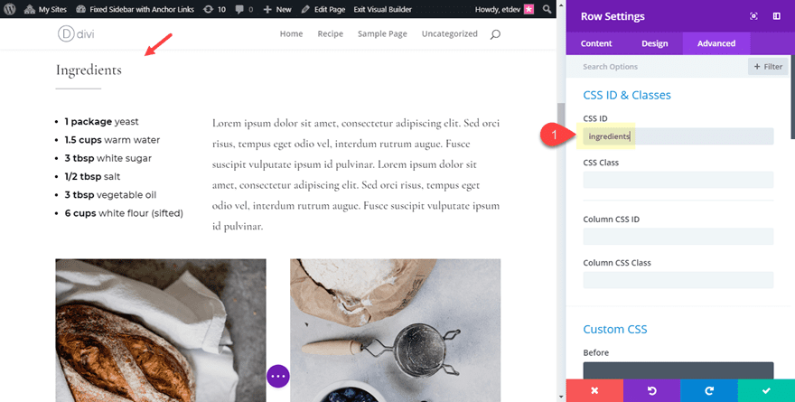
Now in the same section, find the row containing the heading “Ingredients”. Then open the row settings and add the following CSS ID:
CSS ID: ingredients
This will correspond to the Ingredients anchor link button we created earlier.
Scroll down to the next section with the heading “Nutrition” and open the section settings. Then add the following CSS ID:
CSS ID: nutrition
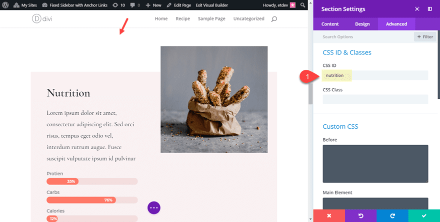
This will correspond to the Nutrition anchor link button we created earlier.
Finally, scroll down to the next section of the layout with the title “Step by Step Instructions”. Then open the section settings and add the following CSS ID under the advanced tab:
CSS ID: instructions
This will correspond to the Instructions anchor link button we created earlier.
Save you changes.
Now is a good time to see if your anchor links are working. Open the page in a new tab and click on the buttons in the top section to make sure they jump/scroll to their corresponding locations on the page.
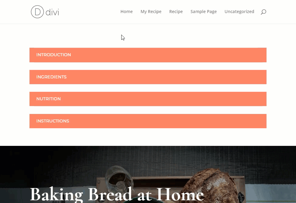
If they aren’t working, make sure to go back and check the CSS IDs are correct and that they match.
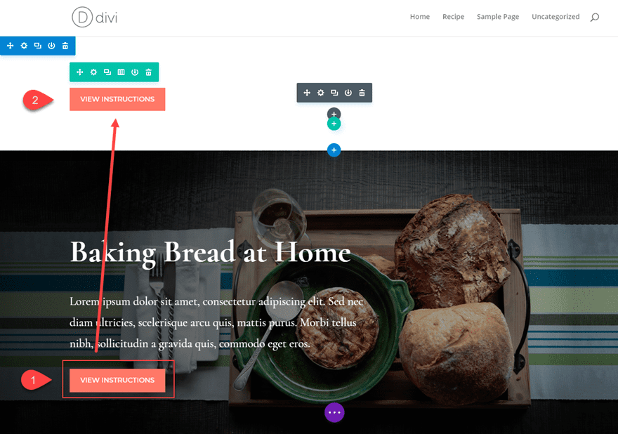
Having anchor links at the top of the page is fine for things like a table of contents. But for this use case, we want to keep those anchor links visible to the user at all times so the user doesn’t have to scroll back to the top of the page after clicking one of the links. A fixed sidebar will solve this problem since it will stay fixed on the side of the page as the user clicks the anchor links.
But before we position the sidebar, we need to create some space for it on the left side of our page. To do this we will add a left margin to each section of the layout.
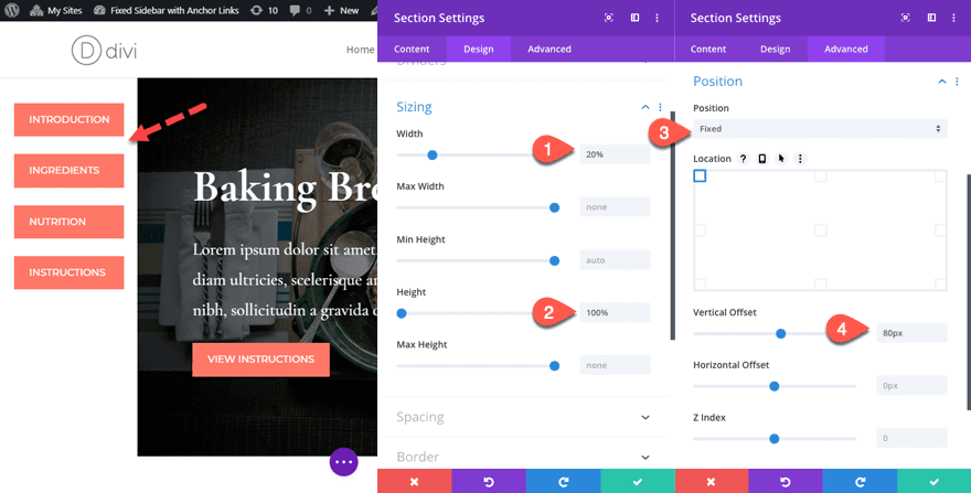
The amount of left margin we add to each section will be equal to the width of the sidebar so now is the time to decide just how wide you want the sidebar to be. For this example, a 20% width will do.
Open the settings of the second section (the one directly under our anchor link buttons) and add the following custom margin:
Custom Margin: 20% left
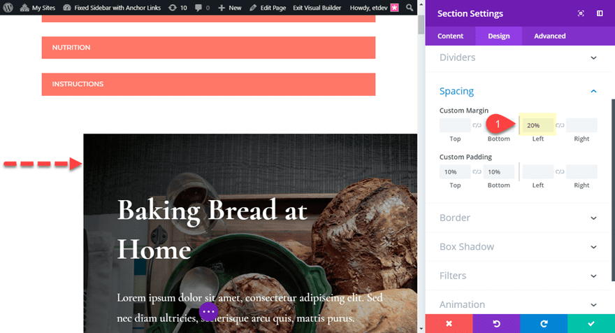
Now before you save the settings, right click on the Custom Margin option and click “Copy Custom Margin” and the save the settings.
On each of the remaining sections throughout your page layout, paste the custom margin to the section by right clicking on the section and clicking “Paste Custom Margin”.
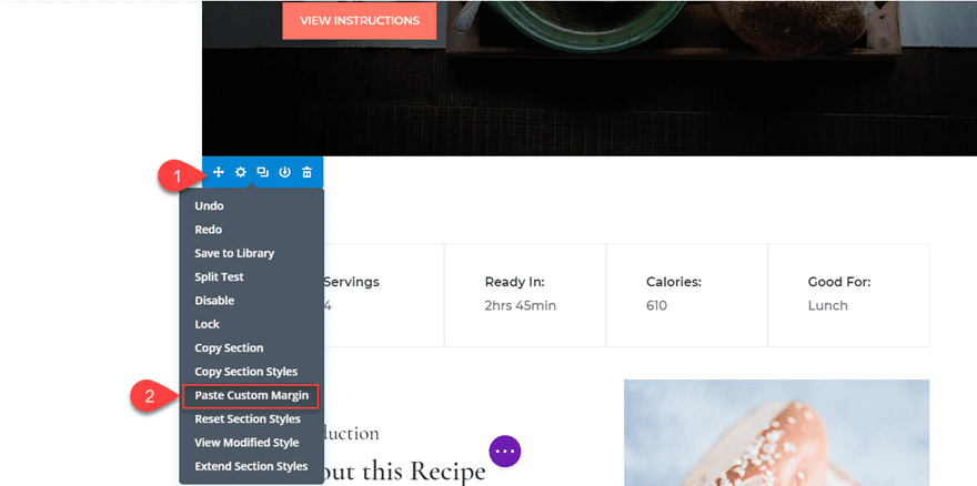
This will give a 20% left margin to all of your sections except the very top section containing the anchor link buttons.
To create the sidebar, we will need to give it a fixed position on the left of the page. So basically, we will turn the top section into a fixed sidebar. To do this open the settings of the top section and update the following:
Under the Design tab, update the height and width…
Width: 20%
Height: 100%
Under the Advanced tab, update the position…
Position: fixed
Vertical Offset: 80px
This gives the section a fixed position with a width of 20% of the page. It also positions the section to the left of the page and 80px from the top of the page to accommodate the height of the header navigation. The 100% height makes sure the section spans the full height of the page.
Now view the page in another browser tab to see the functionality. As you scroll down the page, the sidebar stays fixed and you can click the anchor link buttons to navigate to the different sections with ease.
You may have noticed that the section is overlapping the bottom footer bar at the bottom of the page.
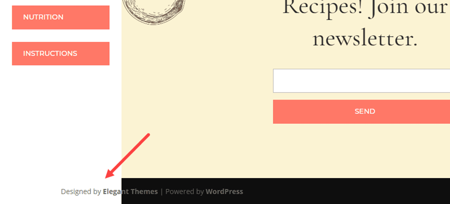
There are a few ways to address this problem. For example, I could take out “height: 100%” from the section or you could add some CSS to the page settings to adjust the width of the footer bar. But if you want to keep the section height at 100%, an easy fix is to take out the section background color. Open the section settings of the section we are using for the sidebar and add the following background color:
Background Color: rgba(255,255,255,0)
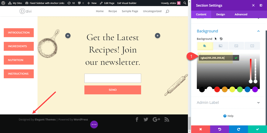
If you want to change the color of the sidebar, you can open the page settings and change the Content Area Background Color.
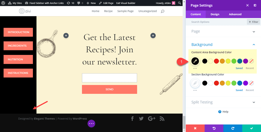
Since the section background color is transparent, the content area background color for your page shines through. And since all of our other sections have background color, it will only show through the sidebar section without overlapping the bottom footer bar.
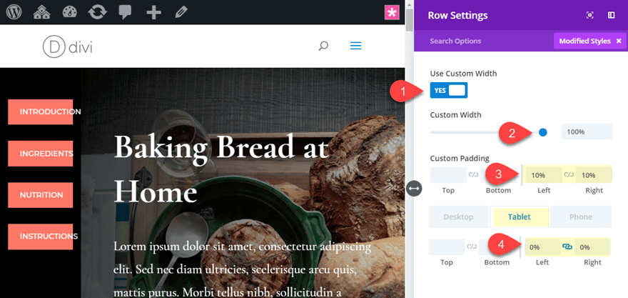
Making Adjustments for Mobile
This design really doesn’t make sense for smartphones because there is no room for a sidebar and having the links at the top of the page will require the user to scroll back up each time they want to click an anchor link. But the design will still work for tablet, but you may need to create some more room for those anchor links. To do this, open the row settings for the row of the section sidebar and update the following:
Custom Width: 100
Custom Padding (desktop): 10% left, 10% right
Custom Padding (tablet): 0% left, 0% right
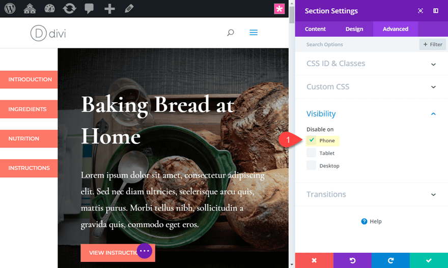
Now all we have to do is hide (or disable) the section on smartphone. To do that, open the section settings and go over to the advanced tab and click the check box to disable on smartphone.
That’s it. You now have a responsive fixed sidebar menu with smooth scrolling anchor links!
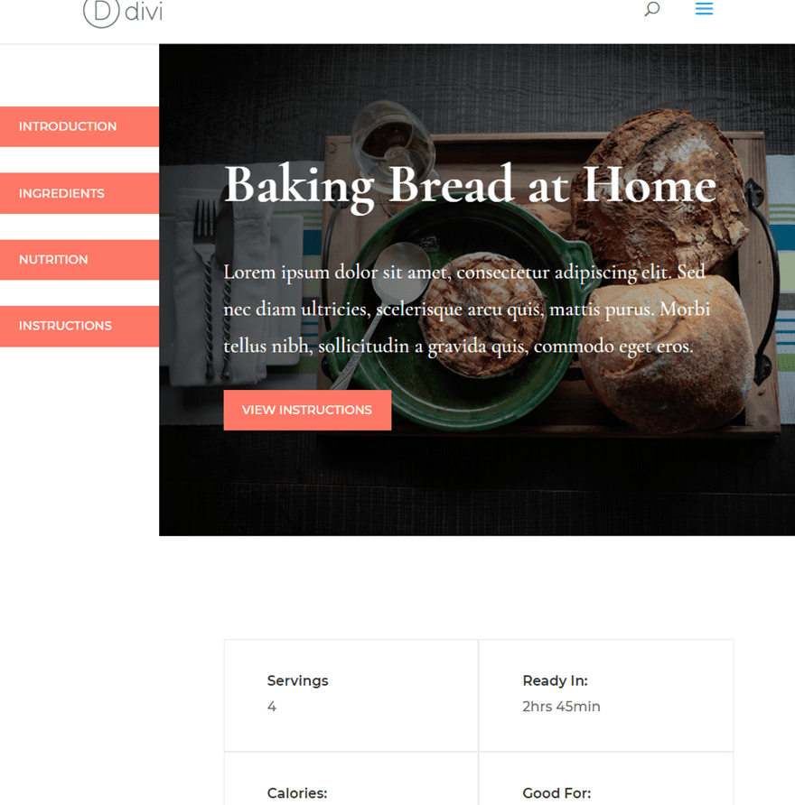
The Final Result
Now let’s check the final result.
And here is what the layout looks like on tablet.
Learn More About Fixed Elements and Anchor Links
If you found this tutorial helpful, check out some of our related tutorials below:
- 5 Cool Things You Can Do In Divi with Anchor Links
- How to Make Any Divi Page Element Sticky
- How to Add Fixed Widgets to Your Sidebar in WordPress
- How to Make Your Divi Navigation Start at the Bottom, Then Stay Fixed at Top When Scrolling
- How to Make Your Divi Footer Fixed
- How to Create a Floating Pop-out Menu in Divi
Final Thoughts
The beauty of this setup is you can easily add fixed sidebars to any page with different anchor links (or anything you want). Since your sidebar is basically a Divi section, you can customize it using the built-in settings, add more rows and use any combination of modules you want.
This setup would be great for membership courses, tutorials, FAQ’s, portfolios, or long blog posts. You can even use it for one page websites as well. Do you have other uses to share? I’m interested to hear what they are in the comments.
Cheers!


Hi Jason,
I’m using this fixed sidebar solution where I have 4 accordions with long lists of items. The fixed sidebar can be scrolled up and down to view each of the 4 accordions and their long list of items. Currently the list sticks to the first accordion list item on top which is great but on some pages where I reuse the fixed sidebar, I’d like to have the sidebar stick to the 2nd or 3rd accordion item so the scroll view is about 1/2 down or 3/4 way down. Is there an easy way to do this?
Thanks!
I’m trying to modify where the menu bar will start and stop on my page as it currently only shows up at the bottom with the boiler plate code.
I need to have it stop at the first module and end by the footer.
My width: 20% is rejected (410px over on my format) and the error message sasys “Expected end of value found “top”
top: 80px; expetced RBRACE
What does it all mean and how can I modify?
In the tutorial, the page scrolls down smoothly when you click on the links, passing through any previous sections. Is there a code for that as well? Because mine is going straight to the linked section but without this nice transition.
Damn this is so effective and neat, yet so easy! Thanks a bunch! 😀
Is there any way to do this using toggles containing navigation/anchor links?
Yes! You definitely can. The fixed sidebar is actually a divi section so you can add any module or combination of modules you want in there.
Nicely done – I like it. thanks for taking the time to share…
Hi!
I read your posts regularly to enhance my skills , keep posting more articles from your end
As always…great articles 😉
Thanks, it has lots of potential. Much appreciated.
Very helpful article and documentation. Is it possible to make the sidebar fixed on the tablet view also? Because the sidebar is not moving on the tablet view
This is my twentieth stimulus:
Why don’t you link your great tips so that you can see the result live and don’t have to imagine the result with your little Micky Mouse pictures.
Is there finally an answer to that?
because this unspeakable arrogance is really annoying now.
THX – Eric
Now here’s the perfect solution for those manual pages I’ll have to add to my website. Thanks a lot, Jason!
I think we missed something. What does it look like on a cell phone?
Thanks, nice tutorial.
I wish the Divi ‘Dot Navigation’ would have an option to show navigation labels and be available for pages.
I’m not sure this is what you are referring to, a previous tutorial:
https://www.elegantthemes.com/blog/divi-resources/how-to-add-labeled-dot-navigation-to-elegant-themes-free-10th-anniversary-timeline-layout
Yes that. But then of course without the need for custom css.
Do you have any code to make the scrolling stop once you reach the footer? That would be great.
Phil,
Sorry, I haven’t looked into that solution. But I’m sure you can find some jquery that would do that for you. Also, you could combine this technique with a sticky plugin to gain more control. https://www.elegantthemes.com/blog/divi-resources/how-to-make-any-divi-page-element-sticky
I’ve been messing around but can’t figure it out.
I really like this. Is there an easy way to get the sidebar to stop at the footer? Even if I put the color as #000000, the fixed sidebar overrides the footer’s content:
https://screencast.com/t/h1M1WjIAYc
I did some Googling but thought that I’d ask here as well.
Well done, Jason! Thank you, man! Very nice tutorial!
This is both a practical and stylish way to provide navigation on longer articles. Thanks Jason!!
Glad you liked it, Mark!
Jason, again, my friend, you ALWAYS rock when it comes to fresh, different design techniques. Thank you and Happy New Year!!
Awesome to here, Ken. Happy New Year my friend!