
Adding a floating pop-out Menu to your website will make it easy for visitors to access your menu at anytime throughout your page. This is great for sub navigation menus that compliment your primary navigation at the top of your page. It also allows you to display menus specific to your page content. For example, you may want to have a custom sub navigation menu for your services page that provides links to all of your different services.
In this tutorial, I’m going to show you how to create a floating pop-out menu in Divi. The basic idea is to take advantage of Divi’s accordion module for the menu functionality and then add advanced customization to a row to float it to the left of the page and have it pop-out when hovering over a portion of the row.
Let’s get started!
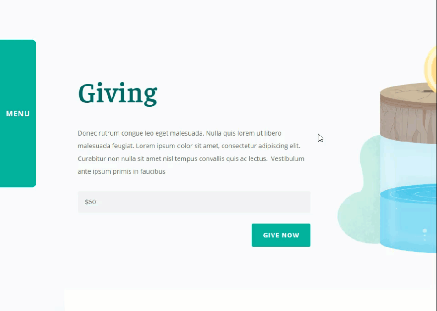
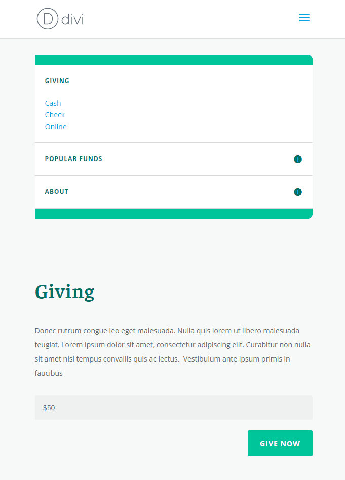
Sneak Peek
Here is a quick sneak peek of the design and functionality we will be building in this tutorial:
What you will need
For this tutorial, you will need the following:
- The Divi Theme
- The Charity Donate Page Layout from the Charity Layout Pack (available for free within the Divi Builder)
Adding the Page Layout
For this tutorial, I’m going to use the Charity Donate Page Layout from the Charity Layout Pack. To add the premade layout to your page, first create a new page and give your page a title. Then deploy the visual builder. Select the option “Choose a Premade Layout”. From the load from library popup, select the Charity Layout Pack and the click to use the Donate page.
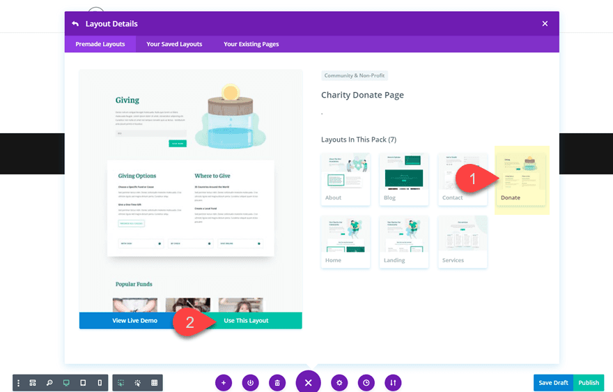
Once the layout has been added to the page, you are ready to start!
To start, we need to add a new section to the top of your page. Then add a row with a three-fourths one-fourth column layout.
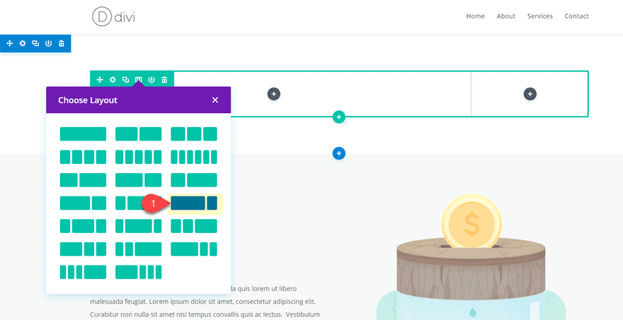
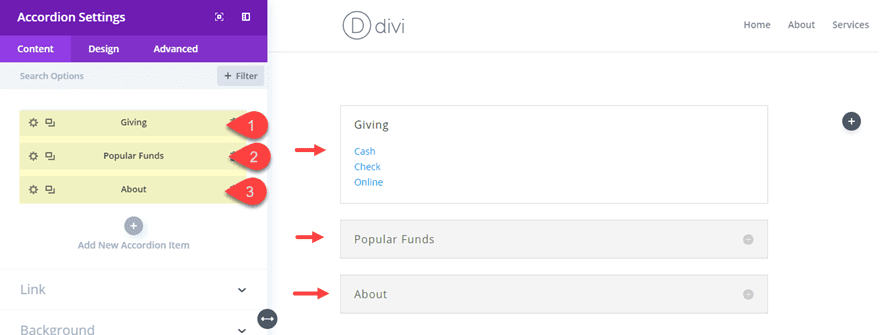
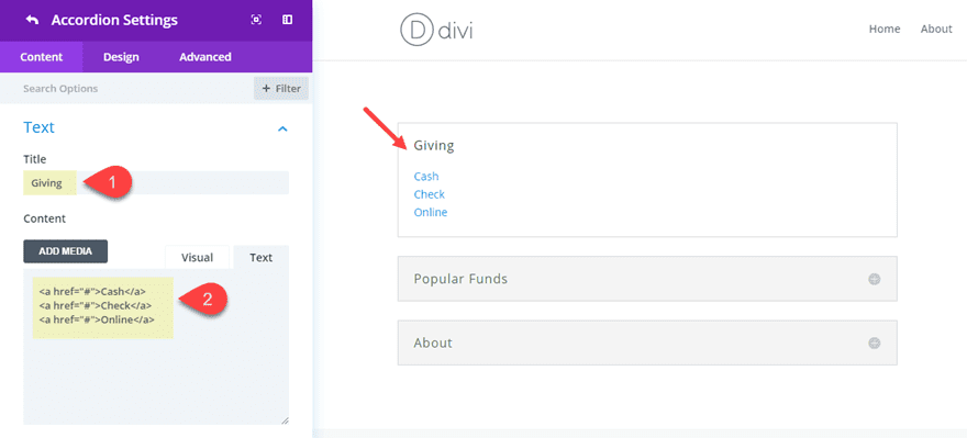
In the left column, add a new accordion module. Update (or create) a total of three accordions. For the content of each accordion, add a Title (this will serve as a category menu item for your sub navigation menu. And in the content box, create a few links (each on a separate line) to serve as your sub menu items.
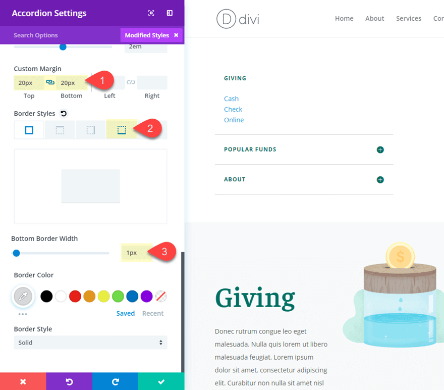
Give each of your individual accordions a custom margin:
Custom margin: 0px top, 0px bottom
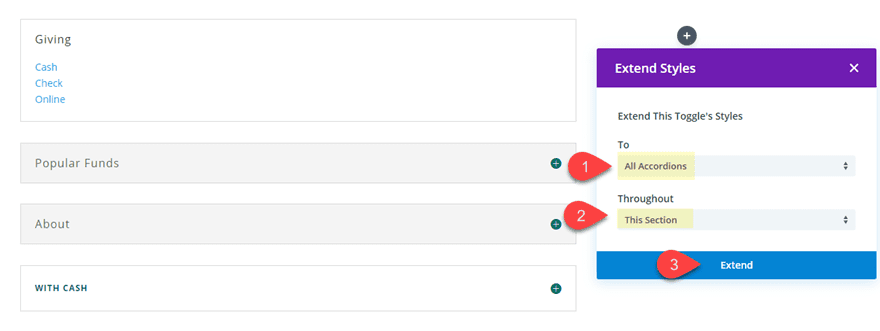
To have the accordion match the design of the layout, copy one of the toggle modules being used on the page and paste it inside the row with your accordion (the placement doesn’t matter, we are only holding it here temporarily). Now we are going to use Divi’s extend styles feature to extend the styles of the toggle to our new accordion. To do this, open the toggle settings and right click on the icon category heading and select “extend icon styles” from the list.
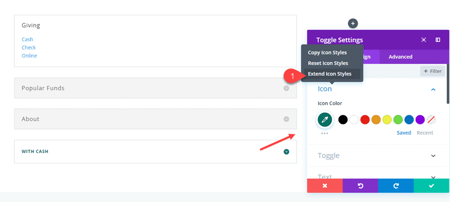
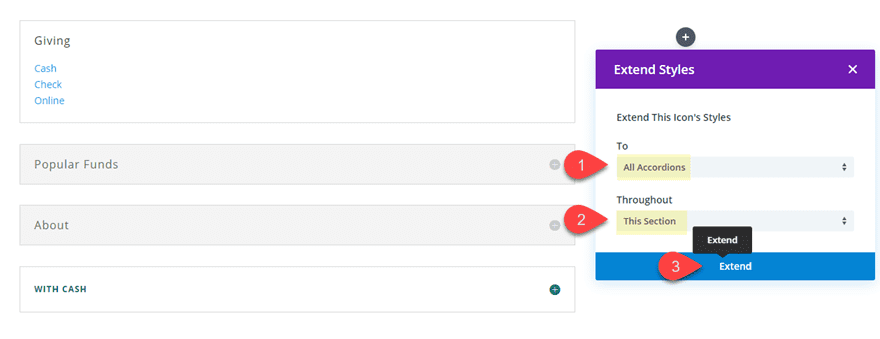
Then select to extend the icon styles to all accordions in the section.
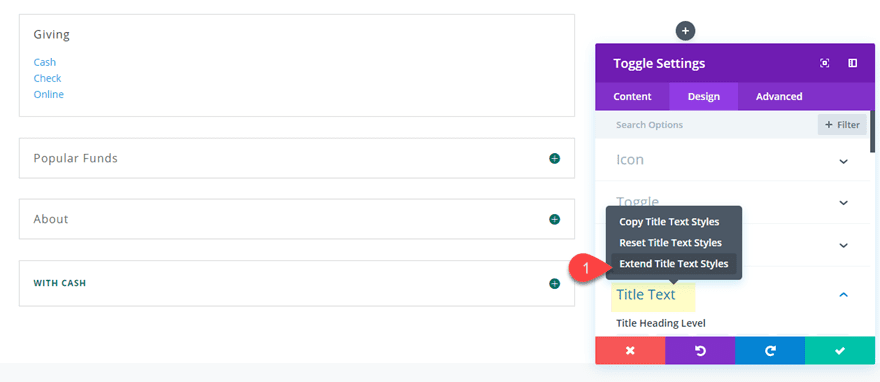
Next, right click on the toggle styles and select “extend toggle styles” from the list.
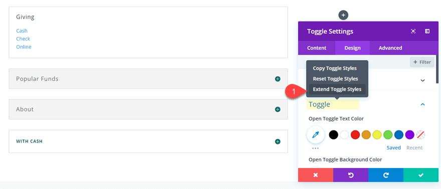
Then choose to extend the toggle styles to all accordion modules in the section.
Next, right click on the Title Text and select “extend Title Text Styles” from the list.
Then choose to extend the Title Text styles to all accordion modules in the section.
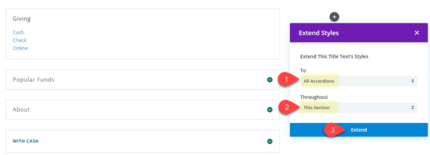
Now that you have the styles extended, you can delete the toggle module.
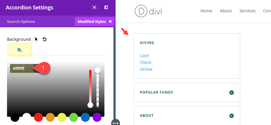
Now go to your Accordion Module and give it a white background.
And wrap up the accordion design with the following:
Custom margin: 20px top, 20px bottom
Bottom Border width: 1px (set all other border widths to 0px)
Now your accordion module is all set!
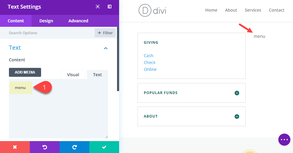
In the right column, add a text module with the word “menu” as the content. This entire column with the text will serve as our label that will stick out of the side of the page so that when you hover over the label, the rest of the row (with the accordion) will appear.
Then update the text design settings as follows:
Text Font Weight: Bold
Text Font Style: TT
Text text Color: #ffffff
Text Text Size: 16px
Text Letter Spacing: 1px
Text Orientation: center
Disable on: Phone, Tablet
You won’t be able to see the text at this point because we haven’t added the color background to our row. Also, notice that we disabled the module on phone and tablet. This is because we are going to disable the hover functionality of the menu on mobile so there will be no need for the menu label.
Styling the Row and Extending it on Hover
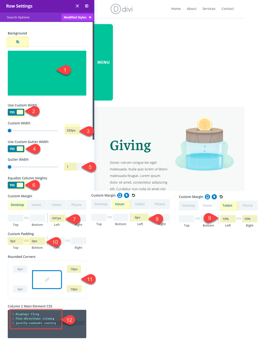
Now it’s time to start styling our row. Open the row settings and update the following:
Background Color: #26c699
Custom Width: 320px
Gutter Width: 1
Equalize Column Heights:YES
Custom Margin (desktop): -241px left
Custom Margin (hover): 0px left
Custom Margin (tablet): 10% left, 10% right
The custom margin is the key to the functionality of the hover effect. By setting the left margin to -241px on desktop, on the right column with the text menu is visible. On hover, the left margin reverts to 0px to expose the left column of the row with the menu accordion.
Custom Padding: 0px top, 0px bottom
Rounded Corners: 10px top right, 10px bottom right
Instead of using custom padding to vertically center the menu text, we can use a few snippets of custom css to vertically center the contents of column 2. Under the advanced tab, add the following CSS under Column 2 Main Element:
display: flex;
flex-direction: column;
justify-content: center;
For more info on this concept, check out how to vertically align content in Divi.
Updating the Section
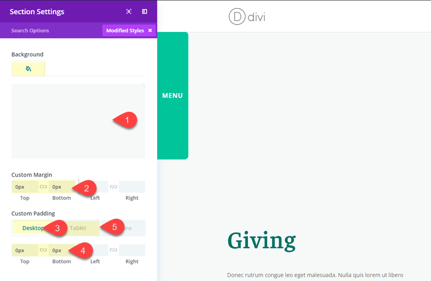
The section will be hidden on desktop since we will eventually give our row a fixed position. However, we will need to customize our section for mobile with a matching background color on some proper spacing:
Background Color: #f7f9f9
Custom Margin: 0px top, 0px bottom
Custom Padding (desktop): 0px top, 0px bottom
Custom Padding (tablet): 5% top, 5% bottom
Positioning the Row with Custom CSS
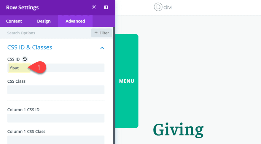
Currently the section with your pop-out menu remains in a section at the top of your page. To float the menu so that it stays fixed at a certain position on the page at all times as you scroll, you will first need to give your row a custom CSS ID. To do that, open the row settings and add the following under the Advanced tab:
CSS ID: float
After that, open the your page settings using the visual builder settings menu at the bottom of the page. Then add the following custom CSS in your page settings:
@media (min-width: 981px){
  #float {
    position: fixed;
    top: 200px;
    left: 0px;
    z-index: 99998;
  }
}
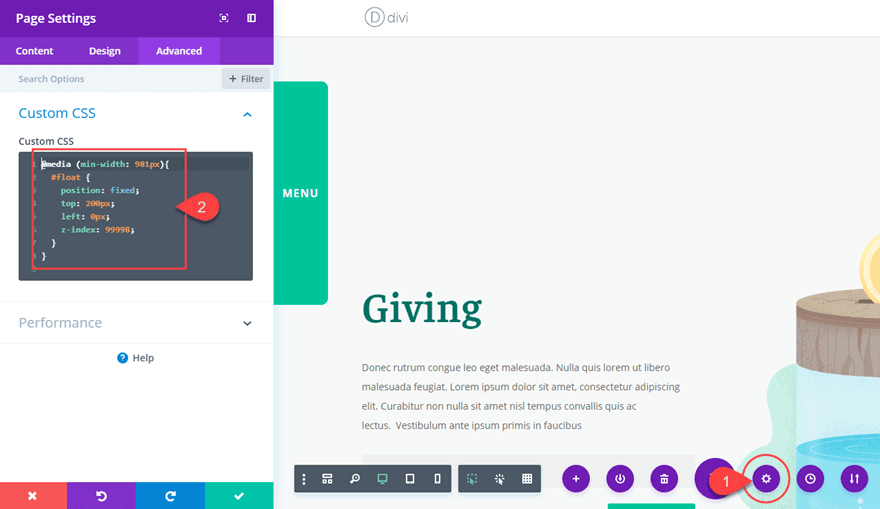
Now your pop-out menu will stay fixed on desktop but will revert to a default style on mobile.
Check out the final result.
And here it is on mobile.
Final thoughts
We are all looking for different ways to keep our menus (and submenus) readily available for our visitors. I hope this tutorial will give you a valuable option for creating a submenu that is fixed (so it stays visible) and pops out on hover (so that it saves space on your page until the user needs it). Of course, this design isn’t limited to menus. You can choose any module to display countless variations of content in a pop-out row. Check out #5 on this post for another example. I look forward to hearing about your own ideas in the comments below.
Cheers!


This functionality is almost what I want. Is it possible to have the accordian open when you hover over a CTA button? That would be exactly what I am trying to create. Thanks.
Thanks for the tutorial ! I have a question, when I get to the bottom of a page with a floating menu, sometimes the menu goes behind the footer and sometimes it doesn’t. I haven’t found what the problem was, any idea what might cause this issue ?
It’s so amazing and creative!
I really appreciate your efforts.
However I followed the instruction above step by step. Unfortunately CSS for floating does not work. My menu is up and gone as I scroll down.
I deactivated all plugins but it does not help.
Could you guess where the problem is?
https://tse.goood000.com/floating-pop-out-menu/
Thanks.
Why does this not work on other pages? I don’t want to use the Charity layout… I have everything replicated on my site but obviously, something is missing because it is not working!!!
Is it possible to make the Menu title vertical instead of horizontal?
You can put this in the css of the main element of the text module, and then put a margin on the left (30% for me is good).
writing-mode: vertical-lr;
text-orientation: upright;
Is there a way for me to extend the CSS code to all Posts without having to add it in to each individual page?
Hi Jason, really nice tutorial for a really nice behavior!
One question with a preamble: I need to create a layout with Full Screen Slider that fills any screen on any device and I’ll follow one of your previous tutorial (https://www.elegantthemes.com/blog/divi-resources/how-to-create-a-full-screen-slider-with-divi).
For this new home page layout I don’t want to use a classic menu but it would be a really elegant solution to use this floating Pop-out Menu.
The question is: does those steps described in this tutorial fits also on my Full Screen Slider section? Can I start adding a new section to the top of my page and then follow all the others steps? At the moment I didn’t import any pre-made layout because unfortunately I didn’t find something similar in ET library.
Thanks a lot for help!
Hi, the CSS code
display: flex;
flex-direction: column;
justify-content: center;
doesn’t work on my testsite. The “MENU” Text is still top left not center-center.
I have placed it like described in the video tutorial in “Column 2 Main Element CSS”, but nothing happens.
The CSS for floating works!
Great Tutorial !
Love it!!! Thanks for sharing!!
Good tutorial, but how to make so that the Title of the accordion point is a hyperlink to a separate page?
For that you could just use a text module instead of accordion module and add and style your hyperlinks in the text.
Thank you Jason, Thank you Mak, fantastic Tutorial Jason, and Awesome Video Mak, It is much easier to understand Tut’s when there is a video with it.
Loved the concept, loved the tutorial, and I didn’t know that Hover options were available before this tutorial. I must have missed an announcement!
🙂
Hello,
Very good tutorial, it is true that more and more site uses a second specific menu for some pages.
Really useful, thank you
Exactly! Thanks Bruno.
This looks great! I am using the standard divi theme and I already have a page. If I use the charity donate page layout will that mess up my page that I have already made? If so, is there another way I can create this pop out menu?
Casey,
When you load a new layout to your existing page, just make sure you UNselect the option to replace existing content. That way the layout will be added to the bottom of your existing page content. Also, you can follow these same steps to add a popout box to any layout.
Would be nice as a new module. It would be great to have a section download that could be edited.
Thank you.
Good idea, Chris. I mean you really can put anything you want in that popout box since it is the row that pops out and not the module. You could even include multiple modules.
Very useful. Very logical. Nothing new that could be scary. Has potential for any site that wants visitors to get additional information on a topic, e.g real estate listing that offers contacts such as mortgage brokers, home inspectors, etc. Thanks.
I agree, Ron. Love the real estate example.
Nice, very creative 🙂
Thanks Canagon!