
The Divi Fullwidth Header module makes it easy to add beautiful hero sections to your website. The module comes with two buttons, a title text, subtitle text, body text, a logo, and an image, making the customization options endless.
In today’s post, we’re going to demonstrate how to re-create hero sections using the Divi Fullwidth Header. We’ll start our design by using 3 premade layout packs and design our sections with a focus on balancing the primary and secondary buttons. We want the primary button to stand out, as it’s our main call to action while keeping the secondary button visible and accessible without overtaking the primary button.
Subscribe To Our Youtube Channel
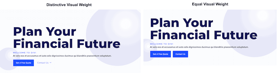
Primary buttons and secondary buttons help guide your website visitors towards certain actions. Primary buttons are typically the most common or desired action and secondary buttons are a less common action. This helps guide visitors to where they want to go.
To accomplish this, primary buttons should stand out visually and secondary buttons should not stand out as much. That means primary buttons should be more distinctive and have more visual weight so that it attracts more attention.
Now that we have an understanding of how primary and secondary buttons work, let’s get to the tutorial!
Design Preview
Here’s a look at the three fullwidth headers we will be designing today.
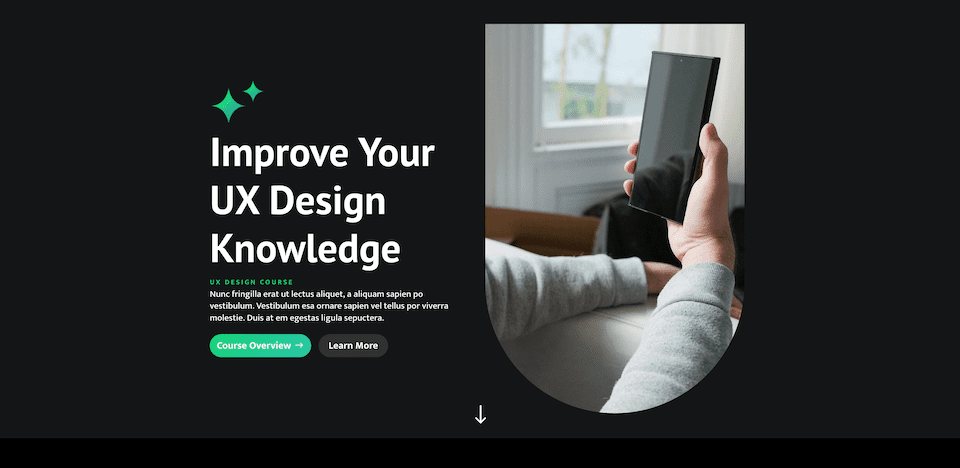
UX Fullwidth Header
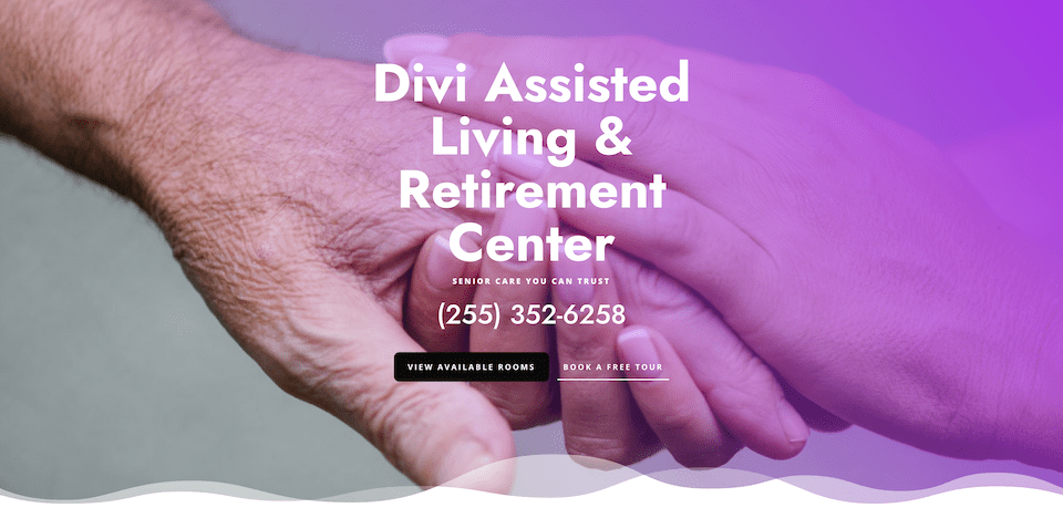
Divi Retirement Center Fullwidth Header
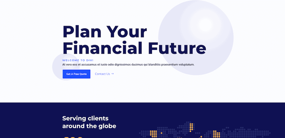
Financial Planning Fullwidth Header
Download the Layouts for FREE
To lay your hands on the designs from this tutorial, you will first need to download it using the button below. To gain access to the download you will need to subscribe to our newsletter by using the form below. As a new subscriber, you will receive even more Divi goodness and a free Divi Layout pack every Monday! If you’re already on the list, simply enter your email address below and click download. You will not be “resubscribed” or receive extra emails.

To import the header template to your Divi Library, do the following:
- Navigate to the Divi Theme Builder.
- Click the Import button at the top right of the page.
- In the portability popup, select the import tab
- Choose the download file from your computer (make sure to unzip the file first and use the JSON file).
- Then click the import button.
Once done, the section layout will be available in the Divi Builder.
Let’s get to the tutorial, shall we?
What You Need to Get Started
To get started, you will need to do the following:
- Install Divi on your WordPress website.
- Add a Page and give it a title.
- Enable the Visual Builder
Ux Fullwidth Header Design Steps
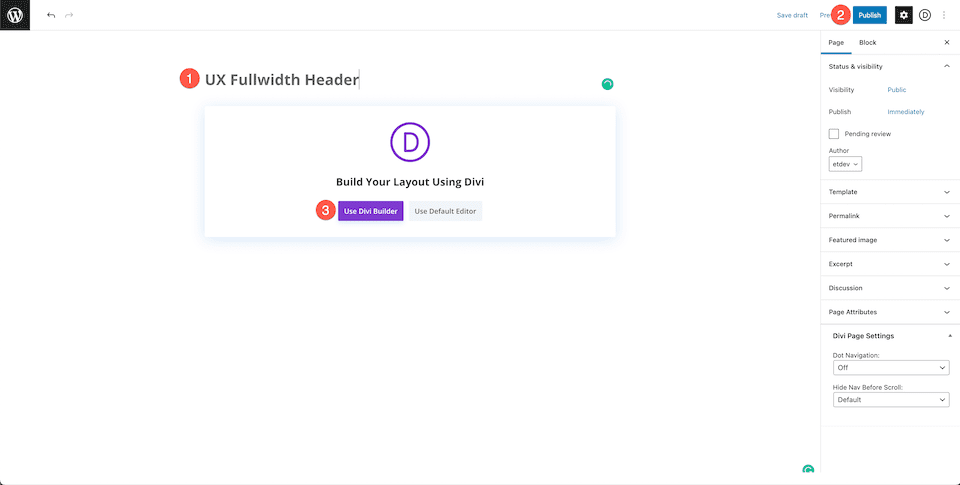
Now that we have our page set up, let’s start with the fullwidth header for a UX landing page.
Setting Up Our Page
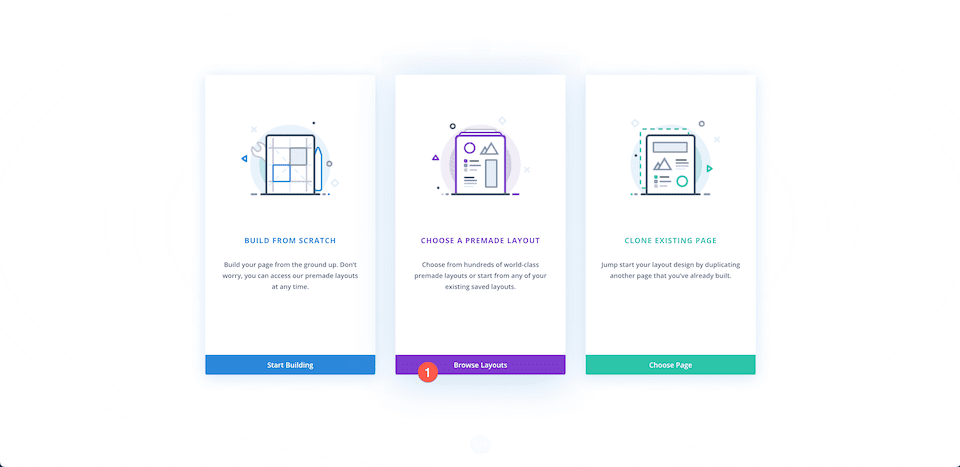
Before we can begin styling, we’ll need to load the free UX premade layout pack from the Divi Library. When you enable the Visual Builder you’ll see three options pop-up, select Choose A Premade Layout.
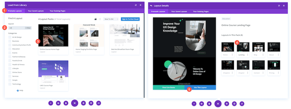
Load Layout Pack
To do load the UX layout pack onto your page:
- In the “Premade Layouts” tab use the search function to find the UX layout pack.
- Once you’ve found it click on it. This will bring up the layout details and pages available.
- Click on the landing page design, then click “Use This Layout”.
We’ll be recreating the top section of the layout as a fullwidth header module.
Delete First Section
Since we are going to recreate the first section using the Fullwidth Header module instead, we’ll need to delete this section. Hover over the section and click the trash icon.
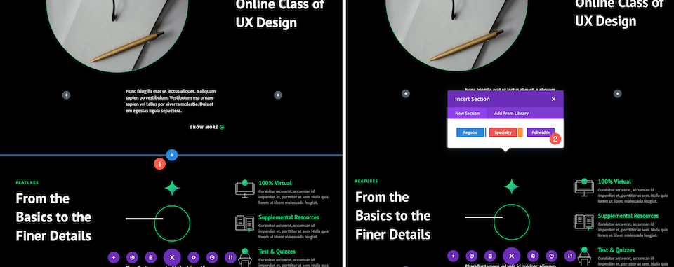
Add Fullwidth Section
Before we can add the fullwidth header, we need to add a fullwidth section.
Click the “+” arrow to bring up the Divi sections and then click “fullwidth”. This will automatically bring up the Divi Fullwidth Module library.
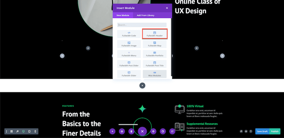
Add Fullwidth Header
Inside the Divi Fullwidth Module Library, click “Fullwidth Header”.
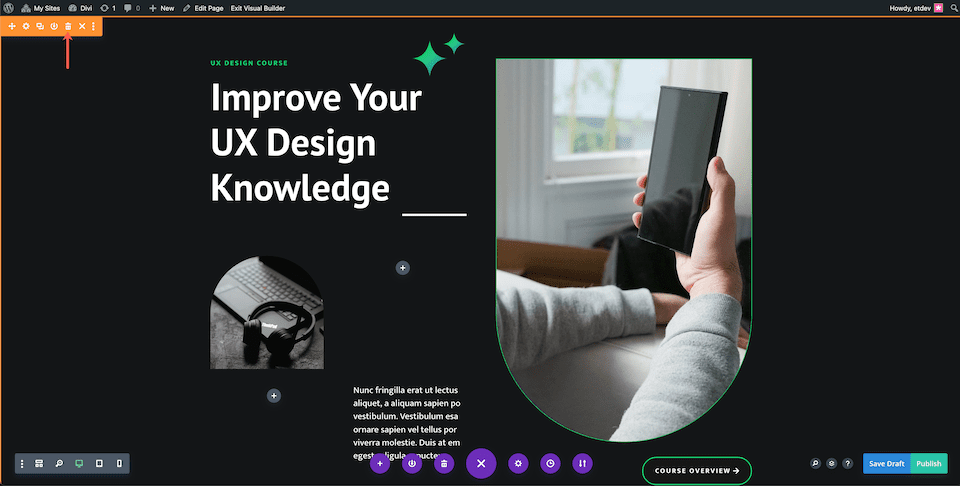
Adding Content
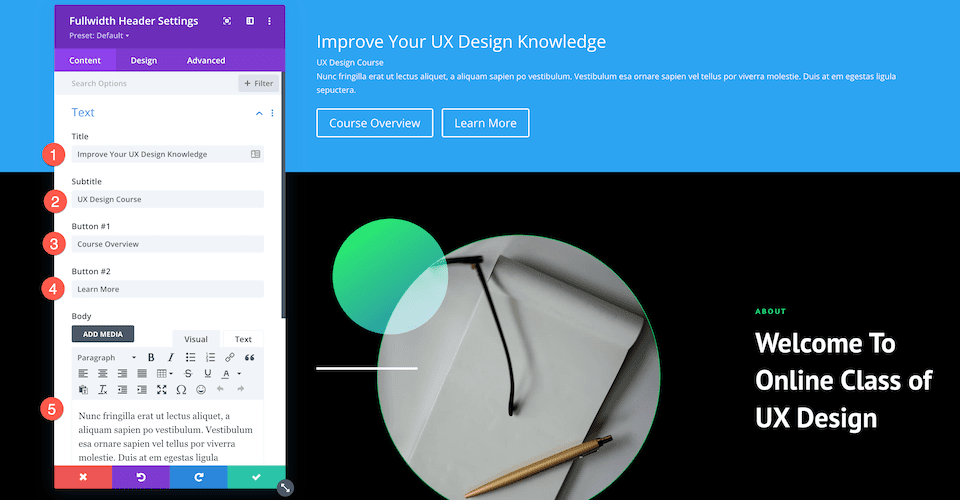
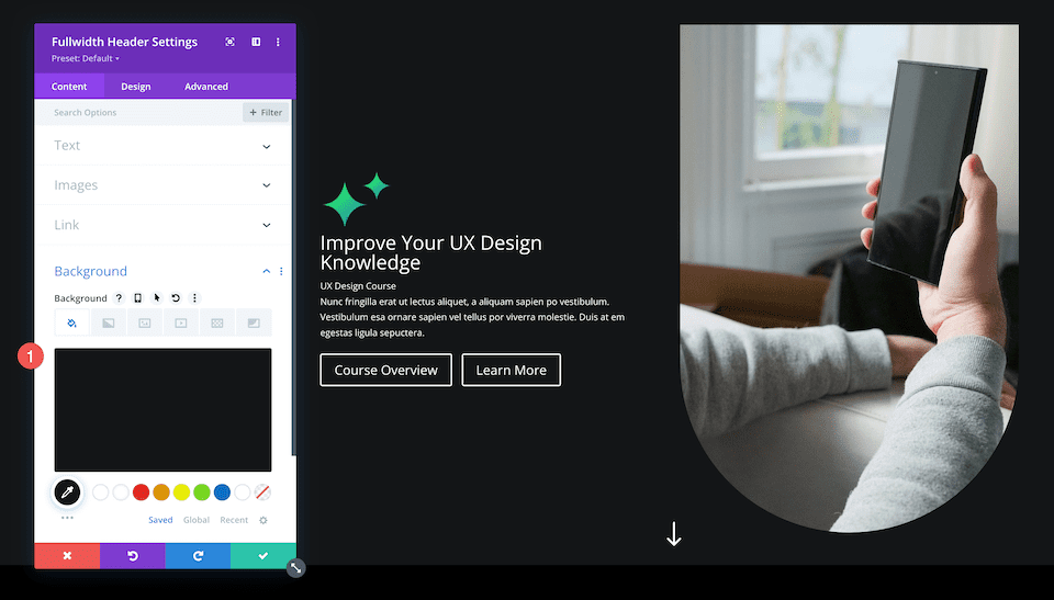
Before we begin styling the module, let’s add the content needed for this module.
Add Text Content
Underneath the Text tab, add the following content:
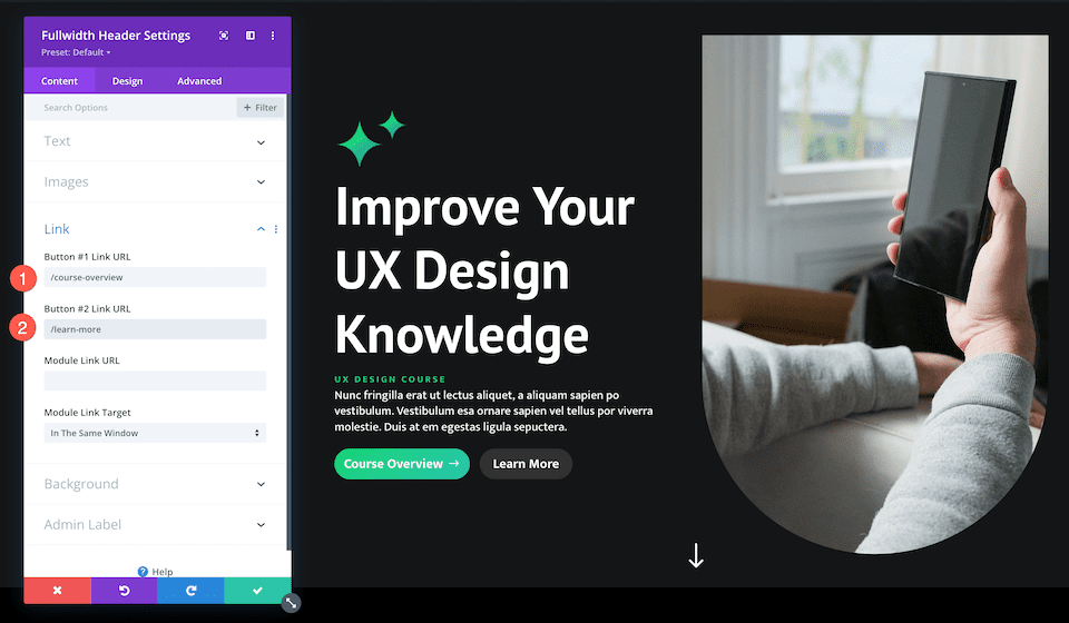
- Title: Improve Your UX Design Knowledge
- Subtitle: UX Design Course
- Button #1: Course Overview
- Button #2: Learn More
- Body: Placeholder text
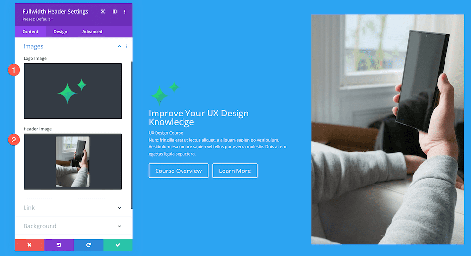
Add Images
Now that we have our text content in place, we need to add two images to our design.
- In the Images tab, add the logo image (the stars) and the header image (the photo of the person holding a phone).
Change Background Color
In the Background tab, configure this setting:
- Background Color: #131517
Styling The Fullwidth Header
Now that we have our content set up, let’s add some styling to it via the Design tab.
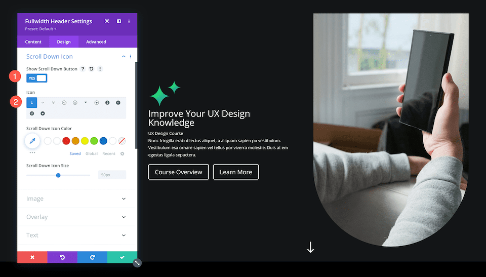
Scroll Down Icon
Let’s add the scroll down icon, the downward arrow.
- This design uses a scroll down icon, so toggle this option to yes.
- Select the downward arrow icon and then set the icon color to white.
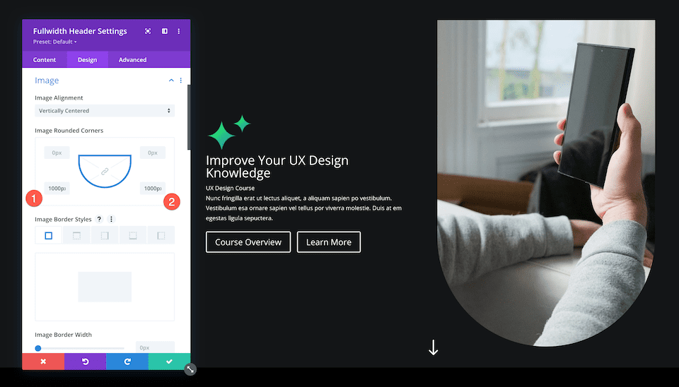
Image
Let’s add curves to our images by rounding the corners.
In the image tab, configure the following settings:
- Image Rounded Corners: Click the chainlink button to unlink the corners, then type 1000px in the bottom left and bottom right input boxes. This will round the bottom left and bottom right corners of our images.
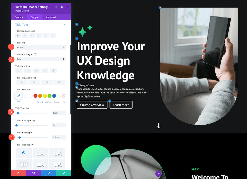
Title Text
Here let’s style the title text for this module. In the Title Text tab, configure these settings:
- Title font: PT Sans
- Title Font Weight: Bold
- Title Text Size: 5rem
- Title Line Height: 1.2em
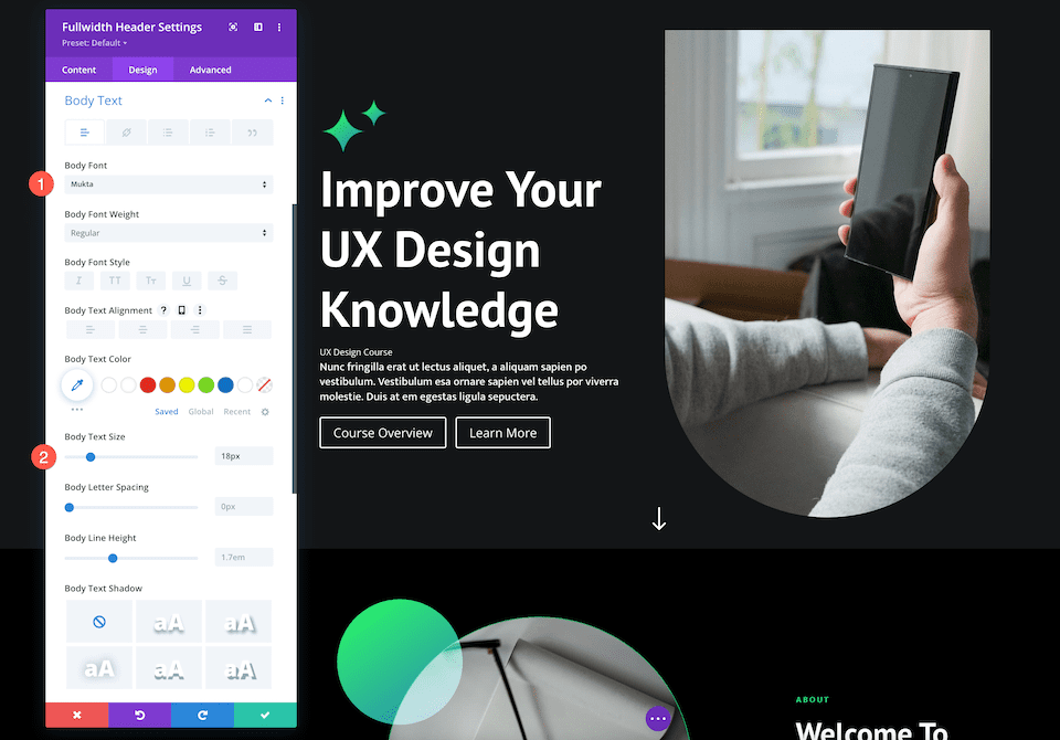
Body Text
This is where we style the body text of this module. In the Body Text tab, configure these settings:
- Body Font: Mukta
- Body Text Size: 18px
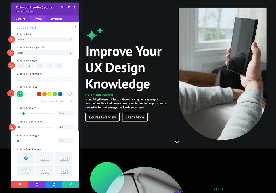
Subtitle Text
This is where we style the subtitle text for this module. In the Subtitle Text tab, configure these settings:
- Subtitle Font: Mukta
- Subtitle Font Weight: Bold
- Subtitle Font Style: Uppercase
- Subtitle Text Color: #13d678
- Subtitle Letter Spacing: 3px
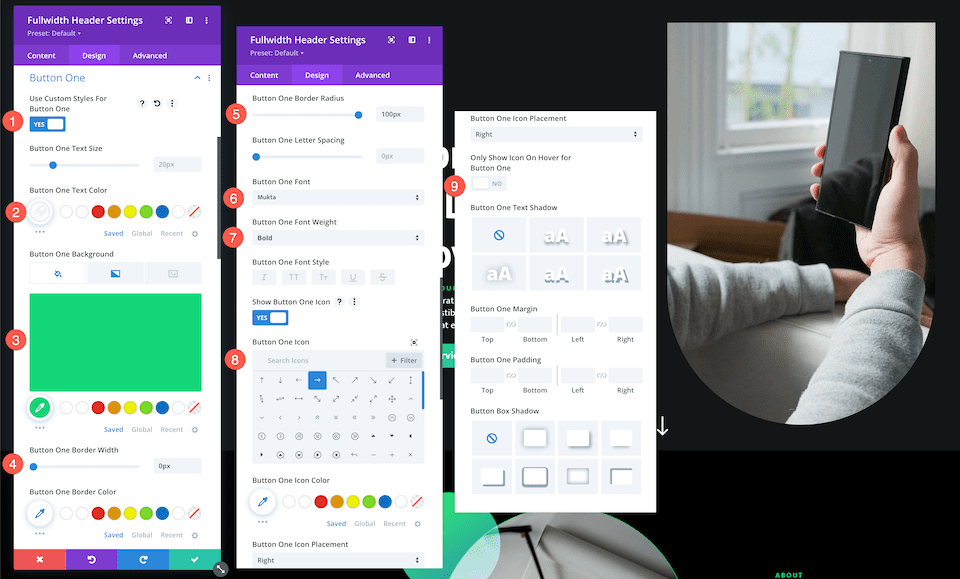
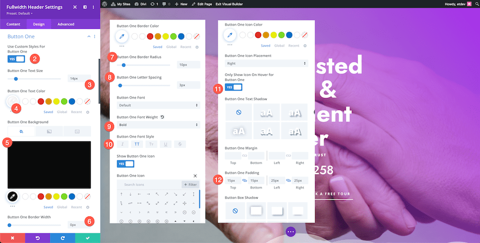
Button One
This is where we can set custom styles for button one, the primary button. In the Button One tab, configure these settings:
- Use Custom Styles For Button One: Yes
- Button One Color: #ffffff
- Button One Background: #13d678
- Button One Border Width: 0px
- Button One Border Radius: 100px
- Button One Font: Mukta
- Button One Font Weight: Bold
- Show Button One Icon: Yes
- Button One Icon: Right Arrow
- Only Show Icon On Hover For Button One: No
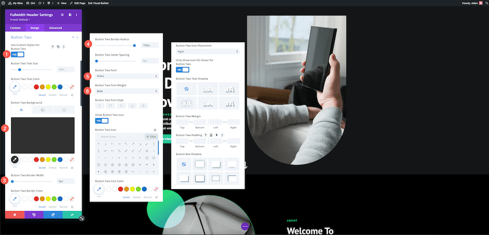
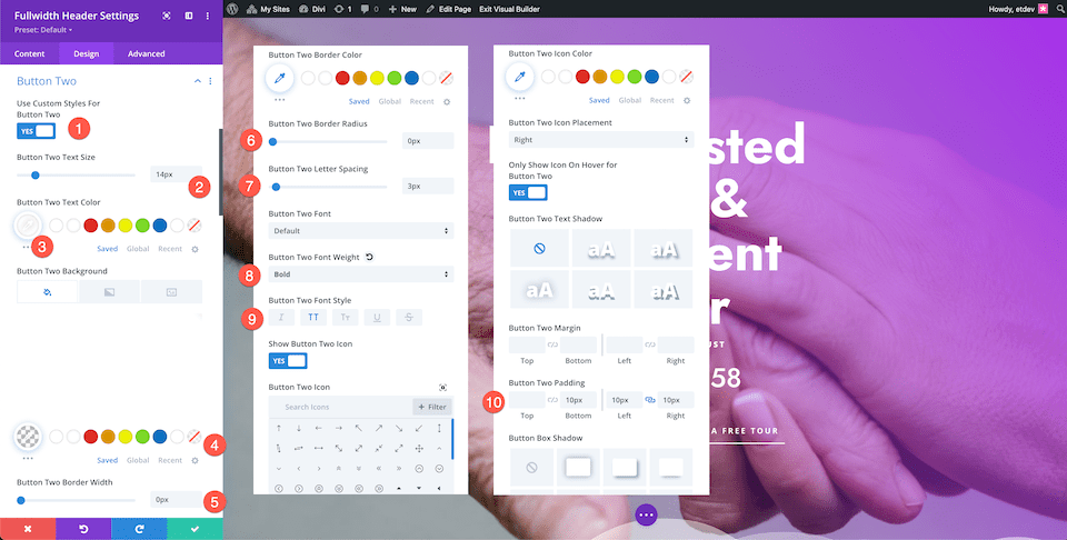
Button Two
Now let’s style the secondary button, the second button. In the Button Two tab, configure these settings:
- Use Custom Styles For Button One: Yes
- Button One Color: #ffffff
- Button One Background: #303030
- Button One Border Width: 0px
- Button One Border Radius: 100px
- Button One Font: Mukta
- Button One Font Weight: Bold
- Show Button One Icon: Yes
- Button One Icon: Right Arrow
- Only Show Icon On Hover For Button One: Yes
Don’t forget to add links to your buttons! In the Link tab, configure the following settings:
- Button #1 Link URL: Paste the URL for button one here.
- Button #2 Link URL: Paste the URL for button two here.
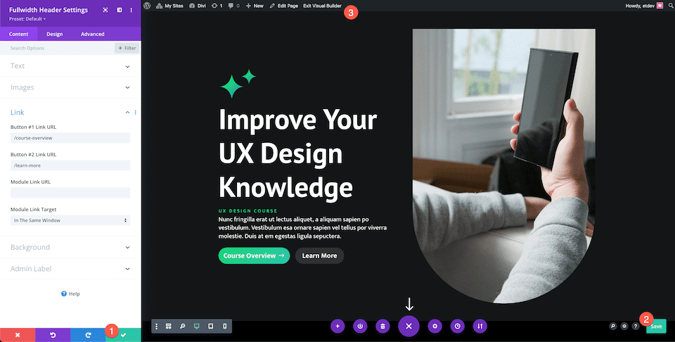
Save Your Design
Now that we have our fully designed Fullwidth Header, make sure to save your design!
- Click the green arrow at the bottom right of the module window.
- Then click the save icon on the Divi toolbar to save your page design.
- Exit the Visual Builder.
Have Fun Experimenting
The ways to style the Divi Fullwidth Header module are endless. Taking advantage of the primary button and secondary button can help direct your visitors to the page you want them to view or take the action (like submit an inquiry) you want them to take.
Let’s take a look at two other Fullwidth Header examples that have a primary button that stands out.
Divi Retirement Center Fullwidth Header
Button Styles
Let’s look at the unique styles for the primary and secondary buttons.
Button One
In the Button One Tab, configure the following settings:
- Use Custom Styles For Button One: Yes
- Button One Text Size: 14px
- Button One Color: #ffffff
- Button One Background: #0a0a0a
- Button One Border Width: 0px
- Button One Border Radius: 10px
- Button One Font Weight: Bold
Button Two
In the Button Two Tab, configure the following settings:
- Use Custom Styles For Button One: Yes
- Button One Text Size: 14px
- Button One Color: #ffffff
- Button One Background: #0a0a0a
- Button One Border Width: 0px
- Button One Border Radius: 10px
- Button One Font Weight: Bold
And there you have it! Two unique buttons, one that stands out, and one that takes the second seat.
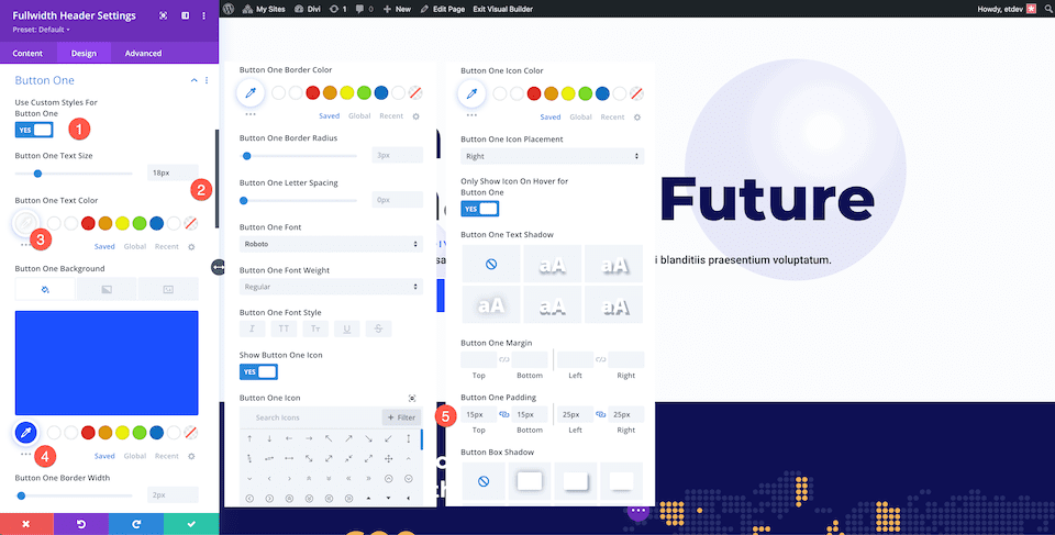
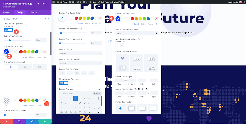
Financial Planning Fullwidth Header
Button Styles
Let’s look at the unique styles for the primary and secondary buttons.
Button One
In the Button One Tab, configure the following settings:
- Use Custom Styles For Button One: Yes
- Button One Text Size: 18px
- Button One Text Color: #ffffff
- Button One Background Color: #1b4ffe
- Button One Padding: 15px Top and Bottom; 25px Left and Right
Button Two
In the Button Two Tab, configure the following settings:
- Use Custom Styles For Button Two: Yes
- Button Two Text Color: #1b4ffe
- Button Two Background Color: Transparent
- Button Two Icon Color: #1b4ffe
Final Thoughts
The Divi Fullwidth Header makes it easy to create stunning hero sections on your website. Making strategic use of the primary and secondary buttons will improve your user experience and help website visitors take the actions they want to take. The customization options are endless with the Fullwidth Header so have fun experimenting!


This is great info. Giving emphasis to one call to action over another is important in driving business action. Thank you.