
Showing less is sometimes how you say more. Put every detail on the page at once and visitors tune out. Strip back too much and you lose the context that builds trust. Hotspots solve that by hiding detail behind small, clickable markers placed exactly where attention already is.
With Divi 5, you can build hotspots visually using Interactions, Module Groups, Canvases, and the Canvas Portal Module. No custom code required.
What Are Image Hotspots?
Hotspots are clickable or hoverable zones layered over an image, graphic, or section background. Each marker sits at a precise point, and when a visitor interacts with it, supporting content appears right there: a short label, a tooltip, a product card, or a richer content panel.
You see hotspots used on product pages, maps, diagrams, room mockups, and infographics because they keep layouts clean while still letting people explore details on demand.
What makes them work is control. Visitors choose what to reveal and when. Instead of forcing everyone through the same wall of copy, you let them pull information from the exact spot they are already examining.
What Are Divi 5 Interactions?
Divi 5 Interactions is Divi 5’s built-in interaction system for adding dynamic behavior inside the Visual Builder. You can trigger actions from events such as Click, Mouse Enter, Mouse Exit, Viewport Enter, Viewport Exit, and Load.
Each interaction is built from three parts:
- Trigger: what starts the interaction
- Effect: what happens next
- Target: which element receives the effect
That effect can show or hide an element, toggle visibility, switch presets, add attributes, scroll to an element, or respond to mouse movement. Because Interactions are native to Divi 5, you can build popups, toggles, reveals, tooltips, and hotspots without extra plugins.
Canvases And Portals In Divi 5
A Canvas in Divi 5 is a detached workspace inside the Visual Builder. Every page starts with a Main Canvas for visible page content. Additional canvases stay separate while you build, which keeps complex off-canvas elements organized and out of the way.
Canvases can be local to one page or global across your site. That makes them useful for reusable popups, menus, modals, floating panels, and hotspot content you want to manage separately.
The Canvas Portal Module gives you placement control. Add a portal anywhere in your layout, connect it to a canvas, and that canvas content renders in that exact spot.
For image hotspots, Canvases are a strong fit because they keep revealed content detached from the main layout, easier to organize, and easier to duplicate when you build multiple hotspot cards.
How To Add Hotspots To Images In Divi 5
The workflow below uses Interactions, Module Groups, Canvases, and the Canvas Portal Module together so each hotspot panel can be managed separately from the main layout.
Add Your Base Image
Add an Image module to your column and upload your image. In Design > Sizing, enable Force Fullwidth so the image scales predictably and your markers stay aligned more reliably as the layout changes.
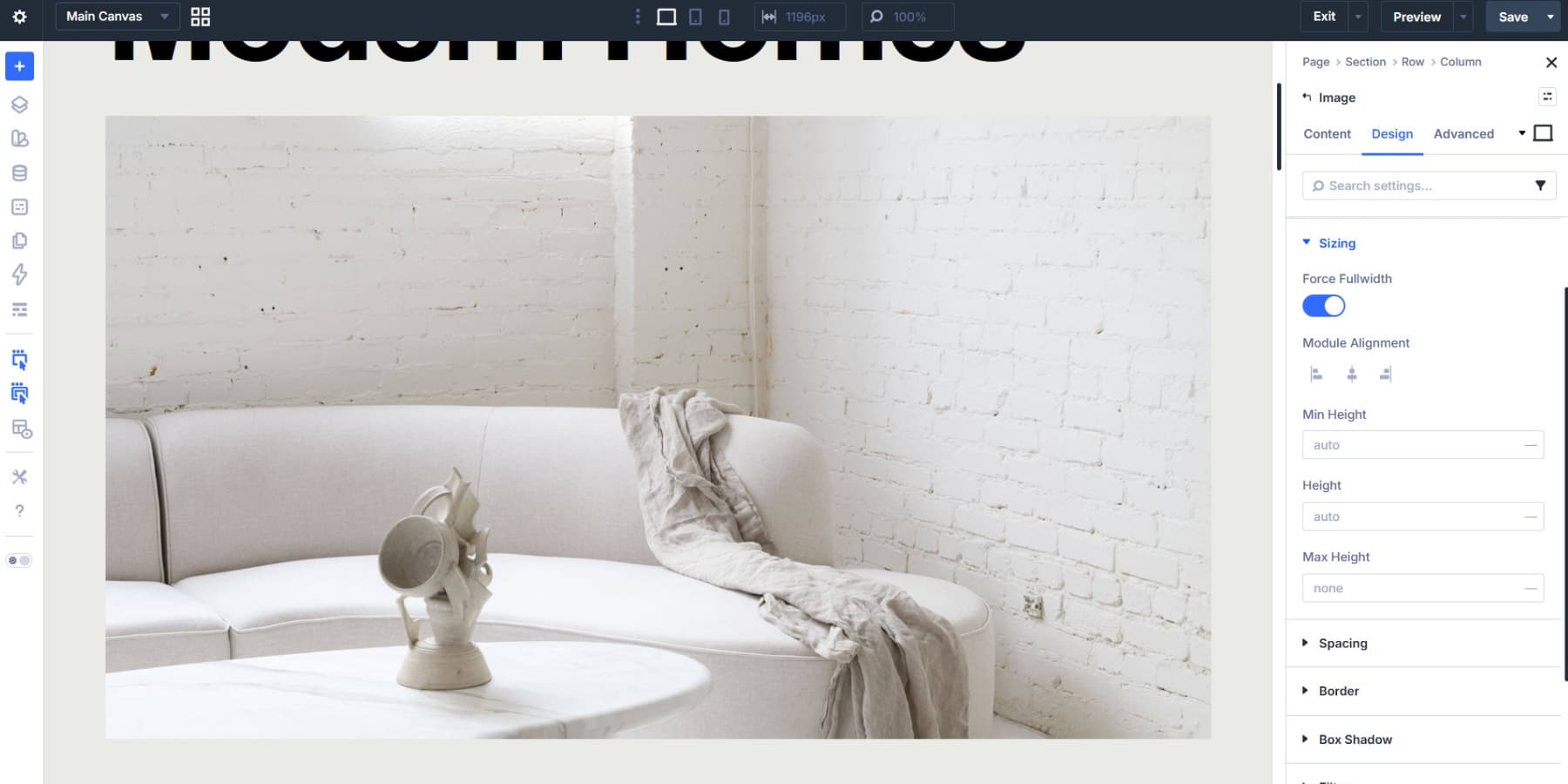
Choose an image with clear focal points and enough visual separation between subjects. Good contrast makes markers easier to spot. Busy overlap makes placement harder and weakens the effect. High-resolution images also help because visitors can inspect details without the base image breaking down.
If you need the hotspot area to span a whole section instead of a standalone image, you can also build this with a section background image. In that case, set the background image to Cover, Center, and No Repeat, then give the section enough min-height for the composition to breathe.
Build And Style Your Marker
Add a Module Group in the same column as the Image module. The Group acts as the shared container for the marker and the content tied to it.
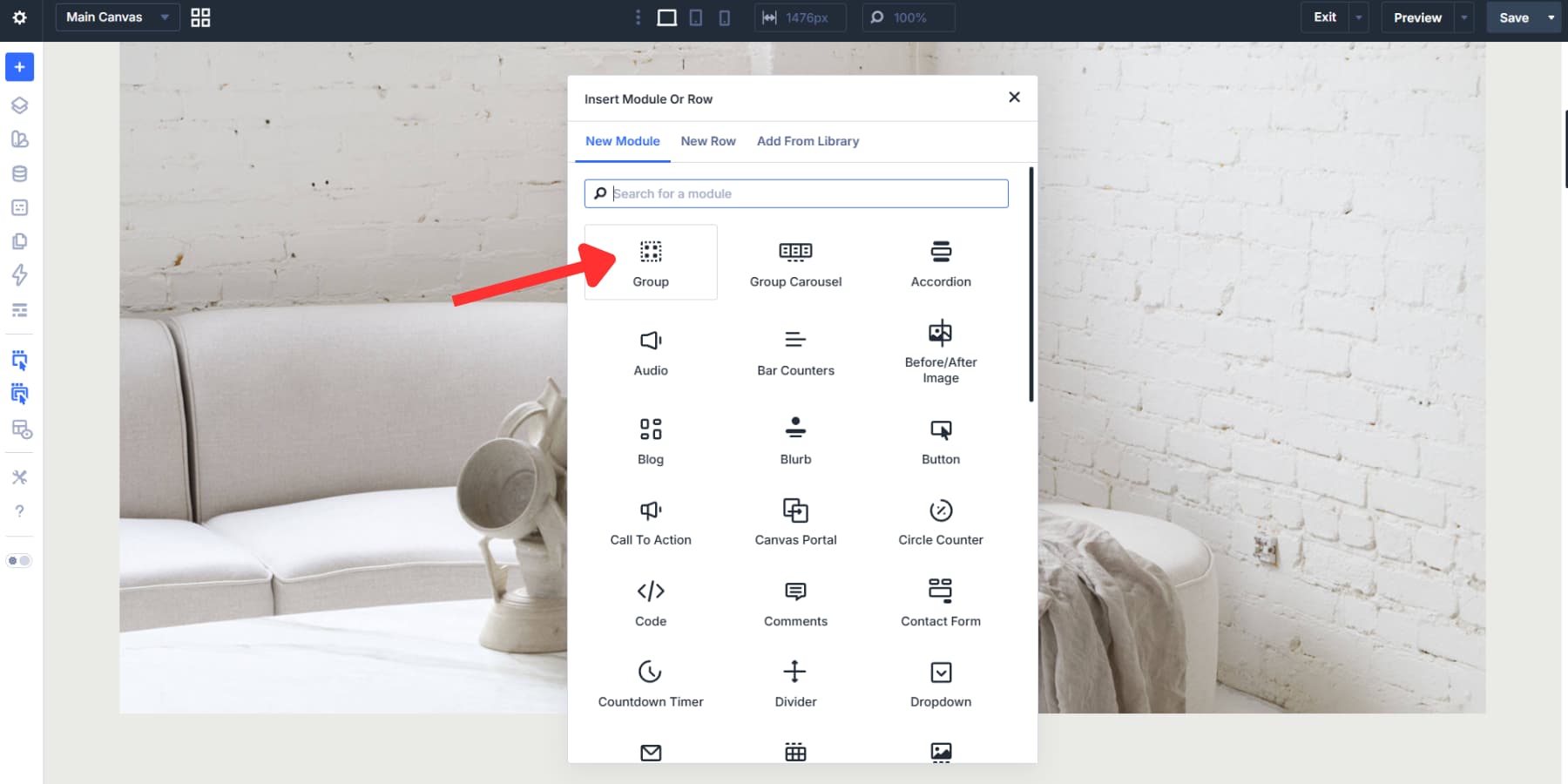
Groups matter here because they move, duplicate, and position as one unit. That is much easier than repositioning a loose icon and a separate content element every time you adjust the layout.
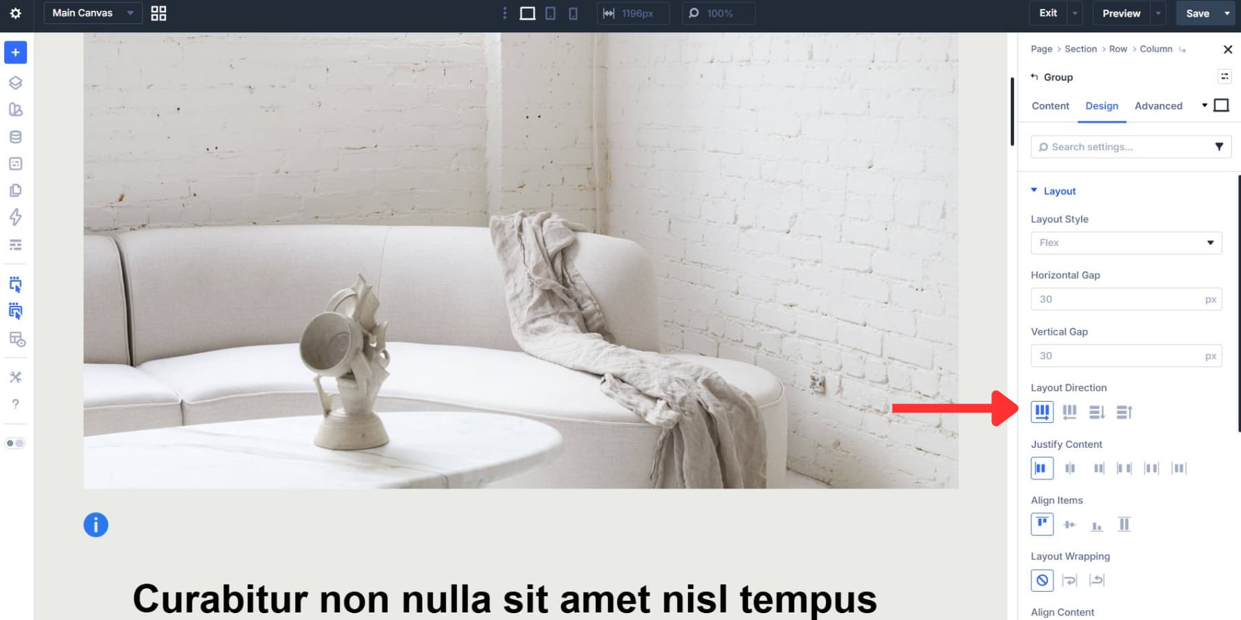
Set the Group layout direction to Row if you want the revealed content to sit beside the marker. Use Column if you want the content to appear above or below it.
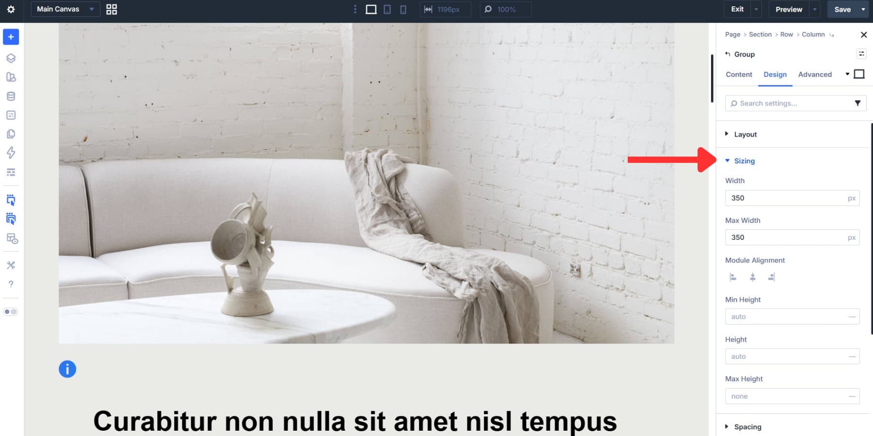
Under Design > Sizing, set the Group to a controlled width so it does not stretch across the whole column. A fixed width can work, but a responsive value is usually better for hotspot content. For example, a max width around 300px to 350px keeps the build manageable while leaving room for readable content.
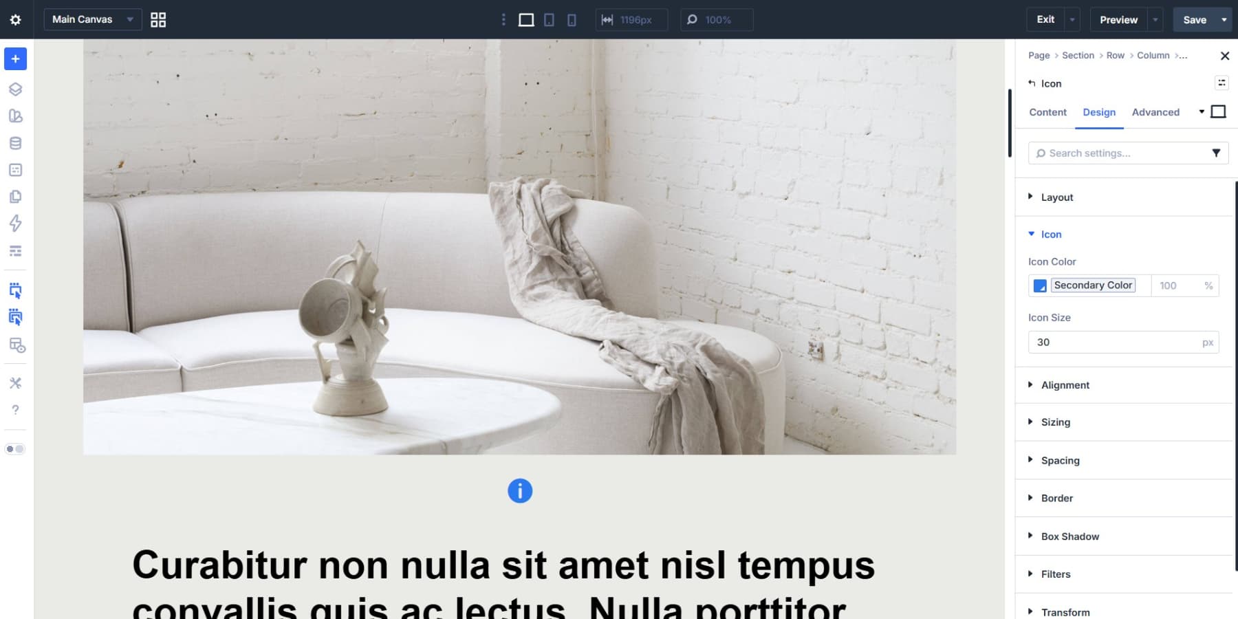
Now add an Icon module inside the Group. Icons make strong markers because they stay crisp at any size, load quickly, and are easy to recolor and reuse.
Open the Design tab and style the icon. Pull the color from your Design Variables so future palette changes update all markers consistently.
For better responsiveness, use a fluid size if needed. A value such as clamp(14px, 3vw, 24px) keeps the marker usable on smaller screens without growing too large on wide layouts.
Add a hover state for visual feedback. In Design > Transform, set Scale X and Scale Y slightly above 100%. A subtle bump is enough to tell people the marker is interactive.
If you plan to reuse the same marker style, save it as an Element Preset now. That keeps every hotspot visually consistent.
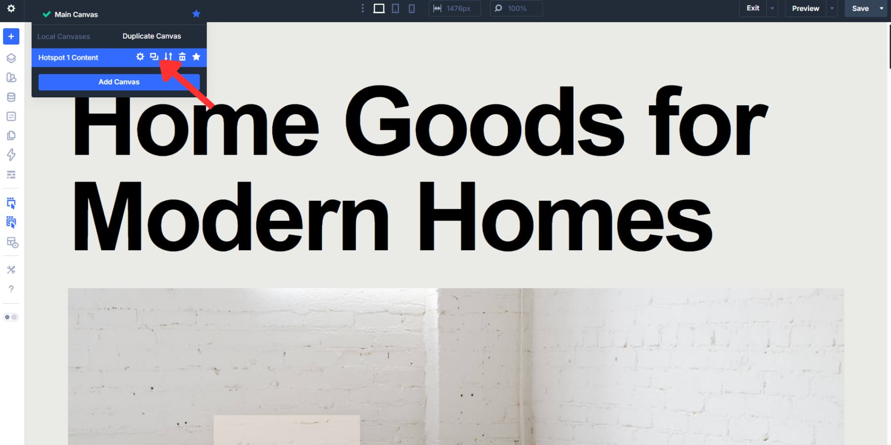
Create A Canvas For Your Hotspot Content
Open the canvas dropdown in the Visual Builder and select Add New Canvas. Give it a clear name such as “Hotspot 1 Content.”
Once created, the new canvas opens as its own workspace. It stays separate from the Main Canvas while you build, which keeps the page editor cleaner when you are working with multiple hotspots or more detailed content cards.
Build Your Hotspot Card
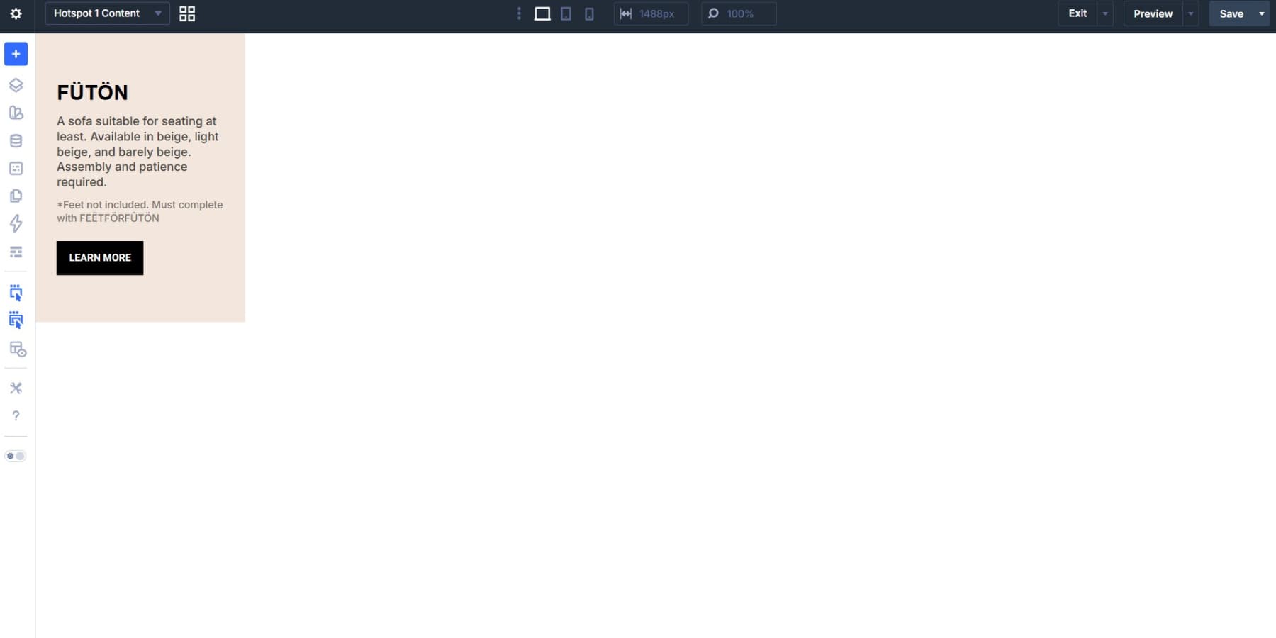
Inside the new canvas, add a section and row, then build the content you want to reveal. For a product-style hotspot, a small Heading module, a short Text module, and a Button module are usually enough.
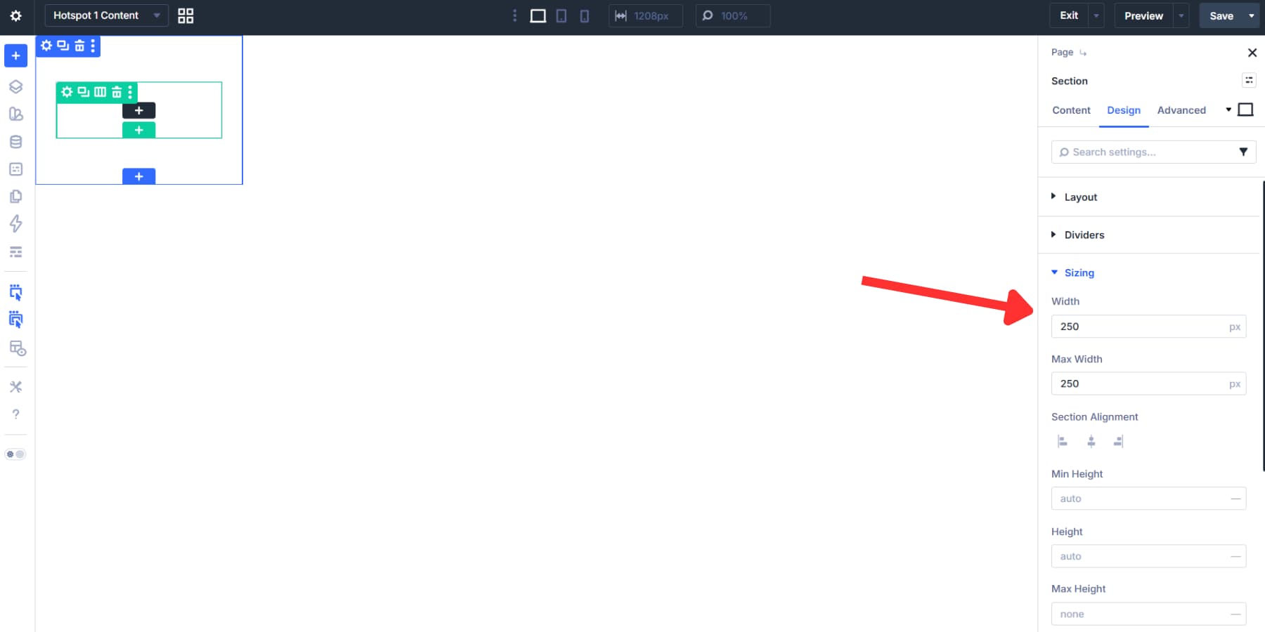
Set a controlled width early so the card does not inherit oversized section or row dimensions. A compact width such as 250px to 300px works well for short content cards, while responsive values such as min(60vw, 300px) make the card adapt better across breakpoints.
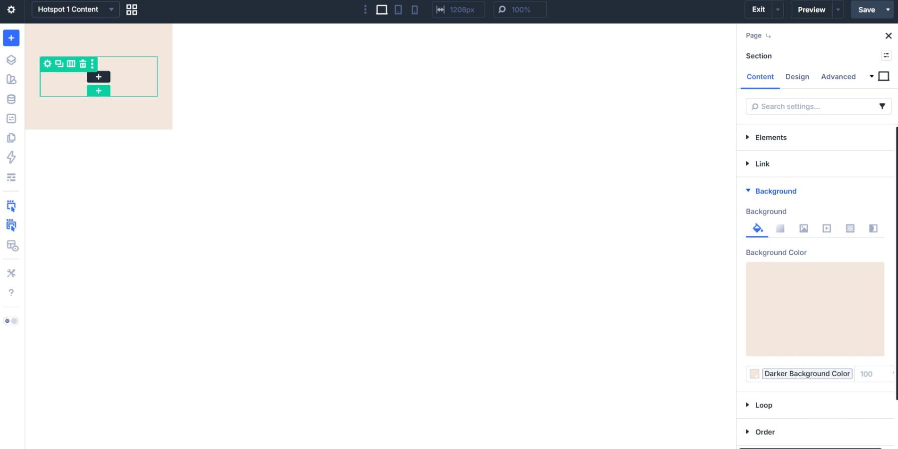
Add a background color that separates the card from the image behind it, ideally from your Design Variables. Then add padding, border radius, and a light box shadow so the content reads as its own layer.
For this example, keep the copy short. Hotspots work best when they reveal useful context quickly, not when they turn into mini landing pages.
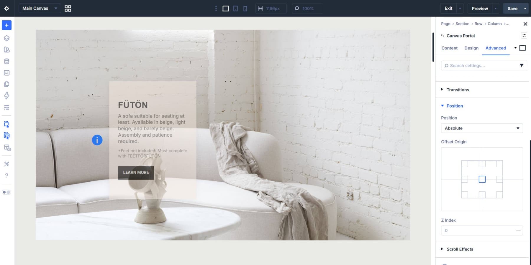
Place It With A Canvas Portal
Switch back to the Main Canvas. Inside the same Module Group as your Icon, add a Canvas Portal module and choose the canvas you just created from the Canvas dropdown.
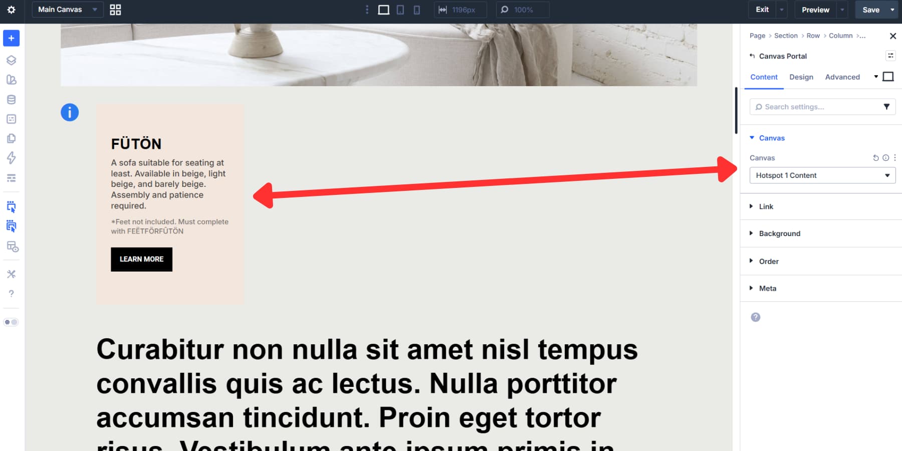
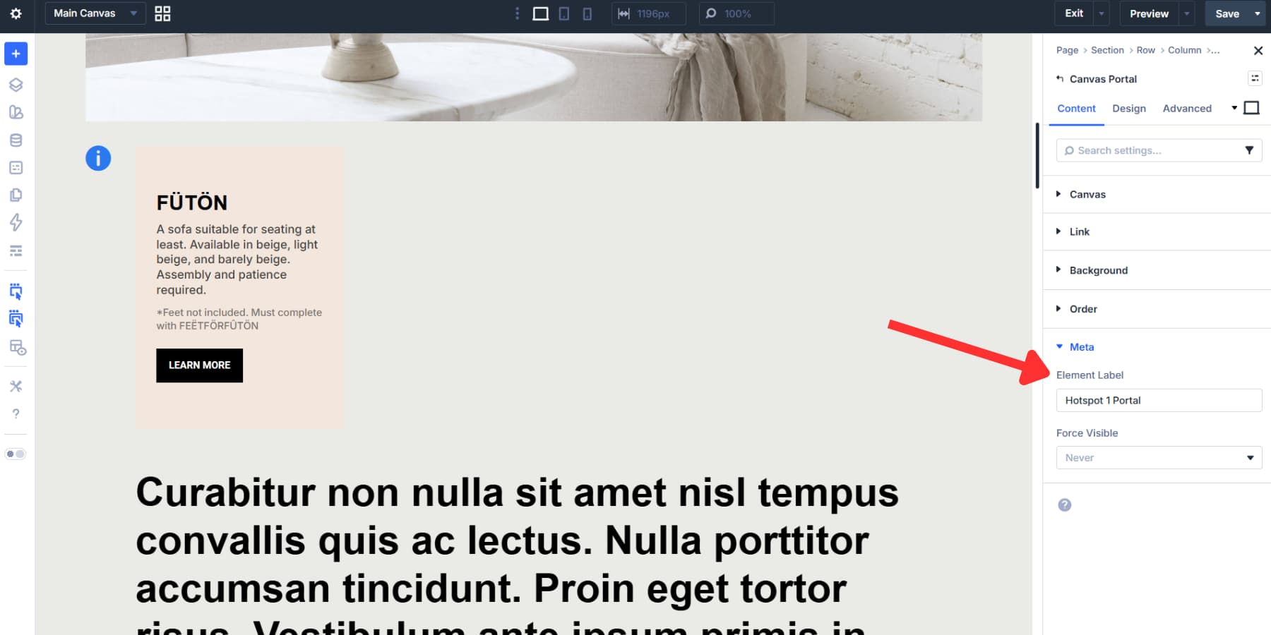
Under Meta, add a clear Element Label such as “Hotspot 1 Portal.” This becomes helpful once you start assigning interaction targets.
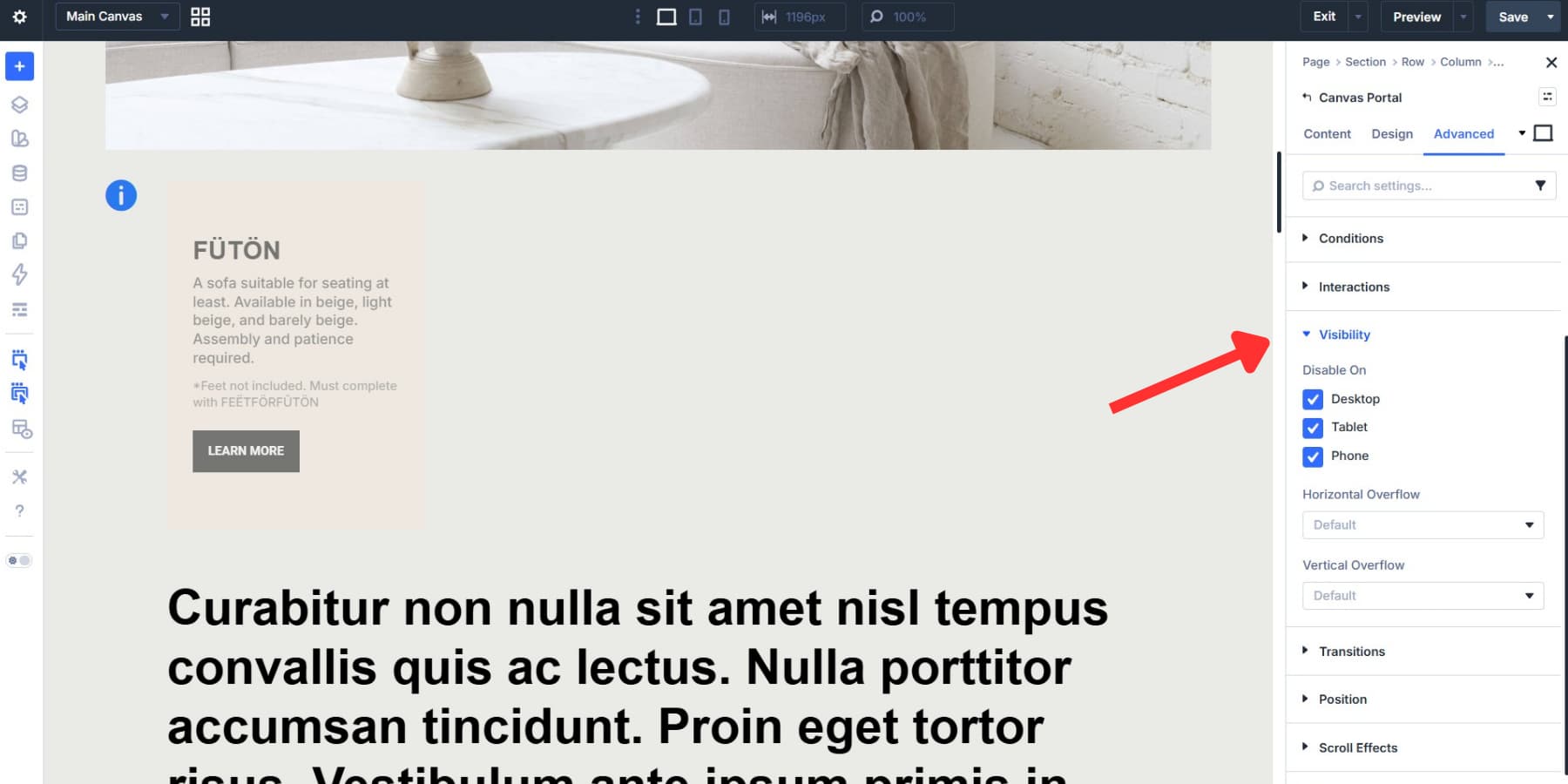
To keep the card hidden until someone interacts with the marker, hide the content by default before wiring up the reveal interaction. In Divi’s hotspot workflow, this is commonly done from Advanced > Visibility using Disable On for Desktop, Tablet, and Phone on the hotspot content element so Interactions can control when it appears.
Position Your Group
Open the Module Group settings and go to Advanced > Position. Set Position to Absolute. This removes the Group from normal flow so you can place the marker exactly over the image.
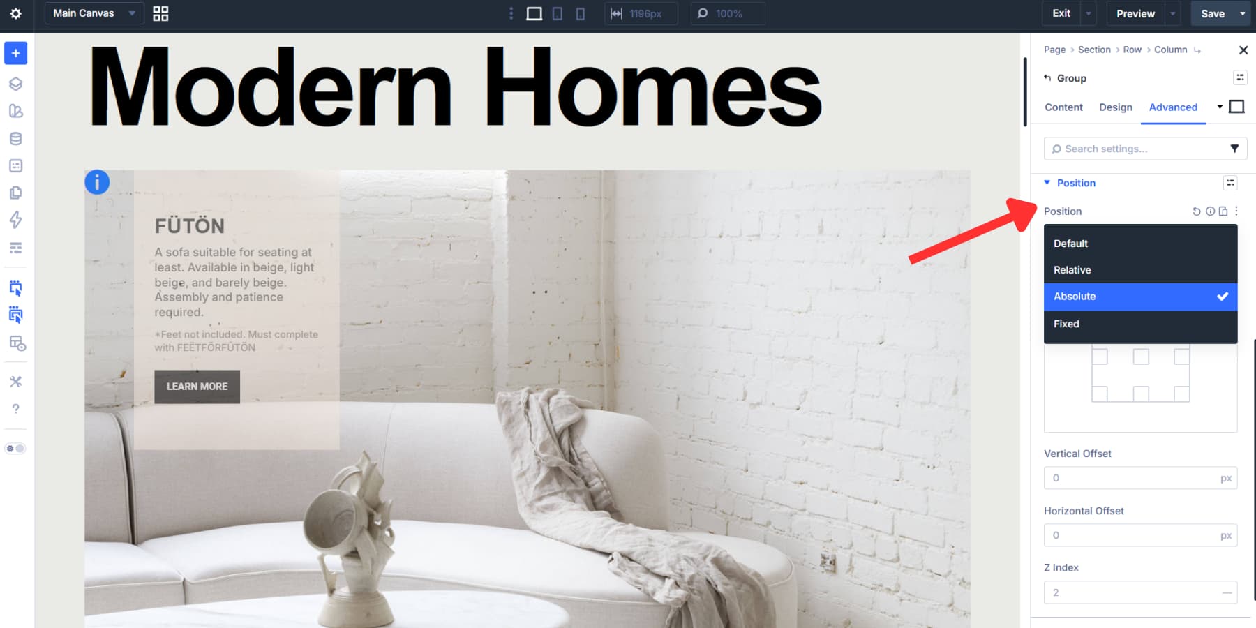
After choosing Absolute, Divi shows the Offset Origin grid. That grid defines the reference point for your measurements. Choose the origin that makes placement easiest for the part of the image you are targeting.
From there, adjust Vertical Offset and Horizontal Offset until the marker sits exactly where you want it. These values will be different for every image, so treat example numbers as reference only.
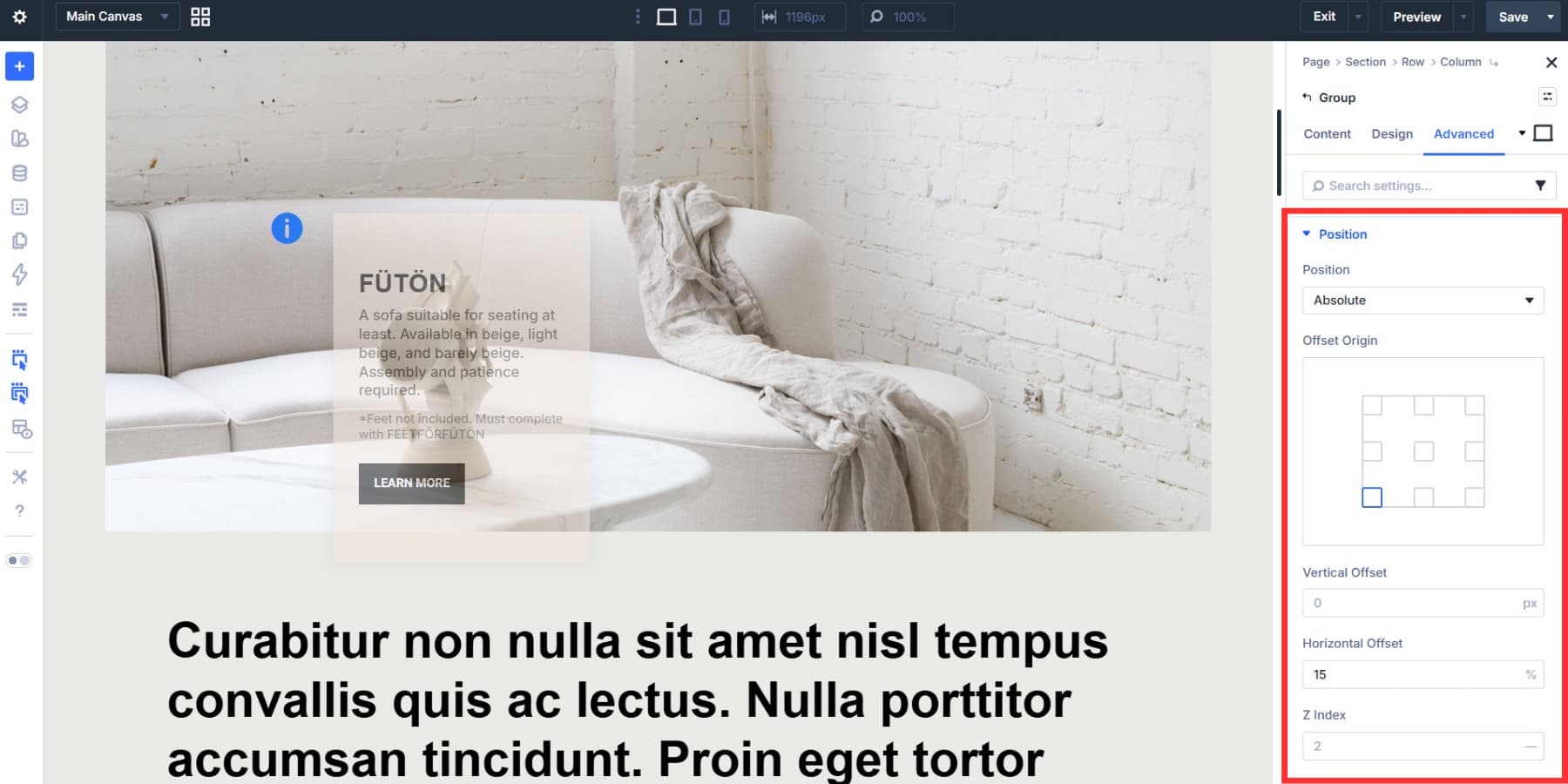
Set the Group Z Index to 2 or higher so it stays above the image.
Then position the Canvas Portal itself. Giving the portal absolute positioning lets you offset the hotspot card relative to the marker so it can sit to the side, above, or below without disturbing the rest of the layout.
Connect Markers To Content
Now connect the marker to the hotspot content with Interactions. Open the Icon module settings and go to Advanced > Interactions. Add a new interaction with:
- Trigger Event: Mouse Enter
- Effect Action: Show Element
- Target Module: your Canvas Portal
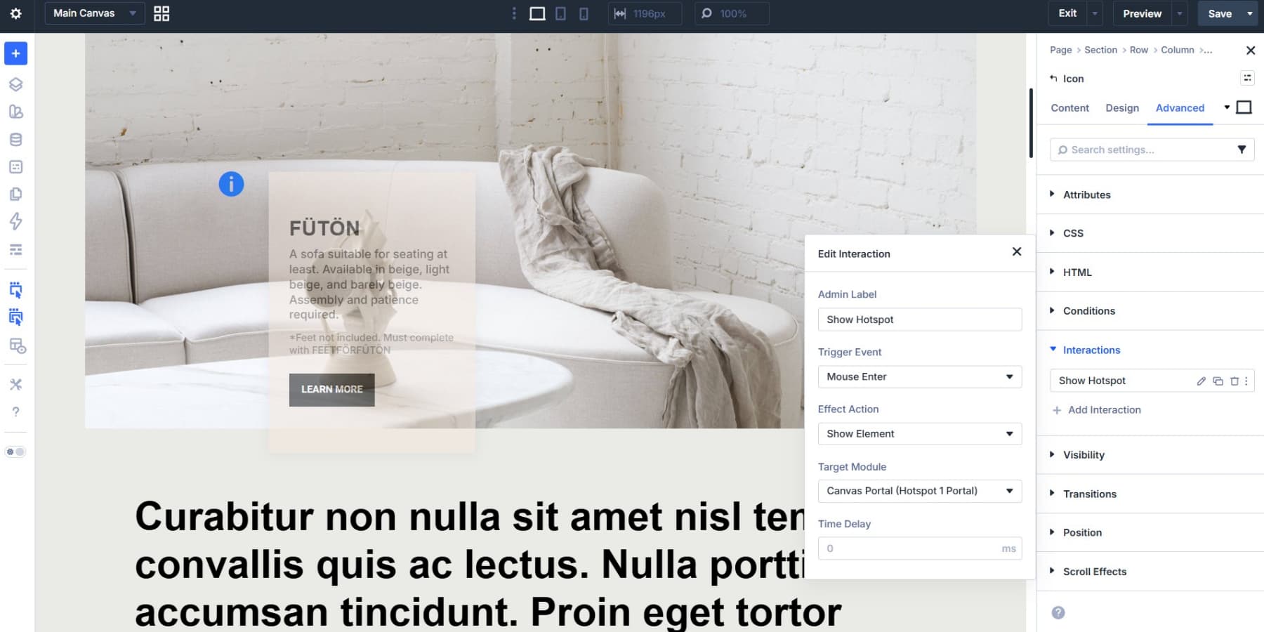
Using Mouse Enter on the icon keeps the trigger precise. The card appears only when the visitor reaches the marker.
Next, add the hide interaction. If the revealed card contains a button or link, place this interaction on the Module Group rather than the icon:
- Trigger Event: Mouse Exit
- Effect Action: Hide Element
- Target Module: the same Canvas Portal
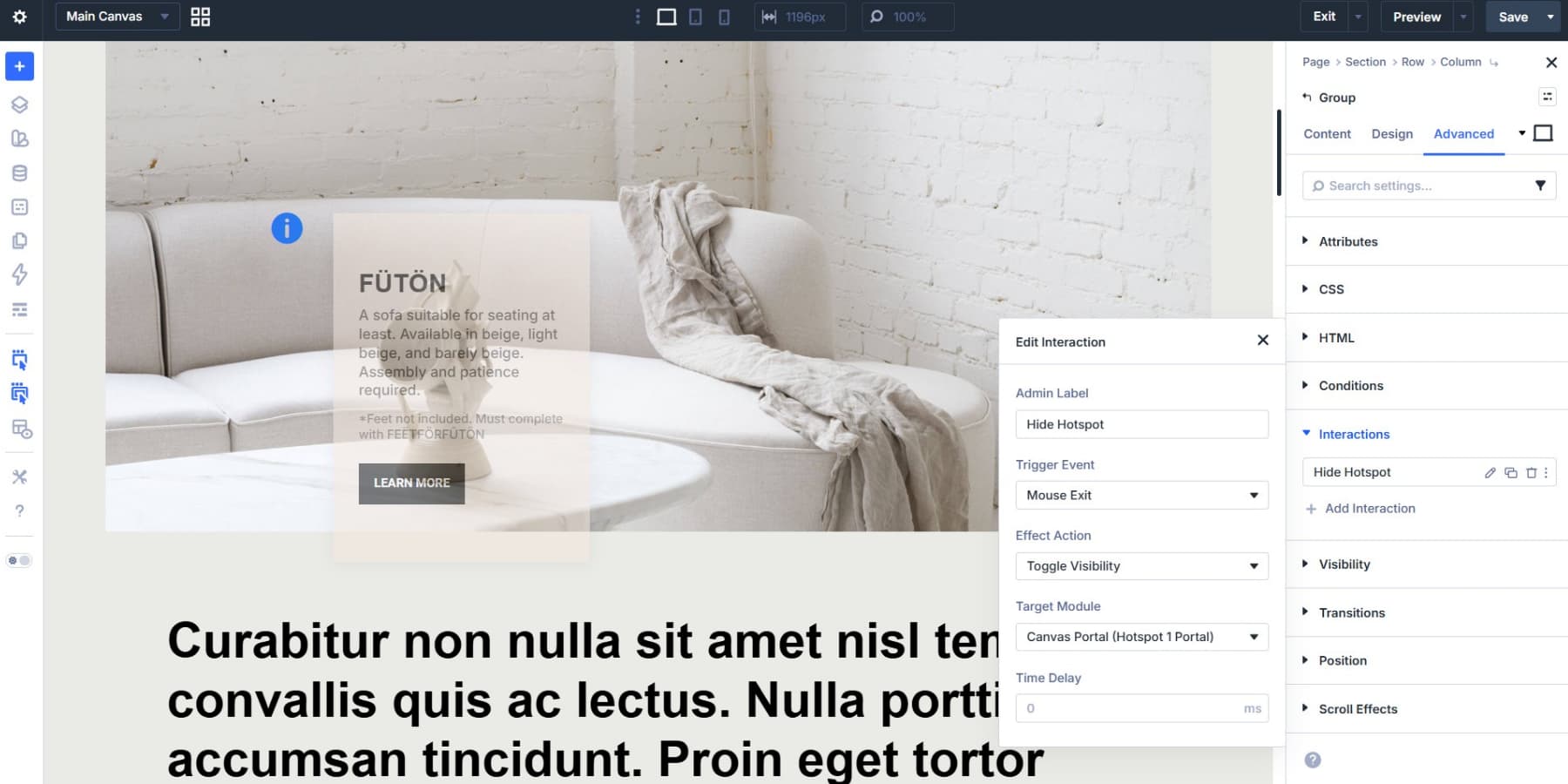
That split matters. If Mouse Exit lives only on the icon, moving from the marker into the revealed card can close the card too early. Putting the exit trigger on the Group keeps the hotspot open while the cursor remains anywhere inside the marker-plus-content area.
If the hotspot content is display-only and contains no interactive controls, you can keep both show and hide interactions on the icon itself. On touch-heavy layouts, consider using Click with Toggle Visibility instead of hover so the experience is clearer on phones and tablets.
Add More Hotspots
Once the first hotspot works, the rest are mostly duplication. Duplicate your canvas in the Canvas Manager, rename it, and replace the content for the next hotspot.
Then duplicate the Module Group on the Main Canvas. Update the Canvas Portal so it points to the new canvas, reposition the Group and Portal, and make sure both interactions target the correct portal.
Nothing about hotspot placement is universal. Each hotspot needs its own offsets, and each content panel needs its own interaction target.
If you are repeating the same marker style across the page or site, Element Presets are worth using. Style once, apply everywhere, and keep your hotspots consistent.
Helpful Build Tips Before You Publish
Before you publish, take a few minutes to pressure-test the build. Hotspots are meant to feel effortless, but that only happens when the markers are easy to spot, the revealed content is easy to scan, and the interaction behaves predictably across devices. These final checks help ensure the experience feels polished rather than fragile.
- Keep hotspot labels and card copy short so the interaction stays fast to scan.
- Use strong contrast between the marker and the image behind it.
- Leave enough space around focal points so markers do not overlap.
- Test hover-based hotspots on touch devices and switch to Click plus Toggle Visibility if needed.
- Use clear Element Labels for portals and interactions once you have multiple hotspots on the page.
- Use Canvases to keep hotspot content organized, detached from the main layout, and easier to duplicate.
Build Interactive Layouts With Divi 5 Today!
Hotspots look advanced from the outside, but in Divi 5, they are mostly a matter of structure: place the marker, create the content, position both pieces, then connect them with Interactions.
Once you understand that pattern, the same approach carries over to tooltips, product reveals, floating cards, popups, and other interactive layouts. Divi 5 gives you the control to build it all directly in the Visual Builder.


When using the Mouse Enter interaction on the icon and the Mouse Exit on the Group when your Group’s Layout is Display Flex with a Horizontal Gap of 10px (not that it matters since the Canvas is absolutely positioned), upon first page load and the first time to hover over the icon, the content does appear. However, when you hover away from the icon, the text disappears when it shouldn’t. When you hover over it again, it is then that the Mouse Enter and Mouse Exit works correctly.
What I did was set the flexed Group Horizontal Gap to ‘0’, and that seems to have fixed that issue. Something to note, in case anyone forgets to disable the flexed gaps?