
Timelines make sequences easier to understand. A company history, product roadmap, project phase, resume, onboarding process, or case study can all become easier to scan when each step follows a clear visual path.
Divi 5’s Timeline module gives you a native way to build those layouts directly in the Visual Builder. You can add Timeline Items, choose a vertical or horizontal direction, style the track, markers, connectors, cards, and text, and use alternating layouts without custom CSS.
In this post, we’ll explore how the Timeline module works, where its most important settings live, and how to build a responsive timeline you can reuse across your Divi 5 site.
- 1 What Is The Timeline Module In Divi 5?
- 2 What Makes The Timeline Module Useful?
- 3 Timeline Module Settings Overview
-
4
How To Build A Timeline In Divi 5
- 4.1 Step 1: Add The Timeline Module
- 4.2 Step 2: Add Timeline Item Content
- 4.3 Step 3: Set The Overall Timeline Layout
- 4.4 Step 4: Style The Track
- 4.5 Step 5: Style Items, Spacers, And Connectors
- 4.6 Step 6: Style The Markers
- 4.7 Step 7: Style The Timeline Cards
- 4.8 Step 8: Style Date, Title, And Body Text
- 4.9 Step 9: Add Card Animations With Composable Settings
- 4.10 Step 10: Use Individual Overrides When Needed
- 4.11 Step 11: Test The Timeline Responsively
- 4.12 Step 12: Save The Timeline As A Preset
- 5 Best Practices For Timeline Design
- 6 Download And Install The Example Files
- 7 Download For Free
- 8 Build Your Own Timelines In Divi 5 Today!
What Is The Timeline Module In Divi 5?
The Timeline module is a native Divi 5 module for displaying a sequence of events along a connecting track.
Each event lives inside its own Timeline Item child module. That means you can add, edit, duplicate, delete, reorder, and style individual items while still managing the overall timeline from one parent module.

Use it for:
- Company or brand history pages.
- Product roadmaps and release plans.
- Project timelines and case studies.
- Resume, CV, education, and certification sections.
- Step-by-step processes, onboarding flows, and service explainers.
Before this module, many timeline layouts required stacked modules, custom CSS, or third-party extensions. Now you can build the structure and style it from Divi’s native settings.
What Makes The Timeline Module Useful?
The Timeline module is not just a list of cards. It gives you control over the timeline structure, the content inside each event, and the visual system that connects everything together.
Timeline Items Are Independent Child Modules
Each milestone is managed as a Timeline Item. You can edit the date or label, title, body text, icon, link, and item-level design settings for each entry.
This makes the module easier to maintain than a timeline built from separate rows and modules. You can reorder events from the parent module without rebuilding the layout.
Timeline Items Support Nested Modules
Timeline Items also support Divi 5’s Nested Modules workflow. That means a timeline entry can contain more than simple text.
You can add supporting modules inside a Timeline Item, such as images, buttons, icons, or other content modules. This turns a basic milestone into a richer content card when the timeline needs more context.
Use nested content carefully. A timeline should stay scannable. Add extra modules only when they help explain the event.
Even Option Groups Make Alternating Layouts Easier
The Timeline module includes Even option groups for every second item. These let you style alternating items differently without manually editing each one.
For example, you can give alternating cards different backgrounds, adjust spacing on every second item, or create a left-right rhythm in a vertical timeline.
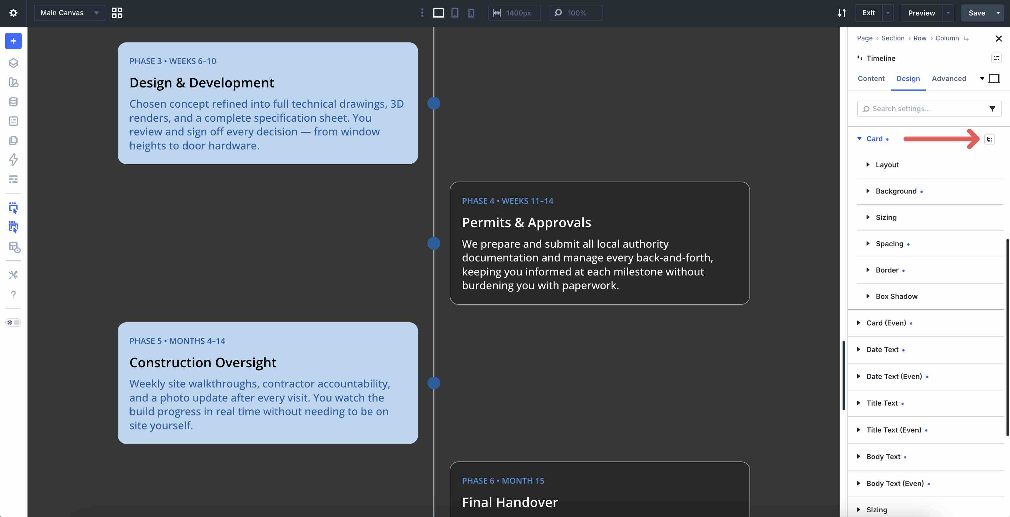
Even option groups are available for Item, Spacer, Card, Date Text, Title Text, and Body Text. The track, connector, and marker styles are usually best kept consistent so the timeline still feels unified.
Composable Settings Add Deeper Control
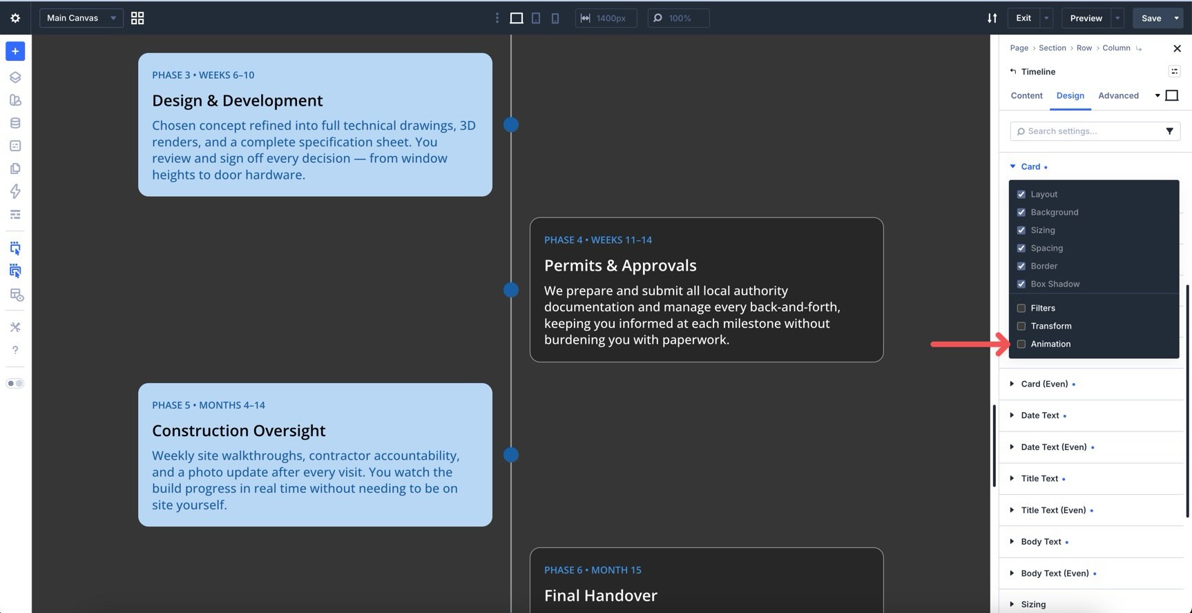
The Timeline module works with Composable Settings. You can enable additional option groups on specific parts of the module when you need more control.
For example, you can enable Animation, Transform, or Filters on the Card option group instead of animating the entire Timeline Item.
This matters because a Timeline Item contains multiple parts: the card, marker, connector, and spacing structure. Composable Settings let you target the part you actually want to affect.
Design Variables And Presets Keep Timelines Reusable
Timelines often appear on more than one page. A roadmap page, About page, case study page, and service process page may all use the same visual pattern.
Use Design Variables for colors, spacing, font sizes, border radius, and other reusable values. Then save the finished Timeline module as an Element Preset, or save focused Option Group Presets for cards, markers, dates, and body text.
This keeps the timeline connected to your larger Divi 5 design system.
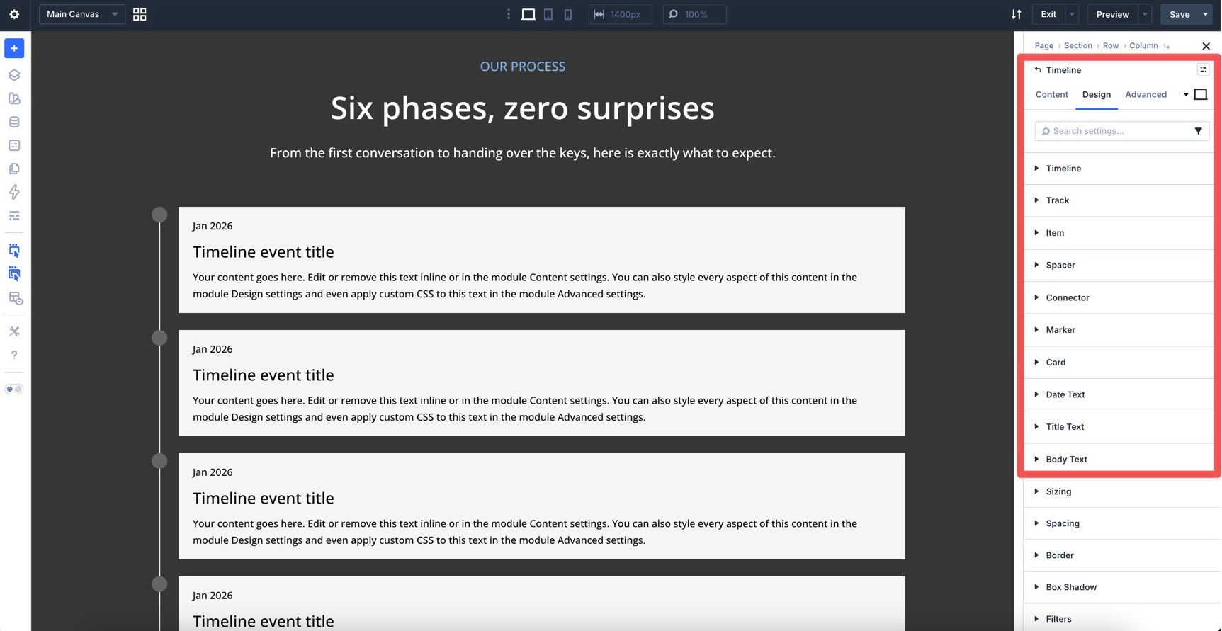
Timeline Module Settings Overview
The Timeline module uses the same Divi 5 structure as other modules: Content, Design, and Advanced tabs.
Content Tab
The Content tab is where you manage the Timeline Items and module-level content settings.
You can:
- Add, edit, duplicate, delete, and reorder Timeline Items.
- Set module-level links and background styles.
- Enable Loop settings when the timeline should pull from dynamic content.
- Adjust Order settings when the module sits inside a Flexbox or Grid layout.
- Use Meta settings to label the module inside the Visual Builder.
Loop support is especially useful for dynamic timelines, such as a roadmap, release list, event history, or case study archive.
Design Tab
The Design tab controls the visual structure and styling.
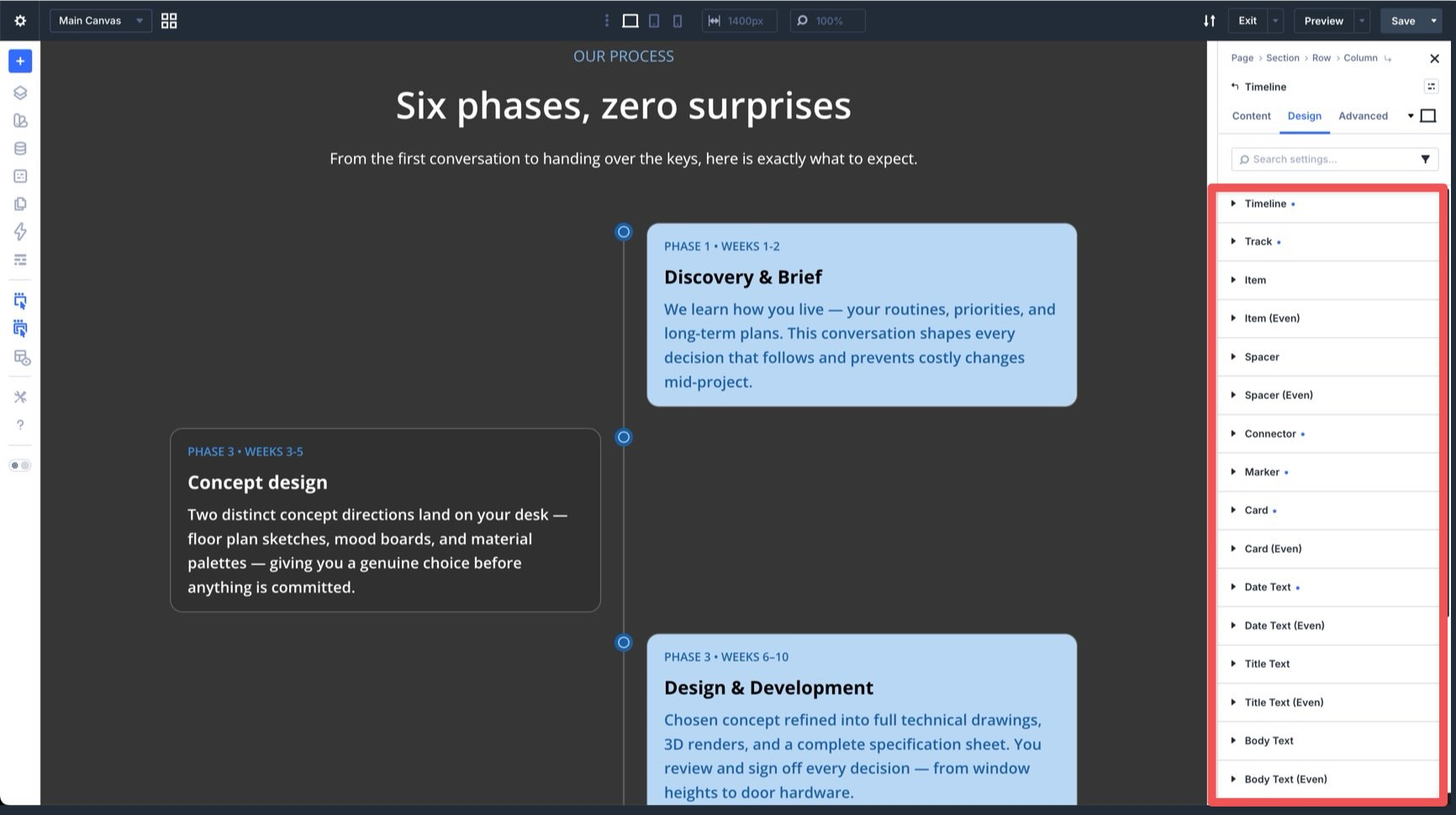
Important design groups include:
- Timeline: Controls the overall timeline layout, direction, position, and spacing.
- Track: Styles the main line that connects the events.
- Item: Styles the wrapper for each Timeline Item.
- Spacer: Controls the space around items along the track.
- Connector: Styles the short line between a marker and its card.
- Marker: Styles the dot, icon, or shape that marks each event.
- Card: Styles the content box that holds the date, title, and body.
- Date Text: Styles the date or label text.
- Title Text: Styles each Timeline Item title.
- Body Text: Styles each Timeline Item description.
You also get the usual Divi design groups such as Sizing, Spacing, Border, Box Shadow, Filters, Transform, and Animation.
Advanced Tab
Use the Advanced tab for more technical control. This includes attributes, custom CSS, semantic HTML options, conditions, Interactions, visibility settings, transitions, position controls, and scroll effects.
Most timelines can be built from the Content and Design tabs alone. Use Advanced settings when you need extra control over behavior, visibility, or custom markup.
How To Build A Timeline In Divi 5
Now let’s build a clean timeline from scratch.
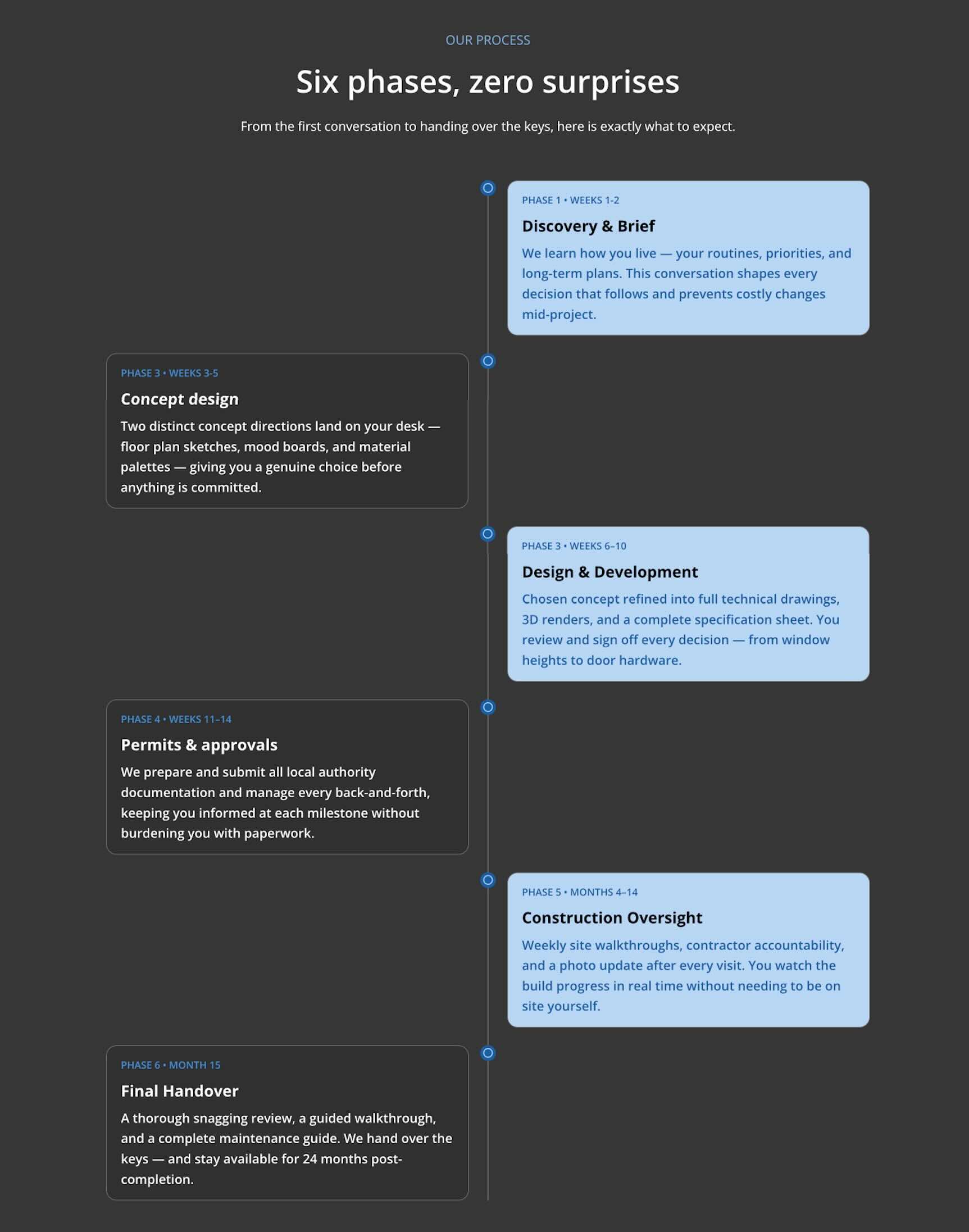
The example below uses a vertical timeline with six phases, alternating cards, custom markers, and responsive adjustments for smaller screens.
Step 1: Add The Timeline Module
Create a new page or open an existing one in the Visual Builder.
Add a Section and a single-column Row. Then click the gray plus icon inside the Row, search for Timeline, and add the Timeline module.
Divi loads the module with starter Timeline Items, so you can see the structure immediately. Keep them as placeholders or delete them and start fresh.
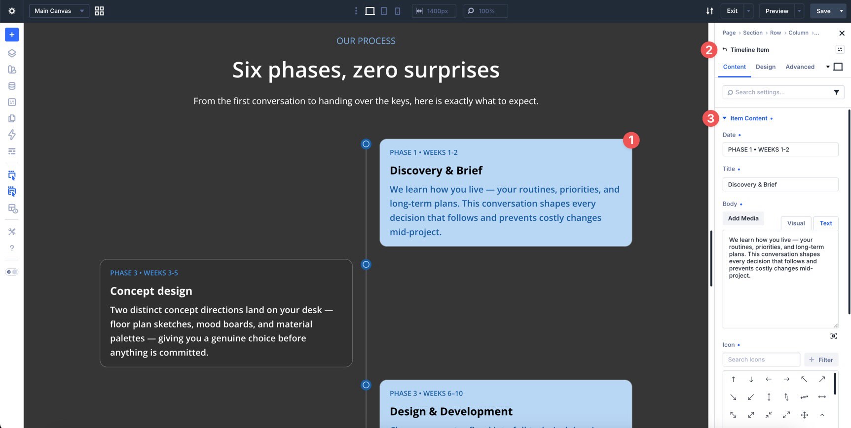
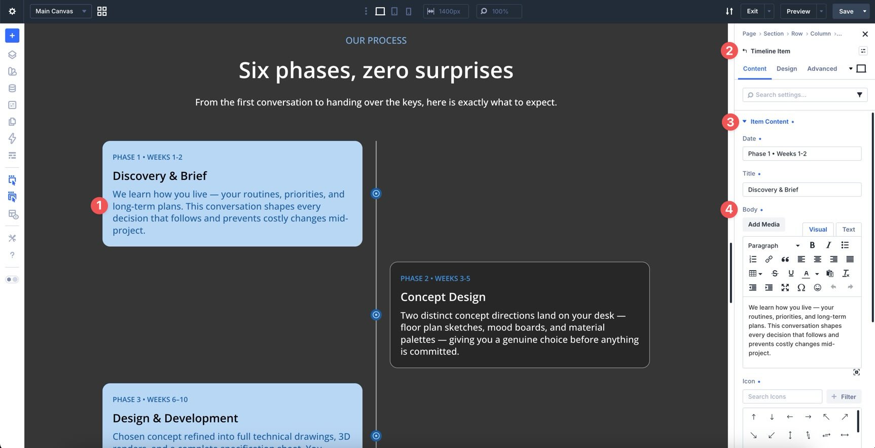
Step 2: Add Timeline Item Content
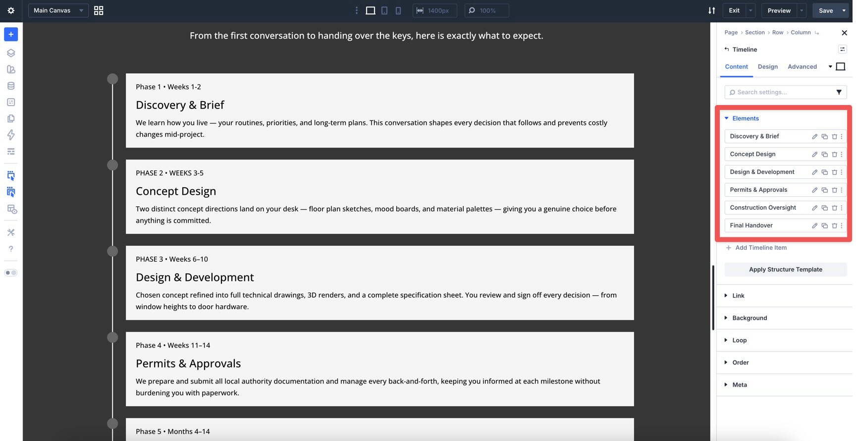
Open the Timeline module settings. In the Content tab, you will see the list of Timeline Items.
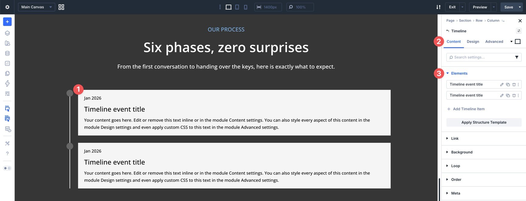
Click Add Timeline Item to create a new item. You can also duplicate an existing item if you want to preserve its structure or styling.
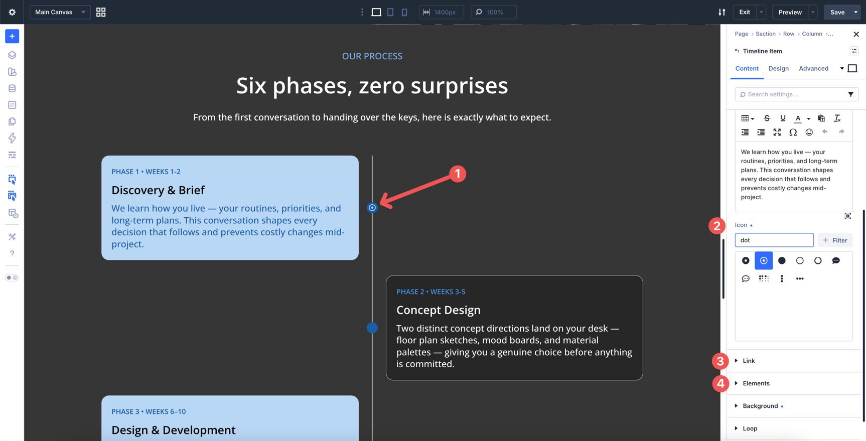
Open a Timeline Item and expand Item Content. Add the date or label, title, and body text.
The Date field does not have to be a literal date. It can also be a phase label, step number, release name, or short status note. For example:
Phase 1 • Weeks 1–2
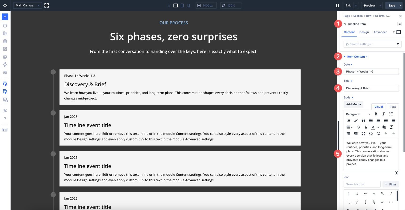
In the Timeline Item’s Content tab, you can also add an icon, link the item, adjust background settings, add nested elements, and use other item-level controls.
Add the rest of your timeline content before styling. Once each item has a title, the item labels become easier to recognize in the parent module list.
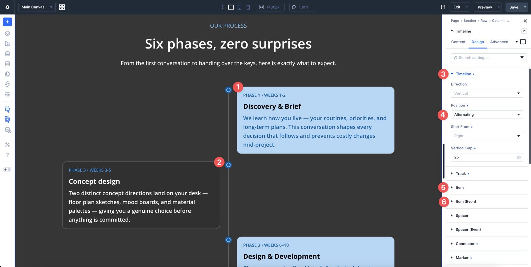
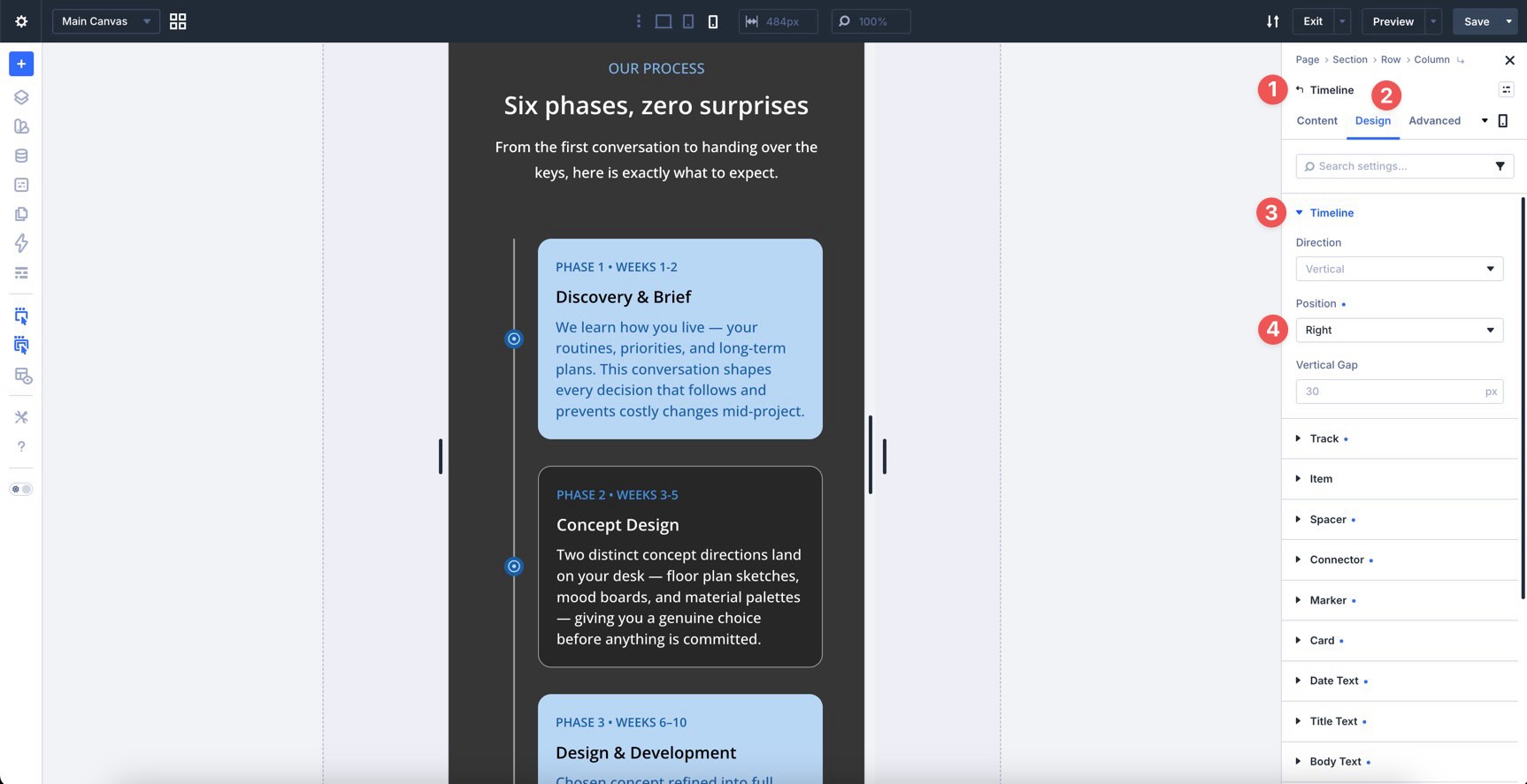
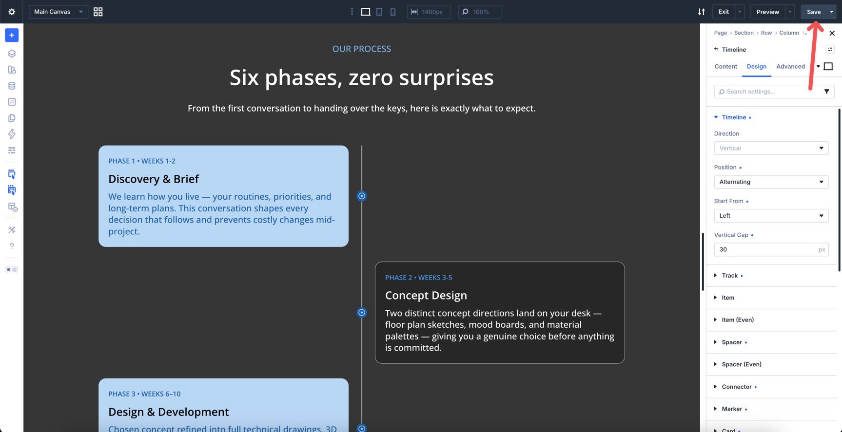
Step 3: Set The Overall Timeline Layout
Switch to the parent Timeline module’s Design tab.
Open the Timeline option group. This is where you set the foundation for the layout.
Use these controls to choose the timeline direction, set how items sit relative to the track, and adjust the gap between items. For a classic company history or project timeline, a vertical alternating layout is usually a strong starting point.
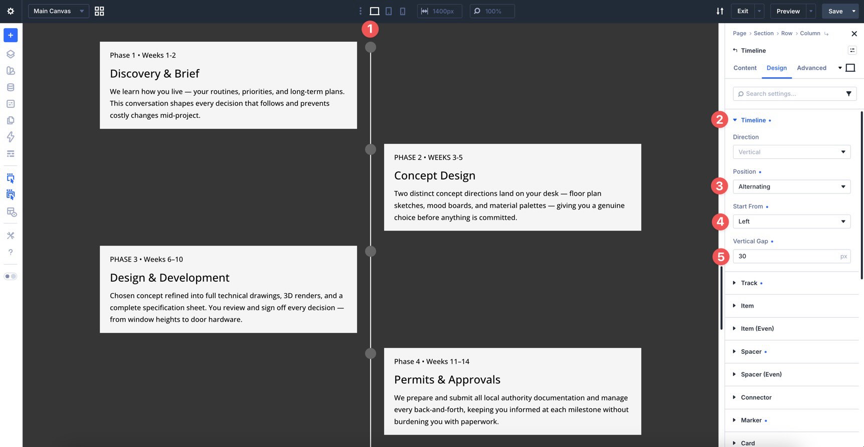
For mobile, plan to simplify the layout later. Alternating timelines look great on wide screens, but a left-aligned or right-aligned layout is often easier to read on phones.
Step 4: Style The Track
The Track option group controls the line that runs through the timeline.
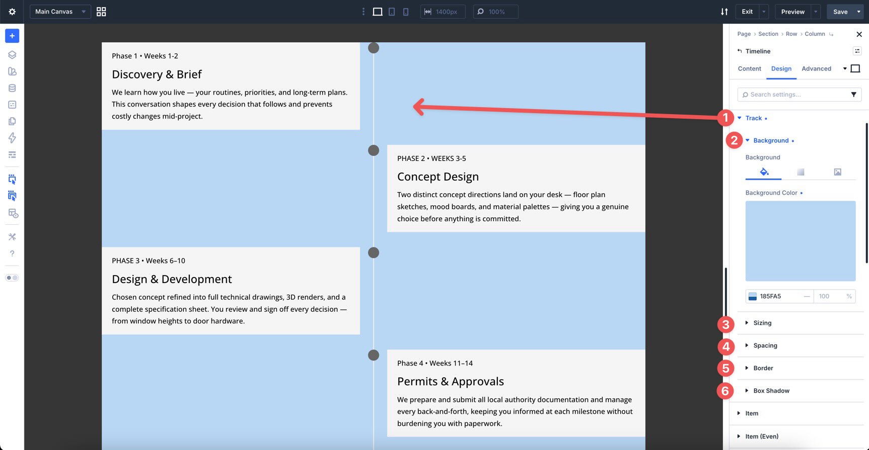
Use it to style the track’s color, gradient, width, height, spacing, border, and shadow.
Keep the track visible but not overpowering. It should connect the events, not compete with the content cards.
Step 5: Style Items, Spacers, And Connectors
The Item option group styles the wrapper around each Timeline Item.
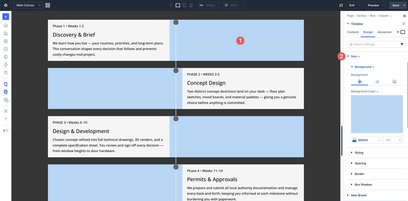
Use it for item-level background, sizing, spacing, borders, and shadows. The Item (Even) options let you style every second item differently.
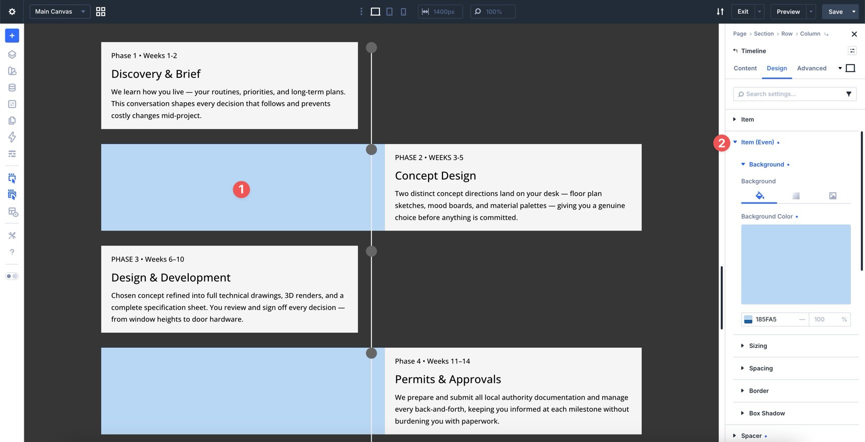
The Spacer option group controls the space around items along the track. It also includes Even options when you want alternating spacing.
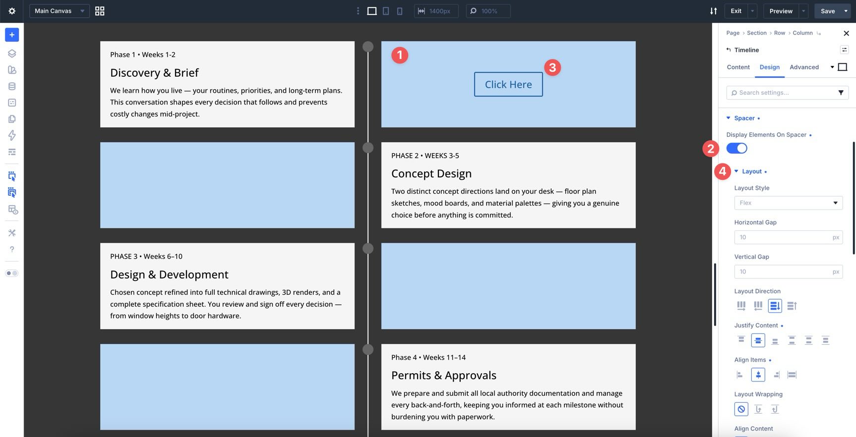
If you add nested elements to Timeline Items, the Display Elements On Spacer setting can place those elements in the spacer area for more advanced compositions.
The Connector option group controls the short line between the marker and the card.
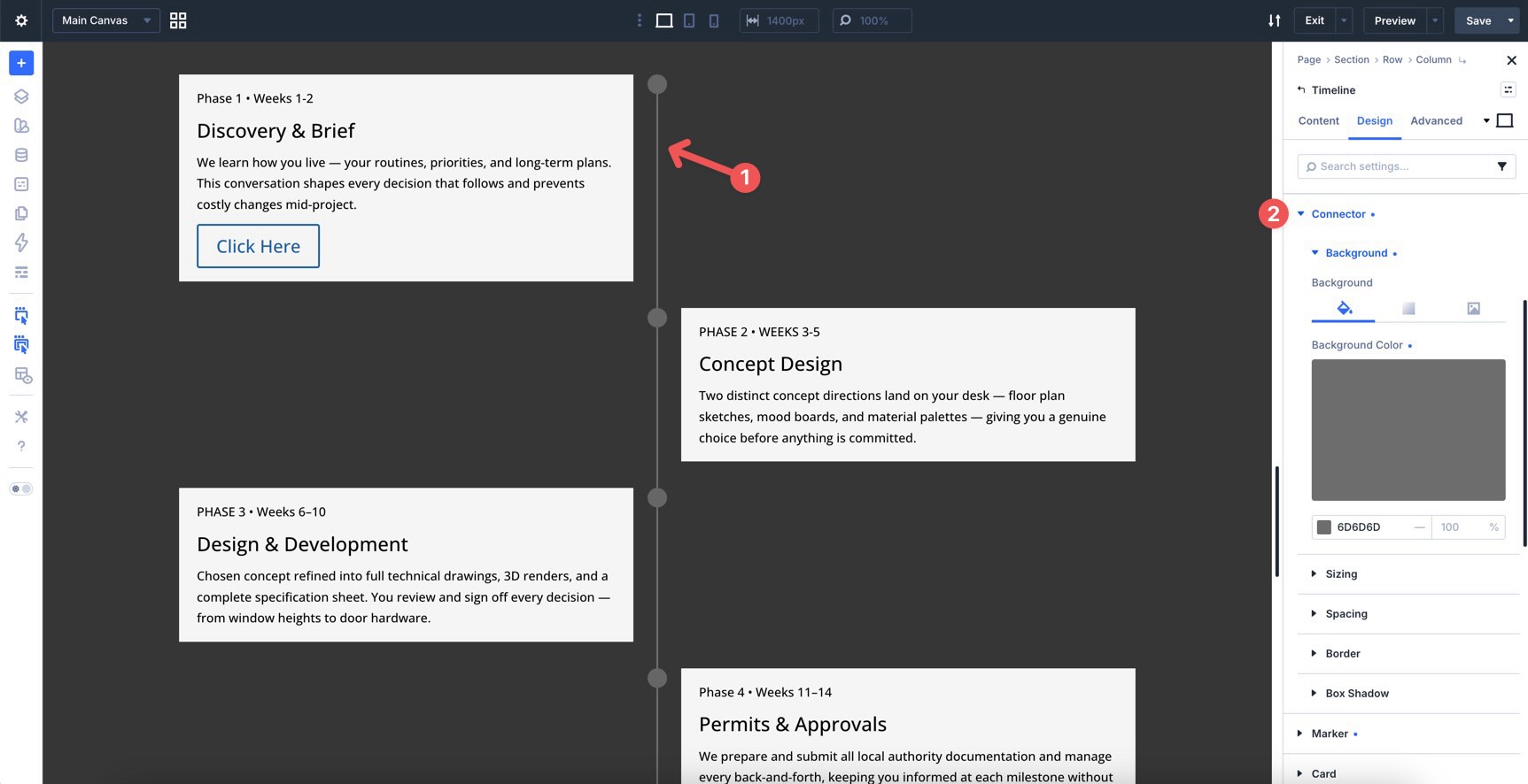
Style the connector so it visually belongs to the same system as the track. Matching colors or related Design Variables work well here.
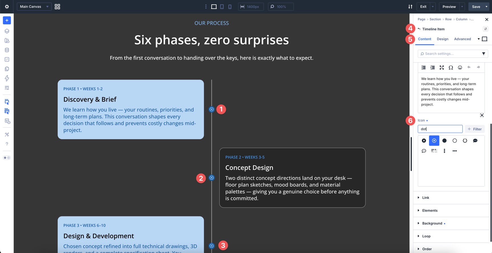
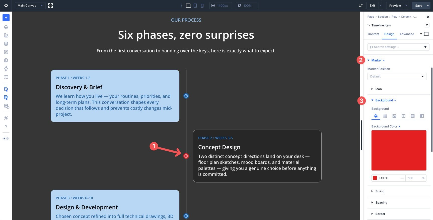
Step 6: Style The Markers
Markers are the dots, icons, or shapes that sit on the track for each event.
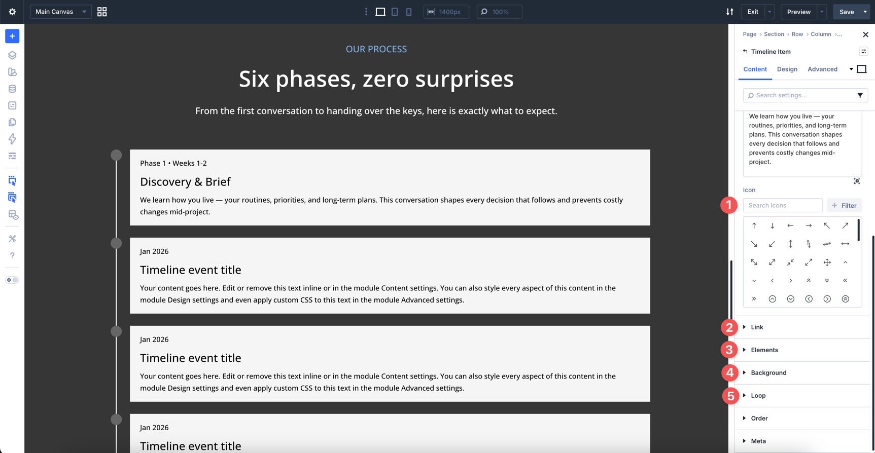
Open the Marker option group to style marker color, size, background, border, shadow, spacing, and position.
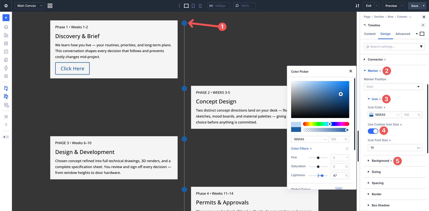
You can also add custom icons from each Timeline Item’s Content tab. Use icons when they clarify the milestone. For example, a launch icon, checkmark, calendar, trophy, or warning icon can make important phases easier to recognize.
You can position markers at the start, center, or end of each Timeline Item.
Step 7: Style The Timeline Cards
The Card option group controls the content box for each Timeline Item. Use it to style the card background, border, radius, shadow, and padding.
In an alternating layout, use Card (Even) to style every second card differently. You might use a subtle background change, a slightly different border color, or a different shadow direction.
Keep alternating styles intentional. Too much difference between odd and even cards can make the timeline feel inconsistent.
Step 8: Style Date, Title, And Body Text
The Timeline module gives separate typography controls for the date or label, title, and body copy. Use Date Text to style the date label at the top of each card.
The Display Date On Spacer setting can move the date into the spacer area. This can help balance alternating layouts by placing short labels on the opposite side of the track.
Use Title Text for the milestone title.
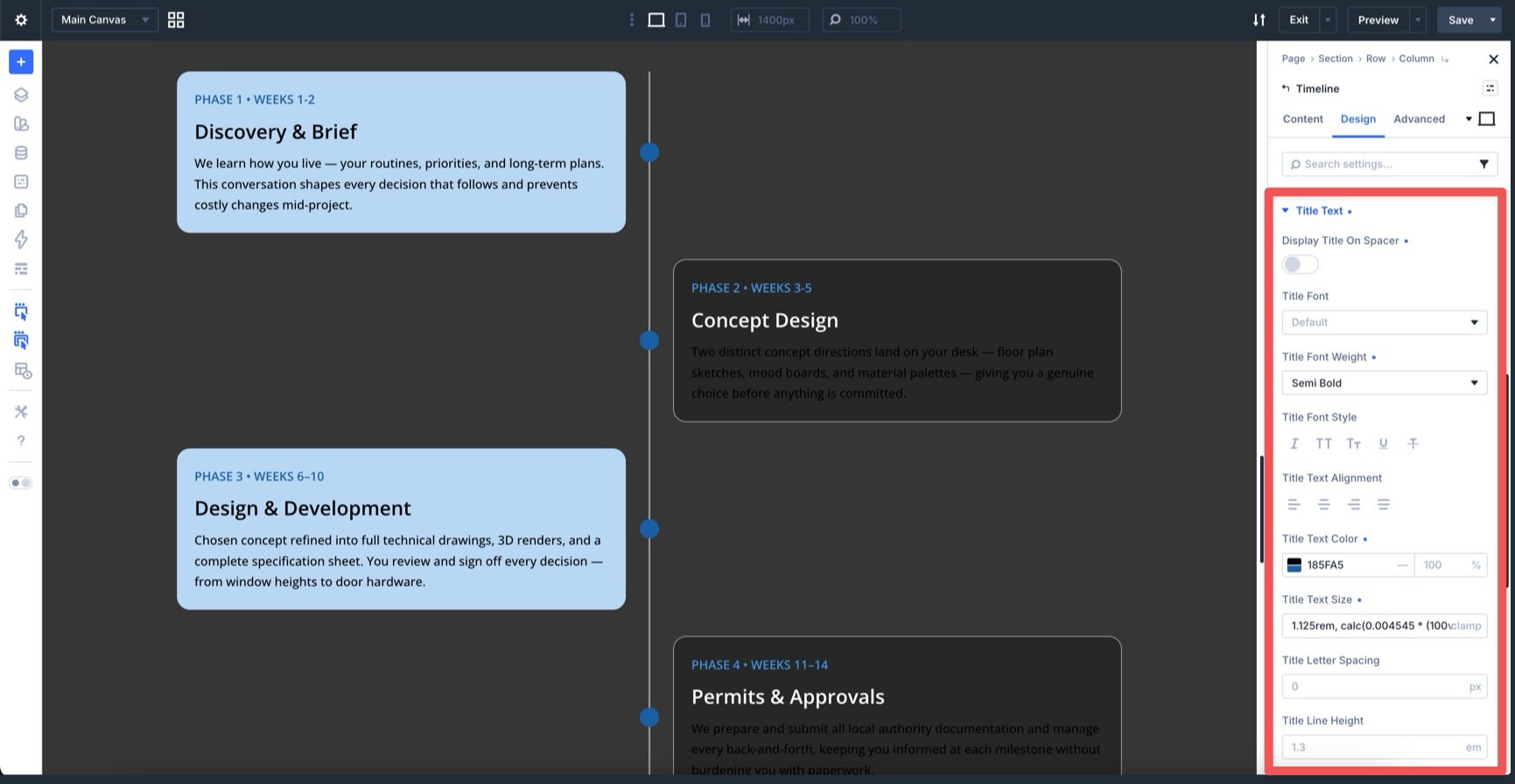
Use Body Text for the description.
Even variants are available for Date Text, Title Text, and Body Text. Use them when alternating cards need different text colors or alignment.
Step 9: Add Card Animations With Composable Settings
Animation works best when it supports the timeline’s flow. A simple fade, slide, or zoom can make each milestone feel like part of a guided story.
To animate the cards only, open the parent Timeline module’s Design tab. Hover over the Card option group and click the Toggle Options icon.
Enable the Animation option group. You can also enable Filters or Transform if the design needs them.
Choose an Animation Style, such as Fade, Slide Up, Zoom In, or Bounce. If you are using alternating cards, you can enable Animation on Card (Even) too and use a different delay or direction.
Step 10: Use Individual Overrides When Needed
Parent Timeline settings apply across the whole module. Individual Timeline Item settings apply only to that item.
To edit a single item, open the Timeline module, click the Timeline Item you want to customize, and use that item’s Content or Design tab.
You can apply item-level design changes for a featured milestone, final step, warning state, launch date, or important result.
You can also animate an individual Timeline Item from its own Animation group.
Keep in mind that item-level animation affects the whole Timeline Item, including its marker and connector. If you only want the card to animate, enable Animation on the Card option group with Composable Settings instead.
In the individual Timeline Item’s Content tab, you can also add a custom marker icon, set a link, or add nested modules.
Step 11: Test The Timeline Responsively
Once the desktop timeline looks right, switch to tablet and phone views in the Visual Builder.
Alternating layouts often need a simpler mobile treatment. In the Timeline settings, you can adjust the Position setting for smaller breakpoints so the timeline becomes left-aligned or right-aligned on mobile.
This prevents the cards from feeling cramped on narrow screens.
Also check:
- Card width and padding.
- Body copy length.
- Marker size.
- Connector spacing.
- Date placement.
- Animation timing.
When everything looks good, save the page.
Step 12: Save The Timeline As A Preset
If you plan to reuse the timeline style, save it as a preset.
Click the Timeline module header to reveal the preset icon. Choose New Preset From Current Styles, give the preset a clear name, and save it.
Use a role-based name, such as Timeline Roadmap Alternating, Timeline Company History, or Timeline Process Steps.
That makes the preset easier to reuse later.
Best Practices For Timeline Design
A timeline is only useful if people can understand the sequence quickly. Use these practices before publishing.
Keep Each Item Focused
Timeline cards should be short enough to scan.
Use the title for the main idea and the body text for the supporting detail. If an item needs a long explanation, link to a dedicated page or add a button with nested content.
Use Consistent Icons, Colors, And Spacing
A timeline can become visually noisy if every item uses a different color, icon, or card style.
Choose a small set of design rules and repeat them. Use Design Variables for shared colors and spacing values so updates stay easy.
Highlight Important Milestones Intentionally
Some events deserve extra attention. Use marker size, marker color, card background, icon choice, or typography to highlight them.
Do this sparingly. If every event is highlighted, none of them stand out.
Use Horizontal Timelines For Short Sequences
Horizontal timelines work best when the sequence is short and the labels are compact.
Use them for process overviews, launch phases, roadmap summaries, or step-by-step previews. For longer histories or detailed project timelines, a vertical layout is usually easier to read.
Use Vertical Timelines For Longer Stories
Vertical timelines are better for detailed content because they follow the natural scroll direction of the page.
They work well for company histories, resumes, case studies, and long project timelines. If you use alternating cards, test the mobile layout carefully and simplify the card position on smaller screens.
Test Custom Breakpoints
Use Customizable Responsive Breakpoints to check the timeline at the widths that matter for your design.
Look for cramped cards, long date labels, oversized markers, and animations that feel too slow on smaller screens.
Download And Install The Example Files
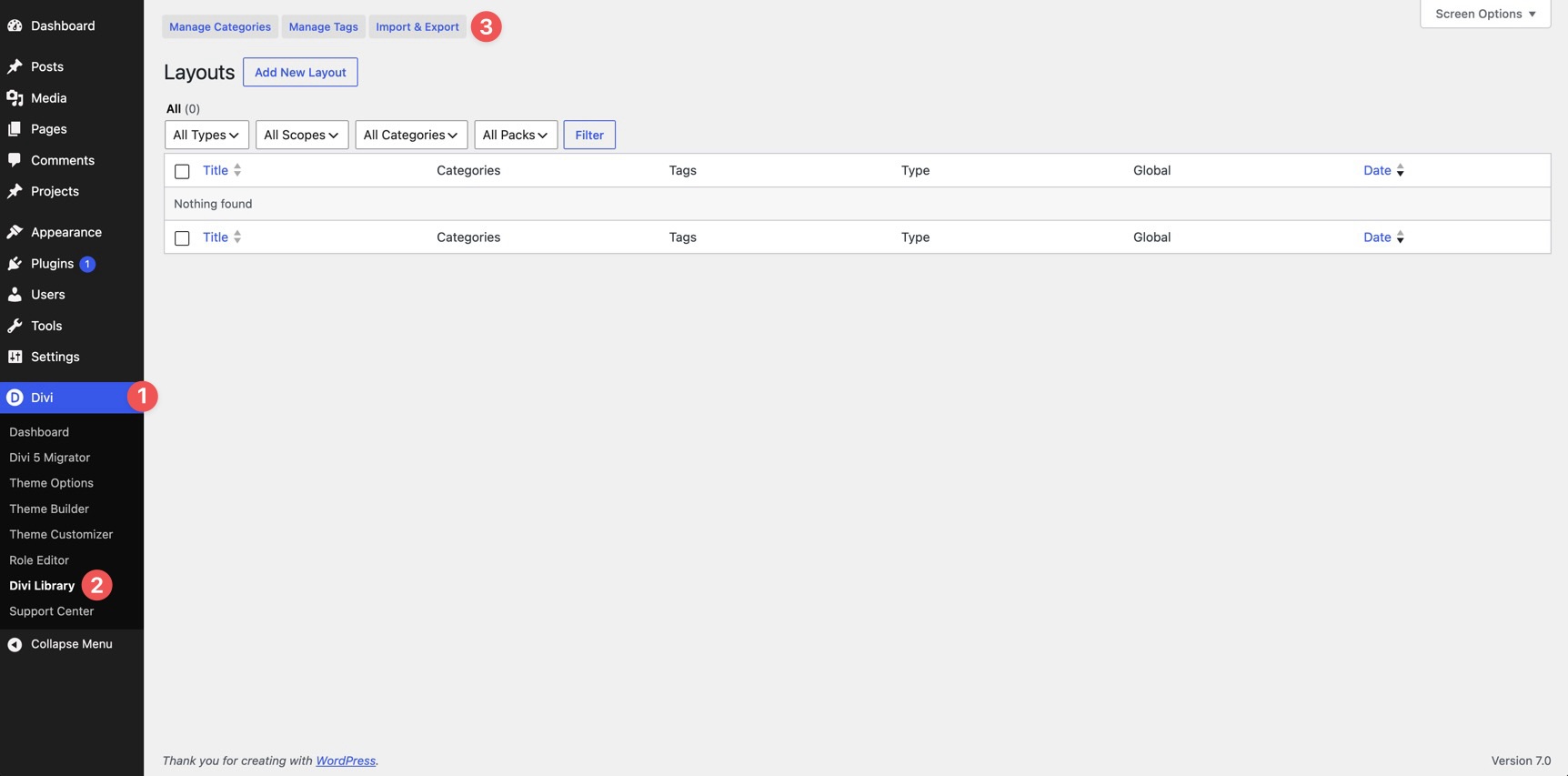
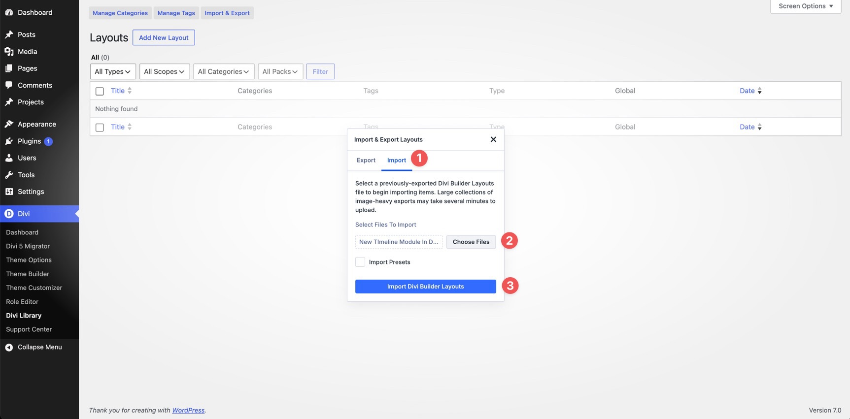
To help you get started, we created a full-page layout using the Timeline module from this post. After downloading the zip file, go to your WordPress dashboard and open Divi > Divi Library. Click Import & Export.
Open the Import tab, choose the JSON file from your computer, and click Import Divi Builder Layouts.
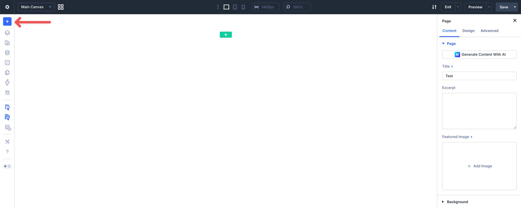
After the file imports, create a new page and open the Visual Builder. In the Builder Bar, click the blue plus icon.
When the Insert Layout modal appears, choose Saved Layout.
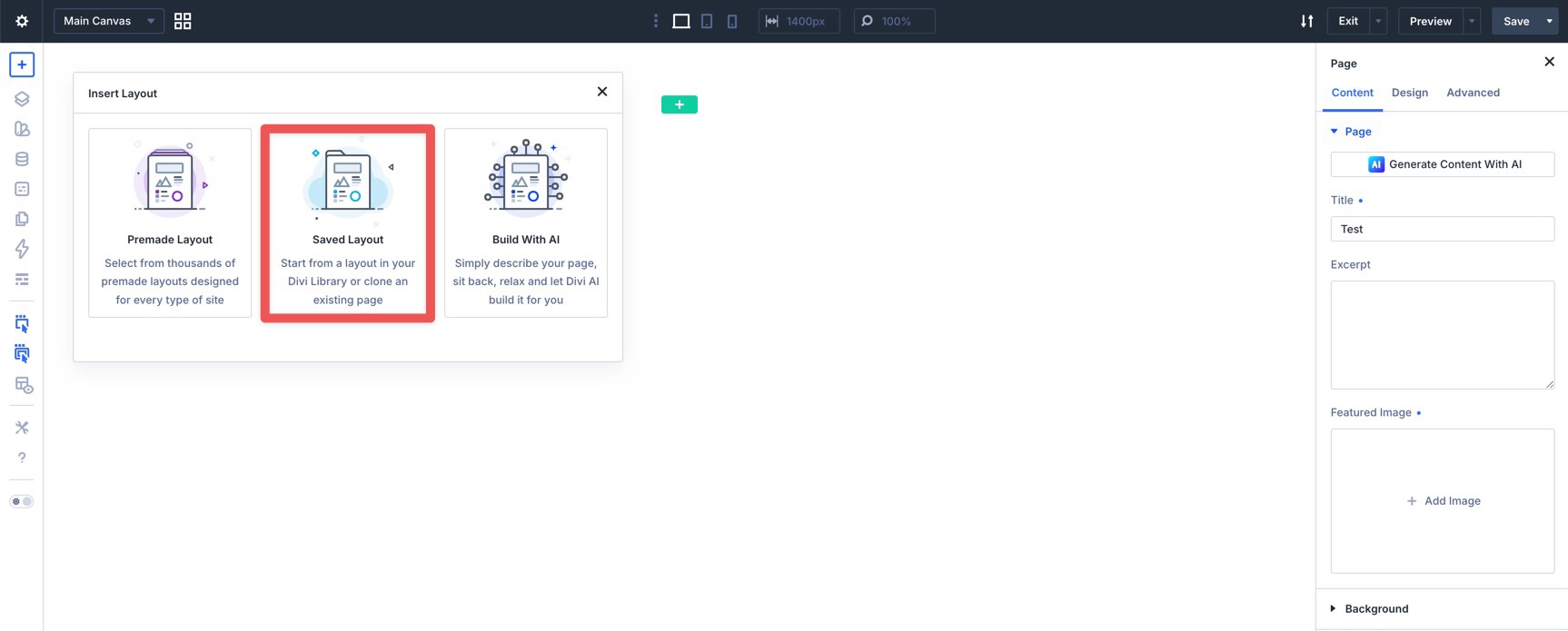
Select New Timeline Module in Divi 5 to load the layout.

Build Your Own Timelines In Divi 5 Today!
The Timeline module gives Divi 5 a native way to build chronological and step-based layouts without piecing together the structure from separate modules.
Use Timeline Items for each event. Use the track, markers, connectors, cards, and text groups to shape the visual system. Use Even option groups for alternating layouts. Use Composable Settings when you need to animate or style a specific part of the timeline. Use presets when the same timeline style should appear elsewhere.
Whether you are building a company history, product roadmap, project timeline, resume, onboarding flow, or process section, the Timeline module gives you a cleaner way to turn a sequence into a visual story.


Leave A Reply